Favicons are something we’ve all seen, whether we know what they are or not.
If you take a look at your open browser tabs right now, you’ll see Webflow’s ‘W’ on this open web page. This small graphical embellishment is known as a favicon.
Let’s take a closer look at where favicons came from, how they’re used, and tips on designing your own.
Where do favicons come from?
Favicons trace all the way back to Internet Explorer 5. At the time, they lived in the root directories of websites, with the rather simple name “favicon.ico,” which is still in use today. If you favorited a website on Internet Explorer, a favicon would appear next to it in the address bar as well as your bookmarks list.
In addition to their role as a design element, website owners once tracked site popularity by counting the number of times a favicon was downloaded. Those numbers provided an early glimpse into visitor engagement. Thankfully, metrics and measuring blog visitors have come a long way since these rather crude beginnings.
Where are favicons used?
You'll see a recognizable icon on each of your browser tabs—this helps visitors identify your site at a glance. They may be small — generally at a resolution of 16x16 or 32x32 pixels on retina-based screens — but these bite-sized pieces of visual branding should not be overlooked when putting together a website.
A favicon image may take the form of a stripped-down version of a logo, a symbol, or even just a single character. Since they must fit into the small space afforded by modern browsers, they need to be simple, yet impactful.
- If you’re looking at the HTML code of a website that has a favicon, you’ll see it in the <head> tag, and in the form:
<link rel="icon" type="image/png" href="/my_favicon.png" sizes="16x16"> - If you want to support high-resolution devices, add multiple link tags with different sizes. For example:
<link rel='icon' type='image/png' href='/my_favicon_32.png' sizes='32x32'><link rel='icon' type='image/png' href='/my_favicon_192.png' sizes='192x192'>This helps your site display crisp icons in browsers on phones, tablets, and large screens. - You may also see additional favicon.png sizes in the code, to accommodate different apps and devices, we'll be getting into this a bit later on in this post. Favicons aren’t limited to browser tabs and can be seen in other places that list or display websites.
- You’ll find favicons in your browser’s history. Whether you’re using Chrome, Safari, Firefox, or any other capable browser, a favicon will appear next to the website it represents.
- Favicons also appear in Google search results and autosuggest in the search bar, as well as bookmark dropdowns and browser toolbars. In these busy lists, favicons allow us to identify websites without even having to read any of the text.
Can you use favicons in different browsers and platforms?
Different browsers and devices may require varied favicon sizes and file formats. For instance, older versions of Internet Explorer rely on .ico files, while modern browsers support multiple file types. Apple-touch-icons and Android-specific sizes are also frequently used. Including multiple favicon sizes and formats can help your site look professional no matter who's visiting.


Ultimate web design
From 101 to advanced, learn how to build sites in Webflow with over 100 lessons — including the basics of HTML and CSS.
How to implement favicons
Favicons serve as visual guides, creating a more consistent user experience and overall brand identity. Just as you put effort into the harmony of CSS styles that come together in a web design, you should also pay attention to how a favicon fits into your overall theme and branding.
Examples to think of when designing your own favicon include YouTube’s play button, Twitter’s bluebird, and Google’s colorful ‘G.’ These favicons are unique, immediately identifiable, and make the brand easy to spot when scanning tabs.
When creating an equally memorable favicon — here are some things you should take into consideration
Make your favicon small but legible
There are several favicon sizes to consider, but keep in mind at their smallest iteration of 16x16 pixels they need to be legible. This means coming up with a visual hook that captures the essence of a brand, giving it instant recognition.
A great example is this use of crisp text from one of our favorite design websites Behance . Even at this small scale, there’s no lack of definition, and the image appears high quality and easily identifiable.
Don’t overdo it
With such a limited amount of space, it’s best to take a minimalist approach. One of the easiest ways to create a favicon is to take an element from your preexisting logo.
Here are some examples:
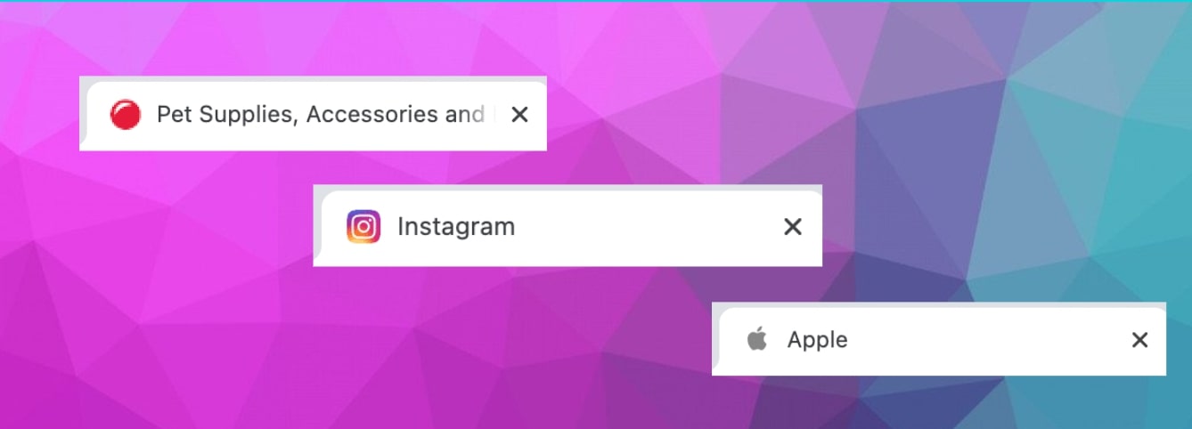
- PetSmart streamlines its logo by using the bouncing red ball. This small element ties directly to their brand and stays crisp in the tab space.
- When your logo is also a symbol, it’s easy to use it as a favicon. Apple’ s logo is a great example of this.
- Instagram uses its camera logo for both its app button and favicon, which creates a sense of brand continuity across platforms.
Keep it to a few characters
Along with pulling a symbolic element from a logo, you can also use a character in a favicon. There are many brands out there with favicons that use a single letter to represent who they are.
Can you guess whose favicons these are?
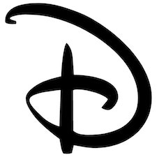
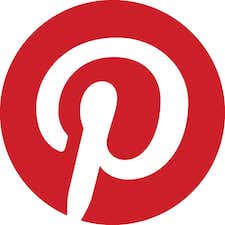

The swooping letter “D” is instantly recognizable as Disney, the stylized P in a red circle is from Pinterest, and the blue square with “in” ties back to LinkedIn.
When designing a favicon, whittling it down to a key letter or two works well in representing a brand.
Consider the color scheme
Beyond what your favicon is, how it utilizes color is just as important. Here are some things to consider when deciding on what colors to use:
- The background color of a browser tab is generally grey or white , or sometimes black if it has been switched to night mode. When designing a favicon, consider how it may appear against different background colors. For example, Marvel uses just red and white, which is a solid combination that stands out no matter what color a tab may be.

- Your canvas for creating a favicon is a tiny space. Use a refined palette , with colors that look good together at a minuscule scale.
- Use colors with enough contrast so that they’re distinct from one another. Clarity and definition are key.
Use a vector-based graphic
While it may be tempting to create something quick in Photoshop, using vector graphics will help you in the future. When you craft a favicon in Illustrator, Sketch, Figma, or another vector-based design application, it’s much easier to resize and alter it later on.
Many designers start with an SVG-based favicon graphic and then convert them into non-vectorized files like a png, gif, jpg, or ico.
Consider creating favicons with a favicon generator
Favicon generators offer a quick way to come up with an icon and generate multiple sizes. They’re also handy in producing HTML code you can implement into your designs by displaying them on different apps and devices.
Use the right file format
Today, favicon.ico still has widespread support across a variety of browsers. However, more contemporary websites tend to use favicon.png. Keep in mind that Internet Explorer only supports .ico, and the .png format will not display. You can get ahead of this issue by storing both a .ico and .png version of the favicon so it will appear properly on multiple browsers.
Size favicons properly
The standard size for favicons is 16x16 pixels, but most designers start with 32x32 pixels to accommodate retina screens. This way, the larger favicons show up nicely on retina screens and can also be scaled down. Of course, there are other favicon sizes out there, and it’s worth mentioning that Apple-touch-icons, like those for OS Safari require dimensions of 180 x 180, Android Chrome needs a favicon at 192 x 192, and Opera Coast works best at 228 x 228. Designers generally create a variety of different sizes to accommodate both desktop browsers and other applications.
Don’t skimp on favicons
Favicons are important. Without them, our open browser tabs feel empty. We’re left with a bunch of grey space with text, which is far from noteworthy.
Favicons provide visual cues that help people recognize and — more importantly — remember your brand. If you want your brand and site to be memorable, this tiny icon can pack a big punch.
Favicon resources and next steps
For more help with code or cross-platform settings, official documentation from major browsers like Chrome and Firefox provides up-to-date guidelines. Experiment with different file formats and keep track of your site analytics to see how visitors engage with your brand.
Build websites that get results.
Build visually, publish instantly, and scale safely and quickly — without writing a line of code. All with Webflow's website experience platform.