
Think of a brand. Do you picture their logo in your head?
Logos are an important part of brands’ identities. In many ways they are the face of the brand, giving customers a strong visual identity to build an emotional attachment with.
Logos can be tricky to design. They need to be unique and distinct enough to be recognizable but also simple enough that they can be used anywhere in a business’s designs at any size needed. They should visually represent what you do, what you stand for, and who you are.
If you want to know how to design a custom logo, it helps to break the graphic design of a logo down into pieces. A good logo is font, color, shape, and form. Follow these logo design tips, and build your logo step by step.
How to find inspiration for your logo design
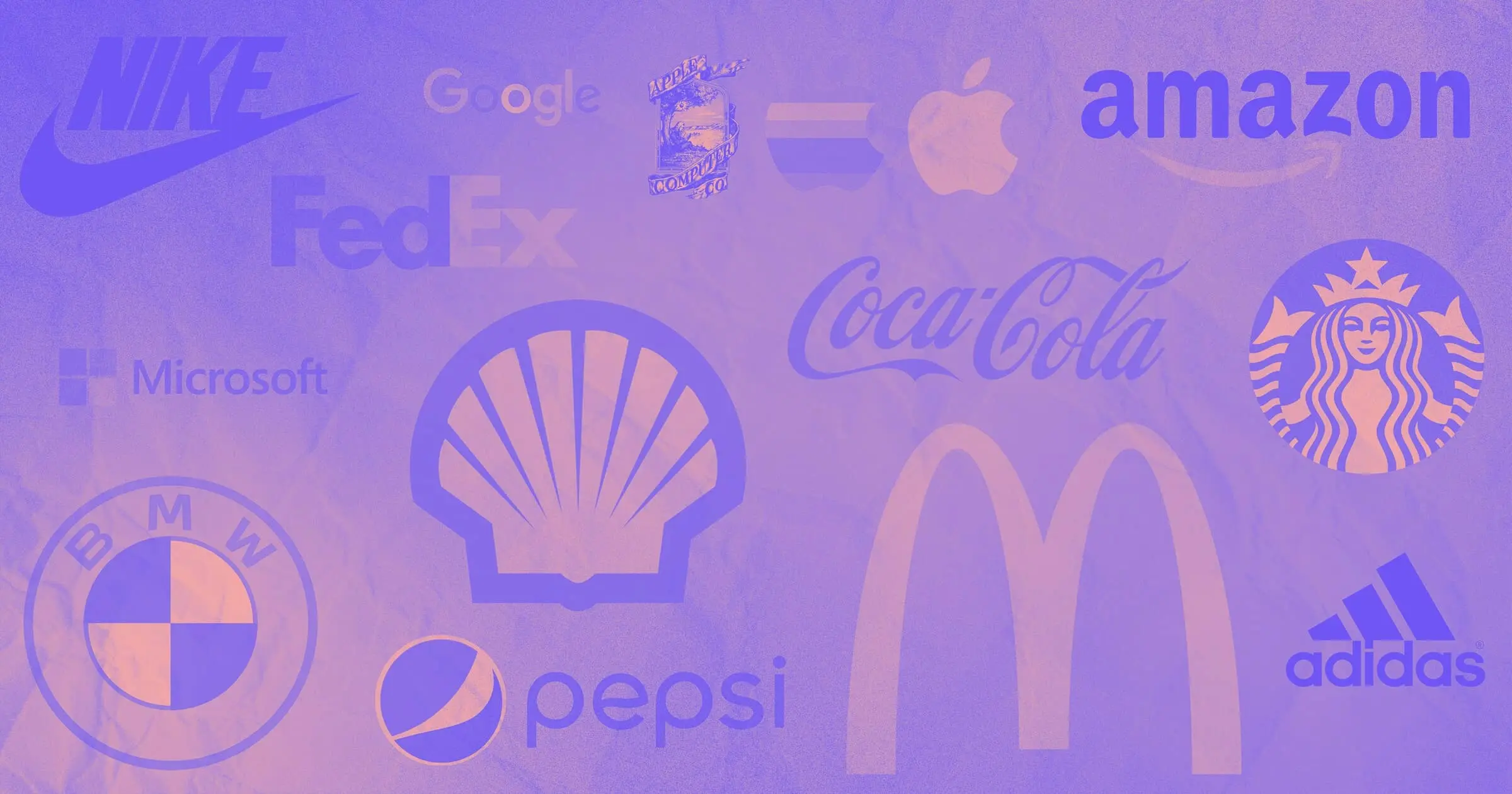
To get started on your logo design, look at your brand identity, company name, or industry. Your logo could represent your brand name literally — for example Apple’s is an apple — or it could play with hidden meanings like the negative space arrow in the FedEx logo.
Find words to guide your logo design process. What feelings and impressions do you want to evoke in your audience? What is your brand personality or identity? Are you fun or serious? Hip or heritage? Techy or artisanal? Accessible or luxurious? Do you want to be seen as trustworthy, aspirational, silly, comforting, or futuristic?

The next step is finding creative inspiration. A great place to start is looking at famous logos or other businesses in your industry for examples of good logo design. Logo Design Love, written by designer David Airey, has plenty of inspiration and explanations of the why and how behind successful logo designs.
Then just start sketching and getting those ideas down on paper. Don’t start saying “no” until you have a wide variety of ideas.
Follow the 5 principles of logo design
To create a great logo, let the widely recognized five principles of logo design guide your work. A logo should be:
- Simple - Easy to recognize in any context.
- Memorable - Distinctive, so your brand stands out in customers’ minds.
- Timeless - Relevant over the long term as logo design evolves rather than following trends and needing frequent redesigns to stay fresh.
- Versatile - Able to adapt to any size and format it appears on — websites, social media, print, and physical products.
- Appropriate - Suited to your business. It should help communicate your brand identity and indicate what your company does.
Decide on a type of logo
Logos may be made up of text, images, or a combination of both. Image-based logos can be creative, cute, minimalistic, or even elaborate. Images may stick in the viewer’s mind more easily.
A text-based logo is great for new companies that need to make their brand name recognizable to audiences. “Not all brands need a symbol alongside a wordmark,” said Airey. “The brand name on its own can be enough, especially with a distinctive name.”
Wordmark logo
A wordmark, sometimes called a logotype, is a logo that is formed from your brand name. The entire company name is stylized to create a recognizable mark. Font, layout, and color are the main design elements that make it recognizable. Coca-Cola, West Elm, Google, and Sony all use wordmark logos.
Lettermark or monogram logo

A lettermark logo uses just the initials of the brand to form a logo. They are great for brands with long names. NASA and HBO are simple, iconic lettermarks. Louis Vuitton and Chanel are more elaborate monograms that give a luxurious impression.
Emblem
An emblem is a more complex logo. They have a border or background with multiple visual elements on them, which can include images and text. They communicate prestige, history, and luxury but are less versatile since their complexity makes them harder to recognize at a smaller size.
Car brands, beer breweries, and coffee producers all commonly use emblems. Paramount, Harley Davidson, Stella Artois, and the old Starbucks logo (now more of a pictorial mark) are good examples of the style.
Pictorial mark

A pictorial mark is an image representing something important to the brand or brand name. Customers remember the logo through association. Examples include Shell’s shell logo or Instagram’s camera icon.
Abstract logo
This type of logo is a shape or image that doesn’t represent a real object, instead using an abstract form or shape to represent a brand. Adidas’ three stripes and the Nike swoosh are both memorable abstract logos. However, abstract logos may be harder to remember or recognize for newer brands.
Mascot

A mascot logo uses a character that represents the brand. They have historically been popular with sports teams and food companies, like KFC’s Colonel Sanders or the Pringles logo. However, they have also become more popular with digital and tech companies, such as Duolingo’s owl or Reddit’s alien, Snoo.
Combination mark

A combination mark uses a mix of images, letters, and words to represent a brand. Combination marks are the most versatile because they can be used whole or in pieces to suit different needs. Mastercard has a combination mark of its name and an abstract image. Puma uses a combination of its brand name and puma icon.


Get started for free
Create custom, scalable websites — without writing code. Start building in Webflow.
Select the right font for your logo
The font is a primary design element in logos that use text. You have many options for good fonts for logos. Every font will give off a different impression to the viewer. The main categories are:
- Serif - Times New Roman, Georgia
- Sans-serif - Arial, Open Sans, Montserrat
- Script - Great Vibes, Indie Flower
- Custom Font - Letters drawn by hand or digitally
A sans-serif font will feel more modern, while a serif font might be more classical. A cursive or handwritten style can make a logo feel familiar or elegant. Monospaced fonts can feel retro and clean. When you pick a font, look at how it will pair with the rest of the typography on your website and materials.

Features to consider when choosing a font are bluntness, angularity, softness, and font weight. Changing these will change the visual impact of your font. A blunt, heavy, angular font is more bold and aggressive. Make that same font soft at the edges, and it starts to look pillowy and comfortable. A lightweight, angular font looks modern, while a midweight serif font might look more traditional.
Another option is to create a custom font to make your logo stand out. Unlike pre-set fonts, you’ll have more control over how the font appears and is perceived.
Tesla is a good example of a custom typeface for a logo. It is minimal and futuristic, communicating its cutting-edge technological brand identity. The company pairs the typeface logo with a stylized “T” icon to create a combination logo. Another example is Tate Britain’s custom font which is a blurred, grainy text formed from tiny individual dots. It’s almost abstract and evokes halftone printmaking, which suits its modern art focus.
Choose colors for your logo design
The color you use in your logo is an important part of logo design and brand identity. Choose colors that resonate with your target audience and make your brand unique and recognizable. Color psychology helps explain the associations and emotional reactions viewers have to certain colors.
Choose a logo color scheme that includes two to three colors. Sticking to a limited logo color palette helps make your logo more recognizable. Some color combinations can become so iconic that audiences can recognize the brand just by the colors — think of McDonald’s red and yellow, UPS brown and gold, or Twitter blue and white.
Looking at popular logos, you can observe that some colors are more common than others for different types of businesses. Food companies may use shades of red since red can make the viewer feel hungry. Technology companies often use blue, black, or silver, which communicates a clean, futuristic, and serious identity.
You may want to choose a logo color scheme that aligns with your industry to give your audience more information about who you are. Alternatively, you can choose a more unexpected contrasting color palette to make you stand out from your competitors.
David Airey described his process of choosing not to use the obvious green logo color palette for an environmentally focused business. “While obvious can be good, it rarely differentiates,” he said. “Applying reds and blues within the identity gives Ecometrica some added differentiation and memorability.”
Size your logo and variations appropriately
Logos appear in such a wide variety of contexts that designers need to choose their logo dimensions carefully. Your logo needs to be recognizable in many contexts and sizes. It should look as appropriate on a billboard as on a business card. A simple logo without too much excess detail will be more adaptable.

You can start with your standard logo size for websites, products, and business materials. You can design your logo in Photoshop, Adobe Illustrator, or a free logo maker as a vector file with a transparent background. A vector file can be resized without becoming pixelated, so you can save it as your file type of choice to use in designs.
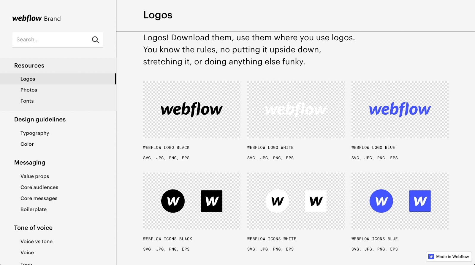
You should also design variations of your logo to use on social media and a favicon that will appear in the viewer’s browser bar when they navigate to your website. You may use your entire logo, just the pictorial icon, or just a letter (like Webflow uses) for smaller variations on your logo design. Consider creating color variations to use, so your logo can be used against a variety of background colors in designs.
Create files of each variation of your logo that individuals across the business can use in their materials. You can build a brand design system that includes these files so that your logo will remain consistent across all branding.
Design and redesign your logo until it’s perfect
Designing is redesigning. The best way to see how font, color, and form affect your logo is by creating variations of your design. Keep your mind open, and experiment with ideas, variations, and different versions of your new logo.
Next, narrow your choices down and do some audience testing. Ask test subjects what impressions they get from different logo designs. Have them describe what they think the brand that would have each logo would be. See if they remember one logo above the others. You may even combine a few options to come up with the perfect logo.
With careful consideration and development, you can build a logo that represents your brand well.