A call to action encourages users to actively engage with your brand.
Calls to action (CTAs) show users the shortest route to something they’re interested in, whether it’s a product, upgrade, or subscription. These messages turn passive interest into active engagement. A good CTA generates better click-through rates and conversions.
Using the following information, tips, and examples, learn how to write strong CTAs that will improve audience engagement.
When to use a call to action
A CTA encourages readers to engage with a website using clear and persuasive language. Web designers typically use CTAs as buttons with copy such as “Sign up” or “Learn more,” but CTAs can also be text within content. Whenever you use copy to compel the user to do something, you’re using a CTA.
Here are some typical applications of CTAs:
- Blog articles — A common engagement tactic is including a CTA at the bottom of each post. These messages might direct readers to the next article or encourage them to make a purchase.
- Email marketing — Email campaigns cast a wide net over a passive audience. A well-written CTA directs attention to your desired link, such as event tickets, promotional pages, or new product launches.
- Social media posts — On social media, pair CTA copy with graphics to catch user attention as they scroll through their feeds.
- Product pages — Product descriptions teach users about a product, but to motivate them to buy it, you need buttons like “Purchase here” and “Shop now.”
- Pop-ups — Direct requests like “Sign up” or “Subscribe” ask people to engage with the site before they navigate away from the page.
- Online advertisements — Online ads aim to distract users from their current activity, so they use enticing deals and engaging titles alongside CTAs like “Order now” and “Read the article.”
- Landing pages — Landing pages use CTAs like “Learn more” and “Explore” to punctuate their high-level information.
7 types of CTAs
Here are seven examples of CTAs with descriptions of how they use clickable CTA buttons to reach their goals.
1. Lead generation
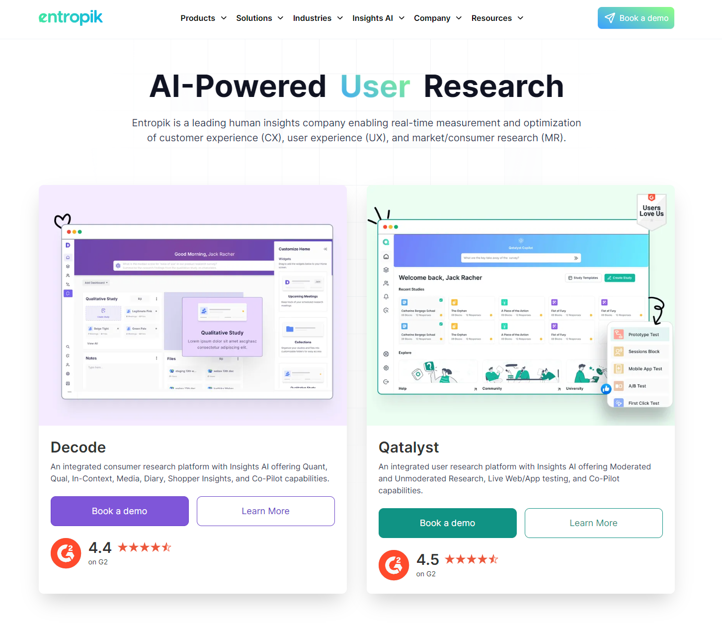
Entropik is a research platform that offers real-time metrics and user experience (UX) optimization, and Everything Design built their website. The homepage features three instances of a “Book a demo” CTA button, which encourages readers to get in contact and learn more about the platform.
Below each button is a high-caliber rating from G2 that offers impressive social proof, making these CTAs engaging, inviting, and eye-catching all at once.
2. Product or service discovery
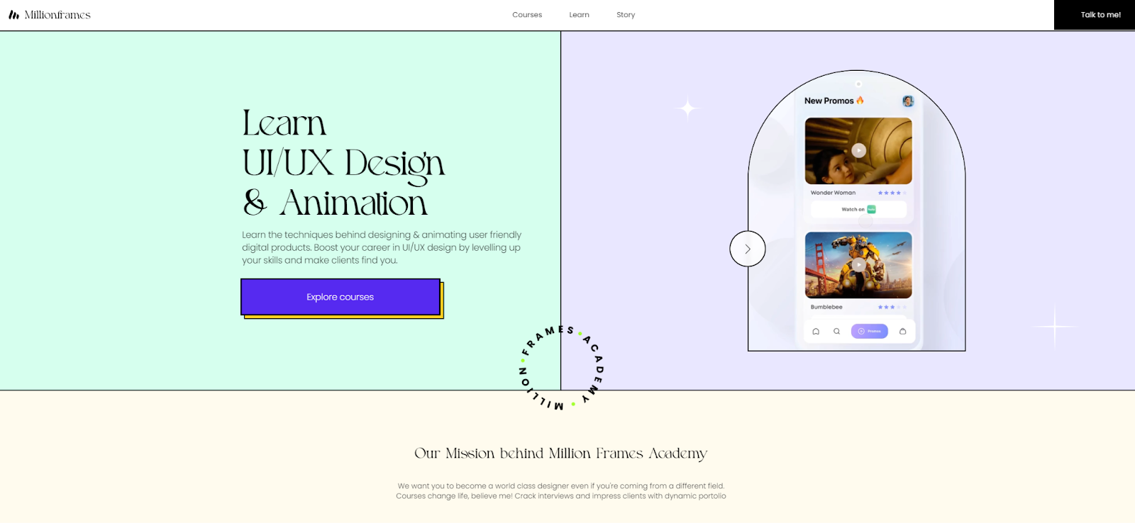
Aashish Kumar built Million Frames Academy’s website, which offers an online learning experience for UI/UX designers. Because the company offers graphic arts courses, it’s important for their website to be visually engaging. This design shows potential students what they could learn to create by participating in Million Frames Academy’s classes.
To draw readers’ attention, the homepage and primary CTA button use eye-catching visuals, color, and animation. The CTA, “Explore courses,” changes colors and features hover animations, encouraging potential students to roll over the button and click.
3. Closing the sale
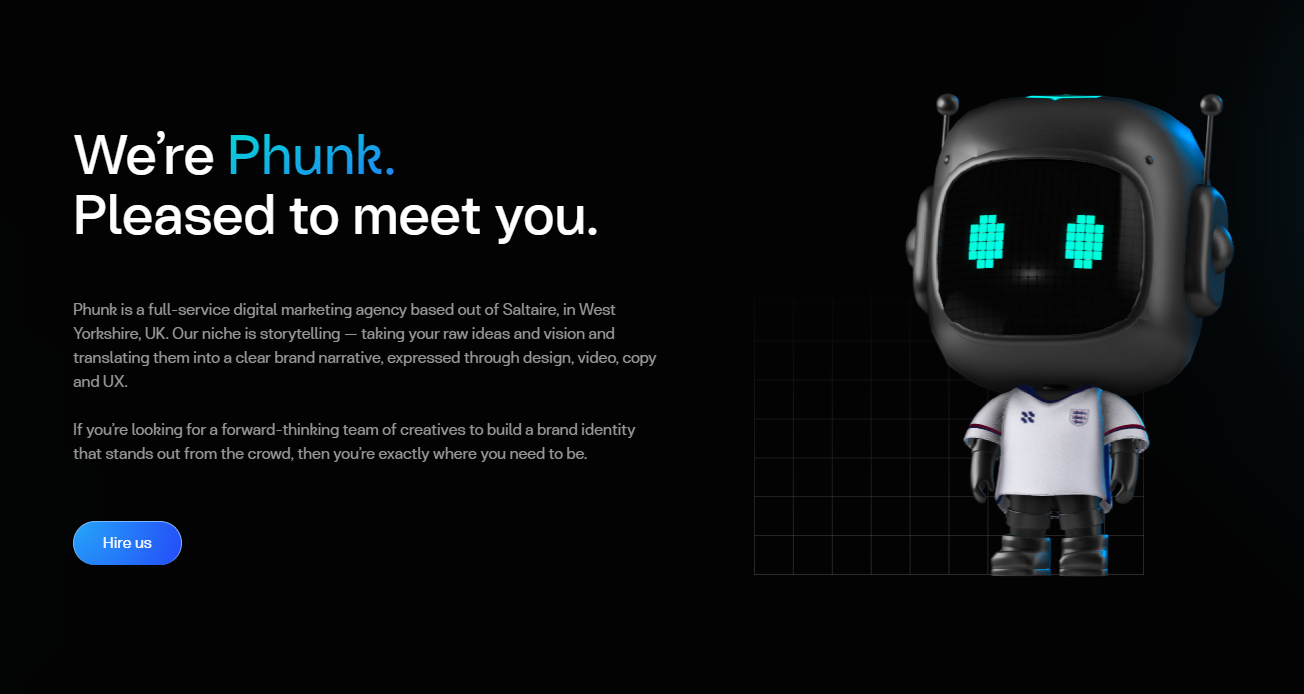
Phunk Creative is a digital marketing agency based in the UK. Adorable animated avatars draw website visitors’ attention to key copy that describes Phunk’s services. For example, their process involves “taking your raw ideas and vision and translating them into a clear brand narrative.”
To close the sale, they use a simple CTA button that reads, “Hire us.” The bright blue button stands out against the dark background, drawing attention instantly. Paired with clear descriptions, action-oriented language, and animations, this page encourages users to click the CTA.
4. Form submission
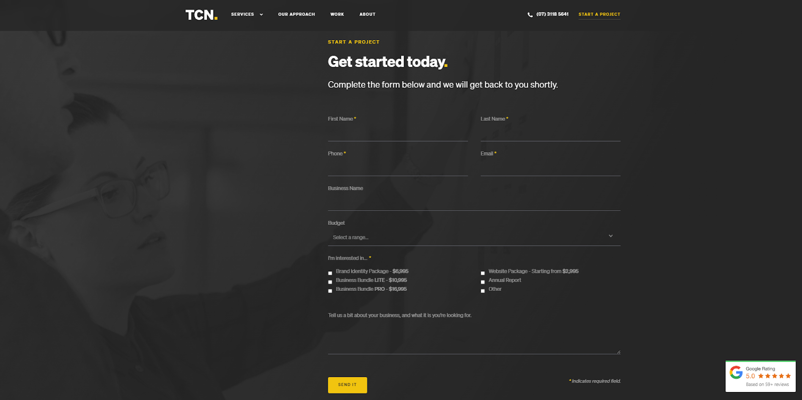
Another great way to use CTA buttons is to guide visitors along a multi-step journey. For instance, designers Rory and Amanda Sleed added a CTA button to The Creative Noise’s homepage that reads, “Start a project.” You’d expect that this button would lead to a service sign-up form, but instead, you’re directed to their contact form.
Here, you’ll provide detailed information about your goals, budget, and business. This method opens communication and helps the company better understand your needs. They close this form with a “Send It” CTA button to encourage you to complete it.


SEO and Webflow: the essential guide
Get 13 need-to know tips on website SEO — whether or not you use Webflow.
5. Pop-up
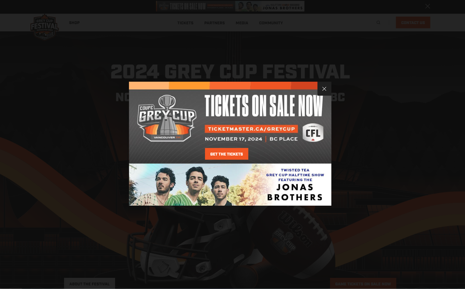
The Grey Cup is a Canadian football league, and the festival is the largest community event of the year. The Digital Panda designed this site and added a pop-up to the homepage with a CTA that clearly states, “Get the tickets.” The square, all-caps design matches the rest of the site’s bold colors and text.
By using a branded pop-up, this page offers an official-looking place for people to buy tickets as soon as they enter the site, immediately turning traffic into conversions.
6. Banners
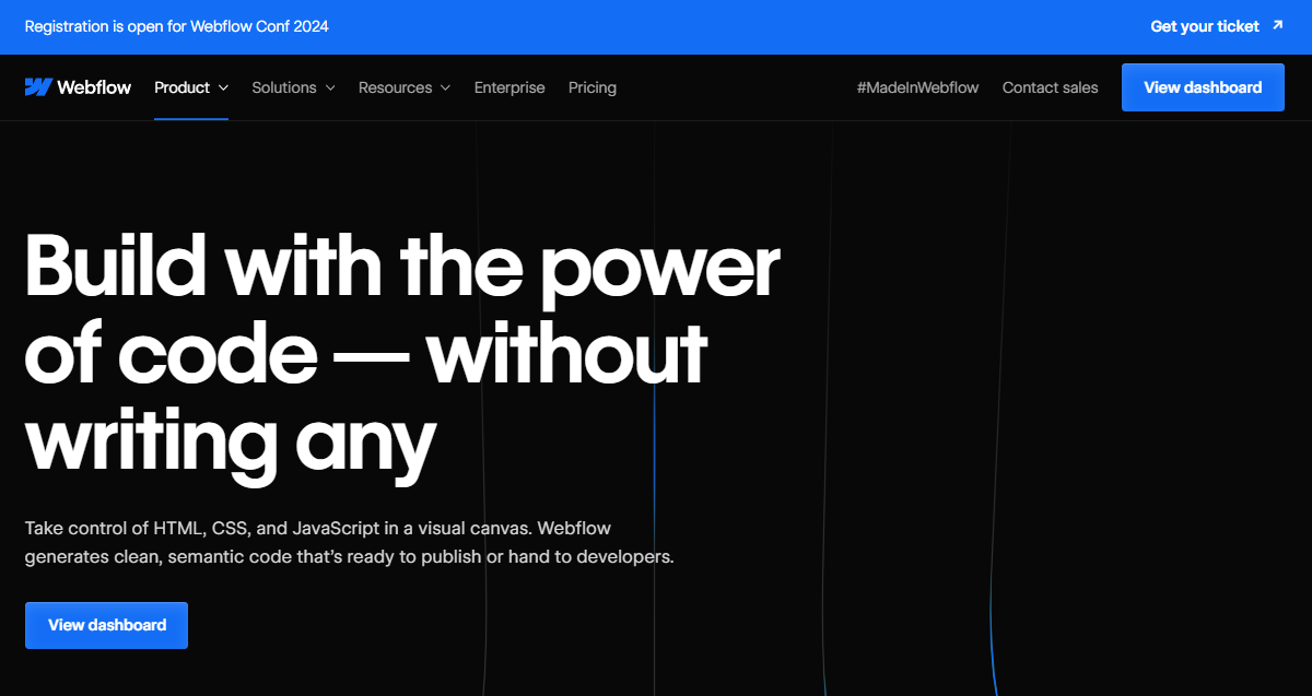
A header banner, like this example announcing our annual Webflow Conf, is a prominent CTA used to announce a major event or an upcoming release. Banners can be used to add another CTA to the page and creates a sense of urgency for visitors to register or learn more.
7. Learn more button
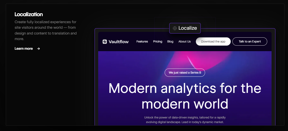
So far, these CTAs have used short, active language to get a quick click. But when showing off the in-depth features of a product or website, it’s better to tell the audience they need to spend a little more time on the interaction.
The “Learn more” button may be the right choice in these cases. This link should lead to a landing page outlining your product or service’s specs. After reading this information, perusers are more likely to turn into customers.
How to write a CTA in 4 steps
Follow these four steps to ensure your CTAs encourage action from site visitors.
1. Know your audience
Get to know your target audience to discover how to ask them to interact. For example, if your audience is “busy professionals,” don’t ask them to complete time-consuming tasks — break the CTA down into smaller steps instead.
Consider the UX when putting CTAs on your website so they fit neatly into the customer journey. Learn how people interact with your webpage so you can place CTAs where they’re most likely to see them. Use tools like heatmaps to find your site’s high-traffic areas, then add links there.
2. Define your objective
Distill your objective down to its most essential step and use it as your call to action. For example, “Sign the Petition” would make a strong CTA to get readers to read about and support your cause.
3. Start with a strong verb
The verb you use tells users what kind of task you’re calling them to perform. Choose an active word that communicates the right expectation. For example:
- “Upgrade” and “Add to cart” give users the impression the interaction will involve making a payment.
- “Learn more” and “Register” indicate the task will take time.
- “Subscribe” or “Sign up” can describe a one-click interaction.
4. Strategically place your CTAs
Timing is essential. To optimize your calls to action, time them carefully to catch readers’ attention when they’re most likely to engage. For example, if a user adds items to their cart but doesn’t check out, send them a pop-up offering a discount. This tactic encourages shoppers to complete the transaction.
Drive conversions with Webflow
Strong calls-to-action can make all the difference in engaging your visitors. They’re a key stepping stone for turning passive website visitors into potential customers.
To create compelling CTAs that capture your audience's attention, you need a platform that enables you to test and iterate on winning variations. With tools like Webflow Optimize, you can discover the copy and variation that performs best, then launch it at scale across your website — without relying on developers.

Get started for free
Create custom, scalable websites — without writing code. Start building in Webflow.


