

Heatmaps can show you what parts of your website are engaging your visitors and — more importantly — which areas need improvement.
In web design, heatmaps reveal the hotspots of visitor interactions to track user behavior and the features that entice people to convert and what drives them away. You can leverage this data to improve your site and make elements accessible to as many visitors as possible.
In 2025, heatmaps will still be a key way to see how people interact with your pages, giving you valuable insights for ongoing site improvements.
What are heatmaps?
A heatmap is a data visualization tool that uses colors to represent certain metrics.
People typically associate heatmaps with weather maps that visually represent temperatures across a region. Cool-toned colors such as purple and blue show cold temperatures and warm tones such as orange and red indicate warmer weather.
In web design, heatmaps track activity. These maps typically display a webpage’s high- and low-traffic areas using a warm-to-cold color scheme. Warmer colors indicate high engagement, while cooler tones represent less interaction.
What are the different types of heatmaps?
Two groups of heatmaps exist: interaction heatmaps, which record clicks, scrolls, and mouse movements to analyze parts of a website people use most, and attention heatmaps, which provide an overview of the total time spent on one's interactive activities by identifying the content that engages users the most. This way, designers can find the best areas for CTAs and eliminate elements from other areas that receive little-to-no attention.
Interaction and attention heatmaps are broader categories enveloping the specific metrics tracked. We recommend combining as many types as possible to better understand user activity. Here are a few common types:
Interaction heatmaps
Types of interaction heatmaps include: click, scroll, and mouse-tracking heatmaps.
Click heatmaps plot clicks across a website, providing metrics about navigation habits. Use click maps to discover zones that receive the most and least interaction, like which buttons receive the most clicks.
Scroll heatmaps show webpage sections that receive the most interaction.These maps highlight how far down website visitors scroll, how many reach the bottom of the page, and where users stop throughout the page.
Mouse-tracking heatmaps monitor a cursor's overall movement on a webpage. They show where visitors hover or hesitate before clicking or scrolling to highlight how users interact with the site.
Attention heatmaps
These are similar to scroll maps in appearance, but monitor the time spent on a webpage's specific areas rather than scrolling activity. As a result, attention heatmaps combine many types of interactive data like the number of clicks, their patterns, pages visited, and so on, to provide an aggregated perspective of a visitor's activity.
How website heatmaps work
Heatmap tools capture your visitors’ clicks, scrolls, and mouse movements by using a small tracking script that runs in real time. This script records how people navigate your site, then translates these actions into color-coded data that shows exactly which areas get the most engagement.
By seeing where users hover, pause, and scroll, you’ll get immediate insight into what sparks their interest. Once enough data is collected, your heatmap platform visualizes these patterns, letting you spot high-engagement hotspots and uncover areas that may need improvement.
Mobile vs. desktop heatmaps
Mobile users often tap and scroll differently than desktop visitors, using their thumbs for navigation and covering shorter distances. They’re likely to scroll less and focus on content that’s easy to reach. When you compare mobile and desktop heatmaps side by side, you’ll see these differences clearly and can adjust your design to each device.
The benefits of heatmaps
Whether you have a blog, ecommerce store, or portfolio website, user-friendly designs streamline navigation so visitors reach their goals — like finding information or making purchases — as quickly as possible.
Here are a few ways heatmaps help you optimize a site for usability:
Track general engagement
By conducting heatmap analysis regularly, you’ll see exactly which areas lack engagement. A heatmap's colors immediately draw attention to areas that aren’t inspiring activity. If a scroll map shows 75% of users bounce three-quarters of the way down the homepage, you need to change something to keep them scrolling. That could mean adding a CTA sooner on the page or improving load time for the content that appears further down. And if you notice certain spots getting significant attention, don’t move them — like the “Add to cart” button from the top menu if it’s bright red on your click map.
You’ll also notice spots gaining significant attention and know not to change these areas. For example, don’t move the “Add to cart” button from the top menu if it’s bright red on your click map.
Understand specific behavior patterns
Because heatmaps visually represent user interactions, they highlight specific behaviors based on various clicks, scrolls, and tracking trends.
Over time, consistent heatmap data reveals where users click and where they skip, so you'll know exactly which sections need improvement for better engagement.
Make changes backed by data
Each click, scroll, and mouse movement recorded by a heatmap is valuable when optimizing a website. Instead of making changes based on educated guesses, you’ll see data-driven results as your maps change to make better decisions to improve engagement.
- Validate changes with quick A/B or multivariate tests, and iterate until you reach your goals.
- Pair session replays with heatmaps to see individual user journeys for deeper insights.


Build websites that get results.
Build visually, publish instantly, and scale safely and quickly — without writing a line of code. All with Webflow's website experience platform.
When should you use a heatmap?
Heatmap data benefits all site owners, but here are a few scenarios when it’s especially useful for website optimization:
To make a site more intuitive
If issues arise during user testing, use heatmap data to improve your understanding of the site design’s problem and create a more intuitive site. Intuitive websites place elements where users expect them to be, like a shopping cart symbol in the top-right corner or a “Work with us” button in the footer.
To increase accessibility
Accessible websites allow as many people as possible to navigate and enjoy a site’s content. Use heatmap results from user testing focused on accessibility to address pain points and create a more inclusive site. If certain areas show cooler colors, your audience might be struggling with the content there. The goal is to make these spots red. A great place to start is comparing these areas’ elements with an accessibility checklist and seeing how you can improve access to this content. For example, if your contact page gets a lot of visits but the form fields and “Submit” button show low interaction, there may be an issue with the form’s functionality. Testing the form might reveal that the fields and buttons are too small on mobile devices or that the color contrast ratio makes it difficult for some people to read the text.
To reduce bounce rate
High-traffic websites don't necessarily get conversions. Your bounce rate — the percentage of visitors who exit a site without taking action — can tell you if the people you’re driving to your site are finding what they’re looking for. If the bounce rate for a certain page is high, a heatmap can help you determine where people are losing interest.
Scroll maps illuminate areas where people hesitate or leave. If your bounce rate is higher than 70%, study your site’s scroll map to see what people do before exiting the site and make adjustments. You might put a pop-out sidebar offering a deal or a bold CTA button that animates on hover to encourage visitors to keep exploring the site.
To increase conversion rates
You can use heat map data to increase conversions by drawing visitor attention to CTAs and pop-ups. If you notice they’re scrolling past these important areas, perhaps make the buttons more noticeable or conduct user testing to figure out why they skim past.
6 heatmap-creation tools
Here are six of the most popular and useful heatmap creation tools. When you're picking a platform, consider whether it syncs with your workflow. If you use a visual design approach in Webflow, you'll want a solution that integrates smoothly to keep building and analyzing in one place.
1. Webflow Analyze
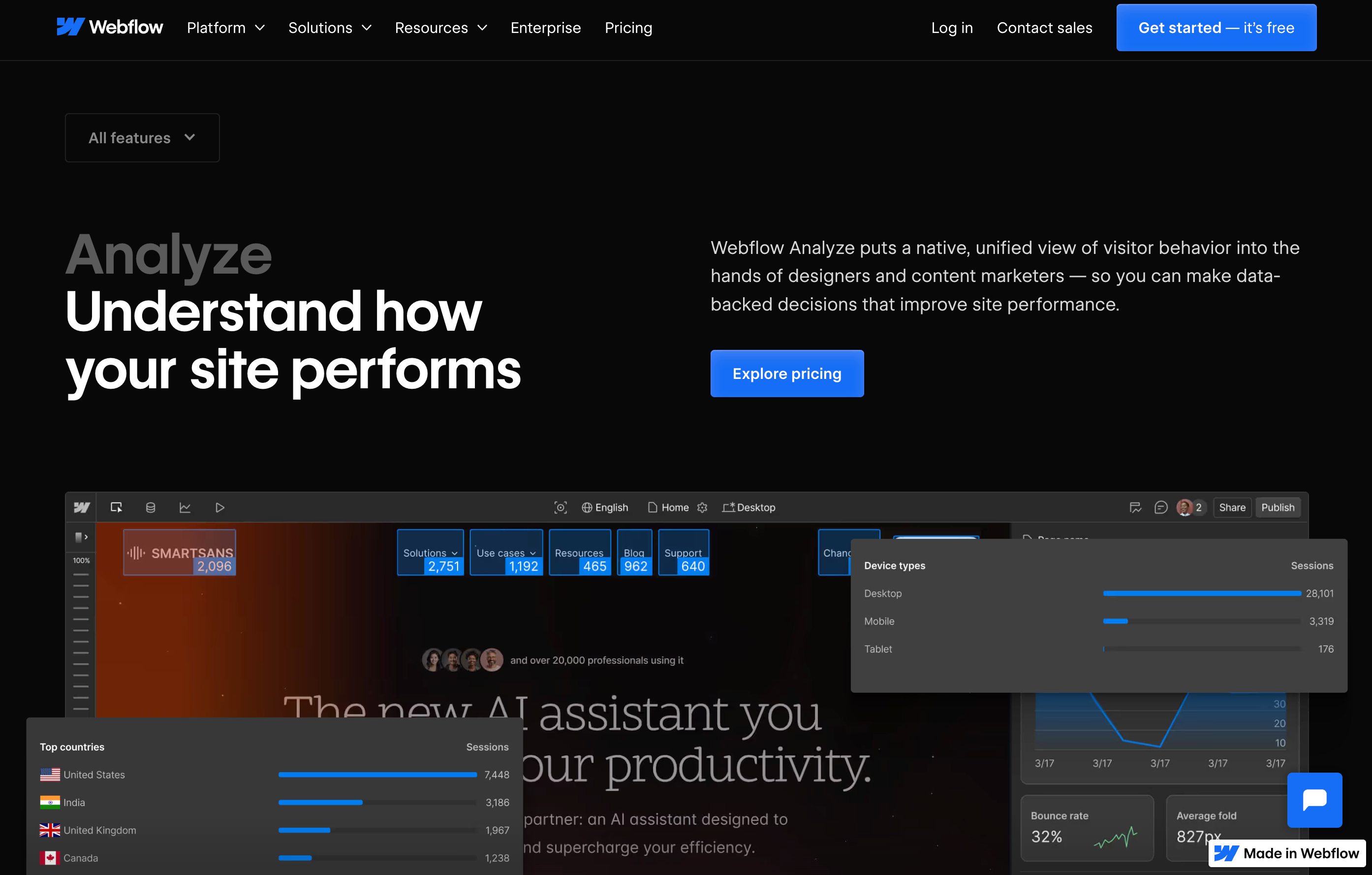
Webflow Analyze offers native heatmap functionality directly within your Webflow workspace, allowing you to visualize user behavior without switching between platforms. Track clicks, scrolls, and engagement patterns right where you build your site, making it easier to implement design changes based on real user data.
Key features: Heatmaps, user flow tracking, conversion analytics, seamless Webflow integration
Plans and pricing:
- Available on Webflow's Business and Enterprise plans
- Add-on available for other plans
2. Crazy Egg
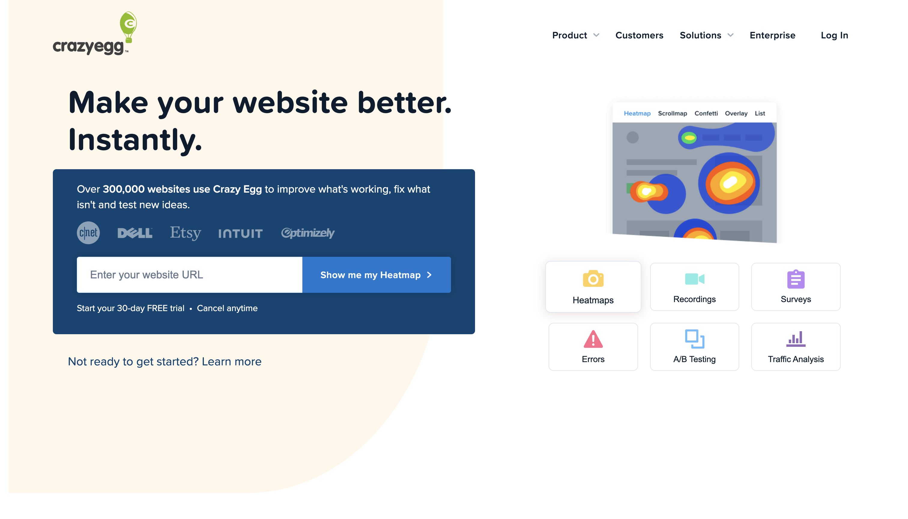
Crazy Egg offers built-in analytics, conversion rate optimization (CRO), and screenshots and recordings of user behavior. Note that this software only works on webpages, not mobile devices.
Key features: Heatmaps, recordings, CRO, analytics
Plans and pricing:
- Free (30-day trial)
- Basic ($29/month)
- Standard ($49/month)
- Plus ($99/month)
- Pro ($249/month)
- Enterprise (custom pricing)
3. FullStory
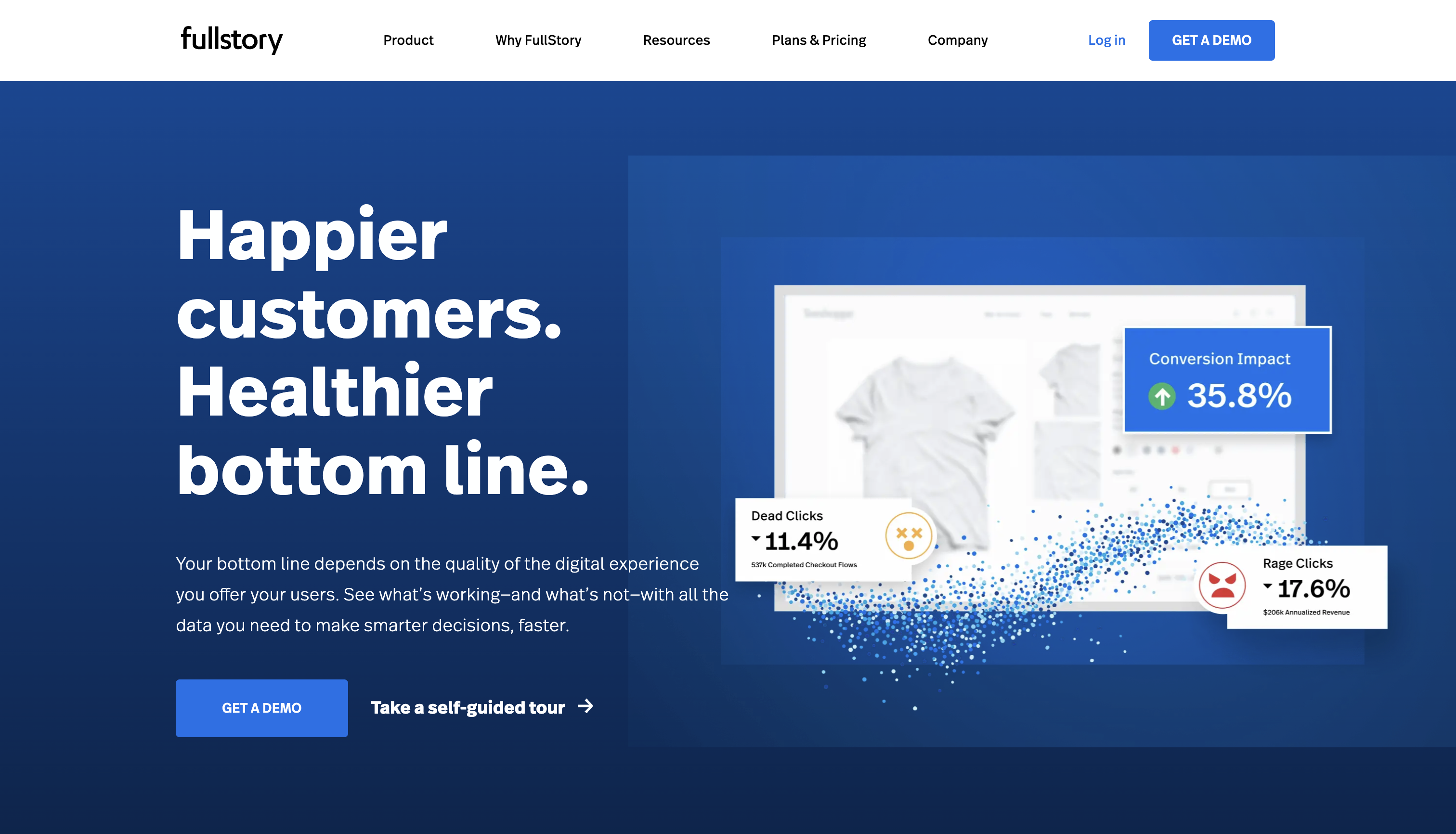
FullStory's advanced software monitors website engagement using AI and machine learning. It stands out as a heatmap tool thanks to its analytical features that provide data on page loading times and visitors. It also works for both web and mobile sessions.
Key features: Heatmaps, session replays, analytics
Plans and pricing:
- Free (14-day trial)
- Enterprise (demo required)
- Advanced (demo required)
- Business (demo required)
4. Hotjar
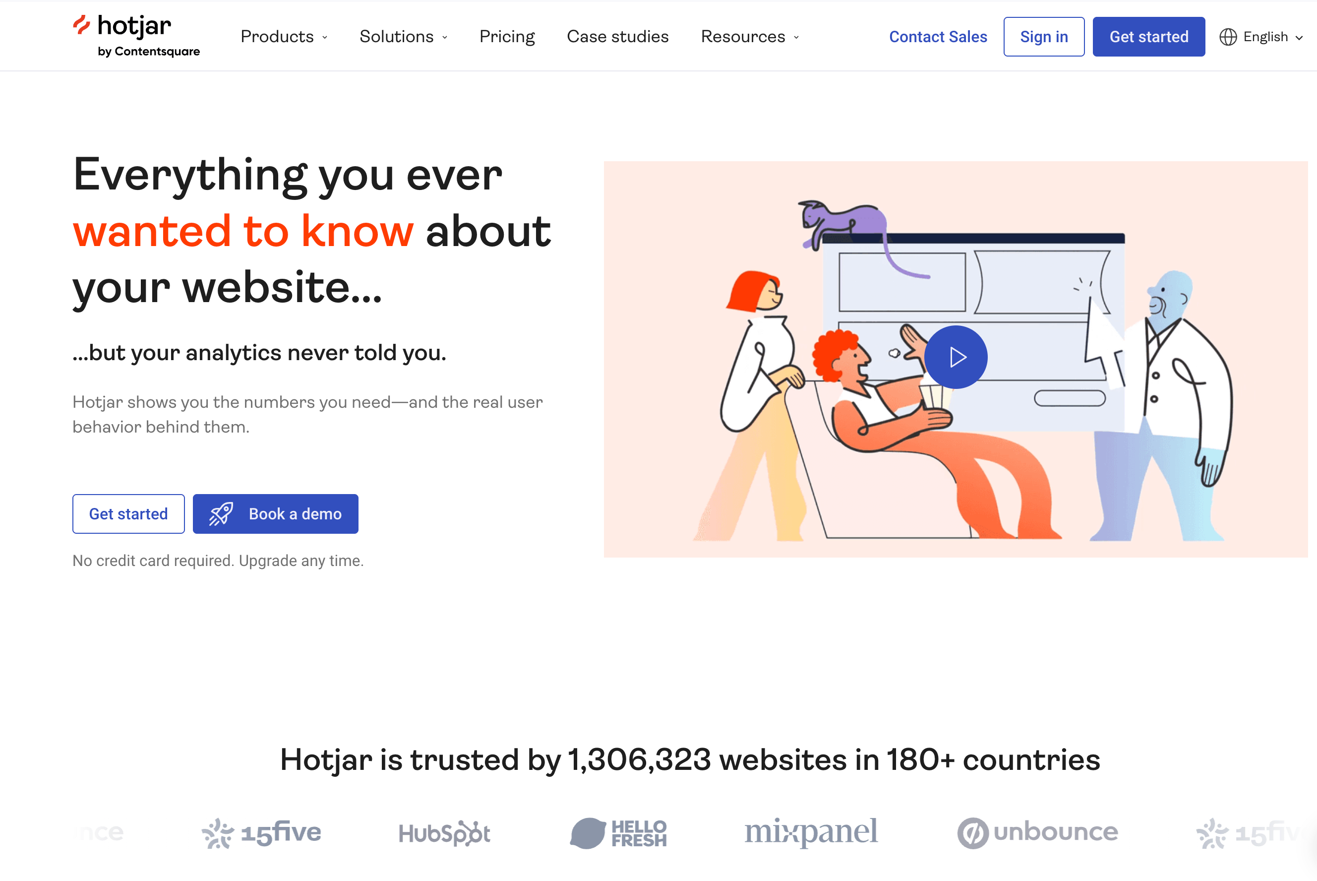
Hotjar's user-friendly interface and dashboard make it the best option for beginners. It offers various heatmaps, including click, scroll, and mouse-tracking. User feedback functionality is its greatest feature — Hotjar records and surveys users for feedback to constantly improve the tool. A downside is its web-only compatibility.
Key features: Heatmaps, recording sessions, user feedback
Plans and pricing:
- Free (35 daily recording sessions)
- Plus ($32/month)
- Business ($80/month)
- Scale (custom pricing)
5. Mouseflow
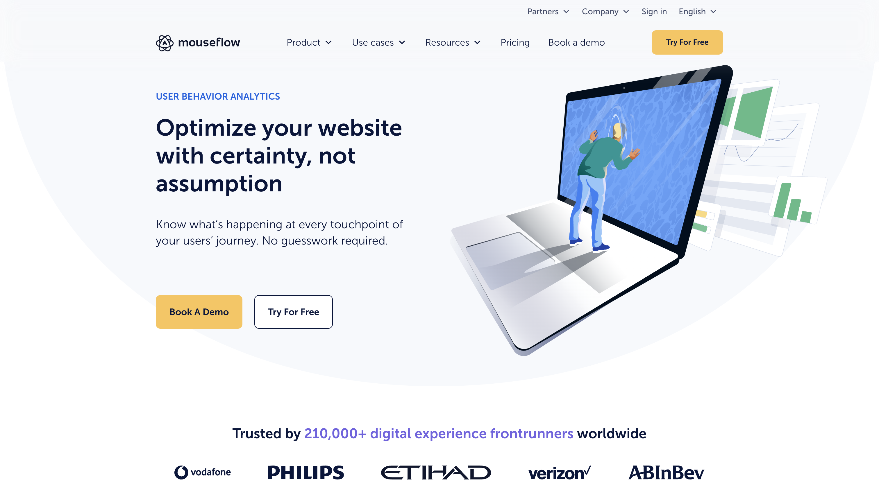
Mouseflow provides accurate tracking for clicks, scrolls, and mouse movements. Its funnel feature shows user movement between webpages and creates reports for them. The platform also offers various built-in tools to display interactions on sign-up pages. Like Hotjar and Crazy Egg, it doesn ' t analyze mobile devices and only provides website heatmaps for desktop use.
Key features: Heatmaps, funnels, session replays, user feedback
Plans and pricing:
- Free (500 recording sessions/month)
- Starter ($39/month)
- Growth ($129/month)
- Business ($259/month)
- Pro ($499/month)
- Enterprise (custom pricing)
6. Lucky Orange
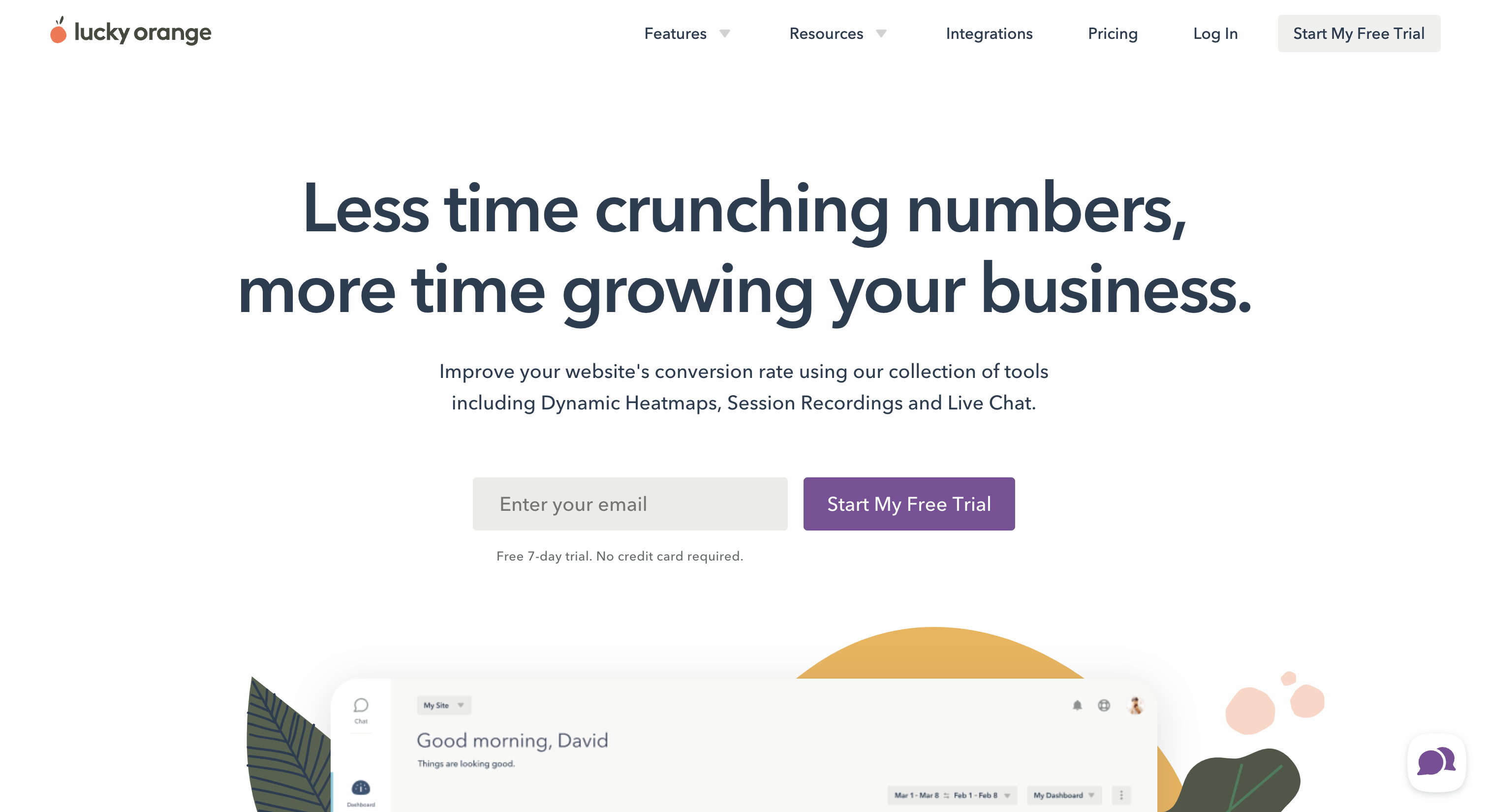
Lucky Orange has various heatmap tools, including recording, CRO, and polling features. Our favorite is the "Dynamic Heatmaps" tool, which allows you to view user activity in real time. This software is only available for web use.
Key features: Dynamic heatmaps for real-time user activity, recording sessions, CRO funnels
Plans and pricing:
- Free (500 recording sessions/month)
- Build ($18/month)
- Grow ($35/month)
- Expand ($70/month)
- Scale ($150/month)
- Enterprise (custom pricing with a free 7-day trial)
Next steps: Improve your website experience
Heatmaps illustrate a site’s strengths and weaknesses at a glance. Use this data to improve user-friendliness and drive conversions.
Make heatmap analysis a regular part of your workflow—combining these insights with your existing analytics creates a powerful feedback loop for continuous improvement. This data-driven approach keeps you one step ahead of user expectations while building a website experience that evolves alongside your audience.
Turn insights into action
Transform your heatmap discoveries into tangible improvements by testing new layouts, refining visual hierarchies, and crafting more compelling copy. Each iteration brings you closer to a website that not only looks great but performs exceptionally well.
Ready to see exactly how visitors interact with your site? Start using Webflow Analyze to unlock powerful heatmap insights without leaving your Webflow workspace. Visualize user behavior, identify optimization opportunities, and make data-backed design decisions — all in one seamless platform.

Start using Analyze today
Webflow Analyze puts a native, unified view of visitor behavior into the hands of designers and content marketers — so you can make data-backed decisions that improve site performance.