Website pop-ups don’t need to be an annoyance — they can be a dynamic way to engage your site visitors.
Odds are you probably close most pop-ups you encounter, but effective ones will catch your attention. What makes those pop-ups different, and how do they compel you to interact?
The most successful pop-ups introduce minimal interruption to a visitor’s journey and encourage the user to complete an action, like signing up for an email list or taking advantage of a promotion. You can make impactful pop-ups that engage visitors and drive conversions by following some creative pop-up design techniques. Discover how web designers have achieved success and learn from inspiring pop-up design examples.
What qualifies as a pop-up?
A website pop-up is a trigger-based window that appears in a user’s view. Pop-ups can trigger when you click a button or scroll a specified distance, or they can present after a set amount of time.
Some pop-ups are modals — smaller windows overlayed on a page that users must dismiss to continue their journey — while others open a new browser window or tab. There are also toast pop-ups that slide into view like a piece of toast springing out of a toaster. You might see these in cookie consent banners or mini-carts on a shopping website.
The primary factor that qualifies a window as a pop-up is whether a user intentionally caused it to appear through a click or action. For example, a toast alert letting people know a site is collecting cookies is considered a pop-up because it appears without the user actively provoking it. But the modal window that appears when you click Manage Cookies isn’t a pop-up because it’s an expected, user-triggered response — not something that appeared based on a timer or scroll point.
Do pop-ups work?
While they were once associated with malware and disruptions, recent pop-up designs offer a sleeker experience to lead generation.
Research by Sumo that evaluated nearly 2 billion pop-ups found the average conversion rate of pop-ups is 3.09%. Their highest-performing pop-ups averaged 9.3%, proving the feature effective with the right formatting and design. For context, these percentages mean a website could see as few as 150 visitors per day and still generate 418 sign-ups per month.
Why you should use pop-ups
The key to using pop-ups successfully is to keep them simple and visually enticing. Here are some benefits you’ll experience if you nail the aesthetics and function.
Catch viewer attention
Their abrupt nature makes pop-ups attention-grabbing by default. They can divert a visitor’s focus to a simple interaction before resuming the user journey.
Customize your website
Pop-up design templates have come a long way. You can fine-tune them to add a neat experience for your user, even adding animations and interactions that make them more engaging.
Generate leads
When implemented correctly, pop-ups tactfully step into the user’s path to encourage conversions, like sign-ups for email lists or accounts. These simple interactions turn casual users into leads — the first step in developing a relationship with your audience.
Create urgency
Pop-ups create a dedicated moment in the user journey to advertise your service or product and ask for interaction — then, they go away. Even visitors who decline this call to action (CTA) might remember the experience and reconsider later.
Tips for crafting effective pop-up designs
To create pop-ups that generate leads and enhance — rather than disrupt — a visitor’s experience, consider following these five pop-up tips.
1. Use lead magnets
A lead magnet is a compelling offer like early product access, a free ebook or course, hefty discounts, or free rewards. Selecting the right incentive is an excellent way to catch attention, so research consumer purchase trends and pain points and work those demands into your pop-up content.
2. Keep messaging concise
Keep your message brief to dissuade users from clicking away without reading. If your pop-up requires longer copy to explain your lead magnet, start with a short, eye-catching headline like “Free ebook!” before diving into the details. Then, end with a highly visible and concise CTA like “Sign up today!” so that visitors know exactly what the pop-up is about right away.
3. Optimize for simplicity
To avoid surprising the user with an overly abrupt experience when you create your pop-up, opt for a minimalist design that seamlessly fits into the user journey. Use the same colors, fonts, and themes the viewer is accustomed to on your site, but simplify them so the momentary interruption feels natural.
4. Use contrast
There’s a sweet spot in creating high-contrast visuals to highlight your CTA while still appearing clean and simple. Precisely what that sweet spot looks like depends on your color palette, but a 3:1 contrast ratio is a good rule that fits within the WCAG contrast guidelines.
5. Be strategic about timing
Don’t set your pop-up to appear when the page loads — this timing can be jarring for the viewer. Instead, set a queue on a timer, button click, or scroll distance. Also, use a cookie to ensure the pop-up only appears once. Users will quickly get frustrated if the pop-up appears repeatedly.
5 effective pop-up design examples
The following pop-up design examples might work perfectly if you use a streamlined site design without many bells and whistles. If your site has a highly unique design system, iterate on these examples to make them fit your layout.
1. Sign-up bounce modal
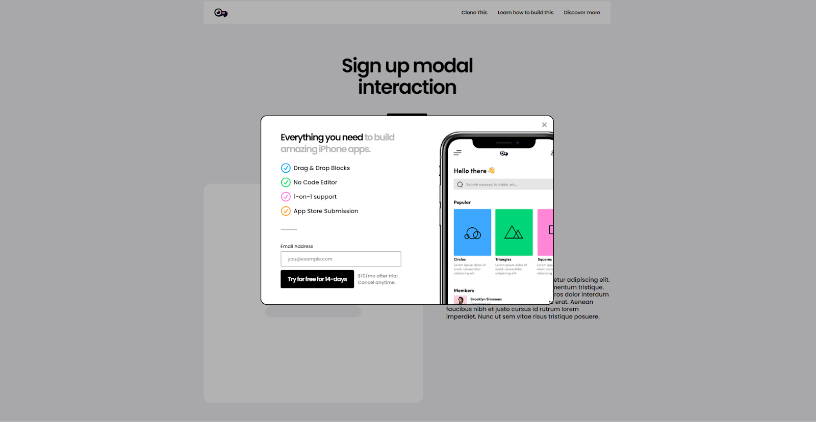
This animated sign-up modal from Mackenzie Child is dynamic enough to be eye-catching and impressive but plain enough to share its straightforward message. This pop-up triggers on a button click, but you can adapt the behavior to queue on a scroll or a timer. Just remember to use a cookie to ensure it doesn’t appear more than once for each user.


Discover what performs best and deliver it at scale
Maximize conversions with rapid insights, tailored visitor experiences, and AI-powered delivery.
2. Simple pop-up modal
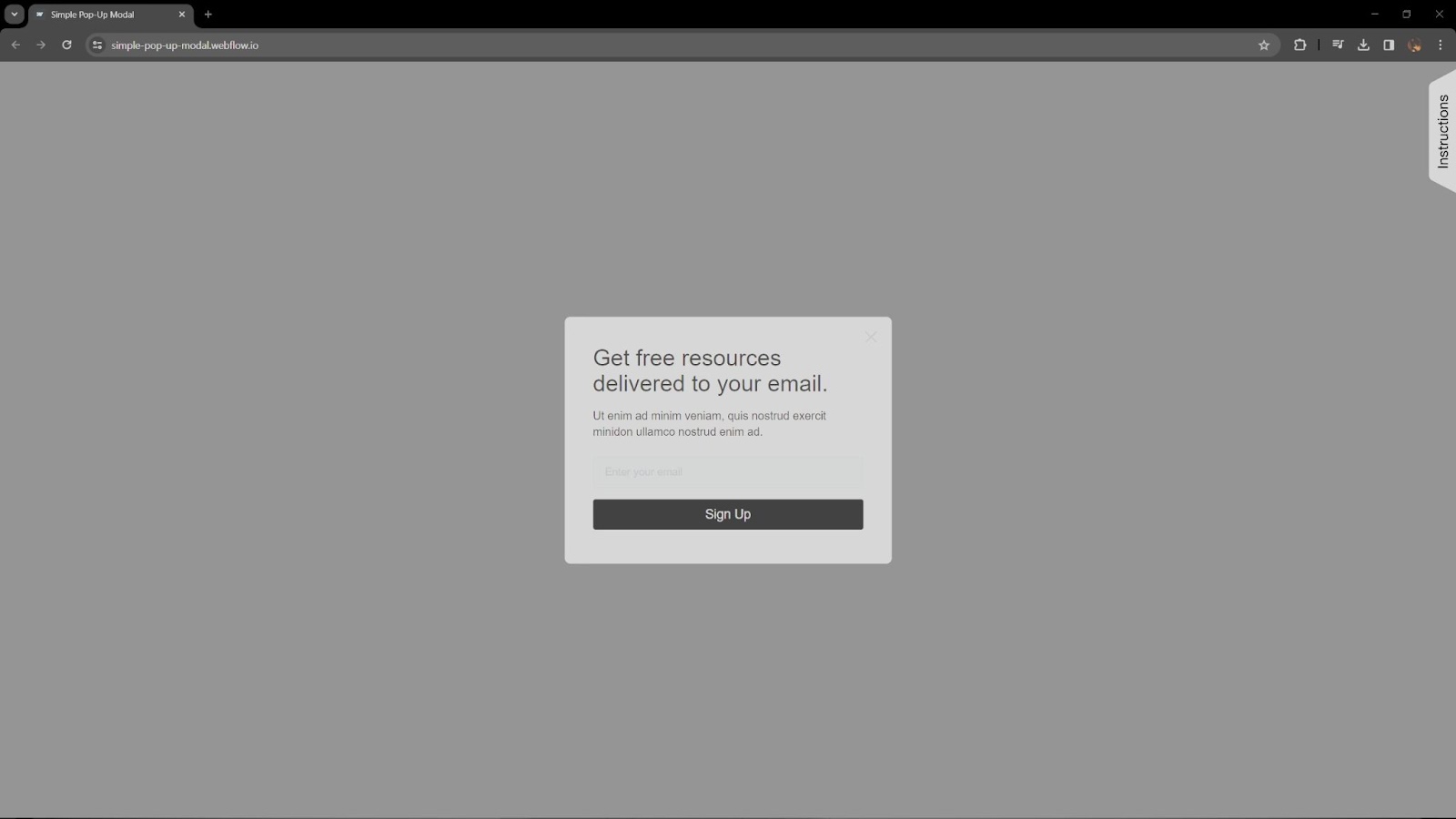
This simple pop-up modal template from Nikolai Bain keeps the experience straightforward instead of overwhelming. It comes preconfigured with a text form, a sign-up button, and space for text. Customize this pop-up with your own CTA and brand colors, but use a light touch. The best feature of this pop-up modal is how inconspicuous it is.
3. Slider modal
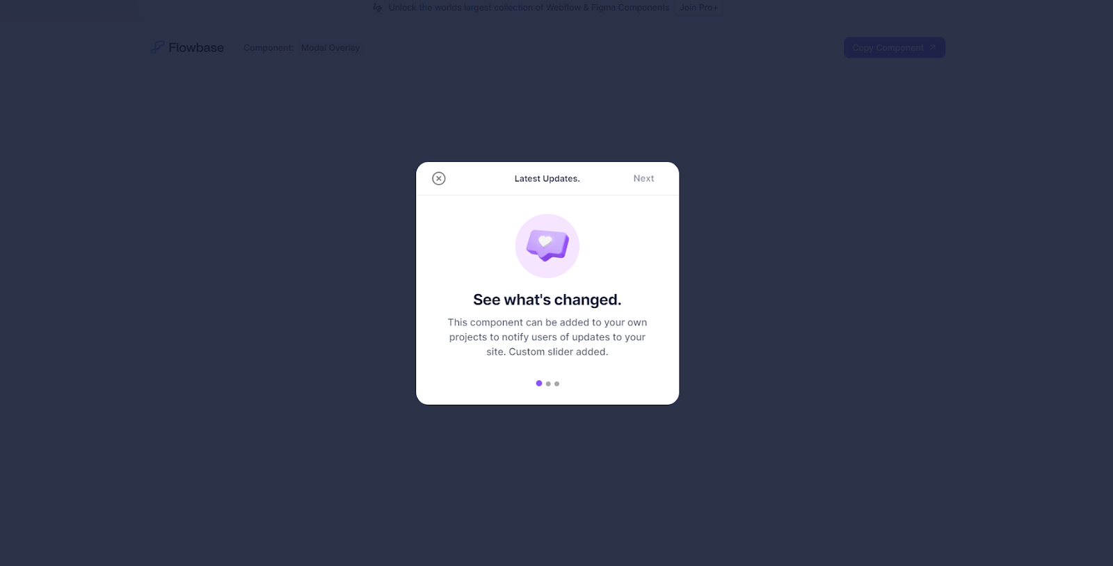
This cloneable slider modal from Flowbase offers multiple pages within the pop-up. It’s great for updating users about changes to your site, but it can be repurposed to provide a unique experience that generates leads. For example, a quick survey that appears automatically after completing a purchase can offer a customized incentive for joining your email list.
4. Cookie notification
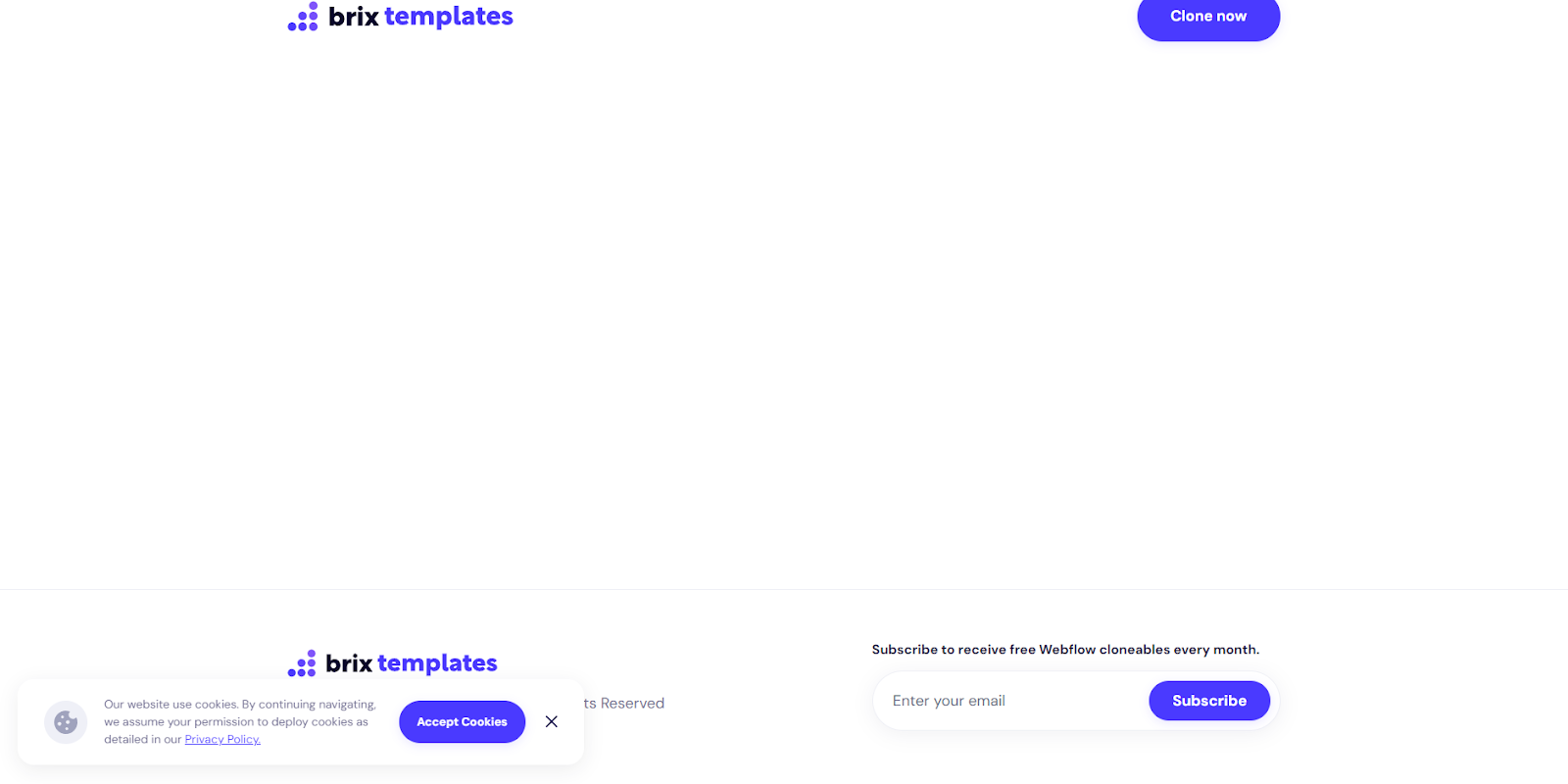
This cookie notification from BRIX Templates is an excellent example of a toast pop-up that doesn’t intrude on the user experience. Its intended purpose is to alert users about cookies, but it can also subtly advertise add-ons to users while they’re shopping or suggest why they should join your mailing list.
5. Page load pop-up
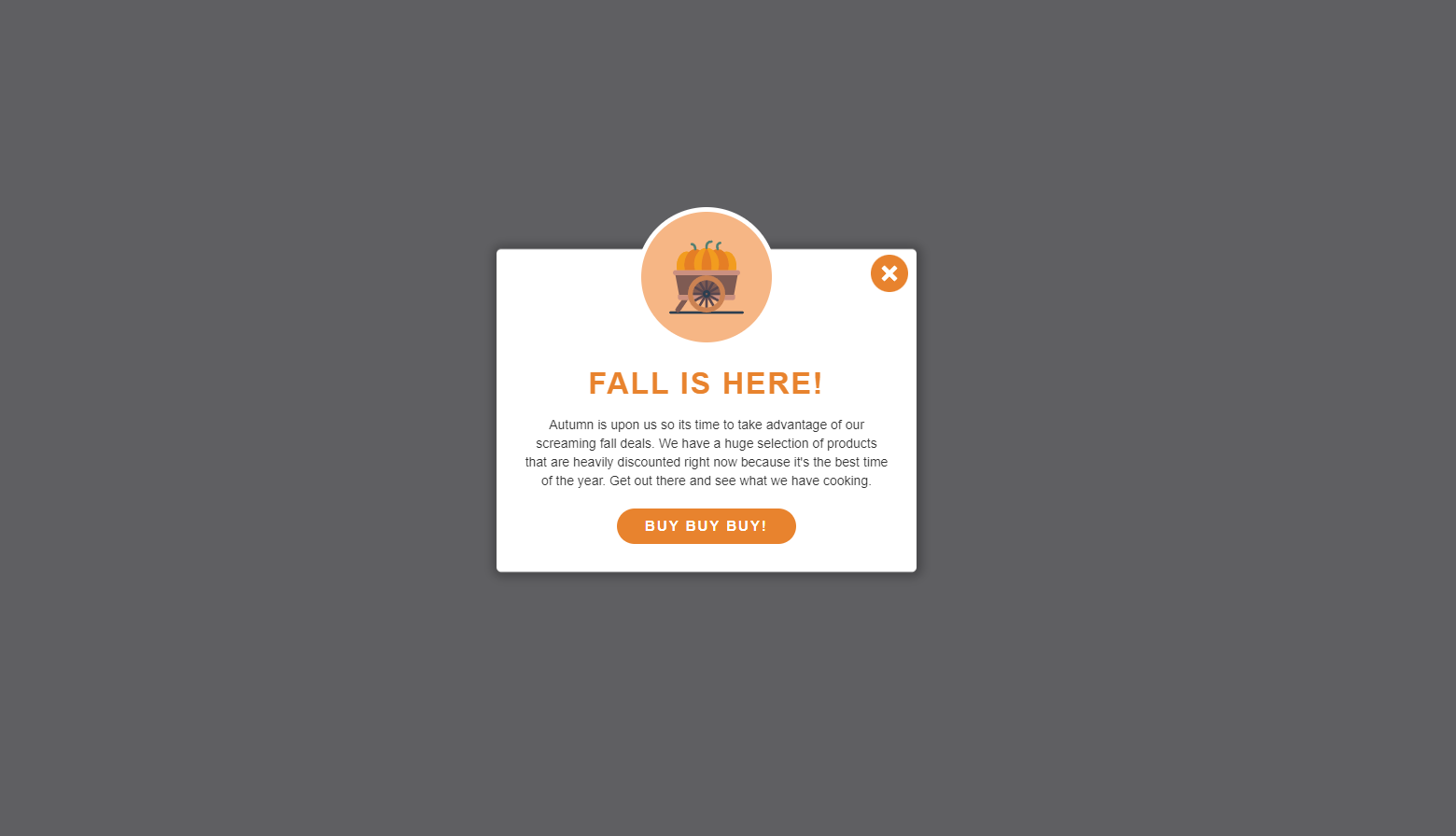
This page load pop-up from Paul Herzog offers a traditional, eye-catching pop-up experience. It triggers when a page is loaded and offers modest space for an image, text, and a CTA button. The bright orange color is perfect for this example as it stands out against the white and gray background, but you’ll want to customize the CTA color to fit your design style.
Take a user-centric approach with Webflow
Pop-ups add a little friction to the user experience, but if you calibrate them correctly, you can use that momentary disruption to generate a lead. To help you get the design just right, Webflow offers many helpful templates. You can customize each with features like Quick Stack elements and reusable components to fine-tune your pop-ups to suit your site.
When you’re ready to get started, experiment with the pop-up templates on Webflow to find one that works for you.

Get started for free
Create custom, scalable websites — without writing code. Start building in Webflow.


