


Contrary to popular belief, product pages are the most popular entry point for users to discover and learn about your software or tool.
According to Contentsquare’s 2024 Digital Experiences Benchmark Report, 33% of visitors begin their journey on product pages, outpacing the 18% who start through the homepage.
Yet this high visibility comes with a challenge: product pages also have the highest bounce rates, often because visitors land on these pages without context about your brand. To solve this challenge, product pages must showcase your product’s capabilities while weaving in your brand's story, which can be achieved by testing and optimizing key elements of product pages. In this post, we'll walk you through the essential components of high-converting product pages and how to optimize them to boost conversion.
What are the elements of a good product page?
At a high level, your product pages help customers easily find the information they need to take the next step—whether it’s signing up for a free trial, scheduling a demo, or purchasing the product. The challenge? You have very little space and need to communicate a lot of information: your product's value, functionality, brand story, and clear next steps. Moreover, your product pages must integrate with the rest of your website to create a seamless experience for visitors, no matter where they come from.
The good news? Successful product pages follow a clear playbook. Regardless of industry, high-converting product pages share these four essential elements:
- Compelling visual appeal
- Clear messaging
- Strong social proof
- Seamless user experience
Let’s break down each of these elements in detail.
Compelling visual appeal
Pictures are often worth a thousand words, and that’s certainly true for a product page. If customers can’t get a sense of what your product looks and feels like (or don’t find it appealing), they’re likely to leave.
For digital products, there are many ways to give visitors a sense of what it’s like to use your product or service, from images to multimedia like video and GIFs. Brands can also use a combination of these media to show users their product’s capabilities. To make your visual elements most effective, focus on these best practices:
- Use high-quality images: Avoid small, blurry, or off-brand images. Hire a photographer (or learn to do it yourself) to ensure you’re presenting your product in the best possible light.
- Show your product in action: Create a GIF of your key features or include short video clips demonstrating how your product’s solution solves the user’s problem. If your product has complex features or workflows, consider creating custom illustrations or diagrams.
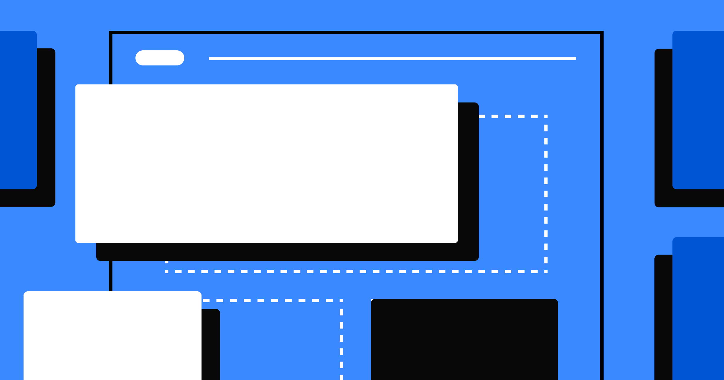
- Emphasize visuals with your page layout: Change the layout of your product page to emphasize your images and make them easier for users to grasp. For example, visual tiles can provide an easy-to-navigate path for product exploration.
- Create a clear visual hierarchy: Use whitespace and color to guide attention to key elements like images and call-to-action buttons. This helps users quickly understand where to focus their attention.
When implementing these visual elements, keep in mind that too much media can negatively impact page load speed and accessibility, which can frustrate users. Use tools like Lighthouse to benchmark your websites as you experiment with media.
Let’s put all these tips into action by taking a look at Opal, an app that helps users focus by blocking distracting apps. When visitors land on their product page, a GIF shows how Opal works by removing distracting apps with a pop-up message—their core value proposition. As users scroll on the product page, they discover detailed descriptions and images of each feature to help them understand exactly how the product works. This combination of tiered visual structure and different types of multimedia brings the product and brand’s story to life, giving users high-level and granular product information in a digestible manner.
Clear messaging
Great messaging speaks directly to your audience in clear, concise terms. When visitors read your copy, they should feel like you're speaking directly to them, whether they're discovering your brand for the first time or already know your product.
The key is using language specific to your target users (think industry acronyms) and clarifying benefits in terms of their specific work challenges. For example, if your product targets product teams, instead of saying, “Improve your workflow,” write “Never miss an important update on your roadmap.”
Here are additional tips for crafting more powerful messaging:
- Pay attention to the language customers use: If your messaging copy feels stale, talk to customers about their problems or sit in on sales conversations. Are there specific keywords or phrases that repeatedly come up in conversation? Chances are, incorporating them in your messaging will make it more authentic and relatable.
- Make content scannable: The average visitor spends less than a minute when browsing a page. Make it easy for your users to find the appropriate content to answer their specific questions.
- Lead with the primary user benefit: Users want to know if the product will help them before investing time figuring out how. Avoid leading with a list of features, but rather summarize how these features work together to help users with their problems.
- Simplify complex features: Use the “Feature-Advantage-Benefit” framework to make it easier for users to understand the complex parts of your product. Explain the feature, how it solves the problem, and why that matters to the user. For more ideas on how to showcase your product’s value to customers, take a look at our guide to website optimization.
The best way to optimize messaging is through ruthless prioritization and experimentation. What do customers absolutely need to know on this page? Is this word necessary for the customer to understand the product value proposition? If not, then consider removing it. If you have several great ideas, run an A/B test to try different variations. After all, actual user behavior is the best way to know what works.
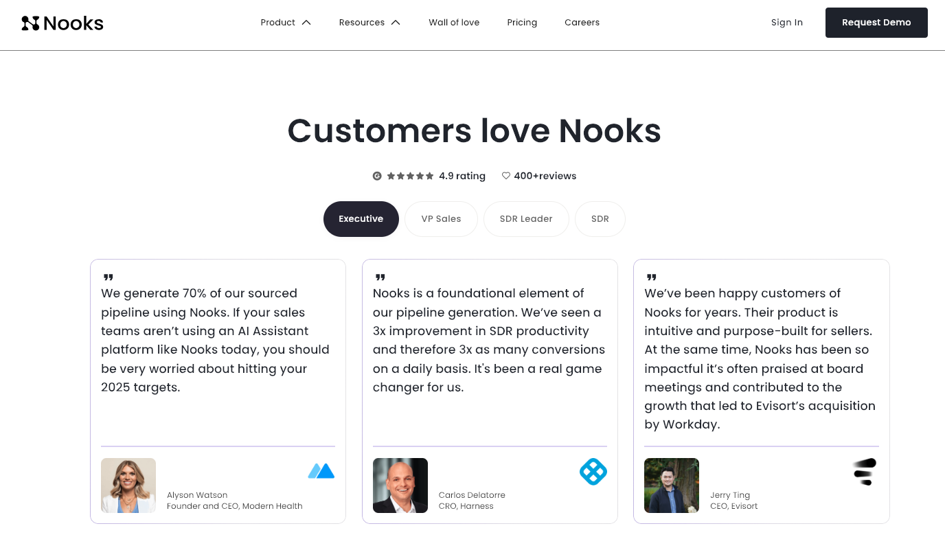
One company that excels at messaging is Adfin, an invoicing tool. They use audience-specific copy on their product pages, which speaks to the unique pain points across their different user segments. Each product page for this group speaks to similar value propositions but in the language of that target user group. For example, the accountant product page uses industry-specific terms like "failed direct debits" and "accounts receivable," helping users immediately recognize their challenges in Adfin's solution. This builds confidence in the solution and drives conversions.

Strong social proof
Strong social proof builds brand trust and can boost your SEO ranking, which drives organic traffic. Here are three effective approaches to showcase your product's credibility:
- Add customer reviews*: One survey found that 46% of consumers trust online reviews as much as word of mouth. You can either add functionality for customers to leave reviews on your website, ask customers for testimonials, or import reviews from platforms like TrustRadius or G2.

- Embed user-generated content (UGC): If it’s challenging to source customer reviews, you can add user-generated content of customers using and talking about your product in the wild. You can source these from Instagram photos, Reels, TikToks, and Tweets.
- Include certifications or awards: If your product has received any recognizable awards, industry recognition, or certifications, you can add that to your product page to boost credibility. Some examples include design/innovation awards (like Apple’s Design Award or Fast Company’s Most Innovative Companies), security compliance certificates (like SOC2 or ISO27001), and industry recognition (Gartner, Product Hunt, Deloitte Fast 500).
*Tips for negative reviews
If your product has received negative reviews, you can share them on your product page to build customer trust, but do so with some caution. Consider these approaches:
- Show a mix of positive and constructive reviews to show your values, like authenticity and transparency.
- Show negative reviews next to potential resolutions to demonstrate your commitment to iterating based on customer feedback.
- Show negative reviews that have since been addressed to highlight your commitment to making the product better.

Seamless user experience (UX)
If users find your site difficult to navigate (especially on a mobile device) or slow to load, they'll leave—regardless of the strength of your messaging or visuals. A good UX can help boost conversions and improve organic search traffic, as many UX best practices, such as site speed, accessibility, and mobile responsiveness, directly impact search rankings. Tools like Webflow automatically optimize for these fundamentals by implementing responsive design and maximizing site speed.
One UX element you must optimize is your call-to-action (CTA). The CTA is the action you want visitors to take after they arrive on your website, whether it’s to sign up for a demo, book a call/appointment, start a free trial, or learn more. The CTA must be above the fold, clear, and compelling to encourage users to click and convert.
A clear CTA is just the start. Round out your UX by implementing these tips:
- Support multiple user journeys: Users might be at different stages of the consideration journey, and your product page needs to speak to all of them. Consider adding a quick start guide for users ready to dive in and links to detailed documentation for users still researching.
- Minimize friction post-CTA: Once a user clicks your CTA, look for opportunities to minimize friction to drive conversion. Some best practices include reducing form fields, offering single sign-on options, and providing clear next steps post-conversion to set user expectations.
- Experiment frequently with your CTA: The best way to find the right CTA for your site is through experimentation. Consider running multiple variants of your product pages with different CTA placements, copy, and designs (size, color, shape). These might seem like small changes, but they can significantly impact your website’s conversion.
For more ideas on specific CTA experiments to run, check out our guide to website optimization.
These UX strategies come together effectively with Typeform's survey product page. Their CTA, “Create a survey,” tells visitors exactly what they'll accomplish by clicking the button, which is more helpful than generic copy like “Sign up.” Below the fold, they support users ready to get started by linking to templates for different survey types, as well as users still in the research phase by linking to blog posts that dive into surveys in more detail.
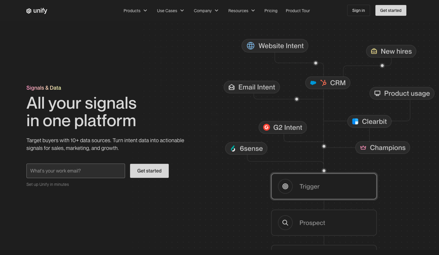
On the other hand, Unify, a workflow management tool for GTM teams, reduces post-CTA friction by collecting email addresses on its product page. The copy under the text input field (“Get started in seconds”) emphasizes the simplicity of the sign-up process.
Continuously optimize your website with Webflow
Product page optimization is an iterative process you can continually build on over time. Start small with targeted experiments for a subset of your audience, learn from the results, and gradually scale your testing program as you gather insights.
Put these optimization strategies into action with Webflow Optimize. Whether running your first or hundredth experiment, our solution helps you set up, run, and optimize your product pages for different audience segments. This improves their overall experience and boosts your conversion rate. Unlock your product pages’ full potential and try Webflow Optimize today.


Discover what performs best and deliver it at scale
Maximize conversions with rapid insights, tailored visitor experiences, and AI-powered delivery.