

If you look at it more closely, the We ♥︎ NYC logo controversy is actually a marketing problem disguised as a design issue.
The city government of New York launched its new “We ♥︎ NYC” logo last month with literal fanfare. Less than an hour later, the internet was aflame with criticism of the logo. Responses ranged from mockery to confusion to furious outrage. Bloomberg’s Ben Schott even brutally compared it to the unfortunate restoration effort of a religious icon in Spain that was dubbed “Monkey Christ”
![NYCs new brand campaign image that reads "WE [red 3D heart] NYC" in large bolded black letters.](https://cdn.prod.website-files.com/687e8d1b96312cc631cafec7/68c48769bc97b7f0f7f73eb3_64469abe259a63b041e582ae_image4.jpeg)
Governor Hochul described We ♥︎ NYC as “a civic campaign to showcase the city’s strengths and mobilize New Yorkers in every community to help ensure that New York remains the greatest city in the world and inspire New York City’s post-pandemic resurgence.”
Collective outrage can certainly inspire unity, but that was probably not the intended effect.
Critiques of the questionable design choices may be warranted. However, on closer inspection, the city’s new marketing campaign might be undeserving of the level of backlash it received. Most people’s assumptions about the role of the new logo were wrong, but by the time the city had cleared up the misunderstandings, it was too late.
![A tweet from user @AdiJoseph with an image of the I [heart] NY logo with "don't" writtern over the heart and "new marketing design" below the logo](https://cdn.prod.website-files.com/687e8d1b96312cc631cafec7/68c48769bc97b7f0f7f73edb_6446a10b829ba99835323d5a_Screenshot%25202023-04-24%2520at%252011.32.05%2520AM.png)
In short, the We ♥︎ NYC incident has a lot of lessons that marketing professionals can take away from it.
Tread carefully with beloved classics
Marketers need to treat legacy materials with extra care when they want to riff on or refresh them. People tend to have powerful emotional attachments to logos and branding. That shouldn’t be surprising, considering the entire point of marketing brand identity is to create those sorts of personal connections and emotional attachments in an audience.
![The famed iconic "I [red heart] NYC" city logo.](https://cdn.prod.website-files.com/687e8d1b96312cc631cafec7/68c48769bc97b7f0f7f73eb6_64469af1336c9a7e3ca60f22_image9.jpeg)
The new We ♥︎ NYC logo, designed by Graham Clifford, was clearly referencing the widely beloved I ♥︎ NY logo initially created by Milton Glaser in 1976. It’s perhaps one of the most recognizable icons to any New Yorker. It can be seen on everything from official city campaigns to bootleg souvenir shops across the city.
![The original sketch for the "I [heart] NYC" logo scribbled in red crayong on a ton](https://cdn.prod.website-files.com/687e8d1b96312cc631cafec7/68c48769bc97b7f0f7f73ec8_64469b30f39983929db93ded_image10.jpeg)
Many are familiar with the lore of Glaser scribbling the image on a napkin with a crayon in the back of a cab during a sudden burst of inspiration. The logo was first used in a 1977 tourism campaign. New York City was in a financial crisis and in the midst of a massive crime wave. It was trying to reinvent itself, and attachment to the logo grew along with the city’s economic development.
This bond only intensified after the September 11 attacks. The logo demonstrated unity and collective spirit for a mourning and traumatized city, and today, New Yorkers continue to be clearly deeply protective of this piece of their city identity.
The lesson for marketers is don’t mess with a classic. It’s unlikely that anyone would have noticed if they had riffed on the city flag (that hardly anyone recognizes) or the Department of Sanitation logo (a timely follow up to the city’s current “war on rats”). Referencing branding with so much baggage requires significantly more care and caution than the city put into this campaign.
Don’t roll out a campaign before giving your audience context
The biggest problem with the logo wasn’t that it shouldn’t have been created. The root of the issue was the piecemeal roll out of the marketing campaign, which failed to consider how people would react to seeing the design without context.
Most of the backlash was leveled at the logo’s design before the campaign details were even shared. People (fairly) assumed the city was replacing a beloved icon with a fairly hideous redesign — but this was far from the reality.
This logo was a starting point for a specific campaign to encourage “coming together to mobilize civic action and community engagement as the catalyst for a renaissance of the city and its neighborhoods,” not a replacement as a tourism slogan.
![An image of empty orange seats on a NYC subway car with the words "WE [heart] SLIDING DOWN TO THE END SEAT" centered over the image.](https://cdn.prod.website-files.com/687e8d1b96312cc631cafec7/68c48769bc97b7f0f7f73ede_64469b7f76d5910910dcd126_image3.jpeg)
People also criticized the awkward look of the logo design before they had context for its intended use. Freelance copywriter Ben Stephens summed it up nicely on Twitter: “The impact of the iconic 'I ♥︎ NY' comes from its simplicity, its boldness, the foursquare arrangement of its elements. This, by contrast, is all lopsided and incoherent (as in, it does not cohere). The *kind of* 3D heart jutting out feels oddly *less* substantial, uglier, detached”.
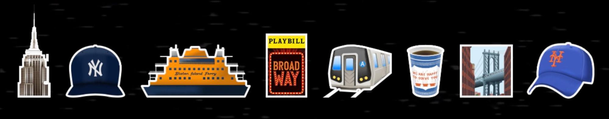
It looks like an emoji because it’s meant to be an emoji. The intention of the campaign is that the heart is interchangeable with a variety of icons and emojis in order to represent many different facets of New York City life. The official website for the campaign features emojis of the Empire State Building, a Yankees baseball hat, the Staten Island Ferry, a Broadway playbill, the A train, the iconic Greek designed to-go coffee cup, the Brooklyn Bridge, and a Mets baseball hat.
Seeing the logo in the context of the campaign, it makes a lot more sense — regardless of whether you find it visually unappealing or not. You can replace “NYC” with beloved New York symbols, or replace the icon to celebrate what New Yorkers love most about the city. The campaign is obviously run by a team who live in, know, and care for the city. With this crucial context, this campaign is actually…kind of cute?
Get your audience involved
The New York State Department of Economic Development could have saved themselves a big headache if they’d done more audience research first. If you want a campaign that is going to inspire feelings of civic pride and community spirit, it’s in your best interest to do your homework to ensure you successfully invoke these sentiments with your audience.
Audience research definitely would have shown New Yorkers’ high level of loyalty and protective feelings towards the original logo. It also would have uncovered the widespread concern about city budget spending, which many New Yorkers have expressed in Tweet replies and Instagram comments. The City could have chosen to go in a more grassroots direction or created a new design that wasn’t quite so similar to the original to avoid unflattering comparisons.
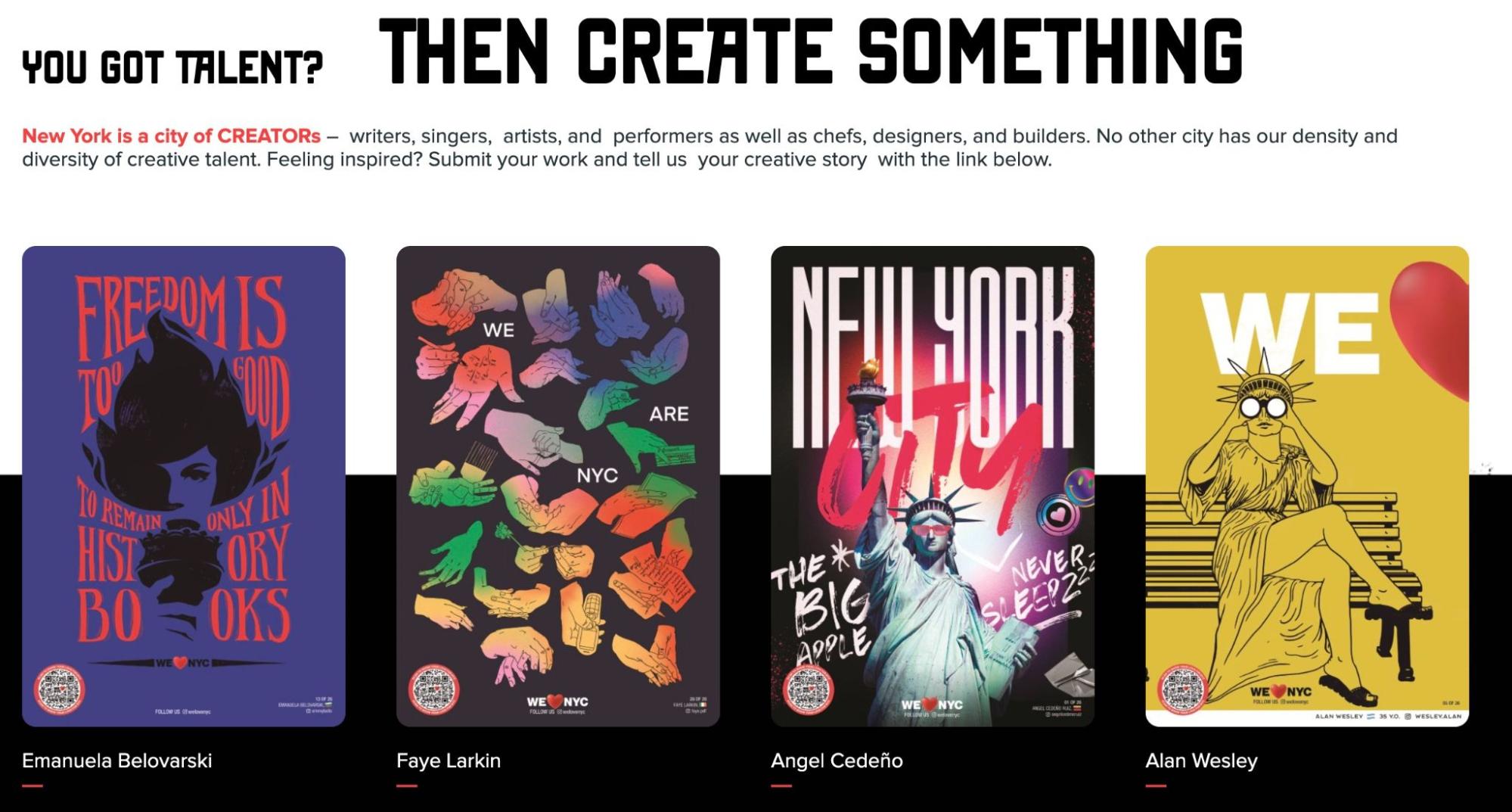
What they’re doing well in the aftermath, however, is giving citizens a platform to create their own takes and contribute creative ideas. They have an open call for posters where anyone can submit their interpretations of the campaign. After all, studies have shown that giving audiences space to share their own perspectives makes them more invested in an end product.
Don’t take yourself too seriously
The final lesson is a lesson in how to successfully recover. Especially in the internet age, defensiveness only opens public figures up to endless meme-ification and mockery. The marketing team for We ♥️ NYC responded in good humor, poking fun at themselves and demonstrating a lack of ego that could defang criticism.
It helps that they’ve clearly gotten some internet-savvy folks working on their social media. Their Instagram account managed to make just as much fun of themselves as the critics with their own memes and self-deprecating pop culture references. The designer, Graham Clifford, even responded to his “infamy” dryly commenting that “I think it’s fair to say the debate was vigorous” on Linkedin.
It’s every marketer’s worst nightmare to get caught up in a severe backlash over a campaign. However, this goes to show that with humor, self-awareness, and a solid understanding of contemporary internet culture, it’s possible to turn a famous disaster into an amusing success.


Tips and strategies from best-in-class organizations
In our ebook, learn how lean teams can overcome organizational obstacles, quantify your team’s impact, and plan and execute your marketing strategy.