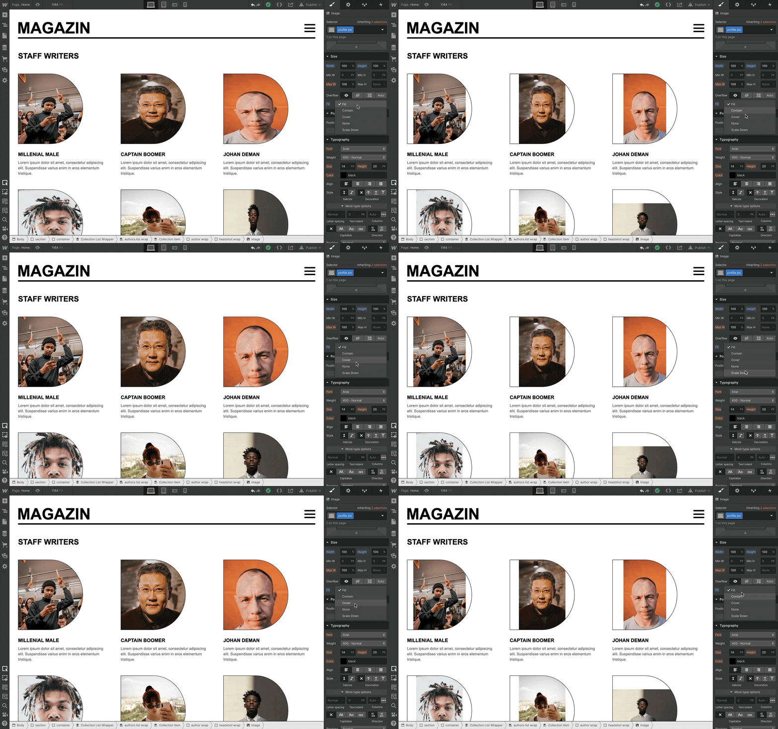
Thanks to popular demand, we’ve added the object-fit property to Webflow (shortened to “fit” on the style panel), giving you control over how images resize within their parent elements — and a more accessible and faster-loading alternative to background images (see why at the bottom of this update).

Object-fit in action
As shown in the first GIF in this update, you can use the fit property to control how a grid of author headshots display within their containing parent.
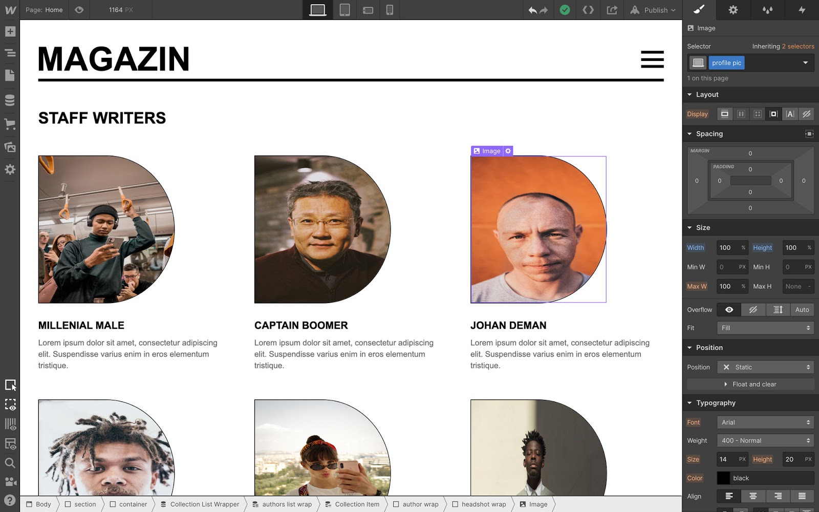
In the example below, the headshot image elements are set to 100% width and height of their parents — but without the fit property, they’re awkwardly squeezed to fit those dimensions.

To make all the headshots fill the space of their parent elements without distortion, we’ll apply the “cover” attribute, which ensures that the image — you guessed it — covers the space available, without distorting its proportions.

Advantages of using the fit property over background images
As many of you pointed out in the wishlist item for this feature, the fit property provides a different way of achieving many of the designs that are currently only possible with background images.
Here’s a couple of the key advantages of using the fit property:
- Improved accessibility. If you use image elements in place of background images, you can provide alt text to let people who use screen readers better understand what your page is showing — an option that simply doesn’t exist when using a background image.
- Responsive images support. Webflow automatically scales, compresses, and optimizes inline images for every device — but not background images. With the fit property, you can use inline images instead, so your images will be appropriately scaled for the viewer’s device, and hence, load faster.
For a full look at all the options object-fit allows, check out Mozilla’s documentation.


