

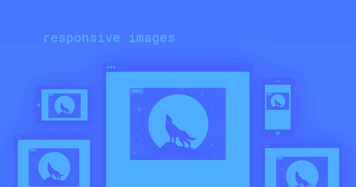
To keep pace with the explosion of device sizes and resolutions, we need new standards to make images adapt and respond to the modern web.
Today, we can access digital experiences of incredible variety, using devices of equal variety, on networks that range from lightning-fast to snail-paced. Add to that reality our increased access to affordable, high-quality photography, and suddenly, the internet is at odds with itself.
We want the web to be lean and fast — even in places where we have a weak signal — but we also want the web to be beautiful. So most of us end up optimizing for retina desktops, hoping that mobile users will bear with the consequently slow page loads.
But it’s an unrealistic hope — most mobile users will just bounce from a slow page.
To balance these opposing forces, we need ways to treat images that scale the web for all users on all devices.
That’s why we’re bringing responsive images to Webflow — for everyone.
What we changed to bring you responsive images
Starting today, all inline images (both static and dynamic) will automatically scale for every device size and resolution. If you have an existing site, a migration process will start the next time you open the Designer (if it doesn't, just hit CMD+SHIFT+i on a Mac or CTRL+SHIFT+i on Windows). Based on our before-and-after tests of page load speeds for some of our more image-heavy templates, this change can improve mobile loading speeds by up to 10 times.


Get started for free
Create custom, scalable websites — without writing code. Start building in Webflow.
For the technically inclined: this means we’ve built srcset and sizes into every inline <img> element, automatically generating variants for each image you upload and serving the most efficient option to optimize page load speeds for every site visitor.
Our approach to building responsive images into all Webflow sites offers three key benefits:
- Speed: Modern browsers use a technique called “pre-fetching” or “pre-caching” to improve page-load speed by loading images before you even visit the page. To take advantage of this speed boost, we chose to use srcset and sizes and not a JavaScript-based method, which would have required an initial page load before we could serve the correct variant.
- Quality: Aside from slowing down page loads, JavaScript-based methods serve low-quality placeholder images on initial load, or, if using <noscript>, create bloated HTML that’s not standards-compliant.
- Efficiency and automation: We want to help you design high-quality websites faster, so we’ve taken the time-intensive process of generating image variants, measuring sizes, and writing code and automated it all, so you can focus on design. Doing this yourself or using a standalone JavaScript library still leaves you with the task of processing each master image into variants — tedious work that only slows down the web design cycle.
And finally, we made responsive images free for everyone who uses Webflow. Everyone.
At present, this change doesn’t include background images or images in rich text elements, but we’ll support these elements in a future iteration. Additionally, building in <picture> element art direction support is not included in this change (for now, you can continue to achieve this effect by setting different images to display or not display for different device sizes).
But first, what are responsive images?
To balance the scales between high-resolution desktop users and average mobile users, the <img> tag needed to be brought into the 21st century. The solution: serve different image sizes and resolutions for each device using the srcset and sizes attributes.
The srcset attribute was first published as a working draft by the W3 in 2013. Since then, the solution to responsive images has evolved to include the sizes attribute, which is just as critical.
We first saw partial srcset support in Chrome 34 and Opera 21, and at the time of writing, srcset is now fully supported in all modern browsers — and backward-compatible with older browsers.
While the srcset and sizes attributes offer us web designers a lot of control, they also hold a lot of mystery and complexity — far more than you’d expect from two simple properties.
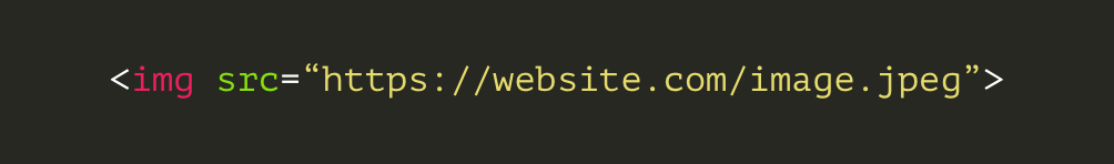
This is a simple image tag, before we’ve added classes, alt text, or dimensions.
Looking at the same image — with just the srcset and sizes attributes added — hints at the underlying complexity.
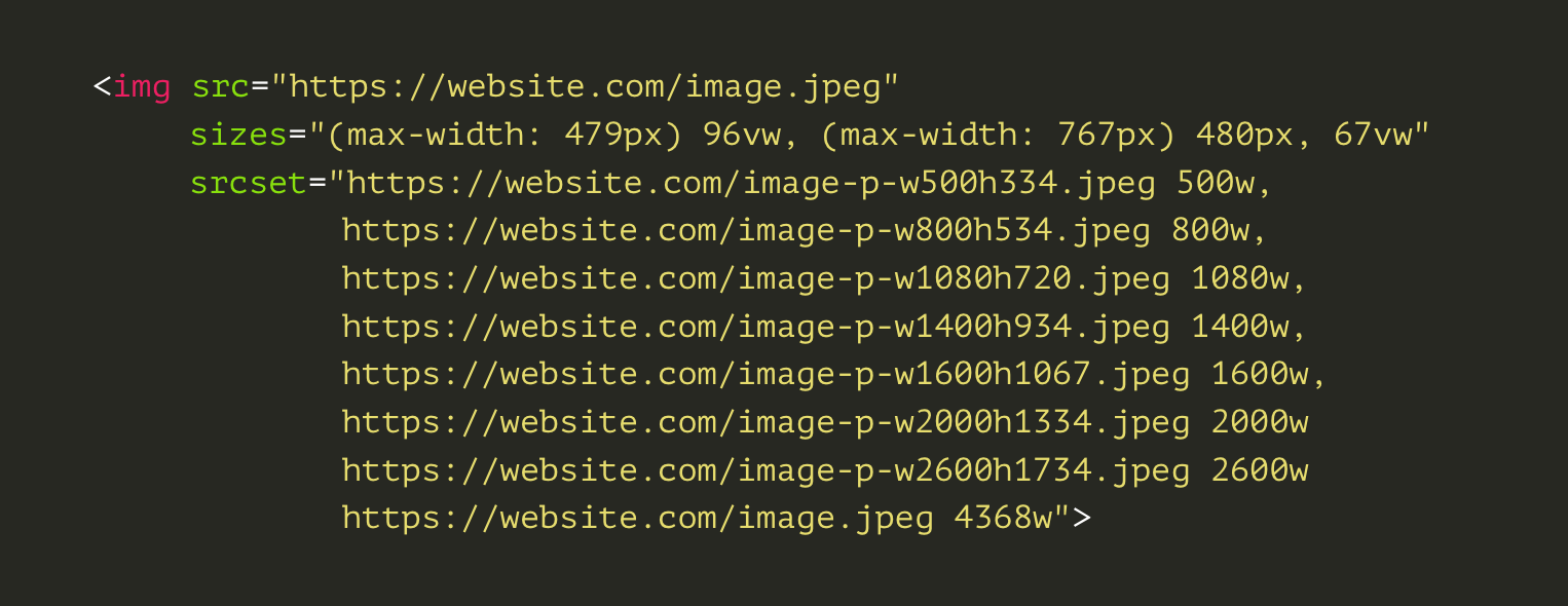
In essence, the above code tells the browser to serve a specific variant (denoted by width) for different media queries. Not too complex.
But as we all know, websites need (a lot of) maintenance. So every time you make a CSS change or move an image to a different container, you’ll probably need to recalculate the sizes attribute for all your images. This is required not just to keep serving the correct variant, but also because the sizes attribute can affect intrinsic image size.
These steps bloat your process. And in truth, humans aren’t the best entities for the job.
How responsive images work in Webflow
At Webflow, we believe in doing things the right way, even when it’s a tough nut to crack.
We’ve taken our time to craft an experience that balances automation with code quality, while staying true to the iterative, collaborative nature of designing and hosting websites in Webflow.
So how do we generate responsive images for your site? The challenge breaks down into two processes:
- Generating responsive variants of your original image
- Applying the srcset and sizes attributes to your <img> tags
Generating variants
We’ve built our own tools to generate responsive image variants for you automatically, behind the scenes. The variants are generated when you upload compatible images, so visitors never have to wait for real-time generation.
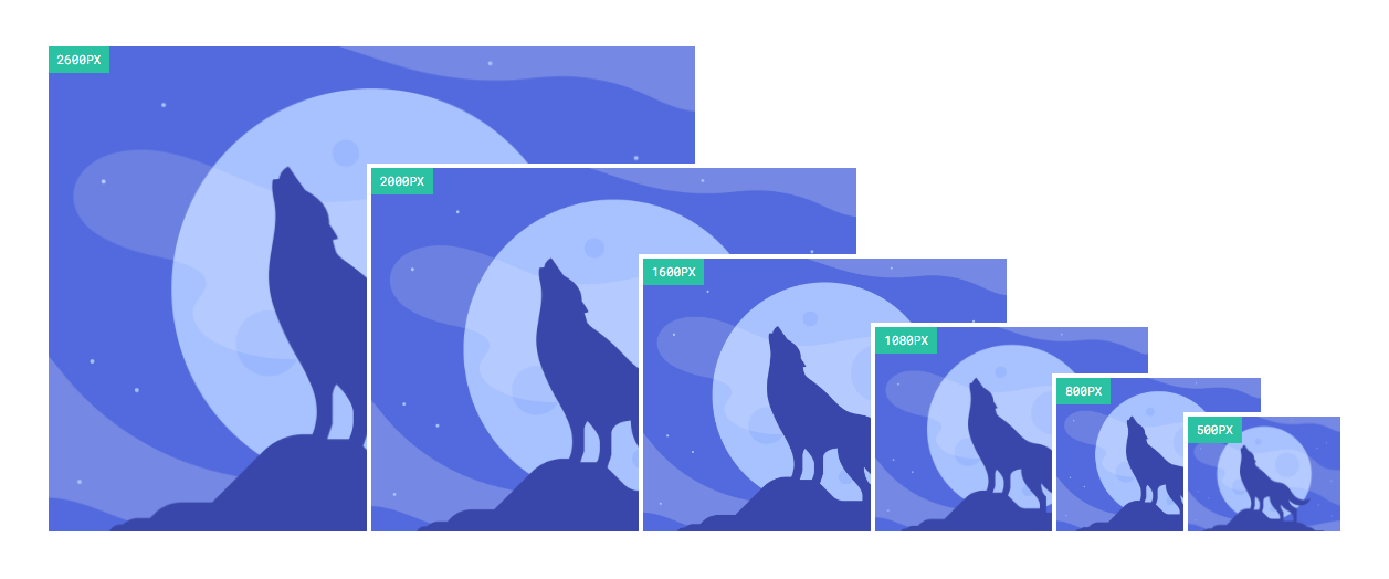
We’ve taken care to audit all the image compression tools available, applying advanced resizing algorithms and lossless compression steps to optimize variants for the web. We serve our variants through the same super-fast infrastructure we’ve been using, via a world-class CDN. We give the variants an extra visual feel of speed and performance by making them render progressively (example below).

Once an asset’s variants have been generated, any inline <img> you use that asset with will be responsive, including images in symbols and dynamic images pulled from a CMS Collection.
Applying srcset and sizes
The srcset attribute represents the list of image variants the browser can choose from. The tricky part of responsive images is the sizes attribute, which hints to the browser how large the image will render to help it select the right variant before the site has actually been rendered in a visitor’s browser.
This is critical to pre-caching, and but even when pre-caching doesn’t kick off, it’s critical for helping the browser download the correct variant without waiting for the whole page to render. We aim to have the correct variant downloading alongside JavaScript, CSS, and other assets and already available in the browser when it’s time to render.
We throw out the unidirectional, walled-off workflow of most CMSs when it comes to responsive images. We let the designer work with our algorithms by previewing the effects of srcset/sizes as you design — while also recalculating the sizes attribute for each responsive image behind the scenes every time you make a DOM or CSS change that could affect it.
Our approach solves not just for devices with different screen sizes, but also for screens with different pixel densities.
We believe this is the future of responsive design: working in a collaborative loop with smart tools that let you build things that usually require a whole team of professionals, without the headaches. And most importantly, without sacrificing control.
The result?
Based on our before-and-after tests of page load speeds for some of our more image-heavy templates, this change can improve mobile page loading speeds by up to 10 times (and even more for very image-heavy pages). Even on desktops and large screens, this change will make a sizeable impact for high-quality stock image sized photos—which in most cases are far larger than necessary.
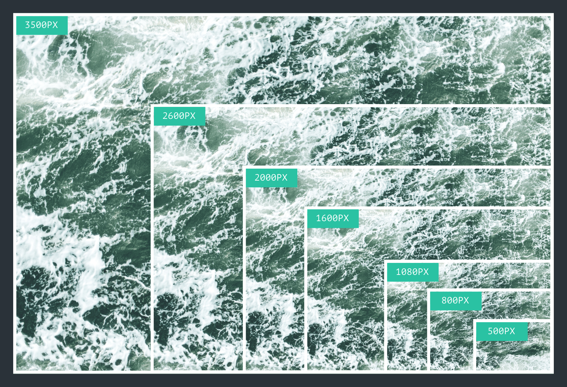
If we focus this comparison on the image files themselves, the performance improvements are even more pronounced. Take the above example of a high-quality (but not unreasonably large) stock photo that we ran through our normal variant generation process. Compared to the original 3500px width image, the 500px width variant is nearly 95% smaller, and will load 20 times faster on mobile.
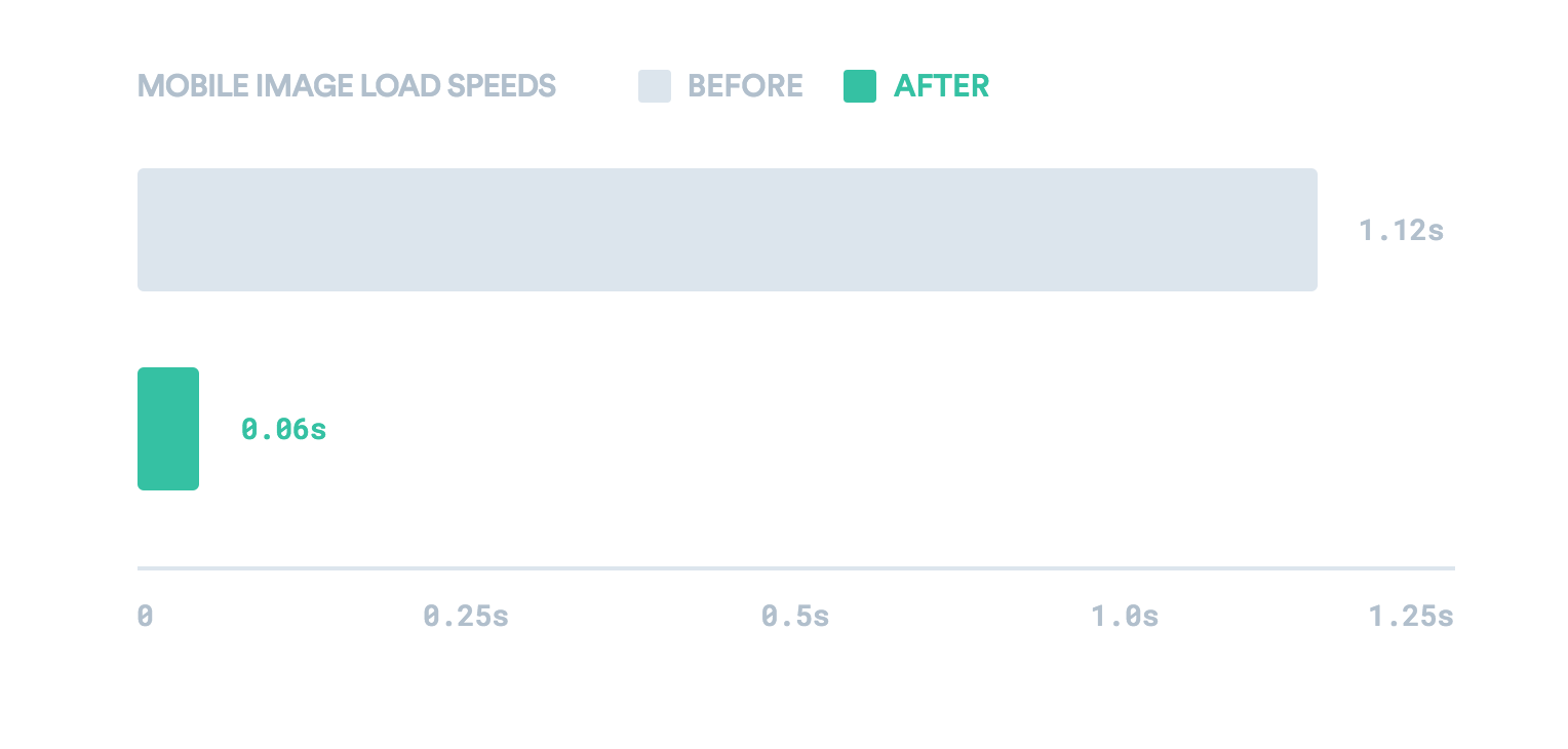
To put this in concrete terms, at 3G speeds from a mid-range cellular provider, the download time for this image drops from 1.12 seconds to just 0.06 seconds for the variant.
With high-quality images making up a larger and larger portion of the web, building responsive images into Webflow was a logical step in our mission of building the ultimate responsive web design tool.
Other responsive images solutions — and why we didn’t use them
While planning this new feature, we took a close look at the existing responsive image solutions, always looking for areas we could improve. These approaches generally break down into two categories, which we’ll call the “Manual” method and the “Placeholder” method.
Manual method
One method used by CMSs like WordPress is to hard-code srcset and sizes directly into their themes, which forces designers to manually adjust this code if they make changes to the layout. The result is a fragile, constrictive, and labor-intensive process that increases the complexity of building and modifying themes.
Placeholder method
The “go-to” approach for drop-in responsive libraries and third-party cloud image services relies on some version of the placeholder method.
The placeholder method works like so:
- The site loads with a low-quality image placeholder in the src
- The site renders
- A bit of JavaScript runs, measuring the page
- Those measurements are used to either update the src attribute or, rarely, to try to set the srcset/sizes attributes correctly
This approach falls short of responsive image standards by setting srcset/sizes after page load — or not at all.
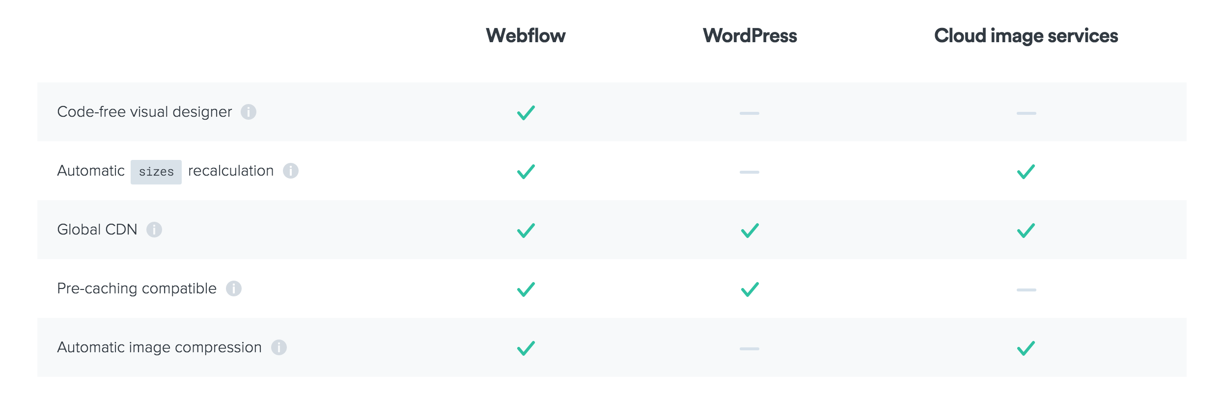
The main differences between Webflow’s approach and those above can be reduced to a few key comparison points, outlined below:
What’s next?
As far as we’re concerned, this is just the beginning — V1 of responsive images in Webflow.
In the future, we plan to expand responsive image support to background images and images in rich text elements. We also plan to build extra controls that allow you to manually edit the sizes attributes as you wish.
In the meantime, we’d love to hear what you think about this feature — so let us know in the comments below, or on the forum!