


Part three — glad you're still with us! Let's take a look at creating layouts with flexbox, adding minimal interacitons, and differentiating pages with an inverted palette. Once we've gone through all of this, you'll be two steps away from your very own agency site. Let's do it!
Part 3: The power of flexbox, logical interactions, and readability
In part two of this series, we looked at steps four and five to create your agency site in Webflow:
4. Plan your pages
5. Plan your classes
Today we’ll take a look at steps six to eight:
6. Harness the power of flexbox
7. Design logical interaction
8. Invert the palette for readability
Step 6: Harness the power of flexbox
Flexbox kicks ass. No two ways about it. If you’ve been building websites for a while and haven’t tried it out — or if you have tried it out, but found the syntax too much to wrap your head around — then you’re in the right place.
I could hem, haw, and opine about how best to use flexbox, but honestly, Webflow does a great job with that already. Learn flexbox with Webflow, my friends, is one of the best pieces of learning material I’ve ever seen.
If you’re building websites in Webflow, and aren’t using flexbox, you’re doing it wrong.
Now, I’m not saying use it for everything. I’m not even saying you have to use it for most things. But to not use it for anything? Yeah, that’s a missed opportunity. Flexbox not only saves time, but also gives you better and more responsive websites. There are some bugs to work through on iOS and Safari, but they’re worth the effort. (Hint: add max and min heights to everything, just in case.)
Instead of walking you through how to use flexbox, let me show you how it’s used on the Bespke site, specifically with the case studies container:
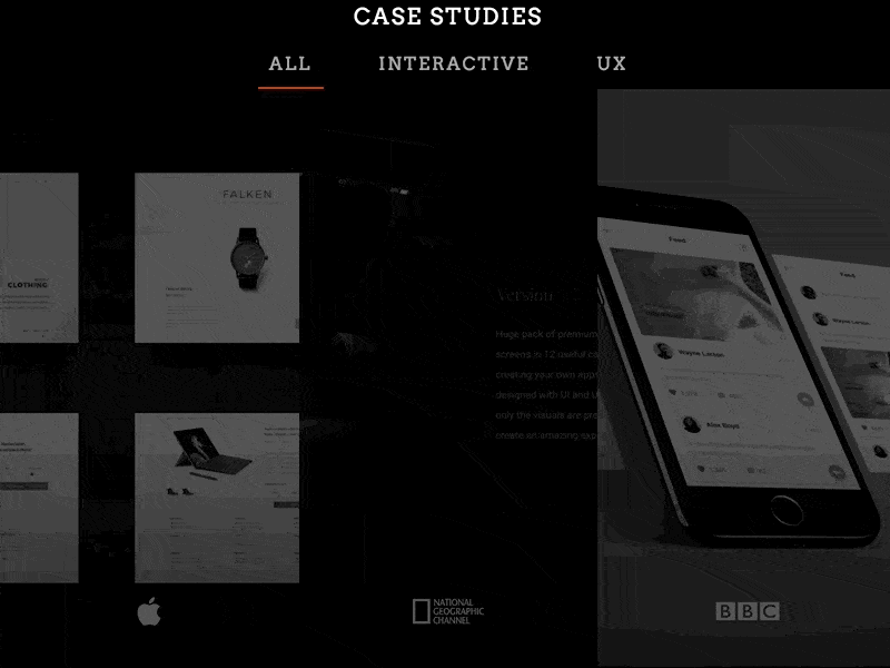
This section was an accident. Honestly, I didn’t design it this way. If you care about this type of stuff, here’s the source file I was using for this.
It was meant to be a grid layout, but after I implemented it, I decided a grid layout was boooooooooooring. Something needed to change. Luckily, I’d built it with flexbox, so changing it wasn’t all that difficult.
To get this to work, I took my “Projects” Collection and added flex to the Collection list element, and the Collection item elements. Here are the settings I had for the list:
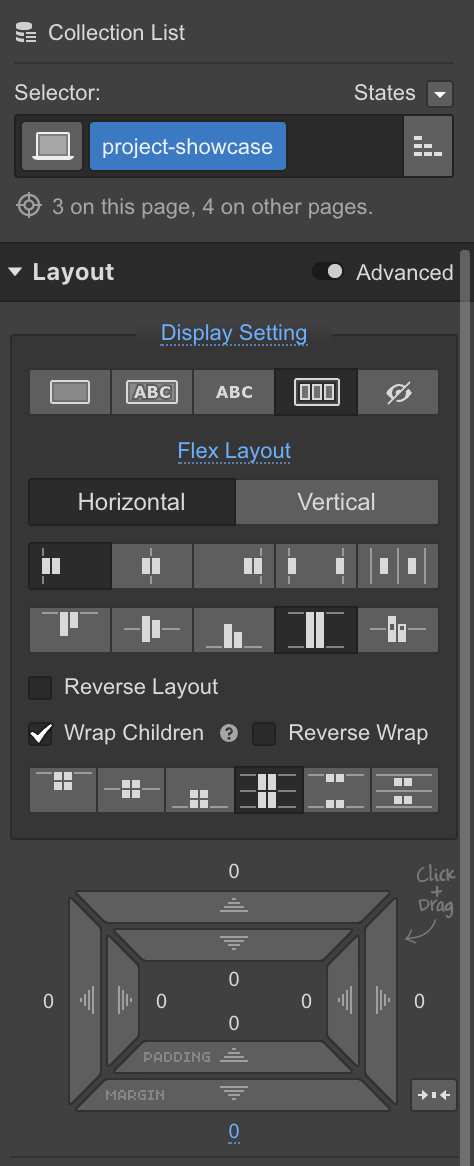
Display: flexFlex layout: horizontal, start, stretch, wrap, stretch
And here’s what I had for the Collection item:
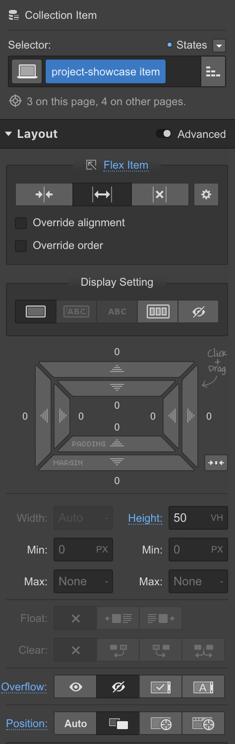
Flex item: expandDisplay: blockHeight: 50vhOverflow: hiddenPosition: relative
Nothing all that fancy, at first glance, but the magic here is in the hover state. You see, with flexbox, all sibling elements know about each other. You can configure them to fill a space equally, be a specific size, and align equally. But you can also configure some of them to take up more room than others, and allow the smaller ones to fill in the gaps — which is exactly what I did with the hover state:

This means that whenever .project-showcase item is hovered, it becomes distinct from its siblings and changes its flex properties to grow or shrink from a 15% basis. All the other siblings remain set to fill whatever space they’re allocated to, so it creates this great hover effect.
Now, that’s not all you need. For something as drastic as changing the size of an element on hover, you need to make sure you add a transition to the flex property, which I did. This type of interaction would have been very difficult to do in the interactions panel.
Remember to use the transitions section of the style tab to add your rich, state-change interactions and stick to the interactions tab for scroll, mouse, and on-load events.
Master the basics of flexbox in 28 increasingly challenging — and fun!— levels, without writing a line of code.
Master the basics of flexbox in 28 increasingly challenging — and fun!— levels, without writing a line of code.
Step 7: Design logical interactions that don’t overwhelm users
I’m really not an advocate of gratuitous interactions. I feel like the same issues with too many classes can arise here — it can be too easy to get carried away adding interactions to your site. The biggest difference between excessive classes and excessive interactions? With too many classes, you are affected. With too many interactions, your user is.
Interactions should be reserved, consistent, and kept to a minimum.
To keep your interactions in check, it’s helpful to define a narrative for your site — a metaphor for how objects look and behave in your world. Do you live in a springy land where everything feels like it’s going to bounce off the page? Do you live in a paper/material world where everything casts subtle shadows and grows as the user interacts with them? Do you convey motion by having things come in from the right, or from the left?
Pick a specific rule for your site and stick to it. Just because you can make everything fly in from all over the page, doesn’t mean you should. Find a timing and easing that can be used over and over again, and then don’t stray. At least not too far.
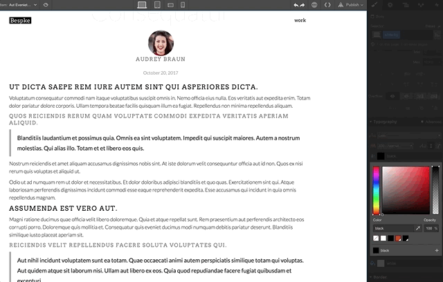
For the Bespke site, I imagined the site as a room with windows to natural light. I wanted to draw the user’s attention to elements on the homepage. I made elements dimly lit and black and white when focus was away from the subject, then brought them to full opacity and saturation when interacted with.
I went back and forth on how subtle this interaction should be — I wanted the hierarchy of each element to be clear without being overly distracting. This interaction, or variations of it, was then applied many different places throughout the site, always with the same easing duration, and always in an attempt to ensure consistency. In some places, the effect was accentuated — like with the expansion of the case studies on the homepage — but it remained consistent with the other interactions. It’s so easy to go overboard, so be careful.
Another thing to keep in mind when creating interactions is that some types of triggering events are not possible for all users. Possibly the most obvious is the hover event. Users on phones and tablets don’t have a mouse — they can’t hover.
One of my guiding principles for interaction design is to never use hover as a primary or sole interaction method. Only use hover to add to your site, but never let it keep your site from functioning if the user is on a device that doesn’t have a cursor. I don’t care if Google Analytics says 99% of your traffic is desktop — desktop users can still rely on touch. Don’t require users to switch input methods to navigate your site. They won’t.
Limiting hover makes it simple to browse your site and makes the transition to mobile easier. If you spend a great deal of time making hover interactions, you’ll have to create workarounds for every single one on mobile. But if your site is built and designed for desktop users who use touch, the transition to your mobile pages will be much easier.
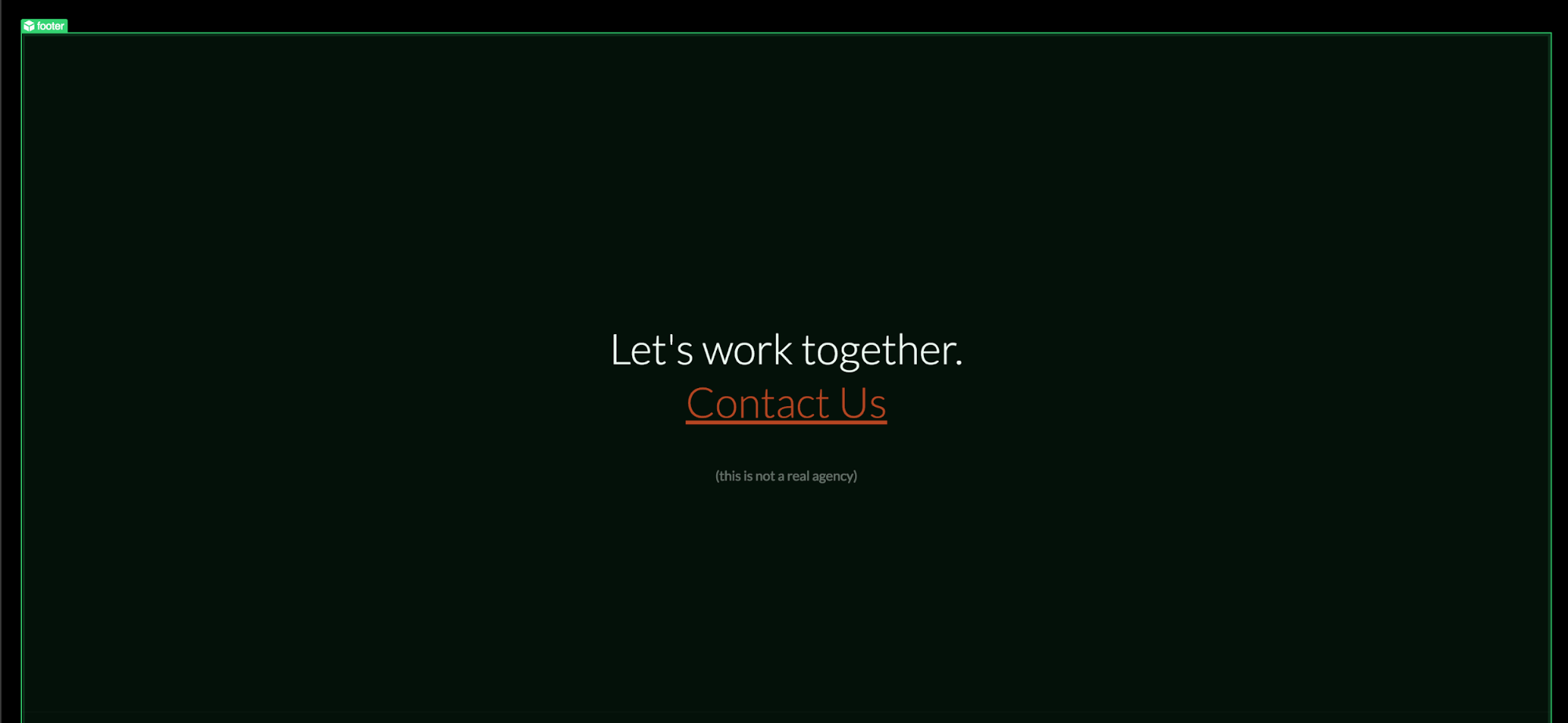
Step 8: Invert the palette for readability
I wanted to treat the long-form content pages on the Bespke site differently from the rest of the site. The easiest way to do this was to invert the color palette. White text on black pages is fine for short sections, but that high contrast can quickly fatigue readers and take away from the site. Dark UIs have a way of framing imagery and making it blend or feel like it’s part of the page. This is fantastic, but for long-form pages, I wanted the imagery to stand in contrast with the site and have that matte-board mounted look.
Inverting the color palette can cause a whole series of issues, namely with things like font color. It’s easy enough to create a class that gives your text a different color, but this technique makes it so you only have to change it in one location:
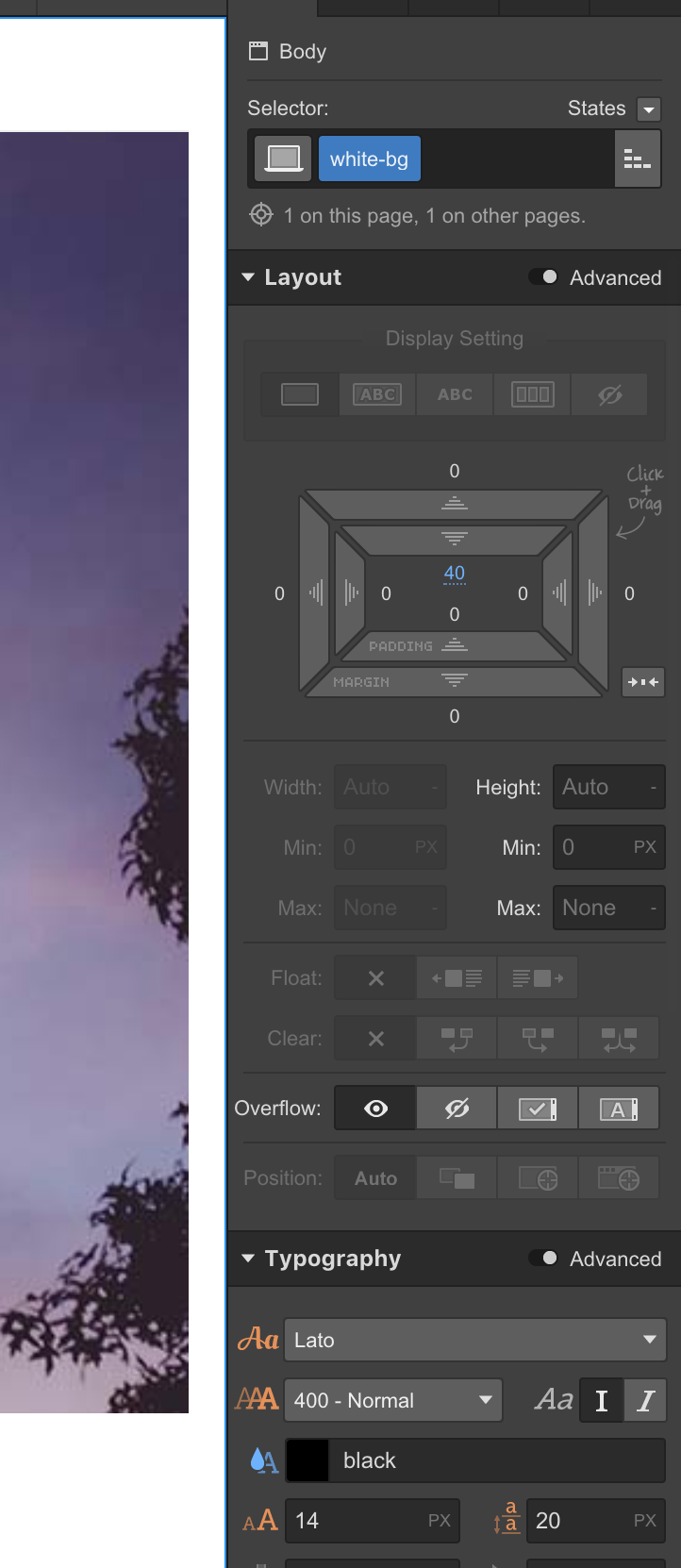
Instead of selecting each individual instance of paragraph on the page, I added a modifying class of “white-bg” to the body style and only changed the background, border, and font color. By doing this, I was able to influence nested components on the page — none of them have their own font color style, but always inherit this from their parent container.
Here’s what this looks like in action:
This also has some interesting implications for symbols.
For this site, I created a symbol for the header and the footer. This is pretty standard fare. Those elements are almost always the same, regardless of your site. However, when inverting the color palette, you can run into issues with the font colors in your symbols.
If I’d applied a white color to my paragraph style — instead of to the body — I would have had to create a separate symbol for the inverted pages, or abandon the inverting altogether. This wouldn’t have been a big deal on my relatively small site, but if you are dealing with a site that has dozens of pages, having multiple symbols spread across different pages is a recipe for mistakes.
Because my font stylings didn’t have any color on their own, but inherited the color from the parent, I could reuse one symbol, in inverted pages, with different outcomes.

This is the same symbol, even though it has different appearances. It’s a small time saver, but because I had an interaction I wanted to repeat across the site, this strategy allowed me to make changes in one location without worrying that I forgot to change that one page with a different implementation.
Don’t miss part four: API integration and content creation
That’s it for interactions and inverted palettes! In the final part of the Bespke series we’ll take a look at API integration and you’ll get a quick tutorial on setting up Zapier. We’ll also take a look at how smooth Webflow has made it to hand off your site to content creators. Hint: silky smooth.


