


In part two of this series, I'll show you how I manage the angst of a blank page by breaking a layout into manageable chunks. We'll also take a look at strategically adding reusable classes in Webflow.
Part 2: Planning pages and defining layouts
So in part one of this series, we talked about the first three steps to creating your agency site in Webflow:
- Creating your project
- Defining your default styles
- Defining your Collections
Now let’s take a look at steps four and five:
- Planning your pages
- Planning your classes
Step 4: Plan your pages
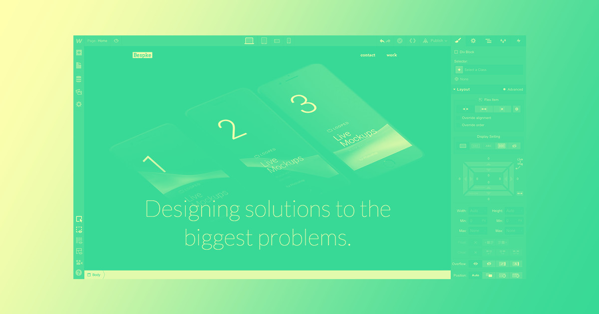
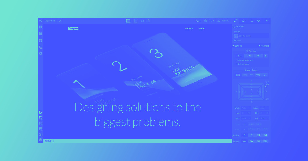
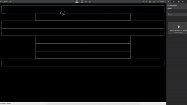
Blank canvases can be intimidating. No doubt about it. There are lots of ways to get started, but I’ve found that using the container and section pieces as a rough wireframe gives me the kickstart I need. Here’s a quick video demonstration of how I did that on the Bespke site.

In that video demonstration you’ll see me:
- Add a section element for each chunk of the homepage
- Give each section element an ID in the settings tab
- Add container elements to the sections that I knew (or thought) wouldn’t be full width
Starting with this site layout helps you break the page into manageable chunks and think about the types of layouts in each section. You can start to stylize the elements if you want, but I’m just going to add headings, columns, Collections, and other basic pieces for now.
Here’s another quick demo video of that. Once you have the basic pieces on your page, you can start defining your classes.


The modern web design process
Discover the processes and tools behind high-performing websites in this free ebook.
Step 5: Plan your classes
One of the hardest parts of Webflow is how easy it is to add new classes.
That may sound crazy, but the single best way to make a great website in Webflow (or in any platform, really) is to make your classes as intentional and extensible as possible.
Yes, you can make a new class each time you add an image, font, or padding — but you shouldn’t. Make sure the classes you add are reusable, without drastically breaking things. The first site I ever built in Webflow had to be rebuilt from scratch because the number of classes was too much to handle. And they were called such specific things that reusing them turned out to be a total pain in the ass.
I mean, this is just one section:

None of these were intentionally cryptic, but the more specific styles you add, the easier it is for things to get away from you. Before you know it, you're dealing with a total mess.
To avoid this, you’ll need to think strategically about how to position your elements so your classes don’t have to be too specific. For example, should things like your headings have center-alignment, or should the body itself be the element that dictates text alignment? Should each section have its own padding, or should you have a generic section class, and then add additional styles to tweak those settings? A good rule is to allow the container for an element to dictate how it looks and where it lives, as opposed to the element taking care of that.
Let containers control element layout and appearance, not the elements themselves.
A great example of this is center alignment. You can do this in a number of ways, especially if you start to use flexbox in your site. However, there’s a really quick and easy way to do it, and do it in a way that can be reused throughout the site: create a class that only does 1 thing, which is give text or an element center alignment.
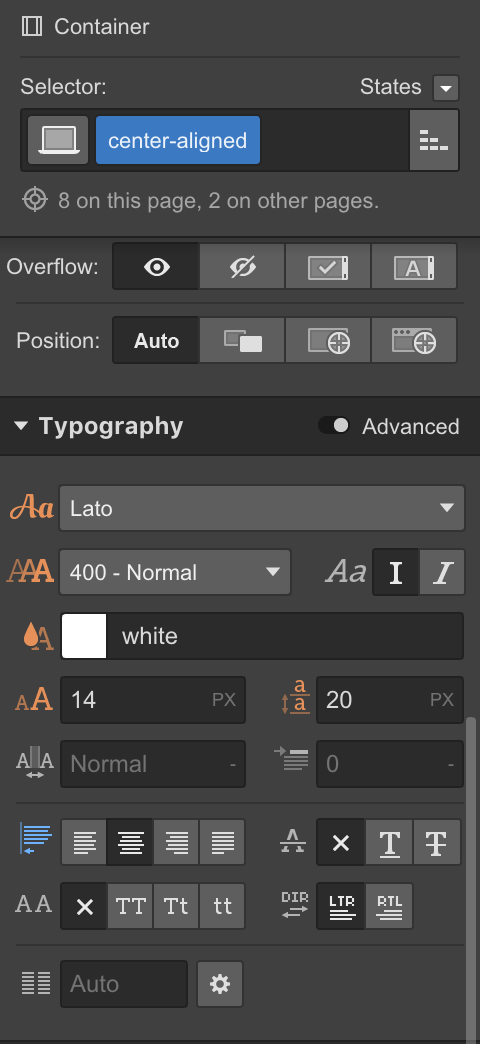
Here’s an example of how I use that element with some other classes in the site:

I used 3 classes here:
- Section
- Half-padding
- Center-aligned
None of them alone are very significant, but the combination of the 3 makes something much better. The best part is that because they’re so slim, they can be reused over and over again, with or without each other — and each will always behave as it should!
No more needing to remember which class has what or if one class is centered or not. Stack your classes, only change the base ones, and you’ll end up with a site that is 1000x more scalable. It makes the naming part way easier too.
Don’t miss part three: the power of flexbox, logical interactions, and readability
In the third part of the Bespke series, we’ll take a look at how flexbox saves time and helps you make better websites. We’ll also talk about designing logical interactions and improving readability with inverted palettes.
See you there!