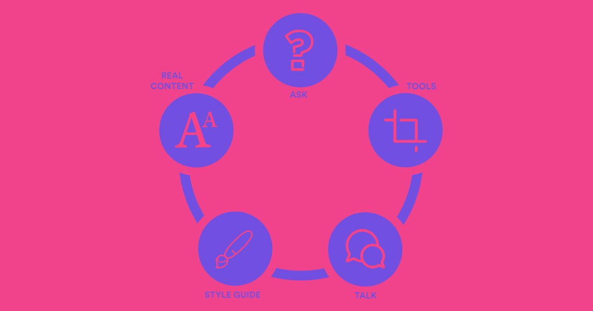
Designing a website for content creators is like building a frame for a painting—without knowing the painting’s exact size, colors, or message. But these 5 tips will help you create a flexible design system that gives content creators the freedom they need, without breaking your site.
Freelance, agency, and in-house designers inevitably create websites for some kind of content creator. You might design for:
- Personal clients, like a local restaurant or plumber
- Other businesses, like startups or corporations
- Content-specialist teammates, like copywriters, content managers, and content strategists
- Joe or Jane Netizen, like everybody out there on the internet (their creations are often called “user-generated content,” a term so vague as to be almost useless)
When you design for content creators, you face a unique challenge, namely:
How do you give creators the freedom they need, without giving them so much freedom they break your design?
Thankfully, Michelle Barker, designer at Future of Web Design, shared some great tips on designing for content creators at FOWD SF 2015.
Here’s my take on her tips, including some ideas for using Webflow CMS to do just what Michelle advises.

1. Ask questions
The first rule of design is “know your user.” And knowing your user becomes even more powerful when your user actually gets to shape your design. Because that’s exactly what designing for content creators means: collaboratively building a website with people who may not know a thing about design.
To get to know them, ask your content creators questions like:
What kinds of content do you create and publish?
And don’t stop at “blog posts.” Find out what types of blog posts they publish, and what types of content go into each type of blog post. (Or video, podcast, infographic, etc.)
You might just find that instead of having one “blog post” design, you’ll actually create multiple templates for different sorts of post. Or it might be better to offer many kinds of input types in your CMS, so blog posts don’t have to fit a rigid structure.
Working with Webflow CMS?
With Webflow CMS, you represent content types with Collections. So, as you listen to your users’ answers to this question, start taking note of what Collections they’ll need, and what fields you’ll need for each Collection.
If you’re creating a blog that will publish diverse types of posts, consider creating Collections that correspond to different types of content, rather than one overarching “blog” Collection. It’ll help you ensure that design and content work together to deliver their message, and promote consistency in the content.
For instance, if you’re building a food magazine website, you might create Collections for:
Recipes
Fields:
- Image: hero photo of finished dish
- Multi-reference: for ingredients
- Number: calories
- Rich text: for the complete step-by-step, with images
- Reference: author name
- Reference: cuisine
Restaurant reviews
Fields:
- Image: hero photo of restaurant exterior or interior
- Number: for ratings
- Rich text: for the review, with images
- Link: chef name
And that’s just a couple of examples: with Webflow CMS, you can build almost any kind of Collection to give your content creators all the flexibility and consistency they need.
What’s your workflow look like?
Every publisher’s workflow looks just a little different, though there are certainly recurring themes. Here are some key questions to get answered:
- What tools do you use for content creation and planning? You might be able to set up some integrations that will make things easier for the team.
- What’s your approval process? With some platforms, you can integrate process into the CMS by creating different roles and levels of permission. Right now, you can add one Content Editor to a Webflow CMS, so that person can act as the “editor in chief,” only adding content that has already gone through the approval process.
- How many people are involved in publishing content and what are their roles? In some cases, many different people might work on a single post. That might include an author to write content, an editor to approve it, a marketer to experiment with headlines, and an SEO to optimize meta info and other content. Each of those contributors will need levels of access and tools to help them do their work.
- Where will content creators get images from? Designing for a team that shoots hero images with their smartphones will pose different challenges than those who regularly pony up for Getty Images.
How tech savvy are the content creators?
The world of web publishing seems to get more complex every day. Just look at the simple image. With a single graphic, you have to be concerned about: image dimensions, resolution, file type, and size; alt tagging; mobile optimization; etc.
Many content creators won’t know all this stuff, so you may need to design methods that help them fill in the gaps in their knowledge. More on that in point 4 below.
What do the people who visit the site need to do?
Another unique challenge of designing for content creators is that you’re not just designing for the creators—you’re designing for the consumers too. Knowing what the site’s content consumers do will help you determine the site’s overall information architecture, build user flows, and determine functionality.

2. Know your tools
When you start designing for content creators, you immediately step out of the comfort zone of your desktop design apps. Sketch or Photoshop won’t be enough here, because you’ll need to do a more fundamental kind of design, one that isn’t all about boxes, typefaces, and colors (though they’re involved): UI and UX design.
You’ll need to think about a content creator’s flow through a variety of tools, but you’ll focus particularly on the content management system. (Which you’ll hopefully have a voice in choosing, but you never know what you’ll be stuck with.) You’ll need to familiarize yourself not only with its UI, but also all of its capabilities. You’ll have to learn what it can do out of the box, and what can be done to expand its functionality.
Need to get to know Webflow CMS?
Your first stop for learning your tool is this video:
In just over 30 minutes, you'll know most everything you need to know to use Webflow CMS effectively.

3. Talk to your developers
With most CMSs, your developers will be a vital resource for helping you understand your tools, its limitations, and what you can do to get around those limitations. In many cases, they’ll have the solutions to your design problems up their sleeves—or at least be happy to brainstorm solutions with you.
Never underestimate the value of collaborating with your thoughtful, knowledgeable team members, even if a given task “isn’t their job.” Every person involved in web design and production has a unique perspective on the process, and we all know how valuable a second pair of eyes can be for tough problems.
Working with Webflow CMS?
In building Webflow CMS, our goal was to empower you to build a custom, CMS-powered website without the help of developers. Between our educational content, forums, and just playing around with the platform, you’ll find all kinds of solutions on your own.
But if you have developers to talk to, do it. For agency and in-house work, you may have to hand off your designs to developers for execution anyway, and they’ll be invaluable for identifying corner cases and overcoming limitations—before the content creators discover them.

4. Create a style guide
Some design problems just can’t be handled in a design tool alone. In those cases, you’ll need to call for a little collaboration, and the help of a style guide.
For instance, many blogs have a gridded index page with thumbnail photos, a title, and a summary of the post. To keep the design balanced, you’ll want titles and summaries to stick to a consistent length.
How do you do that? With a content style guide. (A List Apart has a nice one.) A style guide does the jobs your design can’t necessarily do by informing users of the constraints in place. And if anybody’s familiar with working within constraints, it’s writers. We basically love that stuff.
Creating a style guide with Webflow CMS
It’s super simple to integrate parts of your style guide right into the CMS. When you’re defining the fields for your Collections, you can customize the labels and add helpful explanatory text under each label. You can even add character count limits to text fields to make sure those summaries don’t get too long-winded.
Speaking as a content strategist and editor, it’s way easier to get people to follow your style guide when it’s right there in their face—and telling them when they’ve maxed out their character count.

5. Design with real content
The true killer practice for designing for content creators is—surprisingly enough—designing with real content.
Only designing with real content will let you experience the variety of content your end-users produce and work with. And that kind of experience will help you be more sensitive to their goals and methods, helping you design a better product for them.
Designing with real content also makes it much easier to discover both edge cases and problems with your design. If your design doesn’t work well with the long headlines your content creators like to write, the solution isn’t to ask them to tighten their headlines. Instead, you’ll want to:
- Talk with the team about their headline length, to see if it’s working for them
- If it’s a “yes,” it’s time to adjust your design
- If it’s a “no,” work with them to define guidelines for headline length and build that into the style guide and/or CMS
It’s vital that you don’t stop the conversation with your content creators at the discovery stage. Instead, keep the conversation going throughout the process, checking in for more than just the scheduled reviews.
To summarize, designing with real content benefits you by:
- Building empathy for your end users
- Improving your knowledge of content creators’ tools and workflows
- Helping you identify problems and edge cases in your design work
I recommend using the gnarliest, most edge-case-y content on the current site for your sample content. That can often keep you from limiting things too much.
–Rory Douglas, Managing Your Content Management System
Designing with real content with Webflow CMS
Webflow CMS was built for designing for and around content. Just create a Collection with a few of your “gnarliest, most edge-case-y” bits of content, throw a Dynamic List into the auto-generated Collection Template, and start exploring the best ways to design with that content. With that done, you can start placing dynamic lists in “related posts” areas, sidebars, category pages, etc., to see how your design performs across a variety of placements—or how it might need to adapt to different areas of the site.
How do you design for content creators?
If you’ve got your own tips and tricks for designing sites for clients and other content creators, let us know on Twitter!
You can also check out Michelle Barker’s original presentation on SlideShare.


The modern web design process
Discover the processes and tools behind high-performing websites in this free ebook.


