


Look across the web, from your email inbox to Facebook to whatever weird edges you roam, and you’ll see icons—often either in support of text, or completely replacing it.
Look across the web, from your email inbox to Facebook to whatever weird edges you roam, and you’ll see icons—often either in support of text, or completely replacing it.
But human beings have used icons as a communication tool since long before the rise of web and user experience (UX) design. And wherever they’ve been used, they’ve always had a single goal: to efficiently communicate a message via a commonly understood visual language.
To do that, icons need two things:
- Widespread recognition
- A single, widely recognized meaning
When icons achieve those two things, there’s no doubt about their power. Just look at the world’s major religions. Despite the vast range of meetings you might assign to the cross, the six-pointed star, or the crescent moon with star, you immediately recognize each as a symbol for a worldwide movement.
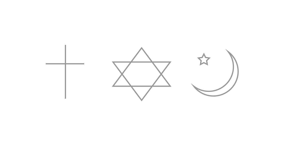
(It’s worth noting that the crescent moon and star is in no way an official symbol of Islam — a famously iconoclastic religion.)
But in the digital world, icons face some serious challenges. One of the largest being inconsistent usage.
So let’s take a closer look at those issues — and find out how to work with and around them.
Universal recognition and the ever-elusive global definition
Widespread adoption of an icon is tough, and might even require some sort of standardization, possibly even a governing body to enforce usage.
The thing is, people won’t always infer an icon’s meaning the way you intend them to. Cultural and even personal associations can alter the intended meaning of a symbol, sometimes in disastrous ways.
If an icon isn’t familiar, people will infer meaning from their past experiences and contextual cues (that is, other signals within the user interface).
This can work for, or against you.
For example, road signage is often geographically specific, and it’s safe to assume that a U.S. driver won’t suddenly and unintentionally find themselves driving European roads. In this case, signage for the United States should be designed in alignment with the standards in place in the U.S.
On the other hand, if you’re designing signage for a tiny, landlocked country criss-crossed by international highways, you’ll need to keep the standards and languages of a wide array of drivers in mind.
Cultural limitations
If you’re designing for an international audience, it’s worth noting that icons can be subject to the same translation issues that written and spoken language suffer. An icon’s connotations can vary widely across cultures, creating the kind of ambiguity we should always strive to avoid in UI and UX design.
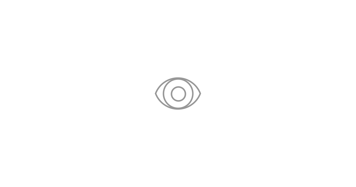
Consider the eye icon, often used in UIs where views matter. With little to no pre-existing meaning in North American culture, the eye icon is an elegant solution here. However, to some, the eye carries a negative connotation as the Evil Eye, The Eye of The Envious, or The Eye of Sickness.
User adaptation
Like other means of communication, icons are dynamic—in a constant state of semantic flux that is, in part, impacted by our own use of them.
As the meanings of icons evolve, previous versions will have to be cleared out so that a standardized visual language can be built.
If the people who use your site or digital product have become familiar with the results of interacting with a particular icon, then keep up the relationship! Suddenly changing the meaning of a symbol in an interface leads to a poor UX.


Free ebook: Web design 101
Master the fundamental concepts of web design, including typography, color theory, visual design, and so much more.
Message ambiguity and why words (still) matter
Use your words
People process visuals faster than they do text, especially when they already know the visuals’ meanings.
But can you rely on a single icon to convey the same message to everyone? In many cases, words will clarify an icon’s message and give people confidence in the results of their interactions. That increased confidence can result in significant positive boosts to key metrics.
So while icons may be faster, words are more reliable. And they work even better together!
Increasingly, user interface designers combine icons and words. It’s a minor sacrifice. The hamburger icons, which has practically become famous due to its lack of clarity, suddenly comes into sharp focus with the word “Menu” below it.
Avoid the vogue
Vogue icons, by definition, aren’t here to stay. They’re fun to use for short-lived projects, but for applications that expect a long shelf life, you’ll want to stick to the classics.
In Hollow Icons, Aubrey Johnson explains his reactions when he was asked to a review a peer’s mobile designs.
The app looked pretty great overall, but some of the design was following the lead that iOS7 created precedent with. They were designing to ‘fit in’ on the platform.
As Johnson argues later, despite the trendiness of thin-line icons, they’re actually the inferior choice compared to filled icons. Designers should be wary of being in vogue when usability is sacrificed.
If your icons seem too situationally specific, then challenge yourself to find a better solution for your designs.
The classics became the classics because of their timelessness and consistent use. And that consistent use has created the familiarity we’re looking for. We know them. We’ve interacted with them. We know what results to expect.
Vogue icons lack recognizability, and that’s a critical element in setting a user’s expectations.
Explanation-free
Nine times out of 10, if an icon needs to be explained, it’s already failing. Familiarity arises from repetition, and deviations can result in confusion or a bad UX.
Avoid letting an icon pull all the weight by using other design elements to clarify its meaning.
For example, to reinforce that your magnifying glass icon stands for search and not zoom, place it within a text-input field. That way, people are primed to recognize the search tool via the icon, and that priming gets reinforced by the presence of the search bar, whether expanded or shrunk.
Here’s an example of an expanding search bar design that uses the magnifying glass supported by a subtle interaction. The preview of the search bar nails down the meaning of the magnifying glass, in this context, as the search icon.
How can we improve?
Use sparingly, and thoughtfully
Icons shouldn’t always be your go-to solution, despite their efficiency.
Instead, intelligent design solutions can reinforce your icons’ message and increase user engagement. Take the current trend in top websites as example: they’re shifting away from a single hamburger menu icon to represent top-level navigation and instead implementing an icon hierarchy. The new layout promotes the most popular pages as icons, increasing familiarity, and reducing the reliance on one ambiguous menu icon.
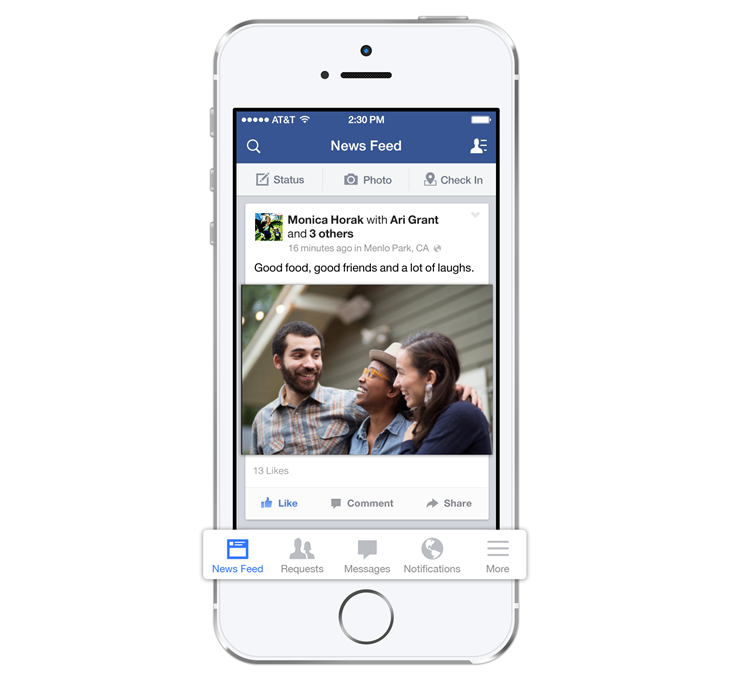
Facebook really championed this shift to the “tab bar” navigation when they redesigned their menu layout in 2013 to better reflect how people use the Facebook app.
Stick to convention
Tread carefully and always be aware of the implications of using unfamiliar icons — any deviations from accepted norms should be intentional, i.e., designed to take advantage of the abnormal meaning or usage.
Icons that uphold conventions will be more easily recognized by a larger user base, thus helping people interact with your icons with more confidence.
Design a meaningful context
Like language, icons gain meaning through their context. So reinforce your icons with good design that creates a context for the icon to shine in.
For example, an arrow at the right edge of a digital book could mean anything, but given its placement, people will probably get that the arrow will turn to the next page.
Note that this example is fairly low-risk (a user can easily get back to the previous page if they didn’t mean to move on yet), making it a good place for experimentation. A more high-risk scenario, such as posting a status update on social media or sending an email, would be a poor place to try something new.
Icon responsibly
Be intentional and deliberate with your icons, support them with words when needed, and be as inclusive as possible. In addition, design your icons’ context to reinforce their meaning.
Never forget that a successful icon is built on widespread recognition and a concrete, consistent message. With that in mind, you can't go wrong.