Even with all the multimedia interactivity the web offers us, typography remains one of the most powerful tools in any web designer’s toolkit.
Why? Because typography conveys the message you’re trying to get across—both literally, in that it acts as the medium of content, and metaphorically, in the ways it reflects your brand.
“Everything about it is calculated to reveal rather than to hide the beautiful thing which it was meant to contain”
–Beatrice Ward, "The Crystal Goblet, or, Printing Should be Invisible"
A picture may be worth a thousand words, but sometimes you want your visitor to remember just a single phrase—and a powerful message beautifully typeset is the best way to do this.
Done right, typography can be more effective than any image or graphic. These seven websites use type in creative ways that offer people a unique and easy to understand experience.
1. Huge
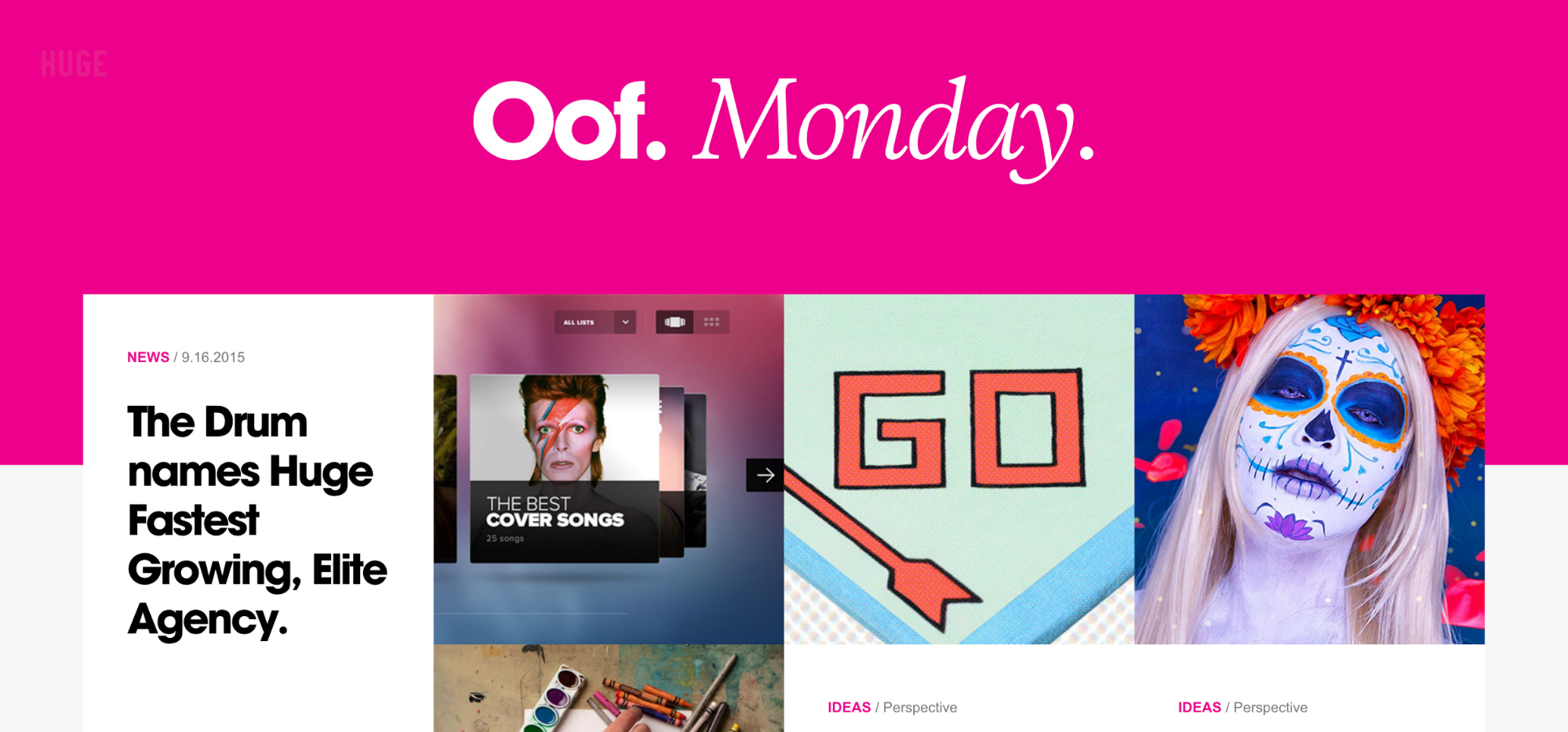
This cutting-edge design and experience agency has built one hell of a bold brand: Bold typography. Bold colors. Bold images. Just a quick scroll through their homepage showcases the use of large, bold lettering to call out client names and important topics.
2. Paul Jarvis

Freelancing advocate Paul Jarvis boasts a stellar portfolio, several products and courses, and a podcast. If you’re thinking of entering the world of freelance, Paul will teach you what you need to know.
Where most designers’ portfolio sites are packed with graphics and photos of their work, Paul relies heavily on content throughout his site. Why? Perhaps he understands that text is the best method of delivering your message—so why clutter things up with images?
3. Ogilvy & Mather

The folks at legendary design agency Ogilvy & Mather understand that typography is key to sending a message—and it’s obvious within just a few seconds of visiting their site. On load, you’re greeted with Ogilvy’s signature (a strong design asset), followed by a wall of text showcasing their appearances in some of the planet’s most prestigious publications, as well as some of their own content.
Not something you see every day. Which lets you know right off the bat that Ogilvy will approach your creative challenge differently.
Note: Most of this text is delivered through images instead of HTML, which is poor for SEO and accessibility, and hence, not a best practice.
4. Thinking with Type
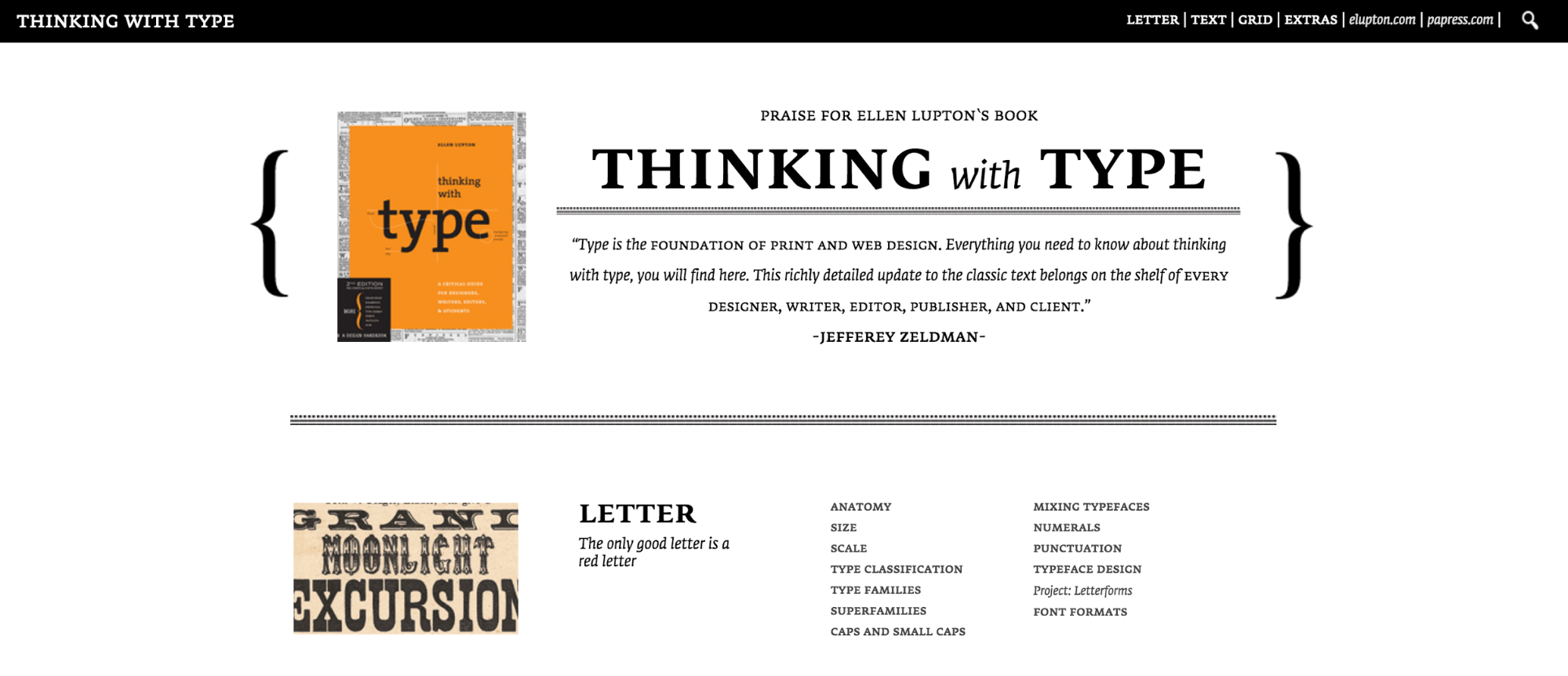
Thinking with Type doubles as a typographically beautiful site and a rich resource for learning about typography. As a companion to Lupton’s wonderful textbook, the site serves to beautifully illustrate key points of the text, and offers the core of the book’s content absolutely free. (Though, if you love type, you’ll want the book too.) Plus, the site features a couple fun projects to help you exercise your typographic brain.
5. The Web Ahead
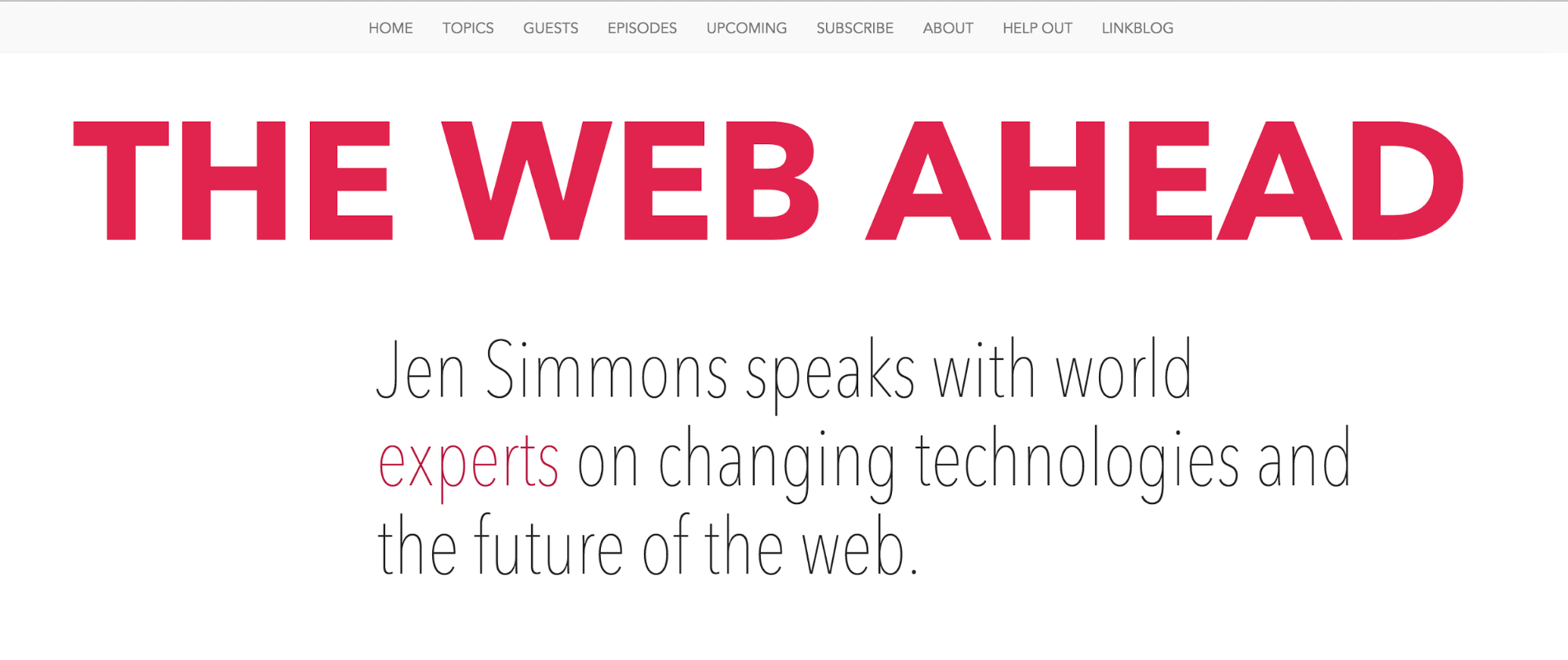
This podcast website from web design advocate Jen Simmons focuses on new techniques and technologies for web creatives.
The site (created by Jen herself) features bold, yet elegant typography that grabs your attention, clearly sets your expectations for the site, and guides you through its rich content.
6. Butterick’s Practical Typography
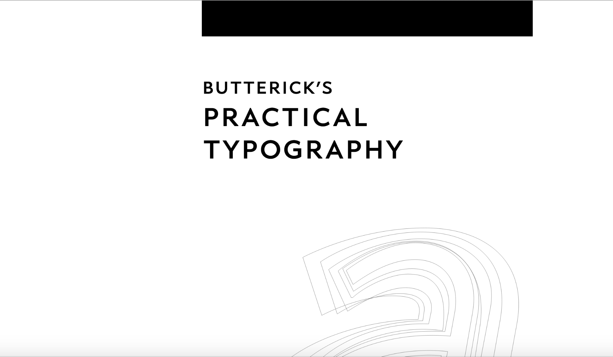
Butterick’s Practical Typography offers up another exceptional typography resource for designers and web creators alike. Not only is the website design almost 100% text, but it’s also filled with content on importance of typography, different types of typography, and how to best use typography on the web.
7. More of the Same
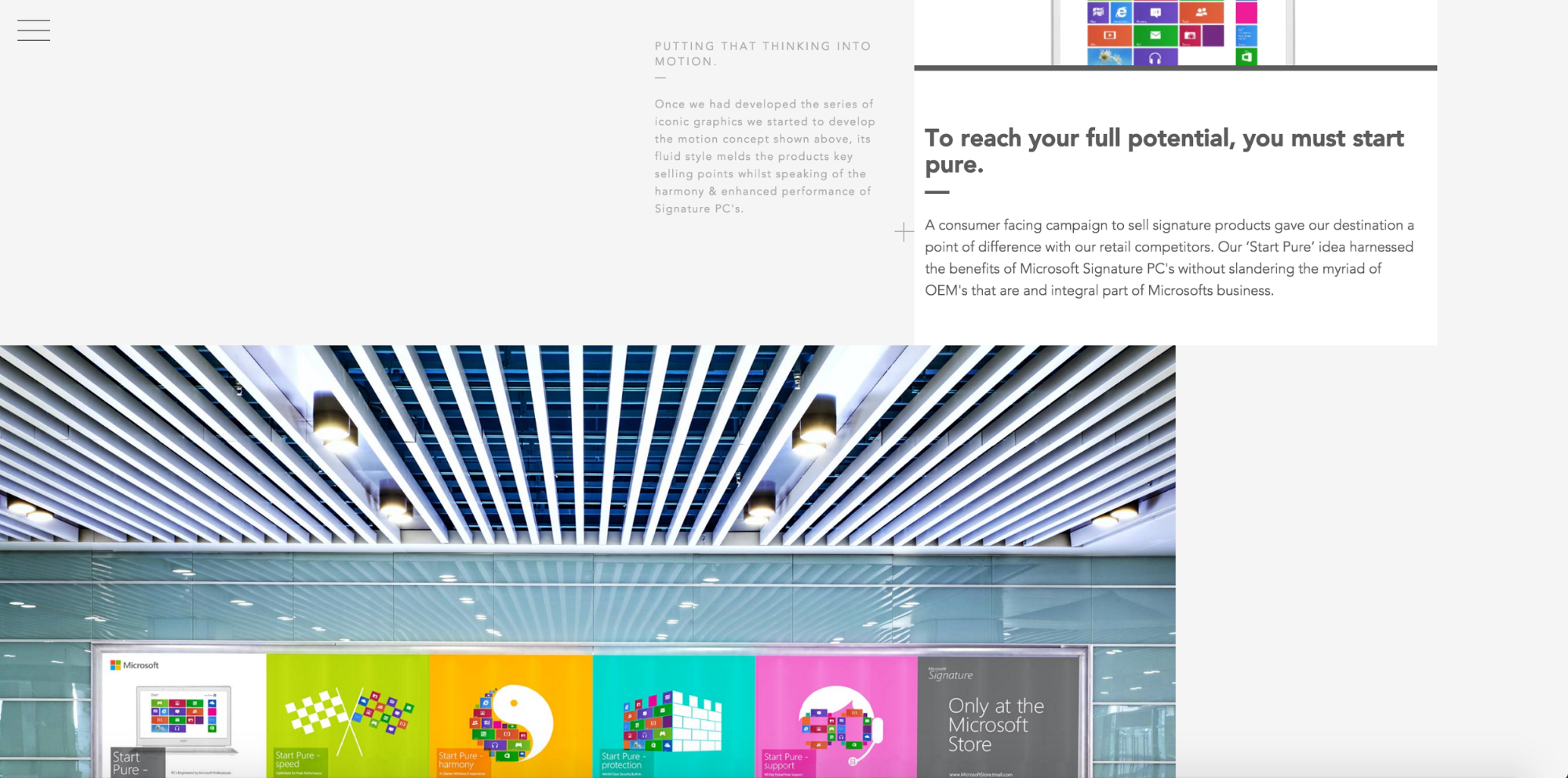
Designer Shane Hurt’s made-in-Webflow portfolio showcases his design projects with full-screen and thumbnail imagery coupled with brief descriptive passages. It’s a highly engaging way of presenting both the output and the design thinking behind that output. The concise text modules also help you do a lot of reading … without feeling like you waded through an essay.
What typographic websites inspire you?
Obviously, the web holds thousands more sites filled with beautiful type. So let us know what your favorites are on Twitter!


Build CSS grid layouts — visually
Experience the unprecedented ease, speed, and power of CSS grid layout in Webflow — with all-new on-canvas controls.


