Thoughtful typography in web design plays a key role in how your brand and message are presented.
Research shows that different typefaces impact our emotions, affect how well we learn and remember things, and even influence how we taste certain foods.
But choosing the right font involves more than considering a visitor’s psychology. Web designers must balance unique design with clarity, presenting content that communicates a brand’s personality while ensuring everything on the site is readable.
It’s also crucial that font choice matches a site’s message. People enjoy luxury products more if the packaging uses a curved font style, for example, while restaurant customers believe food has been prepared with more love if the menu uses a handwritten style.
But readability comes first, then branding. You can’t convert customers if your typography choices make it difficult to understand what you offer or how they can connect with your business.
3 ways to improve the readability of digital text
When reading online, people are more likely to skim and aren’t as good at remembering connections between ideas.
Writing for people moving quickly through your text means readability is paramount. Font choices that improve readability also improve the user experience (UX) — which is why font choice is a fundamental visual design principle across UX, graphic, and web design.
Here are some tips to improve your site’s text.
Choose a legible font and optimize it for increased readability
Legibility is a feature of typeface design. It includes the height and width of the characters (or “glyphs”), the weight (normal, bold, extra-light), and other characteristics of the letter shapes, such as serifs, which are the extra projections on the letters in fonts like Times New Roman and Georgia.
Highly legible fonts have easily identifiable characters, while less legible fonts force readers to do more cognitive work to distinguish the characters.
To maximize legibility, choose a font with wide spacing (“kerning”) between the letters and avoid using light and ultra-light font weights in body text. While serifs were originally designed to improve the readability of print texts, sans serif fonts like Verdana and Helvetica may be more legible on a screen.
Readability is how you arrange the font on a page. It’s influenced by font size, line length, line height, color contrast, and case (upper versus lower).
To maximize readability in body paragraphs, use a moderate font size and ensure there’s a high color contrast between the text and background. Set the line length to 50-75 characters and the space between lines of text to 120-145% of the font size. Avoid using all caps as you lose differentiators between characters, and a reader might feel like you’re shouting at them.
Optimize for each platform
Desktop computers have much bigger screens than mobile devices, and people read them from a greater distance, so they suit larger fonts. In body paragraphs, aim for font sizes of 16-20pt on desktop and 12-16pt on mobile.
Responsive design allows you to work with relative font sizes (em) rather than absolute ones (pixels) so you can be confident your text is readable on all devices.
Design for accessibility
Designing for accessibility means creating a site that poses as few barriers as possible to those with access needs, such as neurodivergent people or those with vision disabilities.
Avoid using color combinations that some people can’t distinguish, like red and green. And in general, try to avoid using more than three fonts. Several fonts can disorient viewers as each font fights for their attention. This variation might also reduce your site’s responsiveness since mobile devices have to adjust even more variables.
Using typography in web design: 7 ideas to get you started
Use these examples of good typography when experimenting with typographic design on your next project.
1. Put yourself out there with bold hero text
While text-only websites aren’t common these days, text-only hero sections are getting more and more love.
For hero text, most designers use a bold, condensed font in high-contrast colors to make the message compelling. Many opt for all-caps hero text, but be careful with this, as uppercase-only text can decrease readability.
![Black text on an off-white background saying “Hi. We are Ordinary Folk. We love good work.” occupies most of the screen. Immediately after it is a round black “play” button inviting the visitor to play a video.]](https://cdn.prod.website-files.com/687e8d1b96312cc631cafec7/68c49262959f390841afdff8_67104c2393f2db79b22138de_642dc1c4479b11d47aeb7816_ordinary%252520folk.png)
The landing page of design and animation firm Ordinary Folk’s website prioritizes one font, sans-serif regular, and a black and off-white color palette. This minimalistic start acts as a palate cleanser: When visitors scroll down and see the vivid color images in the “featured projects” section, the colors appear even more striking because the landing page is so streamlined.
2. Liven things up with a text fill
Text fills, which allow you to put text atop a gradient or image, are one of web design’s most attention-grabbing text techniques.
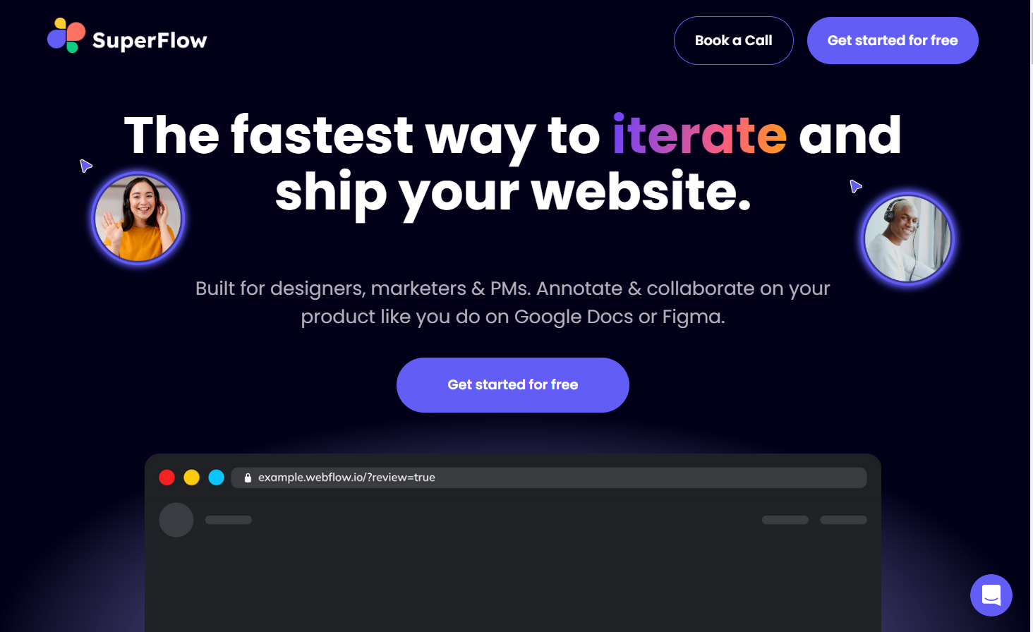
SuperFlow is a startup that makes a plugin allowing designers to collaborate and test ideas quickly, which means they can go through iteration cycles faster. The designer of the SuperFlow site chose a color gradient text fill on the word “iterate,” drawing visitors to the one word that best sums up the value the company offers to customers.
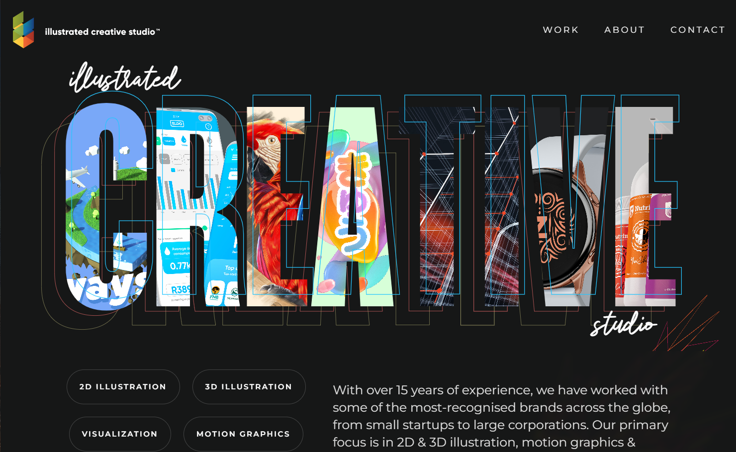
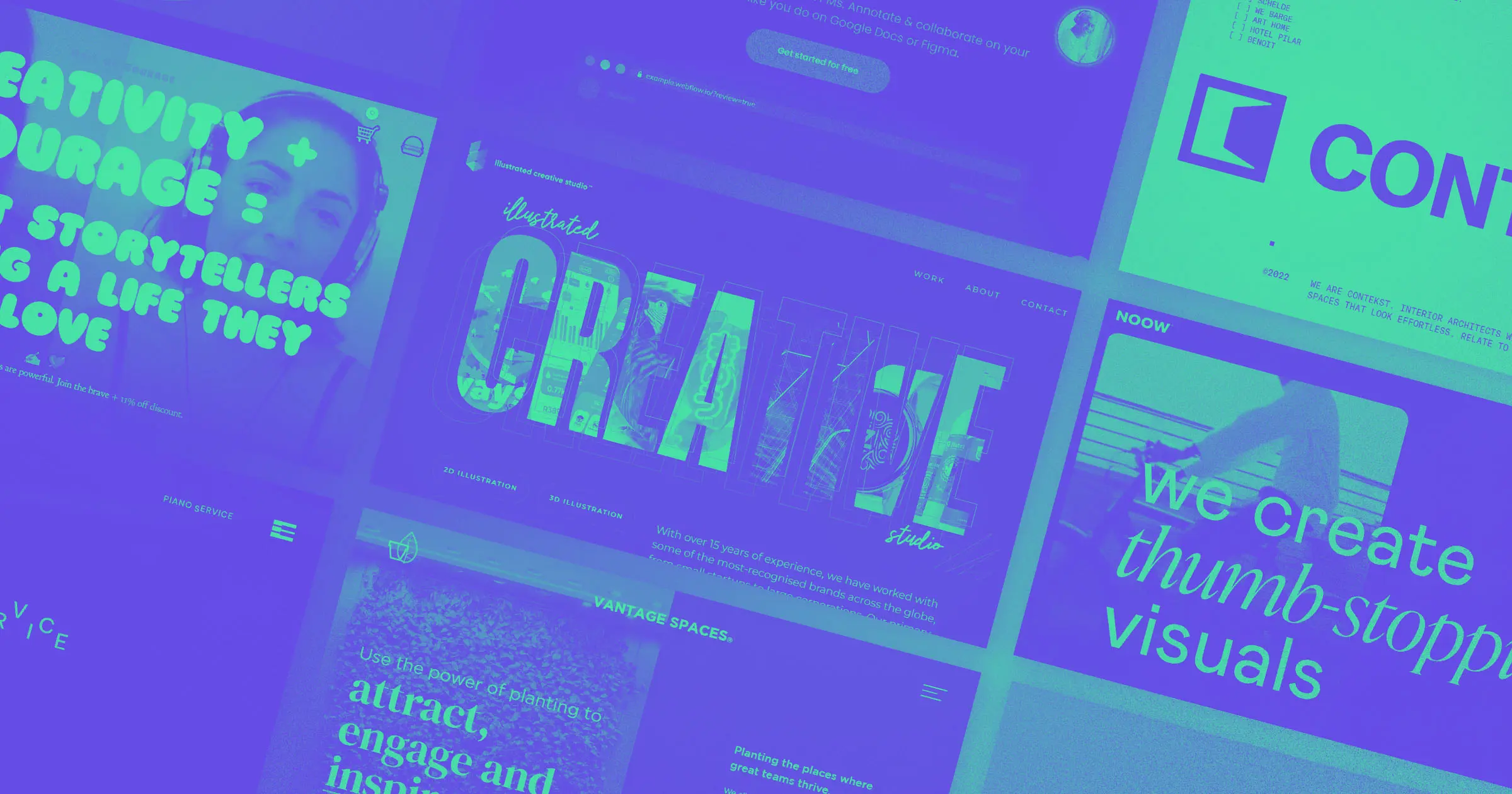
South African design, motion graphics, and illustration firm Illustrated Creative Studio shows off its lively style by using a different image text fill for each letter of the word “creative.”
The designer, Modisana Hlomuka, uses five different fonts — disregarding standard web typography rules, which say you should use three at most — without making the site too busy, as they’re all set against a plain black background. They chose cursive typeface Winlove for section headers, Mango Grotesque bold and semibold for headings, Montserrat semibold for menu and button text, and Montserrat regular for paragraph text, creating a pleasantly eclectic effect.
But text fills and multiple fonts aren’t just a lively design choice. They also draw attention to important elements of the site. Modisana surrounded basic fonts with busier content, making them appear more readable amongst the noise. Because visitors need to know about the company and how to get in touch, using streamlined fonts for information like the biography and menu assists that process.
3. Combine different fonts for emphasis
Font pairing isn’t just about distinguishing headings and text. You can also pair different fonts to direct readers’ attention to keywords and buttons on your site.
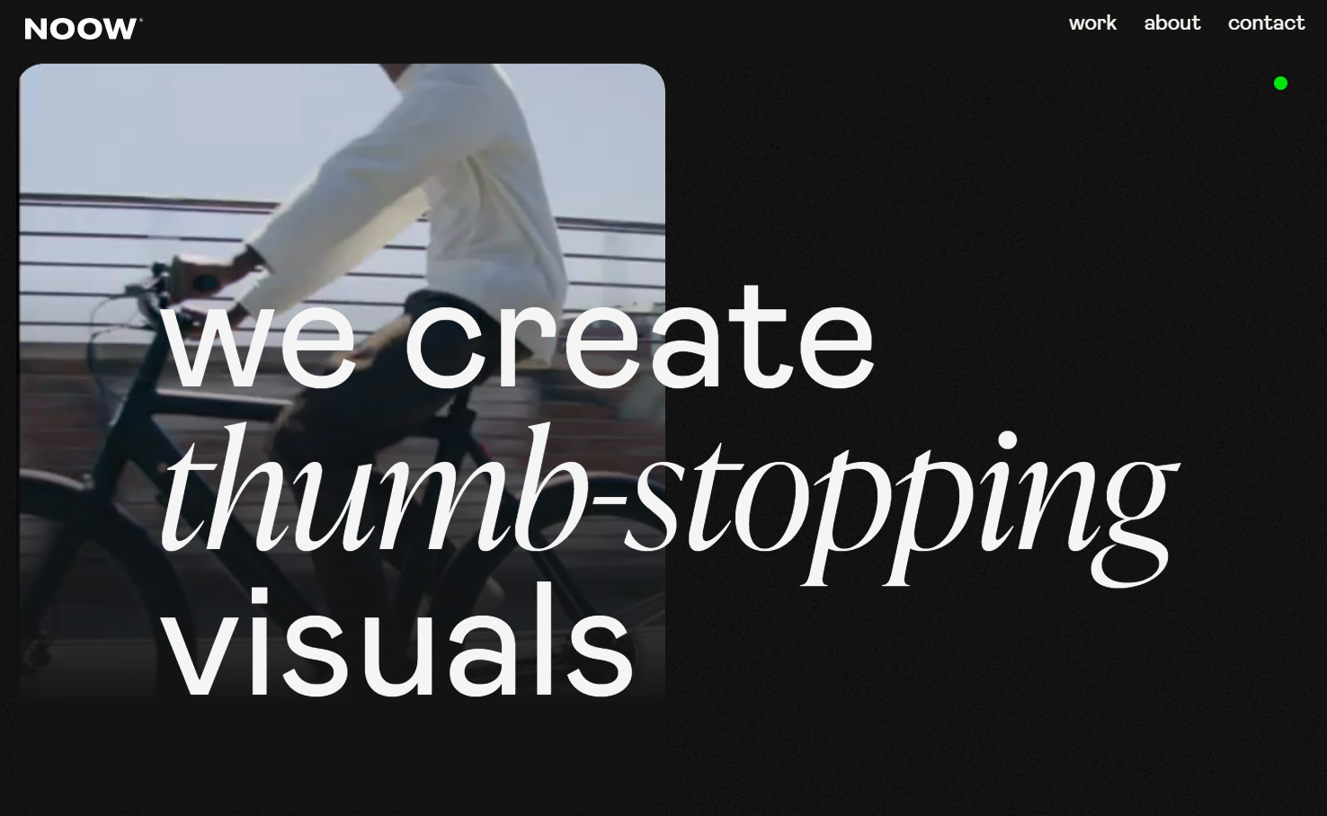
Creative production studio Noow Design’s site combines two web fonts: sans serif Mabry and elegant serif font Ivy Presto Display. This combination maintains visual interest while making sure the majority of the text (in Mabry) is highly legible and the keywords (in Ivy Presto Display) stand out.
They’ve perfectly balanced clarity with uniqueness here, telling the brand’s story with a beautiful image and a headline that describes what they offer while keeping the menu legible and noticeable in white against a black background.


The modern web design process
Discover the processes and tools behind high-performing websites in this free ebook.
4. Try a monospaced font
Most fonts are “proportional” — their letters have different widths. But in monospaced fonts, such as Courier and Lucida Console, all letters have the same width.
Programmers often use monospaced fonts because computers don’t read code the same way humans read text. Most people skim when reading, gaining meaning from the text with a glance. But code is a set of instructions for computers, and one misplaced character or illegible word means the computer won't follow each step properly. For viewers, monospaced fonts lend a brutalist feel that’s perfect for tech websites. They're also more legible than proportional fonts, making them more accessible for people with dyslexia.
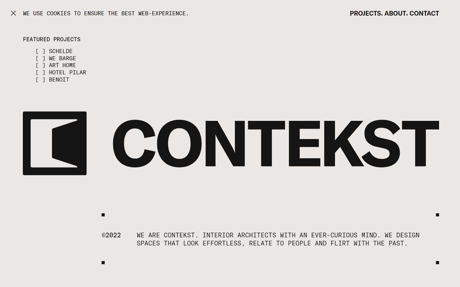
The website of interior architecture firm Contekst uses GT America Mono and whitespace to give its site a brutalist feel to connect the design with their profession. And while this helps us experience the brand, site designer Phil Bastiaans prioritized readability by pairing all-caps text with a monospaced font.
5. Use highlights and underlines
Highlights and underlines can draw visitors’ eyes to certain words. Webflow allows you to create highlight, underline, and strikethrough effects to draw attention to certain elements.
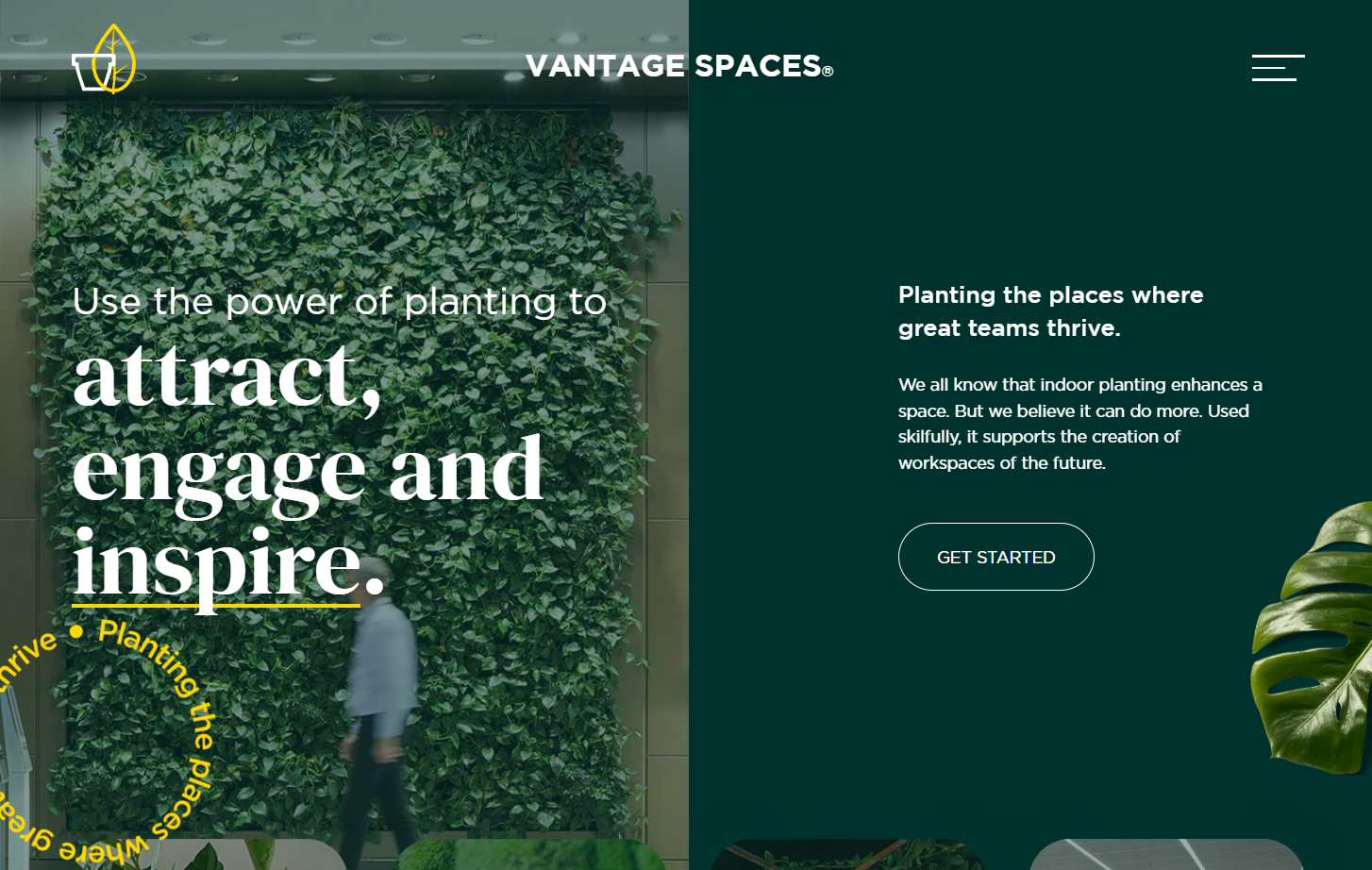
The website for interior garden design firm Vantage Spaces uses yellow underlines to stress the most important words in each section of the site. This adds visual interest and directs visitors to a critical company goal: encouraging customers to inquire about its indoor planting designs.
The designer, Influx, also adds visual interest by using font in a non-traditional way: “Planting the places where great teams thrive” rotates in a circle above the fold. This text strengthens the site’s brand presence, and the strategically chosen yellow font color ties it into the underlines.
6. Dare to be different
Most web designers avoid fringe fonts like graffiti, bubble, and script because if they aren’t used thoughtfully, they can present accessibility challenges or seem unprofessional.
However, while these fonts aren’t suitable for paragraph text, using them as display fonts is a great way to capture a lively brand’s personality.
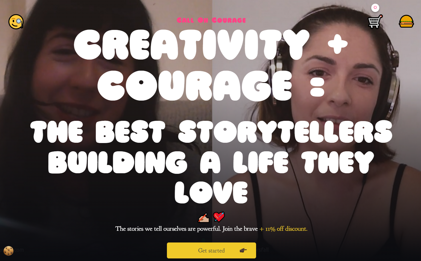
The podcast Call on Courage discusses scary career changes, rebuilding your life after a serious illness, and other ways of starting fresh. The bubble font Ziclets gives the site an inviting feel, especially atop the podcast host and guest’s smiling faces.
The designer, Rachael, also chose entertaining emojis for cookies, search, and the hamburger menu that add to the site’s approachable and fun feel.
7. Try out text animations
Text animations add playfulness to a site. There’s lots of variety in animations, including text reveals, interactive animations, and animated gradient text that changes color over time.
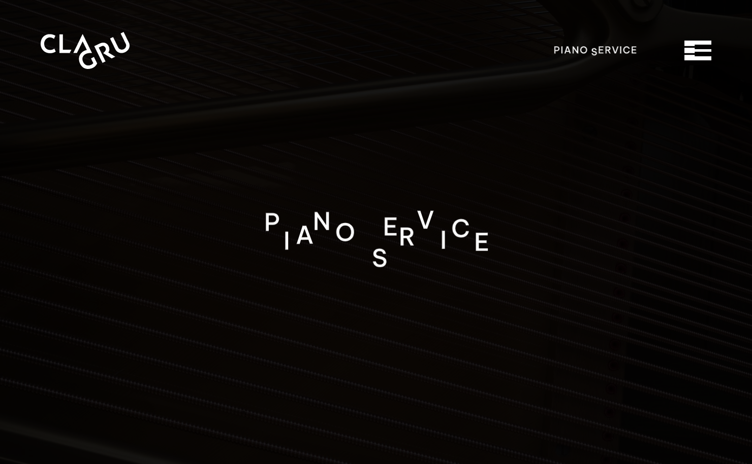
The designer for Clagru Piano Service’s site, Roland Aichhorn, chose to highlight two fun text animations on the homepage: The letters of the central text “piano service” separate and cluster back together. In the top right, the same words are animated with one letter at a time moving down and up as though someone’s pressing piano keys. These effects, along with the delightful piano-themed hamburger menu, engage visitors and encourage them to present a strong brand identity. This is a great way to add visual interest without adding clutter so visitors stay interested and can find the information they’re looking for.
It’s important to note that animations can become distracting, so consider setting them to stop after 2-3 loops or use a custom code workaround for people who’ve disabled animations in their web browser.
Play around with Webflow’s typography tools
To bring your fonts to life, try a font generator tool (like Webflow's font tool) or check out the best places for free fonts. And if you find another website with the perfect font, use typography tools to figure out what it is, pair it with another font, and arrange it into a visual hierarchy.

Get started for free
Create custom, scalable websites — without writing code. Start building in Webflow.
