

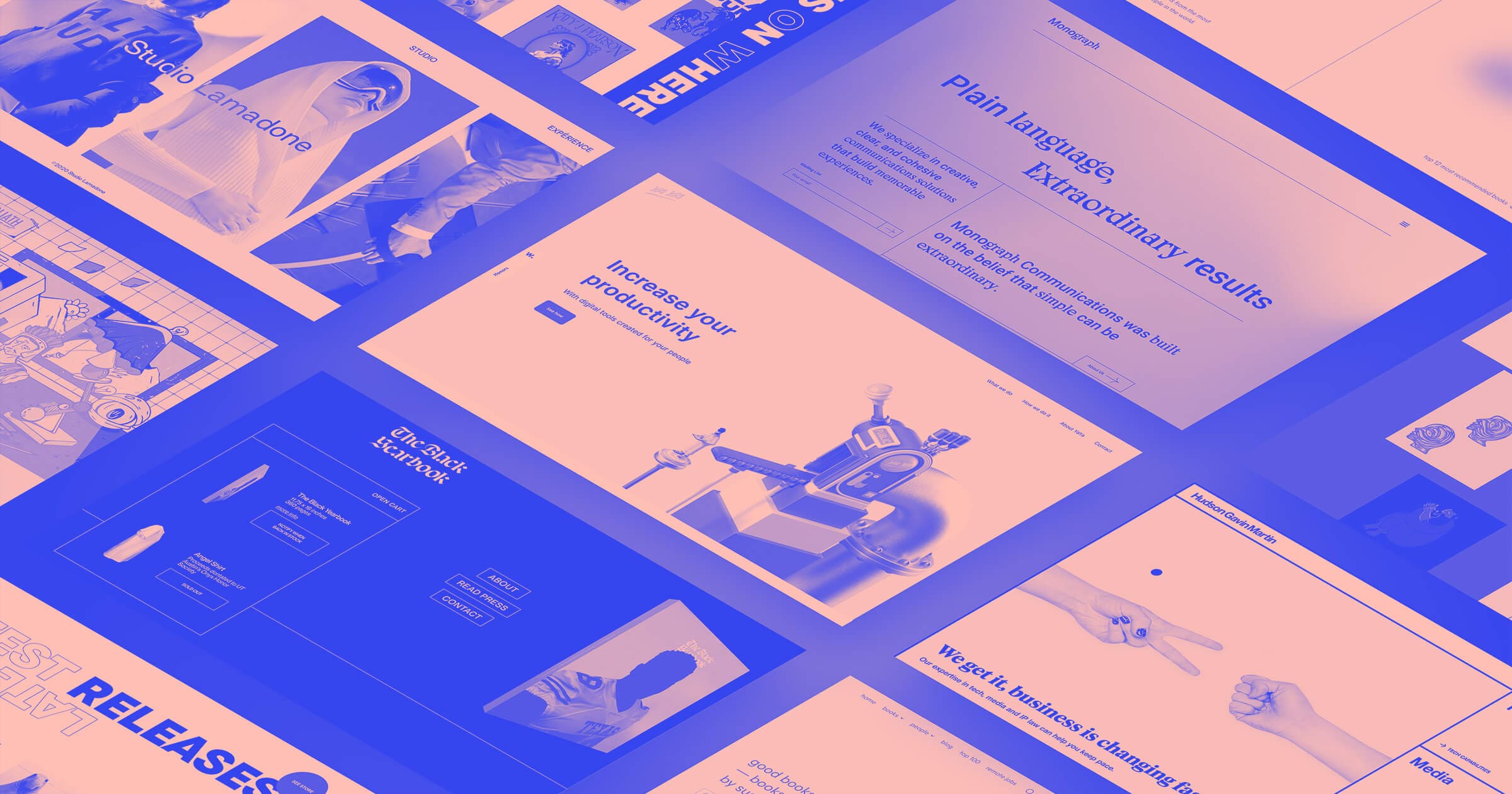
Webflow’s passionate design community inspires us every day. And these 10 websites show the amazing range of what you can do.
10. Solar Wars by Vincent Bidaux
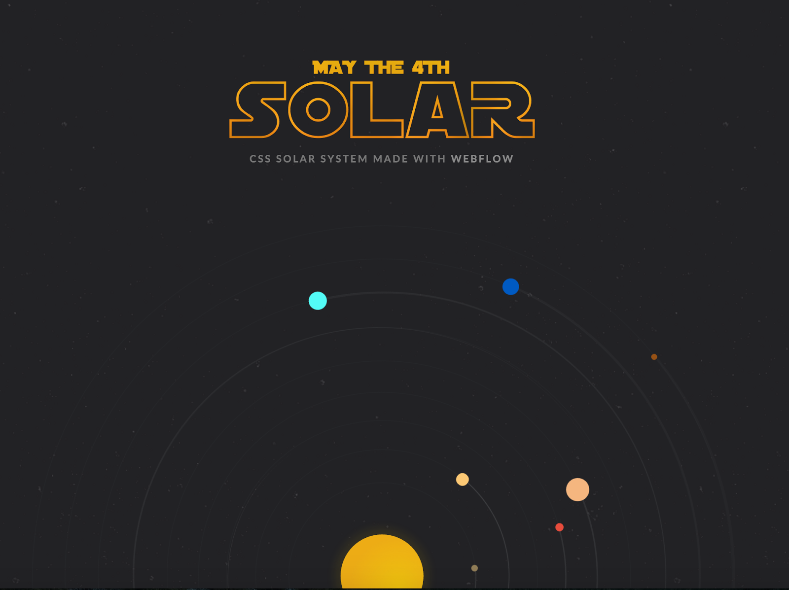
Vincent Bidaux’s Solar Wars offers a quiet, but eye-popping, example of what you can do with CSS and animations in Webflow.
Want to know how he pulled it off? Clone it in Webflow and dig in!
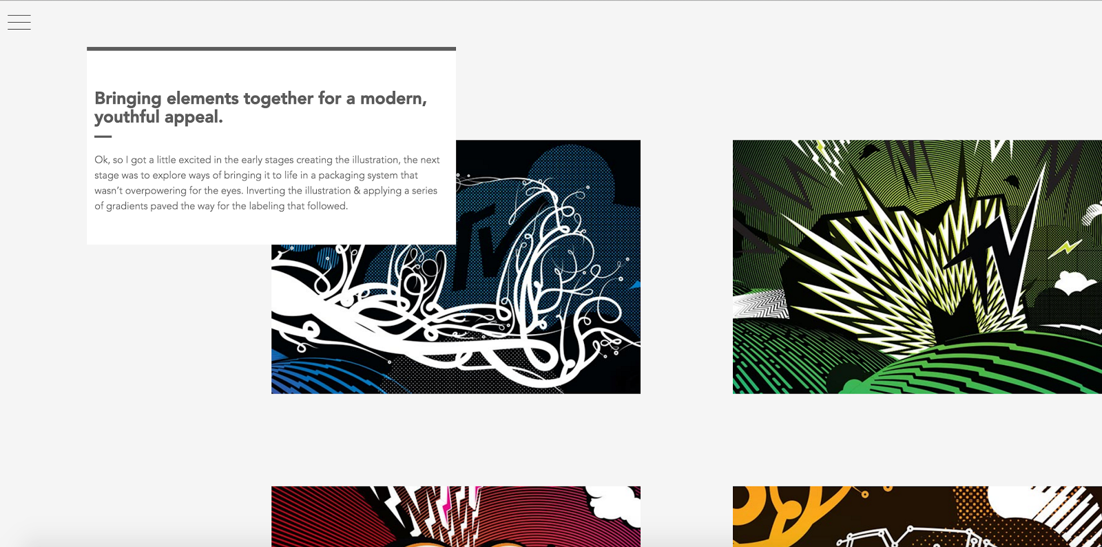
9. Douglas Pinho’s Portfolio

Douglas Pinho’s gorgeous portfolio greets you with a full-screen black-and-white photo and some rotating text that introduces his skillset. I personally love the giant portrait — which persists as you scroll through the site — because of how it humanizes the site, never letting you forget there’s a person behind this code.
I’m also a big fan of Douglas’ project section, which really digs into all the meticulously detailed work it takes to build a robust, on-brand website.
8. UNIQLO Responsive Experiment by Timothy Noah
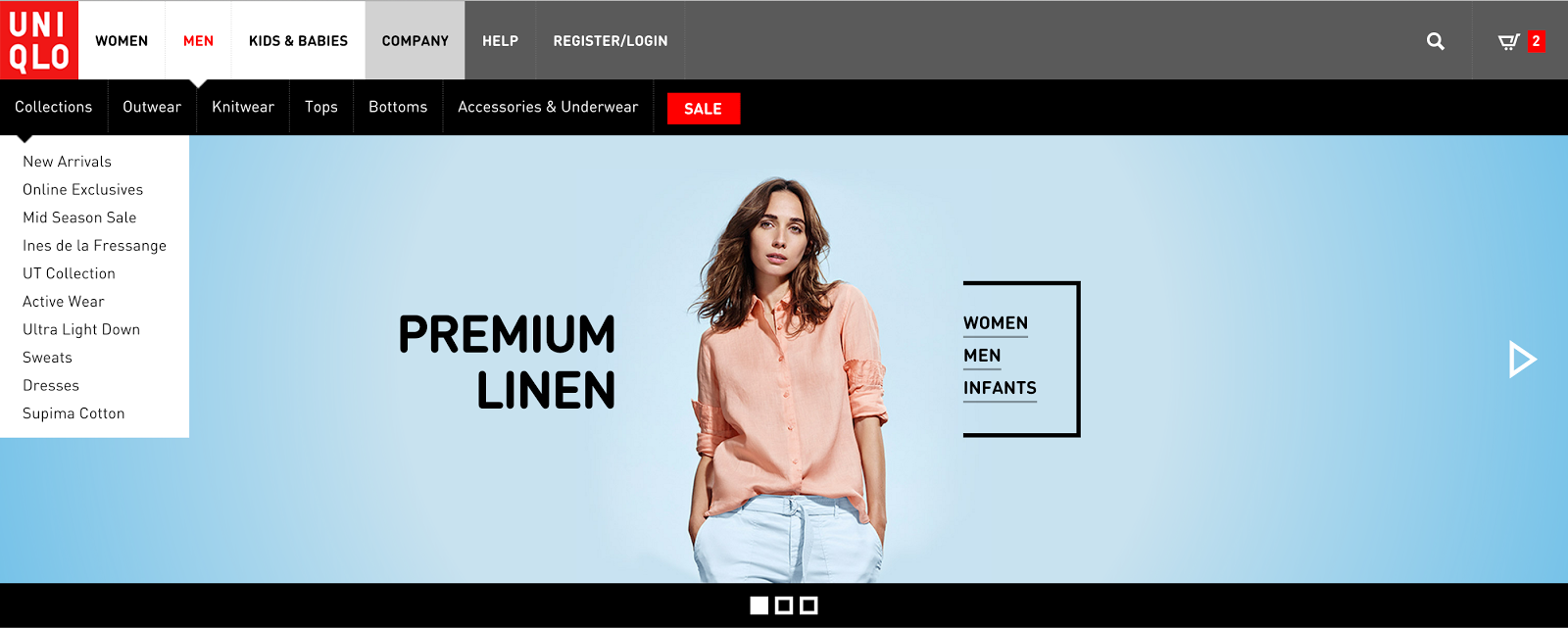
England-based designer Timothy Noah has done a ton of amazing work with Webflow, ranging from his handy UI kits Slinkey and Leafee to the free Foundation template. But he’s really hit his stride with this responsive redesign of UNIQLO’s site (which is in no way affiliated with UNIQLO).
I’m into the persistent multi-level nav menu, which lets you find just the product you’re looking for without navigating all over the site. And it expands on click, not hover, so it’s easier to use on desktop and works just as well on mobile.
But I may like the nicely visual shopping cart even better, which again saves you clicks by showing you what you’ve already picked without going to a new page.
Very nice, very mobile-friendly, work, Tim!
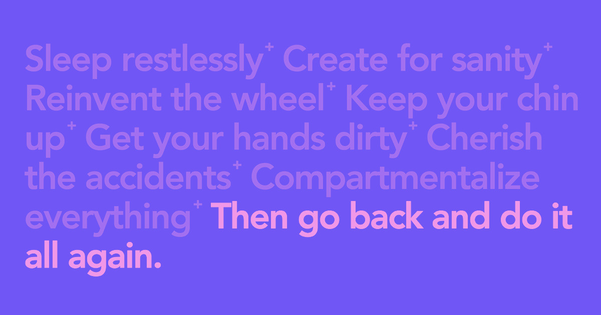
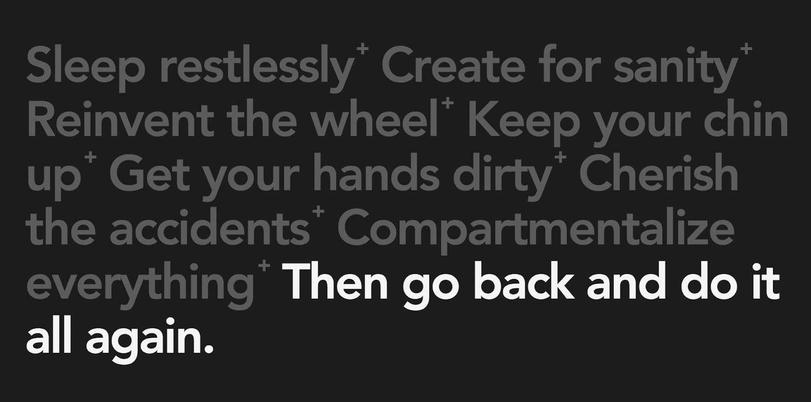
7. moreofthesame by Shane Hurt
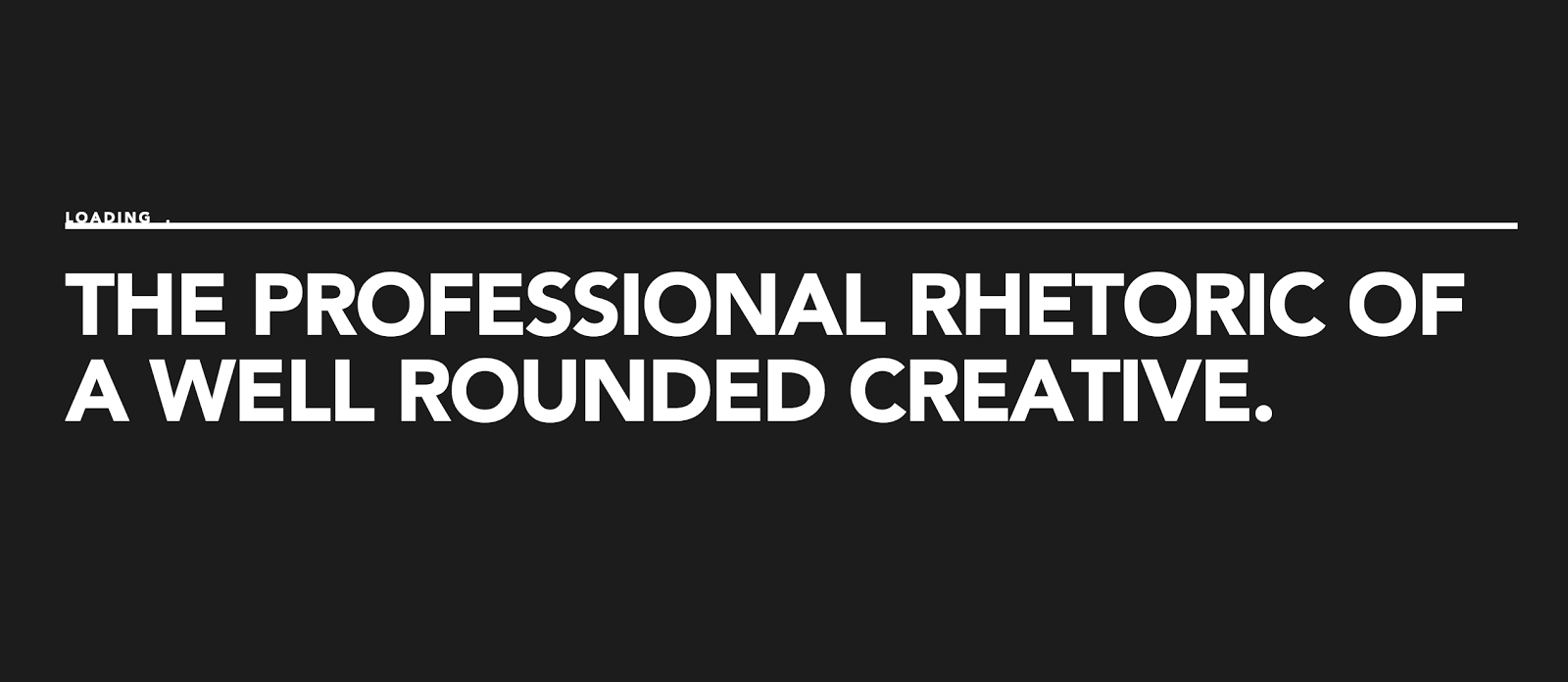
Okay, so no one wants to pull up a site only to see that dreaded word: Loading ...
Thankfully, Shane Hurt makes good use of moreofthesame's loading screens by by presenting us with a series of pithy, memorable lines of copy. Plus, once you start scrolling, you’ll find it was worth the wait.
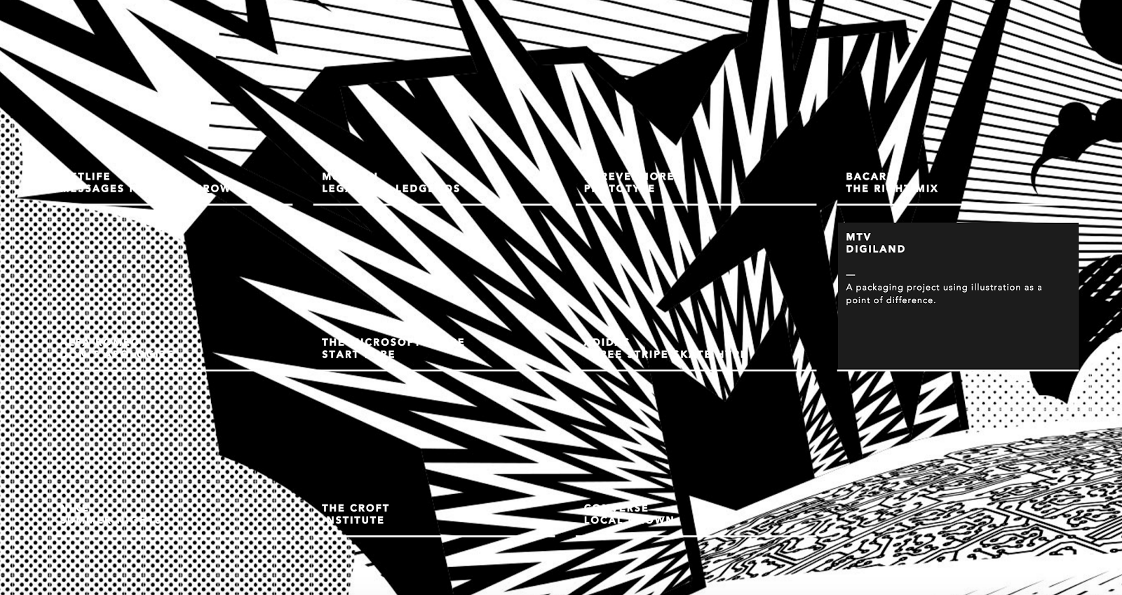
There, an understated list of projects (for some big-name clients) explodes into vivid, fullscreen-images on hover, teasing the next page’s content. It’s a creative and immersive choice that really focuses you on what you’re doing, but does interfere with your ability to read other link text.
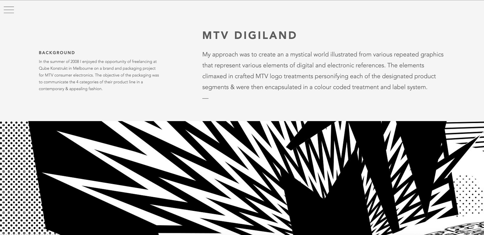
Once you pick a project, you’re greeted by a beautiful intro that nicely inverts the (Medium-reinforced) trend of massive, context-less hero images. Then, as you scroll down the page, sticky blocks of concise but useful content scroll with you, contextualizing the background images and creating a really unique layout.
Shane also makes creative use of CSS cursors by changing yours to a downward-pointing arrow, subtly encouraging you to keep exploring.
6. R.V. Krishna’s portfolio

R.V. Krishna’s portfolio site wins with clarity — as you can see in his site’s hero section, which immediately tells you what he does. It’s not the most motivating copy in the world, but with 5 simple words, you’ve already learned a lot about him.
Possibly my favorite detail of this site is the infographic-like experience section, where R.V. clearly communicates both his responsibilities and skills with animated bar graphs. Not the kind of thing you want on a resume, but for the web, it’s just about perfect.
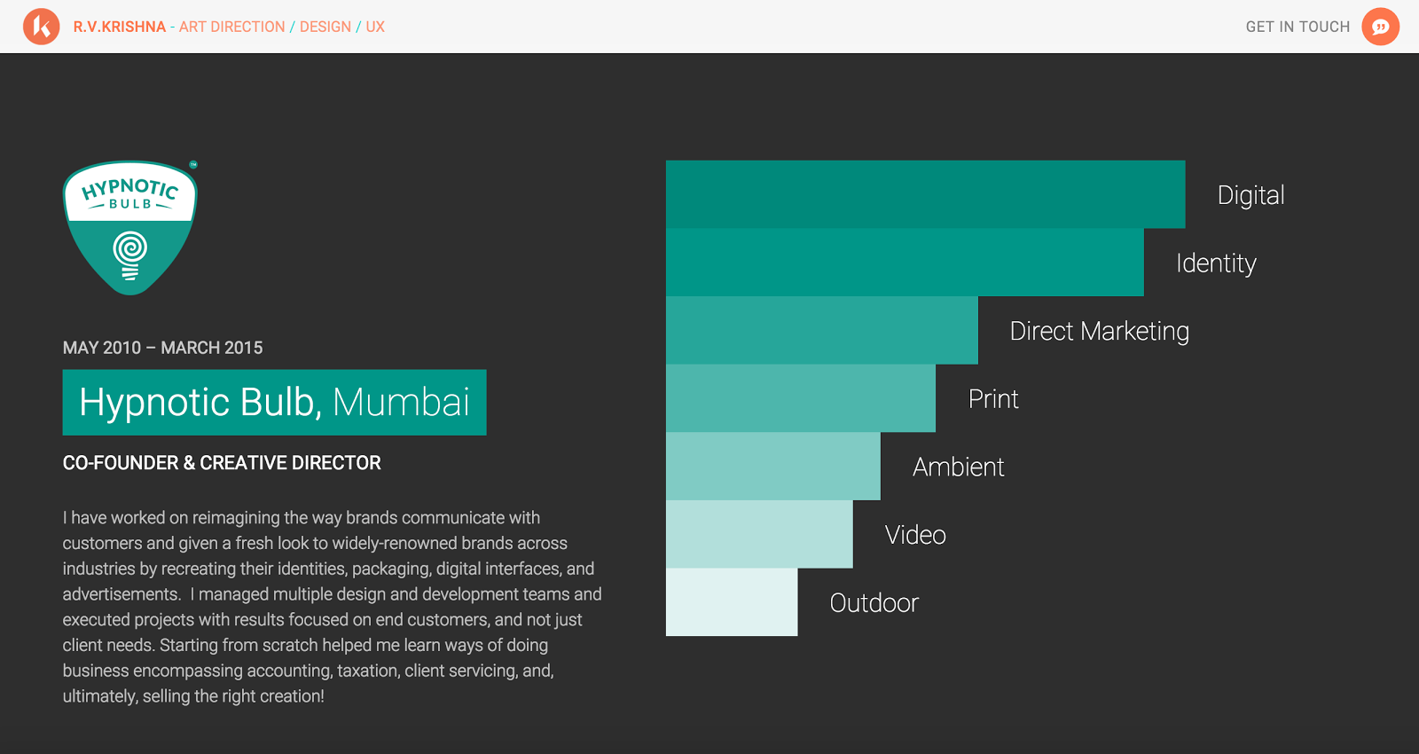
R.V. also shows admirable restraint with his typography, which sticks to various weights of Google’s humanist-grotesque Roboto.
5. Color Theory by Taylor Poe

While making your users wait is never something you want to do lightly, Taylor Poe's Color Theory greets you with a beautiful intro animation that does a great job of visually setting up the agency’s story.
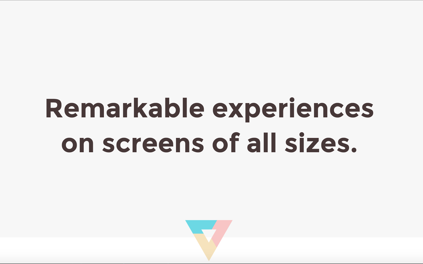
When the animation’s done, it slides up to reveal the tagline, delivering on the intro’s promise. Then the narrative flow continues as the colorful triangle first indicates “scroll down,” then animates to take a place in the design.
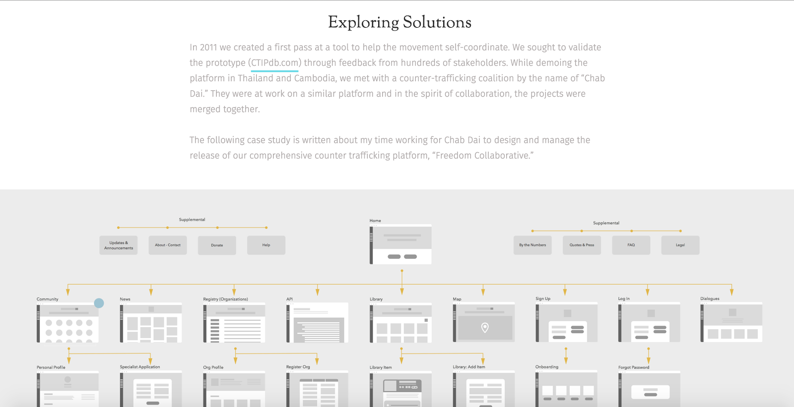
While the site’s typography gets a little busy at times (featuring Sorts Mill Goudy, Montserrat, and Fira Sans), the case study pages settle down to a calm combo of Goudy headers and Fira body copy. These pages also break up the copy with illuminating looks at process deliverables (like the sitemap below).
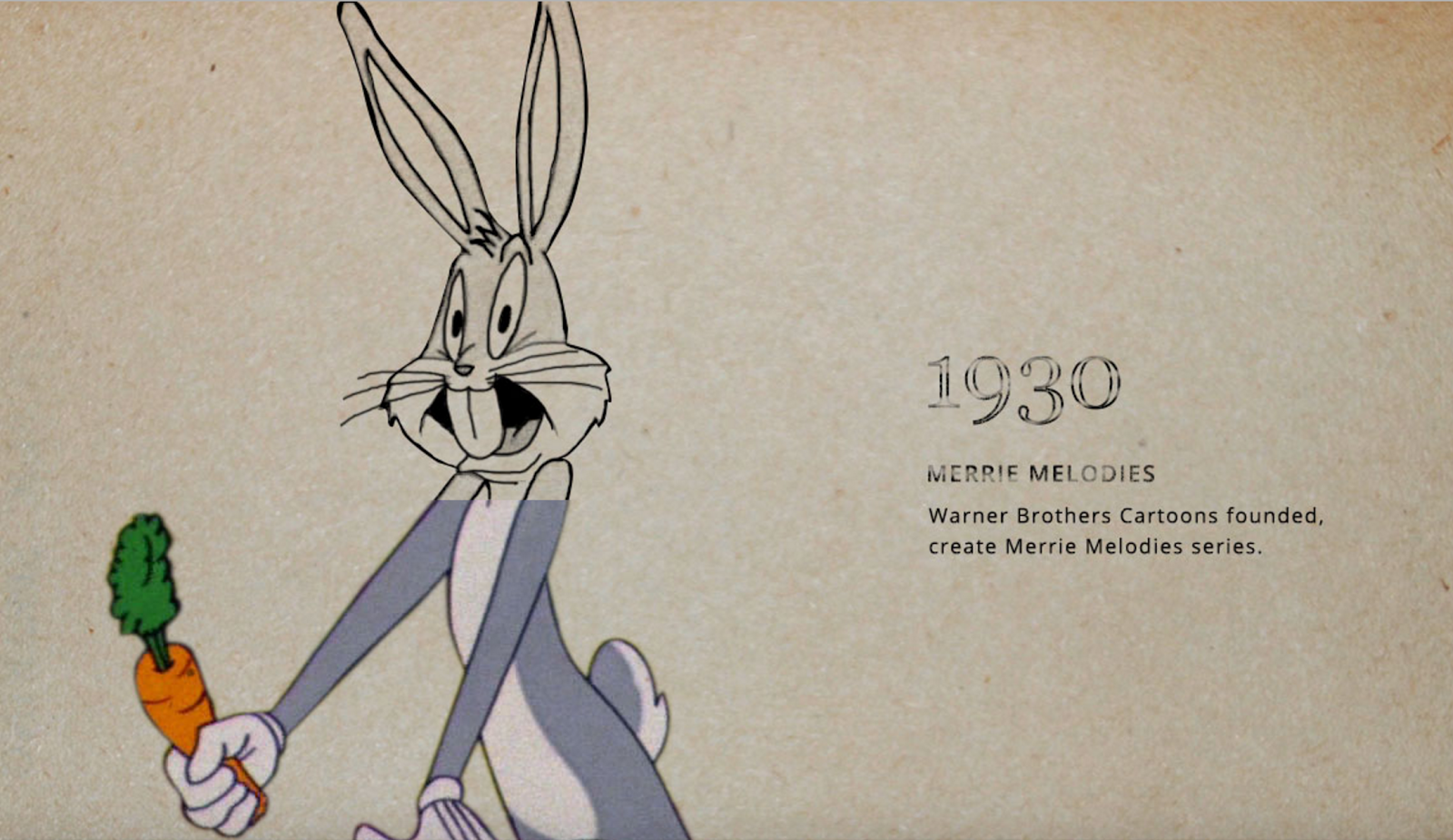
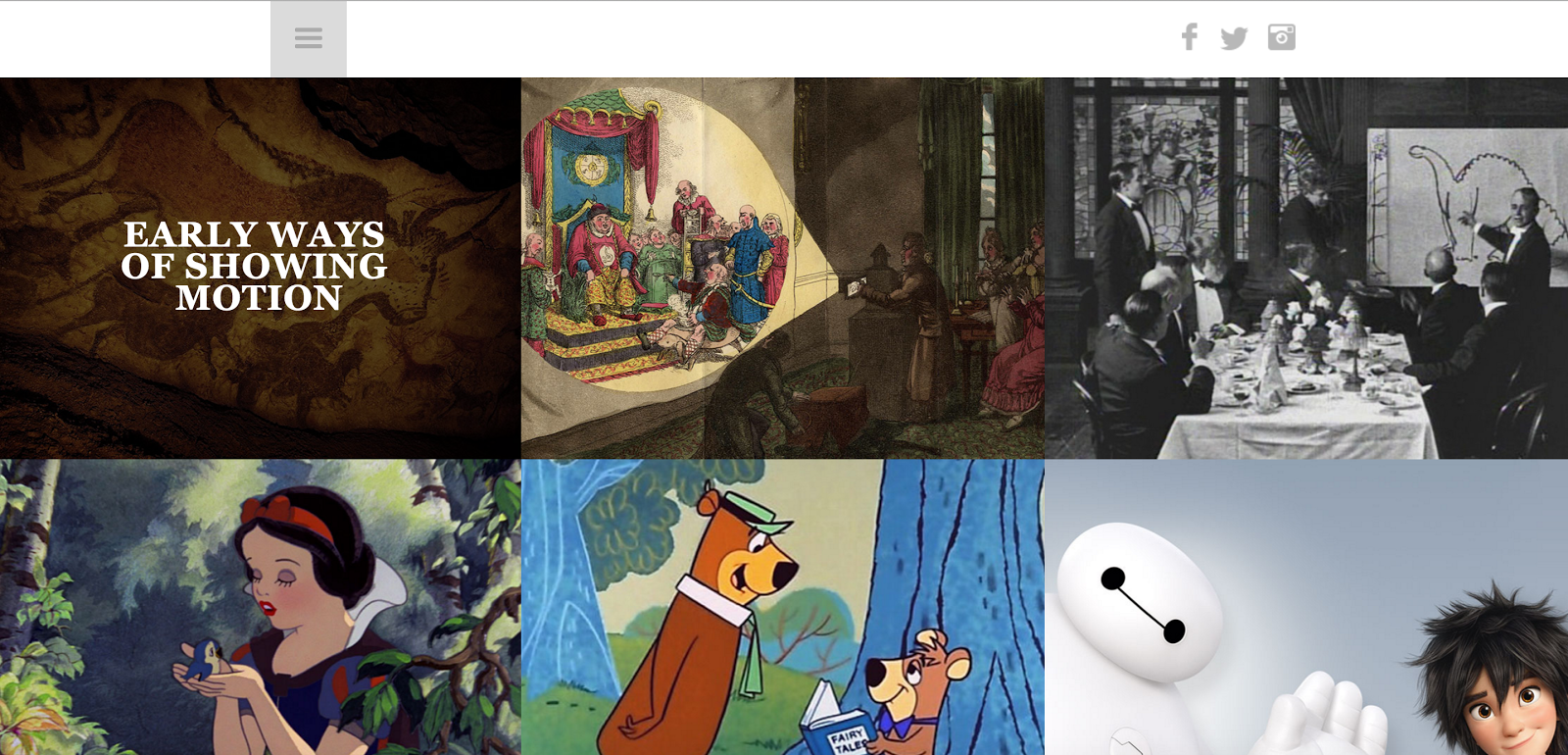
4. History of Animation by Hung Vinh
Hung Vinh’s engaging History of Animation offers a dynamic overview of animation’s development through time. It’s the sort of site you just want to scroll through in search of beautiful details, and Vinh makes sure to reward your effort.
I’m a type nut, so my favorite aspect of the design is the careful combo of Georgia for headings and Open Sans for body copy. There’s no denying that these are two of the most widely used fonts on the web, but they somehow come across as fresh here.
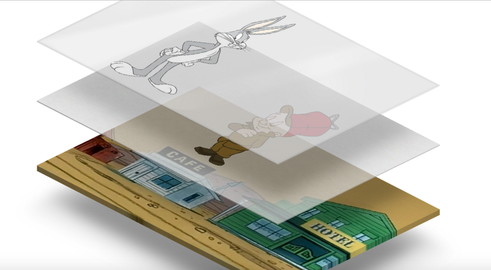
Vinh also makes creative use of a common design technique (isometric layered design elements) to communicate an important fact about how classic animation works — the overlaying of cells to build complex scenes.
I’ve also got to call out the site’s unique take on the mega-menu, which presents page sections with a grid of associated images. Not sure why the section titles only show up on hover, but it’s a creative menu.
3. Creative Agency Template by Evan Jones
Evan Jones’ Creative Agency Template presents a one-page agency website, with appropriately pithy headlines and subheads.
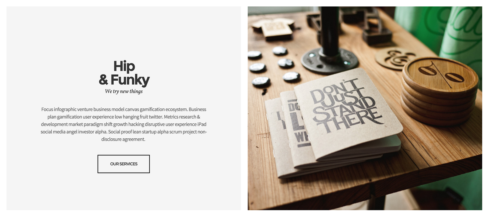
While we wouldn’t usually recommend animating copy much, this template’s animations draw you in to worthy lines you might otherwise miss. It’s an interesting technique, and might be worth playing with for important content you want noticed, like calls to action.
The template is a little typographically busy, with three different faces popping up across the site — though, to be fair, Vollkorn only shows up in those animated subheads.
2. Overton Graphics by Josh Overton

Josh Overton’s Overton Graphics is another one-pager with anchor-based navigation, though Josh has placed his navigation on the left side of the screen (a good location based on Fitts’ law). Though the icons aren’t incredibly clear, the on-hover labels add a lot of clarity.
Visually, Josh has created an interesting combination of Delaunay triangulations photos, adding a bit of character to standard graphics like an epic shot of mountains and, later, a laptop.

I’m also a fan of form fields’ subtly colorful active state, and smart use of labeled icons to replace a dropdown of options.
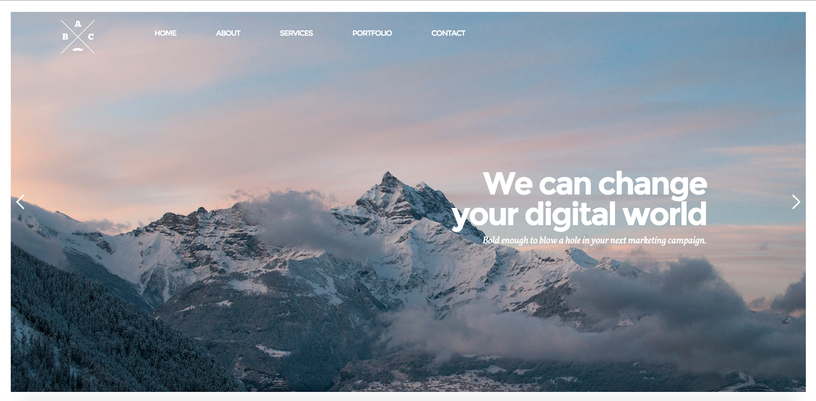
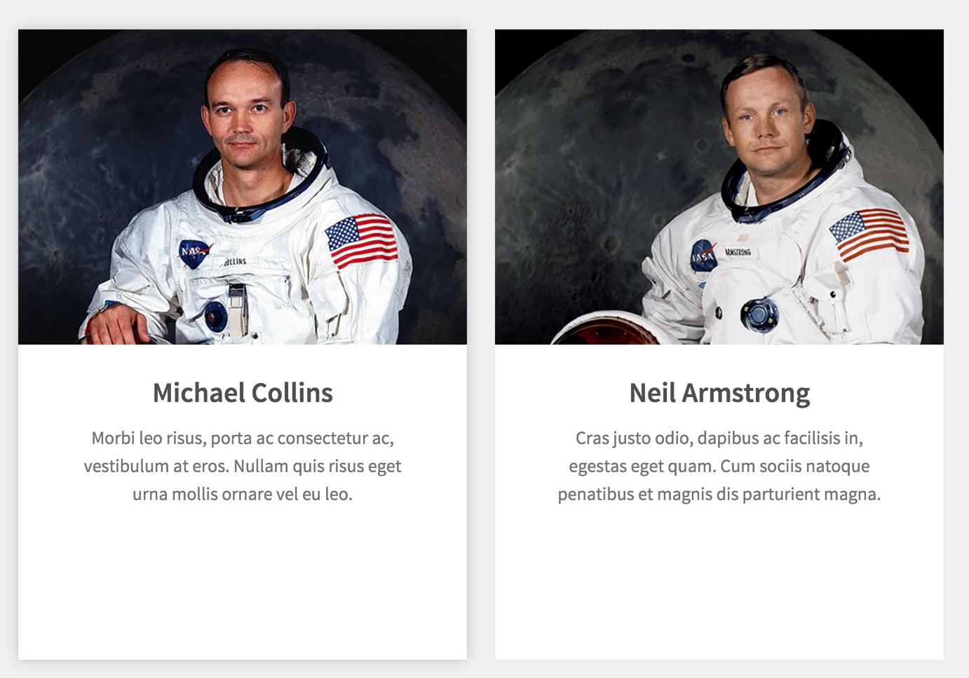
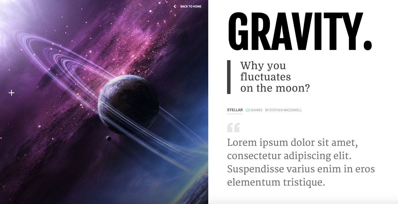
1. Geospace by João Paulo Teixeira
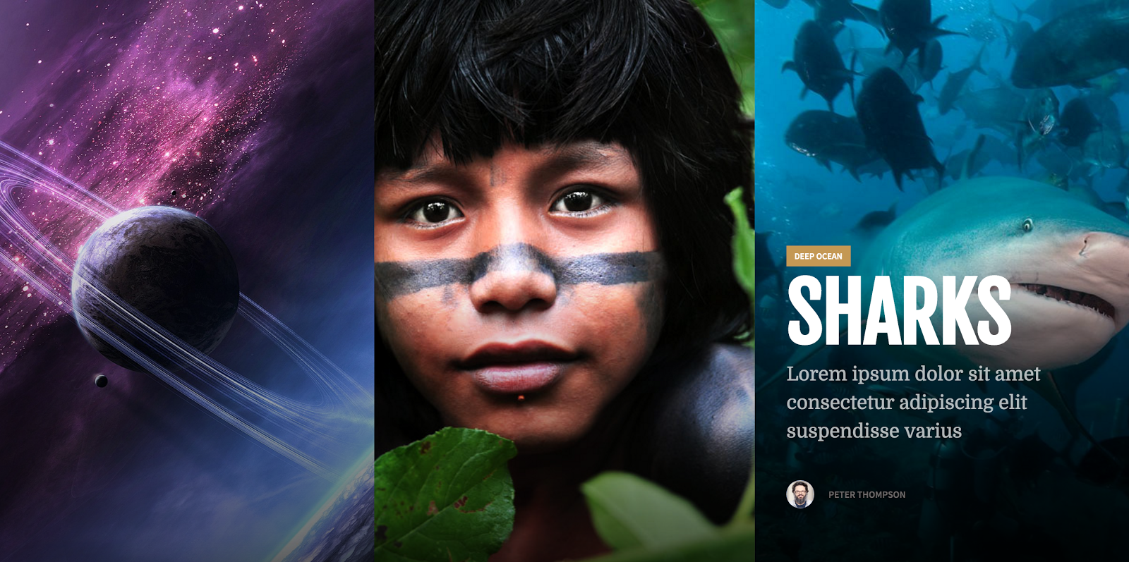
João Paulo Teixeira’s Geospace offers an inspiring example of how a content-focused site might be done a little differently than your average vertical list or grid. Here, articles are listed horizontally, with big, dramatic photos.
The equally bold typography feels like something you’d see in a magazine, though I have to wonder why the article titles only appear on hover on the homepage.
Once you click into an article, content slides in from the left or right. As you scroll through content, the article’s cover photo stays fixed, while the content pane reveals tons of beautiful design elements like related videos, comments, articles, and callouts.
What will be the top sites of 2016?
It’s up to you to decide — so be sure to share your sites in our Discover section and be sure to give your favorites a like!


Get started for free
Create custom, scalable websites — without writing code. Start building in Webflow.