


Last year, Webflow rolled out a fresh look — complete with a bold logo.
The role for our engineering, product, and design teams?
Bring that boldness to life in our core product experiences, including the user interface for the foundation of our product — the Designer.
Webflow turned ten last year. Like a community quilt, different teams had added to the brand and product over the years. The result was a rich and complex experience, warm and familiar on the one hand, but with a mash-up of design aesthetics and diverging UX patterns.
We wanted the product experience to feel both professional and delightful, and like a handcrafted experience. So, to build a more consistent and polished UI, our team put the work in and sweated the details because we know that’s what you — the freelancers, designers, visual developers, marketers, and entrepreneurs who use Webflow — do every day, too.
Wondering how we created a revamped app that’s unmistakably pro? And how we planned and executed this huge redesign and launch to 100% of our customers at the same time? Here's a peek at our process — and what we learned along the way.
Good things come from collaboration
We kicked things off at the beginning of 2023 by bringing together a team of folks from our creative, education, design systems, and product design teams to explore the future of Webflow’s new brand identity from every angle. This included everything from examining the logo, to advertising concepts, to illustrations — all the way down to the button designs. Such a wide range of exploration proved challenging at first, but the contributors’ varied viewpoints sparked new ideas.
By starting with open-ended inquiry, we opened up space to find unexpected solutions. Instead of only tackling a redesign, we considered entirely new products and features. Rather than just creating a new logo, we explored all the ways the brand might be better expressed.
For a project like this — one with many moving parts, tons of collaboration, and an unmissable deadline —we made sure we had buy-in from our leadership team from day one. During the early stages, our cross-functional team shared a video walkthrough of the latest work with all key stakeholders every Friday. After the initial exploration phase, we kicked off a focused sprint to implement the first phase of the project. During this sprint, we decided exactly what was achievable by the deadline, and which ideas had the most impact for customers.
Clearly define brand values to guide exploration
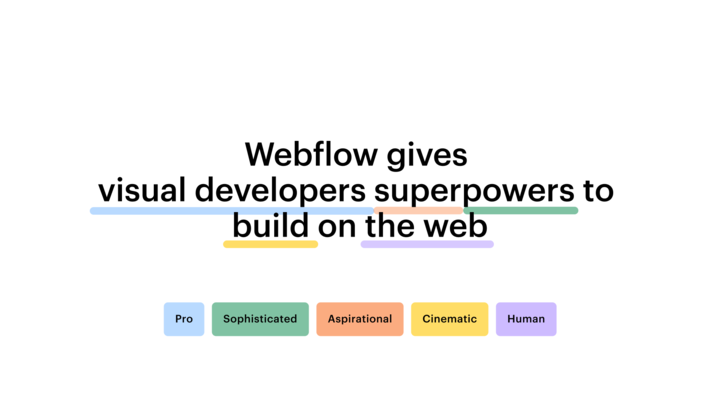
We developed four brand values at the outset to guide our brand exploration and product design direction. The principles we landed on are “cinematic,” “sophisticated,” “aspirational,” and “pro.” The cinematic came through most strongly in the updated product designs, with dramatic lighting, engaging camera angles, and thoughtful compositions.
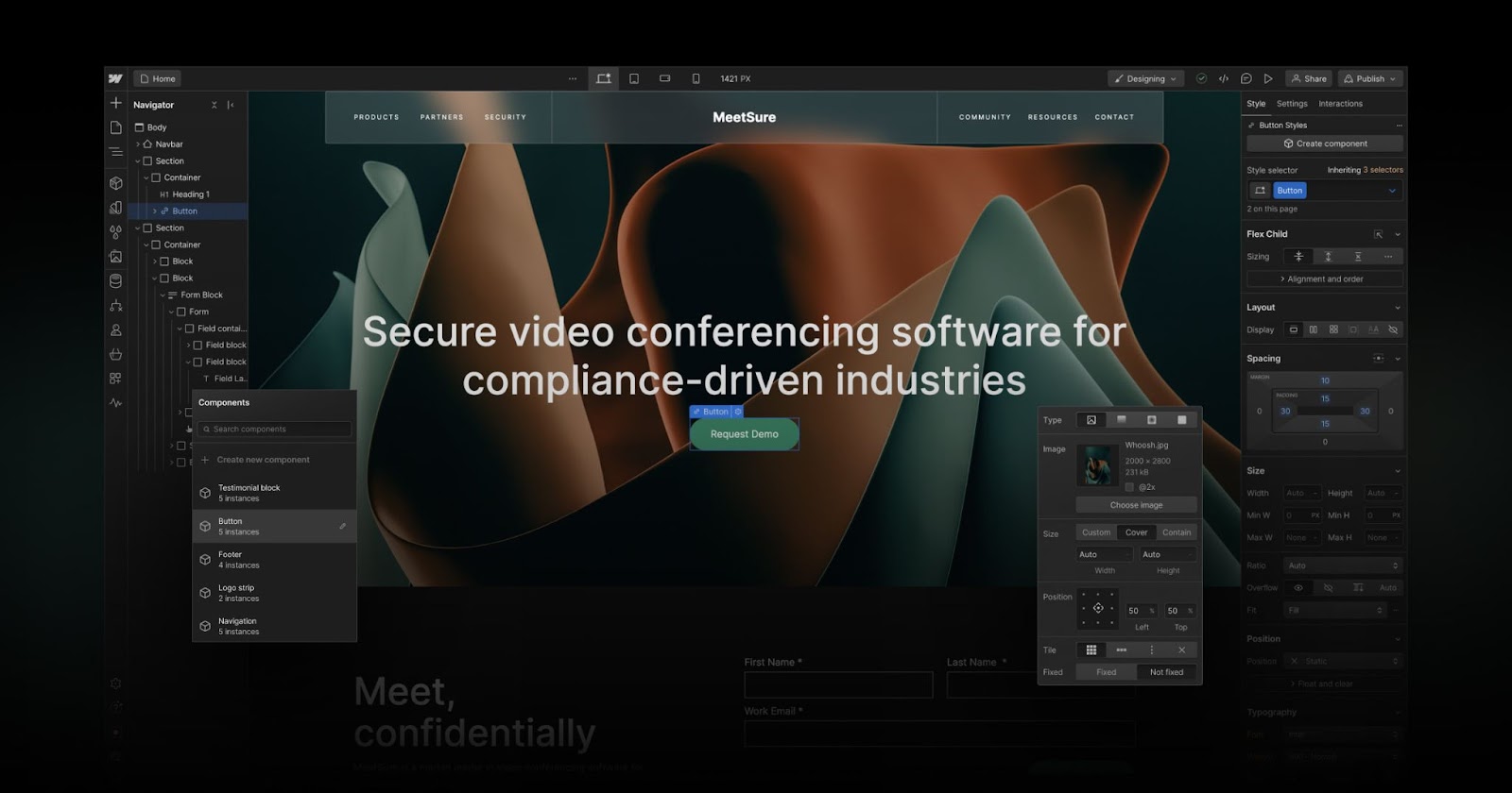
Taking cues from the aesthetics of neomorphism, we steered clear of purely flat visuals and added a sense of depth, materiality, and substance. The Webflow Designer app, loaded with dense interface controls, needed a simple design, but with very clear guidelines to help users intuitively and efficiently understand how to navigate.
We also looked outside of traditional SaaS software for inspiration. Products such as Cinema 4D and Unity, for example, are ultra-powerful professional tools that offer enormous amounts of control with dense yet legible designs.
To improve user experience, tap into valuable customer feedback
Our customers played an essential part in the process. We tested early concepts and significant user-experience changes with new and experienced Webflow community members. Customers in this early testing group even used Chrome Dev Tools to adjust the design and provide direct suggestions for improvement.
As a result, we learned that some of our new ideas needed tweaks, and we iterated to get them right. For example, in response to feedback from early testers, we adjusted type sizes to improve legibility and hierarchy in the Designer and Dashboard. When customers working in very bright environments told us that the almost-black background was too high-contrast, we made adjustments to improve the experience.
Later in the project, we formed a panel of customer experts who previewed our refreshed design. Their feedback? Pure gold. It helped us further refine our designs and squash bugs that only popped up in real-world scenarios.
We have continued to make changes based on customer feedback post-launch, too. Recently, we launched a new Appearance Settings option for better accessibility controls to help pros work comfortably under any environment. .
When engineering and design teams partner, the product wins
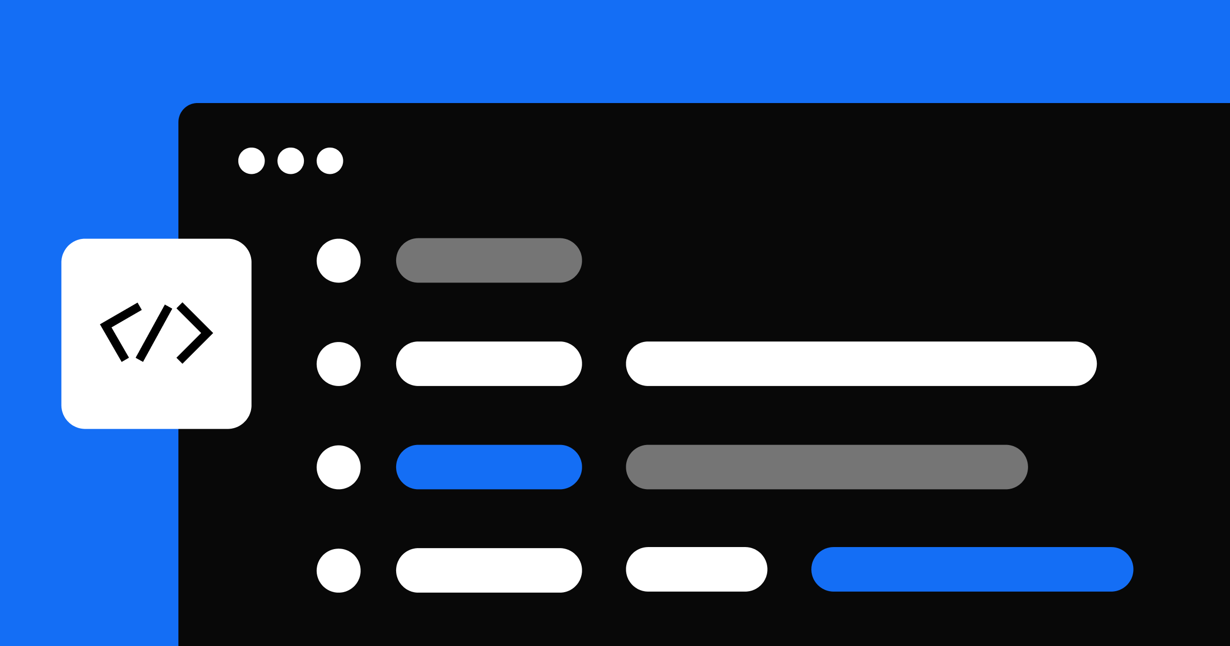
From the get-go, engineers played an integral part in the process. We made crucial structural decisions early on and gave engineers the green light to tidy up the existing code and implement styling variables throughout. This paved the way for a smooth integration of the new design token values later in the process. Our designers used Figma to build full designs for key screens, while working closely with engineers to ensure consistency and swiftly resolve edge cases.
If you’re interested in how Webflow engineers implemented some of the most complex elements of the new interface, check out lead engineer Jon Quach’s tweets, including a deep dive into how we developed the new margin and padding control as well as other lessons we learned throughout the project.
A little story behind new @webflow Margin/Padding control 🤓
— Q ✊ (@itsJonQ) October 12, 2023
A lot went into this UI. The trickiest parts... MATH for sizing and shading for colors.
Video demos a breakdown of the shading. See: https://t.co/nQs2fDEymU
See 🧵for more details... pic.twitter.com/4e4kvJKCy1
What we learned while redesigning one of Webflow’s core products
Redesigning the user interface for our Designer was a complex process. Each lesson we learned along the way will help us continue to hone our approach to innovation and collaboration:
Go big or go home.
When it's time to revamp, don't just tweak around the edges; be brave and aim high. We learned that bold moves can lead to exciting and meaningful improvements.
Teamwork makes the dream work.
Keeping a tight loop with our team members and decision-makers meant everyone stayed on the same page — and bright ideas didn't get lost in the shuffle.
Embrace the new and tweak as you go.
Stepping into something new can feel a bit awkward at first. Think of it as a fresh opportunity and a journey of learning and adapting. Stay open, embrace change, and adjust based on perceptive feedback.
Spread the excitement.
From showing off our cool design drafts to celebrating every new feature, we kept the excitement brewing and energy levels high. This helped us stay motivated and connected to our mission. We also shared community feedback along the way to connect our contributions back to the people we were designing for.
The lessons we learned will continue to shape Webflow’s future moves. The boldness of our new brand is now woven into every pixel, signifying more than just a design upgrade — it's our commitment to being unmistakably pro.