Sean Nelson, senior product designer at Hologram, took their old, complicated WordPress website and rebuilt it with Webflow. He tells us why this was necessary and how important it has been to their design process.
The internet of things, or IoT, encompasses the multitudes of devices that link into cellular networks and Wi-Fi and send out important data. Ebikes are an example of this technology — they rely on a stable way to upload who’s renting them, as well as where they’re located. Other IoT devices, such as Holter heart monitors, transmit information about someone’s health to a system where it’s collected and analyzed. A variety of companies rely on a dependable way to stay connected and transmit data from IoT devices.

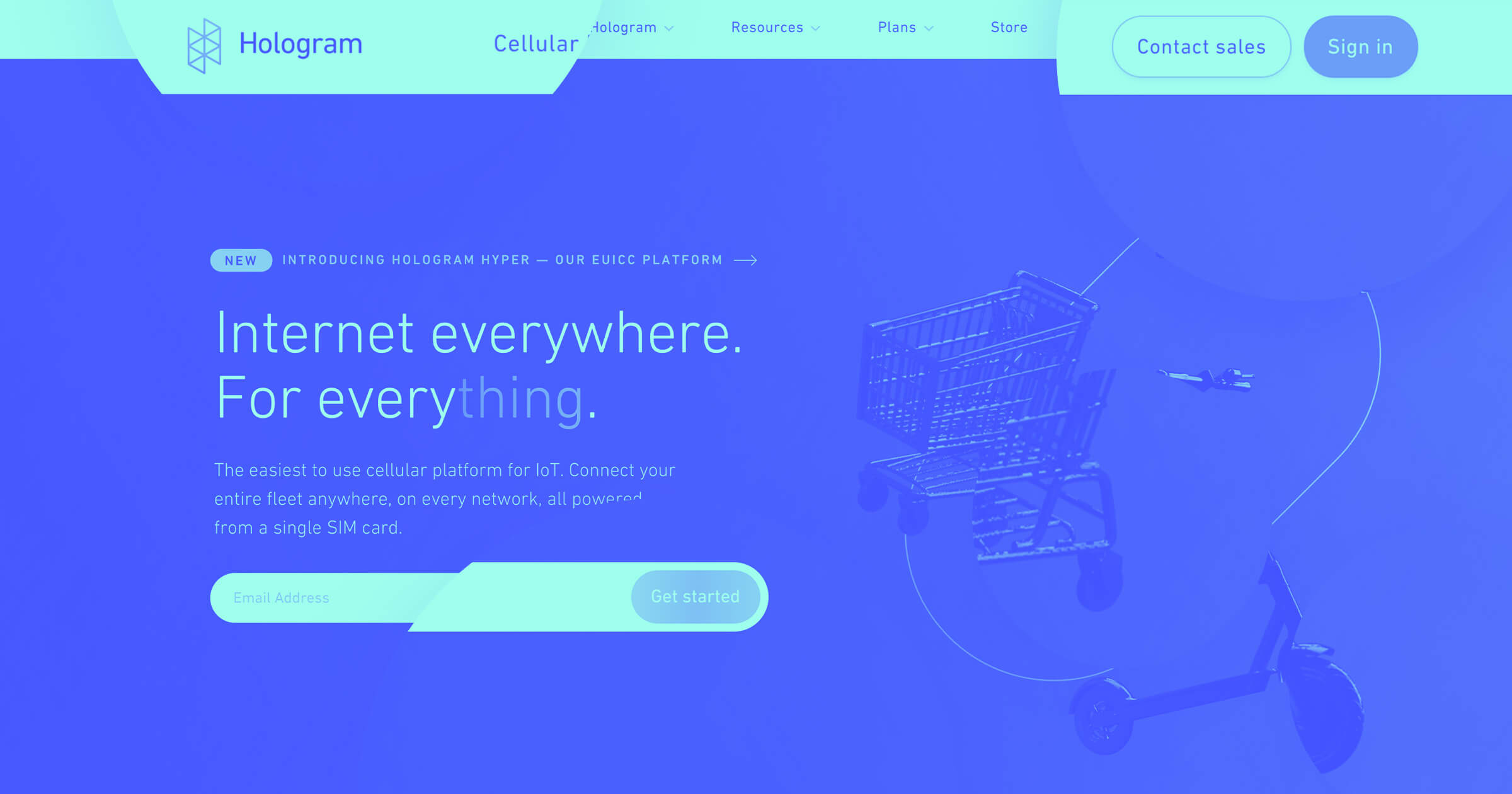
This is where Hologram comes in. They provide a global cellular network for a variety of industries so that companies’ devices will have a reliable connection no matter where they are.
We recently spoke to Sean Nelson, a senior product designer at Hologram, about how they switched from WordPress to Webflow for their Hologram website redesign.
Webflow made for faster web development
Sean has been designing long enough that whipping up a website from scratch with HTML and advanced CSS styles comes as second nature. Even for high-level designers like Sean, Webflow is a valuable tool in expediting the design process.
“I think everybody was very impressed by how quick it was to build, design, and deploy.”
— Sean Nelson
Within 90 days Hologram went from a cobbled-together WordPress site to a modern design, leaning heavily on Webflow’s built-in functionality to make it happen.
Where they started
Like any startup, Hologram was initially focused on product development. During their early days a website wasn’t exactly at the top of their list of priorities.
The original iteration was a Rube Goldberg machine-like amalgamation of WordPress and JavaScript. It worked well for the time, but the company had grown. Their marketing strategies were changing. They needed a new web design that reflected where they were headed.
“Our marketing site previously was in a very weird state. It was a hacked together front end, and nobody quite understood why it was built that way.”
— Sean Nelson
Hologram had come far from their scrappy beginnings. They needed to take another necessary step forward, and that was to completely overhaul their website.
A new marketing strategy
Hologram’s early marketing efforts were targeted at makers. Arduino hackers and other DIY electronics enthusiasts were the initial demographic for their global SIM cards.
But like any company that has gained momentum, they had come to the point where they needed to bring their products to a larger audience. This required a different way of communicating and marketing themselves. Instead of courting individual electronics tinkerers, Hologram shifted their focus to bigger enterprise companies.
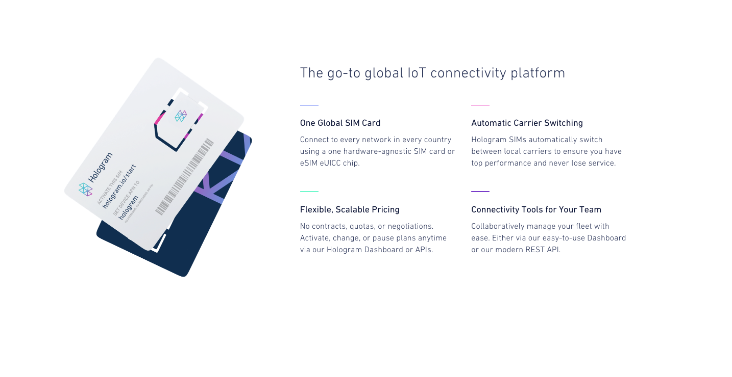
For businesses operating at these larger scales, pricing is the most important piece of information that they need to know.
“I think one of the things we learned was making this as transparent as possible, but also as predictable as possible.”
— Sean Nelson
When building their new website, the pricing pages were the first ones they tackled. Sean and his team tapped into many of the built-in features of Webflow to expedite their workflow and took advantage of Webflow’s capability to integrate custom code.
Webflow democratized Hologram’s design process
“Because our company is so collaborative, it was important that we used a tool that was easy for anyone to update — whether that's a designer spinning up a new landing page on the fly or a customer success manager updating content in the CMS."
— Amy Schwartz, Creative Director at Hologram
With this new direction, Hologram had come to the point where they needed more formal organization. Sean and three other designers joined up with the vice president of marketing Lynette Grinter, the vice president of revenue Derrick Wolbert, the vice president of design Q Carlson, and Amy Schwartz the creative director to form an official marketing team.
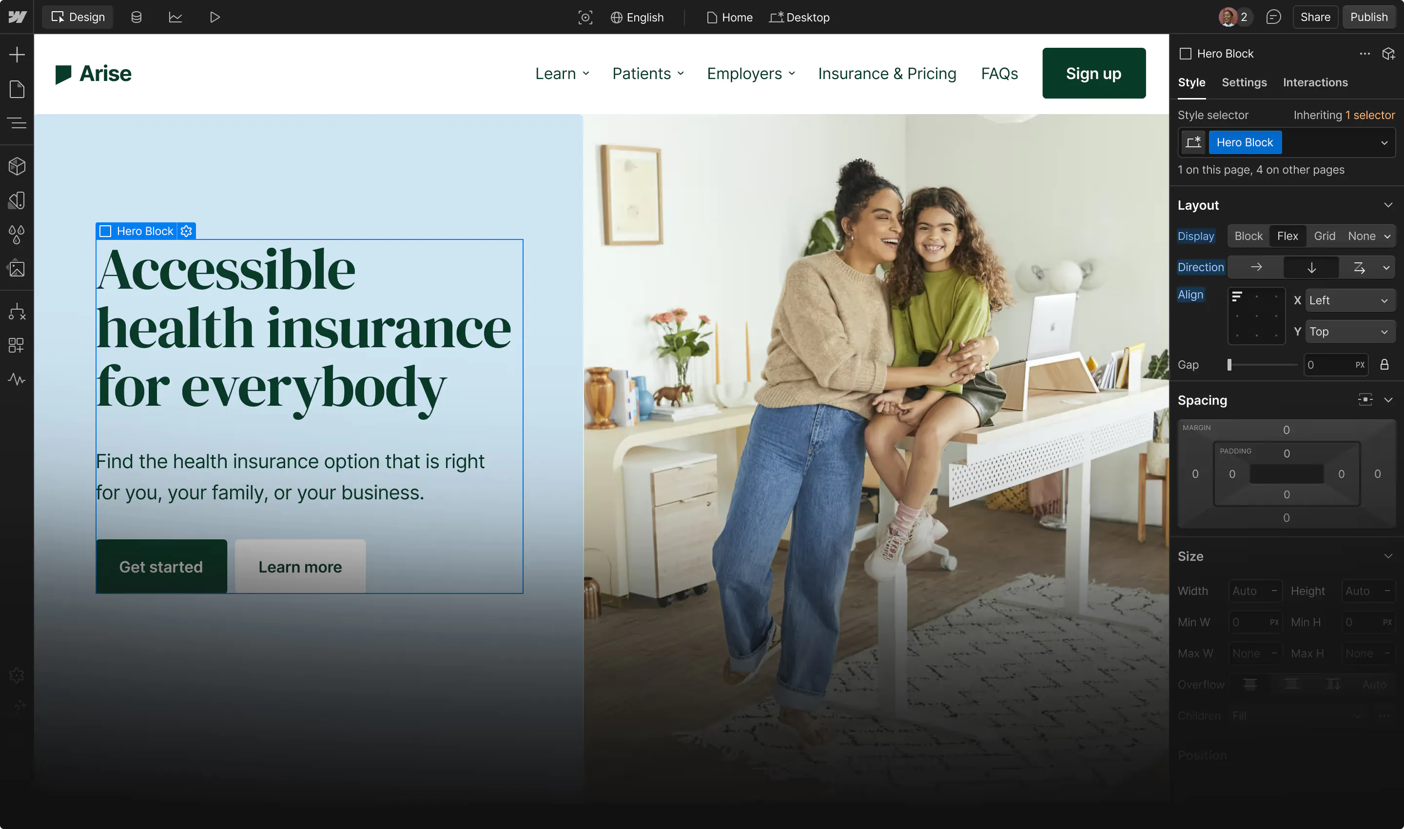
Webflow makes it easy for anyone to go in and make necessary changes. For Sean and the rest of the marketing department, this helped speed up the design process.
“Anyone can log into the site and the editor and just make a couple of copy tweaks or adjust the pricing on the page, publish it, and it’s ready to go.”
— Sean Nelson
Hologram’s pricing pages communicate with clarity
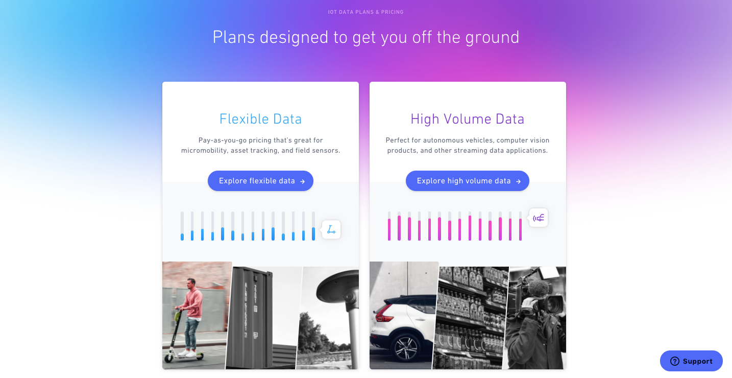
Hologram’s website offers two categories for pricing — one for Flexible Data and another for High Volume Data. Sean and his team used Webflow to construct this layout and used Webflow’s interactions to create the eq band beneath each plan. This graphic representation symbolizes the level of bandwidth each pricing structure covers. We see in an instant without even reading the text how they’re different. This fits in so well with Sean and his team’s mission to make their pricing as transparent as possible.

Let’s take a look at the Flexible Data pricing page above. The number of devices a company needs is the most important factor in this pricing category.
Sean and his team members created this handy pricing slider on the right entirely with custom code. This micro-interaction lets people dial in what their needs are depending on the number of devices. It’s a brilliant element that simplifies how this information is presented. All of the other essential details are there on the page, like no fee activation and uniform pricing no matter the country. There’s no question as to what a business is getting when they sign up.
This interactive slider demonstrates how pricing depends on the number of devices a company has online. Pushing the slider to the limit on the right to 10,000-plus displays a call to action to contact the Hologram sales team, with a bit of explanatory text. For these types of high-volume clients that may require custom pricing, it’s important that they speak to someone at Hologram. This call to action gets this information out immediately rather than having it buried elsewhere in the layout.

The High Volume Data category of pricing — as the name implies — is based on the data needs of the client. We see this same commitment to transparency, with all of the pricing plans explained and laid out on the screen.
Both of these pricing pages were built with the out-of-the-box functionality of Webflow, with custom code put into place for embellishments like the flexible data pricing slider. These pricing pages are great examples of the type of websites you can create with Webflow and its adaptability in adding code of your own.
Hologram’s modernized design communicates all of the important information
The rest of the design provides an in-depth look into how Hologram’s global connectivity platform works. Straight-to-the-point copy details functionality. We see screen grabs of data limit graphs. Through visuals and text, Hologram shows everything a potential client in the B2B realm would need to know.

Along with the more practical aspects of the design, a number of animated visuals dot its expanse, keeping it from being rigid and stale.

Webflow works for any level of designer
Hologram’s smart and stylized design shows that Webflow doesn’t keep you boxed in to boring templates or kept prisoner by proprietary design elements. It allows for a fully customized layout, making whatever your creative ideas are possible.
Anyone from beginners to expert designers — as Sean has shown us — will find in Webflow the tools they need to bring their designs to life.


Webflow — the modern WordPress alternative
Empower your team to visually build the most custom, responsive, and secure sites — in a fraction of the time.


.jpeg)


