More than half of all ecommerce traffic comes from smartphone users.
And about 40% of purchases happen on mobile. Clearly, online stores have room to increase their mobile ecommerce conversion rates. For busy customers browsing your store on their phones, the top priority is speed and convenience.
Improving your mobile conversion rate
These are the 4 key areas you need to focus on to increase your mobile ecommerce conversion rate:
1. Streamline your cart and checkout
Many ecommerce conversions fall at the final hurdle, with 81% of mobile users abandoning their cart without making a purchase. Checkout abandonment is one of the most important metrics for ecommerce sites to focus on. Customers browsing via mobile often don’t have much time, so a lengthy purchasing process asking them to fill out forms and billing information can turn users away. In addition, it’s a hassle to enter information on small touch screens.
Thankfully, you can make these tweaks to your cart designs to address these problems:
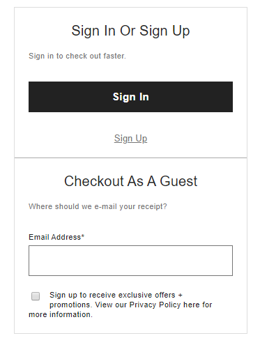
Guest checkout

Creating an account is an extra task new mobile users don’t need or have time for. Offering to save their information after their purchase lets them focus on the most important task —checking out — without feeling you are wasting their time.
Payment types
Mobile users want to be able to pay using their existing accounts instead of entering billing information. For example, a customer browsing your store on the train or bus might buy if they can just tap the Google Pay button, but are they really going to pull out their debit card and start entering their details?
Preserve cart contents
Mobile users don’t always have time to complete their purchase, or they might lose their connection during the checkout process. If a store doesn’t remember their cart contents between logins, users will have to start from scratch and might give up without buying anything.
Reduce form fields
Try to require the least amount of effort from your customer by reducing the amount of information you ask for. For example, letting users choose their address from a list instead of entering every line themselves.
Multistep checkouts
Sometimes it’s all just a matter of presentation. When a user is presented with a long page requesting their information, they think it is going to take a long time. A multistep process asking for only 3–5 details at a time is much less intimidating. A progress indicator also helps users see the light at the end of the tunnel.

2. Provide input feedback
Unlike a mouse and keyboard, the touch screen input of a mobile device provides no tactile feedback to users. In other words, a customer’s phone gives no indication a button has been successfully tapped. Unless you address this problem, it can lead to a poor user experience in which customers are unsure if their inputs are registering. Removing uncertainty around inputs lets users navigate your store faster and with less frustration.
Make sure all buttons on your store are large enough to easily tap with a thumb, and give visual feedback when a button is hit — for example, by animating or changing the color of the button. Improving input feedback makes your store less frustrating to browse on mobile and more satisfying to interact with, increasing your mobile ecommerce conversion rate.
3. Streamline navigation
Time-pressed customers can’t buy anything if navigating your mobile store to find items takes too long or is inconvenient. Here are 3 ways you can streamline navigation to increase conversions:
Reduce clicks
How many clicks does your user have to make to find and buy their item? You can bring this number down in many ways — for example, by enabling users to customize items and add to cart from the search results and by implementing breadcrumb navigation. This should be a priority for every page and process on your store.
Load pages faster
Optimizing your ecommerce store pages to load faster is critical when you consider that many mobile users aren’t browsing from fast or stable connections. Even on a weak connection, your product pages must appear within 3 seconds or your conversion rate will suffer. After 3 seconds, 53% of mobile users will abandon your store.
Optimize search results
How search results should be displayed depends on the type of item and your user’s intent. Depending on the search terms entered, an ecommerce search engine can guess if a user wants to browse products or buy a specific item — helping increase average order values.
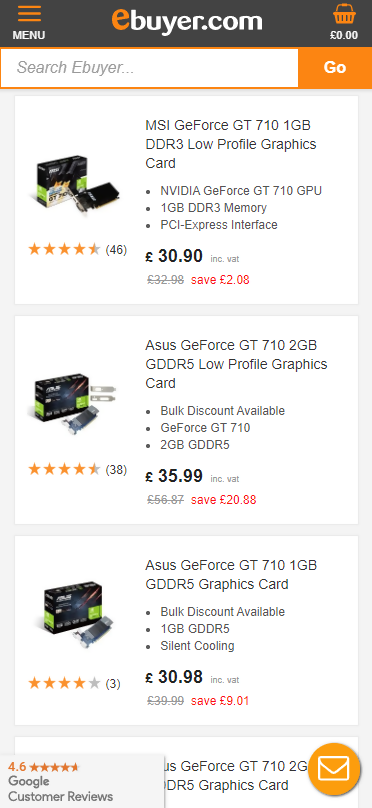
Let’s say your store sells computer components. If a user searches for “graphics cards,” it is unlikely they have a specific model in mind. They want to browse and compare. Including product specifications in the search results will make it easier to do that.

If a user searches for a particular item, a simple grid of product names and pictures might make it simpler to find the one they want.
4. Attract and convert more mobile users with mobile marketing
Mobile users may get distracted, lose connection, or abandon their cart the first time they visit your store. Unless you reach out to those customers to remind them to return, many won’t come back.
You can increase your average conversion rate by getting more of those visitors to come back and purchase. These methods also help convert people with one-off purchases into returning customers:
Retargeting
With retargeting, you can convert more visitors after they leave and bring back lapsed customers. Retargeting lets you place ads in a mobile user’s browser, social media, and apps after they have visited your store. These work best when personalized to each user. For example, send a user an ad offering a discount in the product category they were interested in.
SMS
Text marketing lets you stay in touch with visitors to send them your latest offers. SMS is a useful way to increase your mobile ecommerce conversion rate as texts can be opened anywhere more easily than other channels. Additionally, 82% of mobile users will read your message within 5 minutes, even while on the move.
Increase the uptake of your SMS marketing campaign by using customer referrals and sign-up discounts to give users an incentive to join your SMS mailing list. SMS can also improve a customer’s shopping experience by providing order updates and confirmations.
Shorter opt-in forms
Lengthy forms discourage users from opting in. Make your opt-in form feel like less of a chore by minimizing the information you ask for and creating a step-by-step process with a clear progress indication.
Conclusion
Speed and navigability are central to building a higher conversion rate. Improving your user experience and making your site easy to navigate are vital for converting busy mobile users into repeat customers, especially when it comes to common sticking points like the checkout process. Focusing on these 4 key areas will enable you to improve your average ecommerce conversion rate.


Your brand is unique. Your store should be too.
Shape your customer's experience every step of the way, and build a modern ecommerce website — all without writing a single line of code.


