
A checkout page should help customers finalize their purchase — not drive them away.
If you’ve ever added products to an online cart, then left the site without buying anything, you’ve “abandoned” your shopping cart. You’re not alone — recent industry data shows the average cart abandonment rate is 70% in 2025, meaning most shoppers leave without completing their purchase. This trend highlights the importance of optimizing checkout UX to keep more customers moving toward conversion.
Sometimes customers leave items behind because they never really intended to purchase — they may have been brainstorming gifts, comparing prices, or saving things for later. But if people don’t purchase because of issues with the checkout experience, online retailers need a smoother process for their ecommerce websites.
Why do people abandon their carts during checkout?
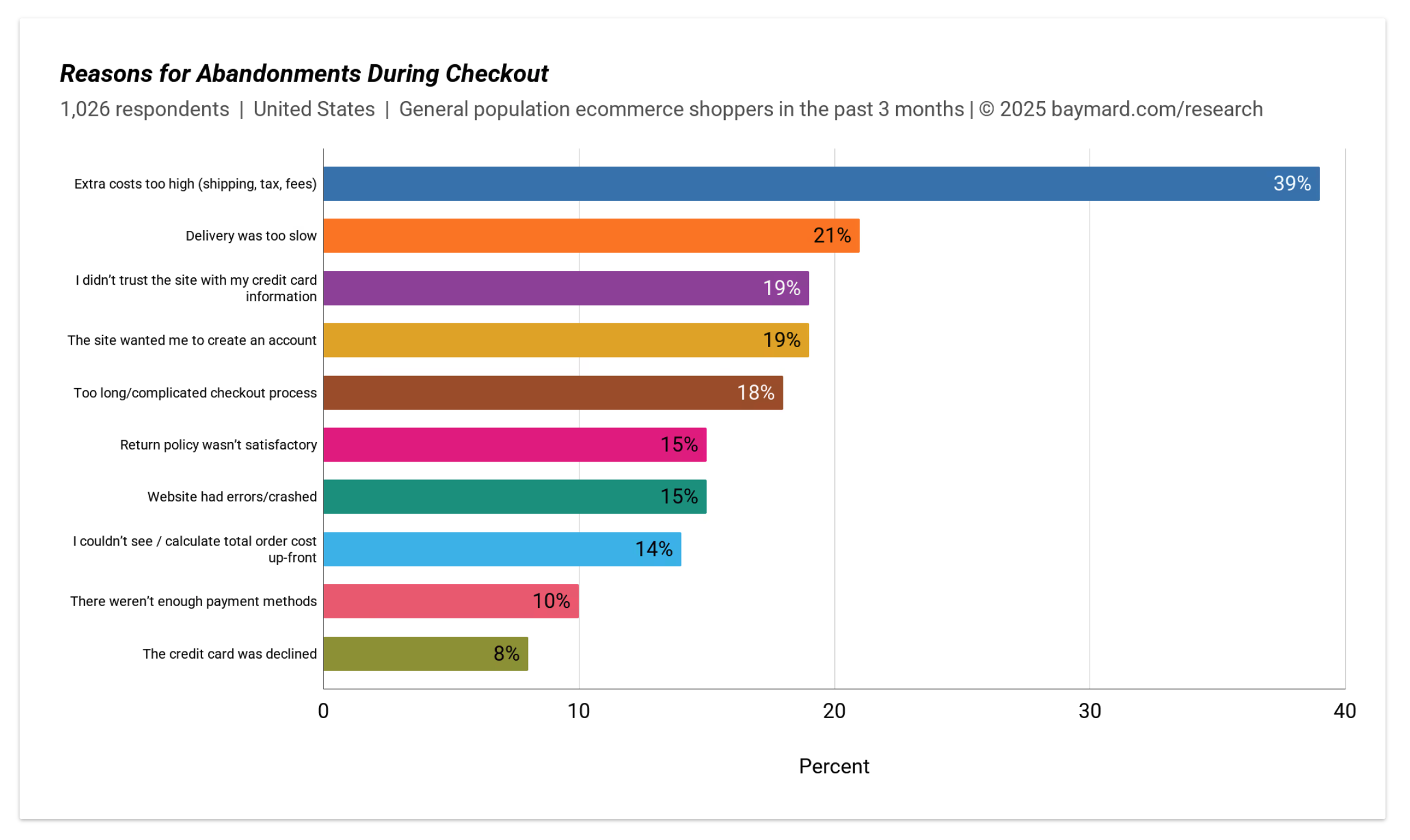
According to a report from UX research firm Baymard Institute, some of the biggest UX issues that led to cart abandonment are:
- Unexpected costs: When customers don’t know the cost of shipping and taxes before checkout, they might underestimate the total cost of their purchase. This includes changing currencies or extra fees.
- Too long or complicated process: Some people don’t want to create an account to complete a purchase, and buyers might be wary of giving away their personal information or signing up to receive newsletters.
- Lack of trust: If people don’t completely trust your site, they won’t feel comfortable entering their payment details.
Luckily, designers can reduce shopping cart abandonment by addressing these problems. Removing steps, adding guest options, and proving the site’s secure improves checkout page design and conversion rate.
How is cart abandonment rate calculated?
To calculate cart abandonment rate in your ecommerce store, start by dividing the number of completed purchases by the number of shopping carts created.
For example, if 200 people put something in their carts and 150 make a purchase, the proportion of people who followed through is 0.75 (75%). That means the proportion of people who abandoned their carts is 25%.
Knowing the cart abandonment rate’s important because it’s a key indicator of UX performance, meaning some people left because of a negative or challenging experience. Baymard found that nearly 1 in 5 abandoned their cart because of a long or complicated checkout process.
As a designer, you might not have direct access to these metrics. In that case, you’ll need to ask the client to provide the statistics. Pinpoint where your clients lose the most customers by checking the top “exit pages,” (the pages from which the most customers click away from a site) to find improvement opportunities.
10 ecommerce checkout UX design tips
Brand examples like Allbirds show that a seamless and user-friendly checkout can drive more conversions and customer loyalty. The following tips will help you refine the checkout experience and keep shoppers on track.
Baymard researchers estimate that ecommerce sites can increase their conversion rate by 35% with an improved checkout page UX design, making it a win-win for businesses and customers alike.
Here are some tips to improve the user experience at checkout and avoid losing potential customers near the finish line.
1. Let customers know the total cost as soon as possible
There’s nothing more off-putting than filling up your shopping cart, adding your shipping information, then discovering the total cost is much higher than you’d expected.
Aim to be upfront with customers about costs right from the start. If you need to add taxes to your client’s product, consider including them in the price. If there are shipping costs, list them next to the product (if it depends, provide them as a range, e.g., $6.00–$10.00). You could also offer a variety of shipping options and let the customer choose their preferred speed and price point.
If possible, include free shipping, as 62% of customers won't purchase without it. Although it’s a significant expense for businesses, it can be offset by incorporating it in the product price, including it as a perk for members or subscribers, or offering it above a certain spending threshold, like $200.
Whenever possible, display estimated arrival dates (e.g., “Estimated arrival: October 5”) to give shoppers a clear sense of when they’ll receive their order. For multi-product orders, consider showing item-specific shipping or fulfillment details — for instance, note if an item ships separately or has a different delivery timeframe than the rest of the order.
2. Allow customers to purchase without requiring an account
When customers create an account, it benefits the business because they can record an email address for email marketing campaigns and use the personal data customers provide to develop more accurate customer profiles.
But if forcing people to create an account before they buy hinders sales, it’s counterproductive. Compulsory account creation means nearly a quarter of customers don’t follow through with the purchase.
A better practice is to give customers a guest checkout payment option, should they not want to make an account.

Stanfords, in the example above, gives site visitors a guest checkout option and the options to login or register. They’re clear about the benefits of creating an account: faster checkout, the ability to save multiple delivery addresses, and easy access to order history and status. But shoppers who aren’t interested can still skip this step and carry on, removing unnecessary steps and potentially increasing conversions.
You could also bypass customer accounts and take people straight to checkout if your client doesn’t want to collect customer data.
If you’re using Webflow, consider adding custom fields sparingly to minimize friction, and let customers seamlessly choose between signing in or checking out as a guest.
3. Reduce the number of form fields in the checkout flow
While some designers choose to build a one-page checkout, research shows that the number of steps in the checkout sequence matters less than the number of required inputs at each step. Typing’s especially cumbersome on mobile devices, so the less typing required to complete a purchase, the better.
Minimize the number of form fields on each page by eliminating unnecessary fields like title and middle name, combining first name and surname into one field, and hiding elements like second address line and billing address. If you can, aim to get down to no more than 6–8 form fields.
Even making small changes like using automatic zip code detection, guiding people to fill in each field, providing autofill and autosave options, and briefly explaining why you need the data can improve conversion rates. These adjustments make filling out forms less tedious for customers and increase your chances of retaining them.
A short note like “We only ask for your phone number to send delivery updates and prevent missed packages” reassures customers that you’re not collecting data unnecessarily.
4. Provide an outline of the checkout process
Divide the checkout process into steps and add a progress tracker to clearly indicate where the customer is in the process. Showing customers how close they are to the end is a great way of encouraging them to finish the process.
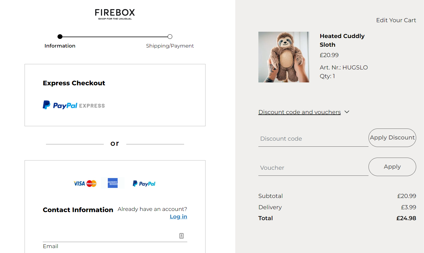
Firebox has a two-page checkout flow. The progress bar shows users how close they are to finishing the process: “Information” or “Shipping/Payment,” encouraging them to take the next — and final — step.
Another option is adding a final confirmation screen after entering payment details, giving shoppers one last chance to review everything before placing their order.
And remember, labeling each step clearly — for example, “Shipping Details” → “Payment” → “Review Order” — makes it obvious how many steps remain.
5. Use graphics and copy to soothe customers about site security
Many people are reluctant to share their credit card details online. Visual signals, such as badges and trust seals, can help them feel comfortable entering their payment information into a site.
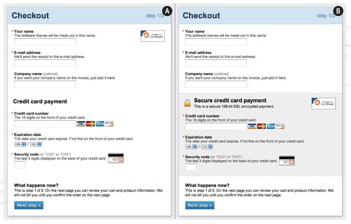
Above, two mockups show how to increase perceived security using copy and visual cues. Panel A is a checkout screen without extra security cues. Panel B adds the following features:
- The credit card payment area is called “Secure credit card payment.”
- The sentence “This is a secure 128-bit SSL encrypted payment” provides additional information about security.
- The sensitive credit card payment area is visually contained, setting it apart from other areas.
- The padlock and badge icons offer visual security cues.
This information doesn’t increase the actual security of the site, but it does communicate the security features already in place and helps ease customers’ minds. It’s especially important for new stores still building their reputation. Use these visual cues to instill confidence that your client treats sensitive information with extra care.
Additionally, you can display trust signals right in the cart. For instance, Apple visibly features well-known safe payment icons so shoppers know they’re in a secure environment from the start.


Elevate your web strategy
In our ebook, experts from Slalom, HubSpot, Microsoft Clarity, Zapier, and more weigh in on the marketing strategies and Webflow Apps teams can integrate across the customer journey to build powerful web experiences.
6. Make it easy to update quantity and remove products
The checkout page design needs to minimize the chance that a customer will leave. Offer the option to update the quantity of products, update the size or color (if relevant), or remove an item from the checkout page so they don’t have to go back and start again.
Recommending related products before checkout also keeps people in the flow, reducing the chance they think of something else they want and leave the page. If you do recommend related products, make this as unobtrusive as possible so people who know what they want can scroll past it or dismiss it with a single click.
A simple note like “Last updated 10 minutes ago” can reassure shoppers they’re seeing the latest items and prices, reducing confusion if they return after browsing.
7. Allow multiple payment methods
Baymard reported that nearly 10% of customers don’t complete a checkout process because their preferred payment method wasn’t available. Offering a large selection of payment gateways, including PayPal and mobile wallets such as Apple Pay and Google Pay, encourages users to complete checkout.
8. Be thoughtful about your checkout buttons
Clearly differentiate the buttons for “Continue shopping” and “Checkout.”
Visual hierarchy is crucial for drawing immediate attention to your primary CTA. For example, Samsung uses a large, high-contrast checkout button to guide users toward completing their purchase without delay.
If the business sells non-essential items, and customers typically only add one or two items before checking out, it’s best to highlight the “Checkout” button. If you’re selling essential items, such as food, then highlighting the “Continue shopping” button can encourage people to add more items to their cart before checking out.
Help shoppers find and click the final checkout button quickly by using bold colors, concise text, and clear positioning that stands out from other elements on the page.
It’s also worth testing different CTA copy, like “Pay Now With PayPal” or “Complete Purchase,” to see which phrasing resonates most with customers.
For easy access, add a shopping cart button to the top right corner of every page. You can experiment with customizing the “view cart” button and showing or hiding the quantity of items in the cart and the total cost. Running A/B tests will tell you which shopping cart icon encourages the most conversions.
9. Optimize the mobile site
The mobile cart abandonment rate is over 85%. That, coupled with the fact that over half of visitors will be browsing on mobile, means you need to make a special effort to optimize a mobile site’s functionality on top of implementing standard UX design best practices.
This includes ensuring a mobile site loads quickly and has big, clearly labeled buttons and navigation elements, especially on ecommerce checkout pages.
10. Set up cart recovery systems
If a customer does leave without purchasing, it’s not the end of the world. You can set up a site to detect and recover abandoned carts.
If a business has the user’s email address, you could automate a reminder email function — perhaps including a coupon code or reminding them of what they wanted to purchase — to encourage them to come back. If the site doesn’t collect email addresses, you can retarget users who have abandoned their carts by putting an ad pixel on the site that lets businesses continue to show customers ads for the products they viewed. Both methods might draw potential customers back and make the sale.
If someone logs out mid-checkout, an automated reminder email can gently direct them back to finish their purchase.
Checkout design recap
- Show total costs (including taxes and shipping) early on.
- Offer a guest checkout option to reduce barriers.
- Shorten forms and explain why you need certain data.
- Use trust signals (badges, icons) and a clear progress tracker.
- Send cart recovery notifications if shoppers log out or abandon their carts.
Delight your clients with tangible results
Making some of these changes will improve your client’s checkout process, but data is always best: test different checkout page layouts and checkout sequences to ensure your changes will have a greater impact.
If you need inspiration, check out some of the best checkout websites built by the Webflow community and start redesigning your client’s checkout page today.

Build websites that get results.
Build visually, publish instantly, and scale safely and quickly — without writing a line of code. All with Webflow's website experience platform.