


Choosing the right image format can make a huge difference in your website's performance and appearance. Let's explore the differences between JPG and PNG to help you make the best choice for your projects.
Image file formats have shaped web design since the early days of the internet. Understanding their evolution helps explain which format works best for different design needs today.
What are PNG and JPG image formats?
PNG stands for Portable Networks Graphics and is a raster-based file format. Unlike the meager 8-bit limitations of the GIF file type, PNG offers 24-bits of spectacular color. This was a huge advancement in the mid-90s. PNGs offer a range of shades and hues, with a higher resolution through lossless data compression. Today’s portable network graphics files can also work at 48-bit, and even up to 64-bit. PNGs have held on and are still a popular format found across the web.
Just as PNGs are still widely used, JPEGs continue to be prevalent in web publishing. The JPEG file format (also referred to as JPG), which is short for Joint Photographic Experts Group predates PNG, was launched in 1992, but its development can be traced back to 1986.
Images contain a huge amount of data. A lot of this visual information is redundant. JPGs are compressed by averaging out color information and decreasing the amount of repeated data. This type of compression is known as lossy compression.
JPGs were also a better alternative to GIFs. They could better capture complex images like photos while bringing them down to a manageable file size with better resolution than GIFs.
What is the difference between PNG and JPG image formats?
Lossless compression (PNG)
PNG is a lossless image file type, meaning that files that undergo this form of compression are almost identical to the source images. Through filtering and encoding, they effectively reassemble image data. Though PNG files have been compressed, they are still much bigger than those that utilize lossy compression.
Lossy compression (JPG)
Lossy compression crunches down files by minimizing repeating data. With redundancies knocked down, there’s far less image information resulting in much smaller file sizes. The JPEG format utilizes lossy compression.
With less data to go off of images can suffer in quality. The colors in an image may be off, the finer details may be lost, and other artifacts may present themselves. This sounds bad, but the average person scrolling through a website isn’t scrutinizing every pixel they see. JPG images give an accurate enough representation that the majority of people aren’t going to notice their subtle flaws.
So what’s the difference between lossless and lossy compression? Lossless compression shrinks the size of a file down while keeping intact its original appearance. Lossy offers a higher level of file size compression but at the expense of a loss in image quality.
When should you use PNG vs JPG in your web projects?
Both of these file types have their appropriate place in web design. Whether you choose jpeg files or the png format depends on the content of the images.
JPG is popular for photo editing and printing, while PNG offers better transparency for crisp lines. Since both are raster-based formats, they can't be scaled up indefinitely like vector images without losing clarity.
Pros and cons of JPG
JPEGs are best suited for images that would otherwise be gigantic without compression. Images that have no transparent backgrounds, a lot of different colors, and details, like photographs, work best for the JPG image file type.
If you want images to have transparent backgrounds, you’re out of luck with JPGs no matter what you do to them in Photoshop. You’ll have to use a PNG, which has an entire channel dedicated to transparency. JPEGs always have a flat background color.
If there are a lot of textures and other fine details a JPG has the potential to squash these pixels together. It can be tricky working with images that have background gradients and translating them into JPGs that don’t suffer from a banding of colors after they’re compressed. For complex images, you may have to experiment with different settings in getting your images to look right.
Use JPG when:
- You're working with photographs or complex images with lots of colors
- File size and loading speed are priorities
- The image doesn't need transparency
- The image won't need future editing (since compression is lossy)
Pros and cons of PNG
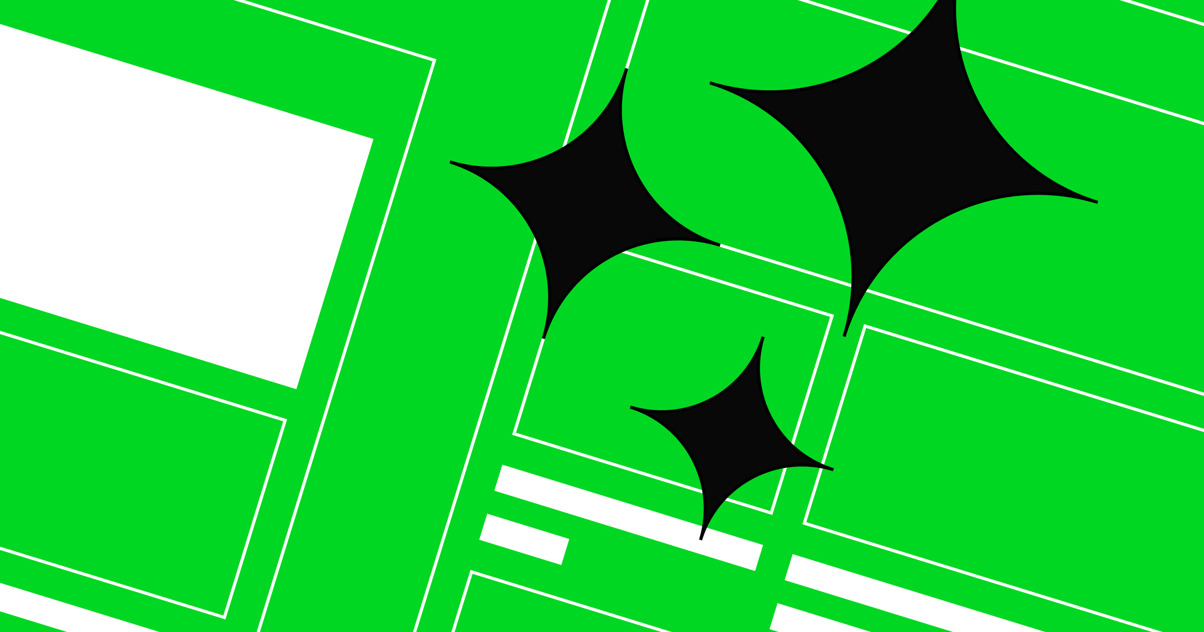
As mentioned earlier, PNGs can have transparent backgrounds (see image above). This makes them highly usable in different web design contexts. They’re also a better image format in reproducing vibrant colors and making sure that lines stay sharp, making PNGs the preferred format for illustrations, typography, and company logos.
PNG is an excellent file format for wireframes where there’s a lot of text and straight lines. They also work great for screenshots. This image format retains its high quality even when compressed, and works for both complicated and simple images. Illustrations and other visuals with clean lines and rich colors display the best when saved as a PNG.
Use PNG when:
- You need transparency or a transparent background in your images
- You're working with graphics, logos, or text-heavy images
- Image quality is more important than file size
- You need to make edits to the image later (since it's lossless)
Since PNGs offer the best resolution, why not use them everywhere? File size is the issue. A web design chock full of PNG files, rather than just a few, will load much slower than if you use JPEGs. A page that doesn’t load fast can hurt a website’s SEO, as well as make people bounce while waiting for the images to appear. This is especially true when image file sizes are over 300 KB.
How should you keep your original files safe?
Whether you're compressing your files into JPGs or PNGs, the source data of the original images is forever changed. It's important to keep your original image files separate from the files you're preparing for a web design project. You may need these in the future, and if all you have are altered versions, it's going to cause complications.
Another common oversight is to have an edited image with multiple layers and to save it in a compressed file type without keeping an uncompressed version of it. Make sure to retain your files with their accompanying layers in something like a PSD so that you can go in and make changes to these layers if need be.


Get started for free
Create custom, scalable websites — without writing code. Start building in Webflow.
How can you optimize images for the web?
A website should offer a consistent experience no matter what screen it’s being used on. Images need to scale up or down depending on the device.
Responsive design is a set of guidelines focused on creating a uniform user experience for anyone scrolling through a website. Whatever the screen size or resolution, both JPG and PNG image file types need to be optimized.
Regardless of which format you choose, it's important to optimize your images for the web. Here are some best practices for image optimization:
- Resize your images to the dimensions they'll be displayed at
- Compress your files without sacrificing too much quality
- Use descriptive filenames and alt text for better SEO
- Consider using responsive images for different screen sizes
Another challenge to consider is including text as a part of an image. There are some instances where you may need to do this, but this should be rare. Integrating text into images can cause all sorts of issues when they’re compressed or need to be scaled up or down. It’s also not a good accessibility practice, as those who use screen readers will not be able to tell what is said on the image. This is why alt text is extremely important for all images on your website, something you can easily add in Webflow.
Instead of using images with text in them, use web-generated typography instead. It’s responsive and will be legible no matter what device they’re viewed on.
What purpose does each image format serve?
How fast a website loads and how the graphics and other images look depends on using the right image file formats.
Choosing between JPG and PNG doesn't have to be complicated. The general rule is to use JPGs for photographs, images that don’t have a transparent background, and other memory intensive files. Choose PNGs for graphics, files with transparent backgrounds, and other images where clarity and color vibrancy are important.
While JPG and PNG remain widely used, it's worth considering newer formats like WebP, which offers better compression than both with support for transparency, and SVG for logos and icons that need to scale perfectly at any resolution. For modern websites, these formats can significantly improve load times and visual quality.
Just like anything in web design there are exceptions to these rules, but these guidelines should give you a good enough understanding to use different image file formats with confidence.
Create optimized images with Webflow
With Webflow, images are automatically optimized for different devices. Our platform applies compression intelligently, and ensures fast loading times. You can focus on creating beautiful designs while we handle the technical details of image delivery. With our built-in image optimization tools, you don't need to worry about manually creating different sizes for responsive layouts or deciding on compression levels.
Explore Webflow for more resources on responsive images and image file types.
Get started for free
Create custom, scalable websites — without writing code. Start building in Webflow.