

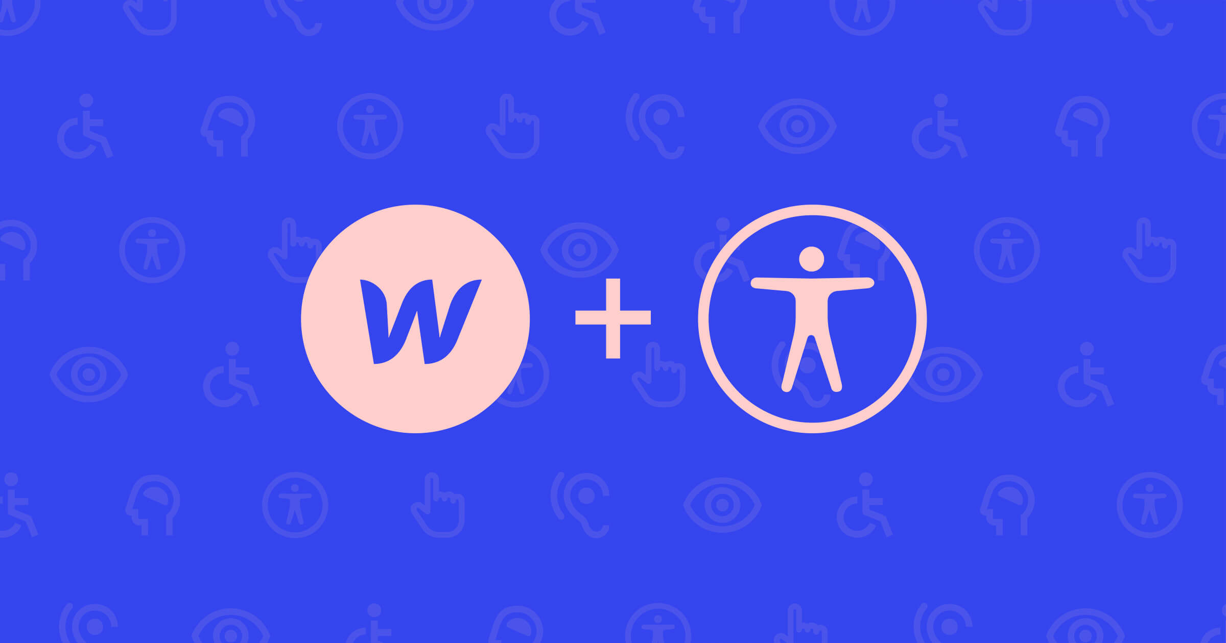
Webflow’s mission is to bring development superpowers to everyone. We want that to mean everyone, and that includes those with various disabilities.
Webflow is in a unique position as a website experience platform, because we have a two-fold responsibility in terms of accessibility. We need to make our platform itself accessible, and we also need to help ensure that our hosted sites are accessible to their millions of daily visitors.
In this blog post, we’ll share an inside view of our accessibility processes and practices at Webflow.
We’ll begin with some of the benefits of accessibility. We’ll then explore how we’ve created a strong accessibility foundation in our internal design system and how that boosts productivity throughout the engineering organization. Next we’ll describe some of our strategies for knowledge sharing and leveling up our collective accessibility know-how. Finally, we’ll examine the impact that this has on our website experience platform and users and close with some advice on how you too can scale accessibility efforts in your company.
Benefits of accessibility
The World Health Organization (WHO) estimates that 16% of the world population lives with some form of disability. That’s one in six people, a far larger proportion than most people expect. These disabilities may take the form of visual disabilities, auditory disabilities, motor disabilities, cognitive disabilities, and more.
It’s also important to remember that accessibility benefits everyone. Even if you don’t think that your user base has very many disabled users (you’d likely be mistaken!), consider the following examples:
Supporting keyboard navigation helps keyboard-only users and also those who consider themselves “power users” and prefer to use the keyboard for faster navigation. Surely you or someone you know prefers to use the Tab key to move from one field to the next when filling out a form rather than clicking on each input with the mouse.
Using good color contrast helps users who may be colorblind or have low vision and also makes the platform easier to use in various lighting conditions or with different monitor displays. Plus, no one likes squinting to read white text on a yellow background.
Providing adequately sized buttons and click targets makes it easier for users with motor disabilities to interact with elements on the page. It’s also easier for everyone in general. Anyone who’s experienced the frustration of accidentally closing a menu because their cursor moved off of a narrow menu item as they moved their mouse can attest to this poor user experience.
Remember that disabilities can be permanent, temporary, or situational. Someone who normally doesn’t consider themselves disabled but who has suffered an injury to their wrist, fingers, eyes, or ears will greatly appreciate accessible technologies while they heal.
Accessibility has a large overlap with usability and good design practices. When we talk about making an app accessible, we’re often talking about following well-researched user experience best practices.
Now that we’ve established the importance of accessibility, let’s look at how we implement these best practices in our engineering organization.
Accessible foundations
At Webflow, we’ve invested a lot of time and energy in our internal design system. For those unfamiliar with design systems, you can think of a design system as a component library of reusable building blocks to build an app. That’s an oversimplification, because a design system is so much more than that, but we won’t get into that for now.
The main point is that a design system provides designers and engineers with everything they need to design and build their app.
Our design system contains many different components, such as:
- Form controls: Autocomplete, Button, Checkbox, FormLabel, Radio, Select, Switch, TextInput, TextArea
- Typography: Link, Text
- Popup-like content: Menu, Modal, Popover, Toast, Tooltip
- Presentational content: Accordion, Avatar, Badge, Banner, Note, RowItem, Table
This is a non-exhaustive list of components, but hopefully you can see the breadth of needs that our design system covers.
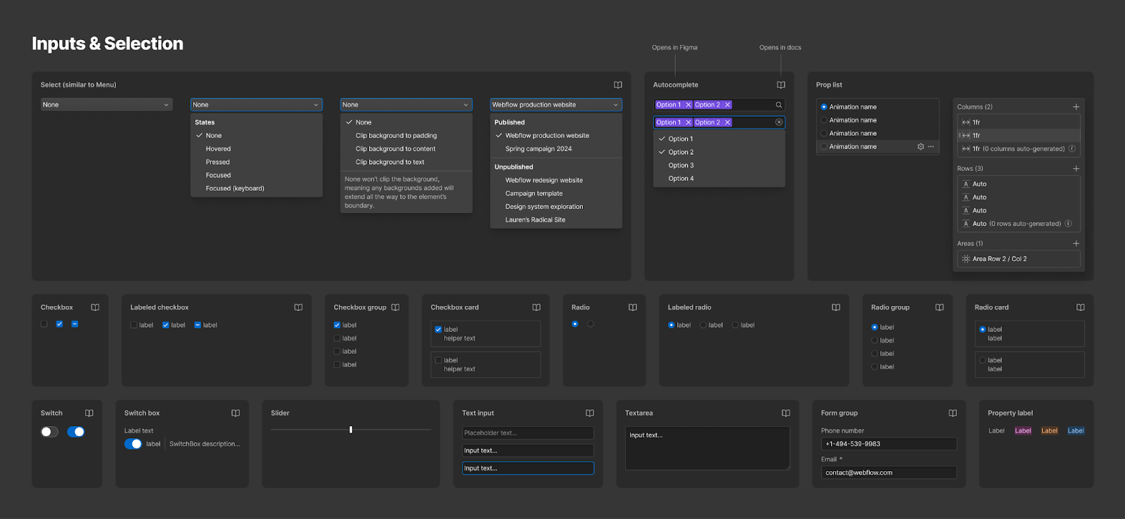
For each of these components, we take time to ensure that they’re accessible right out of the box. The benefit of this is that each engineer using our design system doesn’t need to know anything about how the internals of the components work.
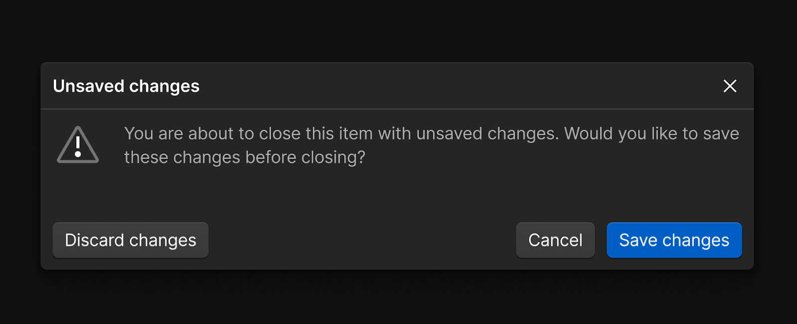
For instance, consider everything that goes into making a modal dialog accessible:
- Keyboard focus should be sent into the dialog when the dialog opens
- Keyboard focus should be trapped within the dialog while the dialog is opened
- Screen readers should only be able to access content within the dialog while the dialog is opened
- Mouse users should only be able to access content within the dialog while the dialog is opened
- The Escape key should close the dialog
- Keyboard focus should be sent back to the trigger button that opened the dialog when the dialog closes
- Dialogs should use appropriate ARIA attributes and roles, such as
role=”dialog”,aria-modal=”true”, and eitheraria-labeloraria-labelledbyto reference the dialog’s title
(There is a lot of nuance to some of the items above. The WAI ARIA Authoring Practices Guide is an excellent resource to consult when considering best practices for any sort of UI component.)
We’ve taken the time to ensure that our modal dialog accounts for all of these accessibility considerations. That means that when an engineer needs to use a dialog for the feature they’re building, they can just use the Modal component and not have to worry about managing where the focus goes when the dialog opens or closes or trapping the focus within the dialog or adding the correct ARIA markup. All of that is handled for them, so they can just concentrate on the work for the feature.
We can’t overstate the benefits of a design system enough here.
First, our design system boosts the productivity of our entire engineering organization. If we can build a component once and then reuse it 50 times in our app, we’ll save ourselves the trouble of reinventing the wheel and building the component from scratch each time. This becomes particularly important for more complex components that take longer to build correctly.
Second, our design system allows us to achieve consistency in our UI and UX. If everyone is using the same set of components, the components will look the same and behave the same everywhere.
Third, our design system enables us to make improvements and enhancements efficiently. Let’s assume we have 50 instances of some component in our app. If all 50 instances of that component use the component from our design system, we can fix the component in one place in our design system and have that fix be applied to all 50 instances throughout our app. This is crucial for changes of all types: bug fixes, new features, and accessibility improvements.
Continuous education
Our design system provides an excellent technical foundation to build upon, but it’s not enough on its own. We can’t have only a handful of designers and engineers who know about accessibility. We need everyone in the engineering, product, and design organization to understand the fundamentals of accessibility and be able to apply it in their work.
One of the most effective tools for continuous upskilling has been our #accessibility Slack channel. In this channel, people can ask questions, learn together, and share accessibility wins.
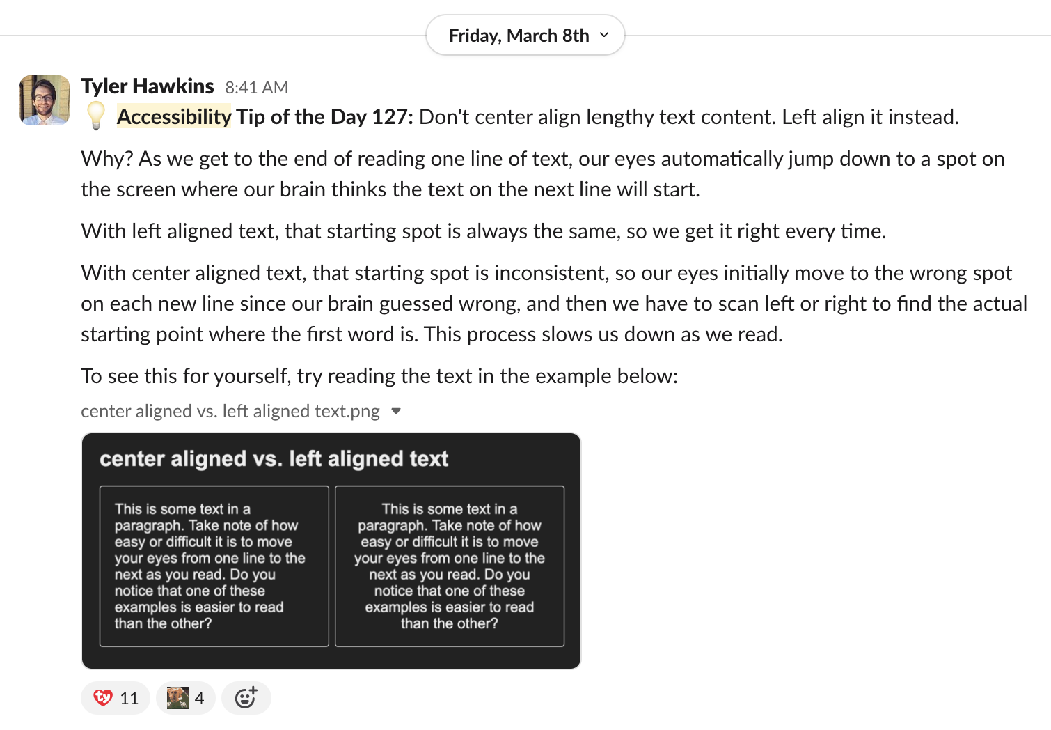
Every work day we post an “Accessibility Tip of the Day”, and it’s something we’ve been doing for over a year now. We’ve posted over 200 tips and are still going strong. These tips are generally more engineering focused and have covered topics like alt text, color contrast, focus indicators, keyboard navigation, screen reader navigation, component design, ARIA attributes and roles, semantic HTML, design patterns, automated tooling, and more.
What’s been fun about the tips is not just the breadth of topics we’ve been able to cover, but that it helps keep accessibility top of mind in a way that yearly training sessions don’t.
Baked into our process
We’ve covered our design system and our continuous education efforts so far. What about how we approach accessibility throughout the software development lifecycle?
Accessibility is baked into our process every step of the way.
When new features are being designed, the proposed designs go through a design review in which gaps can be identified, including potential accessibility issues. We also have a separate design system office hours to help untangle particularly gnarly questions.
When new features are being built, every code change goes through our automated CI pipeline. We use linters such as the eslint-plugin-jsx-a11y package and run accessibility unit tests with the jest-axe package. These automated static analysis checkers are helpful, but it’s important to keep in mind that they can only catch a small percentage of accessibility issues, usually estimated at around 30%. We need to rely on human intervention too.
During code reviews and bug bashes, we’ll also review how accessible the features we’re building are. It’s at this time that we’ll do some manual testing with a keyboard and screen reader to ensure that the features can be used by an actual human being.
Outside of the typical software development lifecycle, we also do audits of our app from time to time, focusing on different areas of the app, different workflows, and different accessibility topics. Any issues found are then logged as Jira tickets so we can address them. The Web Content Accessibility Guidelines (WCAG) are the current universally recognized standard for web accessibility, and Webflow strives to conform to WCAG 2.2 AA.
We also have another internal Slack channel called #ux-paper-cuts for reporting small UX issues that can be easily fixed and picked up by engineers who have moments between sprints or are waiting for code reviews. Not all the issues reported are accessibility issues, but as we’ve discussed before, there’s significant overlap between accessibility and usability. The best thing about this channel is that the reported issues are small, so they’re easy to fix quickly once they’ve been identified.
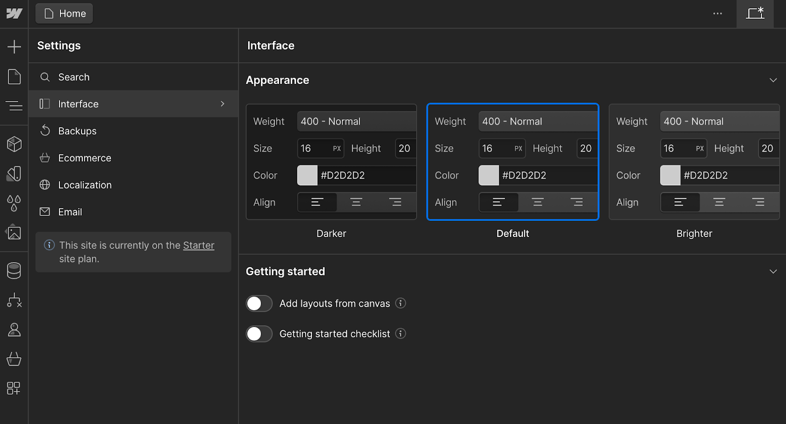
Finally, let’s not forget about all our wonderful customers and partners. We have mechanisms in place for users to send feedback, whether that be issues they are encountering or feature requests they have. Our alpha testing program was particularly impactful during our UI refresh that we released almost a year ago during Webflow Conf 2023. In the time leading up to the refresh and in the months after, we listened to our customers to address several accessibility concerns with color contrast, font size, and hit target size. This feedback led to significant improvements in the initial release of the UI refresh as well as the idea for the Appearance Settings feature in Designer.
Effect on our product
As discussed, most notably we launched our UI refresh in October 2023. We followed that up with Appearance Settings in January 2024. Shortly after that we improved the keyboard navigation of our left sidebar panel system in February 2024. And that’s not all.
As our design system adoption increases, so does the accessibility of our product, particularly in the Designer. We’ve focused heavily during the last few months to increase the keyboard accessibility of the Designer, and we’ll continue to iterate on that. Improved keyboard accessibility lays the foundation for screen reader accessibility as well.
Tools to help Webflow creators
Webflow has also developed several tools to help our users create more accessible sites.
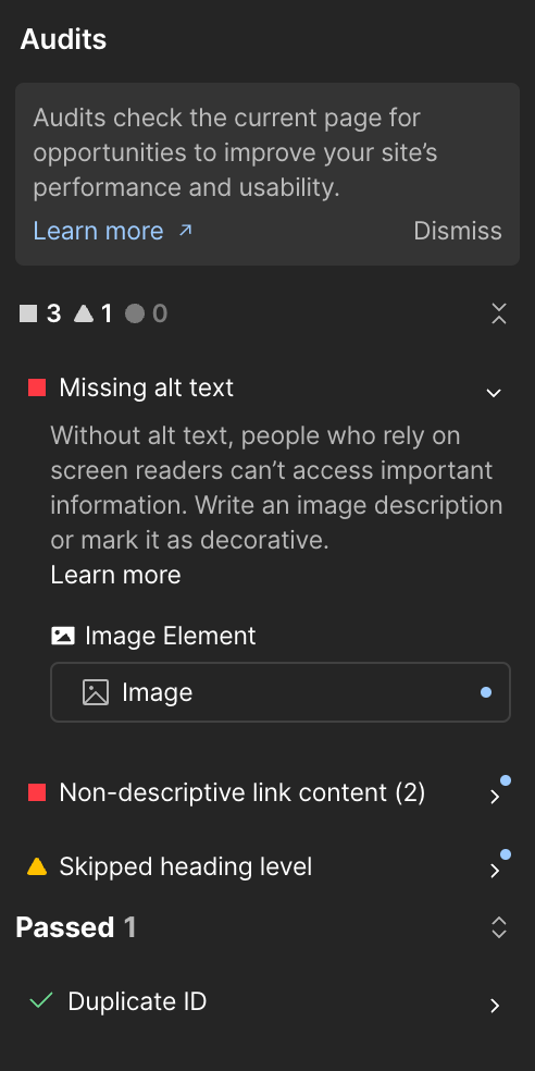
We have the Audit Panel, which can check your site for things like missing alt text on images, non-descriptive link content, skipped heading levels, or duplicate IDs on the page.
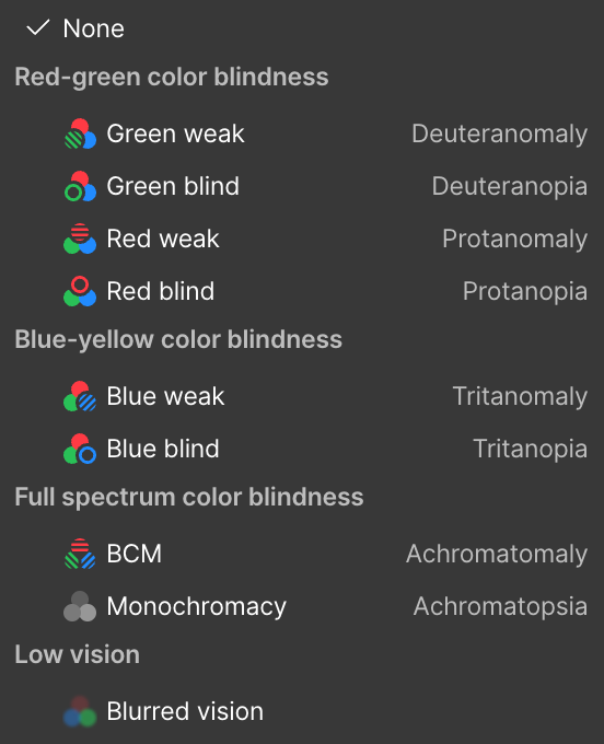
We have a vision preview, which allows you to emulate how your site looks to users with various types of colorblindness or blurred vision.
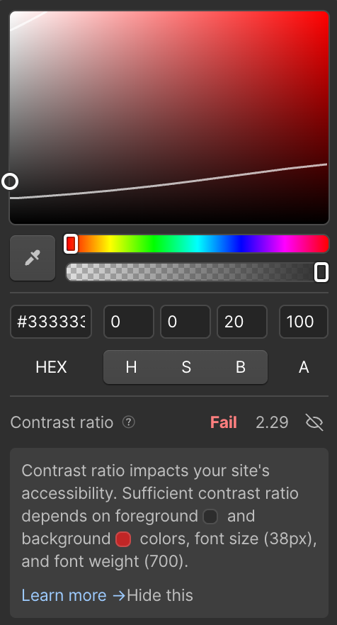
We also have a color contrast ratio checker to help you choose foreground and background colors that have adequate contrast.
In addition to the in-app tools we’ve built, we’ve also put together an Accessibility Checklist you can follow to help your content stay conformant to the WCAG 2.2 AA standards.
Tips for scaling accessibility at your company
We’ve covered a lot today! If you too are an accessibility advocate, you may be asking yourself, “This all sounds great, but how can I implement these things at my company?”
Your specific situation, company needs, and company size may be different from ours, but we’ll leave you with three tips:
First, focus on your design system, the building blocks for your app. If you have a design system, take the time to make your components accessible. If you use a third-party design system, make sure your system of choice prioritizes accessibility. The engineers consuming your design system are trying to accomplish their own goals as they build their features, so make the easy choice the right choice.
Second, bake accessibility into every aspect of your software development lifecycle. Shift left as much as you can. Focus on prevention, not just remediation. It’s far easier to prevent accessibility issues from entering your app in the first place compared to fixing them later down the road.
Third, accessibility allies are everywhere. If you feel like you are struggling to gain support for your accessibility efforts, start with those who are excited about accessibility. Don’t worry about the naysayers who may resist including accessibility work in their sprints for now. Create small wins, share them with those around you, and let the enthusiasm spread throughout your organization.
Finally, thank you for reading, and thank you for being an accessibility ally!


We’re hiring!
We’re looking for product and engineering talent to join us on our mission to bring development superpowers to everyone.