Since our official founding in 2013, Webflow’s been laser-focused on a single problem: making web design more accessible — for creators.
That focus has served us pretty well.
And we did it all — and hope to do far more — on a foundation of web standards. Our Designer relies on CSS standards like grid and flexbox. You can apply HTML5 semantic tags to your design elements with a click (well, two). We use responsive image technology to ensure sites load fast and make SEO-friendliness a central part of offering. And our interactions engine allows our customers to add JavaScript and Lottie animations — visually.
In our laser focus on making web development visual, we haven’t always upheld a key part of the World Wide Web Consortium (W3C) spec: the Web Content Accessibility Guidelines, or WCAG.
What’s accessibility, you ask?
It’s the practice of creating designs and content that anyone can access, regardless of their abilities. That means — but is far from limited to — text that blind people can “read.” Audio that deaf people can “listen to.” Not using interactions and animations for those who might experience seizures. And etc.
Accessibility efforts are guided by the modern definition of “disability”: a mismatch between an individual and their environment.
This definition is elegant not only because it transforms our perspective from one that assumes that disability is intrinsic and permanent, to one that understands that it’s actually relative and can be not only permanent, but also temporary and situational. Accessibility, then, is the practice of reducing the number and intensity of mismatches between the environments we create and the individuals who live and work in them.
The notion that the web was built for everyone is woven right into its DNA. It’s literally in the first sentence the web ever hosted:
The WorldWideWeb (W3) is a wide-area hypermedia information retrieval initiative aiming to give universal access to a large universe of documents.
Today, it’s just as easy to build an inaccessible website in a text editor as it is in Webflow. We have an opportunity here to help you ensure your websites are as accessible as possible.
Looking to learn more about accessible design? Check out our list of resources at the bottom of this post.
The web authoring tools guidelines
The W3C’s guidelines for web authoring tools state:
Authoring tools are an essential element in achieving a universal, accessible web. The ideal authoring tools produce accessible, robust web content, regardless of the technical knowledge of the content authors. They are also accessible in themselves.
There are two key statements in that passage that can be easy to overlook. Namely that web authoring tools should:
- “produce accessible … web content”
- “[be] accessible in themselves”
Now, Webflow has always made it possible to produce accessible web content. Our visual development tools enable creators to make content that anyone can experience. We make it (relatively) simple to publish screen-reader-friendly text, add alt text to images, provide sufficient color contrast, and create keyboard-friendly web pages.
However, we may have made it too easy to publish inaccessible web content. There are lots of areas for improvement, but in broad strokes:
- We haven’t always provided fully-accessible default components and settings to start with, e.g. the default button is low contrast.
- Some of these inaccessible defaults require writing custom code to fix, e.g. adding keyboard navigation for complex components.
- We haven’t enabled you to analyze your site for accessibility issues, and require you to publish your site before you can run 3rd party checkers like WebAIM’s WAVE.
Each of these areas is a big opportunity for us to serve you and people who visit your website better. Accessibility is far more than just a checklist of technical requirements to tick off. It’s a moral imperative, incumbent on all of us who create experiences for others, whether physical or digital, to ensure that everyone can experience them.
Our responsibility to people with disabilities
The onus for enabling accessibility is even more ours to bear than most similar tools.
Why? Because we’re purposefully trying to enable non-developers to build the websites they’ve always wanted.
That means many of our customers are either completely or relatively new to the world of web design and development. They might not even know what an alt attribute is, let alone why it’s important. They may have no idea that low contrast won’t merely make their content inaccessible to many, but even negatively impact key metrics like time on page and conversion (since poor legibility can affect anyone). And they might never have considered that parallax scroll or mouse-based animations could disorient some folks while wowing others.
To us, this is both a challenge and an opportunity — to make it not only easier to create accessible websites with better tooling, but also to educate both ourselves and our customers on the principles and techniques of accessible design.
What we’ve done about accessibility so far
To date, we’ve taken some small steps to encourage more accessible web development practices. We’ve recently updated several elements and/or features to improve their accessibility, including:
Captions in HTML5 tagging UI
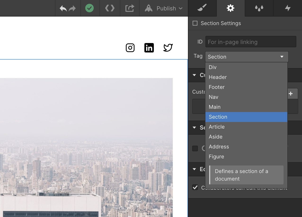
Adding descriptions to our HTML5 tagging UI, so it’s easier to tell which tag best describes your element or section.
More prominent alt attribute fields for images

Making the alt attribute field more prominent in image settings, adding it to the asset manager, and defaulting it to generating empty alt attributes, the best solution for merely decorative images
A more accessible alternative to background images
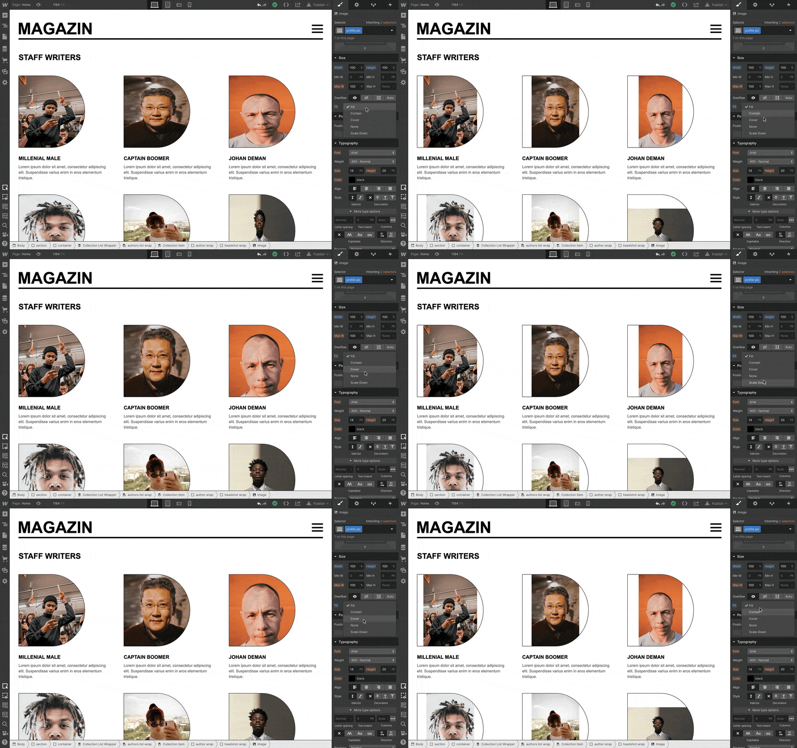
Adding object-fit and object-position to our (lengthy) list of supported CSS properties, giving people a more accessible alternative to background images, which don’t support alt attributes.
Accessible prebuilt layouts
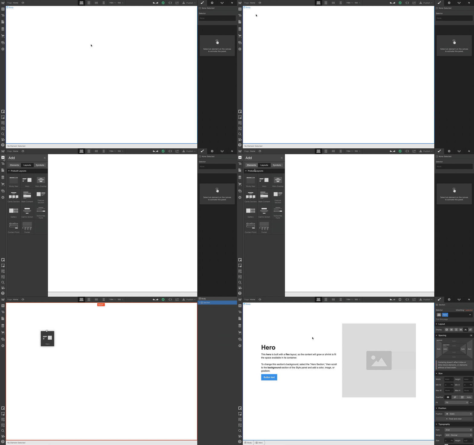
And one of our latest features — prebuilt layouts — was built to be accessible out of the box, and adhere to accessibility best practices like heading hierarchy, page structure, and keyboard navigatibility.
These are small steps. But they do take us closer to achieving our new accessibility initiative’s mission: enabling Webflow to produce accessible content.


Why your design team should use Webflow
Discover how design teams are streamlining their workflows — and building better experiences — with Webflow.
What we’re going to do about accessibility tomorrow
All of the above is exactly why we’re now dedicating ourselves to doing a better job with accessibility.
But we want to be very clear on this: it’s going to be a long haul. There are many steps between today’s Webflow and a future Webflow built for accessibility.
With that in mind, here’s what our (very rough) roadmap toward accessibility looks like:
- Making accessibility a company OKR (objective and key result). Why? Because there’s no way to commit to and succeed at a business task without setting measurable benchmarks, timelines, milestones, and metrics.
- Building our internal expertise around accessibility. We’ve brought 2 subject-matter experts onto the team, and together with a host of collaborators, they’re helping us build accessibility best practices into all our development processes. And 70 of us — just over a third of the company — from disciplines across the company have enrolled in accessibility training.
- Incorporating accessibility into our design, development, and QA practices. Like most web development disciplines — be it SEO, content, or UX — accessibility works best when it’s baked into every step of the process. It’s far easier to build a thing with accessibility in mind than it is to hack in accessibility late in development.
These steps are sufficiently high level to communicate here. Beyond that, it’s going to be the task of our accessibility engineers, product designers, and their product managers to define the accessibility roadmap.
That said, our accessibility roadmap for the product will include:
- Ensuring our stock elements and components are accessible
- Adding in-context tools and education to improve site accessibility
- Incorporating accessibility auditing into the platform, either natively or via integration
But, as mentioned above, accessibility isn’t just about technical requirements.
So we’re also updating our approach to content to do a better job of emphasizing accessibility. That means that we’ll not only produce more content focused on accessibility, but that we’ll also keep it top of mind in everything we write, shoot, and launch — from our showcase list posts to the best practices reviews and trend analyses we publish more irregularly.
We’ll also explore how designs can be made more accessible in our University videos and note when certain design options will contribute to inaccessibility (as we did with the CSS grid option autoflow dense).
Just as important, we’re going to start building it into our brand design practices. We’ll consider it in our weekly review sessions and in every pre-launch review. We’ll make it a topic of our regular project retrospectives.
And probably most important, we’re going to fold accessibility considerations into our hiring practices and other diversity and inclusion efforts. Because as many folks from the disability community (and other marginalized groups) are rightly fond of saying:
Nothing about us, without us.
For Webflow, that means:
- Hiring folks with accessibility expertise, and people with disabilities
- Incorporating disabled individuals in user testing and market research, on both the product and marketing sides
- Ensuring that our voice and tone guidelines and messaging frameworks consider accessibility and people with disabilities
We’re excited to tackle this massive, and incredibly important, challenge
And as mentioned above, the solution isn’t merely technical. So while our engineering and design experts tackle our tooling, those of us on the content side are working on creating guides to making your Webflow sites more accessible today.
Stay tuned.
A quick word from John
As you read this article, I've already said (a bittersweet) "so long" to Webflow.
In my 4.5 years in the world of visual development, I had a hand in a massive number of Webflow features, marketing launches, redesigns, and, of course, articles here on the Webflow blog. I'm proud of each and every one of those projects, naturally. But I couldn't be happier that this article marks my last contribution to the blog — as an employee, anyway.
Why? Because of the staggering importance of accessibility.
If the web is ever going to fulfill its mission of providing universal access to knowledge, it'll need to become vastly more accessible. And it's on every single one of us who build for the web to help it get there.
Additional resources to learn about accessibility:
- Microsoft Inclusive Design
- Heydon Pickering’s Inclusive Components
- WebAIM
- The World Wide Web Consortium’s Introduction to Web Accessibility course
- Web Content Accessibility Guidelines (WCAG) Quick Reference


