A few months ago, our brand studio team learned that many of our marketing pages weren’t very accessible.
Our coworkers who specialize in accessibility explained to us the various issues on our pages such as unclear keyboard navigation, excessive motion, and bad screen reader experiences.
We’d been using a lightweight accessibility checklist to check our pages, but there were two problems with this approach. First, the checklist only scratched the surface of accessibility considerations. Second, because we were using it mostly in the quality assurance (QA) stage, we weren’t considering accessibility at the beginning of our design process, where it matters most.
As we learned more, we started referencing other web accessibility checklists and guidelines, including the industry standard for web content, WCAG 2.1. Though many of these helped us implement better accessibility practices in both our design process and Webflow builds, they were often too technical to easily understand, and still required us to come up with Webflow-specific implementations.
That’s when we decided to start our own set of accessibility guidelines: one single comprehensive set of guidelines, in plain English, that included Webflow-specific implementation for our users.
This initiative was originally for internal use only, so that we could work on bringing the pages we design and build closer to WCAG AA compliance. But as we started chatting about Global Accessibility Awareness Day (GAAD), we pivoted to share the checklist with our community to help make the web a more accessible place, one #MadeInWebflow site at a time.
Here’s how we did it.
Coming up with guidelines
The first step in the build was sourcing and deciding on our version of accessibility guidelines. Web accessibility is an expansive area, with nuanced considerations across various elements of design and development. These considerations could be anything from color contrast to semantic code to use of motion and much more.
We started by consolidating the various internal checklists we already had to give us a clearer idea of which areas we already had covered and what we were missing. For research, we found the following resources helpful:
- WCAG 2.1
- The A11y Project’s checklist
- Deque University’s digital accessibility courses
- MDN’s Accessibility resources
We were also lucky enough to have guidance from accessibility experts on our engineering team. They provided documentation around responsive typography and how to test our sites for screen readers.
Using these various sources, we came up with a comprehensive list of guidelines that we prioritized by impact and effort. For our first launch, we narrowed down the list to things that had a relatively big impact on the overall accessibility of a webpage and were achievable in Webflow.
Voice and tone
From the beginning, we knew we wanted our guidelines to be easier to understand than a lot of existing accessibility documentation. We worked with our UX writer, Shannon, to iterate on our guideline copy, and here are some of the considerations we used when writing:
- Starting each guideline with a verb, e.g. “A mechanism is provided to pause background video” → “Provide a method to pause background video”
- Having one action per-step for instructions
- Staying true to our more casual, conversational tone, rather than something more formal or technical
Format
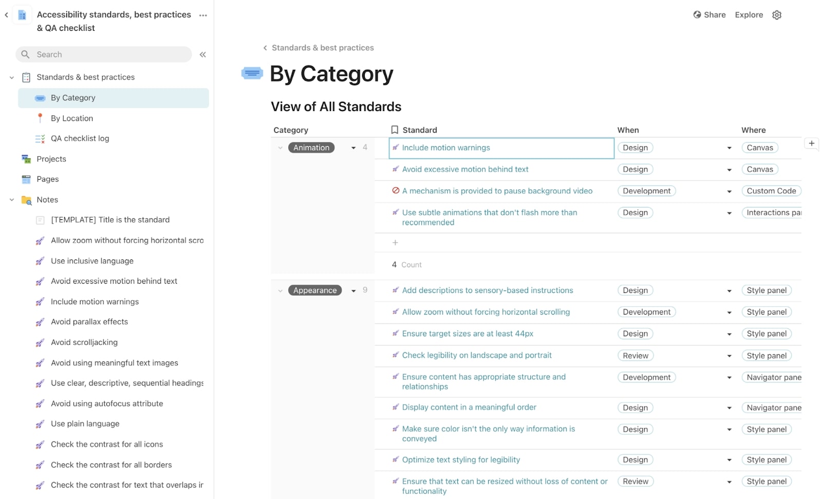
We originally used Coda to house the checklist. That allowed us to incorporate page-level tracking to help us see which guidelines we’d implemented on which pages. We leveraged Coda’s formulas and views functionalities to filter, sort, calculate, and track progress, and to display our checklist data in a variety of ways.

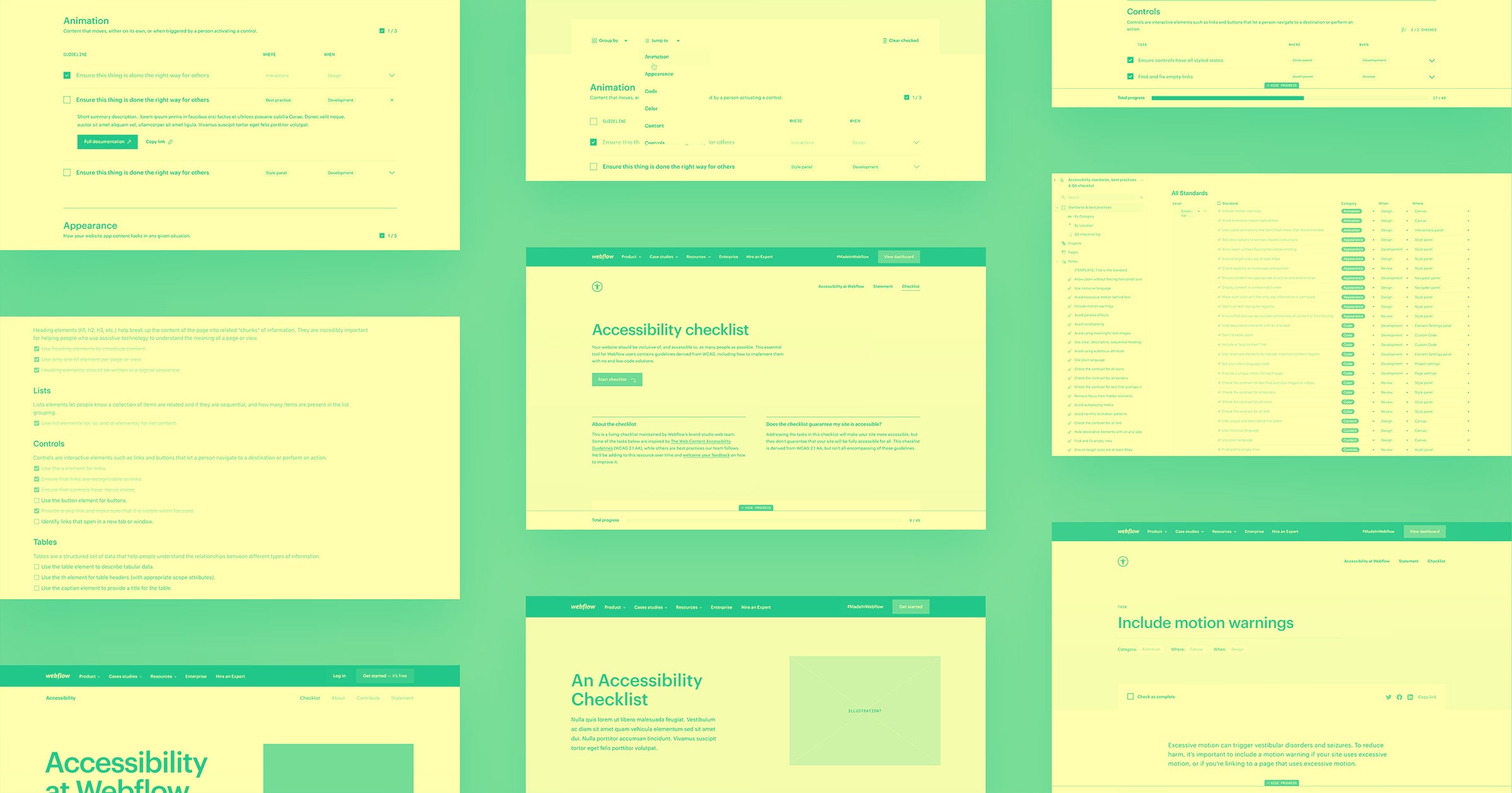
For the public-facing launch of the checklist, we decided to build the checklist in Webflow to give us complete control over its functionality, present the checklist in HTML — one of the most accessible formats — and to optimize SEO for discoverability.


Build websites that get results.
Build visually, publish instantly, and scale safely and quickly — without writing a line of code. All with Webflow's website experience platform.
How we built the site
Building the checklist site in Webflow let us have fun with its functionality. As Webflow users ourselves, we thought about the various ways we’d use the checklist for our own page builds.
We started by focusing on strategic and dynamic display, as well as how we could organize tasks in a way that aligned with a person’s preferred process.
Next, we decided to group guidelines by category by default, and provide secondary options based on where in Webflow a task was implemented and when in the design process it should be considered.
For the checkmark functionality, we thought about how this checklist could be the most helpful to people working across teams. We asked:
- How could we make the checkmarks persist across different pages?
- What if you could share checklist progress with a coworker so they could pick off where you left off?
After some iterations with our engineering team, we came up with something that let us save, share, and clear checklist progress across pages and browser tabs using custom Javascript.
In order to make sure the checklist site itself was accessible, we regularly reviewed interactive components and page structure throughout the build — using our own guidelines as a starting point.
Once we imported the guideline content into the CMS, we worked through final details, like the custom code preview and styling touches within the rich text fields, directly in Webflow.
Finally, we sent the checklist site to coworkers to get feedback on its functionality and our guideline documentation.

This is just a start: Our next steps
Internally, we’re working on an audit process so that we can implement these guidelines on our older pages to bring them closer to WCAG AA compliance. We’re also developing a better QA process to make sure all pages that we’re designing and building currently and in the future meet these guidelines as well.
With this launch in particular, we hoped to publicly get out as much as we could, in terms of guidelines and site functionality, as soon as possible. We’ll continue to add guidelines to the site based on our continued learnings and feedback. We’ve included a feedback form on the checklist site to hear from you on what guidelines you want to see included in the future, and any other thoughts or feedback you have on the site.
Lastly, we encourage all Webflow users to get involved in the conversation in the Webflow forum. We’re excited to continue to iterate on this resource for years to come, and hold ourselves accountable in the process.


