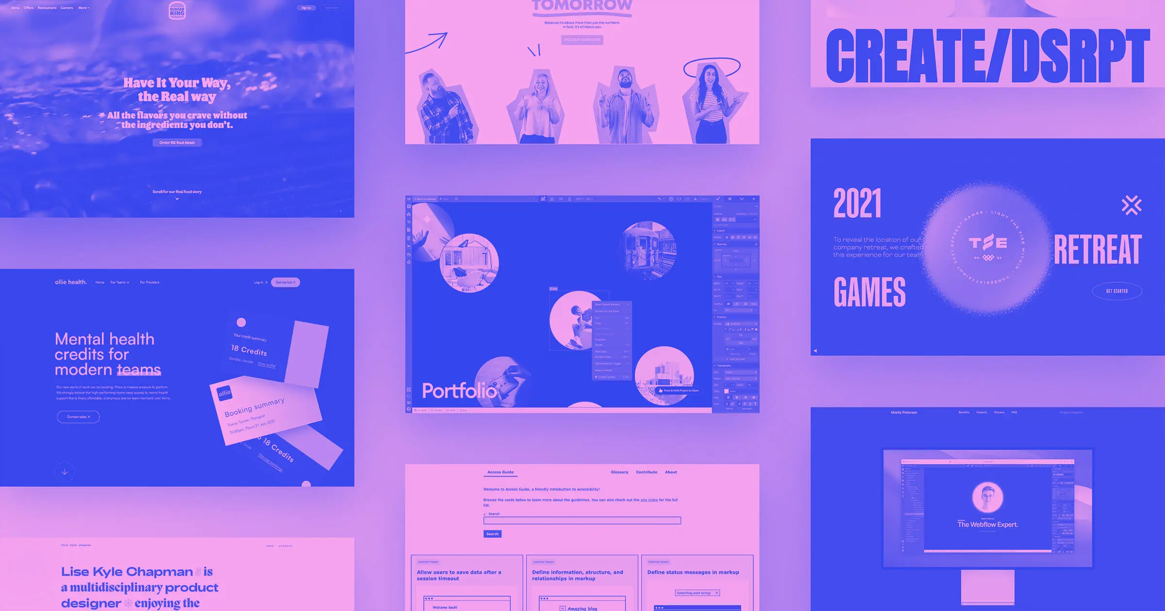
We’re always impressed by the new ways designers are using Webflow.
This month we’re sharing a variety of projects and websites ranging from bubbling portfolios to mental health sites — all built in Webflow and here to inspire you.
1. T.RICKS Bubbles
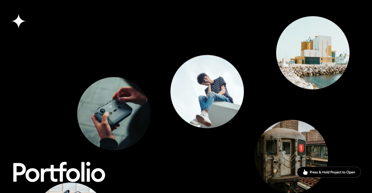
If you’re building a new portfolio website, you want to put something out there that will capture people’s attention. Visitors should be excited to check out your work and see what you’re capable of doing. If you’re looking for a more daring opening, T.RICKS Bubbles provides a strong visual hook with its interactive and effervescent visual experience.
At the center of this design are the project bubbles — hence the name. They rise from the bottom at different speeds and create a smooth and natural effect as they float about the site.
When you clone this template, it also comes with the custom code required to power its animations and interactivity.
2. Create/Disrupt Studio
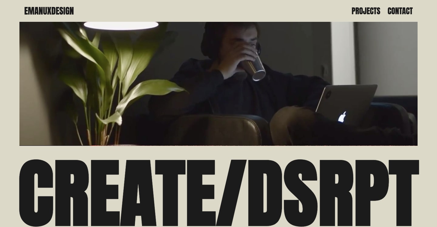
Create/Disrupt Studio leans on bold typography and big blocks of color for a design that exudes a sense of strength and confidence.
With everything at full volume, it would be easy to have all of the elements blend together, but this well-organized layout ensures that everything is readable and easy to navigate.
3. Illumin8

This website from Illumin8, an Australian accounting firm, breaks free from the conventionality often found on accounting websites, with a playful and friendly aesthetic. This is an intentional design choice — Illumin8 isn’t your typical accounting firm. Instead, they’re on a mission to help out independent businesses and make accounting as approachable and easy to understand as possible.
This site has plenty of white space and a fun sense of color, giving a light and airy feel throughout. Additionally, there are fun graphics like an animated camera, scroll-triggered effects that pop up photos of team members, and other custom illustrations that make it feel personable and warm.
4. Moriz Petersen
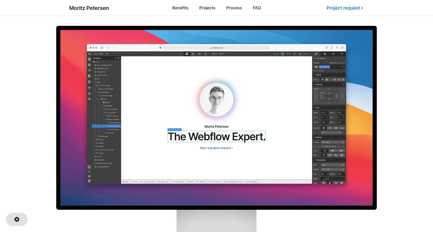
Moriz Petersen’s portfolio greets us with a professional headshot accompanied by the words, “The Webflow Expert.” Dominated by white space, it’s a well put together, yet unassuming introduction.
Scrolling up triggers a zoom effect, where now the site looks like it’s in Webflow Designer. It then zooms out even further revealing Moriz’s portfolio displayed on a desktop monitor.
Moriz sets up his portfolio with fun and surprising elements that draw viewers in from the start. We always enjoy seeing designers using Webflow to wow their visitors in new and refreshing ways.
5. Light the fire within us
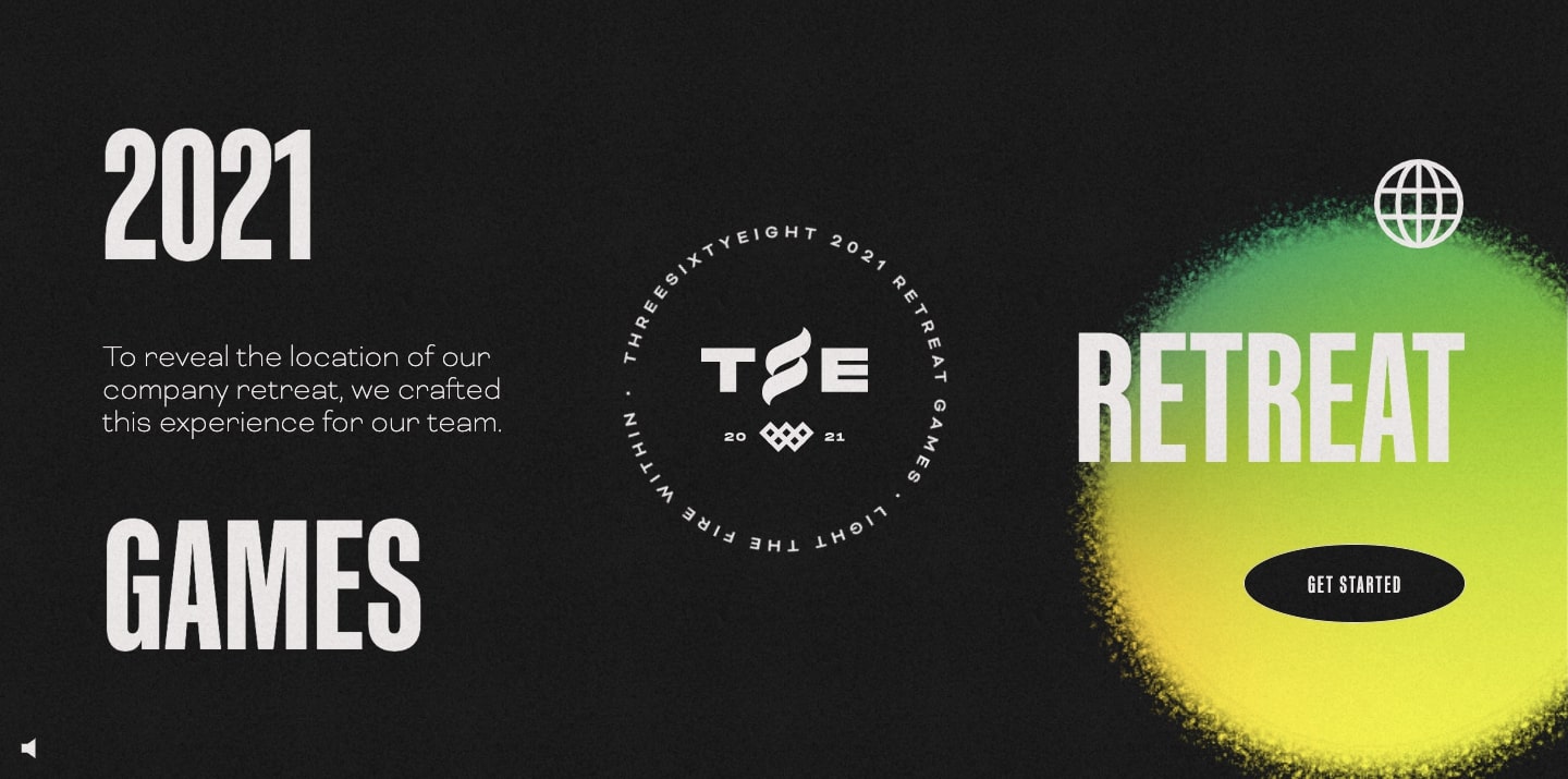
As you open this site, you hear the sound of swelling synthesizers backed by some glitchy white noise — transporting you instantly into a video game. This website, built by and for the agency ThreeSixtyEight, gamifies the process of finding out their company retreat location for their team members. This is definitely no GCal invite or Slack message.
To get through each level, the ThreeSixtyEight team members must answer questions and find symbols with the different tasks getting more and more difficult at each stage.
Web design offers possibilities in communicating ideas or information in ways that are new and exciting. This is a great example of taking something as simple as an invite to a company retreat and turning it into something much more engaging.






Need creative inspiration, like, every week?
Join more than 800,000 people getting the best, coolest, and latest in design and no-code each week.
6. Lise
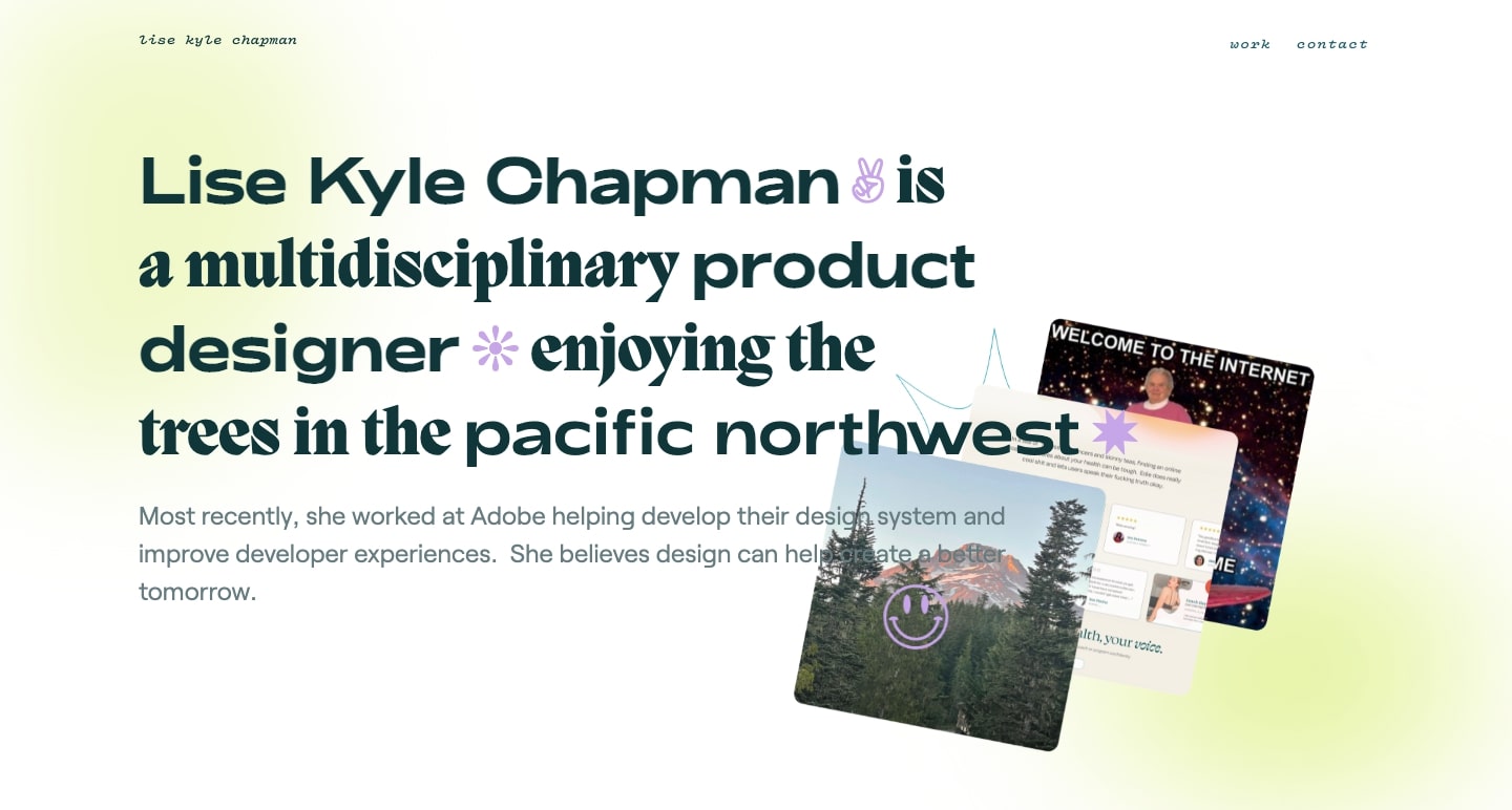
Lise Kyle Chapman has not only created a visually stunning portfolio but she’s also provided plenty of great supporting content such as case studies.
Each of her case studies communicate her involvement with a project such as background information, problems, solutions, and other important details.
Potential clients or employers want to see more than just a tidy grid of projects. They need to know who you are as a creative and how you approach your work — and Lise’s portfolio is a great example of that.
7. Ollie Health
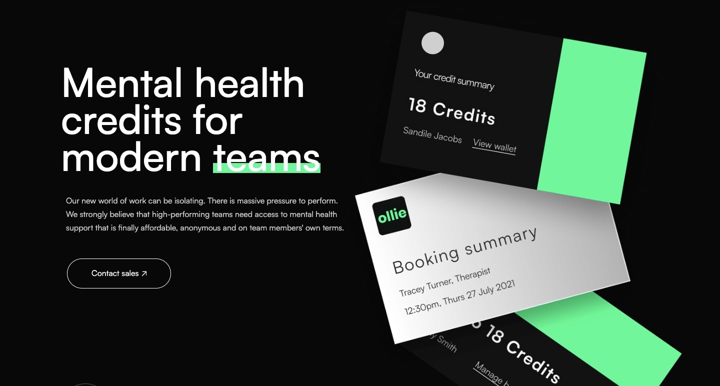
Ollie Health is a teletherapy platform focused on business teams. As remote work has become the norm for many people, feelings of isolation have also become commonplace. In response to this, Ollie Health aims to provide mental health support in helping people deal with the challenges of the modern digital workspace.
From the line-height of the text to the padding around the various elements, the website design leaves space and ample breathing room. This gives Ollie Health the ability to cleanly showcase who they are, the mental health services they provide, and how they can help companies support the well-being of their employees.
8. Humain

Humain is a Belgium tech group that helps companies integrate automation and machine learning into their work processes. While many tech-related websites can feel a bit cold and sterile, Humain sizzles with fiery oranges, abstract visuals and a stylish typeface.
9. Access Guide
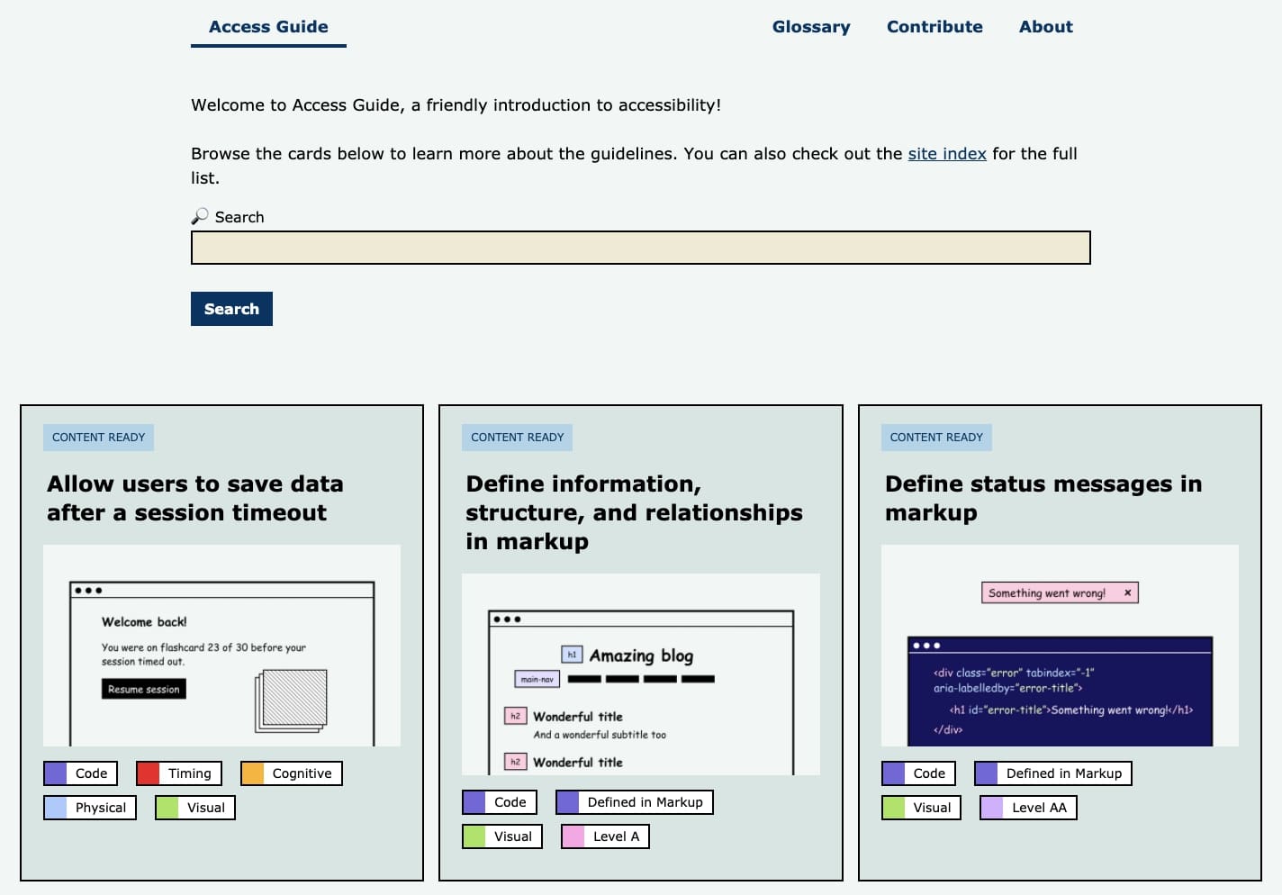
As designers, we should always be concerned about making our websites open to a wider audience. Paying attention to accessibility means more people can interact with your website.
Access Guide uses a simple grid layout to share quick lessons in design accessibility. From rules on how to label elements, to things we may not even consider — like getting rid of background noise in audio clips — there’s a wealth of information here to help you out.
Each article is clearly labeled with different tags such as code, visual, and cognitive — so you know exactly what aspects of design will be touched on. Plus, each topic includes a “why this is important” section so you learn not only how to implement something, but why you should.
Webflow will bring your own ideas to life
Every month, we love putting together these collections of web designs and showing you what’s possible with Webflow.
Webflow is so much more than just a design platform. Check out our forums, tutorials, cloneable designs, and more to help you out on your own path as a designer.
Do you have something you’ve built with Webflow? Submit it to the Showcase for a chance to be featured.
