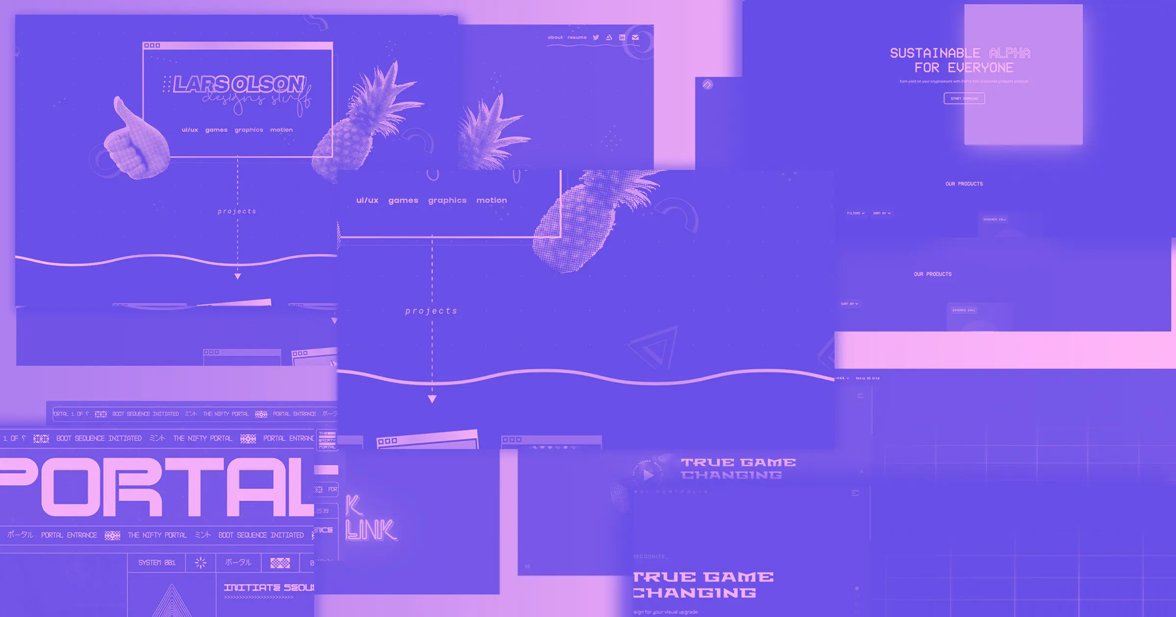
Retrofuturism, as a current design aesthetic, combines a predicted future with the past.
It’s both forward-thinking and nostalgic. It’s high-tech, painted with an intentionally low-tech brush.
For modern-day designers, retrofuturism is a deliberate choice. But prior to the 1960s, creatives were writing, creating art, and making films that attempted to predict what was to come. Their works were never meant to be kitschy — they aimed to be prophetic.
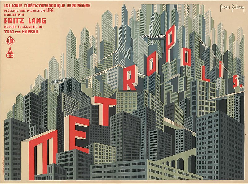
We can see retrofuturism in the 1927 film “Metropolis,” which portrayed the year 2026 as a dystopia inhabited by sleek metal automatons and bleak art deco skyscrapers. It gave its audience a portal to a distant time, both beautiful and terrifying.
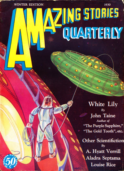
Retrofuturism was also seen in the science fiction books and comics popular in the 1930s-1950s. Scenes featuring bobble-headed astronauts colonizing distant planets, laser guns in hand and ready to battle alien life forms were common. They showcased the technologically-advanced world of the future, as imagined by artists.
Today, designers embrace the imagined futurism as a nostalgic look at an alternative world. Retrofuturist web designs transport users through nebula-like color schemes, otherworldly visuals, and retro computer-inspired typography — resulting in fresh and unique experiences.
Types of retrofuturism
The gritty digitalism of cyberpunk
While we see its roots in the science fiction of the 1960s and ‘70s, the term “cyberpunk” didn’t exist until 1980, when Bruce Bethke wrote a novel entitled Cyberpunk.
The word is a mashup of “punk,” referring to the rebellious music movement, and “cybernetic,” which describes the mechanization of biological functions. This amalgamation of words, makes cyberpunk feel both high tech and rough around the edges.
From there, cyberpunk found its way into popular culture with films like “Blade Runner” in 1982 and “Ghost in the Shell” in 1995, along with many other anime films and manga publications. Video games like “Cyberpunk 2077” have contributed to the popularity of this aesthetic as well. In web design, its sense of anarchy and machination has really only taken off in the last few years.
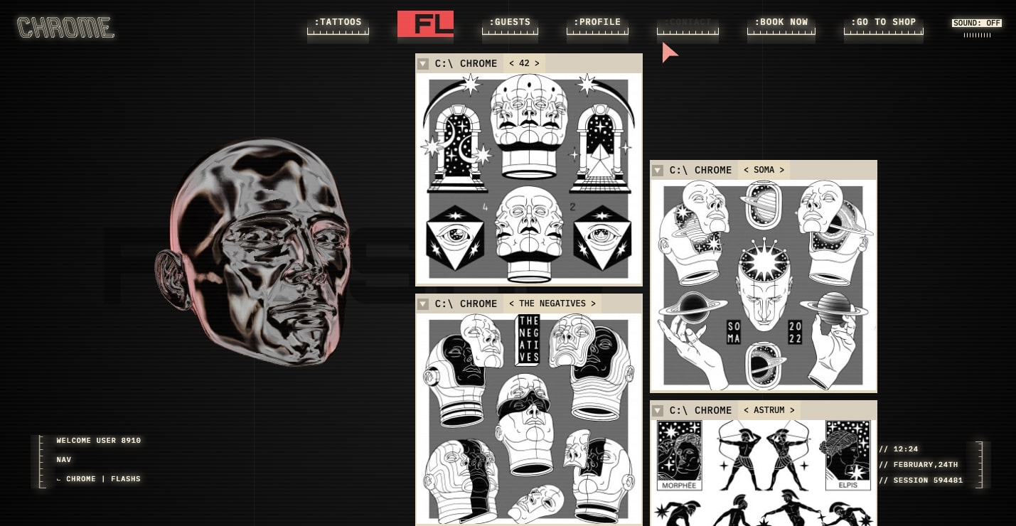
Cyberpunk is one of the main pillars of retrofuturism. The glitches and digital artifacts often found in cyberpunk designs make viewers feel like they’re interacting with unstable technology, capable of crashing at any moment. Color schemes often feel reminiscent of dilapidated cityscapes — blues, greens, and purples dulled by layers of industrial soot.
Cyberpunk is rough around the edges. It’s more Millenium Falcon than Starship Enterprise. There’s a sense of chaos running beneath its seemingly high-tech exterior.
The head-scratching absurdity of vaporwave
Vaporwave is an off branch of retrofuturism. It’s a bit less harsh than cyberpunk but still evokes feelings of nostalgia, drawing from the pop culture and design tropes of the 1990s. Vaporwave’s color schemes are often soft with pastels of purple, pink, and blue. Heavy-handed drop shadows and gradients along with geometric patterns such as grids and triangles are common as well.
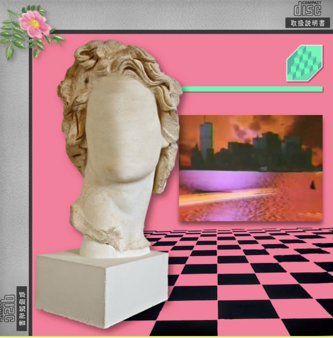
The Vaporwave aesthetic can be traced back to the mid-2010s, with the emergence of this namesake musical genre. With pitched down R&B samples, warped synth lines, and plodding drum machines, it represented irony without the cynicism — reveling in the sillier indulgence of the 1990s.
The visual art of vaporwave also borrows from the cheesier aspects of pop culture and integrates the nonsensical. The album art and memes associated with this electronic music movement embraced garish color schemes and incorporated absurd visuals like out-of-place Roman statues.
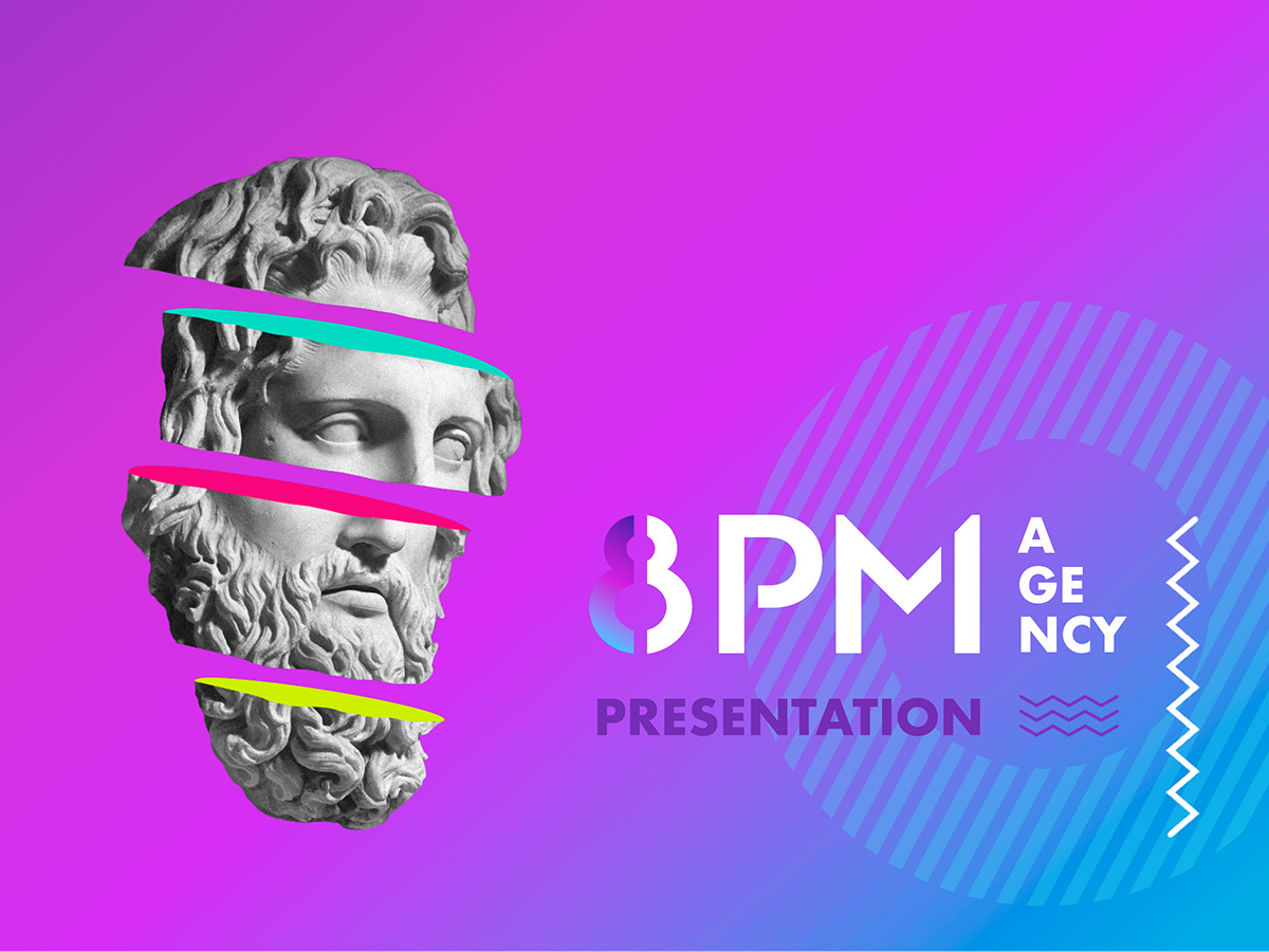
In web design, vaporwave is a more lighthearted branch of retrofuturism. Rather than predict a dystopian future, it embraces the cheesier elements of 90s pop culture. However, it’s not uncommon for web designers to draw from both cyberpunk and vaporwave when creating retrofuturistic websites.


Get started for free
Create custom, scalable websites — without writing code. Start building in Webflow.
Examples of retrofuturism
Retrofuturism isn't for everybody — and that's ok. Consider Elon Musk’s Cybertruck. Though it appears better suited for hauling around rocks on the moon than transporting your groceries across suburbia, plenty of people have put in their orders for the vehicle’s release. It’s a polarizing look, dividing people into those who find its clunky futurism silly, and those who would love to be creating it themselves. Retrofuturistic web design functions in much the same way — you’re either a fan or you just don’t get it.
Retrofuturism won’t work for every web design. But it’s a bold aesthetic, bound to make a big impression on any website it touches. Let’s take a look at examples to show you the different ways designers are using it in their work.
Discover Local Music
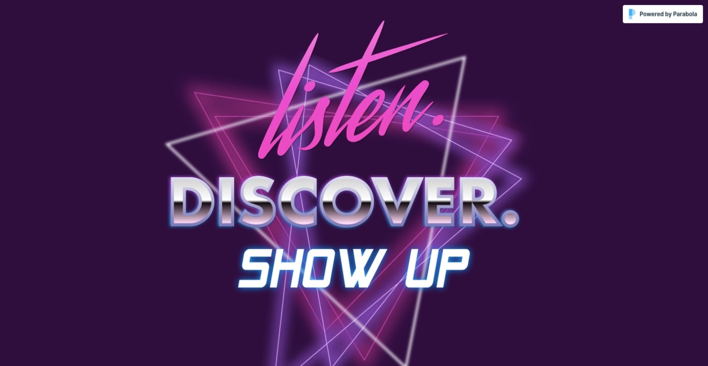
With an opening screen that looks like the introduction to a VHS workout tape, Discover Local Music has all of the markings of vaporwave. We’re fans of the mishmash of typefaces, neon-like tubes of purple and pink, and full unabashed embrace of the 1980s aesthetic.
Mark Alink
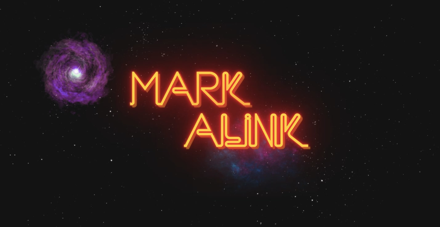
Mark Alink is an open-source bookmark management tool. With luminous text, swirls of stars, and dashes of blues and yellows, this site blends vaporwave with a cyberpunk influence — seen in its screen glitches and flashing cursors.
The Nifty Portal
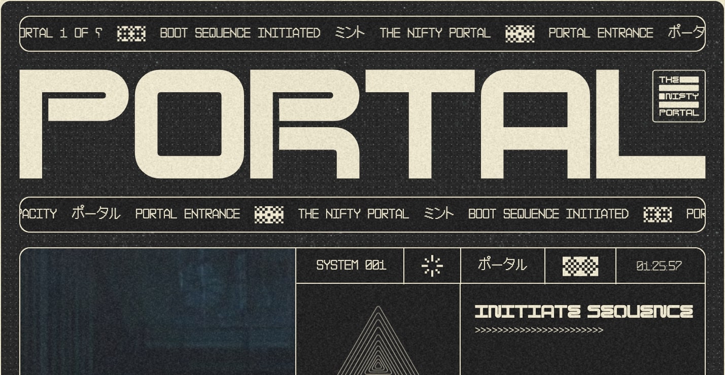
The Nifty Portal, an NFT art project, embodies all that is cyberpunk. The top display font looks like it could be from an interplanetary corporation from the year 2200. With thin vector lines dividing up the pages, computer terminal typography, icons that blink into focus, and atmospheric background images — viewers feel like they’re staring at a computer screen far below the surface of an alien world.
Retro 3D grid
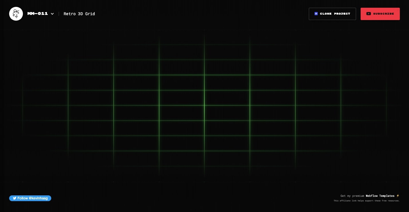
Though this isn’t a full website, you’ll want to check out Retro 3D Grid. With a green that looks like it’s ripped straight from an old Apple IIe monitor, this animated grid will add a sense of retrofuturistic charm to any website that you integrate it into.
Even better, you can clone it for free, giving you a great starting point for your own retro-tech design projects.
Lars Olson Portfolio

Lars Olson takes up the vaporwave ethos without using any of its common design tropes. You won’t find a single Roman statue or kitschy gradient. Instead, Lars takes the tenets of vaporwave in different directions.
Lars’s website features ridiculous visuals including a pineapple, dolphins, and 90s clip art-inspired background shapes. You’ll also find an eye-catching palette of fluorescent greens, blues, and purples.
Ribbon Finance
Cryptocurrency site Ribbon Finance, pitches their product in an 8-bit style typeface.
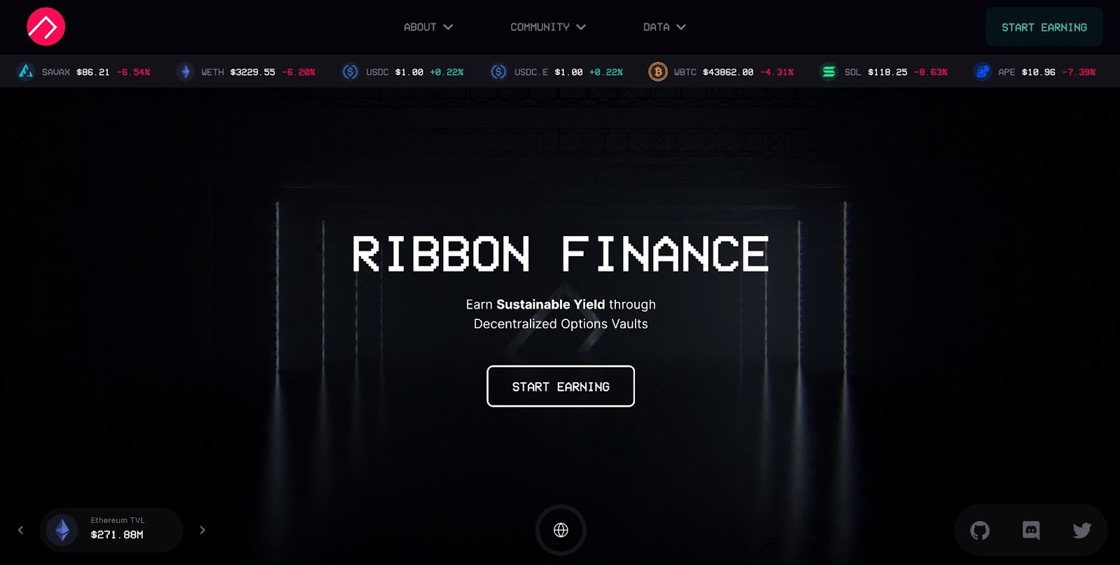
Though Ribbon Finance relishes in the nostalgia of antiquated technology, you’ll find plenty of modern embellishments. The opening has a captivating micro-interaction, opening up squares of glowing colors. This motif is found elsewhere in the design, with a hover effect that touches several elements, illuminating them with fluorescent light.
Ribbon Finance melds the past and with what’s modern, making it the perfect distillation of retrofuturism.
Chafik Design

Data and AI Engineer Chafik combines the best of vaporwave and cyberpunk for their portfolio with elements like an alien busting dance moves in the hero section, purple and blue gradients, and glitchy text. True to the theme, Chafik claims to be “from another planet” and encourages potential clients to reach out to “make the future now.”
Nikita Rybai portfolio
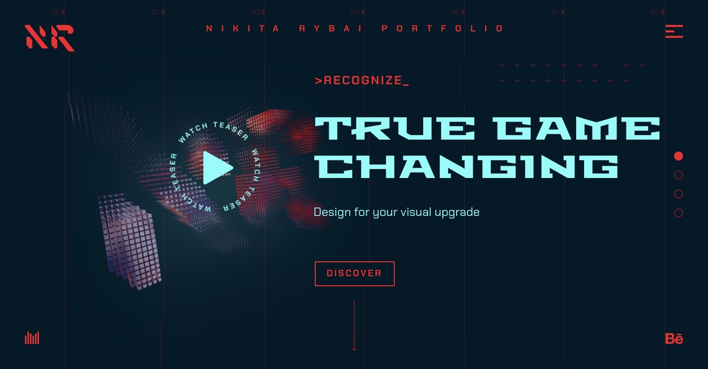
Nikita Rybai’s portfolio delivers an immersive cyberpunk user experience.
Though this is a more polished entry to our discussion, it still has hints of the grittier aspects of cyberpunk. The hero section has a strange configuration of blocky geometric shapes that shifts upon hover. There are also other lo-fi details like a pixelated email icon and command line-style text throughout the site.
Take your own designs into the past and future
While many design trends favor smooth lines and refinement, retrofuturism pushes against such perfectionism. It embraces visuals that mimic blips and bugs and revels in clunky, pixelated typefaces. Retrofuturism takes what’s out of style and spins it into something new.
And that’s the beauty of web design — every designer has the power to mix and match the design trends and styles they prefer. Whatever cool new sites you’re building, we’d love to see them Made in Webflow!
