

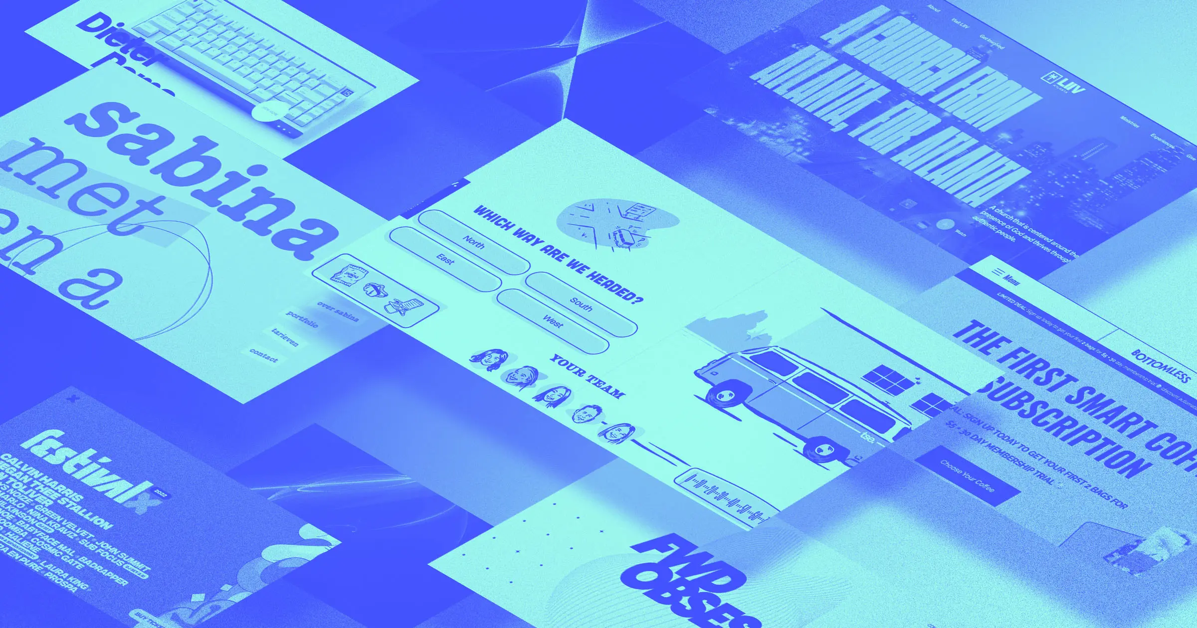
For our September 2022 website roundup, we took a look at projects that engage and entertain.
One uses interaction and animations to create a game for its team’s annual retreat. Others use background effects, interesting navigation, and photo-centric layouts to capture our interest.
Engaging animation
Websites can use animation in ways that are enticing and visually mesmerizing. They can also use it to engage viewers in a deeper way, adding more meaning to a site than it could have with a static page.
ThreeSixtyEight Retreat
ThreeSixtyEight is a design agency that specializes in deeply engaging interactive experiences. It's no surprise that their 2022 team retreat invite took the form of a nostalgic Oregon Trail–style game. Beat the game and get the location of its top-secret retreat destination.
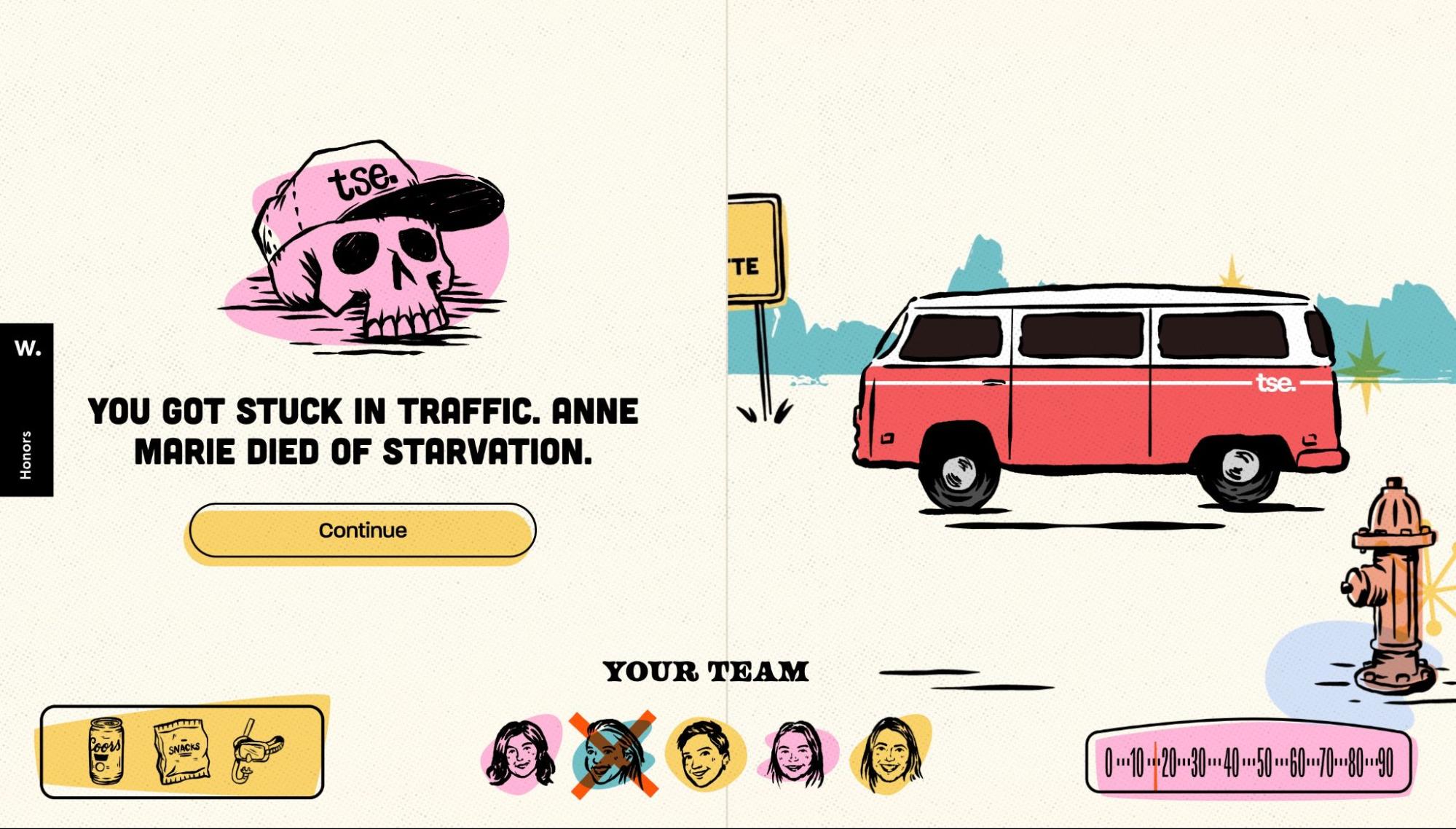
The road-trip reveal the company built lets you gather a team, choose some supplies, and drive your van off into the landscape. Be sure you’re making the right decisions, though, or your coworkers might not make it.
Clever use of scroll and mouseover interactions and a multi-choice play style join together to make the game engaging — without too much technical complexity. Sound effects and some very charming illustrations make it cute and entertaining to play.
For a breakdown of the elements of its design, check out its page on Awwwards.
Sabina met een A
Sabina met een A (which translates to Sabina with an A) is the website of photographer and copywriter Sabina van Gils. Her photography is unexpected and intriguing. Its clean and simple composition pulls all our attention to her interesting subjects.
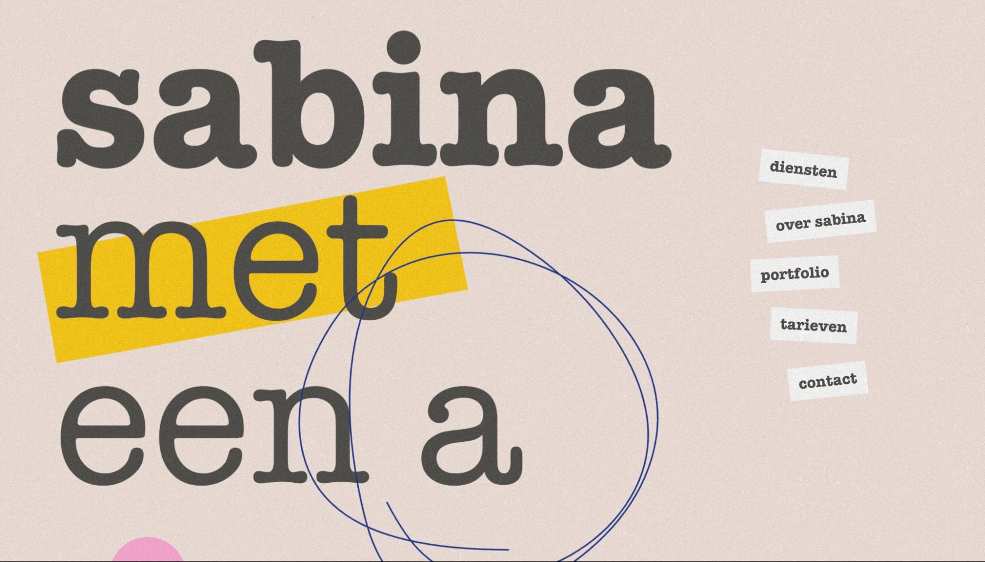
Her website is similarly minimal yet quirky. It has the carefree and creative feeling of a scrapbook. What brings it to the next level creatively is the way it uses animation. Loading animations, mouse interactions, and animations on scroll make perusing her site a delightful experience.
Sabina’s photographs are shown off right in the middle of the page with a subtle brightening effect on mouseover and a slow, deliberate scroll. These animations draw our attention to her work rather than distract from it.
Forward Obsessed
On the Forward Obsessed podcast, Pete Sena and David Salinas interview entrepreneurs and business leaders about their own experiences and their visions for the future of business. Their podcast’s website uses animated effects to create a minimal yet intriguing experience for visitors.
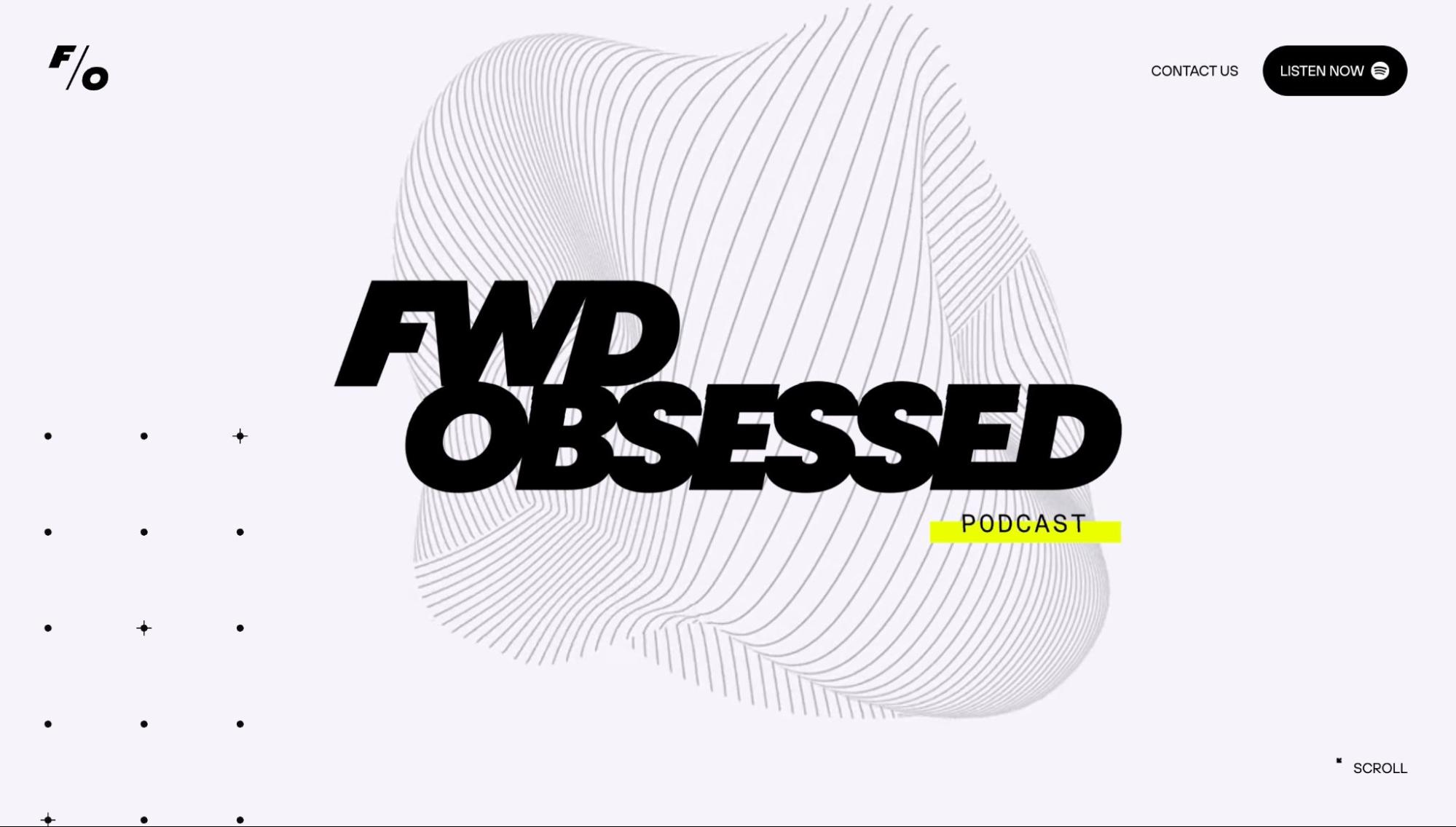
The first thing you notice is the mesmerizing abstract background animations. With an extremely clean black-and-white design and few other elements to distract, the background animations bring our full interest to the page.
They also use an animated effect to bring additional information to their podcast episodes list. When your mouse hovers over an episode title, a little animated icon pops up, giving a hint about that episode’s main focus. It’s just enough information to pique our interest and get us to click through to listen.
Photographs as design
Sometimes anchoring your design in a photograph — or photographs — creates a truly beautiful website. The modern version isn’t a gallery or a slideshow. Instead, these designers used cleverly curated images throughout their designs to build meaning and connection.
LIIV Atlanta
LIIV Atlanta is “A church that is centered around the presence of God and thrives through authentic people.” Its focus is all on its community and the individuals within it. The church hosts services, provides childcare, and builds a support system for its congregation. The choice to anchor the design of its website in photographs of people communicates that mission perfectly.
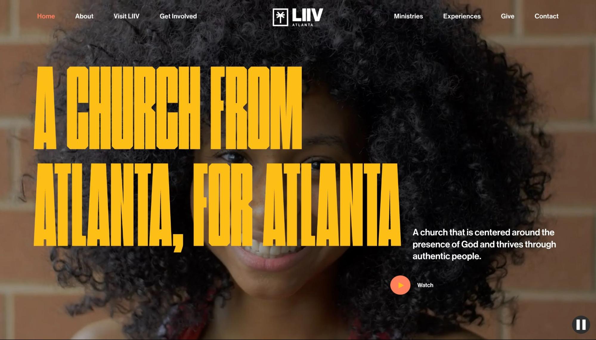
LIIV’s site opens with dramatic videos splashed across the entirety of its hero section. From the first moment you open the site, you know where the church is and what it represents. The rest of the site intersperses bright, cheerful photographs of its congregants. This layout works perfectly for a community-focused organization’s site.
Dieter Rams
Dieter Rams’ website, in contrast, leans into the art of minimalism, which makes sense for a German industrial designer. His designs, like his site, boast a clean, vintage aesthetic that speaks to functionality and efficiency.
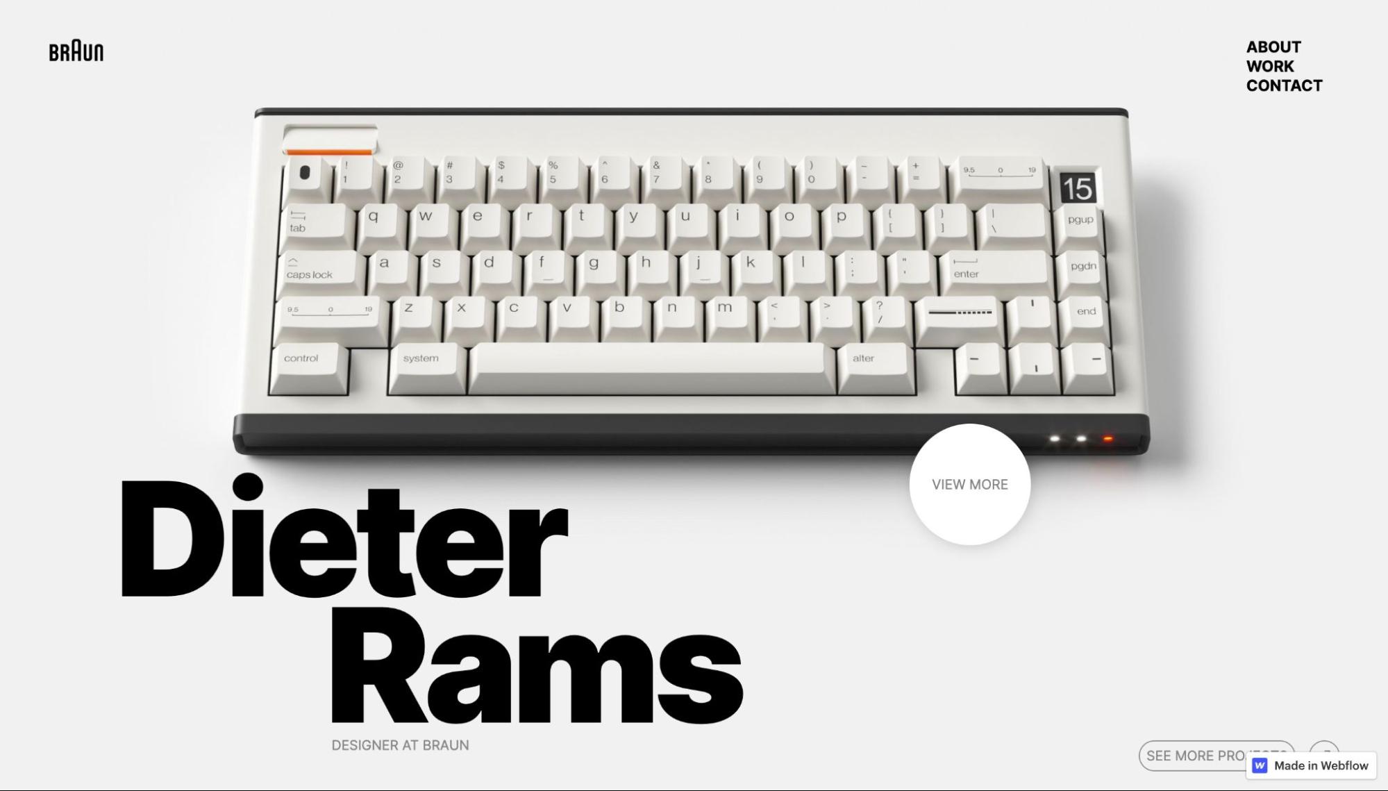
The striking image of a keyboard that appears when you open his site sets the viewer’s expectations perfectly. Despite being a photograph, the purity of the white background and the perfect symmetry of the image create a graphic effect. There are images of Rams and his work throughout the site, and the minimal design brings all the viewer’s attention to his creations.


Get started for free
Create custom, scalable websites — without writing code. Start building in Webflow.
Multi-path navigation
Sometimes you need to get a user to a specific outcome, no matter the path. These websites use multiple navigation options to let visitors explore while making sure they get to their final destination.
Festival X
Festival X will be bringing music and festivities to the Gold Coast of Australia this November. Its site is as colorful and exciting as its lineup. With music festival sites, three things are vital — the where and when, the lineup, and the tickets. Its navigation makes sure you get all this information, whatever path you take.
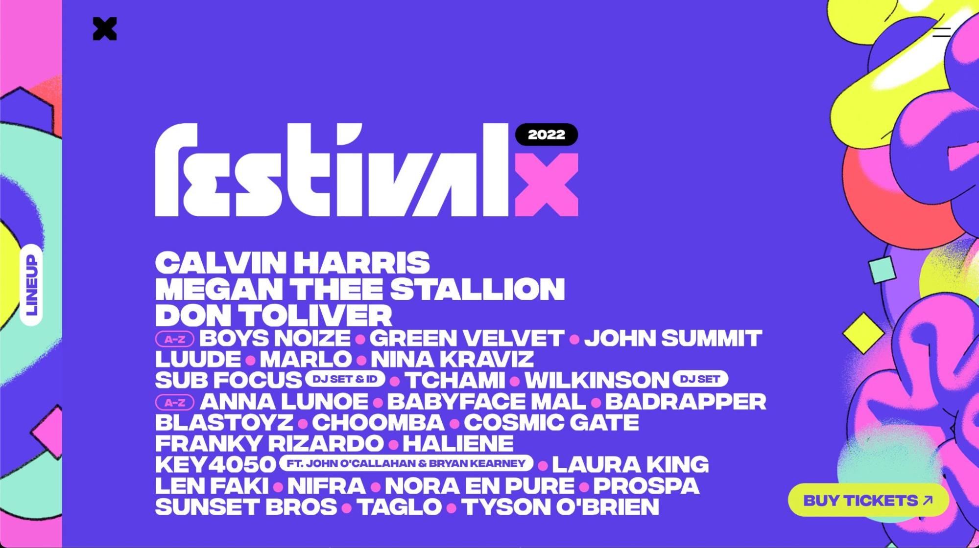
The lineup is the first thing you see when you open the site. Visitors can click the performers’ names to pull up photos and details on the artists. They can also navigate to these pages through the hamburger menu in the top right corner, a “Lineup” button on the left, and another visible menu at the very bottom of the pages.
“Buy tickets” stays obvious, hovering at the bottom left corner no matter where the user is on the site. That way, whenever they decide to attend the festival, the path is always clear.
Bottomless
Bottomless is a coffee delivery service that provides replenishing orders of customized coffee-making supplies to users. The company partners with high-end roasteries to give customers access to coffee without having to travel to a store.
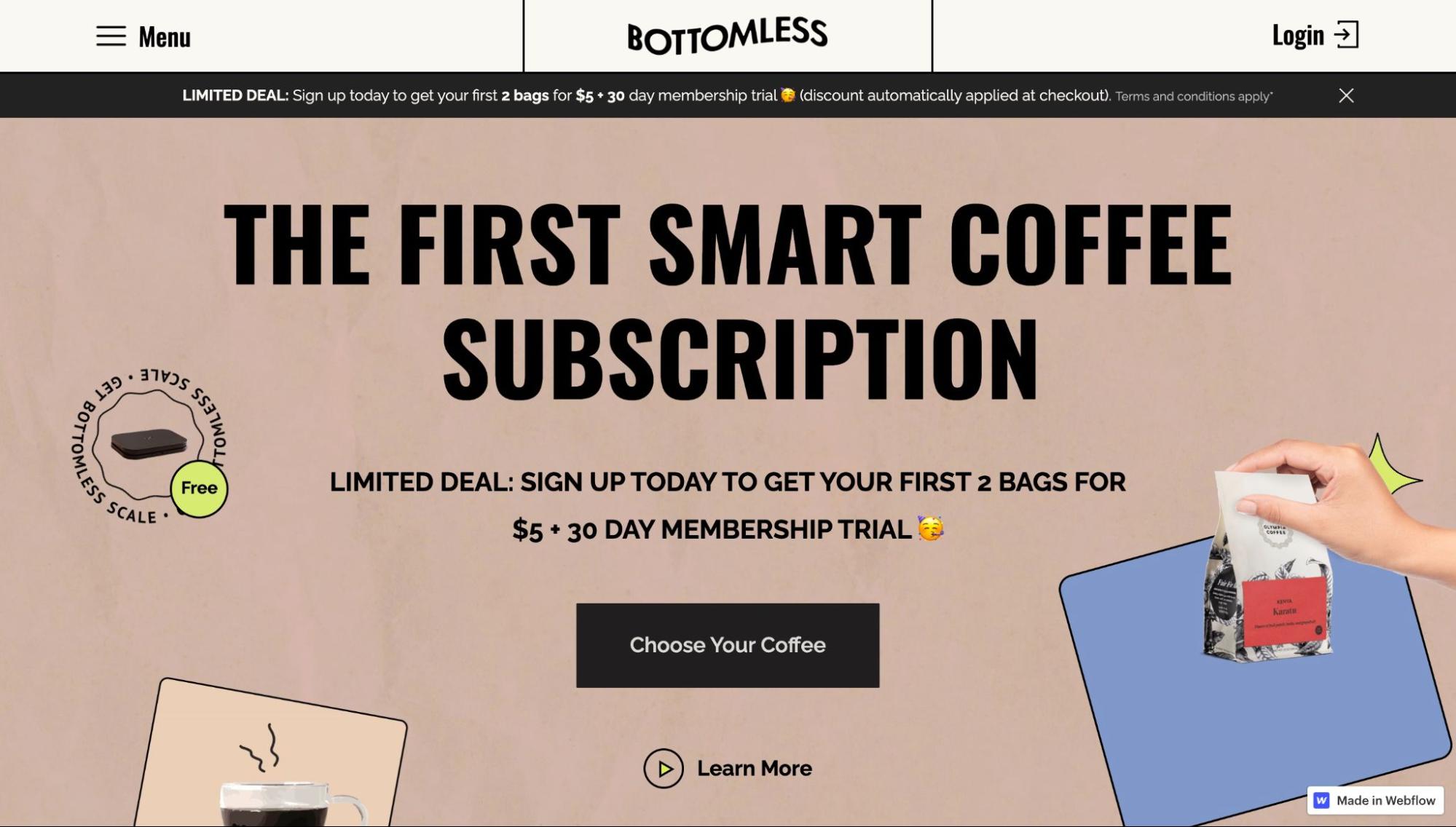
The site is still a work in progress, but the company uses a “Choose Your Coffee” call to action throughout its design. Visitors can freely browse, and whenever they’re ready, they can begin shopping for their coffee beans of choice. The CTA button repeats throughout the site, giving users an easy path to purchase.
Once they hit the shop button, visitors are led through a series of pages where they can customize their choices. Each page features descriptions and images with large, clear buttons where they can make their selection.
Do they want dark roast, medium, or light? What grind do they need? How much coffee do they go through in a week? Based on that, the site recommends an order size and reorder schedule. By the time customers have put together a perfectly tailored coffee box, they know exactly what the value proposition is.
Share your creations with Made in Webflow
The Webflow community loves to explore projects through Made in Webflow, and so do we! Share yours, and you might show up in our monthly roundup.