As another less-than-normal school year ends, we wanted to show off some of the best website portfolios that we’ve seen from recent graduates.
We remain committed to making Webflow free for students and educators — and we love seeing the amazing work that comes from virtual and physical classrooms around the world.
The best thing is that all of the grad portfolios featured in this post have come from students studying a variety of topics such as UI design, graphic design, visual communication, mathematics, entrepreneurship and more.
Here’s some of our favorite graduate portfolio examples. We hope they inspire you as much as they’ve inspired us.
Gerardo Orozco – San Diego City College ‘22
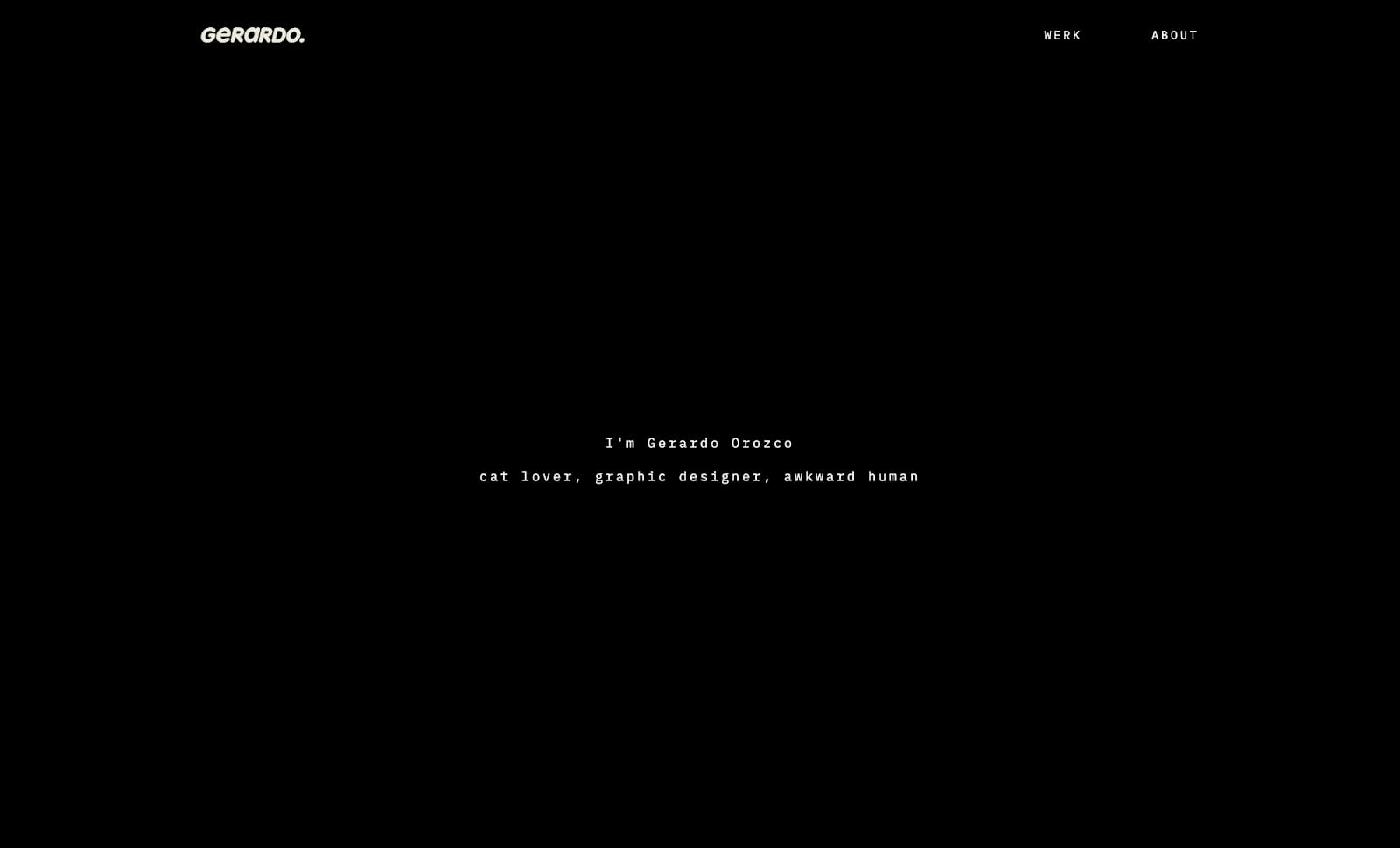
Gerardo Orozco’s portfolio is one of the most engaging student portfolios we’ve ever seen. From the get-go, the scroll animations pull you in, as do the playful typography choices.
The thing that stands out the most throughout Gerardo’s site is how colorful and playful their work is, as well as the fact that they’re able to work on so many mediums. In addition, the work Gerardo showcases perfectly ties into their career goal to work as a graphic designer in the film industry.
Kristoffer Staugaard – University College Lillebaelt
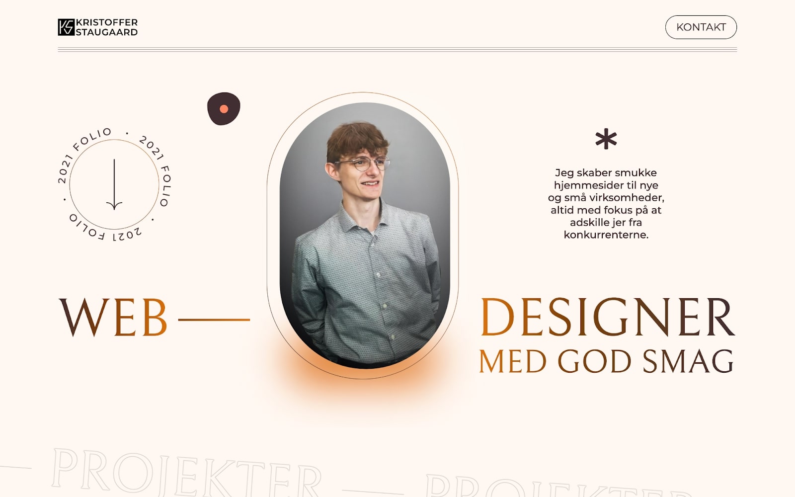
Kristoffer Staugaard’s portfolio is really fun to scroll through — with a great mouse interaction that makes hover animations even more effective. As you scroll through the homepage, Kristoffer shows off his different projects. He uses well placed and concise copy with eye-catching typefaces, along with small visual aids from the projects.
Kristoffer’s portfolio is one of the few that uses quotes from previous clients as a form of social proof. (A tip: if you’re a student and haven’t done any real-world projects yet — ask your lecturers or professors for a quote!)
Novia Chao – University of British Columbia ‘22

Novia Chao’s portfolio does an amazing job of showing her personality, alongside showcasing her work.
Her “About” page states that “design is at the core of how humans interact, navigate, and understand the world.” So, it’s no surprise that her portfolio is an absolute joy to navigate. When you land on Novia’s portfolio, you’re greeted by a beautiful gradient that changes ever so slightly as you scroll through the homepage. Hover animations encourage you to click through and explore her projects and draw you in.
Novia has a “playground” section on her portfolio, which is such a lovely way to show the smaller, non-project related designs that you create in a less structured way.
Lauren Shirley – University of Utah ‘22
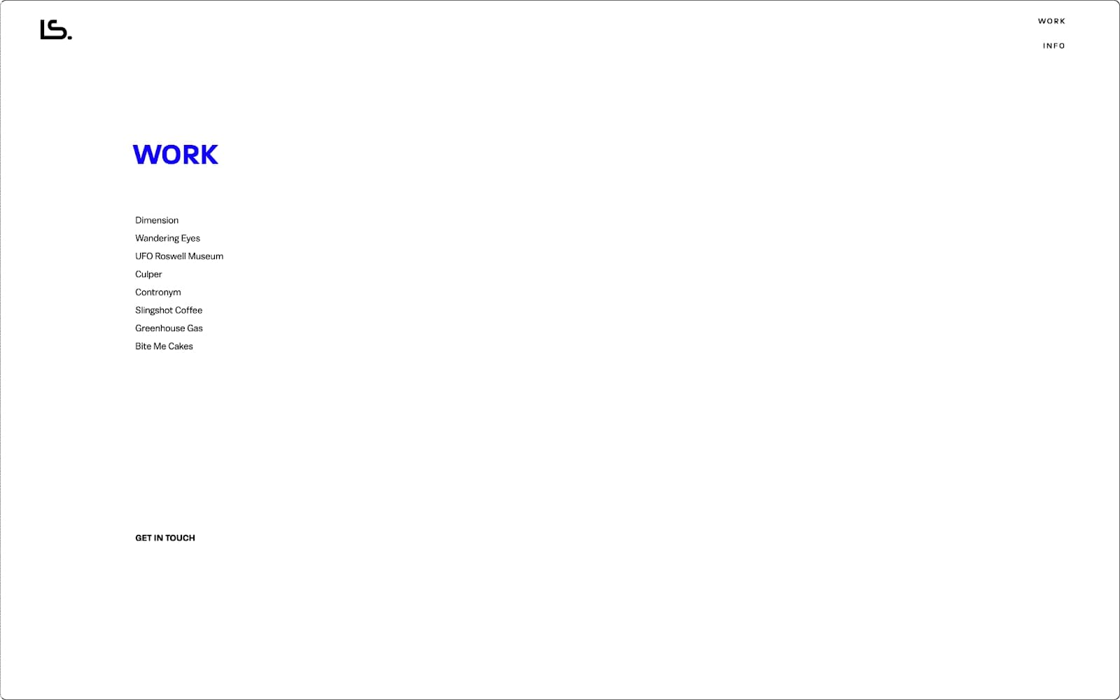
Lauren Shirley’s portfolio is one of the most unique sites on this list.
Her use of whitespace is incredible — you’re instantly drawn to click on one of her projects listed under “Work.” One of our favorite parts of her site is the sneak peak of each project as you hover over the project name.
Lauren’s work is an amazing combination of typography, print design, and graphic design — and her portfolio showcases all of these skills to the viewer.
Charlene Xinyi Zeng – Columbia University ‘22
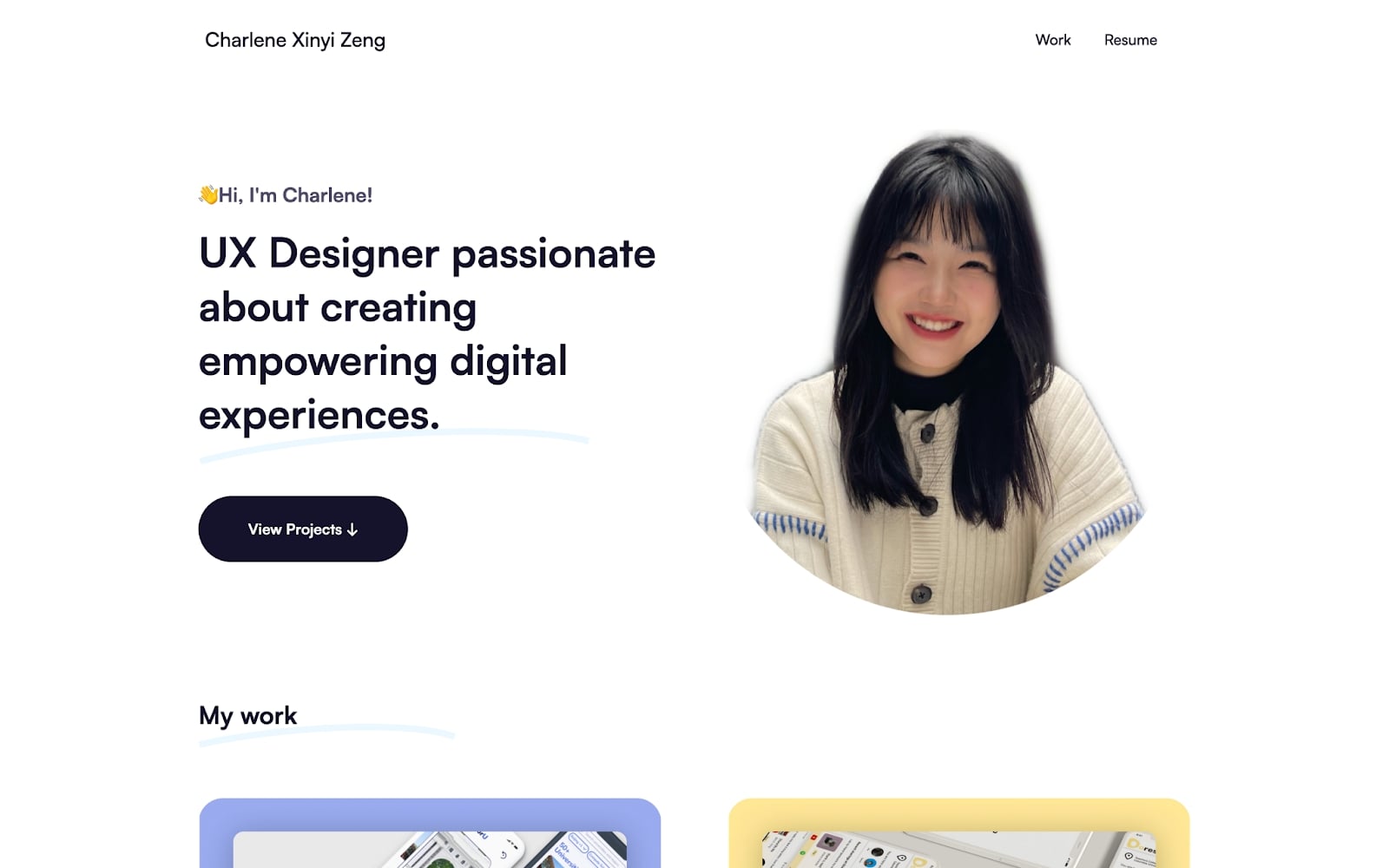
Charlene Xinyi Zeng’s portfolio appears relatively straightforward at first, but as you travel through her website, you’ll find tons of fun hover animations, scroll interactions, and typography plays.
Her product pages bring you on a journey through each project from start to finish. And Charlene makes her role in each project very clear — an important aspect that anyone building their own web portfolio should take note of.
Lauren Kim – Design Lab ‘22
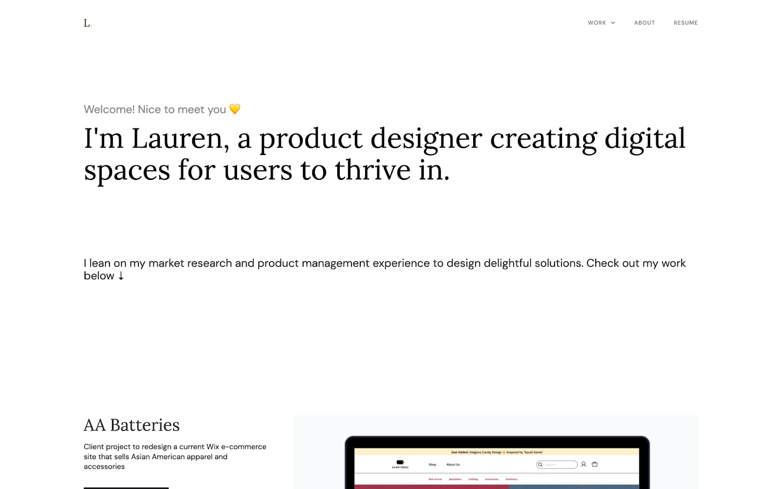
Lauren recently graduated from a Design Lab course in UI and UX interaction design. Design Lab is one of our approved online courses, and we’ve had over 250 of their students apply to use our student discount since we partnered with them at the end of 2021.
By using whitespace, Lauren’s portfolio directs viewers’ eyes to the most important content on the site.
Throughout her project pages, Lauren shows the business impact of every project she’s completed. Future employers want to see the impact of your previous projects and adding this important information could have a huge impact on your job search.


Get started for free
Create custom, scalable websites — without writing code. Start building in Webflow.
Jieying Xiao – National University of Singapore ‘22

Jieying Xiao’s portfolio is built around a subtle but eye-catching gradient — which is absolutely beautiful (also, not to brag but we called gradients with grain as a trend for design in 2022).
As you scroll down her homepage, Jieying features her most recent projects. Before you even click through to the project pages, Jieying shows off a picture of the project and includes a short blurb about it. By doing so, Jeiying gives potential employers or clients a high-level understanding of her work.
Marino Franulovic – Coventry University ‘22
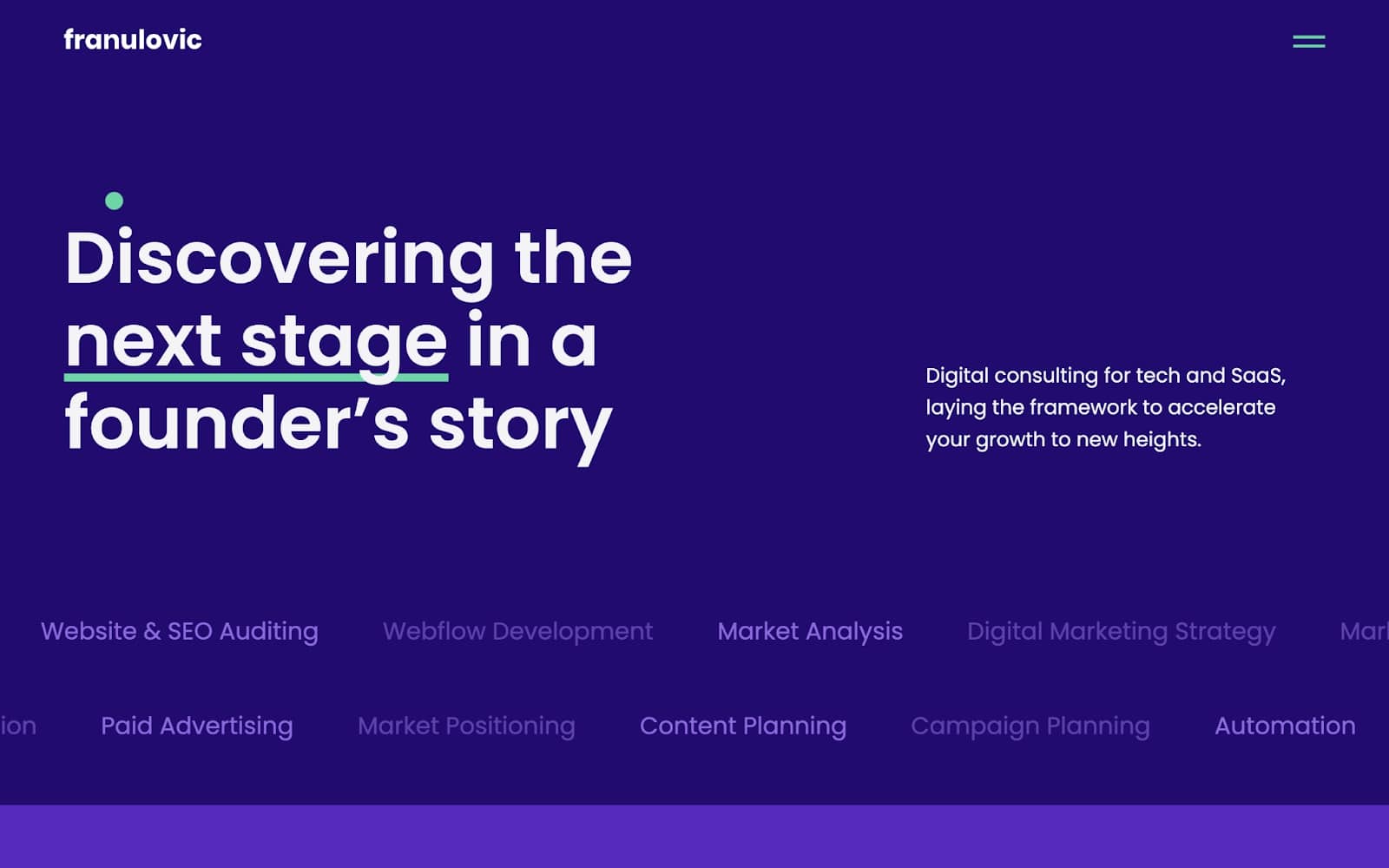
Marino Franulovic’s portfolio differs from the others on this list — he’s advertising digital marketing work instead of design. For this reason, his portfolio is more conversion-focused than the others.
Marino’s homepage is filled with super engaging scroll-animations and hover interactions. His use of color throughout is consistent, and gives the viewer the feeling of a fully-fledged brand rather than a recent grad’s portfolio. He’s also got a blog, which gives potential employers or clients a deeper look into his ideas.
Greg Chen – Carnegie Mellon ‘22
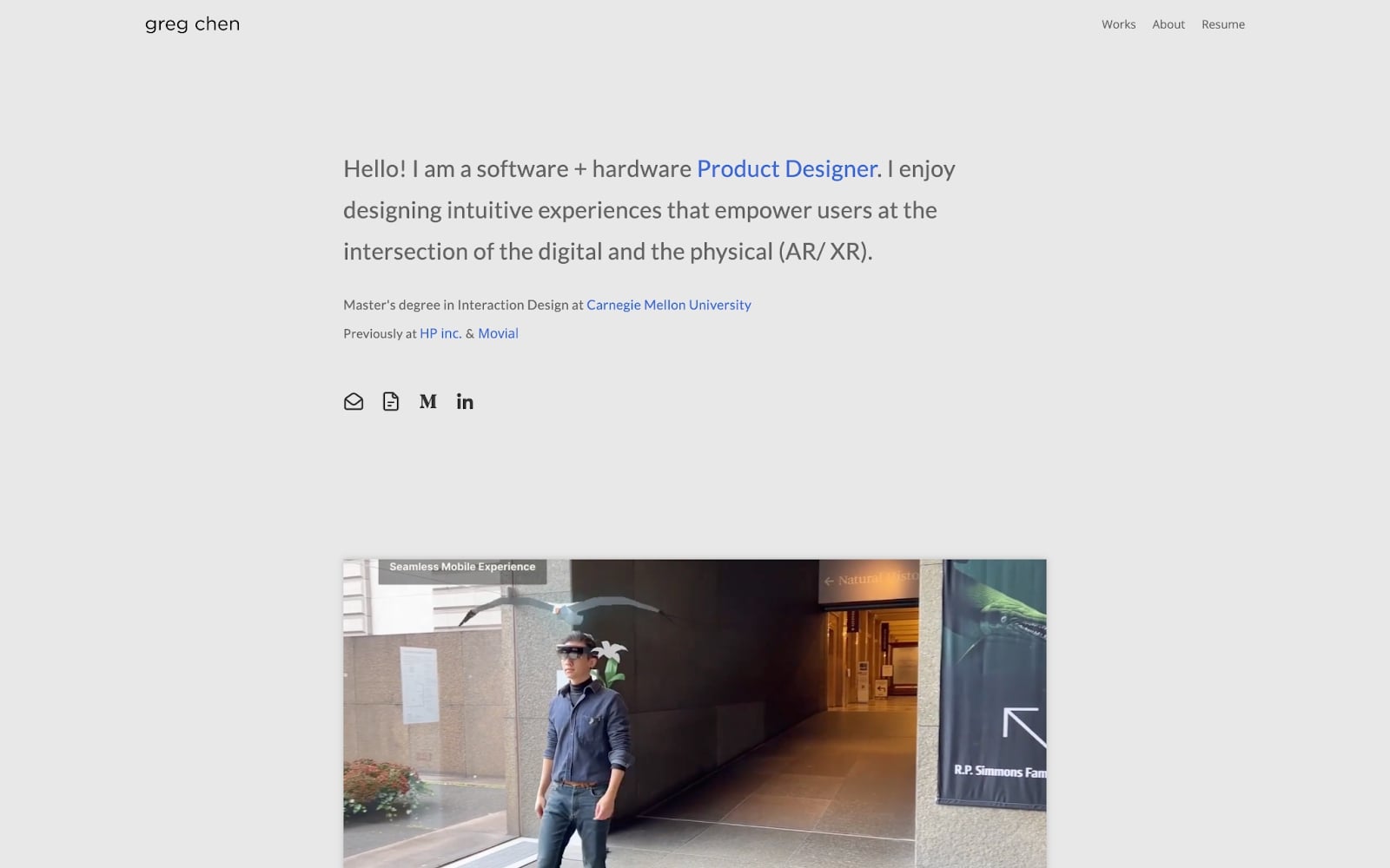
If you’re looking for a great way to lay out your product pages on your own portfolio, then Greg Chen’s is the perfect for some inspiration. He starts each project page with a description of the project, then runs through key information like timeline, team size, tools used, and his role.
The detailed project pages cover every step of the process from storyboarding through to prototyping and app UI — an important factor in highlighting his expertise and thought process for different projects.
Frequently asked questions
Should I include testimonials or quotes in my student portfolio if I don't have client work yet?
Yes, including testimonials in your student portfolio is a smart way to build credibility, even if you haven’t worked with clients yet. Consider asking professors, classmates, or project collaborators to share short quotes about your creativity, problem-solving, work ethic, or communication style. These endorsements offer valuable third-party validation and help paint a fuller picture of your professional potential. They also give potential employers insight into how you contribute to group work or handle feedback, which can be just as impactful as client testimonials.
How should I structure project case studies in a student portfolio to make my role and impact clear?
The most effective case studies clearly outline the challenge, your role, the steps you took, and the results. Start with a brief overview of the project goal or problem, then walk through your design process — including research, ideation, prototyping, and testing. Highlight your contributions with phrases like “I led,” “I researched,” or “I decided,” and use visual examples to support your narrative. Whenever possible, include measurable outcomes or reflections on what you learned to demonstrate growth, initiative, and strategic thinking — even in academic or personal projects.
What's the role of animations, hover effects, and whitespace in making a graduate portfolio more engaging?
Subtle animations, hover effects, and well-used whitespace can significantly enhance the user experience of your portfolio. Microinteractions — like hover states on buttons or animated transitions between sections — show you understand how to guide users through an interface and care about the small details. Whitespace gives your content room to breathe, creates hierarchy, and helps visitors focus on your work without feeling overwhelmed. Together, these elements elevate your portfolio from a basic showcase to a refined, thoughtfully designed experience that reflects your UX sensibilities and design maturity.
Get started on your own student portfolio
We wish all recent grads a great start to their career — and remember, Webflow is free for students and educators. Check out more student portfolio examples, or explore the 21-day portfolio course on Webflow University to get your new web design portfolio live.

Show off your work.
Choose from fully customizable portfolio templates built for creatives. With Webflow, you can design, refine, and publish a standout portfolio — without writing a single line of code.


.jpeg)


