Setting out on a project with only a vague idea of its organization will only complicate the process. Once you know the goals and scope of a project, it's time to create a sitemap and a wireframe. These will give you a guide to your website’s organization and a targeted outline for creating content.
Start with a sitemap

Have you ever looked out of an airplane window and seen the outline of a brand-new subdivision taking shape below? It’s kind of like a sitemap: a footprint signaling where structures need to be built, as seen from 30,000 feet.
A sitemap provides a diagram of the site’s hierarchy and shows where each page fits into this hierarchy.
(Note: in this post, we’re discussing the sitemap as a website planning and communication tool, not the literal XML sitemap you’ll create to aid search engine spiders in crawling your site — though the planning tool should essentially define what that XML sitemap will contain.)
As you’re building out your hierarchy, it’s vital that you continually reference your project’s goals. That’s because the site’s hierarchy needs to reflect and contribute to the fulfillment of that goal.
For example, if you’re building an ecommerce site, one of your goals will undoubtedly be to sell products. Thus, your sitemap should place product indices and pages at or near the top of the hierarchy, so visitors can immediately see where they need to go to fulfill your goal and theirs: buying stuff.
Creating your sitemap
You can approach the design of your sitemap in several different ways. You’ll want to choose your method based on two qualities:
- Ability to capture the information you need to capture
- Ability to convey the information you need to convey
In other words, it needs to be capable of conveying the info you want to convey in a manner that’s clear to your audience.
For example, here are 3 common ways of creating a sitemap, along with the information each is best at conveying:
1. The list
The list format is a simple ordered or unordered list that uses nesting to convey hierarchy. Here’s an example based on part of the core Webflow site:
Index
- Designer
- CMS
- Editor
- Hosting
- Customers
- Groupon
- New Story
- Possible
- Salt
- Freelancers
This is great for communicating page topics and relative hierarchy. You can immediately see that the pages for the Designer, CMS, Editor, Hosting, and Customers all receive the same level of prominence, with specific customer stories coming in one level lower.
What it’s not so good at communicating is user paths between those pages. There’s no indication, for instance, that Designer, CMS, Editor, and Hosting all appear under a dropdown labeled Features in the site’s main navigation. Or that each of those pages are linked to from the site’s homepage.
That makes a list format handy for, say, a page inventory, but you wouldn’t want to hand it to a client and say, “This is how people will navigate around the site.”
2. Horizontal diagram
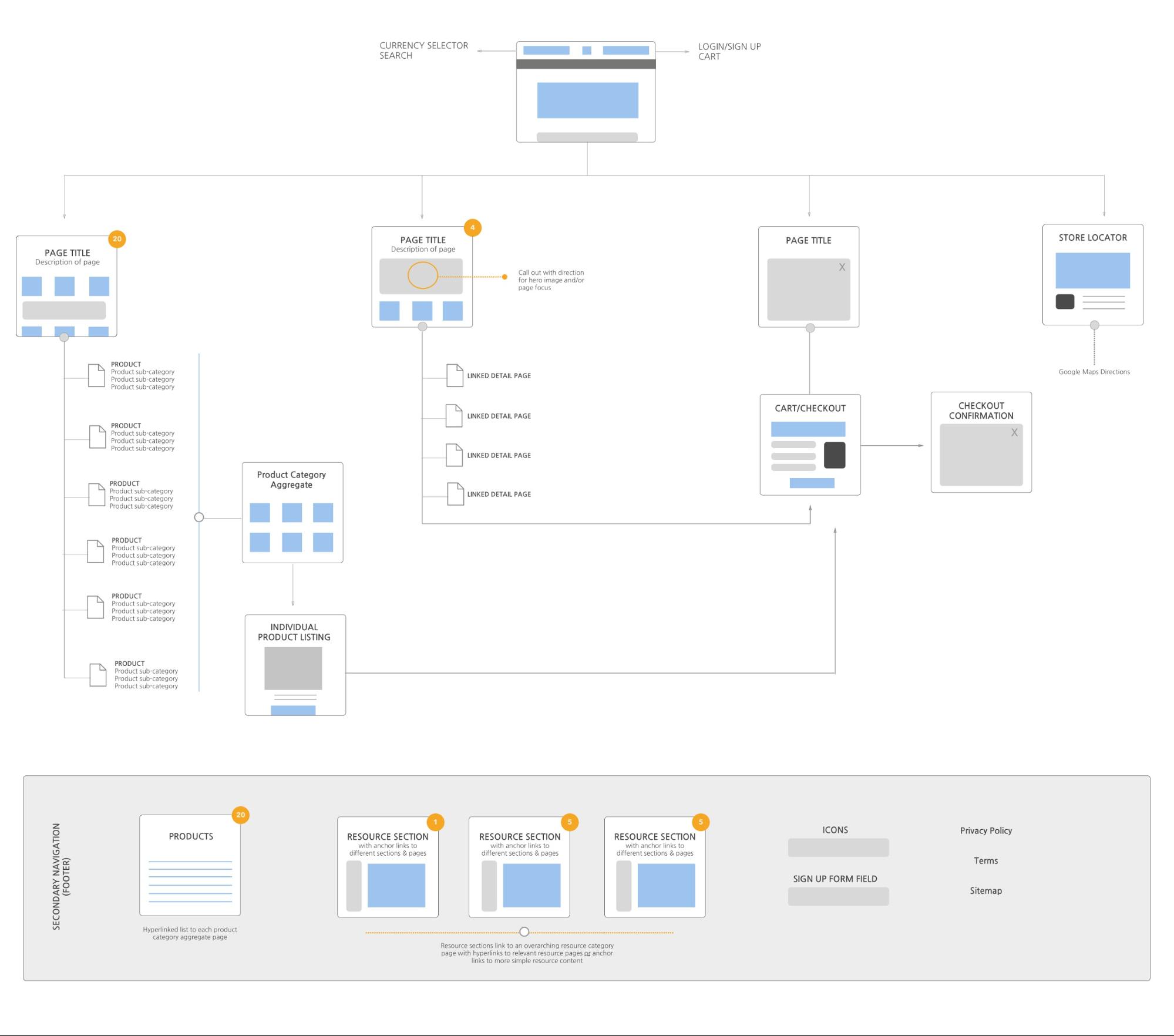
Hillary Pitts’ sitemap (at the top of this section) is a horizontal diagram, probably the most familiar form of sitemap out there.
Like the list, it captures a high-level view of the site. Unlike the list format, it more clearly indicates paths between pages/experiences, as you can see in the checkout flow that runs across the center of the map.
That makes it a far better tool for communicating the hierarchy and how people will navigate the site to clients and other non-technical folks. Though it works beautifully for the technically inclined too!
It’s worth noting that, as Pitts’ site is an ecommerce store, it doesn’t provide a comprehensive inventory of site pages. There could be one or one thousand different product pages — it doesn’t matter for this map, as product pages will almost certainly be handled via dynamic templates, and the flow from product index to product detail is unlikely to vary from product to product. However, if there are product types that require distinct content models, you'd want to note those.
3. Vertical diagram
The vertical diagram is basically just a horizontal diagram tipped over on its side. Because the left-to-right flow connotes progress (in cultures where reading flows left to right), vertical diagrams are most useful for mapping a more contained experience, such as a specific user flow, or the structure of a more specific area of the site.
The purchase flow section of Pitts’ horizontal diagram would be a good candidate for a vertical diagram (and in fact, kind of is a vertical diagram, embedded in the horizontal one).
Running into trouble with your sitemap? Try a card sort!
If you and your client have clearly defined your project’s goals, there’s a good chance that building your sitemap will come pretty naturally. But on larger projects, and those with detailed content, you might need to break out a tried and true tool: the card sort.
To run a card sort, just gather yourself, your client, and any other stakeholders together (in person or digitally). Then write down all your page names on index cards and collaboratively sort them into categories that make sense for you all. Once that’s done, create a sitemap based on the sorted cards and (ideally) run it by a few members of your target audience to make sure it makes sense to them too.
Once you’ve nailed down the sitemap, you can dig into your wireframes, where this outline becomes far more specific and detailed.
Sitemap tools
Any design tool that boasts boxes, arrows, and text editing capabilities can help you get the job done when mindmapping. But it helps (a lot) to use a tool that has those boxes and arrows as pre-existing elements (often called stencils).
Here’s a few tools that come with sitemap elements preloaded:


The modern web design process
Discover the processes and tools behind high-performing websites in this free ebook.
Why you need to wireframe
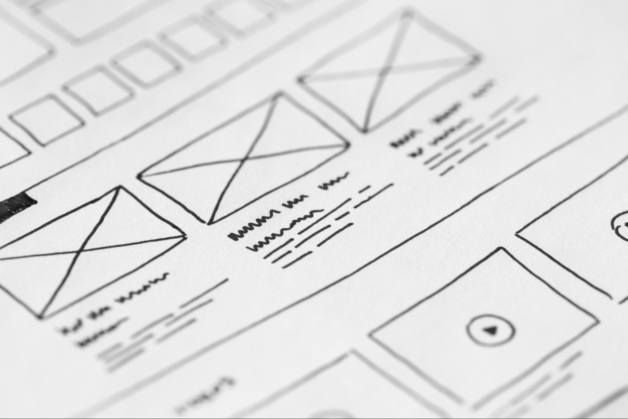
If a sitemap provides the blueprint for your whole website, a wireframe represents the blueprint for a single page (or group of pages). It’s what you’d see if you could take your sitemap, then zoom in on and enhance a single page in that high-level map.
Like the sitemap, a wireframe captures hierarchy. But this time, that hierarchy is limited to a single page, and thus defines the relative importance of content as it flows down the page.
Similar to prototypes, wireframes can come in a variety of levels of fidelity. Some wireframes basically are the final design, complete with the final fonts and sizing, sample photos, and even production-ready copy. Others are much more schematic, sticking with a collection of monochrome boxes and blobs where content will one day appear.
Because of that wide range of fidelities, it’s important to clearly explain to your stakeholders just how final-final your wireframe is.

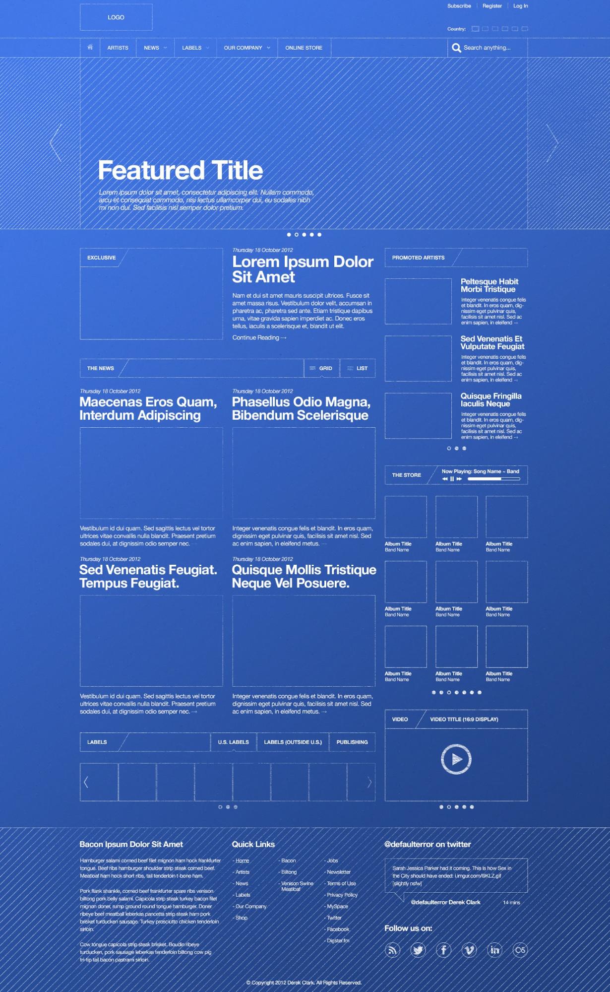
Take a moment to review this wireframe from a content perspective. It actually has a lot of implications that will either need to be turned into content standards, or revised with content standards in mind!
For example:
- The large headline type means articles won’t be able to have more than 6 or 7 words
- Article teasers can be comparatively long, which could help mitigate the above limit
- Every article will need to highlight an image
- Slider headlines will need to be extremely short due to the type size
- There’s a “country switcher” in the top right, which could imply a need for translating site content. That can have significant design impact, as a 6 or 7 word title in German is likely to be much longer than one written in English.
And that’s just for starters.
Related reads: 10 best wireframe tools for designers
Give stakeholders just enough to get the right idea

Don't mistake a wireframe for a prototype. Wireframes provide a schematic representation, with graphics and content (usually) stripped away, showing the basic structure. Prototypes, on the other hand, should present a working version of the final site (although level of fidelity can, again, range widely).
Wireframes allow stakeholders to see how individual pages within a website will flow and function. And since nothing in a wireframe has been set down in code, stakeholders have the freedom to request drastic changes before you even start designing.
Wireframes communicate the structure of a website in a visual way that everyone can understand. Something like a state change can be complex to describe to someone unfamiliar with design, but a wireframe can clarify that with a simple visual or two.
One thing that needs to be made clear before you show anyone your wireframes is what exactly the represent.
It should be obvious to any viewer that these wireframes don’t represent how the end product is going to look and function. Keep things simple and clear so that everyone can visualize what the project is going to entail. Simple grayscale shapes should do the trick.
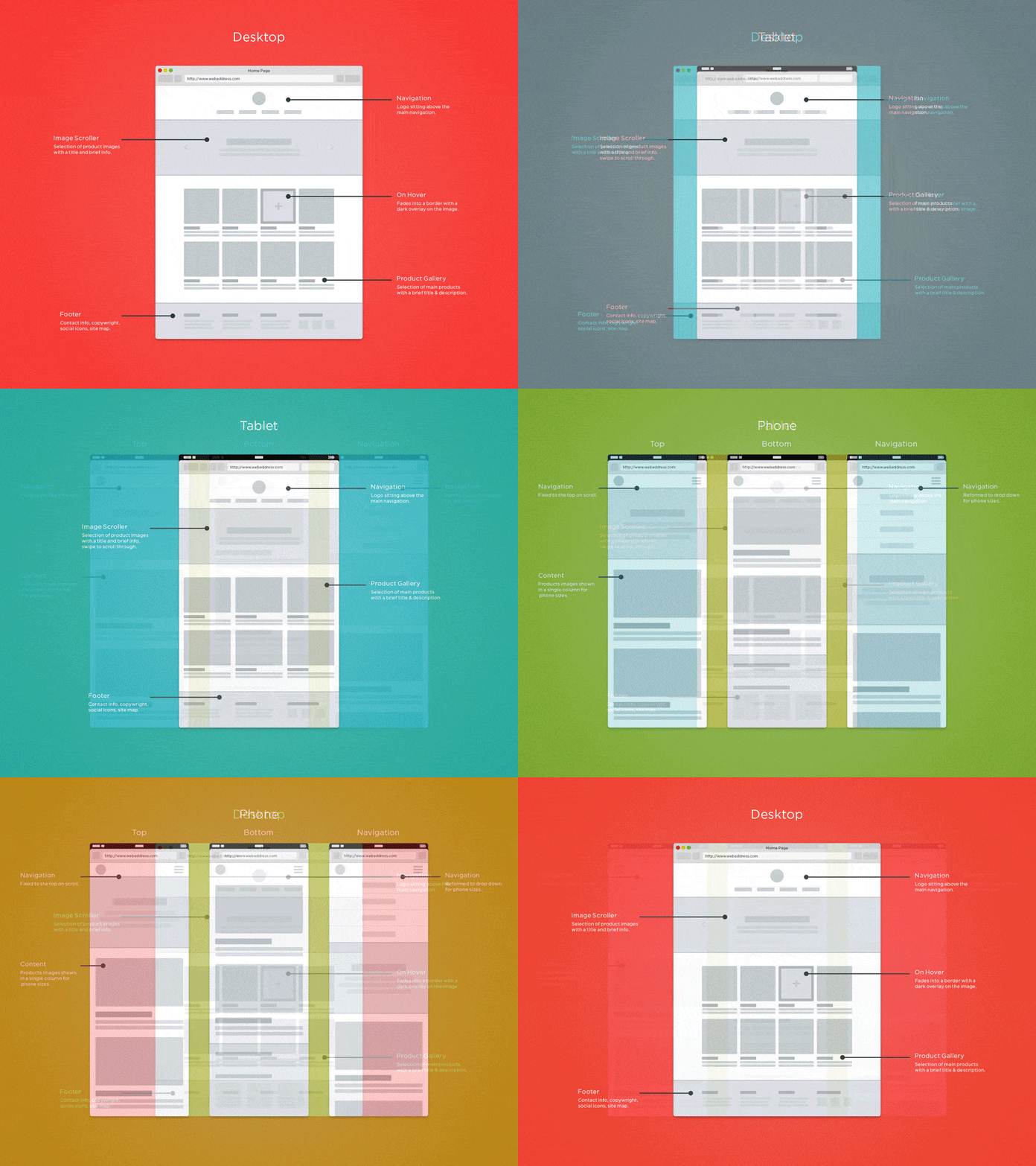
If in doubt, annotate
Because your wireframe is a schematic of a web page, you'll probably want to include any extra notes/annotations that can bring clarity to the experience.
Look at the wireframes below. As a designer, you no doubt immediately recognized the grey circle and four dashes as a logo and navigation links. But most clients wouldn’t know what they’re looking at without the “Navigation” callout!

Personally, I like to label wireframe sections in the wireframe, as long as I can come up with a clear, simple name. I’ve just seen too many stakeholders misunderstand a section’s purpose, and have that misunderstanding skew their feedback, to skimp on this simple addition.
Sitemaps and wireframes help you get a head start on content
What came first: the chicken or the egg? Who cares — what matters is the yolk. A design is like the shell that holds the content together.
No matter how great a design looks, it won’t make up for the fact that its contents may be rotten.
How do wireframes help? By showing us what content we need, and roughly how much space to devote to each section. Wireframes should thus flow directly from your site’s content strategy, showing the hierarchy of content on each page and how each page fits into the overall strategy. When writers are working from such a map, reaching their goals becomes that much easier.
That’s not to say that you need to start with the homepage. In fact, many believe that your homepage should be the last thing you create.
So where else do you start? With the content that matters most — i.e., that which contributes most to your project’s core goals.
Does this website hope to boost online sales? Then you’ll need to make sure each product gets a well-written, on-brand description, plus all the specs a potential buyer would want to know. Which goes a long way toward structuring the CMS fields you’ll need for your products Collection!
Is your site part of a bigger rebranding? Make sure you know how your project fits into the rebranding, and that you have all the assets you need to communicate this new company identity.
You don’t have to do all of the writing at once. Instead, focus on making sure your UI is understandable at a glance, if only in terms of what will go there.
For example, you can just have a few headlines to orient people to page content, then fill out the rest with placeholder fonts like BLOKK or the Flow typeface. Make sure that each section is labelled to show where content will go so that a client doesn’t get distracted by the filler content.
Content shapes design

Content encompasses everything of substance on a website. Whether it’s a video explaining a product, animations showing how an app works, or the about page for a nonprofit, each element is there to communicate a message or tell a story. You don’t need to have all of this content on hand before you make your design, but it certainly does help.
We’ve already discussed how a wireframe can shape content. But this can also work in the other direction. Once again, you don’t have to have all of this content completed. But if you have an outline of everything you want to include, you can create a sitemap and wireframe based on that outline.
Even knowing the types of content the website will require will help you come up with a sitemap and wireframe. This content does not to be fleshed out, but knowing that there needs to be a blog, a contact page for customers seeking quotes, and a page about the company’s history will help you figure out how everything needs to be structured. A sitemap breaks a website down to its most basic components and a wireframe gives more detail of what each page will contain.
But if you do have fleshed-out content ready, bring that content into your wireframes to see how it fits. If the content on hand exceeds the dedicated space, you may need to further divide it. You can then add this additional page to the wireframe and tweak the content organization. This is way easier on a designer than doing it after the fact.
Know your SEO
Search engine optimization shouldn’t be an afterthought. So before you sit down to start sitemapping and wireframing, arm yourself with a list of the keywords a client wants to target, and shape the structure and organization of the website and its content accordingly.
The wireframing stage can be a great place to start your SEO work because you can do it without all the distractions that come from fully developed content. Without all those words on the page, you can focus on key SEO elements like headlines, meta tags, and navigational elements. These SEO-ified wireframes can then serve as a great outline for the creators of the final content.
When you put in the work beforehand, the process gets easier
A sitemap and wireframes lay the foundation to build a website on. When you’ve prepared and put thought into the site goals, architecture, and UX it makes for a purpose-driven process. When the path to success has been cleared of obstructions, it makes for a quicker journey.


