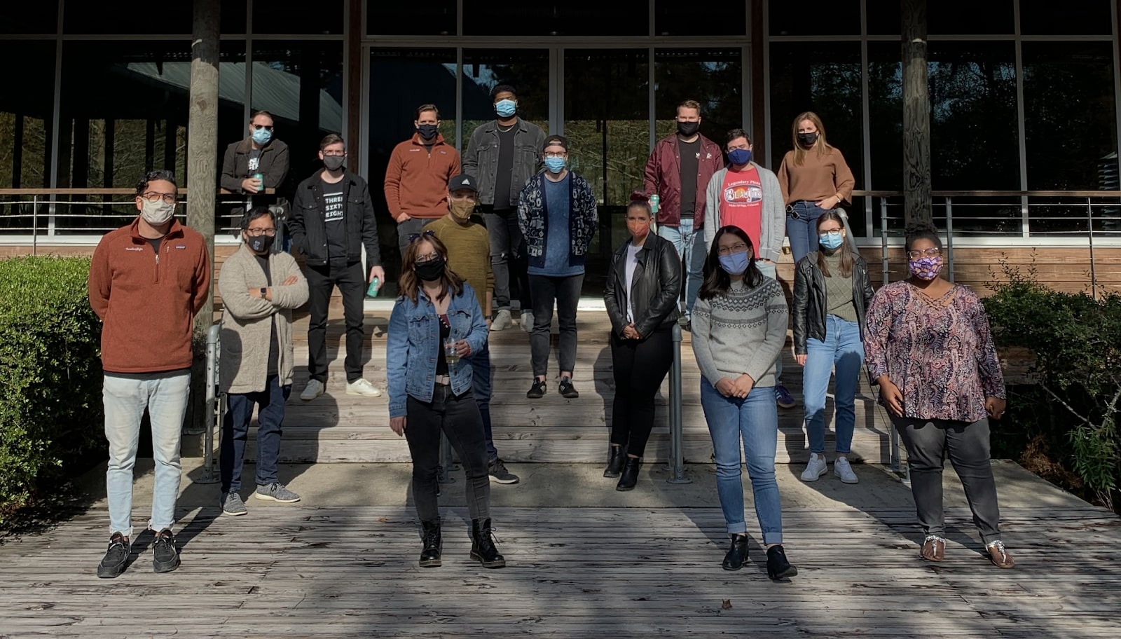
For Jeremy Beyt, Chief Strategy Officer and co-founder of ThreeSixtyEight, it was clear that there was an opportunity to evolve.
At the time, ThreeSixtyEight — a full-scale design agency based in Baton Rouge, LA — was a WordPress shop, utilizing an agile waterfall approach between strategy, design, and engineering to create websites for their clients.
Though the ThreeSixtyEight team found WordPress, the preeminent open-source web behemoth, to be generally well-suited for their needs, there were very clear limitations that increasingly couldn’t be ignored. “It was a constant push and pull between engineering and design,” said Jeremy. “There was a constant tension of priorities, with designers striving for novel interactions, and developers striving for efficiency and scalability.”
According to Jeremy, it was the handoff from design to engineering that was the main pain point for the ThreeSixtyEight team. In turn, this would cause a litany of issues — designers building heavy sites without understanding the limitations of code, and engineers limiting designers’ ability to design — ultimately slowing down build times.
This became a major issue especially as the design landscape evolved. “Websites started to get more design heavy,” said Jeremy. “All these design elements started to become more complex, and our work started falling behind.”
For Jeremy and the team at ThreeSixtyEight, it was clear that they needed an overhaul. Not just with what they were building on, but how they were building and how their organization was structured.
But first, let’s take an even closer look at how the agency operated using WordPress.
Friction and inefficiencies
On paper, it was a natural fit for an agency like ThreeSixtyEight to use WordPress as their site builder of choice.
But according to Shelby Buquet, Interaction Designer at ThreeSixtyEight, building with WordPress caused friction between design and engineering. “As designers, our vision often wouldn’t come across in the way that we wanted in development. There was always a barrier between the role of designer and developer,” he said.
In short, designers would want to build the coolest, biggest, site — and developers would push back in order to have efficient and streamlined code. “With the limitations of code, there was always this argument of ‘which way do we go?’” said Jeremy. “Nobody had a clear answer. There still isn’t a clear answer.”
As a result, neither design nor development was able to deliver an optimal product to the client, because the original design vision and what was delivered often differed.
“There were often significant inefficiencies, both from a business perspective and from a production perspective,” said Jeremy. “It was difficult to consistently deliver on the original vision. It was a game of compromise.”
As ThreeSixtyEight tried to work through those challenges, web design was also evolving. Beautiful, innovative sites began proliferating in the market, and not only were they heavy with design, but the elements were complex and the interactions were fast and flexible.
This caused the design-to-development handoffs at ThreeSixtyEight to become more and more strained.
“I felt like I was banging my head against the wall,” said Jeremy. “How are other teams accomplishing this? Some have design-dev hybrids, but then, I started hearing about Webflow.”
Uncertainties and ambivalence
When Jeremy first looked at Webflow, it was far from love at first sight.
“I looked at Webflow and admittedly dismissed it,” said Jeremy. “I thought it was just another small business product for people who aren’t striving to push the limits of web.”
Shelby felt ambivalent as well. “I thought, oh, this is just another one of those drag and drop editors,” he said. On top of that, he couldn’t imagine it being possible to bring the power of high-level development onto a visual platform.
For about a year, Jeremy and the team ignored Webflow as a viable option. And then one of Jeremy’s freelancing friends told him about his experience switching over to Webflow. “My friend was like, ‘Have you taken a look at Webflow? You have to look at it. It’s all I use now,’” Jeremy said.
This piqued Jeremy’s interest, and that night, he went home and started watching all of the videos in Webflow University. “I just watched all of them in one night, binged it. I felt like I was looking into the future,” he said.
For Jeremy, Webflow’s ability to frictionlessly merge design and engineering, and build and iterate quickly were game-changers — and the antidote to much of ThreeSixtyEight’s problems. Plus, it empowered their clients to be able to make changes quickly and seamlessly.
Afterwards, Jeremy knew that this Webflow was the direction that ThreeSixtyEight needed to take. “I wanted to find the best Webflow designer that I could find, and I came across Tim Ricks, who happened to be in our city.” Jeremy and the ThreeSixtyEight team hired Tim immediately to explore the possibilities with Webflow.


Webflow — the modern WordPress alternative
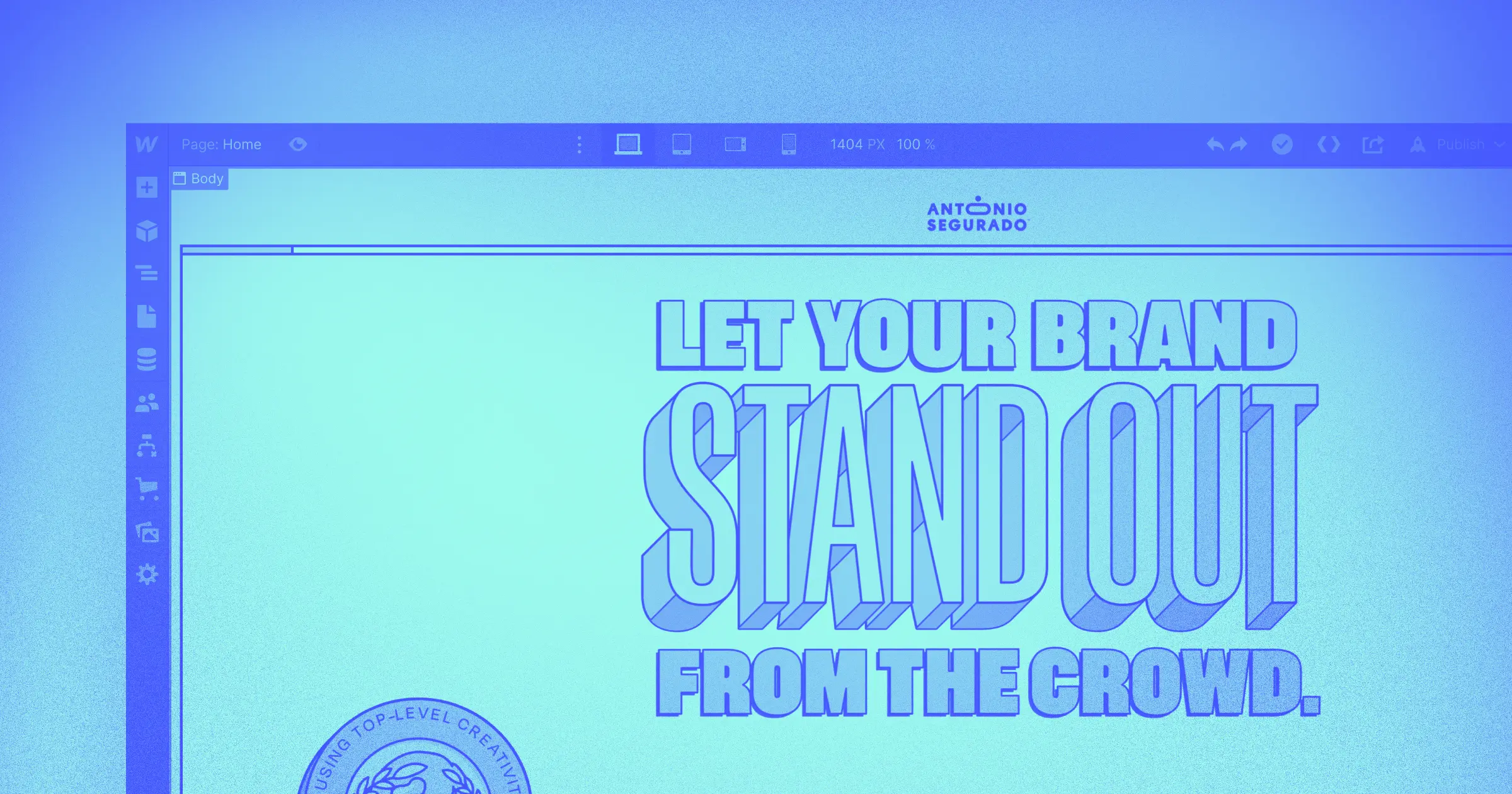
Empower your team to visually build the most custom, responsive, and secure sites — in a fraction of the time.
The turning point
Unlike the rest of the team at ThreeSixtyEight, Tim has only worked as a designer in Webflow. Though he’d dabbled with WordPress and other website builders, along with learning front-end development in school, he wasn’t sold on any of it.
He found Webflow via YouTube during his third year in college. “It only took one video of seeing Webflow’s CMS, and the way you can build out a complete database visually, to completely sell me,” Tim said. “I knew that this was the right platform to go with.”
Fast forward a couple of years and Jeremy was asking Tim to join ThreeSixtyEight — a shop that was completely WordPress — along with a team that, except for Jeremy, was skeptical at best.
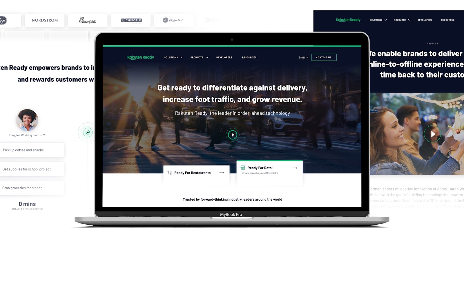
It didn’t take long after his hiring that Tim was able to show the rest of the ThreeSixtyEight team the true value of Webflow. Around that time, the agency had been working on a site for Rakuten, a Japanese electronic commerce and online retailing company based in Tokyo — and they were running into roadblocks.
“For Rakuten, we had this highly custom interaction experience that we wanted to do,” remembers Jeremy. “At the time it was being built on WordPress. We were iterating on this concept ad nauseum with our engineering and design teams, and we kept going around and around it. We couldn’t get it right.”
Tim saw what the team was doing and told them, “I bet I can do this on Webflow.” Naturally, the team was naturally skeptical. They believed that, given the custom nature of the site, there was no way Webflow could work for their vision.
“The next morning, Tim came in and he had built the entire homepage on Webflow. Fully functional and perfect in one night,” said Jeremy. “That was the turning point.”
Impressed by the capability of Webflow, Jeremy and the team began integrating Webflow as their website builder across the entire agency.

A more efficient process
Because Webflow is so different from WordPress, the processes at ThreeSixtyEight had to shift as well.
First, they added an interaction design step in their process. This allowed for everything from microinteractions to large-scale loading screens. Then, they were able to minimize the engineering phase — which was, historically, the longest process in a project. “Typically, for a six month project, three to four of those months were engineering and testing,” said Jeremy.
ThreeSixtyEight’s internal teams needed changes as well. The design team pivoted from just visuals toward UI and front-end development, and every designer was trained on how to build in Webflow. The development team, on the other hand, refocused from front-end to full-spectrum software development. This empowered the team to build websites and platforms. As a result, it helped upskill everyone who designed or built software at the company.
“Webflow helps our designers to think more like developers and gives us the power to understand how different elements of a site link up dynamically.”
“With Webflow and our new process, we compressed our timelines to less than half of what they were before,” said Jeremy. “It’s fast to build and iterate on, and it gave us a competitive edge in the market.”
From Shelby’s perspective, shifting to Webflow empowered him and his team to grow as designers. “It gave us a better understanding of how the web actually works and how code works,” said Shelby. “Webflow helps our designers to think more like developers and gives us the power to understand how different elements of a site link up dynamically.”

Webflow: The future of web design
For ThreeSixtyEight, Webflow is their bet as the future of web design. “We don’t want to use Webflow as a WordPress replacement. We see it as a new category,” Jeremy said. “Our big vision is to be known as the place that built the last coolest website you saw — and Webflow gives us that.”
Some notable ThreeSixtyEight projects include:
- Project Turntable takes interactions to the next level and plays some great tunes.
- The Legend of Santar is an end-of-year project featuring Santa’s “not-so-jolly twin” that, through an interactive journey, tells you if you were naughty or nice.
- Viral Positivity was created during COVID-19 to collect donations for ThreeSixtyEight’s local community.
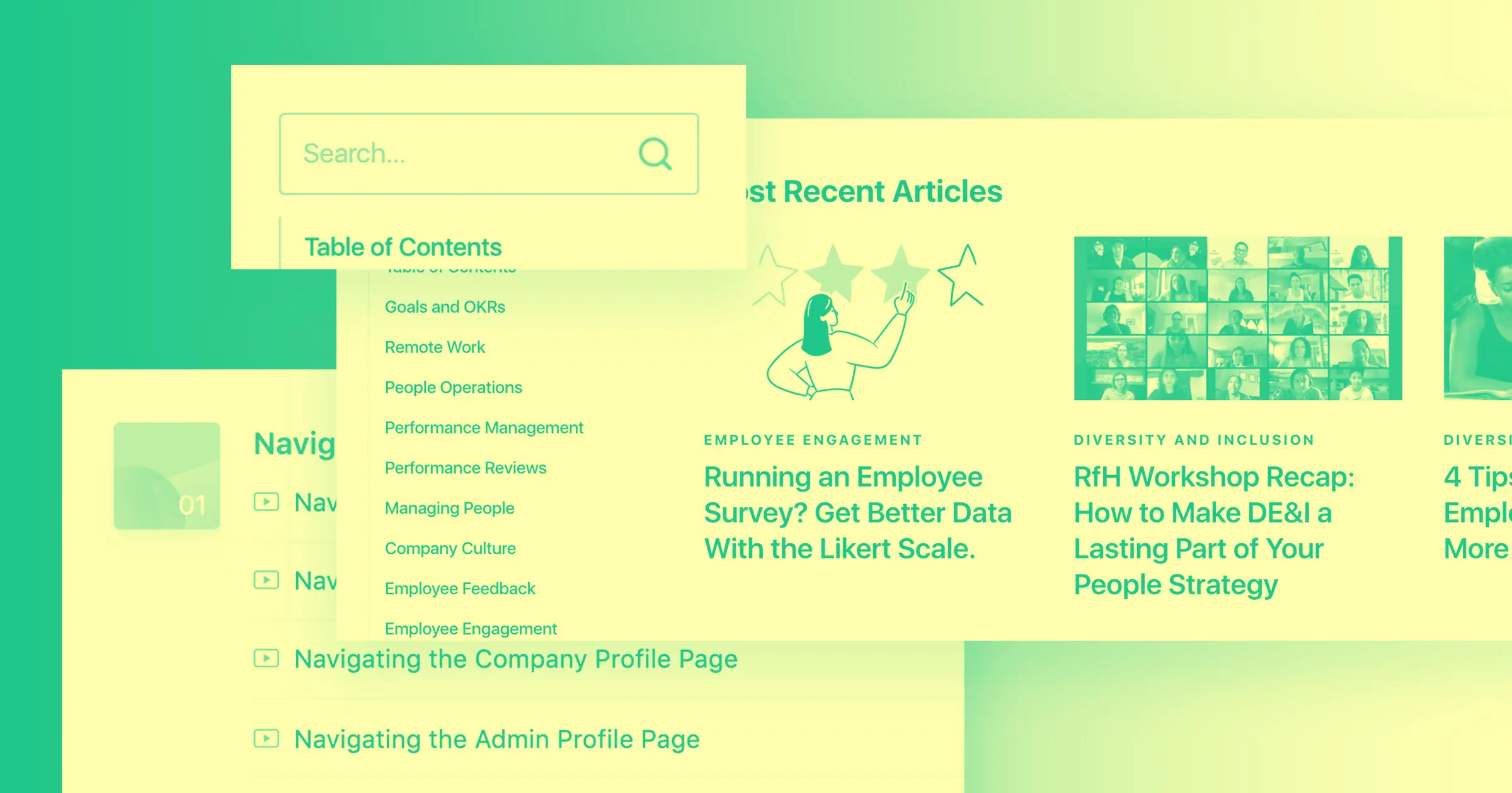
- ThreeSixtyEight’s Culture Manual is the coolest culture site we’ve ever seen and the first we’ve experienced where we have to scroll up to uncover the content.
ThreeSixtyEight’s work has spanned engagements from small mom and pop shops to large, multinational organizations. If you’re intrigued and want to explore working with the ThreeSixtyEight team, head over to their Webflow Experts profile to reach out and get started.


