

We’re grateful to have such creative designers using Webflow for so many awesome projects. Check out some of the work that we’ve been really into recently.
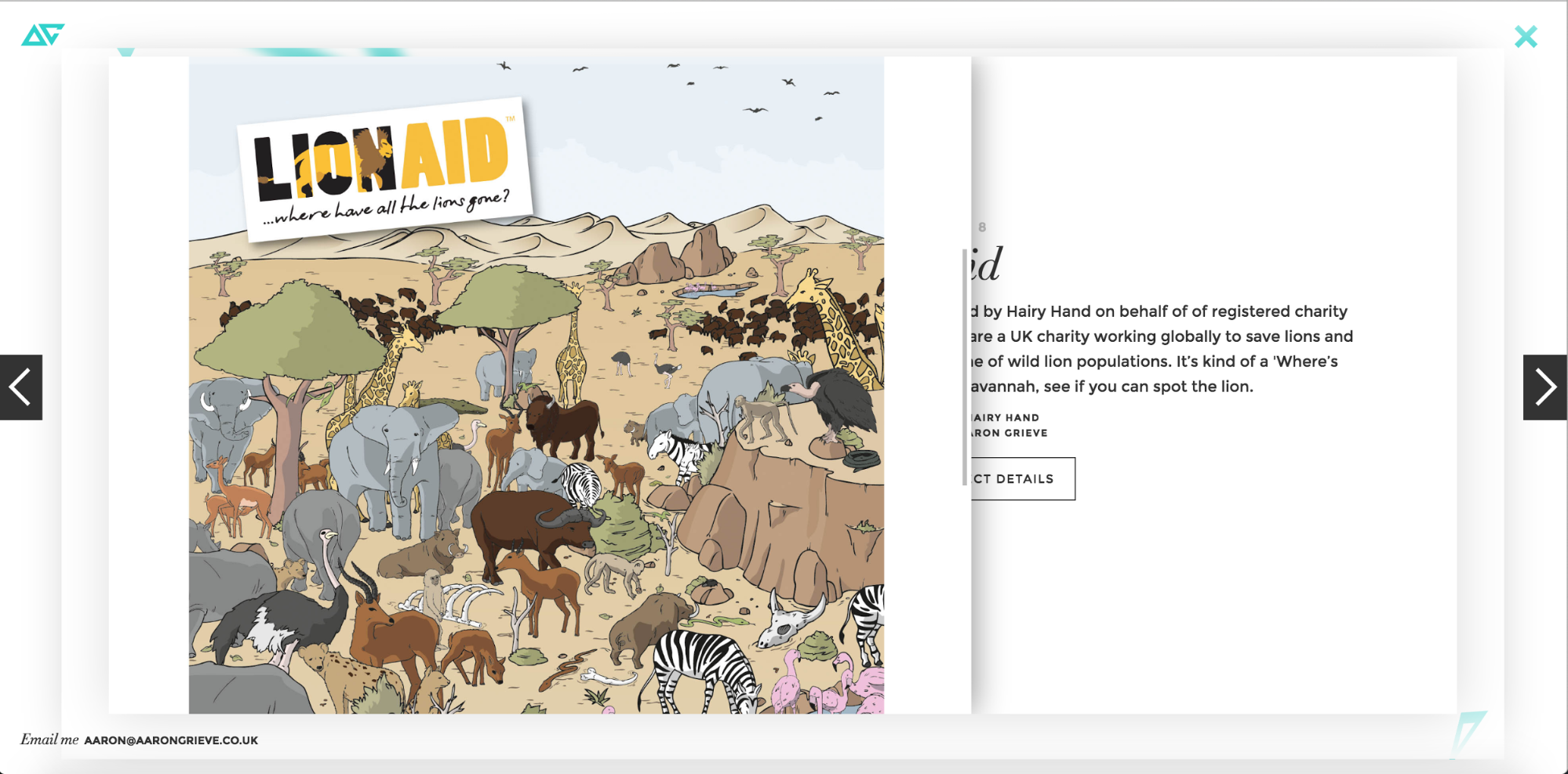
10. Aaron Grieve’s portfolio

Aaron Grieve’s portfolio website puts his design skills front and center with a bold block of introductory text set over an animation of soft, floating triangles. His simple palette of white, black, and teal offers a striking example of considered minimalism, allowing every element to be distinct.
Aaron avoids falling into the abyss of boring and shows off his creativity by utilizing Webflow’s easy-to-use 3D transformations and interactions. His portfolio is especially engaging, with its intuitive slider-based gallery. The simplicity of this website combined with dynamic elements makes it a great example of Aaron’s skills as a designer.
Perhaps my favorite part is Aaron’s use of the hamburger menu for all devices. By placing it in an area we’ve come to expect a “continue” arrow, he partially overcomes the hamburger menu’s well-known lack of clarity. Given its placement, we just want to click it anyway.
It’s worth noting that Aaron’s use of interactions to create a complex single-page site does create some potential UX and SEO issues.
On the UX side, the multilayered experience can get confusing as you drill deeper into the site. For instance, once you click into a portfolio item and scroll down, it isn’t obvious how to back out of the item, and the X icon at top right—which offers the tantalizing possibility of closing out of the portfolio entirely—no longer works. You figure out that you need to scroll up to the top of the case study to close out quickly enough, but it does feel a little laborious.
It’s also a little odd that the desktop site works like a single-pager, but on mobile, each portfolio item has its own unique URL. For SEO, it would be better to just assign each portfolio item its own page and URL on every device, even if it meant sacrificing the unique, layered design. That way, individual case studies pages could target distinct focus terms and potentially rank for those. That said, it can be remarkable difficult to rank with your portfolio without a lot of geotargeted content, so it’s not the worst place to experiment.
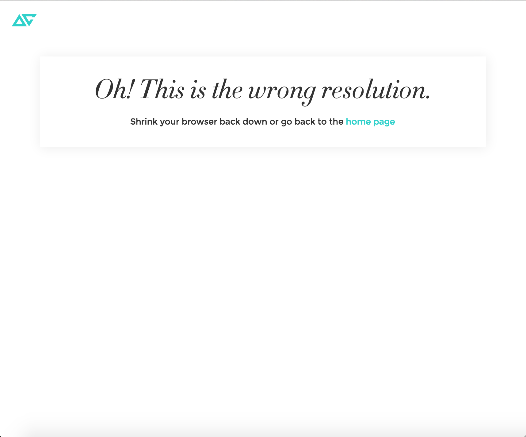
Speaking of mobile, Aaron did a fine job offering a unique experience on smaller devices. However, the experience breaks down a little if you’re actually just resizing your desktop-scale browser, as shown here:
That SEO and UX commentary aside, the result of Aaron’s experimentation is so fresh, it’s hard to fault him.
9. Salon Amann by Ben Visual
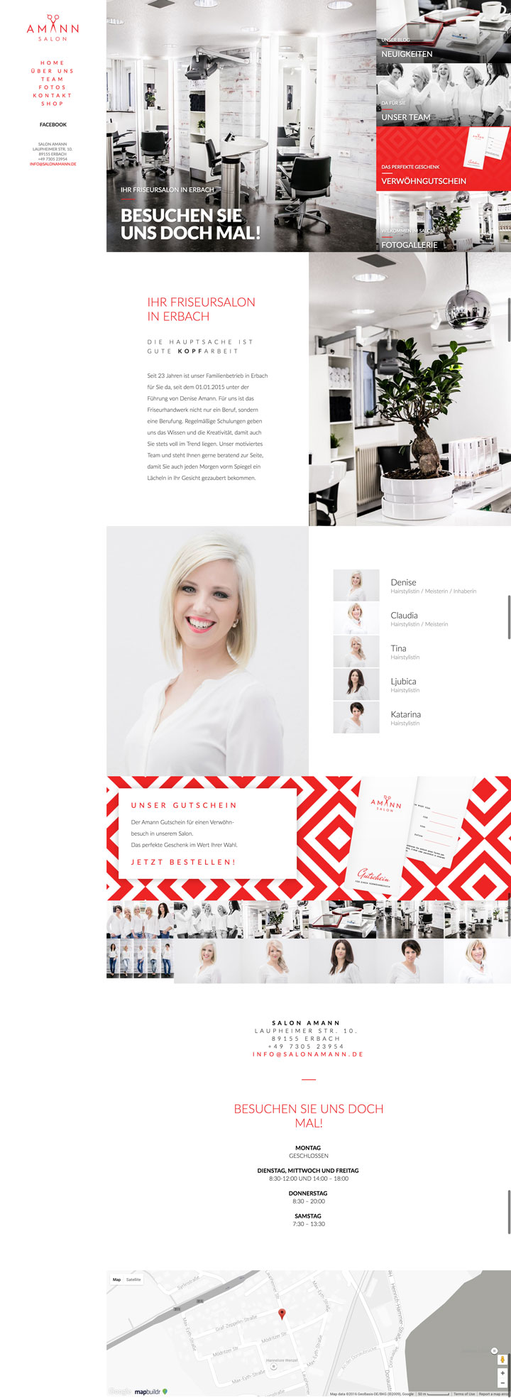
The Salon Amann website created by Ben Visual features an elegant design that uses the gestalt principle of invariance to make parts of the salon pop with brilliant splashes of color. The photos are stunningly evocative of a high-end art gallery. The website’s aesthetic really reflects Salon Amann’s brand identity.
This design uses sidebar navigation and in-page section links to guide people through the one page of content. This layout style is a great option for any person or business that needs a simple, content-light design that doesn’t skimp on style.
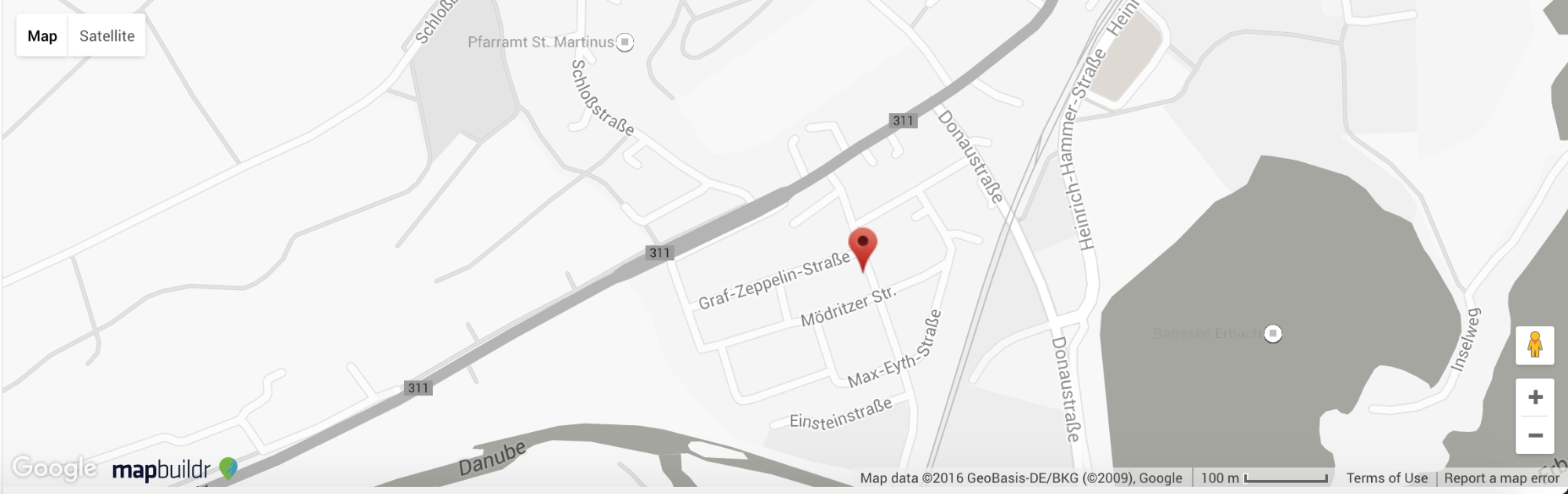
Another great element of this site is its use of percentage widths and heights to ensure the hero grid area fills the whole screen. I also dig the greyscale map at the very bottom, which Ben customized with the handy MapBuildr.
Note that, as with Aaron’s site, a single page design limits the site’s SEO potential, but perhaps the salon will start blogging to bring a lift in that area.
8. Christian Arete Photography by IGdesign

A photography website needs more than just pretty pictures and IGdesign did a great job of showcasing Christian Arete’s images in a design that is both interactive and visually interesting for this portfolio.
The homepage text displays above a background video that comes into focus as a hand turns a camera’s lense. We love the simplicity of this idea, which captures the essence of photographer’s artistry.
The bottom navigation uses a slider to navigate through the options of portrait, landscape, and wildlife photography. When clicking on any of these choices, IGdesign created a 3D transformation with Webflow that triggers a smooth, engaging transition to the gallery of images. The interactive spinning X is also a very satisfying way to close a window. Who knew closing a page could be fun?
This portfolio website template is free, so go ahead and clone it.
Of course, this is yet another one-page template, so those potential SEO issues we’ve already mentioned come into play again.
7. Morin Khuur Horsehead Fiddles by Studio Corvus
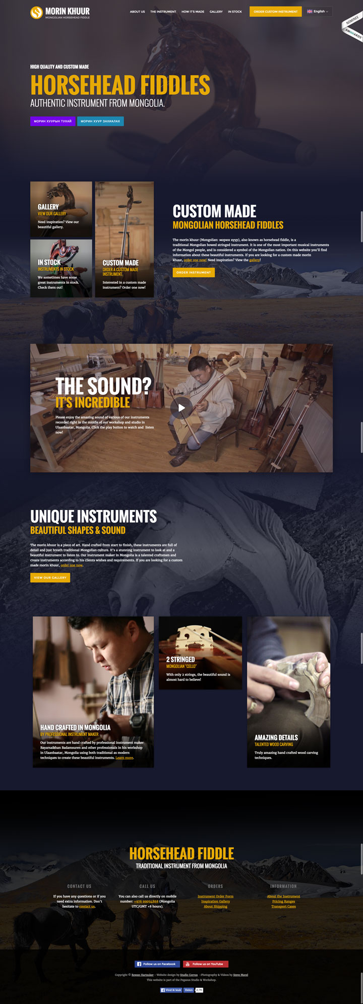
Through text and fantastic imagery the Morin Khuur Horsehead Fiddles website by Corvus tells the story of how these fiddles are made in Mongolia, as well as their significance as beautiful musical instruments. The headstock of one of these instruments serves as the site’s hero image and really highlights the artistry and craftsmanship that goes into making them.
There are quite a few photos and blocks of content but the clean layout ensures the site never feels overwhelming. Plus, the combination of photos and video really highlight the handcrafted beauty and gorgeous sound that these instruments can produce.
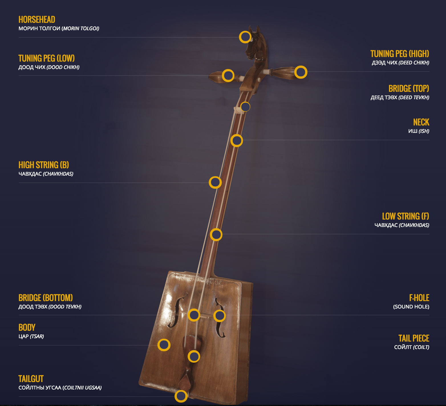
Other highlights include a lovely infographic of a fiddle with labeled parts, a masonry-style gallery of macro shots capturing the detail work, and a localization toggle that switches content to Mongolian.
It’s no wonder this #MadeInWebflow site became an Awwward Nominee!
6. Mecca:83 by EvanJones
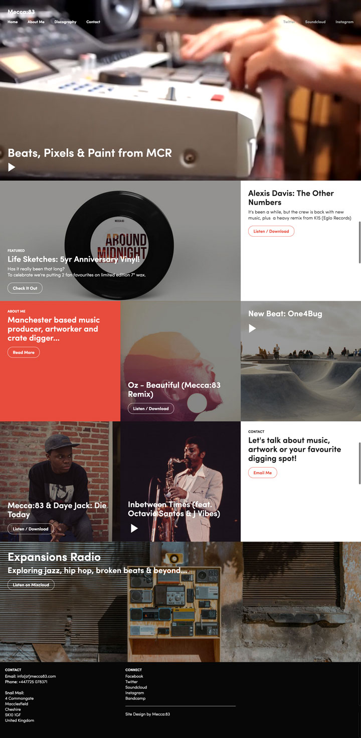
If you’re a musician, it’s important for people to be able to find your music and learn about who you are on the web. Evan Jones, a hip-hop producer and multi-instrumentalist, designed his Mecca:83 website to showcase who he is as an artist as well as a person.
The homepage has a video background of Mecca:83 triggering samples on an MPC 2000. This is a visually engaging image and it’s great to see him in action. This website is heavy on content, but it all comes together to tell the story of how he want from humble beginnings as a skater kid to laying down some dense, hypnotic beats. If you’re musician or a band, you’re going to want to clone this design for your own.
You also might want to set up your own embedded music players with our dynamic embeds and SoundCloud, so people can listen without leaving your site.


Get started for free
Create custom, scalable websites — without writing code. Start building in Webflow.
5. FREEBIE: Slick Template by Arthur
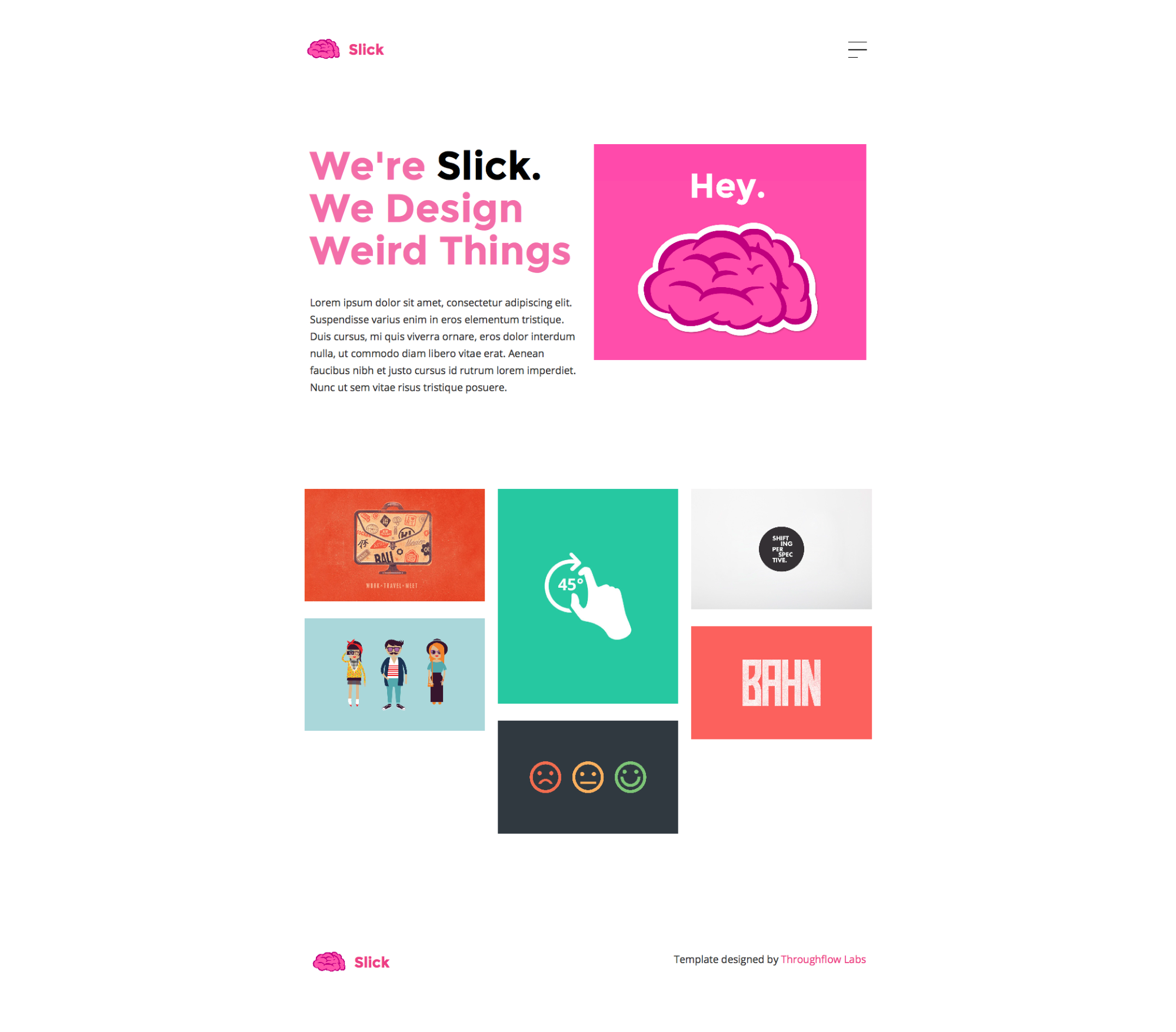
Webflow designer Arthur gave himself one hour to come up with this Slick template design. The result is this beautifully stripped-down layout focused on content. The hero area consists of a big, bold headline, some paragraph text, and an image. It’s a refreshing reminder that you don’t need a full-screen background image or video to get your point across. Below, there’s a grid of images with a text overlay that appears on hover.
This template works beautifully for a simple graphic design or writing portfolio, with a project page already set up and accessible from the top navigation.
There may be no such thing as a free lunch, but this creative portfolio template is free for you to use, so clone away!
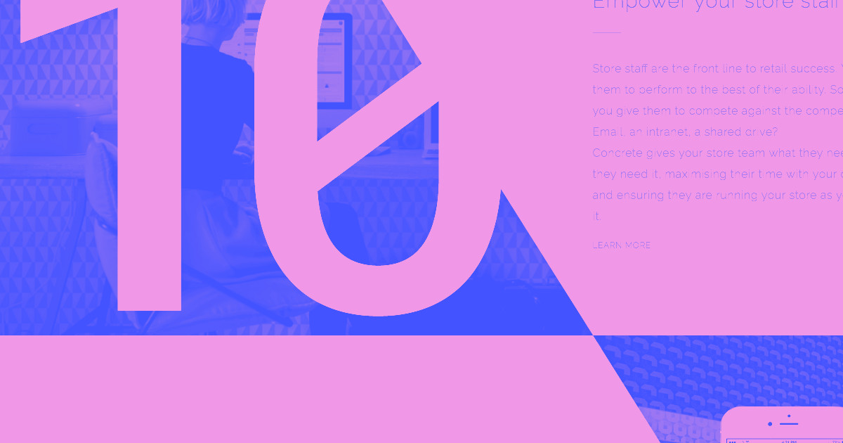
4. Concrete Platform by Overton Graphics
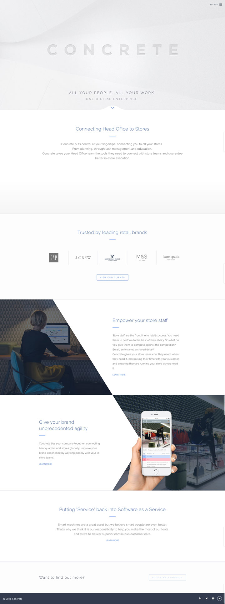
Concrete makes software to help businesses increase their retail productivity. Since they’re concerned with a brand’s functioning and identity, it’s vital for them to have a website that communicates the strength of their own brand.
With so much stark white and cool grey, it would’ve been really easy for this website to be as engaging as watching its namesake dry. Instead, Overton Graphics uses this color scheme to great effect on the Concrete website by throwing in a variety bright images and tasteful animations. This simplistically elegant design is easy to navigate and uses just the right amount of content to communicate who they are.
If I had to level a criticism, it’s that the copy tends toward vague benefit statements (like “Concrete puts control at your fingertips, connecting you to all your stores”) rather than concrete details. In an age so drowned in content that “information overload” has become idiomatic, people want to know exactly what your product does, as well as how it benefits them.
3. Contact Page Template by Corvus

In this post-skeuomorphism age, it can actually be refreshing to see a design take a cue from its real-world equivalent without overdoing it. And Corvus’ business card–based design does just that.
This contact page template by Corvus reminds us that you contact page shouldn’t be an afterthought with its clean, easy-to-read layout packing in all the info you need and nothing you don’t. The calls to action at the bottom are also a really nice touch. We highly recommend cloning this contact page to kickstart your own website.
After all, if you’re an agency or freelance web designer, your contact page is basically your final call to action. So give it all the attention you normally give your landing page’s hero sections.
2. Olivia AI by Christopher Meeks
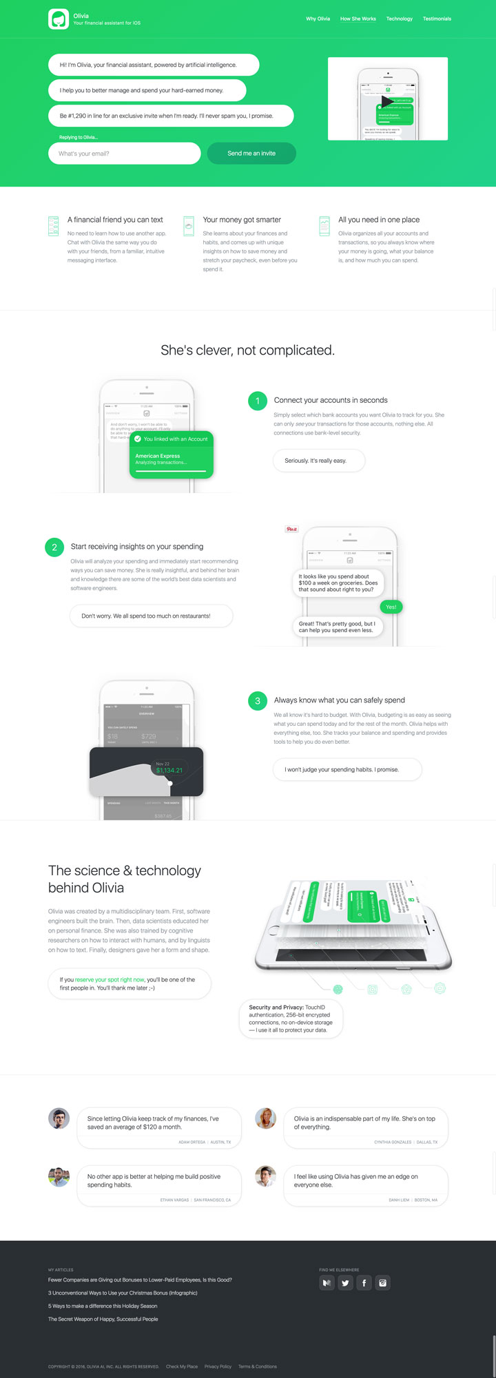
Olivia AI is a financial management app that uses artificial intelligence to help you better balance your money.
The technology behind this app is complicated – but the content and the design of the Olivia AI website designed by Christopher Meeks isn’t. We really get an idea of what Olivia is without being overwhelmed by the tech.
This comes from the content’s clear combination of benefit statements like “all you need in one place” with more concrete details like “Olivia organizes all your accounts and transactions, so you always know where your money is going, what your balance is, and how much you can spend.” The clean layout combined with animations and interactions that demonstrate how the app functions reinforce the messaging and create a really enjoyable user experience.
We can only hope that Olivia AI will soon branch out and tell us what our purpose in life is.
1. Super Duper Design Studio by Ava Araujo
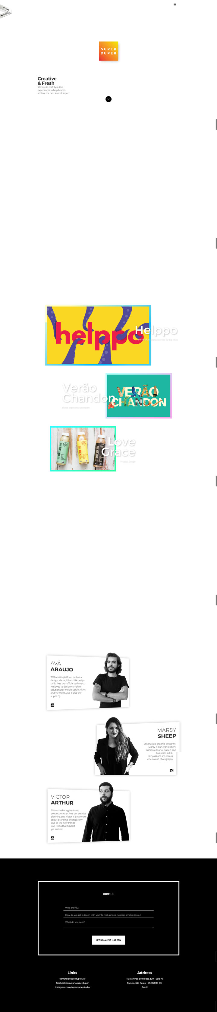
We have to hand it to Super Duper. Their website, designed by Ava Araujo, is at first glance pretty unassuming.
First there is the centered logo with a changing background gradient. Then, some text at the bottom left corner of the screen. All of this is against a background of white. There’s a purposeful sense of stillness and calm that this homepage projects.
Scrolling down just a bit awakens this website with a myriad of colors. There’s a beautiful background gradient that transitions to other color combination while scrolling down as well as other fun interactions and animations that make this website truly stand out.
Super Duper may be a hard name to live up to, but this website does a super duper job of showcasing their design talents.
Ready to start building your own cool website?
Start your free trial of Webflow—and discover your future as a web designer.


.png)