Every design seeks to either create a sense of unity among disparate elements, or creatively break that unity to encourage a particular action. The principles covered here will help you do both.
When you fire up an editing suite or put pen to paper, each visual design you use creates unity among disparate elements or creatively upends that unity to encourage an action.
While visual design is an art form, it’s also governed by the laws of mathematics. You don’t start with a metaphorical blank canvas as a designer: there are a few simple but powerful guidelines for creating — and disrupting — unified designs. Web designers should give credit where credit is due: you have the Gestalt psychologists to thank for the governing visual design principles you use every day.
What are the principles of design?
You likely learned the principles of design in grade school art class.
When viewing a painting, sculpture, pamphlet, or email, you likely have an immediate, emotional reaction to it. You know, instinctively, whether you like it or not. However, those not trained in design may not be able to verbalize why. Visual design principles help us make sense of visual compositions. Basic principles of design include:
- Space: In web design, this is often referred to as "white space," or the area between elements.
- Hierarchy: The importance of some elements in respect to others.
- Contrast: How different elements can create a more cohesive composition.
- Scale/Proportion: The relationship between the size of elements.
While these principles were developed alongside visual art, web designers apply design principles that build from these core ideas.
What does Gestalt mean?
The Cambridge Dictionary defines gestalt as:
A structure, configuration, or pattern of physical, biological, or psychological phenomena so integrated as to constitute a functional unit with properties not derivable by summation of its parts
If you’re thinking, “Hey, well-designed website would be ‘gestalt,’” you’re right on the money.
The Gestalt psychologists didn’t all have the last name “Gestalt.” German psychologists Max Wertheimer, Kurt Koffka and Wolfgang Kohler studied how the human mind processes complex imagery and patterns in a chaotic world. They wondered, “How do people arrive at meaningful perceptions out of all the mess their brains perceive? Through that effort, these scientists identified four core concepts describing how humans interpret visual data.
Understanding how users on mobile devices and on desktops interpret each pixel on your website makes you a sharper, more intuitive designer. In general, Gestalt principles hinge on the idea that the brain processes information as a whole before moving on to smaller parts.
The four fundamental principles of design expand into 13 specific rules of thumb about visual experiences to consider when designing your next cutting-edge website. Before you dive into the world of each Gestalt principle, master these visual design principles.
Principle of emergence
Building from the core idea of the Gestalt circle of thought, the principle of emergence states that viewers attempt to make sense of an entire image before identifying its parts.
So, when your brain is digesting an image and trying to make sense of it, first, it will take stock of the outline. Then, it compares the outline to other forms from your memory and tries to find a match. Once a match is found, your brain moves on to each component. When your brain can’t find a match, it tries to examine the components to make sense of the whole image.
If you see a fuzzy silhouette of a person walking far away at night, your brain knows right away it’s a person from the shape of the body and the individual limbs. You don’t need to see the hands or the eyes or the feet to know it’s a person, but these visual details help you determine who the person is.
What does emergence mean for design?
You’ve likely heard the cringey but true expression “Keep it simple, stupid!” in many contexts; sadly, that’s the case for your website. When designing, the principle of emergence suggests you should stick to familiar, easily recognizable patterns.
We know you’re itching to leave your signature stamp on your next form design, and impress your manager with a truly out-of-the-box presentation. But, for your users, it's best to stick with the styles they’ve seen before.
Clearly outlined and labeled boxes with a "send" button will be recognized as a form more quickly than a more "creative" take that makes site visitors do mental gymnastics to understand what they’re looking at.
Wait! Don’t click away. The rule of emergence doesn’t mean you should stop designing creatively. Emergence indicates a hierarchy of visual interpretation: viewers begin with the whole and then focus on the parts.
Use your visual flair and impressive knowledge of current design trends to get creative with individual form elements, as long as the whole image is recognizable as a form. Emergence offers a compelling argument for minimalism: a simpler form is easier to recognize than a complex one. So, as some annoying instructor once said, “Keep it simple!” We won’t call you stupid.
Principle of reification
The principle of reification states that your brain fills in gaps in visual information to identify objects. You don't have to see the entirety of something to understand what it is – if a design only includes a nose, one eye, and the outline of a jaw, you can deduce that you’re looking at a face.
Because of the principle of reification and the way it plays out in your mind, you have no trouble recognizing a stop sign even when it’s sliced in half:

What does reification mean for design?
Reification means that you don't have to include all of an object for viewers to recognize it. You can use this principle to save space in a layout, suggest the content of the next slide in a carousel, or make your "coming soon" page both clearer and more enticing.
Reification is what makes minimal logo designs so aesthetically pleasing. Humans are always trying to bring meaning and order to meaningless chaos, and our eyes do that via reification: the filling in of missing data to make sense of something we see.
Let’s look at a concrete way to put reification in action on a website. The image on the left is the “before” image – look to the right to see adjustments that take advantage of the principle of reification to make a more memorable (and less cluttered) layout.

Principle of multistability
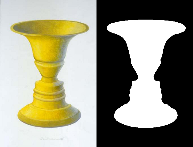
Reading about the principle of multistability may make you feel like you’re stuck in a dorm room with a freshman philosophy major, so we’ll make this brief: Multistability explains why you can see just the faces, or just the vases in that famous optical illusion, but never both at the same time.

The mind isn’t onboard with the unknown. Evolutionarily, the brain needs an answer, and now. This need comes from seeking safety, but it has fascinating implications for visual design. The brain fixates on one way of seeing something and excludes possible alternatives. Fascinating, right? You either see Brutalism as an architectural innovation or a scourge, a blight on an otherwise pristine cityscape. But let's move on.
What does multistability mean for design?
If your Spidey senses are tingling, that’s good – multistability inevitably contributes to confusion, so it’s tough to implement successfully in web design. We seek unity and cohesion, not chaos!
But, as dozens of memorable logos have proven over the years, you can use multistability to make striking and pleasantly surprising designs, like the FedEx logo. Once you see that arrow (between the E and the X), and the other arrows that reification suggests, it's pretty hard to unsee it.

Invariance principle
The principle of invariance states that your brain is skilled at pinpointing similarities and differences. That’s why it's really easy to make something stand out in a crowd of similar objects.
Remember the lady in the red dress in The Matrix? How about the little girl in the red jacket in Schindler's List? Those two stand out so much — and remain so memorable — because their bright color practically screams out of the homogenous black-and-white backgrounds we see them moving against. It marks them as meaningful and worthy of your attention.
What does invariance mean for design?
In the realm of design, the invariance principle is a powerful tool. Introduce a different element in an otherwise homogenous group of elements to draw the eye and invite clicks.
Products' pricing pages are terrific locations for reification. Web designers can make one column stand out from the rest of the pricing table through color or size. On a “cancel subscription” page, the “cancel” button may be small and grey to blend into the background, while the “keep subscription” button is vibrant and colorful.

This pricing table from Envato’s Modern Bootstrap 4 website theme clearly executes invariance by making the “Corporate” pricing option stand out against the other choices.

By looking at MileIQ’s billing page, you can tell what action they want the user to take. The “Edit Payment Info” button is brightly colored to motivate a click, while the “Cancel Subscription” button is barely noticeable.
How these 4 visual design principles differ from UI design tips
Visual design principles, taken along with Gestalt rules of thumb, apply to the whole picture and how your brain makes sense of an entire design. Our top UI design tips, on the other hand, deliver actionable advice for designers working on each individual element. Read our breakdown to learn UI design tips that cover scale, balance, hierarchy, and contrast, among other concepts.
Are you ready to create appealing, fresh, cohesive designs that represent your brand perfectly? Apply our foundational visual design principles and leave coding behind - check out our Webflow tutorial to discover how you can start building design-first online experiences.


Free ebook: Web design 101
Master the fundamental concepts of web design, including typography, color theory, visual design, and so much more.


