

Good web design for hair salons is like a great haircut: aesthetically pleasing, functionally practical, and thoughtfully tailored to highlight the client’s best features.
Visually speaking, a site that features professional interior photos paints a picture of the salon’s look and feel. Similarly, shots of various models wearing different cuts and styles allow prospective clients to envision how they’ll look after getting out of the chair — or perhaps even inspire them to boldly go for a new cut or color altogether.
But winning looks alone won’t cut it. Clients also need to be able to easily navigate the site and find relevant information, such as prices, location, and contact info for making an appointment.
Like good hair styling, building a standout hair salon website is all about look and feel — and form.
How to create a hair salon website
Most hair salon website designs have the same basic structure as other small business websites.
At a minimum, your design will need the following elements:
- A homepage that captures the salon’s style
- A list of the services offered
- High-quality photos of the salon’s services
- A price list
- Contact information
Most salon and spa websites also include:
- An online booking system
- A page introducing the stylists and their specialties
- Photos or videos of the salon
- A social media page
And don’t forget that the site should be user-friendly and look great on mobile.
Whether you’re building a minimalist one-page website or an elaborate site full of animations and SEO-focused content, it always helps to find out how other designers have tackled the same problem. Here are 10 great websites to check out for design inspiration.
10 hair salon websites to inspire you
1. Album Hair
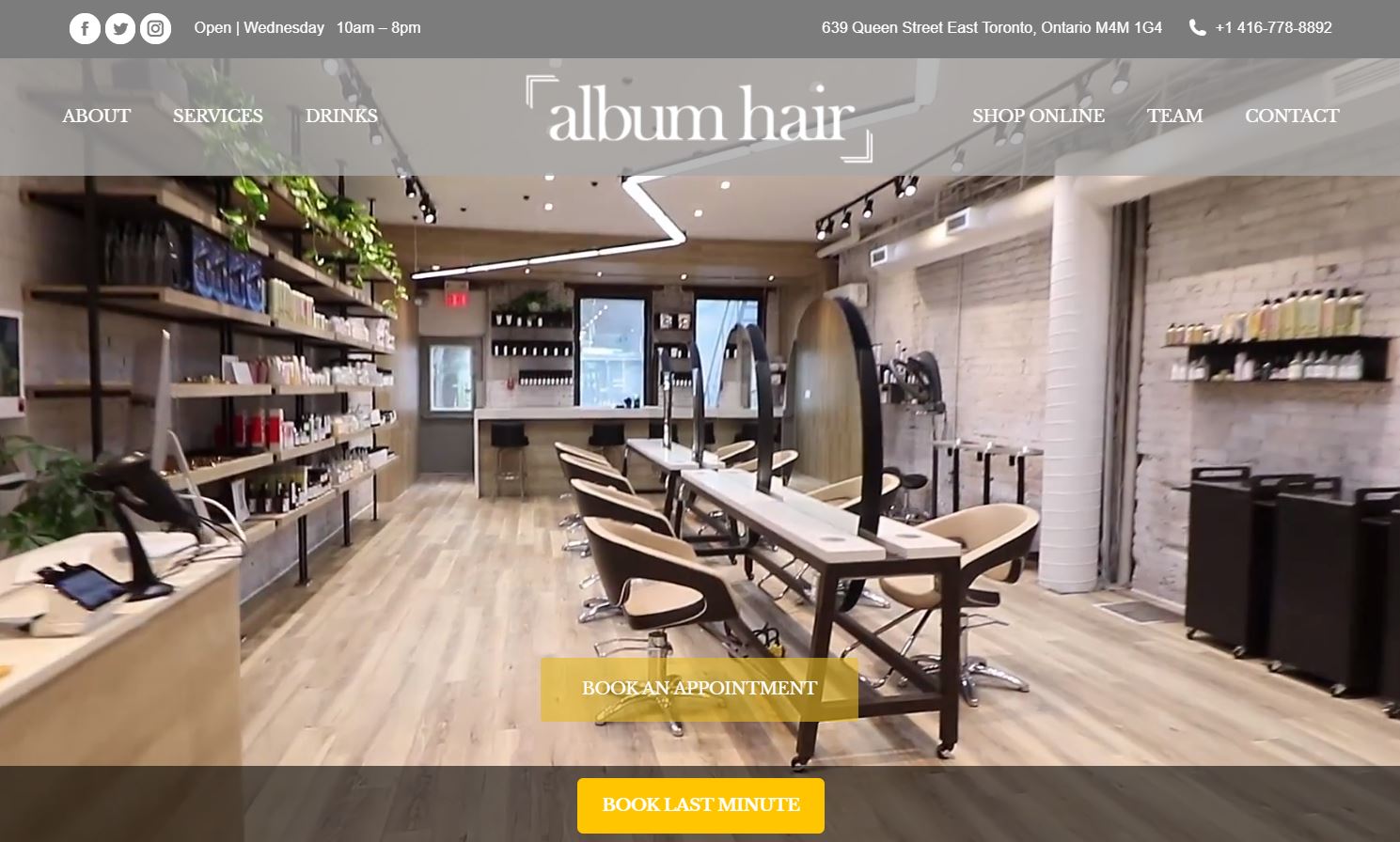
Album Hair welcomes prospective customers to its Toronto studio with a background video that glides through the salon’s interior, showing off the comfortable seats and hair care products.
The two yellow call-to-action (CTA) buttons prompting visitors to book an appointment or book last minute draw attention while also complementing the neutral colors of the site.
This complete beauty parlor website also includes an ecommerce store that sells hair care products, accessories, and gift cards.
2. Ouidad
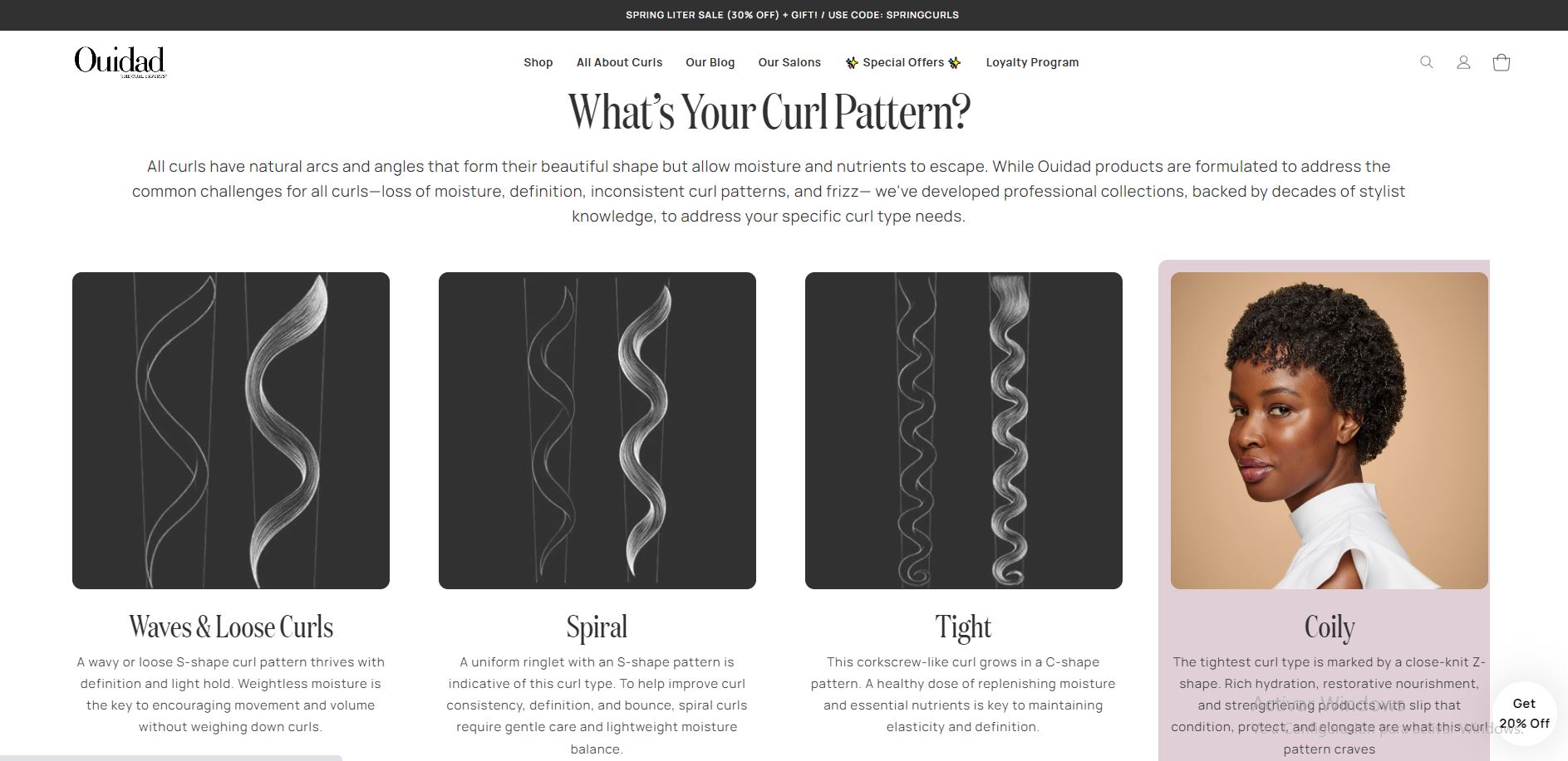
Ouidad, a salon chain specializing in naturally curly hair, dedicates part of its website to educating visitors. On the “All about curls” page, expert hairdressers describe different types of curls, explain how to care for each type, and showcase Ouidad’s product lines. This kind of content serves two purposes: It’s a valuable resource that keeps customers coming back even when they don’t need to book a haircut, and it improves search engine optimization (SEO), increasing the likelihood that the site will rank highly in search results and thus attract more customers.
3. Love Hair Singapore
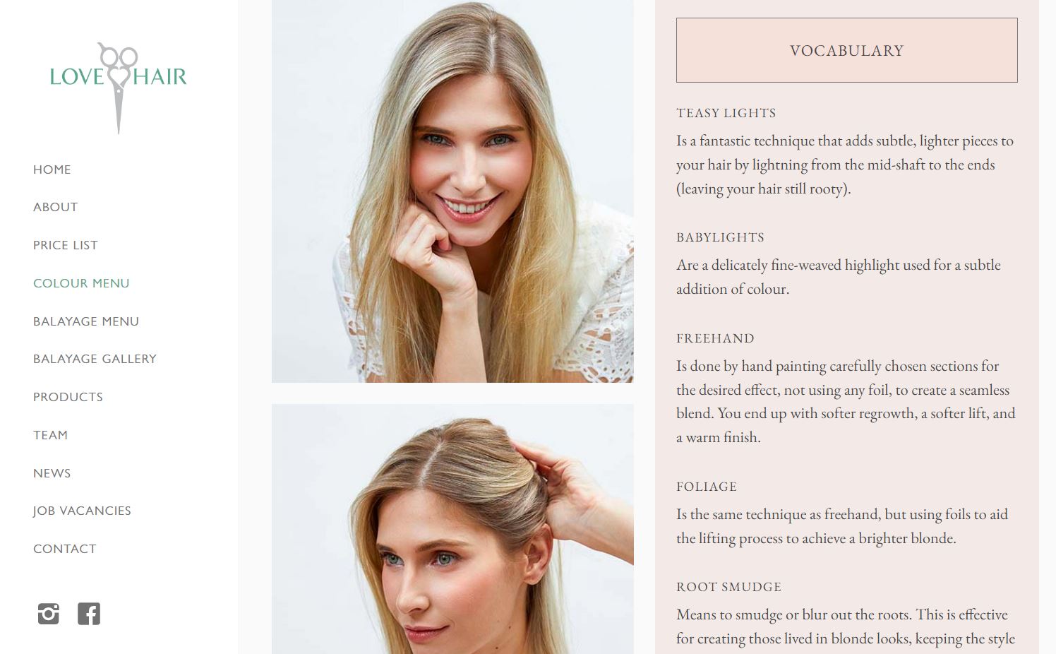
Like Ouidad, the Singapore branch of Southeast Asian beauty salon Love Hair also uses its site to educate. The information this salon provides to customers ensures they’re well-informed about the service they’re receiving. This is especially useful for customers who might feel intimidated by all the different options or too shy to ask for explanations.
The Love Hair site’s delicate pink color palette matches the business name, and designer Faye Gibbs uses touches of green to represent the salon’s eco-friendly approach.
4. Modern Micro Hair
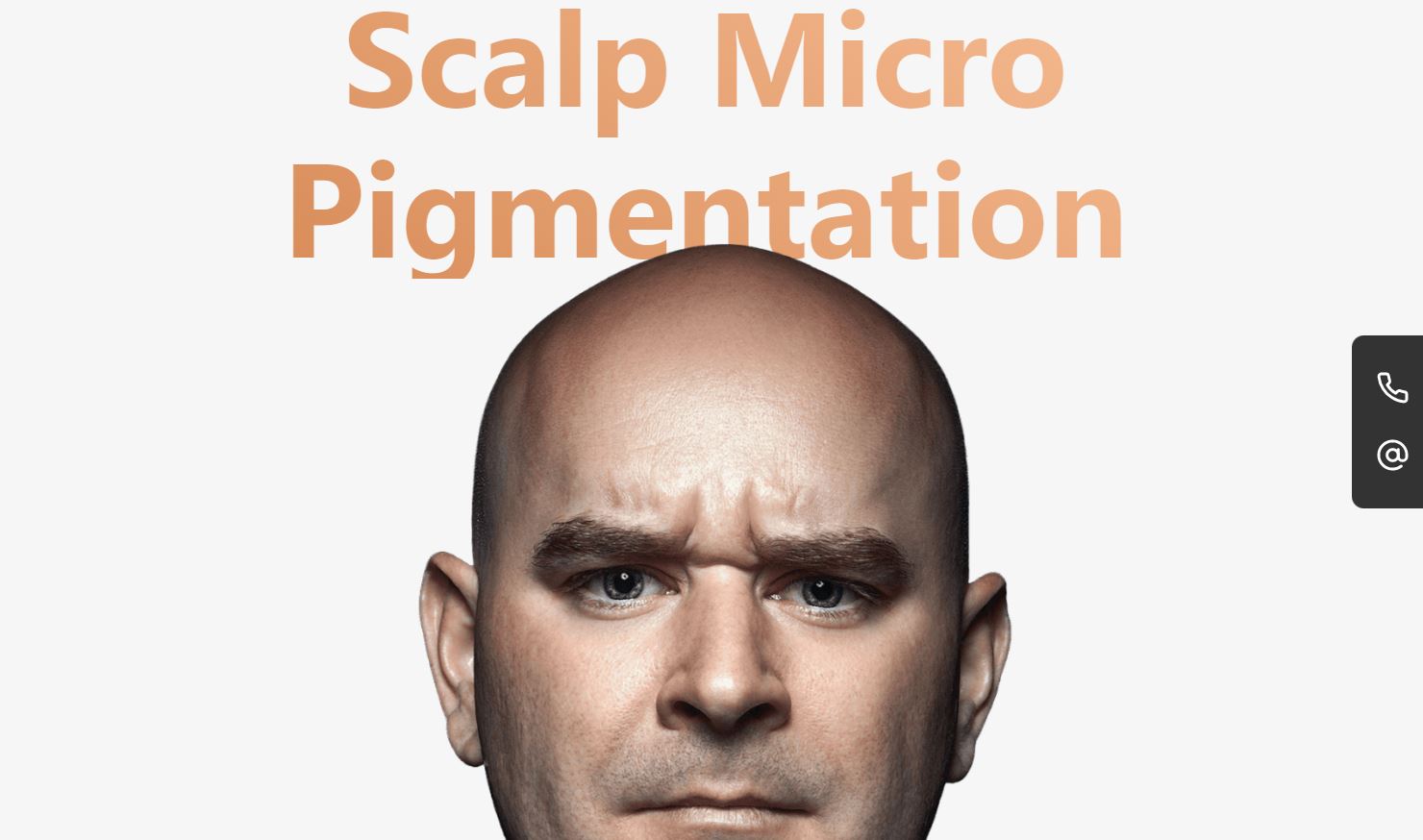
Modern Micro Hair site designer Kevin Bürger leverages a fun scroll animation that aims to make website visitors laugh while showing off the salon’s treatment results. The landing page features a bald, frowning man, and as the visitor scrolls, his hair appears to grow and his frown turns into a smile. The background also morphs from white to black, emphasizing the man’s transition.
The long scroll layout of the homepage presents information about the hair treatment, customer testimonials and reviews, and answers to frequently asked questions. This engaging user experience keeps people on the salon’s page for longer and hints to visitors that humor and fun will be part of the in-person experience.
5. Hairfantastic

Hamburg salon Hairfantastic’s site — designed by AYLAB — includes a services page that provides comprehensive information on each service: a photo, the price, the components of the service, and a description, showing new clients precisely what the booking entails.
Hairfantastic also regularly updates their blog, which covers a range of hair care and styling topics, like why a fringe works better with thick hair and tips on fighting a flaky scalp. Blogs are multifunctional additions to websites for hair stylists: They help businesses connect with customers, create brand trust by providing valuable content, and improve SEO so more potential clients will find the salon in the first place.


Get started for free
Create custom, scalable websites — without writing code. Start building in Webflow.
6. Raoul Hair & Beauty

Like Album Hair, Dutch salon Raoul Hair & Beauty’s landing page design features a background video showcasing the salon’s luxurious interior. Designer Bas Ratering also uses typography to carefully highlight the brand’s elegant aesthetic, pairing the austere Scandinavian display font Eklips with the fluid cursive Bon Vivant.
The Dutch salon’s use of visually engaging scroll animations also draws the viewer’s attention toward important information about their treatment offerings and their brand story before concluding with a CTA to book an appointment.
7. Lemongrass Salon University
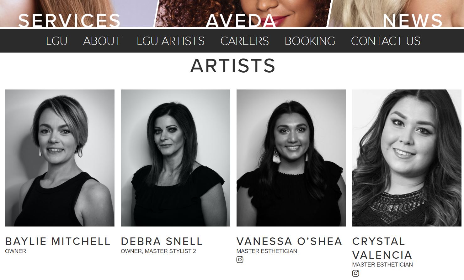
On the Lemongrass Salon University artists page, the website development agency Farside Web Development introduces the salon’s team using black-and-white photos, providing a visual break from the vibrant colors of the rest of the site. Clicking on the photos brings up a paragraph written by the stylist about their background in the industry and passion for what they do.
Lemongrass’s landing page includes an unobtrusive special offers pop-up that slides out from the side of the screen on opening. This type of pop-up is perfect if you want to call attention to a particular offer but don’t want to interrupt the visitor’s experience with a full-screen pop-up.
8. Trichology

Trichology keeps its testimonials section simple, with just one happy client sharing her experience. Designer Half Design chose to feature a photo of the client (showing off the new hairstyle), limited the testimonial to four sentences, and displayed it in a bold font. This straightforward approach is more effective than cramming the section with long testimonials in tiny text, which visitors might not pause to read.
9. Sustain Salon
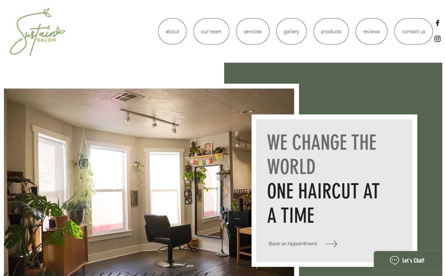
Sustain Salon shows its values-forward approach to hair styling with the all-caps tagline, “We change the world one haircut at a time.” Designer Ben Parker opted for a green and brown color palette to match the business’s eco-friendly message.
The landing page includes two subtly presented CTAs prompting visitors to book an appointment and chat. The chat function gives immediate answers to questions, providing a route for first contact that poses fewer barriers than asking people to call.
10. The Collective
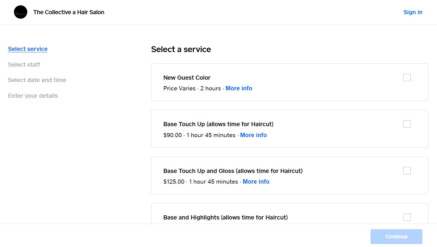
The online booking page of The Collective, designed by Eli, walks potential clients through the process of booking appointments step by step. The description of the service includes the time it’ll take to complete, which has two advantages: It shows customers that stylists dedicate considerable time to each customer and allows customers to plan their day around the appointment. Plus, the simplicity of the online booking system makes it easier for new and returning clients to book appointments.
Build a website that never has a bad hair day
Working on hair salon web designs gives you a chance to get creative with color and layout within a fairly standard small business website layout. For even more ideas, check out our examples of small business websites.
If you need to brush up on your web design skills before starting, you’ll find the course you’re looking for at Webflow University. Consider experimenting with value-adding features like embedded Google and Yelp reviews, a human or bot chat function, or an embedded Instagram feed to showcase clients’ fresh cuts.
When you’re ready to start moving the business online, use a pre-made business website template or start building from scratch. Whatever you choose, you’re sure to end up with a user experience as silky smooth as the locks you’re showcasing.