A student portfolio should answer the question: Why you?
Making a portfolio website puts your best work in front of potential clients, customers, and employers right away. Rather than relying solely on grades and certificates to land a job or project, a digital portfolio creatively demonstrates previous work and achievements in one place.
Building a strong online student portfolio doesn’t require expert technical skills or coding experience. With the right tools and web design ideas, you can use your portfolio to turn everything you’ve learned into visible proof for others to see your work.
Read on to explore seven student portfolio examples with best practices to create a website that can help you stand out from the crowd.
What should a student portfolio include?
With the right mix of details and examples, you can build a website that effectively showcases your capabilities. Here are some portfolio tips for students and design elements to include on your site:
- Hero section. A hero section is the first thing people see in the topmost area of your homepage. It should include your name, a short tagline, and a call to action (CTA) like “View my work” or “Featured projects.” A good hero section immediately tells visitors what you do and sets the tone for the rest of your site.
- Simple, intuitive navigation. Navigation — elements like navigation bars (menus), search bars, and links — acts as a map for your visitors. The menu and search bar should be visible and highly legible, with links standing out in a color different from the primary text. If people can quickly find what they’re looking for, they’re more likely to stay and explore.
- Case study pages. Case studies are dedicated pages that tell the full story of your projects, from your initial ideas to the process and results. They help visitors understand what you made and how you think. Adding visuals of the project in process, like sketches, prototypes, or drafts, to showcase your decisions along the way is another helpful tool to entice visitors.
- Featured projects or galleries. Exhibit your strongest projects on the homepage, either as large feature cards or in a clean grid. Each project you feature should include a visual and a short description. Linking case study pages can also give you room to analyze and explore what made that project great. This gallery gives people an overview of what you’re able to do before learning more.
- Skills and tools section. Add a list or set of icons for the tools, languages, or software you know best. It helps potential clients and recruiters know if you have the right technical or creative skills for a role or project.
- About section. Write a brief, friendly professional bio that explains who you are, what you’re passionate about, and what you’re working toward. The ideal length depends on your field and achievements, but preferably brief. If you’re comfortable, including a professional photo of yourself adds personality and makes your student portfolio design feel authentic and approachable.
- Contact section. Make it as easy as possible for people to reach you. If comfortable, include your email, social media profile links (if they reflect your professional life), or a simple contact form at the bottom of your site. Guide them toward interaction with a CTA like “Get in touch” or “Let’s work together!” at the end of the browsing experience.
- High-quality visuals. High-resolution images, video clips, and animations to demonstrate your student work can make the user experience more engaging. Visuals help people understand your content better than words alone and encourage visitors to interact with elements.
- Testimonials. If you have them available, include short quotes and recommendations from professors, mentors, or clients who can vouch for your student work. They add credibility to your personal brand, make you more marketable, and build trust with website visitors.
- Resumé or CV. Linking a PDF of your resumé or CV is a practical method for employers who want to share your details internally and allows them easy access to all necessary information in one place. You can also link your LinkedIn profile as another source of information for recruiters to review.
- Responsive design. A responsive website automatically adapts to all devices, mobile or desktop, without sacrificing the design or functionality. Many people will view your site on a mobile device first, so it’s important to test your site on different screens to ensure the layout loads smoothly and works properly.
- SEO. A well-optimized website is more likely to appear in search results when people search for your name or industry on Google and other search engines. Search engine optimization (SEO) includes adding descriptive titles, meta tags, and high-traffic keywords to your site.
- Accessibility. Building an accessible site means that it is usable for everyone and shows attention to detail and a commitment to inclusivity. Use legible colors with high contrast, alt text for images, and a clear text hierarchy for better readability.
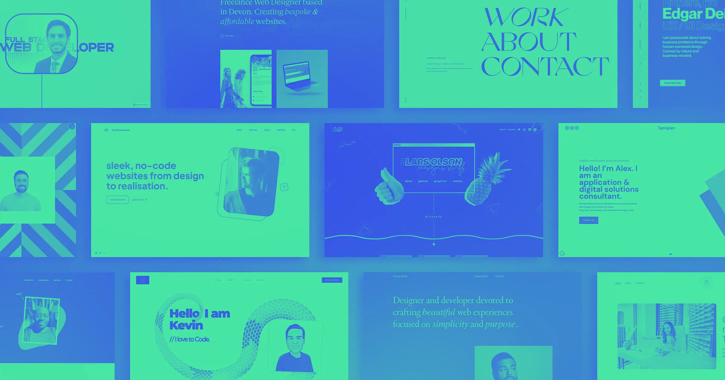
7 digital student portfolio website examples to inspire your design
To see how design elements, layout structures, and storytelling can make effective websites in practice, here are seven websites to use as inspiration for your student portfolio.
1. Gerardo Orozco
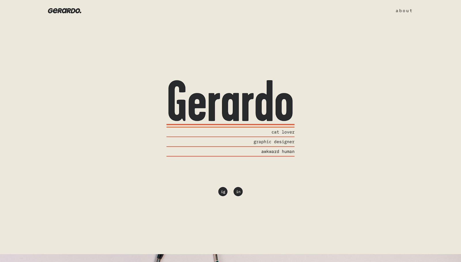
Gerardo Orozco opens their student portfolio with their first name in bold letters and a list of three facts about their personality: They love cats, they’re a graphic designer, and they're a self-described “awkward human.” This introduction differentiates their profile and immediately shows that they’re approachable and humorous while still retaining a professional edge.
Scrolling reveals a curated project list. The images cover the entire screen, making the visuals stand out, with a hard-to-miss client name button in the middle that takes you to dedicated case study pages. Each page then covers branding and packaging, with room to showcase Gerardo’s approach and thinking during the creative process.
2. Ruben Hernandez

Ruben Hernandez’s student website follows a minimalist approach to spotlight their student work. Their “About” link takes you to a concise description explaining Ruben’s journey along with a playful video of them skating. Condensing his background on a separate page gives the homepage room to focus on a large visual compilation of Ruben’s projects.
The “Work” section redirects viewers to the homepage, which highlights different projects with large thumbnails and hover-triggered animations, prompting you to explore. Once you do, each page has a “Story-Challenge-Opportunity” structure showing Ruben’s approach to each project, followed by several visual samples.
3. Tim DP

Unlike traditional top-to-bottom websites, Tim DP’s digital portfolio scrolls horizontally. It’s an attention-catching, unique portfolio design that encourages viewer interaction. The short description “Physical & digital designer” on the homepage makes it very clear what Tim does, and viewers can toggle between their digital and physical work to see the most relevant projects.
An “Info” button takes you to an about page, where Tim lists their experiences, services provided, and distinctions in more detail. Tim’s website makes it easy for potential clients and recruiters to reach out by linking to their email and social media profiles on the right-hand side of the page.


Launch with Webflow Templates
Choose from hundreds of professionally designed website templates for any industry or style. Customize visually, launch instantly — no coding required.
5. Jon Rodz
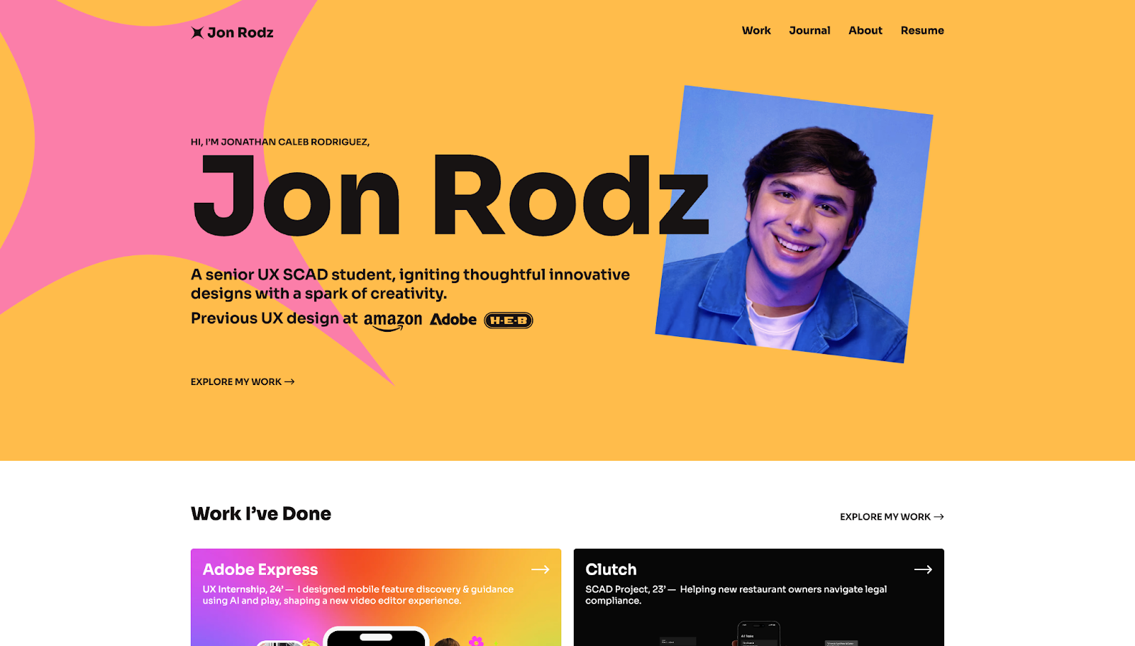
Jon Rodz packs a lot of valuable information into his website header. His name appears in bold letters next to his professional headshot. Jon describes himself as a senior UX SCAD student and mentions previous work for companies like Amazon and Adobe. An “Explore my work” button expounds upon his impressive introduction and details his professional experience.
After his introduction, Jon describes his creative process, highlights testimonials from satisfied customers, and links to media coverage for his professional and student work. To back up his strong reputation in the field even further, Jon shows a list of design awards he’s won. A thin border around each button indicates what kind of award he won (gold, silver, or bronze) or reflects the award’s brand colors, further communicating his success.
Instead of an about section, you can access his journal-style blog, which provides unique insights from his perspective as a young Latino designer. Viewers can then view his professional resumé through the menu at the top of the site, which is accessible from any page.
6. Lauren Hung
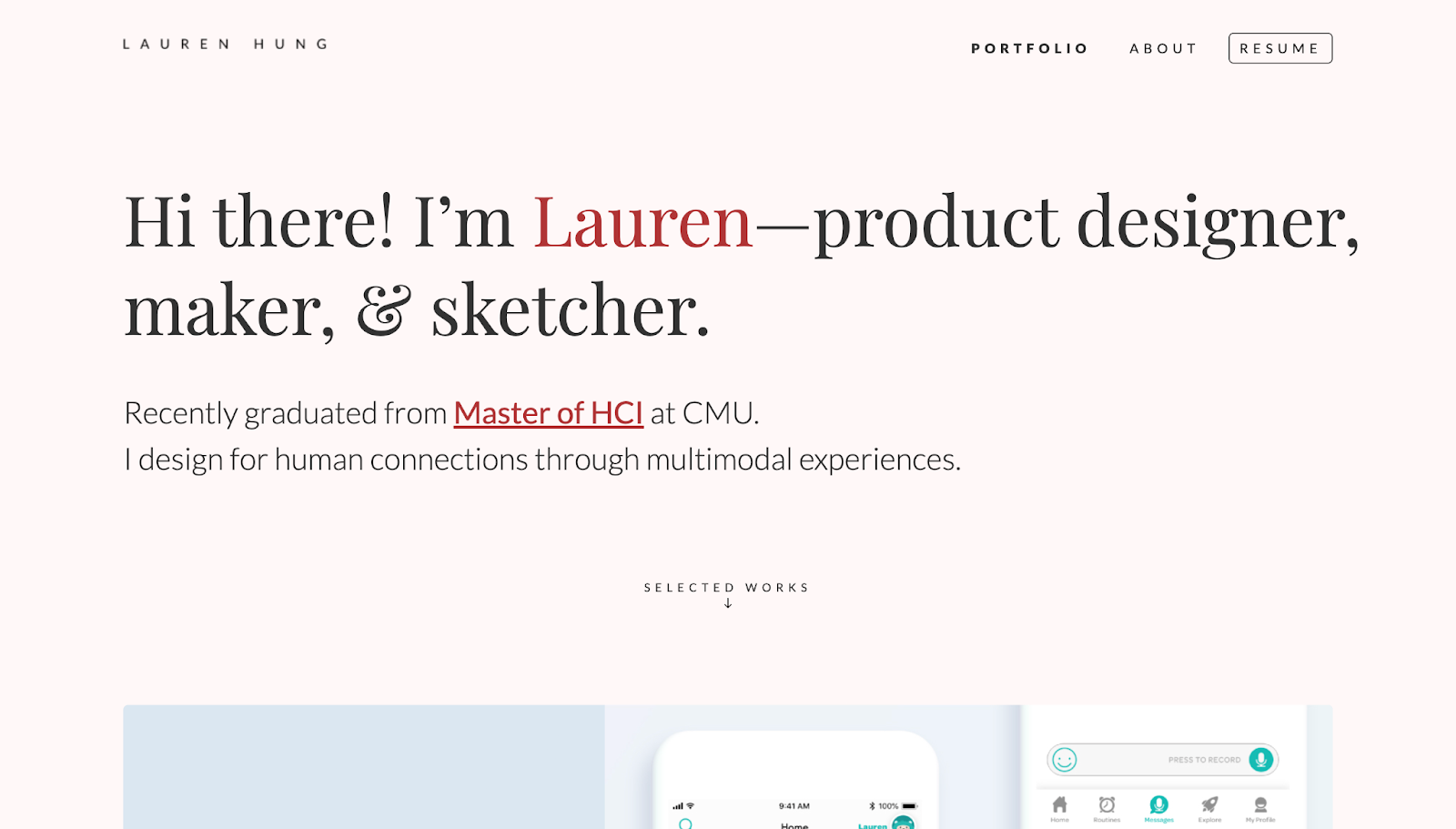
Lauren Hung introduces herself as a product designer, maker, and sketcher, immediately giving viewers a clear picture of who she is and what she does. Her student site has two sections — a portfolio and an about page. Viewers can also download Lauren’s resumé via a dedicated button in the header menu.
The portfolio section of Lauren’s website has large thumbnails with descriptions of each project that you can click on for more details. Each case study page has several elements that walk you through Lauren’s decision-making process: an overview, scope, prototyping, collection of experiences, final proposal, value to the client, and post-project reflections. Her analysis leaves no room for confusion and simultaneously communicates her work’s value.
The about section has a similar structure, with “Where I came from,” “Where I’m going,” and “Meanwhile” descriptions. A smart headshot shows her professional side, but hovering over the image changes it to a more casual and friendly, smiling image of Lauren. There are similar hover-triggered images throughout the website that show her interactive design skills in action.
7. Yichen Xie
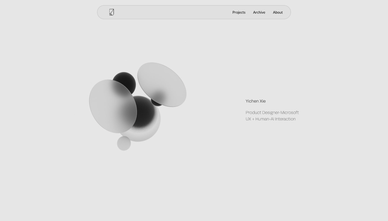
Yichen Xie uses a minimalist, monochromatic design approach for his student portfolio that highlights his knowledge of contemporary tech design. His list of featured projects sit in clean cards, which expand into detailed pages full of mockups, wireframes, and prototypes demonstrating his creative thinking.
An archive page shows Yichen’s prior work, highlighting his growth over time. Additionally, his about section showcases his work experience at reputable companies like Microsoft. In addition to his education, Yichen lists his skill set, making it easy for potential employers to match him to specific projects.
Build your own student portfolio with Webflow
An effective student portfolio shows what you’ve built during your educational and early professional years, how you think, and where you want to grow. It invites real engagement from others in your industry, helping you develop into a seasoned pro.
Whether you’re a budding graphic designer, developer, or marketer, a well-made online portfolio makes your strengths easy to find and remember. Webflow’s tools help you build the website that takes you to your next step. With Webflow, you can design visually and maintain your website without needing third-party resources (but integrations with Webflow are available to make your website more powerful).
Start with one of our free website templates or build a new website from scratch with Webflow.
Show off your work.
Choose from fully customizable portfolio templates built for creatives. With Webflow, you can design, refine, and publish a standout portfolio — without writing a single line of code.
.jpeg)