Your UX design portfolio demonstrates your skills and creativity. It’s not just a visual showcase — it reflects your expertise in user-centric design principles.
Creating a compelling user experience (UX) portfolio goes beyond aesthetics. It requires blending great visuals with intuitive functionality, demonstrating how you align design choices with user needs, and curating a thoughtful layout that narrates your design process.
Every detail of your site — from the structure to the color scheme — should demonstrate your capacity to deliver a seamless and impactful UX. Your portfolio is your canvas, the platform where you showcase the skills you’ve honed as a UX designer.
What’s a UX design portfolio, and why do you need one?
A UX design portfolio is a collection of work samples designers share with potential clients and employers. It showcases your best projects to demonstrate your style and expertise. Some artists and designers make printed portfolios, others post them in online galleries like Behance and Dribbble, and others create custom websites.
UX designers especially benefit from using a portfolio website because the site itself becomes a sample of their work. Even if your work experience is relatively slim, the UX of your portfolio website demonstrates your skills. It also shows potential clients how you design at your own discretion, unfettered by someone else’s product and brand guidelines.
What to include in your UX design portfolio
While each portfolio above tells the designer’s unique story, they all include a few consistent components to ensure their sites demonstrate their expertise, creativity, and unique understanding of what goes into effective UX design.
Case studies
UX case studies are long-form descriptions of a design project from beginning to end. They describe initial requirements, the designer’s role in fulfilling them, and their approach. Sprinkled throughout these case studies, you’ll find visuals like wireframes, flows, and samples demonstrating how the project took shape.
Project examples
UX project examples typically show the finished product a designer worked on, preferably with a link to where it’s published. These examples give potential clients something real to appraise and lend credibility to the designer’s ability to produce quality content clients ended up using.
Your design process
Case studies in your UX portfolio should include a detailed overview of your design process to help potential clients and employers thoroughly understand how you approach project work. Include research you conducted to justify your design decisions and describe the team structure you worked in so they can learn how you fit into a team. And if you’re a solo designer, outline how you manage all the disparate tasks involved in completing a project, like determining budgets, writing content, and interfacing with clients.
Visual and interaction design skills
UX designers are uniquely suited to creating online portfolios because UX is so integral to building great websites and information architecture. Take this opportunity to show off your design skills so potential employers and clients can see you at your best, unrestrained by project requirements and limitations.
15 best UX design portfolio examples
The following are 15 top-notch portfolios that stand out from the crowd. Every one showcases the designer’s user experience and user interface (UX/UI) design skills, with careful attention paid to each design choice. Let these inspire you to create your own skills showcase.
1. Niklas Bubori
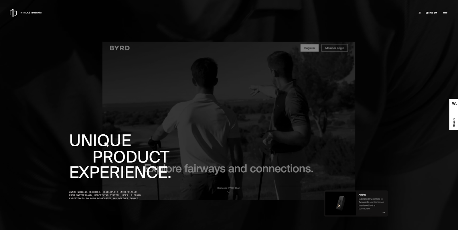
Niklas Bubori is an award-winning UX designer and entrepreneur from Switzerland. Nik’s portfolio website combines smooth animations and interactive design elements with clean navigation, creating a natural flow through the work. From the homepage, visitors can easily move into detailed case studies that highlight Nik’s design process and end results. Every page ends with a clear call to connect, either through LinkedIn or the site’s contact form. It’s a strong example of how to engage visitors, build credibility, and encourage them to reach out.
2. Ljubomir Bardžić
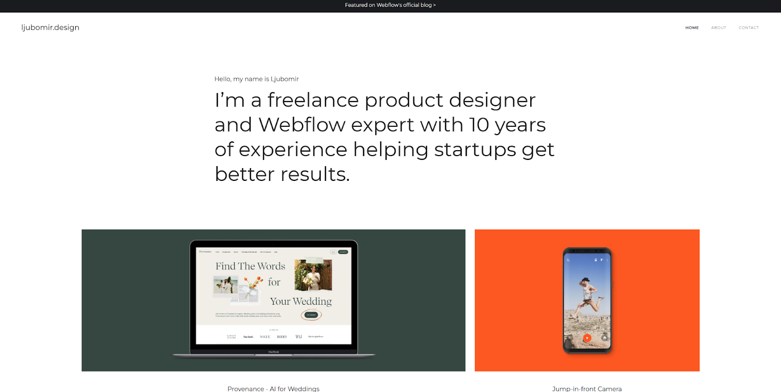
Freelance UX/UI designer Ljubomir Bardžić’s portfolio balances minimalist design with colorful aesthetics. Using a classic black-and-white background theme draws attention to colorful project work. The portfolio includes client feedback, user journey mapping, and wireframes to illustrate ideation and design processes.
The text leaves no room for ambiguity. Ljubomir succinctly communicates service offerings — web design, UX/UI design, and Webflow development services — to clearly describe the value proposition.
Ljubomir’s portfolio offers a straightforward experience for potential clients to quickly evaluate this UX designer’s style and expertise with minimal clicking and scrolling.
3. Karolis Kosas

Product designer Karolis Kosas uses a minimalist approach that lets their design prowess shine. A stark black-and-white color scheme subtly comes to life with animated blinking eyes on a CUJO device, adding a touch of motion to the otherwise static homepage to engage viewers.
Each case study consists of a vertical stream of unadorned grids that provide comprehensive explanations and visual representations of each step. Side-by-side product design deliverables and images of the product in use illustrate how each step contributed to the final design. This thoughtful and thorough presentation indicates Karolis’ skills.
4. Pascal Strasche
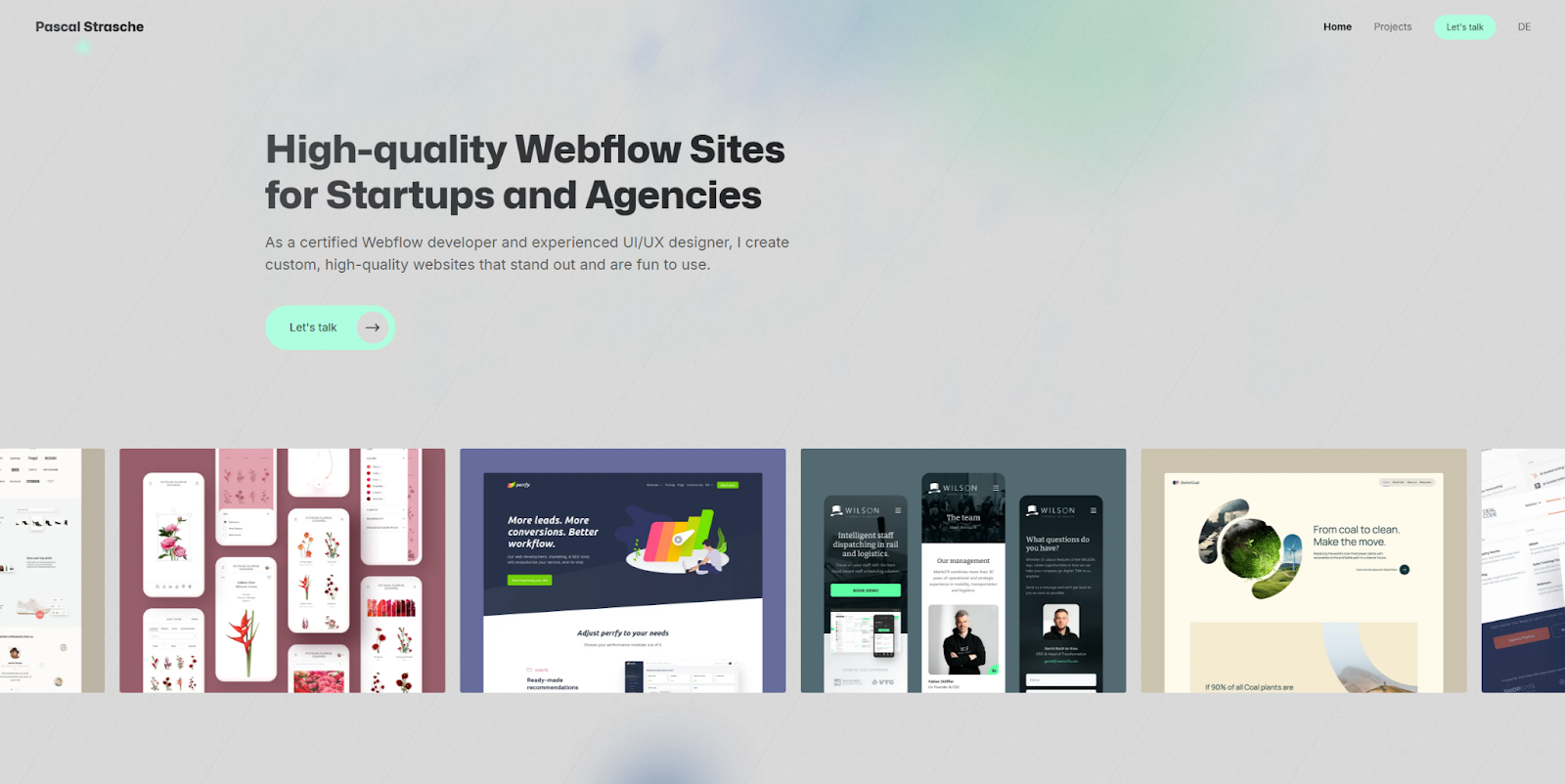
When visitors land on Pascal Strasche’s portfolio website, a seamless blend of professionalism and personal flair greets them. A unique light teal color accents a murky gray background, while the header immediately introduces Pascal as a freelance product designer and Webflow expert. And many case studies further support this expertise.
Near the bottom of the homepage is Pascal’s personal manifesto — a clear outline of ambitions and values — symbolizing Pascal’s depth of investment in the brand. This articulate and direct approach fosters trust and reliability. By integrating a unique personality and UX/UI expertise, Pascal creates a genuinely individualized portfolio that demonstrates design acumen and a robust personal ethos.
5. Vicky Marchenko
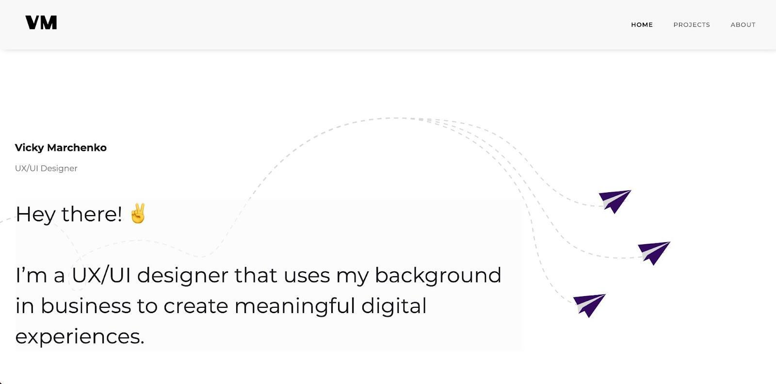
Vicky Marchenko’s UX/UI design portfolio feels warm and inviting. The playful paper plane animation and friendly “Hey there!” expression deliver a sense of personal connection. And the consistent use of a comforting light-purple-and-white theme furthers this inviting atmosphere.
Dive into Vicky’s projects page to find comprehensive and transparent case studies showcasing cross-industry skills. Vicky ensures the reader clearly understands the role in each project (and what Vicky can offer them) by starting with broad overviews followed by specific deliverables and examples of final designs. Finally, the footer invites you to enter your name, email address, and a message, offering a clear line of communication to simplify getting in touch.
6. Sarah Lauchli
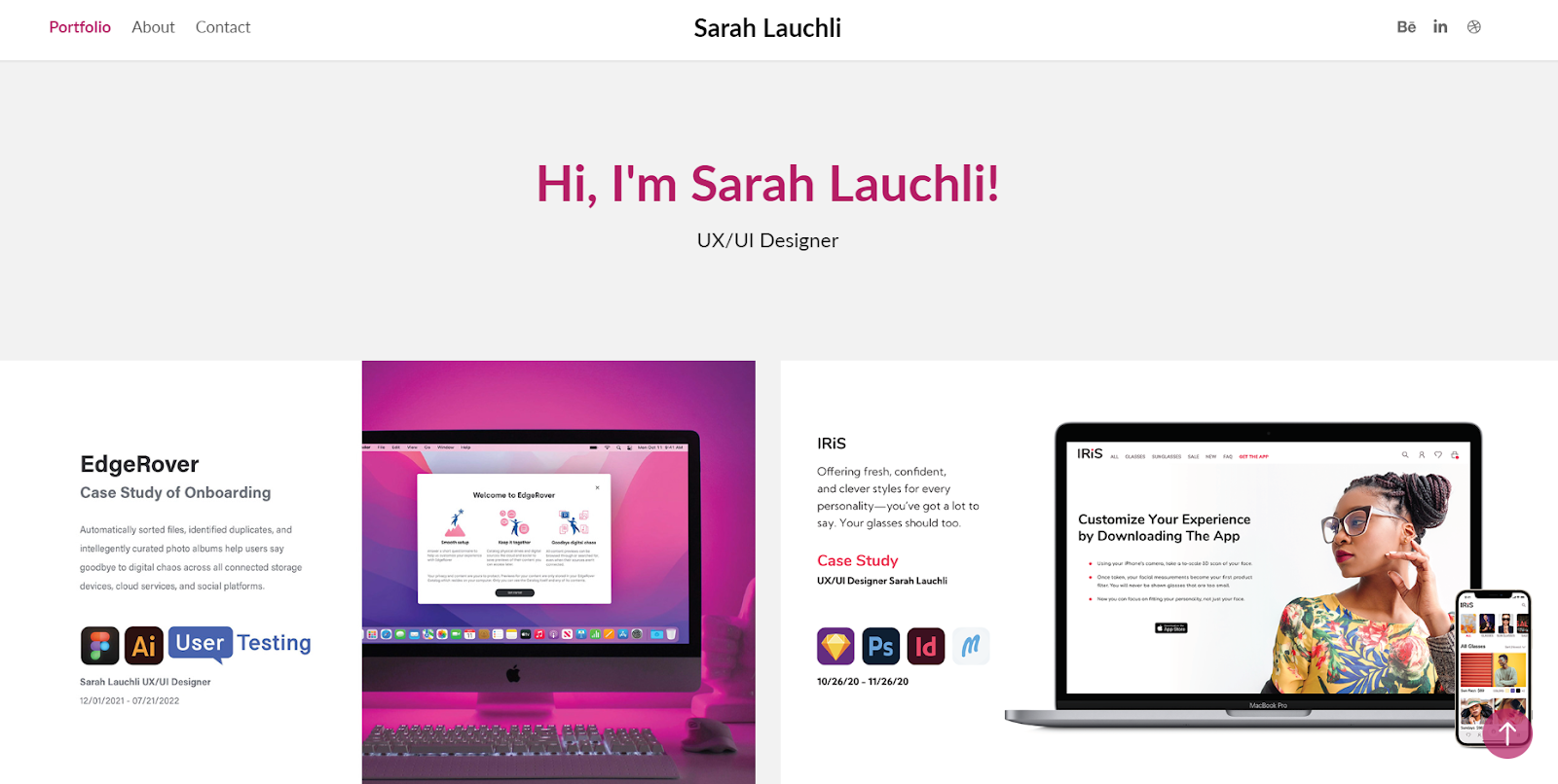
Sarah Lauchli’s UX design portfolio website showcases her impeccable taste in colors, layouts, and typography. Every case study dives deep into her design choices and process with clever graphics, a responsive layout, and detailed background information.
Sarah carefully documents the objectives and challenges she encountered in each project and the direct actions she took to conquer them. In each case study, you’ll find the step-by-step process she undertook, including the user flows and wireframes she created. At the top of every page, she includes icons to indicate which tools she used for that project, demonstrating her proficiencies clearly and alongside their proper context.
After visitors are thoroughly impressed by the case studies, they can visit Sarah’s about me page for a detailed description of her design philosophy and specialties. At any point, visitors can click the “Contact” option at the top of the page to reach a lightweight contact form.
7. Olga Rody

Large text and a minimalist design take center stage on Olga Rody’s sleek portfolio homepage. She displays her projects in a large grid, featuring images from each project to inform visitors of what to expect before they click. And she uses a natural color scheme that prioritizes accessibility with its excellent font-background contrast.
At the top of each case study, Olga defines her role up front. As visitors scroll, she introduces various design deliverables such as journey maps, wireframes, and prototypes, painting a comprehensive picture of her process.
Her portfolio isn’t just a gallery of pictures. She also includes measurable outcomes, such as usability testing results and survey answers, to showcase her impact as a designer. This social proof might be just what convinces viewers to get in touch.
8. Ryan C. Robinson
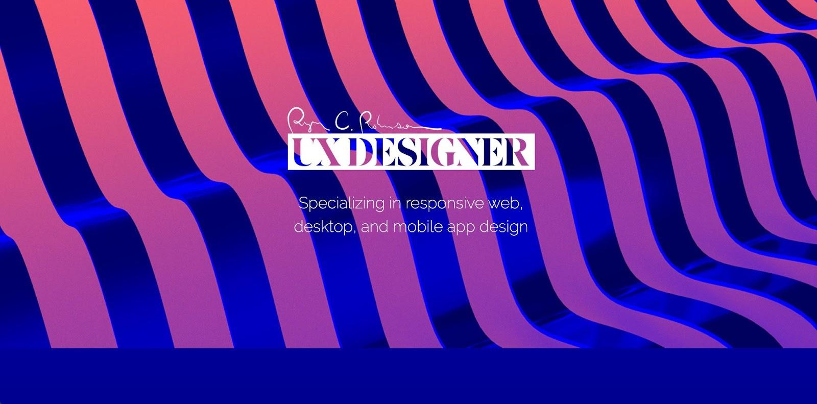
Switching it up with a burst of color, Ryan C. Robinson’s design portfolio gives a vivid twist to modern design. As visitors scroll through the portfolio, projects pop off the screen, breaking away from the standard 2D design approach and introducing 3D elements.
Each of Ryan’s project pages balances descriptive content with engaging visuals, ensuring a complete understanding of the design process. The focus tags for each project are particularly useful — like wireframing, UX, and visual design — and provide an efficient reference point for potential clients or employers looking for examples of specific skill sets.
This portfolio showcases a unique blend of creativity and function, demonstrating Ryan’s versatility as a UX designer.


Launch with Webflow Templates
Choose from hundreds of professionally designed website templates for any industry or style. Customize visually, launch instantly — no coding required.
9. Gina Yu
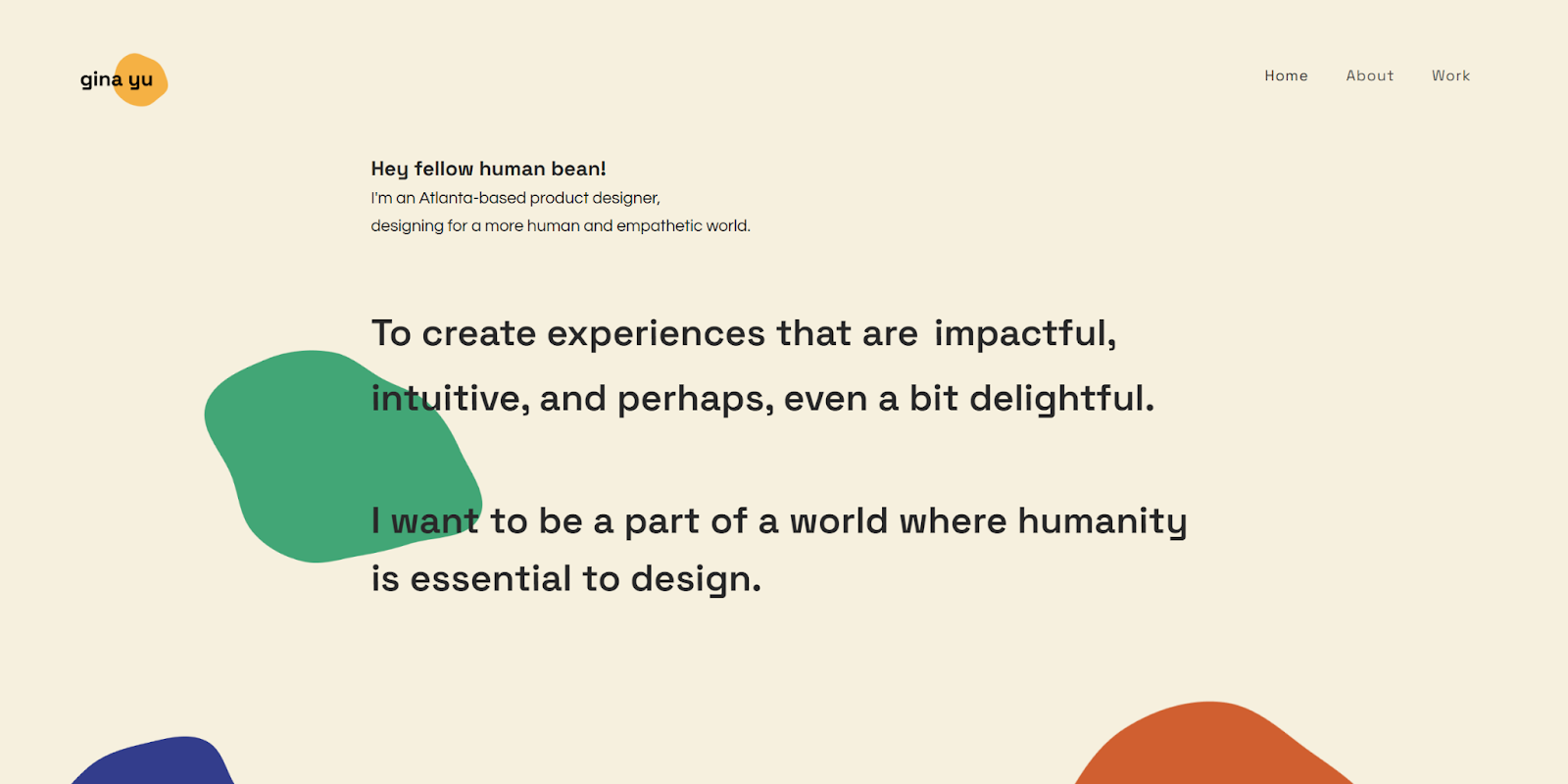
Web designer Gina Yu offers a refreshing departure from conventional product design portfolios that open with product images and sleek, techy designs. She uses a light beige background to highlight fun paint drops (hinting at her artistry) and text that starts by stating “Hey fellow human bean! I’m an Atlanta-based product designer, designing for a more human and empathetic world.” Instead of opening with a focus on her design skills, Gina highlights her philosophy. This sets a wonderful tone for people hoping to work with someone who shares the same human-focused values.
On Gina’s work page, the spotlight first falls on her most recent project, with four other undertakings trailing closely in a simple grid layout. She populates each case study with process narratives and interactive prototypes. And she even embeds a functional prototype on a graphic representation of a Mac screen for her Outback Bikes project, offering visitors a realistic demonstration.
10. Keith Chan
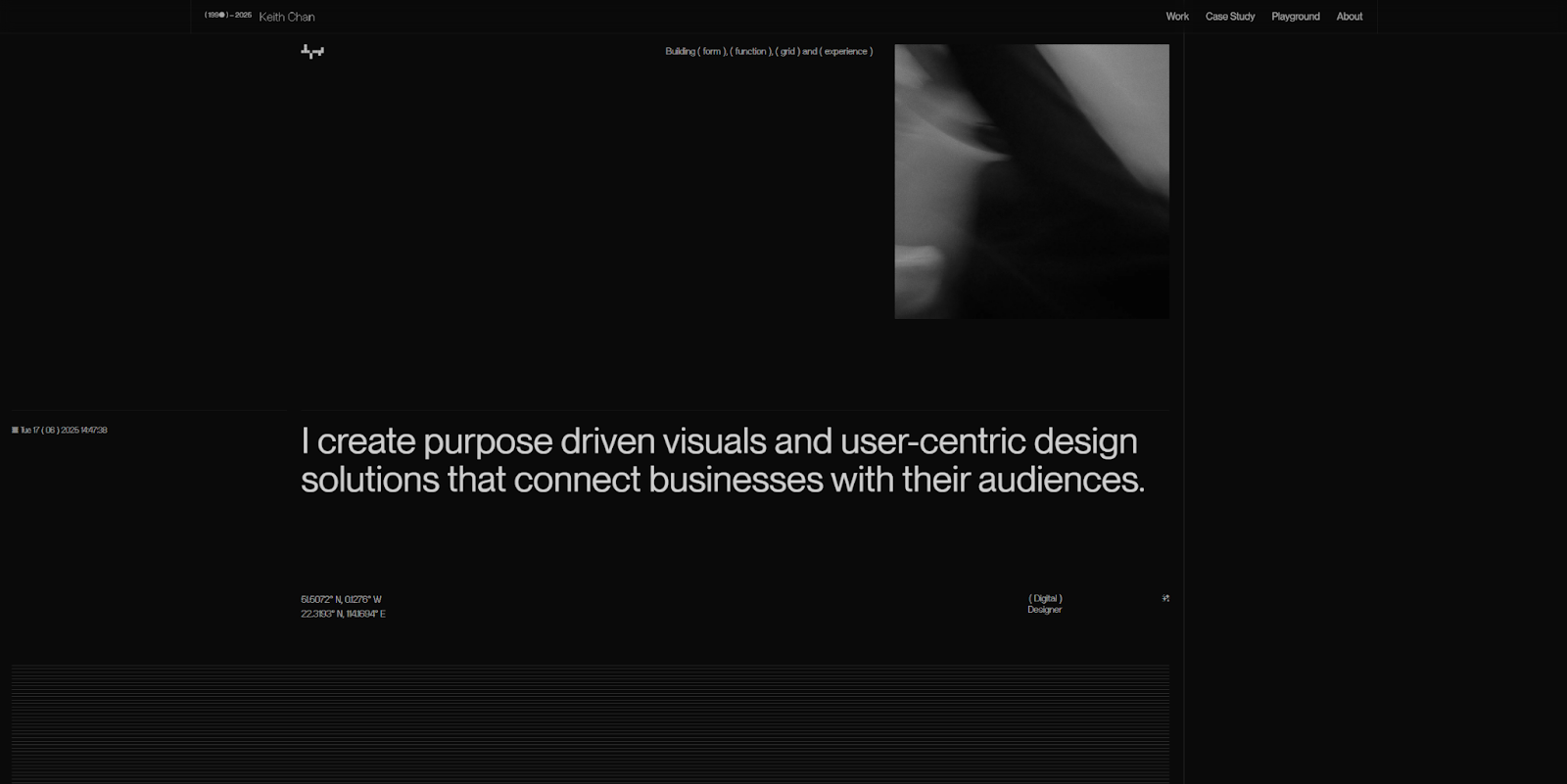
Keith Chan’s portfolio website takes brutalist web design in a bold, experimental direction that goes beyond expected raw styling and unconditional design elements. Its avant-garde minimalism leaves room for embellishment and unusual layouts, and Keith doesn’t disappoint. Time stamps, coordinates, and page-breaking lines make the experience uniquely engaging.
While Keith’s take on brutalism departs from traditional minimalism in places, the use of white space, symmetry, and sans-serif fonts keeps the website highly readable and intuitive. It’s great inspiration for designers looking to break away from predictable web design trends without losing clarity.
11. Marga Navarro
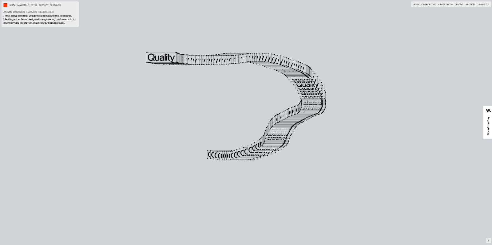
Marga Navarro’s portfolio website takes an unconventional approach. There’s no scrollable homepage or standard navigation menu — instead, a single clickable menu drives the entire experience. Within specific case studies, visitors drag floating windows to watch short video clips, making exploration a playful, interactive experience.
This unpredictability is part of the charm that makes Marga’s portfolio so memorable. Whatever action visitors take, it feels deliberate and leaves a lasting impression. While the abundance of motion can challenge accessibility, it also shows how bold interaction designs can stand out. The lesson here is to balance thoughtful, creative originality with a smooth, user-friendly journey.
12. Bleibtgleich

Despite its dry, tongue-in-cheek tagline — “another burnt-out soul behind the screen … scroll, sigh, and exit” — Maksym Ponomarenko’s Bleibtgleich UX design portfolio delivers an unforgettable experience. It’s extreme maximalism: overlapping design elements that collide with witty headlines and flashy animations. The result is loud, chaotic, and impossible to ignore.
Maksym’s portfolio website works as both a showcase and a filter. Visitors looking for a standard blog or simple ecommerce site will likely move on, while those seeking an edgy, avant-garde portfolio or visually surreal website redesign will know they’ve found the right designer. It proves that unapologetic style can attract the right audience simply by being authentic.
13. Bryn Taylor

Here’s an example of how to flaunt modern minimalism without going overboard. Bryn Taylor’s design portfolio uses clean typography, generous white space, and a simple, intuitive layout that’s easy to explore. Subtle animations lead visitors through the site, while clear calls to action (CTAs) add personality without compromising usability or accessibility. And for anyone inspired by this style, Bryn’s creator page includes several ready-to-use templates with a similar look and feel.
14. Studio Direction

Studio Direction’s website shows off their flair for originality and high-contrast color. A video reel at the top highlights recent work and draws visitors into the design, where they can explore case studies and learn about the studio’s philosophy. The vibe is bold and immersive yet still accessible thanks to intuitive navigation that’s easy to follow. It’s excellent inspiration for walking that fine line between audacious style and broad client appeal.
15. Irene Butenko
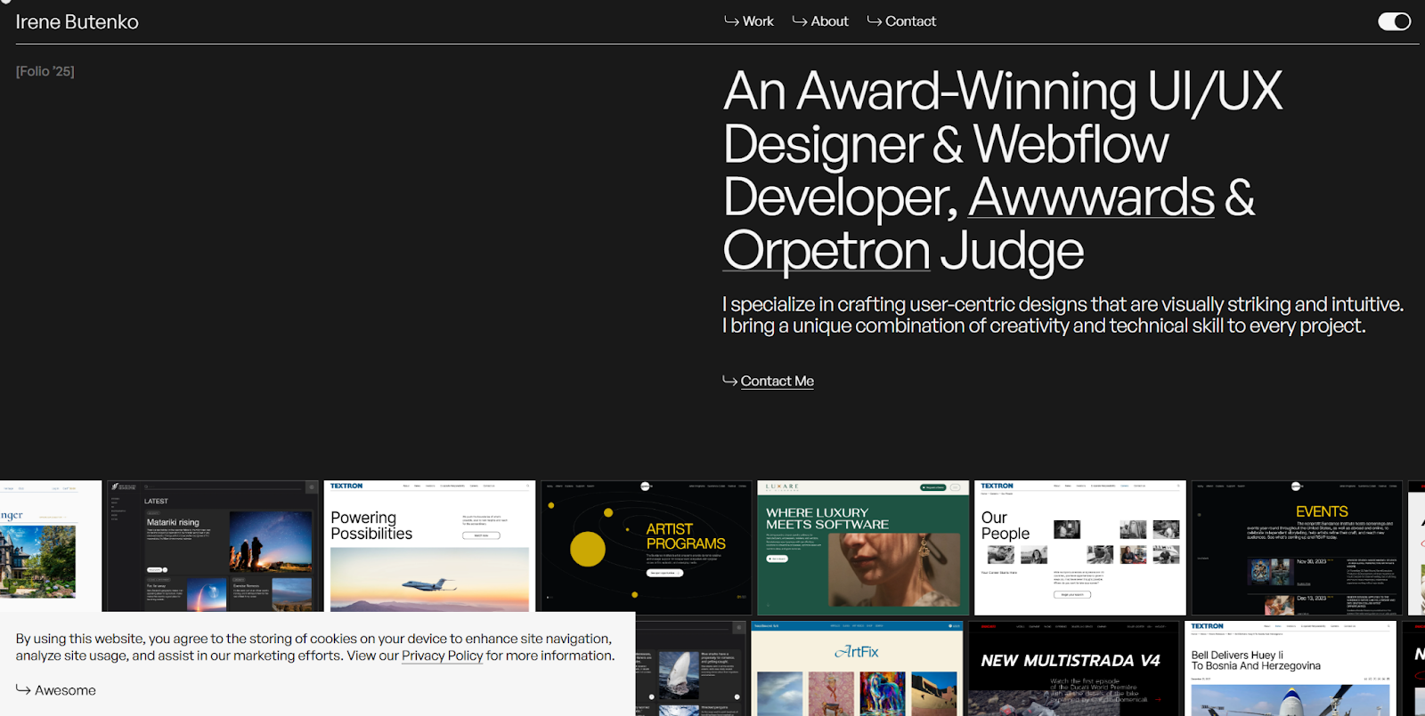
Irene Butenko’s UX design portfolio puts her award-winning work front and center. Every page opens with a bold loading bar before leading into scrolling galleries and in-depth case studies. Detailed visuals, thoughtful descriptions, and client testimonials build a sense of scale that leaves a lasting impression. For designers with a large body of work to showcase, this layout is a sure way to give it the spotlight it deserves.
Start your portfolio with Webflow’s 21-day design course
Designing and publishing a UX design portfolio involves important decisions like selecting a platform, picking the right case studies, and building the best layout. Even veteran designers can benefit from input on those decisions. Before you get started, take the time to research tips and tricks from other designers.
For more comprehensive guidance, check out the 21-day portfolio course at Webflow University. It provides step-by-step guidance for publishing your portfolio with Webflow, covering everything from creating layouts and interactions to launching your site. By the end of the course, you’ll have a completed portfolio website and many new skills.
Attract new clients with a stunning UX portfolio
Your UX designer portfolio is likely the first thing potential clients or employers will see, so it’s crucial to ensure it stands out. Find ways to showcase your skills and highlight your passion for the industry.
Whether you’re a web designer, UX/UI designer, or UX researcher, your portfolio should work for you, not against you. Portfolios should indeed have a certain wow factor aesthetically, but make sure they showcase skills relevant to you. In addition, not all portfolios will focus on perfect UI alone — case studies, research, and process-related material are also necessary.
If you’re looking for more help, Webflow offers a 21-day portfolio course to help revamp or kickstart your design portfolio. And remember to consider all of the essential design tips and tricks you picked up along the way as you create your own UX portfolio.

Show off your work.
Choose from fully customizable portfolio templates built for creatives. With Webflow, you can design, refine, and publish a standout portfolio — without writing a single line of code.


