The design process has evolved dramatically over the last few years. Dozens of powerful, flexible tools have emerged to streamline every stage of the design process. Despite all that advancement, gathering and acting on client feedback remains one of the more painful parts of the design process.
Particularly when you’re dealing with remote clients, stakeholders, and team members. And it only gets more painful if those providing feedback aren’t all that web-savvy.
With that in mind, here’s a list of my favorite design feedback tools for recording and sharing feedback faster, more easily, and more efficiently.
10 design feedback tools for design teams
Here's a list of 10 great design feedback and annotation tools:
1. Helio
Helio (formerly Notable) boasts a ton of features, including built-in tools for screenshots, annotation markups, presentations, project management, user testing, and prototyping. Plus, if you’re the sort who likes to develop sites in the browser, you can collaborate on coded sites as well as flat prototypes! (Which might make it perfect for those of you with Pro or Team plans.)
Pros
- Very, very robust feature set
- Built specifically for design teams, so it’s got all the bells and whistles you want
- Team-oriented
Cons
- Premium app
- Robust feature set may be far more than you need
2. Nimbus
Nimbus Screenshot and Screencast has become a mainstay for me — and not just for providing feedback on designs. Its ability to take scrolling, whole-page screenshots makes it super-handy for building your portfolio, blogging, and screencasting too!
After you’ve taken your screenshot, you can edit and annotate the image, then save it, send it to Google Drive or Slack, or print it (I guess people still do that?).
Pros
- Free browser extension
- Takes full-page screenshots
- Offers a variety of annotation methods
- Diverse sharing and saving methods
Cons
- It’s not pretty
- Full-page screenshots with animations or fixed elements can get funky
- Is screenshot based
3. CloudApp
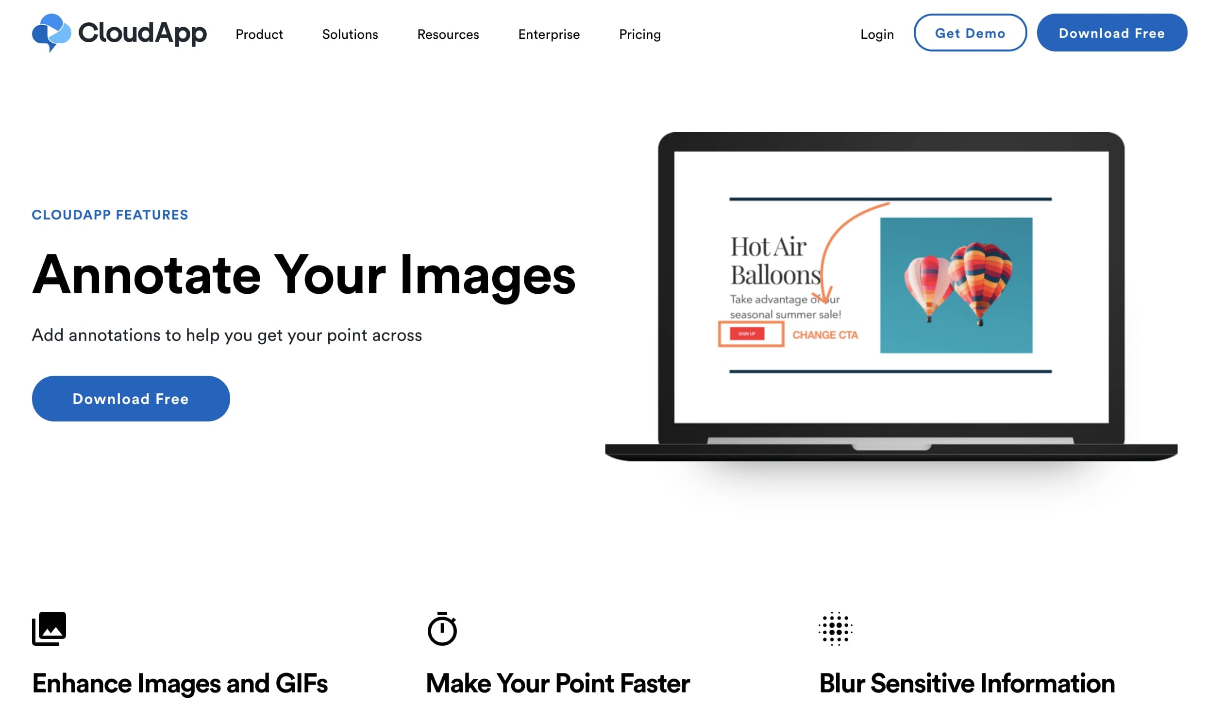
CloudApp has been building a name for itself as a reliable annotation and visual feedback tool.
All you need to do is install the application on your computer and from there you can take screenshots and videos of anything open on your desktop. It's a great collaboration tool for web designers and project managers that need to gather feedback.
Pros
- Free
- Available for Mac, Windows, and iOS
- Easy to share via a link
- Powerful content review tool
Cons
- Focused on commenting on writing, which could cause confusion in providing design feedback
4. Droplr
Droplr caught my eye while researching this post, and I’m already loving it. You can use it in your browser alone, if you’d like, but I particularly love the menu bar app, which gives you quick access to your last few screenshots. It’s got all the features you expect from a screenshot and annotation tool, including screencasts. But you can also quickly make reaction GIFs, share a web page as an image, or quickly shorten a link, too.
I’m also a big fan of the fact that you can use the key combo Option + Shift + 4 then click and drag to screenshot a specific area of your screen, and have the shot save to Droplr instead of your desktop.
And if you’ve ever seen my desktop or Dropbox, you’ll know I take a lot of screenshots.
Finally, screenshots self-destruct, which I think is a really smart feature. After all, screenshots are typically very of-the-moment, and otherwise sit around clogging up your hard drive for no good reason. And since you can choose to keep a particular image, you’ve got control.
Pros
- Free
- Pretty
- Robust
- Desktop app
- Space saving (screenshots go to app, not desktop)
Cons
- Self-destruct feature could backfire on you
5. Evernote Web Clipper
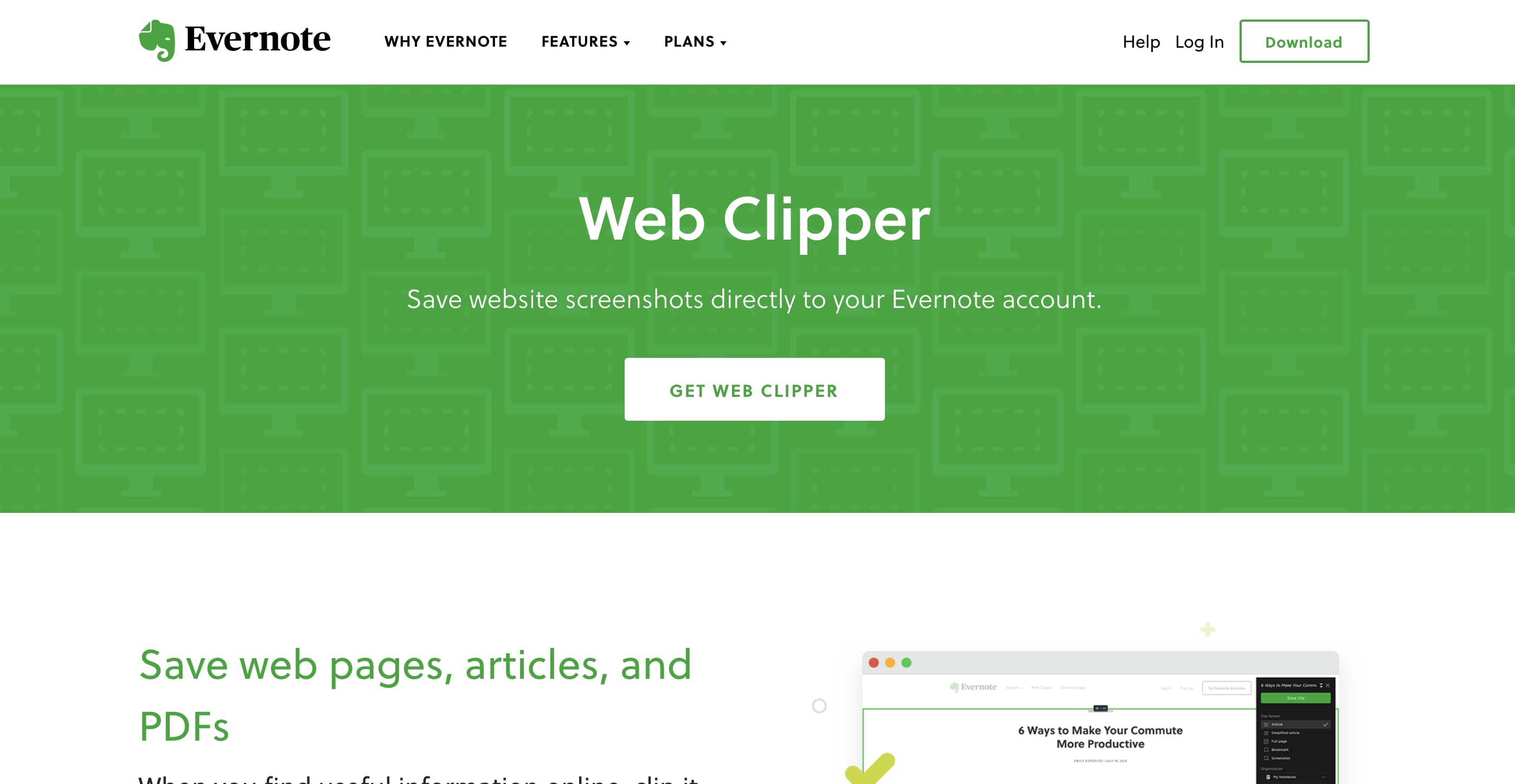
Evernote Web Clipper has also earned a permanent place in my design process. Like their headline implies, bookmarks have never felt like the right solution for saving the web. One reason being that, unless you’re using your bookmark bar efficiently, you never see — and hence, never think — about your bookmarks.
Evernote Web Clipper helps solve that problem by being part of an app you probably already use on the regular. And the ability to save, tag, and comment on the page is genius. Perfect for researching blog posts — particularly this kind of post.
The feature does try a little too hard at times, though. Attempting to display the web page within Evernote typically leads to a broken mess. But you’ll just click through to the site anyway.
Like Highly, this tool does suffer from a lack of specificity in shared content. Unless you’re commenting on a page at a high level alone, you’ll have to do some work to ensure your feedback comes across.
Pros
- Nice integration with the browser makes it easy to use
- Great for research, in addition to annotation
- Better than bookmarks
Cons
- Because you can’t indicate “this comment applies to this design element,” miscommunication can happen


The modern web design process
Discover the processes and tools behind high-performing websites in this free ebook.
6. Skitch
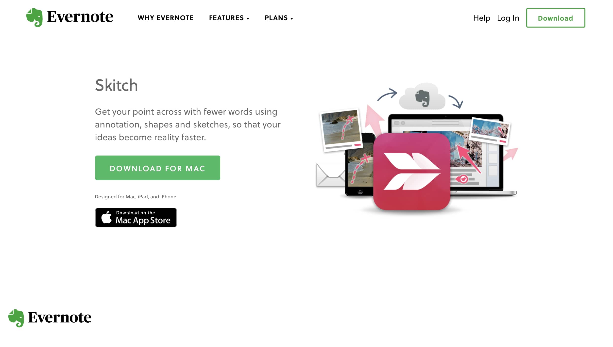
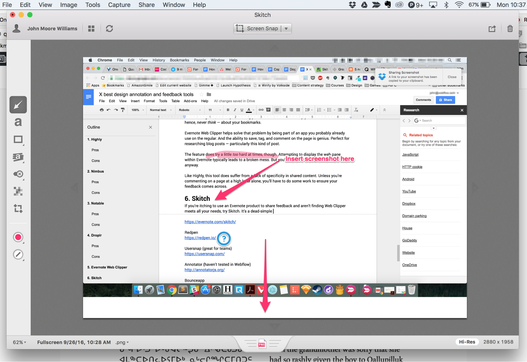
If you’re itching to use an Evernote product to share feedback and aren’t finding Web Clipper meets all your needs, try Skitch. It’s a dead-simple way to grab screenshots and add a variety of annotations, call attention to key areas of a design, and blur out sensitive details.
If you (or your client) already use Evernote, it’s a no-brainer due to its deep integration with the notetaking tool. Just download Skitch, then sign into Evernote, and Skitch will ask if you want to create a “Skitch” notebook and save your shots there. For those who dread installing yet another app (or remembering another email/password combo), this feature is key.
My favorite detail of the UI is how easy it is to embed your latest screenshot in other apps. Once you’ve added all your commentary, just click the tab at the bottom of the UI to drop it into another app, like Google Docs.
I can also add that Webflow’s support team relies on Skitch every day. So there’s that.
Pros
- Free
- Simple
- Integrated with Evernote
- Lots of annotation options, including blur
- Desktop app
Cons
- Counts toward your Evernote storage limit (and adds up fast!)
7. Red Pen
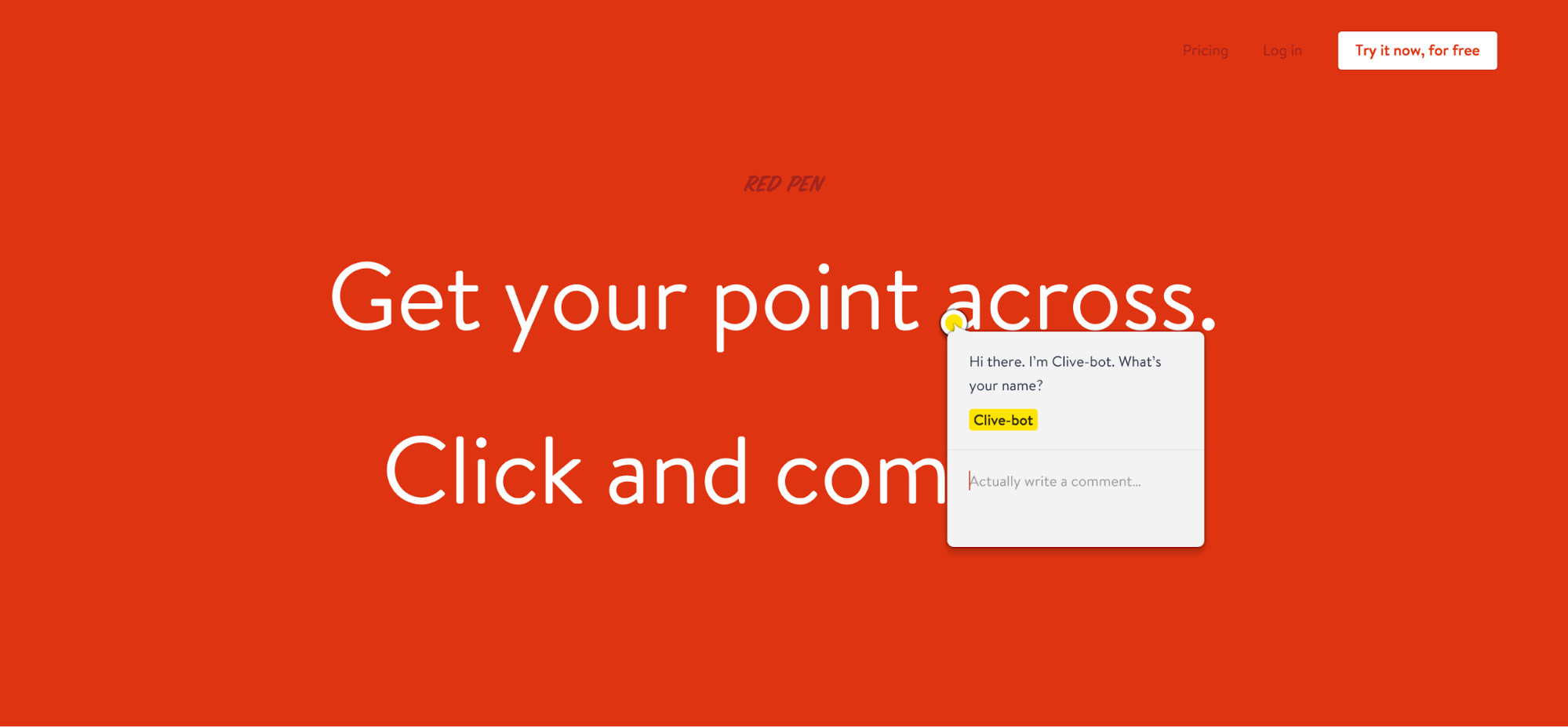
Redpen ticks all the boxes for an annotation and feedback tool, with a focus on simplicity and real-time (and asynchronous) feedback sessions among teammates. Plus it’s got a beautiful red website, with a ton of personality, that just might inspire you to show people how your product works, instead of just telling them.
The trial-based pricing model could be a bit of a bummer for freelancers looking to not pay for a feedback tool they’ll only use intermittently, but the app’s more focused on team collaboration anyway.
Pros
- Simple
- Beautiful
- Team-focused
Cons
- Trial-based pricing model (14 days free, then you pay)
8. Usersnap
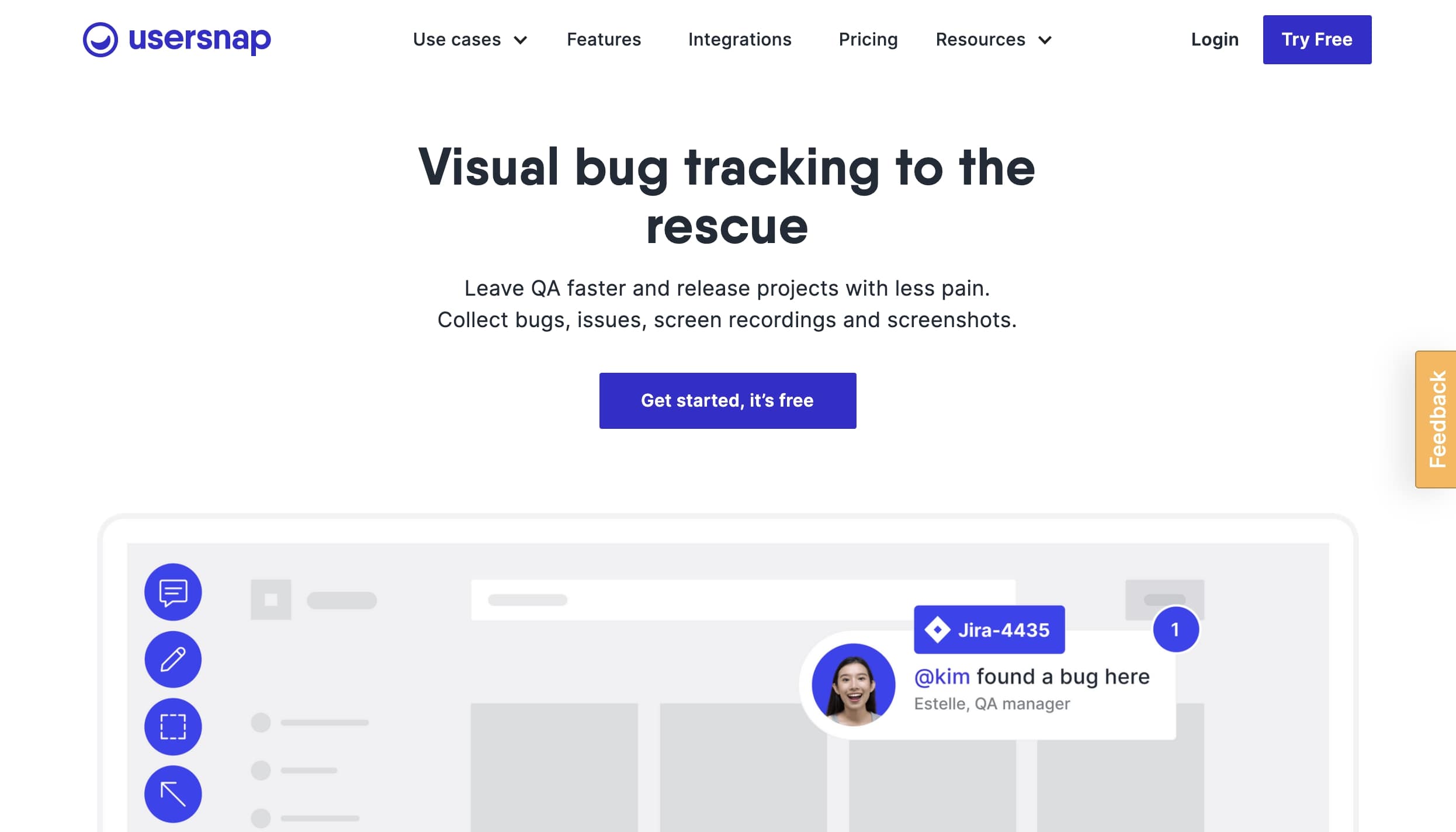
While most of the above design feedback tools have focused on general annotation and design feedback workflows, Usersnap targets developers, QAs, and interdisciplinary teams building software and websites together.
In part, this is just a matter of framing: success stories focus on enterprise companies’ use of the app, and the copy focuses on reporting bugs. But it’s deeper than just framing, as you can “implement a JavaScript feedback widget on your website or make use of available plugins for leading content management systems.” The pricing model is also straight-up premium, so freelancers on a budget may want to look elsewhere.
Pros
- Built specifically for teams and bug hunting/squashing
- Integrates with popular project management tools like Slack, Jira, Trello, Basecamp, etc.
- JavaScript error recording
Cons
- Premium pricing
- Team-focused
- More robust than most freelancers will need
9. Annotator
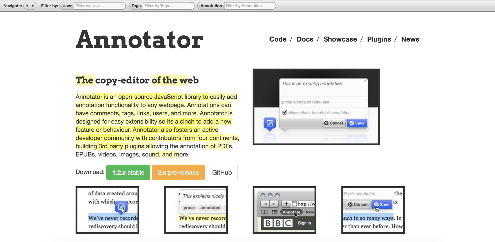
If you’re comfortable with JavaScript and don’t want to ask your clients to install or join a third-party tool, you might just love Annotator. Once you’ve done the preparatory work of integrating it with your site, you can just send your in-progress site over to your clients or stakeholders, and they’ll automatically be able to comment all over the place.
Pros
- Free and open-source
- Doesn’t require clients to install or download anything
- Lots of optional functionality to add when you need
- Seems fairly simple (if you know what you’re doing)
Cons
- Requires comfort with JavaScript
10. Bounce
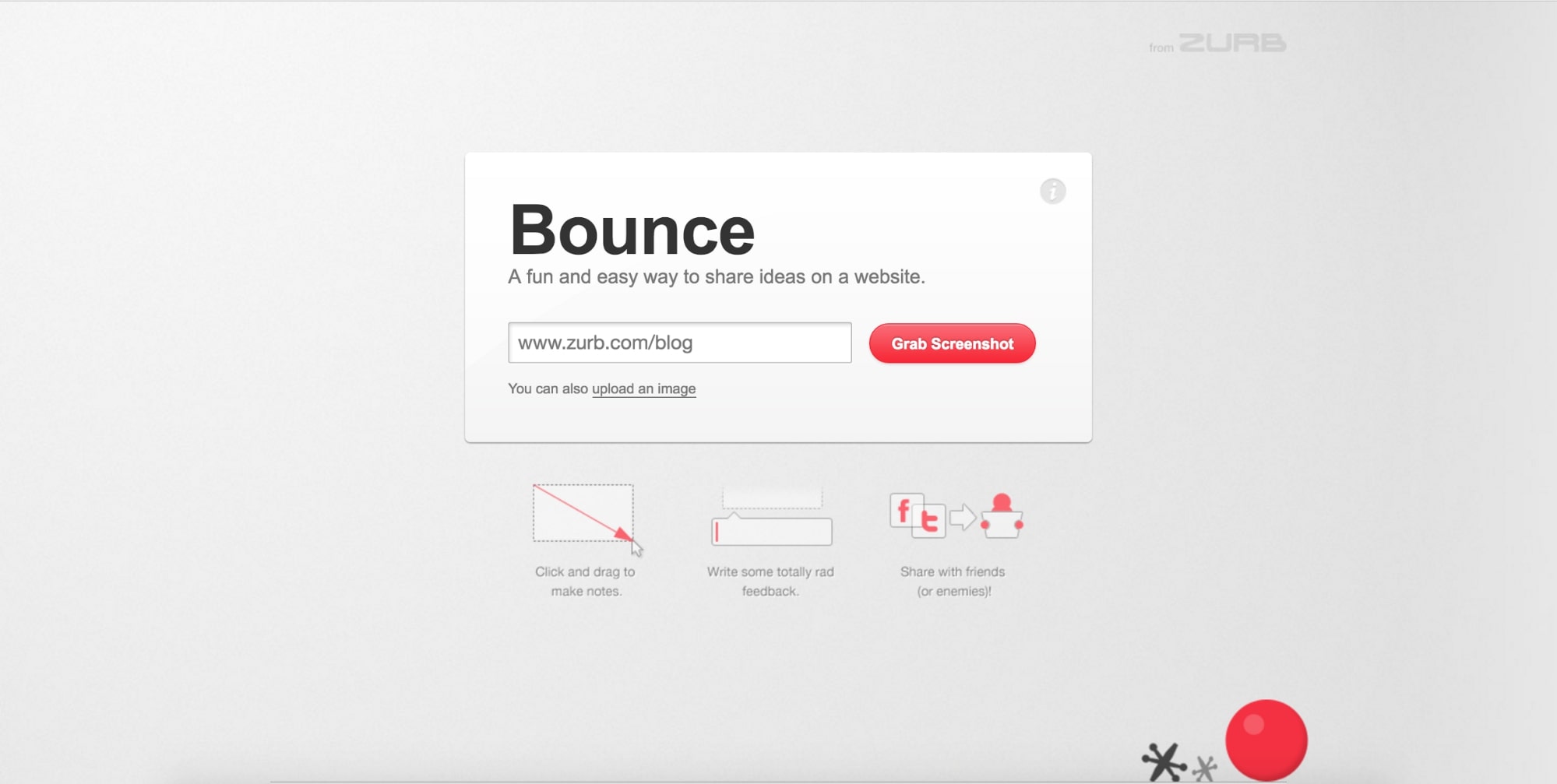
If you want to make things stupid-easy on your clients (which happens to be an excellent idea), Bounce may be your absolute best bet. Just send them the link to Bounce, have them input the URL for your work in progress, and it pulls a screenshot for your client. Then, they just add their comments, save them, then copy a share URL to send back your way. Really couldn’t be easier.
Of course, that ease comes with a small price tag in terms of minimal functionality, but again, with clients, that might not be the worst thing.
It’s also worth noting that Bounce doubles as a canny marketing tool for Zurb’s more robust tool, Notable (see #3), so Bounce could get you caught up in a convo about Notable. Which might not be terrible, if you’re on a team.
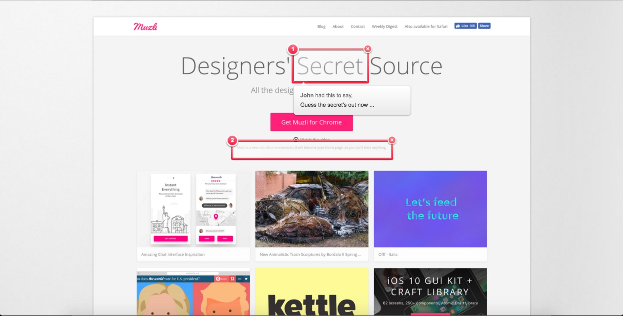
One thing that could cause potential issues with Bounce: like Nimbus, Bounce creates full-page screenshots, which is awesome. But also potentially problematic if your page has animations, lazy-loading elements, or fixed elements. For example, in the screenshot of Muz.li above, cards “below the fold” were grayed out and lacked images, which could scare some clients (especially those who ask why all the website copy is in Latin).
How do you manage design feedback?
We’d love to hear all about the tips and tools you use to share and manage design feedback, so share them in the comments below!


