Bad online shopping experiences … we’ve all had them. And when you’ve had one, chances are you haven’t bought anything from that particular online store again (unless you had to).
But what makes for a bad ecommerce experience? Unclear calls to action, non-mobile-friendly websites, confusing order forms, insecure checkout pages: the list goes on and on.
Unfortunately, bad online shopping experiences have almost become the norm. It’s astounding how many online businesses don’t even realize that they’re losing sales because of these simple mistakes.
With that in mind, here’s 8 tips to help you deliver the best shopping experience possible — and make more sales.
1. Make your ecommerce website mobile-friendly
There’s nothing worse than having to pinch and pull because the website you’re visiting isn’t mobile-friendly. Your customers hate it just as much as you do, so make it easier for them to buy from you on any device. With tools like Webflow and Foxy.io, building a responsive (mobile-friendly) shopping experience is easier than ever.
According to Internet Retailer, mobile commerce now makes up 30% of all U.S. ecommerce. And that number grows every year. It’s clear that mobile-friendly websites are a must for any online business.
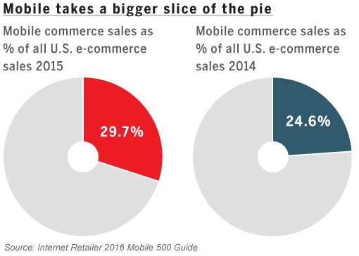
In fact mobile-friendliness can affect not just your mobile sales, but also how you rank in Google searches! That’s right: Google has mobile-friendly criteria that can affect how your website ranks in search results.
Not for sure if your website’s mobile-friendly? Use Google’s free mobile-friendly test to find out and get optimization recommendations.
2. Help people understand what they’re buying
Whether you have one product or thousands, a clean, easy-to-understand product detail page is vital. This page should include the appropriate media, information, and buying options to help your customers make a quicker purchasing decision.
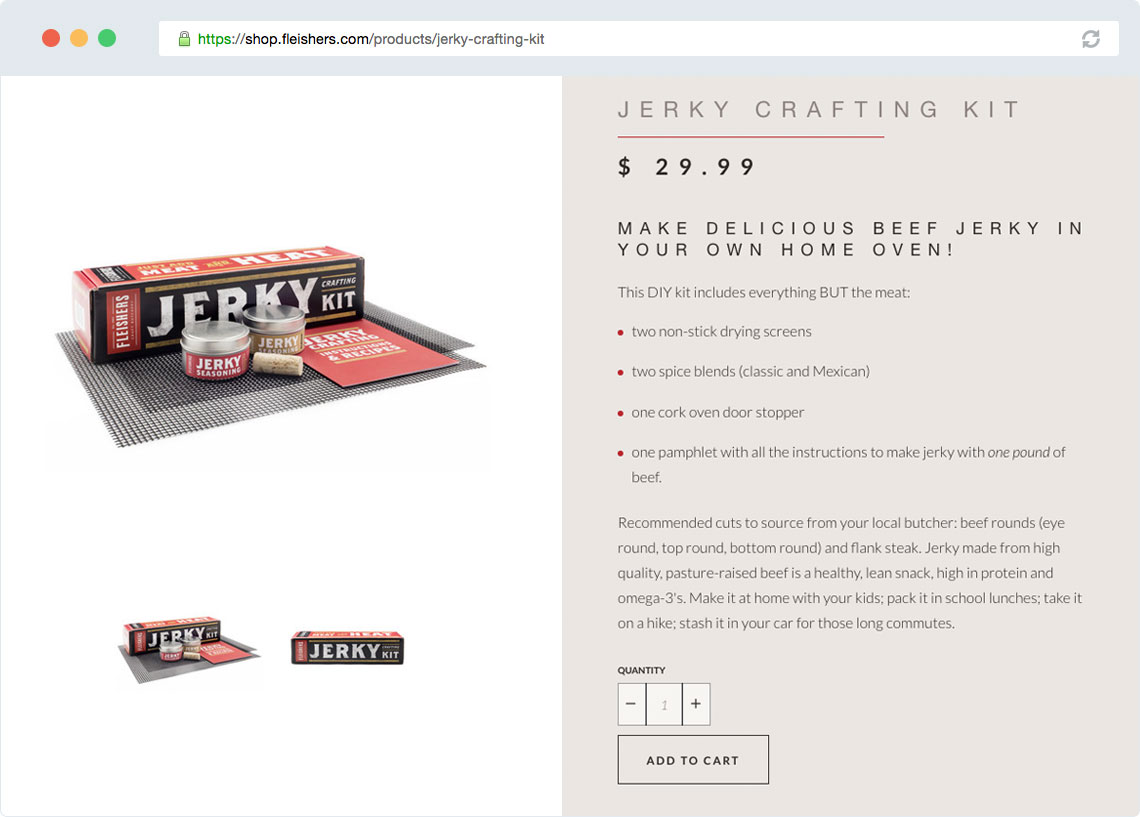
Be smart about the content on your product detail pages. For example, products like shirts and shoes need detailed photos to help people buy with confidence. If your product requires a little consumer education, include an explainer video. And if you sell products with lots of specs (computers, phones, etc.) thorough descriptions and feature lists will help people compare their options.
Clear product options (i.e., size, color, format) and add-to-cart buttons will ensure your customers are buying exactly what they want. Make sure your add-to-cart button stands out from everything else on the page.
3. Be upfront about pricing and fees
We’ve all been there. You get to the final stage of placing your order, only to find out there’s an extra fee that somehow went unmentioned till now. Now that “great deal” no longer looks so great.
Being upfront about your pricing and fees — including taxes, shipping, and handling — will go a long way with your customers. Most customers won’t mind paying the extra fees if they’re aware of them ahead of time — it’s the surprise that kills sales.
4. Build trust with a secure checkout experience
One of the best ways to earn trust from your customers is to show them you care about keeping their information safe. I’m certainly not the only one who suffered from one of the many security breaches at large corporations over the past few years.
It’s much easier to maintain your customers’ trust than to rebuild it after a hack.
There are two key ways to build trust with your ecommerce customers:
Buy an SSL certificate for your online store
If you aren’t familiar with SSL certificates, I’m referring to the green padlock you see in your browser’s address bar — which shows up when a URL starts with HTTPS instead of HTTP. Having an SSL certificate means the information transmitted (through forms, checkout pages, etc.) is sent securely.

While you don’t need every website page to be secure, Google does give a ranking boost to secure websites.
You’ll find several different types of SSL certificates available online, and prices vary depending on who you buy yours from. DigiCert and Comodo both offer affordable SSL certificates.
But before you buy, check with your website provider and ecommerce platform to make sure you don’t already have access to an SSL certificate. Webflow offers secure websites as a paid add-on and Foxy.io includes a shared SSL certificate with all Foxy stores.
Outsource your checkout—and payment options
While having your own SSL is the optimal choice, it’s not feasible for every business. So you can, instead, rely on a third-party ecommerce solution like Foxy.io or Shopify to provide a secure checkout experience for you.
Whichever way you go, be sure to also accept secure payment methods like PayPal and Amazon Payments so customers can buy without sharing their personal info with you.


Free ebook: Web design 101
Master the fundamental concepts of web design, including typography, color theory, visual design, and so much more.
5. Remove distractions from your checkout page
The checkout page is the last step before customers either complete their order or bail. Simplifying your checkout page by removing distracting visuals and calls to action will keep your customers focused on completing their order.
Distractions include primary website navigation, irrelevant graphics, unrelated information, or anything that pulls the customer away from finishing filling out the checkout form.
Another distraction is unnecessary checkout form fields. Remove any fields that aren’t needed to complete an order, or just move them to a later point in the flow, possibly after the order is complete.
About those upsells
Upsells (like Amazon’s “Customers Who Bought This Item Also Bought” and “Frequently Bought Together” modules) can also be a distraction, but they don’t have to be.
To keep upsells from becoming a distraction, make sure they either:
- Relate to and add value to the product the customer’s about to buy, or
- Are something the customer has already expressed an interest in
You can also consider moving upsells earlier in the checkout flow, i.e., right after customer adds a product to their cart, like Amazon does.
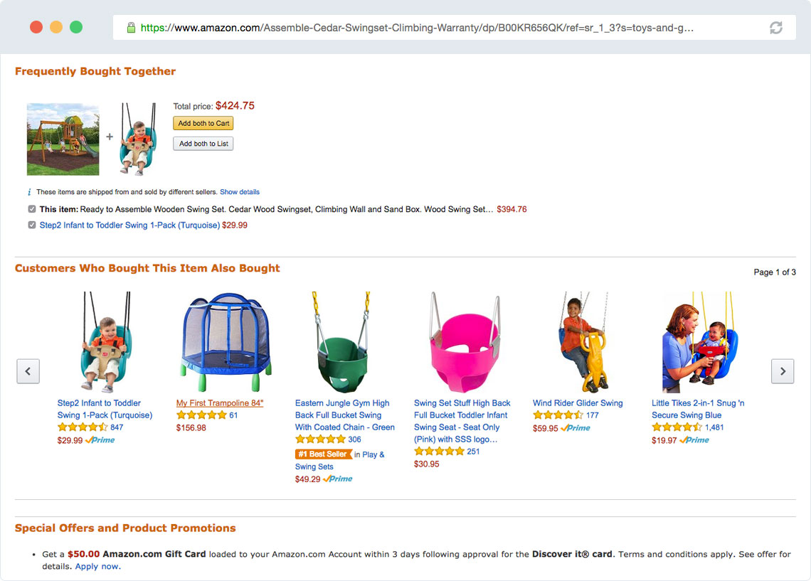
In the end, this is an interaction that will almost certainly warrant testing. If upsells lead to more high-value sales, keep them. If they bump up your abandoned cart numbers without also increasing high-value sales, cut them.
6. Give customers payment options
Not everyone likes to pay with their debit or credit card when they’re shopping online.
In fact, I’ve talked with many consumers who will only buy from online stores that accept PayPal. Allowing your customers to choose how they pay you provides a better shopping experience and can sometimes mean higher conversions.
When choosing a shopping cart to use for your online store, check to see what payment gateways and alternate payment methods they support. For example, Foxy.io supports nearly 100 payment options. Accepting more popular alternate payment methods like PayPal, Pay with Amazon, or bitcoin opens your business to more customers than if you just accepted one payment method.
7. Make it stupid-easy to check out
When it comes to the final stage of your checkout flow (adding payment info), don’t trip up customers by asking them to create an account.
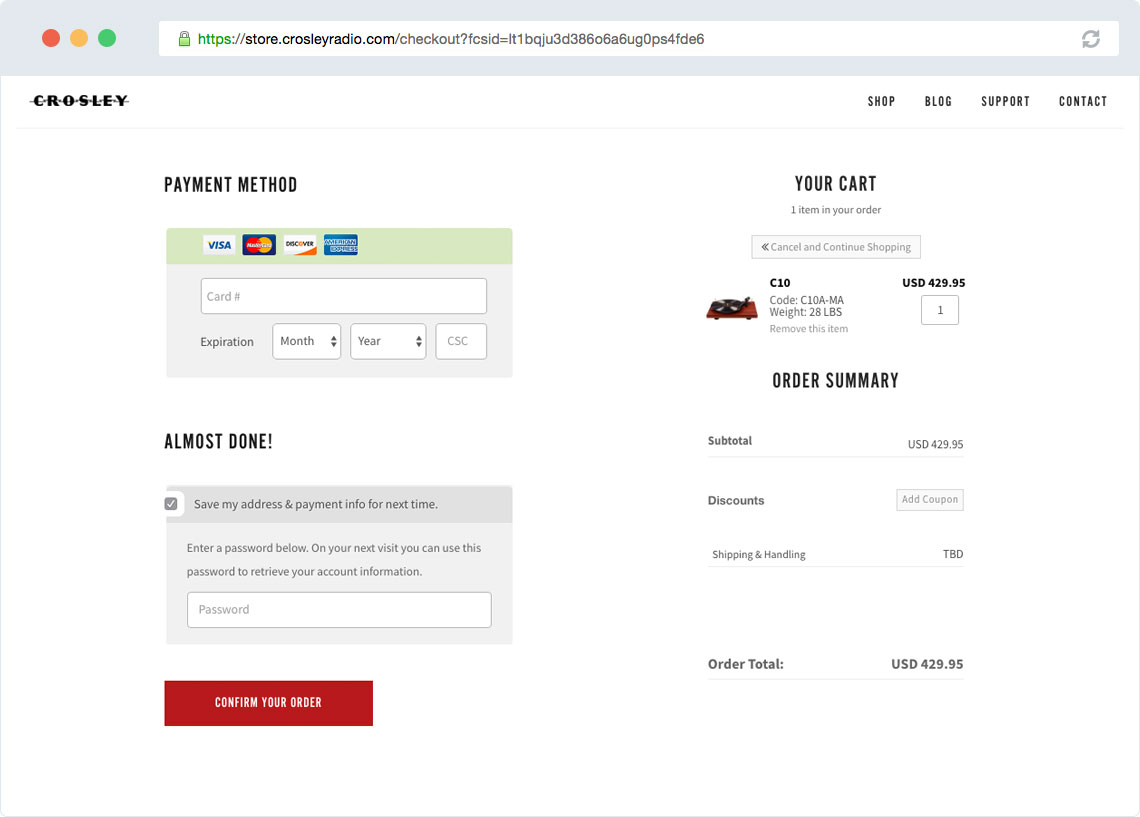
Depending on your business model, you may need people to create an account (e.g., if you sell monthly subscriptions). If that’s the case, make account creation frictionless and clearly explain the benefits of creating an account.
For businesses where account creation isn’t beneficial to customers, remove the option to create an account. Slim down your checkout page as much as possible to ensure a better customer experience and faster checkout.
8. Set clear expectations — before and after the sale
While you understand your checkout flow and order process, your customers may be confused about what happens next — unless you tell them.
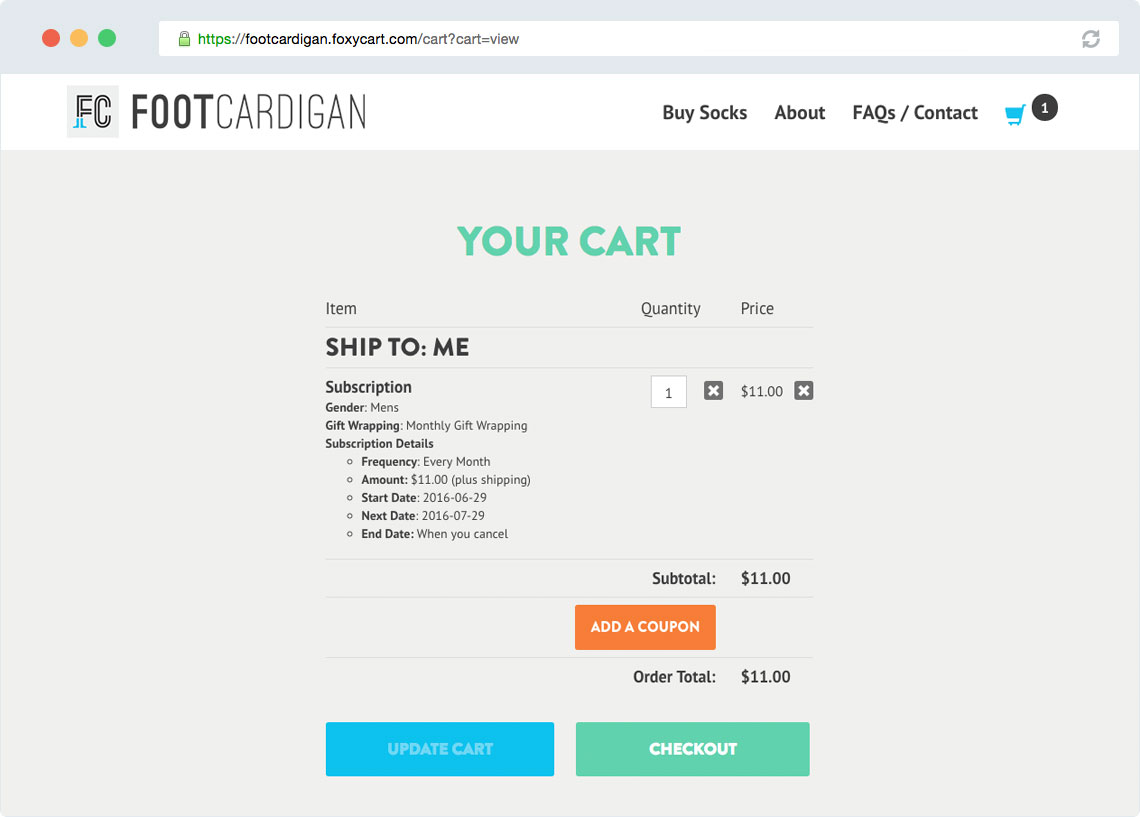
Before your customers complete their order, clearly explain how products/services will be delivered and when. Then repeat this info after they’ve placed their order and in your receipt email.
Also, be sure to highlight contact information in obvious places so customers with questions can quickly get in touch. Setting clear expectations and being accessible will limit surprises and reassure people that, if any concerns arise, you’re there to help.
9. Don’t let the receipt be the end
A single sale is satisfying, no doubt about it. But truly successful businesses know the first sale is only the beginning. Once you’ve attracted a paying customer, it’s time to start building a lasting relationship.
Creating a loyal customer base can be as simple as continuing to offer value to your customers. Include a way for them to opt-in to get messages from you somewhere in the flow. Then, connect with them on a regular basis by letting them know about new products, promotions, or even free information and resources.
Periodically check in with customers to get feedback on their experience with your product/service. Genuinely listen and apply the feedback you get (good and bad). Your willingness to improve your product/service based on customer feedback will make it that much easier for one-time customers to become returning customers.
10. Convert abandoned carts into satisfied customers
While it can be easy to focus on customers who’ve bought from you, let’s not forgot about those who came close but bailed. Many online businesses assume there’s no way to get these customers back, but they’re dead wrong.
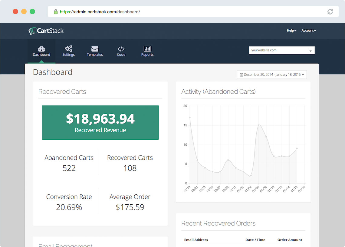
Services like Rejoiner, CartStack, and CartHook offers tools to track customers who almost completed an order but didn’t, show what was in their cart, and automatically send emails encouraging them to complete their order with coupon codes or discounts.
Along with these great features, you’ll get deep reporting on conversion rates, customers saved, recovered revenue, and more. This is vital information for any serious online business.
How do you create loyal ecommerce customers?
Running an online business can be tough, but my hope is that these 10 tips give you a fresh point of view and actionable steps you can take to confidently grow your business and better serve your customers. I’d love to learn more about the steps you have taken to grow your online business, so share them in the comments below.


