


Offering a convenient and enjoyable experience online and off has always been crucial to the customer journey. Of course, it matters even more these days because nearly everyone browses primarily on mobile.
Mobile internet usage surpassed desktop in October of 2016, and that trend has continued to climb every day.
This migration to mobile matters because mobile offers a completely different experience from desktop. Browsing websites remains relatively the same at its core, but visuals, content, and delivery all need to be adjusted for mobile. For starters, mobile devices have smaller displays — not to be confused with lower resolutions. Modern phones can display HD content almost as well as desktops.
The key aspect of mobile browsing is that it can be done from anywhere. A browsing experience tailored for mobile needs to be fast and user-friendly.
Aside from offering a mobile version or a responsive site, how can you ensure a user-friendly experience? How can you pamper your audience without dumbing down the platform? These are questions you’ll need to answer if you want to build a successful B2C or ecommerce site.
Here are a few necessary components for building a successful site and ways to implement them.
1. Optimize navigation and performance
If customers visiting your site are running into issues like poor loading times or terrible navigation menus, they’ll be too frustrated to stick around. This leads to poor revenues and high bounce rates.
This problem is even worse on mobile. Most mobile users browse while multitasking. This means they want to get in and out quickly. That is, they want fast loading times and great performance.
Caching tools can deliver faster image and media loading — as can hosting your videos on platforms such as YouTube or Vimeo. Gorgeous, HD-quality visuals are a big deal, but be careful not to bog down your site. Bridge the gap by offering engaging content without sacrificing performance.
Here a few of the most common villains of slow page loads, and what you can do about them:
- Images: Use the right image format for your images. Enable Webflow’s responsive images feature, and be sure to compress all your images before uploading them to the site. Photoshop offers a number of compression tools in its Save for Web UI, or use a web-based tool like TinyPNG.
- Fonts: Only upload the fonts and weights your design actually uses. So if your content is set in Roboto Light and Regular, there’s no need to upload Thin, Bold, Black, etc. Alternatively, you can serve the user’s system fonts so there’s no need to load custom typefaces from a third party.
- Code: The leaner and cleaner your code is, the faster your website is to load. When possible, style tags (e.g., “All H1 Headings”) instead of create unique classes. Create a style guide at the start of every project. Use Webflow’s “clean up” feature in the Style Navigator to delete unused styles. And minify your code in your Project Settings.
You’ll find more tons more tips on site speed optimization in our article “How to boost your site’s performance.”
Not sure if your site’s fast or not?
Test it out on Google PageSpeed Tools and Pingdom.
Just note that the former doesn’t actually test your site’s speed: it only checks to see if you’re doing things that tend to improve page speed. The tips they provide are of course useful, but don’t lose it if your grade isn’t great.
2. Use trusted payment providers and clear indicators
Hacking, breaches, and identity theft are rampant these days. Your customers know this and are wary of sharing sensitive information. Instill confidence by selecting trusted payment providers and placing clear indicators and logos where applicable. Logos certain users find trust-inducing include those from the Better Business Bureau, Diamond Certified, etc.
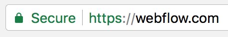
Also, be sure to enable HTTPS on your site. This keeps data encrypted so that if someone does get their hands on it, it’s better protected and more difficult to read or access. And you get the nifty little “secure” tag, as shown above.
3. Make sharing easy with social media links
Whether your website offers demos, previews, or descriptions of your services, you need to give customers a way to share your content. Placing social media buttons and links throughout your website is the best way to do this.
Most news and blog sites like TechCrunch offer great examples of ideal social media button and link placement. Buttons on landing pages make it easy to share content directly to social.
When you click through to an individual story or news update, you’ll find the sharing buttons just below the title and byline. (A sensible placement per the law of proximity.)
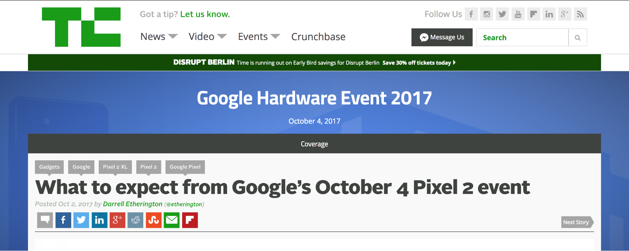
Scroll to the end of the content and — bam! — more social buttons await. Whenever the urge hits to share or discuss the site, links are always accessible. And keep in mind that sharing isn’t just for “virality” — sometimes it just makes it that much easier to discuss something amongst friends online.
Remember: just because TechCrunch is a content-heavy site, doesn’t mean you can’t take inspiration from it for your B2C or ecommerce site.


The missing guide to the freelance designer's life is here
Learn everything you need to know about making the leap to freelancing, from how to find clients to how to price your services.
4. Provide intuitive customer service
Did you know that 55% of U.S. adults are likely to abandon an online purchase if they can’t easily find answers or get help?
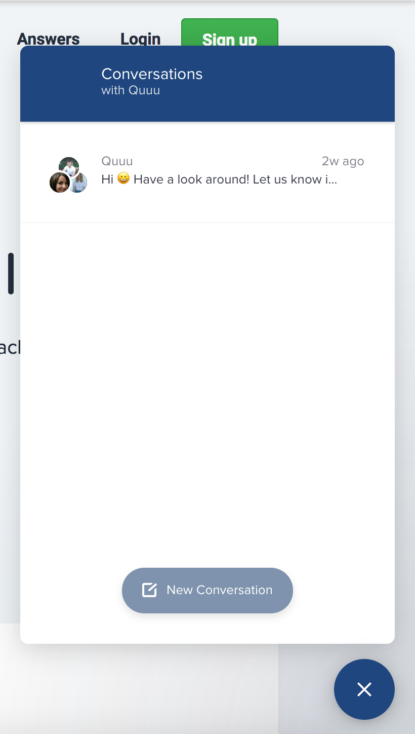
Your customers will have questions and issues will arise. So make it easy to find answers and get help. Social media networks like Twitter can facilitate this, but it’s also a good idea to make use of native tools on your site.
The most obvious way to help customers get help is to provide contact information in an easily accessible place, including a dedicated page with links to email addresses, support pages, and telephone numbers, as well as in your site’s footer. But a more intuitive way to offer customer support is through live chat and instant messaging tools. Live chat is great because it’s quick, always available, and, ideally, human.
5. Offer a guest checkout option
Some customers appreciate personalization options like logging in to a user account. A personalized account makes it easy to see and organize details like purchase history, receipts, rewards, and warranties.
But not everyone has the time or interest to log in when they visit. The same is true when making a purchase. Sometimes users just want to pull up your site from their mobile device, add an item to their cart, and check out as quickly as possible.
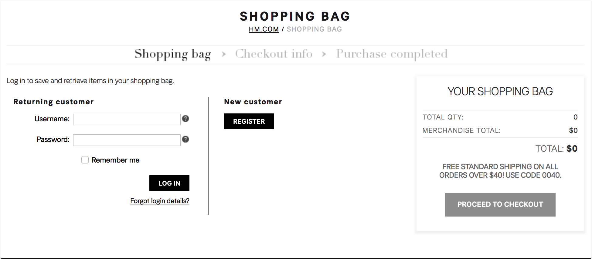
Accommodate this with the option to remain logged-out and make purchases as a guest. Eight out of the top 10 U.S. retailers currently offer guest checkout options.
Staples and Apple allow customers to use a guest account to make online purchases, but they also suggest signing up for a new account or logging in if customers already have one — they leave it to customers to decide.
6. Make room for user-generated content
Customers like to know you’re listening. This means more than providing easy access to social media and sharing links. Consider creating opportunities for user-generated content on your site. This could include blog posts, articles, photos, videos, how-to guides, and even more obviously promotional content like testimonials, reviews, and customer product demos.
Amazon allows user-generated content in the form of reviews. They also have a unique question-and-answer system where users ask and answer questions of other users. This taps directly into the experience of folks who’ve used a product. In other words, they get answers from the community.
If you’re fired up about user-generated content, keep in mind that it does require moderation. Any content published on your site can be interpreted as your company’s content. Which could lead to some very sticky situations…
Plus, some people still practice the iffy “SEO tactic” of spamming comment boxes with links back to their sites.
Endless features to enhance user friendliness
The features I’ve highlighted are some of the best and most popular options, but there’s still plenty more you can do to spruce up the user-friendliness of your site. Make sure you deliver high-quality product pages and item descriptions, outline a reliable return policy, offer free shipping and/or exclusive promotions, and much more.
The goal is to create a convenient and pleasurable experience for your audience. They should enjoy themselves at every point of the customer journey, from discovery of your brand to loyal, future purchases.
Where will you start to make your site more user-friendly? Share in the comments!