

Attention is the primary currency in the marketplace of ideas.
In today’s digital age, customers are bombarded with information from every direction, and trying to get them to notice you is a daunting task. Businesses are in constant pursuit of ways to stand out in a crowded online space and capture their target audience’s attention. And sometimes, the best way to do this is by saying less, not more.
Microsites are a great way to accomplish this because they offer a minimalist approach and deliver a streamlined message to a target audience. Unlike traditional websites, which can be expansive and packed with tons of information, microsites provide a concise, user-friendly experience that is easy to navigate and digest. They are able to cut through the noise and capture an audience’s attention.
What is a microsite?
A microsite is a small-scale website or landing page designed to promote an individual product launch, campaign, or event. They can consist of a single webpage or a small grouping of pages and are great for lead generation, product launches, or brand promotion. They can be part of your main marketing site or sit within a unique domain.
Say you’re organizing a conference and want to promote it. Launching a microsite dedicated to the conference and providing visitors with an immersive digital experience by showcasing the lineup of speakers, atmosphere, and what they can expect keeps visitors engaged and excited about the event.
Digital experiences can help establish an emotional connection with the audience, drive engagement, and fortify brand loyalty. It helps to build trust and credibility with customers, which can turn into increased sales and revenue. It’s not just about generating leads, but about creating these memorable experiences for the customer throughout their buying journey.
Using microsites to reach your audience is a more focused approach that lets you finely tune and deliver targeted messages, as well as a more immersive and engaging user experience. This space to focus on a core objective eliminates any extraneous content and helps you deliver a clear call-to-action to your audience.
8 stunning microsite examples
Microsites help you achieve more with less. Whether you're launching a new product, running a campaign, or sharing a story, microsites can help you achieve your marketing goals by providing a focused and engaging digital experience. Here are some examples of companies that have leveraged microsites to drive clicks, increase brand awareness, and deliver memorable user experiences.
Does your website look like death?
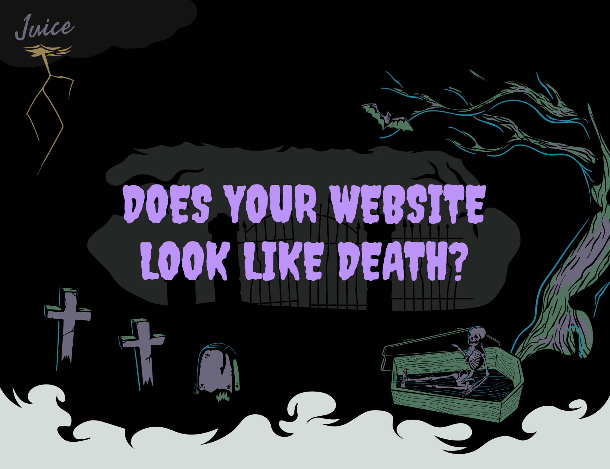
This beautiful one-page microsite by Juice does a fantastic job pulling the reader in with an engaging premise and attractive visual design. The “spooky” horror-themed design (reflecting the “horror” of having your company website look dated, cluttered, and ugly) moves beautifully along as the user scrolls down the page, with quirky illustrations and simple animations making the case for why one would need the design agency’s services.
This is a great example of how a microsites allows for control over the customer’s journey, crafting a narrative arc that defines the problem, shows the potential solution, provides clear information about pricing, and concludes with links to the agency’s various social media feeds. It’s simple, clean, thoroughly engaging, and fun.
I love financing cars
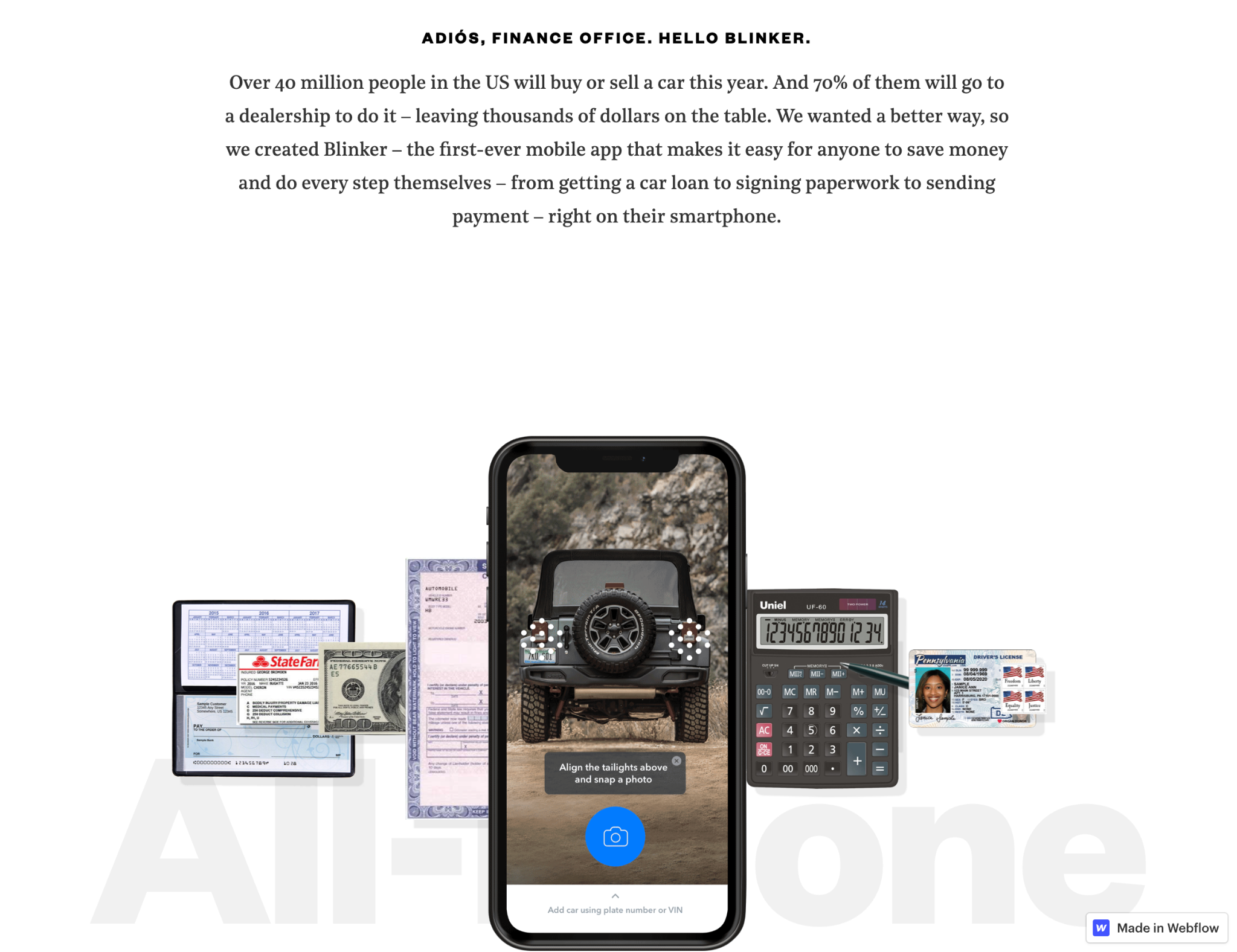
Mobile app Blinker created an incredible microsite called “I love financing cars.” It opens with a fictitious quote next to the clarification “said no one ever” to draw the user in. The landing page then comes to life as users scroll down and are presented with a play button to watch a one-minute video that presents Blinker’s services. This is followed by an attractive scroll animation that illustrates how the Blinker app combines all the elements traditionally involved in car financing into one.
The smart use of scroll animations, short videos, and CTAs make Blinker’s microsite an engaging experience that lays out their services, their brand’s identity and tone, and their achievements.
Lenny Contacts
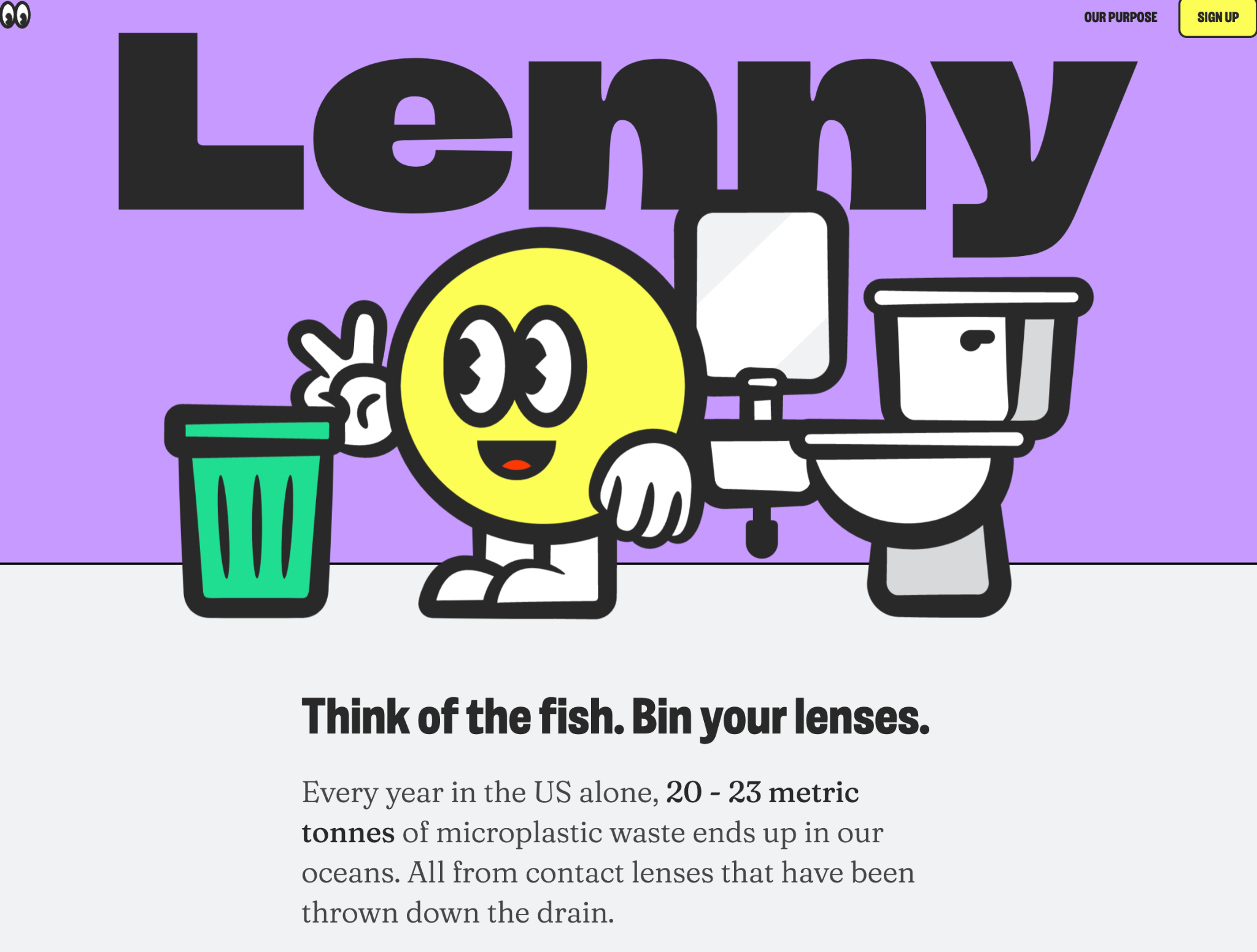
Contact lens manufacturer Lenny Contacts built this awesome microsite to promote their “Think of the fish” campaign, which is focused on reducing the plastic waste dumped into the ocean annually. As the reader scrolls down, they are presented with more information about the problem of ocean waste, with supporting links to sources inviting the reader to learn more if they so choose.
Reading about recycling and environmental issues can be challenging to frame as fun, which is why Lenny’s choice to present the information in an attractive, colorful presentation is paramount for preserving user engagement. The website also provides useful information through the use of animations that illustrate how to dispose of the lenses after use. It concludes with links to their social media pages, as well as an invitation to join their newsletter. Simple, clean, and attractive the whole way through.
To the Third Dimension
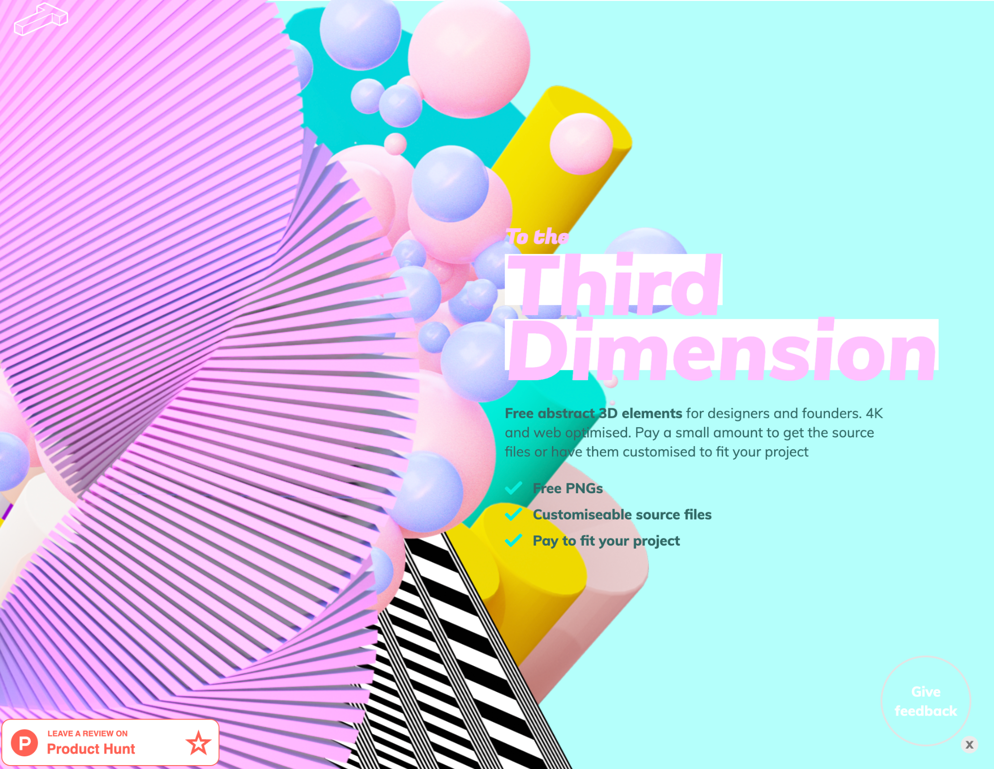
To The Third Dimension is a resource hub for designers to find free 3D illustrations and abstractions. The microsite is a stunning display of these designs, with a colorful header that lays out what they offer and an invitation for people to pay for different resources as it fits their project and budget. The images on the left side of the header come to life when you move your mouse pointer around, adding dynamism and interactivity to the experience.
The site then simply lays out the 3D designs it offers with a link to learn more about them and download them. The microsite ends with a link to the creator’s Twitter account and a Frequently Asked Questions section, letting the stunning images do most of the talking.
Meeting your meeting persona
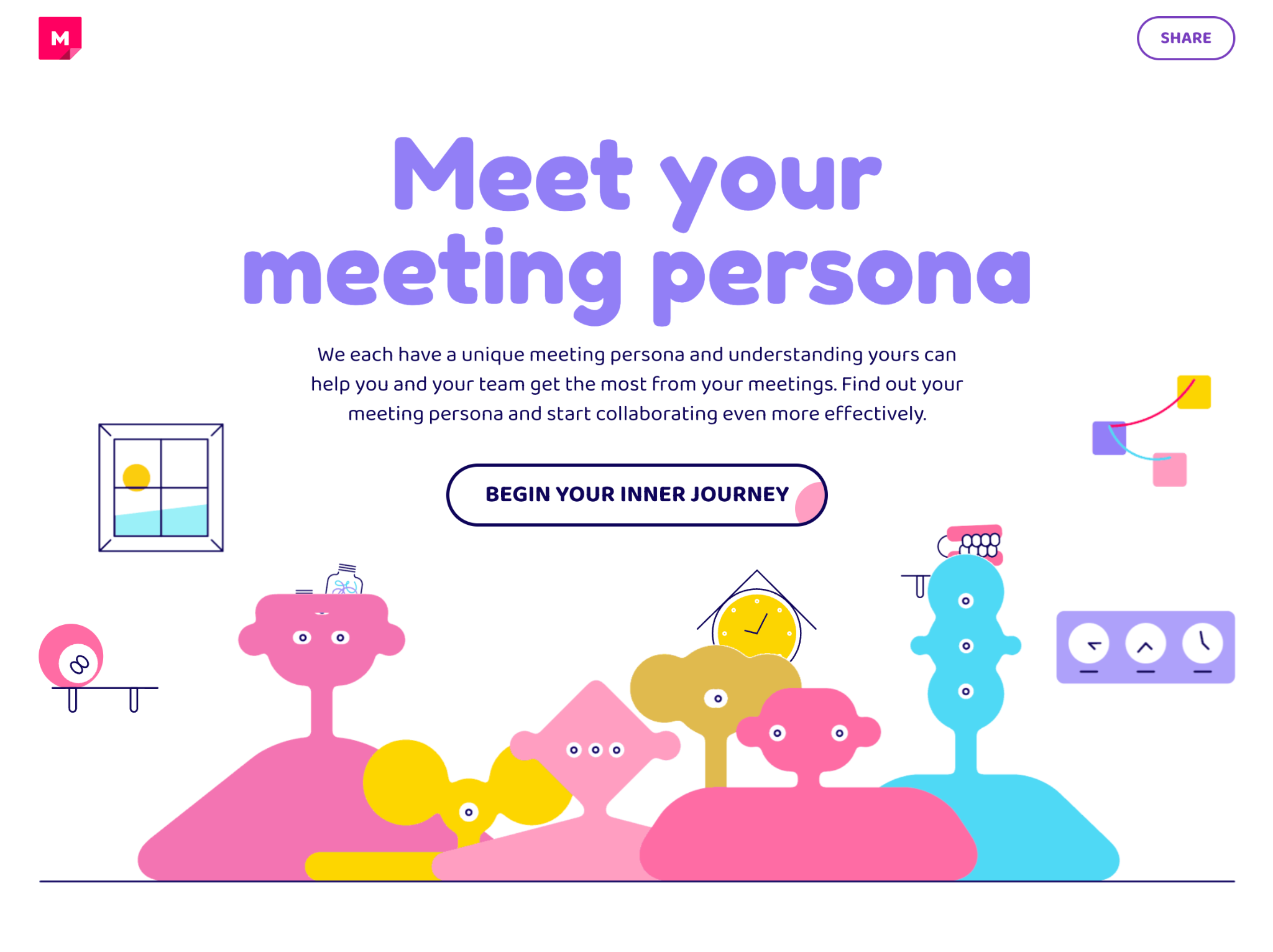
Putting a quiz on your microsite is an excellent way to drive engagement and keep your audience interested. This amazing microsite by Mural is an example of how fun, friendly, relatable content can capture the attention of users and generate leads. The microsite features a colorful, fun quiz (accompanied by some delightfully quirky animations) inviting readers to find their “meeting persona.”
By providing a personality quiz that tells your audience about their own habits or behaviors, you are providing an opportunity to learn something new about themselves. Mural very cleverly leads to a sign-up form at the end of their quiz, where users are encouraged to fill out their contact details in order to receive their results. Part of the appeal of these types of quizzes is how easily the results can be shared on social media, which can help increase your reach and bring in new visitors to your microsite. Coupled with unique graphics and content, it’s a fantastic example of a B2B microsite.
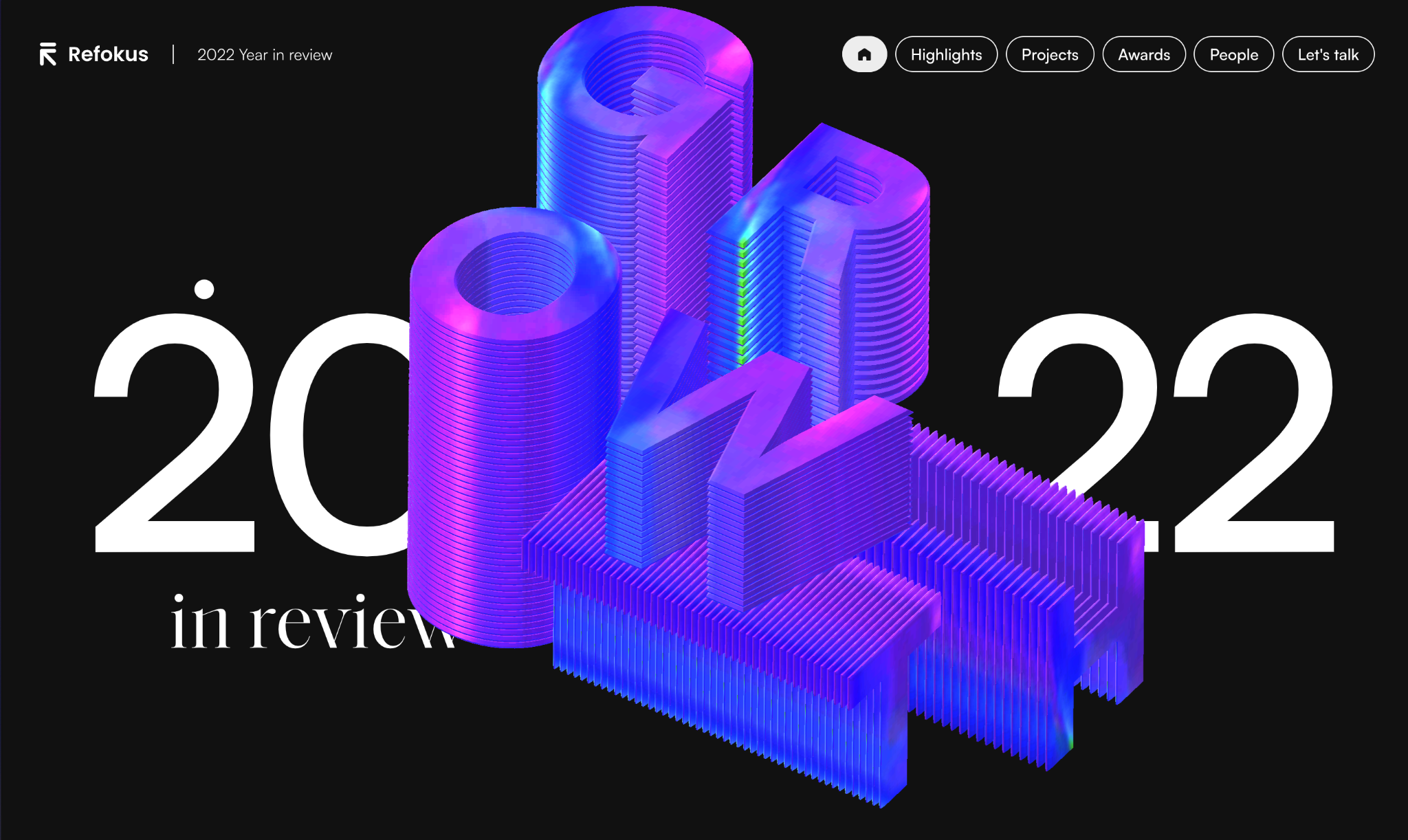
2022 year in review
One of the benefits of using a microsite is being able to use it as a platform for a specific type of content, placed away from the company’s main website. This allows the brand to play with styles and have a bit of fun, while still nodding to their primary brand aesthetic.
This 2022 year in review by Refokus opens up with a stunning interaction of a 3D visualization of the word GROWTH centered over “2022 year in review.” The microsite employs smooth horizontal and vertical scrolling that guides users through their work over the course of the year. It also makes clever use of a navbar, with buttons that gradually turn white as you scroll deeper through the site to explore the agency’s highlights, projects, awards, and people. Full-bleed solid background in the agency’s brand colors and stacking project thumbnails keep the site engaging yet sleek. The use of logos and team headshots points out the expansiveness of the company’s work and team, and a subtle interaction at the end of the site that points users to 2023 drums up excitement for what’s to come in the following year.
AR glossary
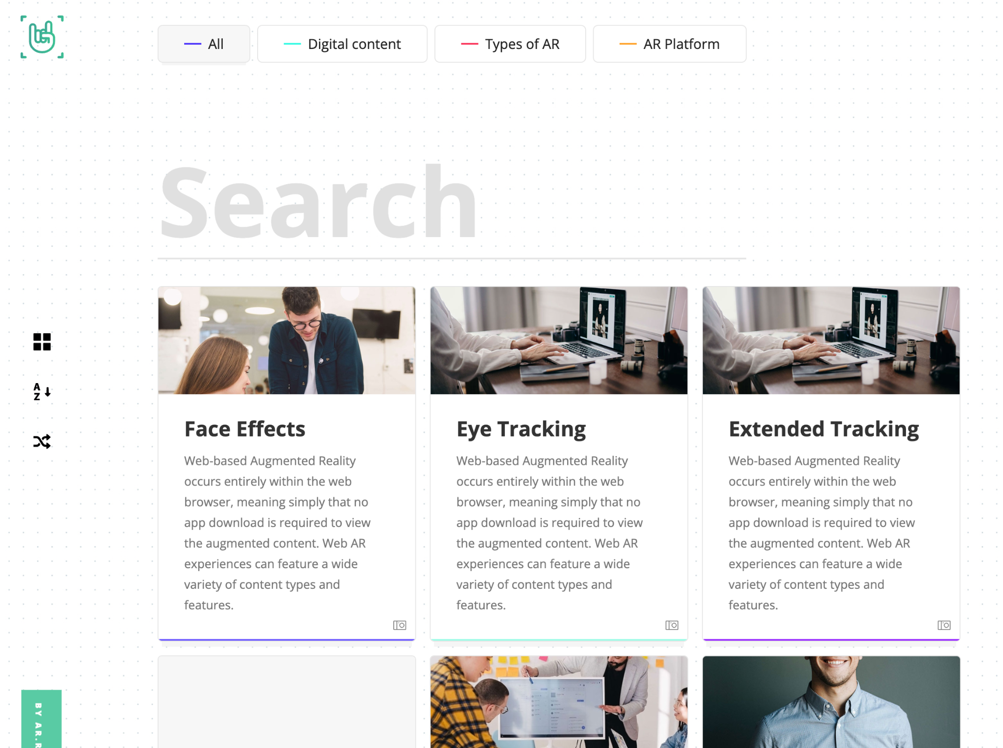
AR.Rocks created a microsite as a way to display their glossary, allowing users to browse through the various topics they cover. The layout is a single simple page, with a search bar at the top and the different results right below. The menu on the left side presents the user with different options for browsing these glossary elements, including a shuffle option and an alphabetical listing. This is a great example of a microsite used as a tool that complements the main website, which can then be pushed out as part of a campaign or as its own standalone project.
Childcare centers and natural disasters
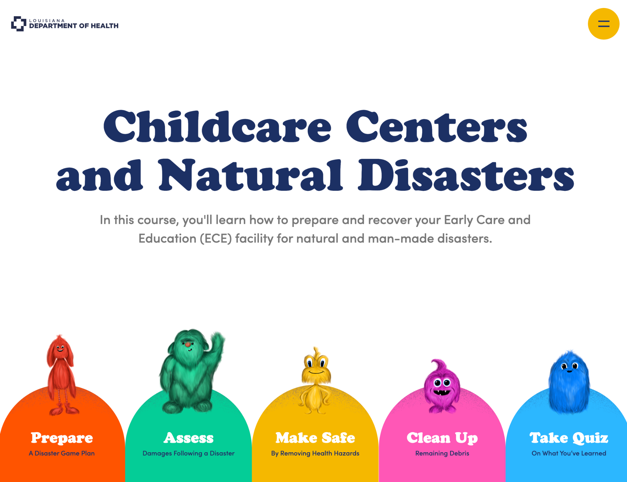
Microsites can also be used to house educational material. This microsite from the Louisiana Department of Health shows us how with this brief interactive course on how to prepare and recover an Early Care and Education facility for a natural disaster. It features five main links represented by colorful cartoon characters who bounce up when users put their mouse pointers over them. Each one of these links takes users to a separate microsite, where they can learn all the relevant information.
The individual microsites are fun and colorful, employing video and animated illustrations in a storybook style to teach the reader about the topic they’re covering. As users scroll down, they are shown various pieces of information accompanied by supporting links. At the end of each site, there’s a knowledge check that allows users to test their knowledge, responding to some questions and reinforcing the knowledge they just gained.


Get started for free
Create custom, scalable websites — without writing code. Start building in Webflow.
Should you create a microsite of your own?
After looking at these examples, you might be considering creating a microsite of your own for one of your company’s marketing initiatives. While this is usually a great idea, there are a few key questions you should be asking yourself before deciding if a microsite is the way to go.
1. Would your content benefit from standing on its own?
It’s important to assess whether it makes sense to have your content stand on its own, or whether it would be better to integrate it into your existing homepage or a subdomain. Microsites are most commonly used to promote one-off events or seasonal promotions, but they can also be used for more evergreen or long-form content.
It all comes down to the user experience you want to provide and the amount of control you want to have over it. A microsite gives you a great deal of control over the user’s journey, and it will build excitement around the project you’re promoting, but not every marketing initiative will necessarily benefit from existing in its own microsite.
2. Who is your target audience, and how will a microsite help you engage with them?
Your target audience and buyer personas will be a factor into whether a microsite is the right choice. Microsites are a powerful tool for engaging with a particular demographic or customer segment, but it needs to be built around the interests of that demographic in order to be successful.
By identifying your target audience and understanding their needs and preferences, you can determine whether a microsite is the best way to engage them. If you’re creating content for a subset of your target audience, it’s best to host it on its own website; this will allow you to produce unique content that will resonate with them without alienating other important demographics.
3. What resources are required to create and maintain a microsite, and do you have the capacity to handle them?
A microsite likely doesn’t necessarily require a complex build — but creating and maintaining it will require a significant investment of time and resources. Before deciding to build a microsite, you'll need to assess your team's capacity to handle the design, development, content creation, and ongoing maintenance of your microsite, as well as how it will fit into your marketing budget.
4. How will you measure the success of the microsite and ensure it aligns with your overall marketing strategy?
Setting clear metrics for success is critical when embarking on a microsite project. You'll need to identify key performance indicators such as traffic, engagement, and conversions, and determine how you will measure them. It's also important to ensure that your microsite aligns with your overall marketing strategy and that it fits seamlessly into your existing marketing campaigns and initiatives, as it might have some unintended consequences such as diluting your main site’s SEO efforts.
Make a big impact with your own memorable microsite.
By crafting a small, targeted website that speaks directly to your audience, you can drive engagement, boost conversion rates, improve SEO, and launch cost-effective campaigns that resonate with your audience. If you're looking to elevate your digital marketing strategy, incorporating a microsite can be just the thing you need to take it to the next level. To get started, create a Webflow account and visit Webflow University to learn how to start building today.