Lots of companies talk about how they “eat their own dog food,” which just means they use their own product as part of running their business.
I prefer the more appetizing “we drink our own champagne.” But regardless of how you say it, the truth is, we really do use Webflow for just about everything here at Webflow.
Our website, of course, is built in Webflow. But so is our online learning platform, our design system, our landing pages, and a host of other experiences and assets we create in the course of running a software company.
And since Webflow is built on the principle that everyone can build for themselves — without code — we train every new hire on Webflow. We want them to be knowledgeable about our product, sure, but also want them to get hands-on experience actually using the platform — because for many teams, using Webflow is part of their daily jobs.
As a Senior Brand Designer at Webflow, I spend a lot of time building in Webflow on projects for my team and many others across the company. And while I may be biased, I think the beauty of our product is that anyone can create similar projects at their workplace. So to share a little inspiration, here are just a few of the ways we Webflow at Webflow.
Keeping things consistent with the Webflow design system
How it works
Design systems are more than just pattern libraries or style guides. They’re dynamic sets of reusable components, principles, and guidelines that give designers and engineers a shared language for consistent product, web, and brand design.
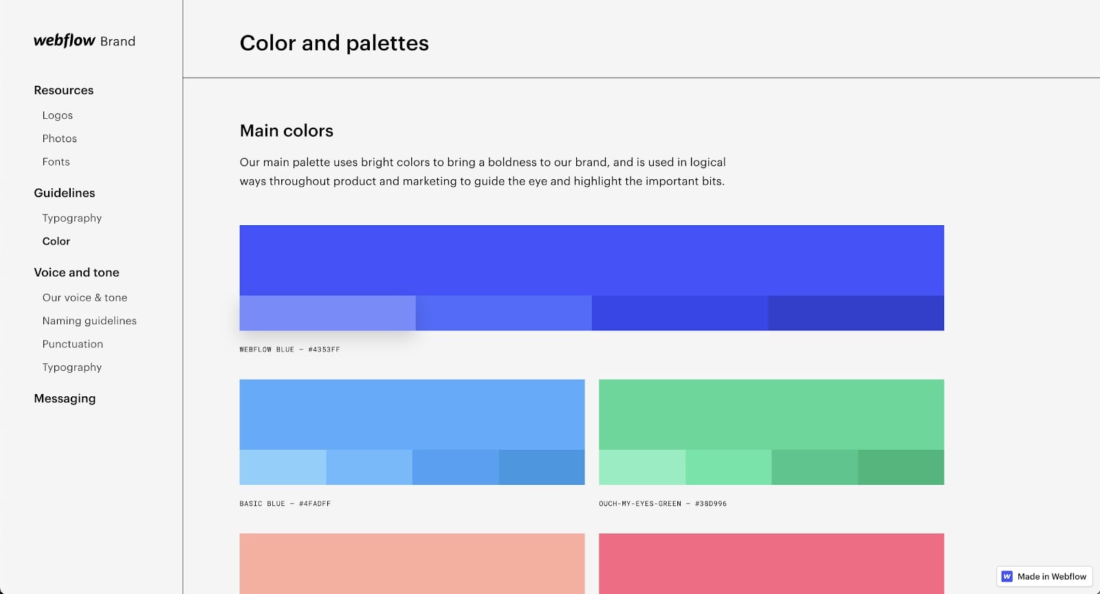
Our design system includes a style guide for building Webflow branded experiences, covering everything from typography to buttons to background colors. We also maintain a boilerplate library of common, prebuilt components like video players and testimonial call-outs to speed up workflows while creating a consistent look and feel across every asset.
There’s also a brand guide that we maintain to share with internal or external partners as needed. This functions as the single source of truth for brand resources, voice and tone guidelines, messaging, components, and content patterns.
All of these assets about building in and for Webflow are built in Webflow.
Which teams at Webflow use it
The Brand Studio team is responsible for maintaining and updating the design system, and everyone who creates assets for Webflow refers to them.
Why we love it
Our guidelines ensure our brand’s visual style is reflected on every page and asset we create within Webflow. And since our teams have approved design elements at their fingertips, they can create consistent content quickly while avoiding duplicative work.
Publishing helpful, on-brand content on the Webflow blog
How it works
The Webflow blog is built on the Webflow CMS, a powerful content management system that allows our editors to upload and edit content without having any design or development background. And with design guardrails already in place within Webflow itself, our content team can publish new articles without having to worry about meeting design standards.
Which teams at Webflow use it
Our content marketing team uses the CMS to publish new blog posts every week, with brand designers uploading images or visual assets as needed. The growth marketing team can also create ads within the blog by using the CMS.
Why we love it
The Webflow blog draws hundreds of thousands of visitors to our website every month, making it an important piece of our marketing strategy. Since the content team doesn’t need to involve software developers or other teams to publish or edit posts, we can avoid bottlenecks and maintain a consistent production schedule. Plus, the content team can easily manage SEO best practices, like defining meta titles and descriptions, directly within the CMS — ensuring our blog ranks well on organic search and drives more traffic.
Creating landing pages at scale to support campaigns
How it works
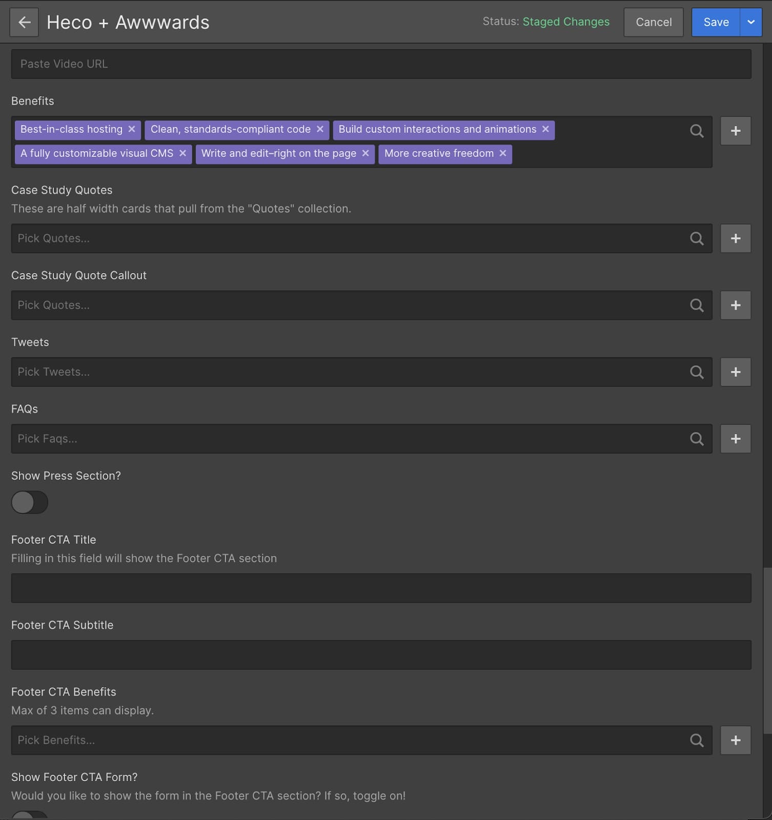
The Webflow CMS also powers our advertising landing page system. Premade layouts include conditional visibility, collection filtering, multi-reference fields, and toggles within the CMS. This structure essentially allows anyone to create a new landing page within minutes by simply filling in a few fields. No designer or developer involvement is required. Plus, every layout is responsive to ensure no matter what content gets added, it will render correctly across all devices.
At Webflow, our teams are using these templatized landing pages for campaigns promoting our ad pages, webinars, and ebooks.
Which teams at Webflow use it
As you can imagine, the marketing team is the primary user for our landing page system. Brand designers like me step in to tweak or create new layouts when needed.
Why we love it
Our landing page templates save the marketing team an immense amount of time and reduce bottlenecks that can happen when other teams get involved in launching campaigns. And since every template is responsive and on-brand, we’re always showing up with a consistent look-and-feel and making a positive impression on potential new customers.
Educating and supporting our community with Webflow University
How it works
Instead of using a third-party learning management system, we use Webflow to build and maintain Webflow University, our collection of articles, courses, videos, and other educational materials. This is a perfect example of a project that pushes boundaries, as our database of content includes content organized into outlined courses, discovery paths like search and browsable topics, and features like a filterable list of integrations. And by combining no-code with some custom code, we’ve unlocked functionality like progress tracking — so that site visitors can keep track of what courses they’ve already completed.

Which teams at Webflow use it
Our Education team plans, creates, builds, and publishes the content within the university.
Why we love it
Since we built Webflow University, we can customize it to support whatever kind of learning experiences our Education team wants to produce to better serve our users. And since we’re using Webflow to create Webflow support content, it helps keep our skills sharper and our understanding of our users more front-and-center.
Build memorable experiences with microsites
What it is
Microsites are basically small websites created for a specific purpose. They’re also great reasons to stretch our design muscles and try to build something new and unique with Webflow.
For example, we create a new microsite for our No-Code Conf every year. In 2021, we decided to use motion to make the microsite illustrations come to life, representing how the building blocks and elements of the no-code framework work together. This approach is pretty different from the brand standards we apply to the website, so it was a fun chance to experiment. It even ended up inspiring a Webflow blog post about using motion while prioritizing accessibility in web design.
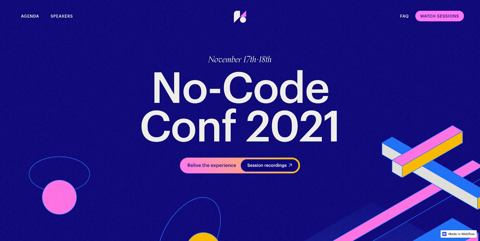
Event sites are a pretty common occurrence around here, but we also make some microsites just for fun (we’ve got some surprises in store this year!), or to see if we can. It’s amazing how a simple conversation with other people here at Webflow can end up in a new Webflow project.
Which teams at Webflow use them
The brand design team usually builds out microsites for different needs.
Why we love it
We’re designers. We love to create new things! Microsites let us play and occasionally break the rules — under specific conditions, without compromising brand consistency on core properties like Webflow.com, the blog, Webflow University, or landing pages.
Curious to learn more about what you could build with Webflow? Check out Made in Webflow for more examples of Webflow in action.


Discover inspiring design work from the Webflow community
Made in Webflow is the place to browse, clone, and customize the latest websites built by the Webflow community.


.jpeg)


