A strong website aesthetic sets the stage for your overall visual branding.
Visuals are an integral component of the web design process. You must consider how colors, fonts, and multimedia work together to form an attractive and on-brand appearance. And your site must also offer an enjoyable user experience so visitors want to stick around and explore.
Learn how to balance visuals and usability to make your website attractive, memorable, and effective in achieving its goals.
Key Insights
- Strategic visual design enhances brand identity, user experience, and conversion rates by using consistent colors, typography, and layout to guide users and create a strong first impression.
- A structured design process includes setting goals, launching and iterating to ensure clarity, creativity, and long-term effectiveness in delivering a successful website.
Why is visual design important?
Your web development process should include creating a solid visual design to elevate your site’s aesthetics, user experience, and overall performance. Here are a few critical reasons to prioritize your site’s appearance:
- First impressions. Your visual design is often the first thing a visitor notices when interacting with your brand. An appealing, professional, and engaging website layout creates a positive impression and encourages people to explore your content. On the other hand, a poorly designed website can drive visitors away, potentially reducing conversion opportunities.
- Brand identity. A unique color palette, consistent typography, and custom imagery establish a recognizable brand identity and make your site memorable. By maintaining this visual aesthetic across multiple channels, you differentiate yourself from competitors and reinforce your messaging, which fosters trust and loyalty with your target audience.
- User experience. Effective visual design goes beyond aesthetics and extends to usability. Thoughtful elements like user-friendly navigation, clear call-to-action (CTA) buttons, and well-organized content improve people’s interactions with your site. When visitors find a website straightforward to navigate, they’re more likely to engage with and return to it.
- Engagement. Engaging imagery, like high-quality illustrations, informative videos, and interactive animations, captivates audiences and keeps them on your site longer. Increased engagement reduces bounce rates and encourages people to return for similarly immersive experiences.
- Conversion rates. Compelling aesthetics can guide website visitors toward taking action, like signing up for a newsletter, buying a product, or contacting your business. Strategically placed elements like buttons and forms help people take the next step, boosting your site’s bottom line.


Ultimate web design
From 101 to advanced, learn how to build sites in Webflow with over 100 lessons — including the basics of HTML and CSS.
9 steps for creating visually appealing web designs
Here’s a breakdown of nine critical steps for a successful web design process.
1. Identify your goals and project scope
Clear goals help shape your design language, whether you’re looking to generate leads, sell products and services, or showcase your portfolio. For example, a portfolio will highlight case study images and contact details, while a product site should have attractive typography describing benefits and unique value propositions.
Set a project scope that outlines your website’s resources, costs, and detailed timeline to keep the design process on track. Knowing how much you’ll spend influences decisions like hiring designers and buying prototyping tools.
2. Understand your audience
For a successful targeting strategy, learn what kind of branding will resonate with your ideal users. Consider demographic factors like age, interests, and online behavior. For example, a website aimed at young adults might use vibrant colors with dynamic animations, while a site for a professional enterprise audience might prioritize a cleaner, more sophisticated look.
3. Analyze your competitors’ websites
Evaluating competitor websites helps you understand what works and what doesn’t in your field. Look at their design elements, how they structure content, and the user experience they offer. A SWOT analysis in which you look at the strengths, weaknesses, opportunities, and threats of competitors’ sites can support a data-led approach to designing your site’s visuals by helping identify opportunities to differentiate your site and offer something unique.
4. Create a mood board and style tiles
Now, it’s time to create your site’s visual aesthetic.
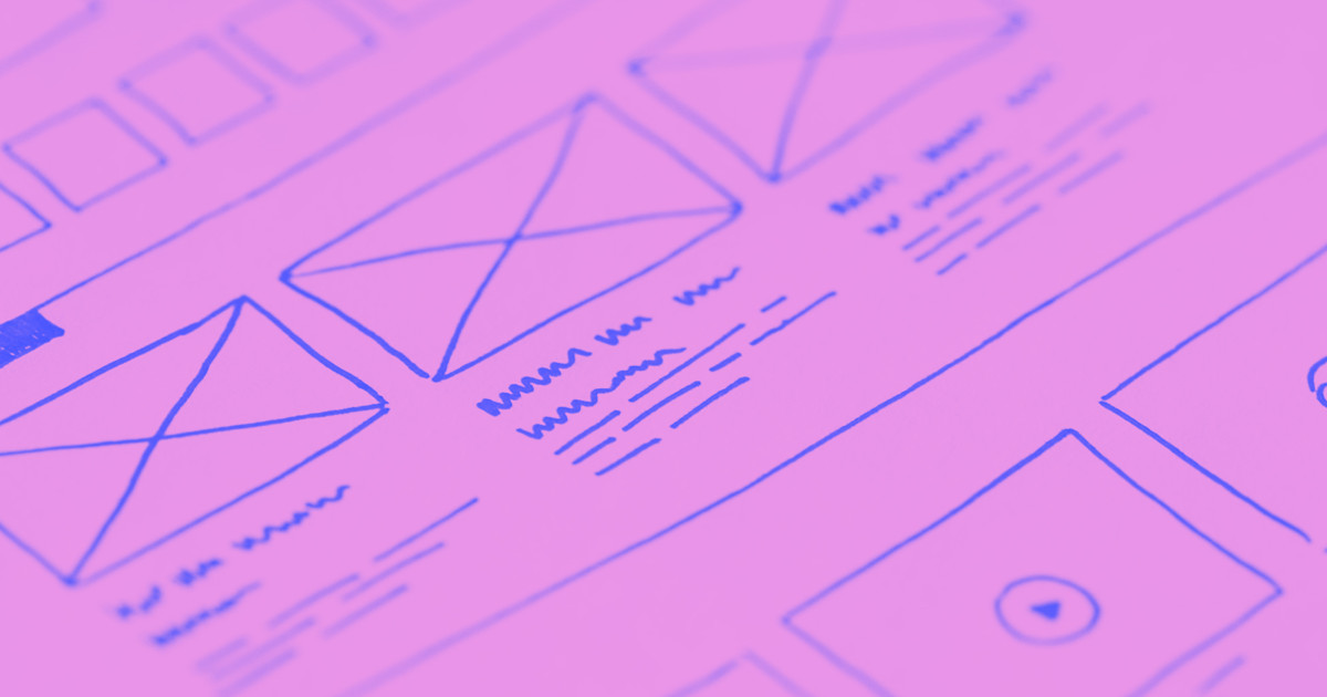
A mood board is a visual tool that includes components like images and text to represent your brand’s essence. This board conveys concepts that may be challenging to put into words, like feelings or pictures that evoke emotions. List these concepts and select imagery that reflects them based on your brand’s goals, vision, and voice. Then, assemble your visual inspiration in one place, like a wireframe, and identify overarching themes. This helps you find direction for the rest of your design.
Then, refer to your mood board to generate style tiles, which translate overarching concepts into concrete components like logos and color palettes. Find the words and themes that reflect your brand, like “elegant,” “trusted,” or “quirky.” These identifiers evoke different visual styles that you can manifest through color, negative space, and typography. Try testing multiple iterations to explore ideas and find the perfect style tile for your organization.
5. Build an element collage
Element collages organize and display style tiles and site components to reflect their function in real-world usage. For example, you can use collages to show buttons with hover states, creative content reveals, and interactive animations. If you present design components and functionality separately, it’s challenging to consider how all the pieces come together. Instead, use collages to stitch style tiles together and assemble your essential elements from there.
6. Create a style guide
A style guide is a living document that outlines your brand’s design guidelines. It includes typography rules, color combinations, and visual standards to ensure consistency across your site and other channels. Unlike static documents, a living style guide typically exists on a password-protected page of a live site to allow for real-time updates. This shared resource centralizes all design elements from your style tiles and collages, ensuring your site maintains its cohesive aesthetic.
7. Start designing your site
With your site’s look, feel, and visual elements approved, begin laying out the pages and integrating content. In this stage, you’ll arrange images and text, create menus and navigational components, and ensure content and design work together for a user-friendly experience.
Flexibility is critical — you might have to adjust your ideas in real time. For example, a bright color scheme might need toning down to work harmoniously with surrounding elements.
8. Test your site
Before launch, thoroughly test your website to make sure all components, like images, forms, and animations, look good and function correctly. Check for broken links and test the site’s speed and responsiveness across different devices. You can use data visualization tools like Google Analytics to measure loading times and other site-related metrics.
9. Launch your website (and then regularly update it)
After testing, set up a web hosting environment with built-in security. Ensure all necessary backups are in place and follow a task checklist with items like configuring search engine optimization (SEO) settings and integrating analytics tools. You can also prepare marketing materials to announce and promote your new website.
Once you’ve launched, track visitor behavior and organic traffic. Engage with early users to gather feedback and identify problems so you can make continuous improvements. Regular updates ensure your website remains effective and user-friendly in the long run.
Let Webflow support your visual design process
From ideation to execution to post-launch monitoring, every step in the design lifecycle contributes to your website’s success. A visually appealing site creates a favorable first impression and continuously reinforces your brand’s identity in consumers’ minds.
With Webflow, you can leverage a visual-first design environment to build sites that suit your style and needs. And Webflow’s content management system (CMS) lets you conveniently update your site to ensure a strong and lasting online presence. Get started with Webflow today.

Get started for free
Create custom, scalable websites — without writing code. Start building in Webflow.


