Perhaps you're a new blogger seeking out ways to make your blog posts better,
or maybe you're a marketer looking into how a blog can fit into your company's digital marketing strategy.
Regardless of the reason, creating a good blog takes time, effort, and insight. To get you started, we've put together seven examples — all built in Webflow — of some of the most effective blog and informative designs we’ve seen lately.
1. Flowrite
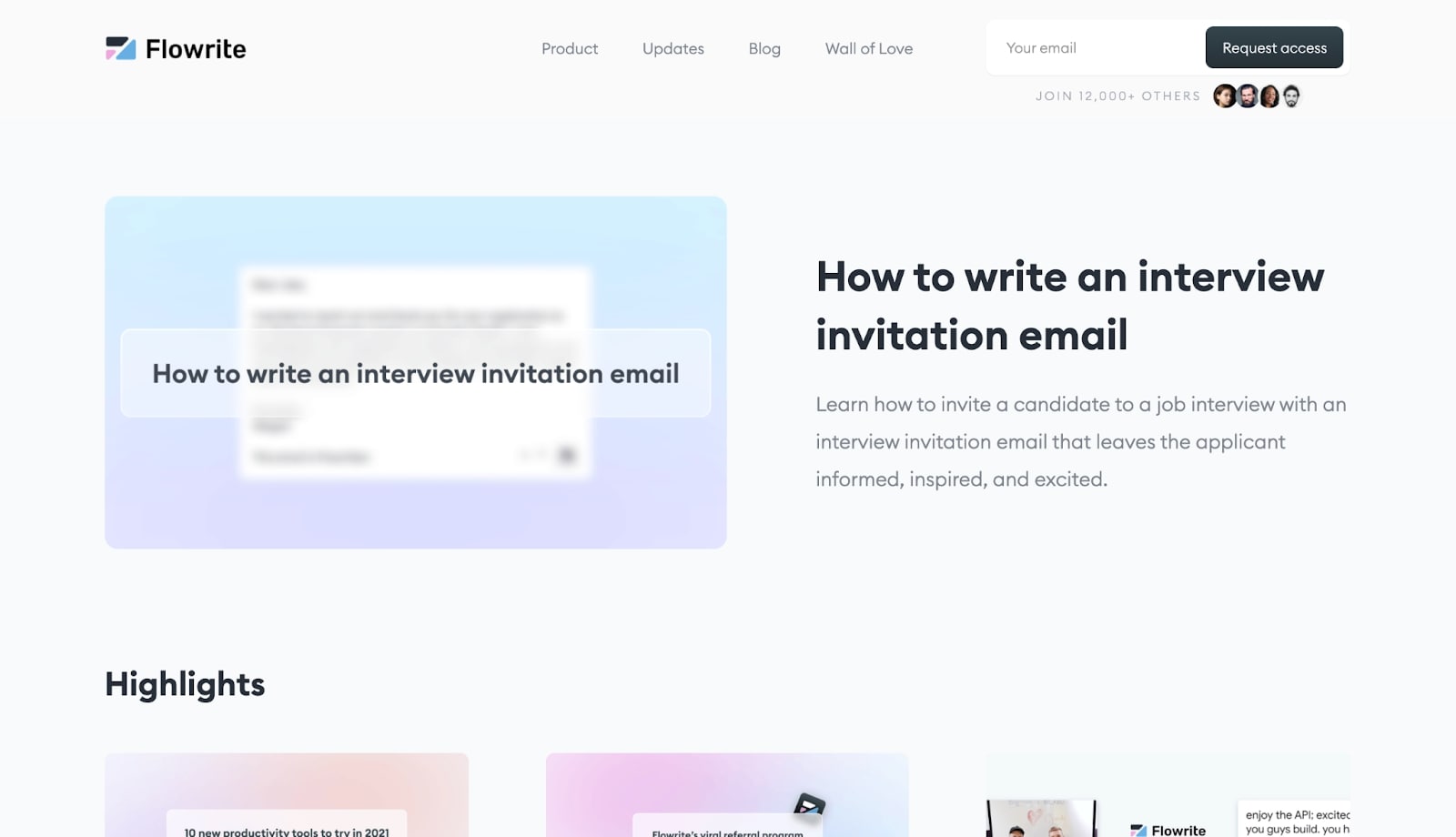
How many of us have sat in front of a computer screen, stuck in the haze of writer’s block, as we retype the same line of an email over and over? Flowrite offers an AI-powered writing tool that tracks what you’re typing and generates the words you may have difficulty finding in the moment.
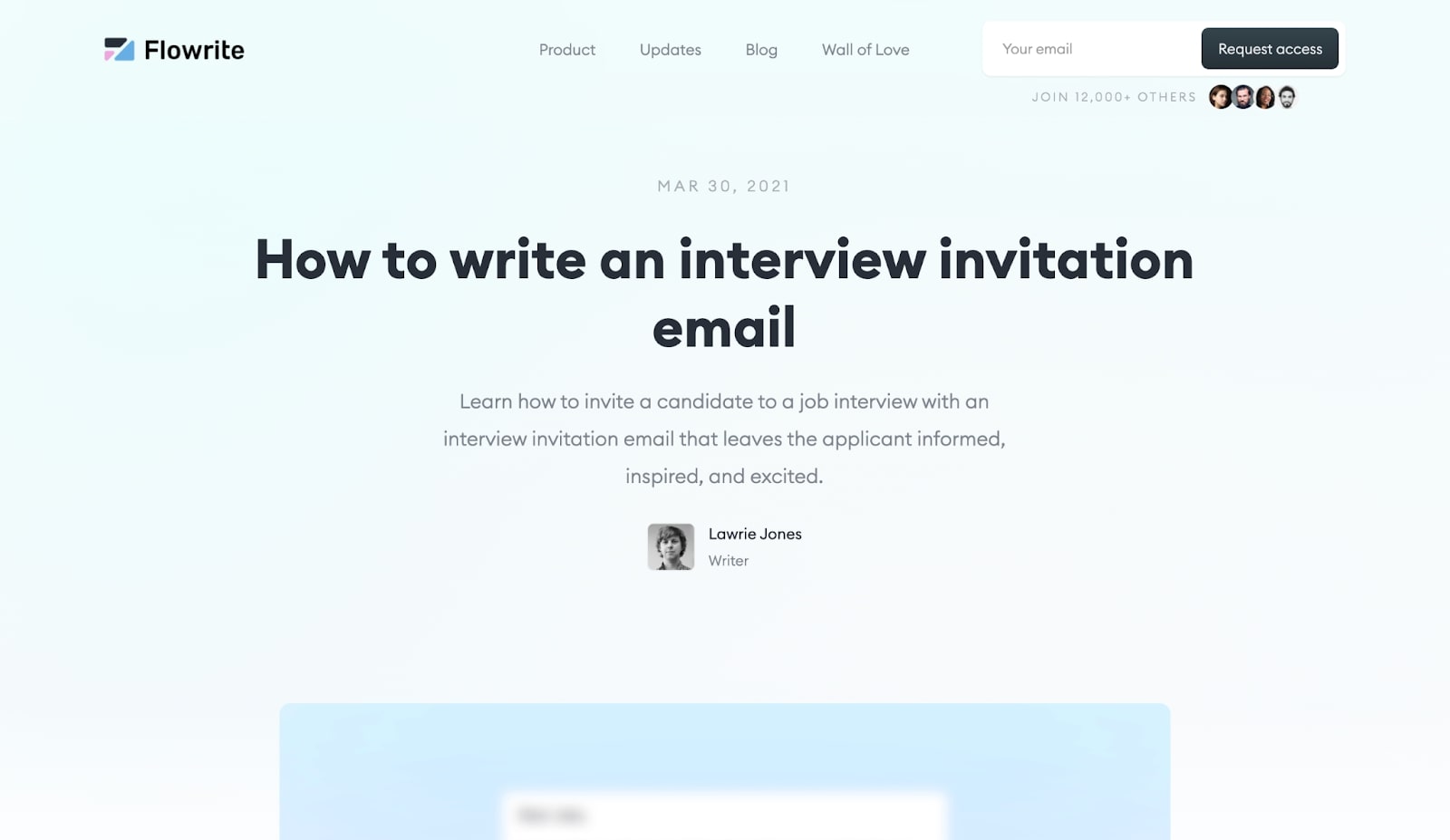
Much of Flowrite’s content marketing is aimed at a business target audience and, as a result, their blog covers a variety of topics. Some of those topics include how to put together job interview invitations, respond to customer complaints, and write professional emails.
The blog is where Flowrite’s site excels. With a central thesis of helping people become better business writers, Flowrite seamlessly ties in their product with value-adding content for customers and prospects. Their article, How to write a reminder email with examples is a great show of this. It reads like a tutorial with a table of contents at the top to make it easier to navigate. (And bonus: a table of contents is good for SEO.)
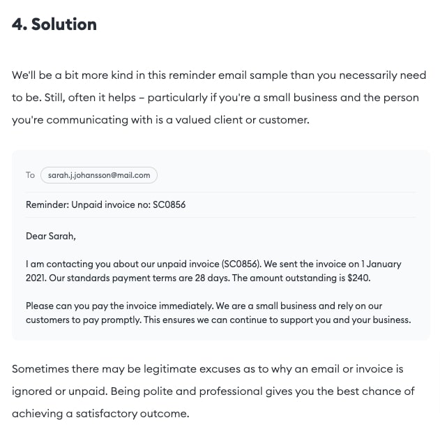
What makes their blog stand out further is the level of detail. Not only do they include writing examples, they also use images and graphics to illustrate their points. Showing and telling is what continues to make Flowrite’s blog successful — and perhaps it’s what can make your blog successful, too.
2. Primer
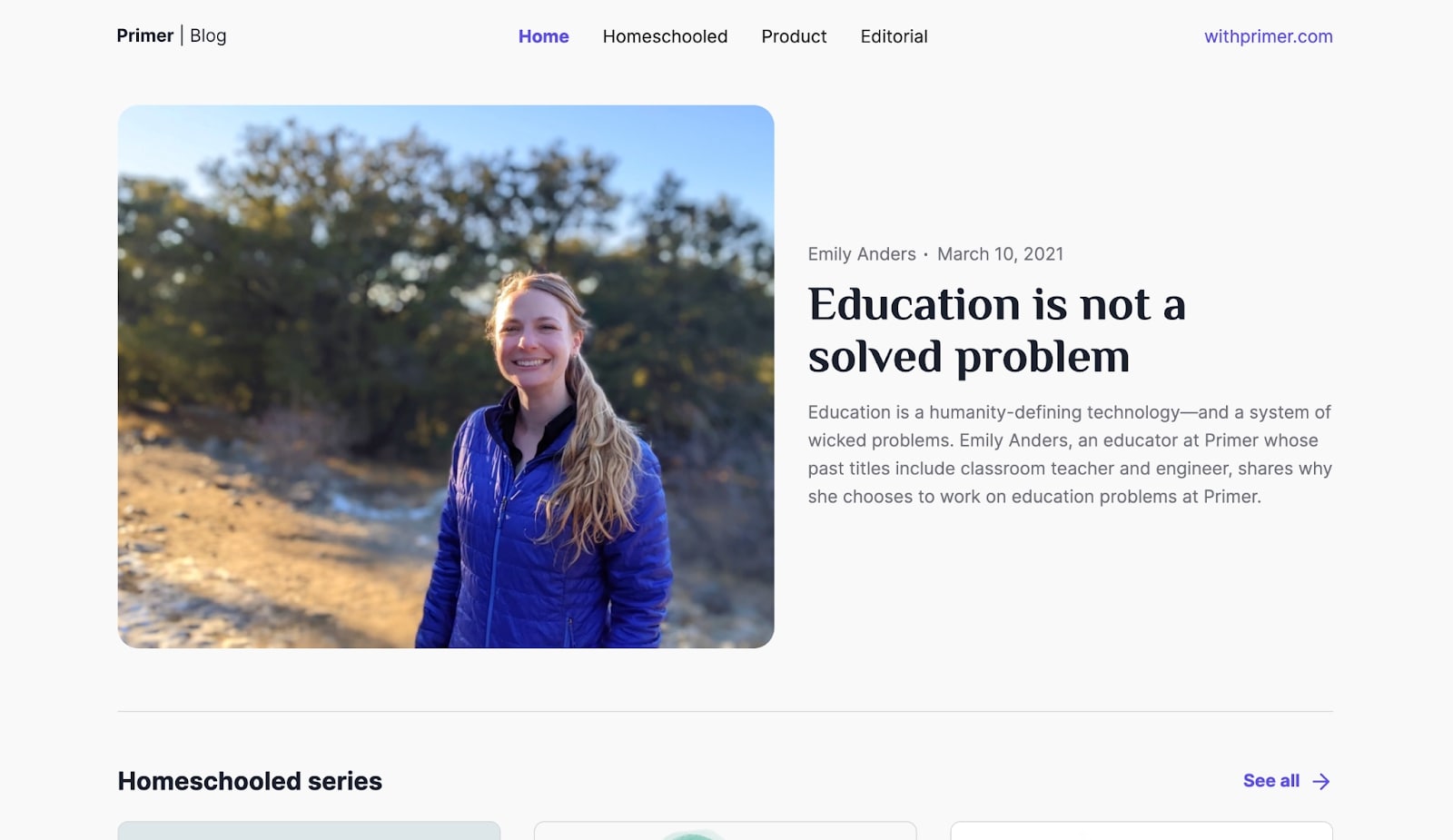
Primer is a startup that wants to transform education. With a foundation rooted in the philosophy of homeschooling, they want to reimagine how kids learn by placing an emphasis on curiosity and creativity. Their ranks are filled with engineers, founders, and other team members who all have a homeschool background themselves.
Primer keeps their blog streamlined with three categories: Homeschooled, Product, and Editorial. When building your own blog, consider organizing your posts into clear and concise categories. By doing so, you’ll be able to provide a more efficient experience for your readers to find relevant content. You can also add meta tags to each post to further help your audience find what they’re looking for more easily.
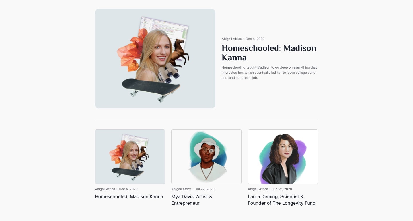
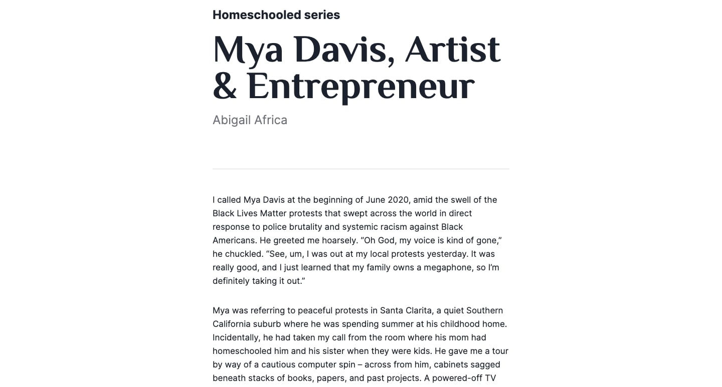
Primer also excels in creating thoughtful and insightful content. For example, their Homeschooled series profiles homeschool individuals and how their education shaped who they are today.
Primer’s blog content highlights the positive impact of homeschooling on real people. Instead of stats, readers get a firsthand view into what makes homeschooling special. It’s often hard for companies and brands to humanize what they do, and this blog displays the power of writing and storytelling to make a personal connection with readers.
3. The Practise
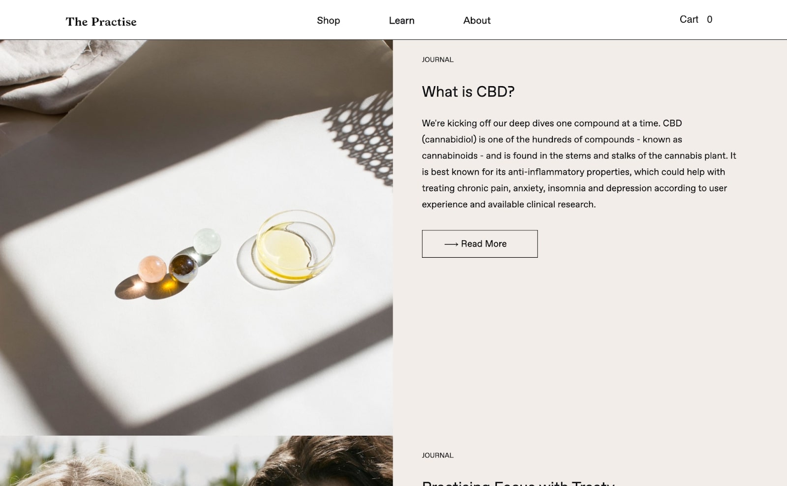
The Practise is an online business whose goal is to give people a better sense of wellbeing through the power of plants. With an ecommerce store stocked with CBD drops and teas, they offer a variety of supplements for those seeking a DIY herbal approach.
The Practise leans heavily into creating mood and brand with a visual aesthetic. Their palette of whites and grays, open space, and full-color photos of plants and herbs helps the reader become imbued with a sense of zen. One doesn’t scroll through the content, but floats through its light and airy user experience. Their blog design reflects this same sense of inner peace and self-reflection in its layout and imagery as well as its writing.
When designing your own blog, think about what emotion or feel you want it to elicit. Pick a color scheme, typography, and layout that reflects what you’re all about.
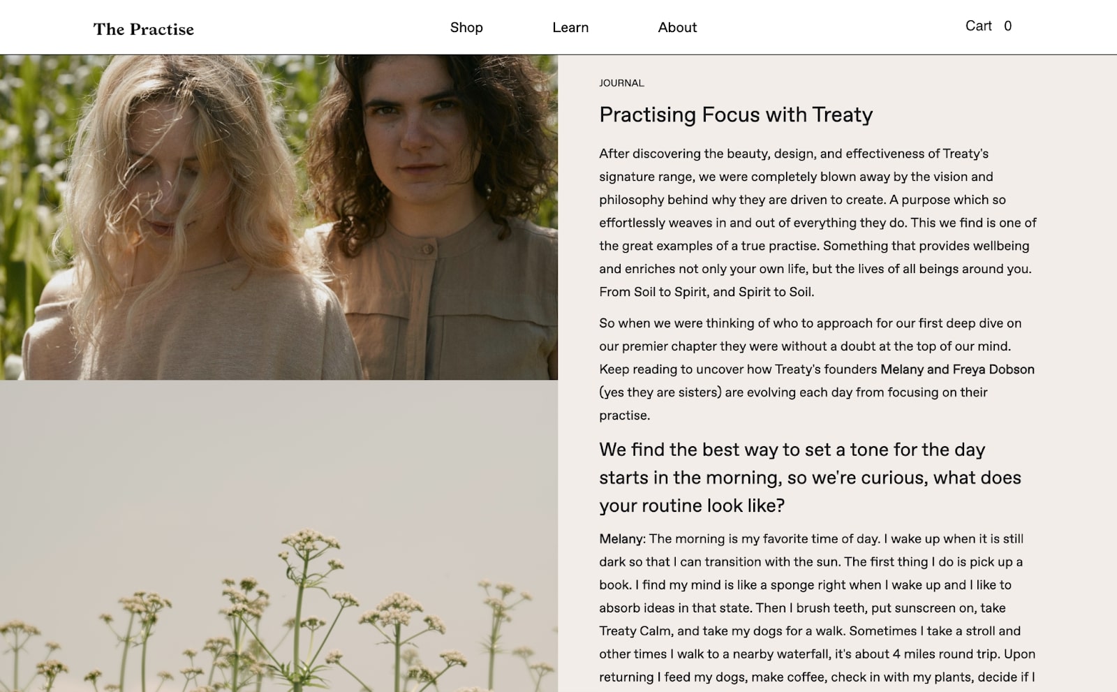
A dry, generic tone doesn't fit in with their brand identity. Instead, this has the personal feel of a lifestyle blog, encapsulating their desire to create a lifestyle product and embodying their mission to help people live more mindful lives. Their post “Gardening as a Practice of (Self)Care” shows the importance they place on, well, self-care. One of the lines reads, “as we tend to the garden we tend to ourselves — we learn to be in the present moment, observe the textures, colors, shapes, sounds and smells …”
When building out your own blog design, find that thread that ties everything together. Like the Practise, stay consistent with a theme, and make it clear about who you are.


Get started for free
Create custom, scalable websites — without writing code. Start building in Webflow.
4. ContentFly
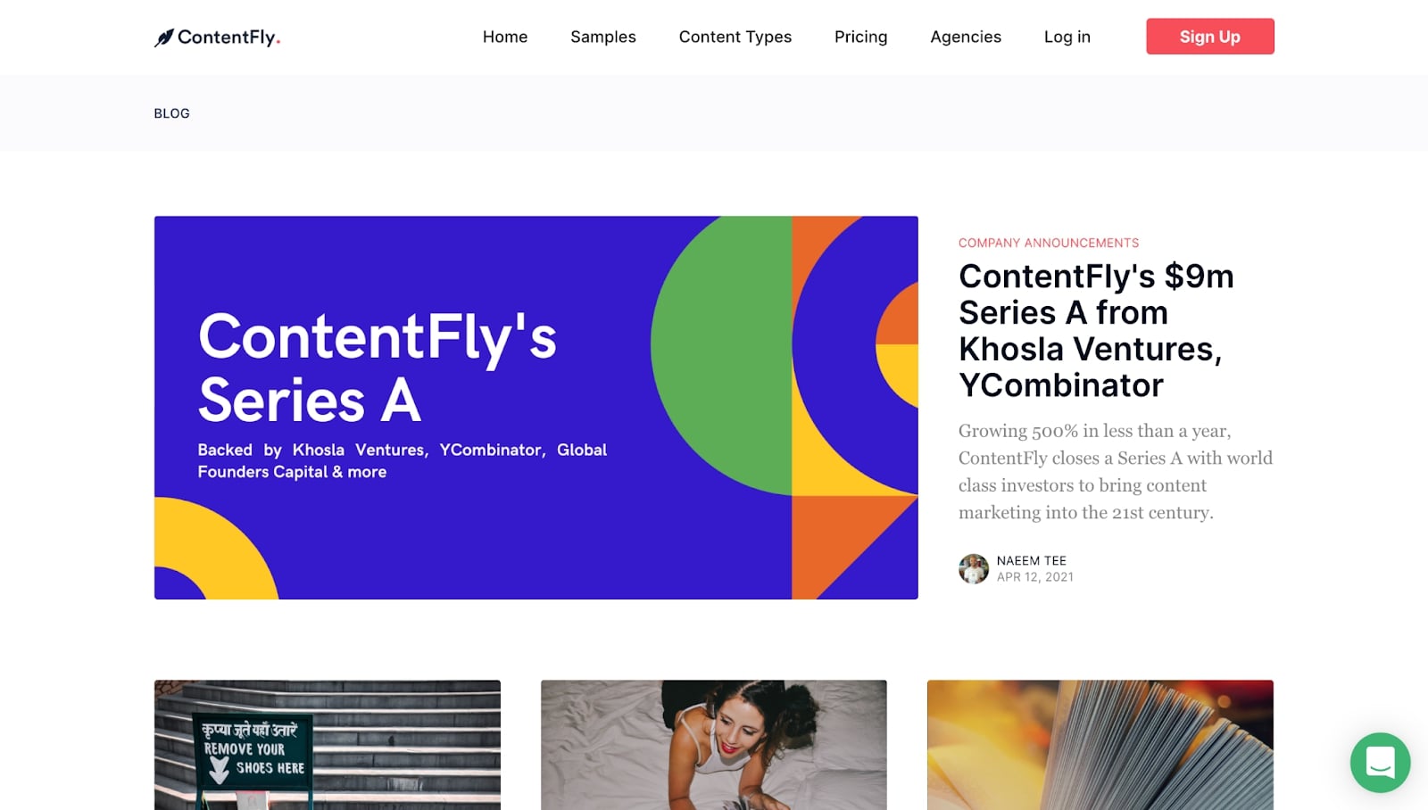
Content is what makes the web worthwhile. Whether you need landing page copy, social media posts, blogging, newsletters, or other content marketing materials ContentFly connects companies with skilled writers. Every post on their blog covers a different facet of content, bringing the focus in on the importance of content and demonstrating why the services they provide are a necessity for any business.
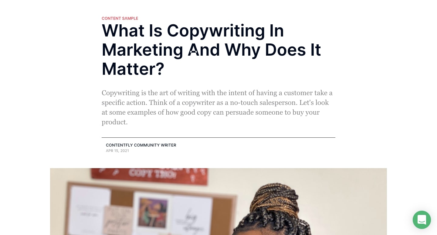
ContentFly is mindful to keep their blog active — they add new blogs every couple of days. Staying consistent with posting is so important to running a successful blog. It not only keeps the content on their site fresh and relevant, it creates a constantly growing funnel via search, shares, or other channels to encourage more visitors to their blog and website.
ContentFly isn’t shy to create blogs with saucy titles. Examples include: “It’s 2019. Outsourcing Blogs Posts Shouldn’t Suck,” “Your SEO is Worthless,” and “We Made It to the Front Page Of Product Hunt. It Was Pointless.” Coming up with attention-grabbing blogs and blog titles — while staying on-brand — can help boost traffic and interest in your brand or product.
5. Unheard Voices
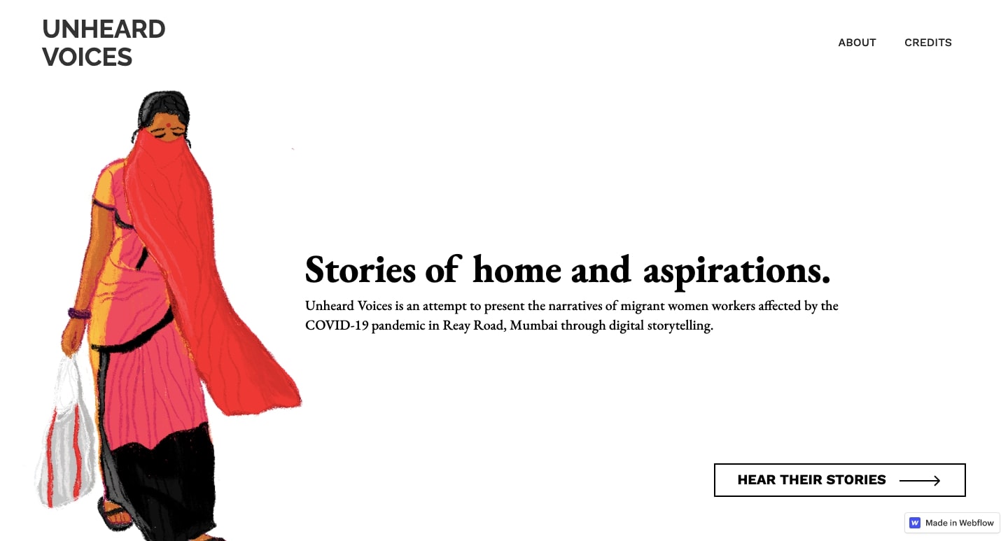
Unheard Voices is more than just a blog — it’s a powerful collection of stories about migrant women whose lives have been impacted by COVID-19 in Mumbai, India.
To create an immersive experience, Unheard Voices utilizes a horizontal scroll to bring the reader through an artistic rendering of the streets of Mumbai. With brushlike swashes of color and scribbled line work, the illustrations feel like they were created with colored pencils, paint, and paper — bringing a whimsical, storybook element to very personal stories.
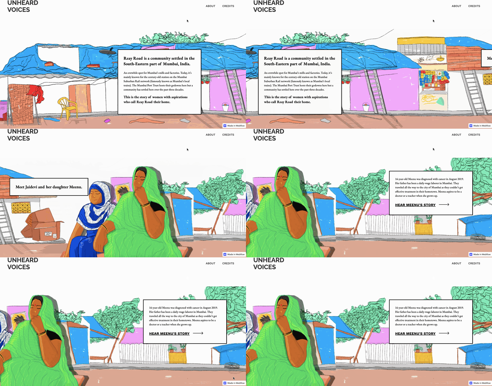
Unheard Voices also allows their storytellers to reach people in a different way with audio stories. They cover topics such as the experiences of being a migrant worker, some of the struggles the women face, and how COVID-19 has affected their lives. Clever interactive elements make it possible to amplify their voices and give them a chance to truly be heard.
By implementing simple, custom elements to your blog, like Unheard Voices does, you can simultaneously make your blog stand out while creating immersive experiences for your readers.
6. Chef H. Delgado
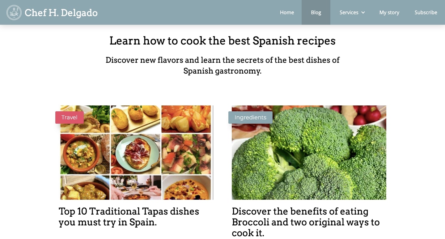
Chef H Delgado, a specialist in Spanish cuisine, fills his blog with poetic food prose that captures the joy he has for cooking.
What makes this blog unique is the caliber of the photography. Like any food blog, photography is a huge part of the storytelling. It can be hard to translate the deliciousness of a dish into pixels, but the featured food images here capture every nook and cranny, color, and texture in delectable brilliance.
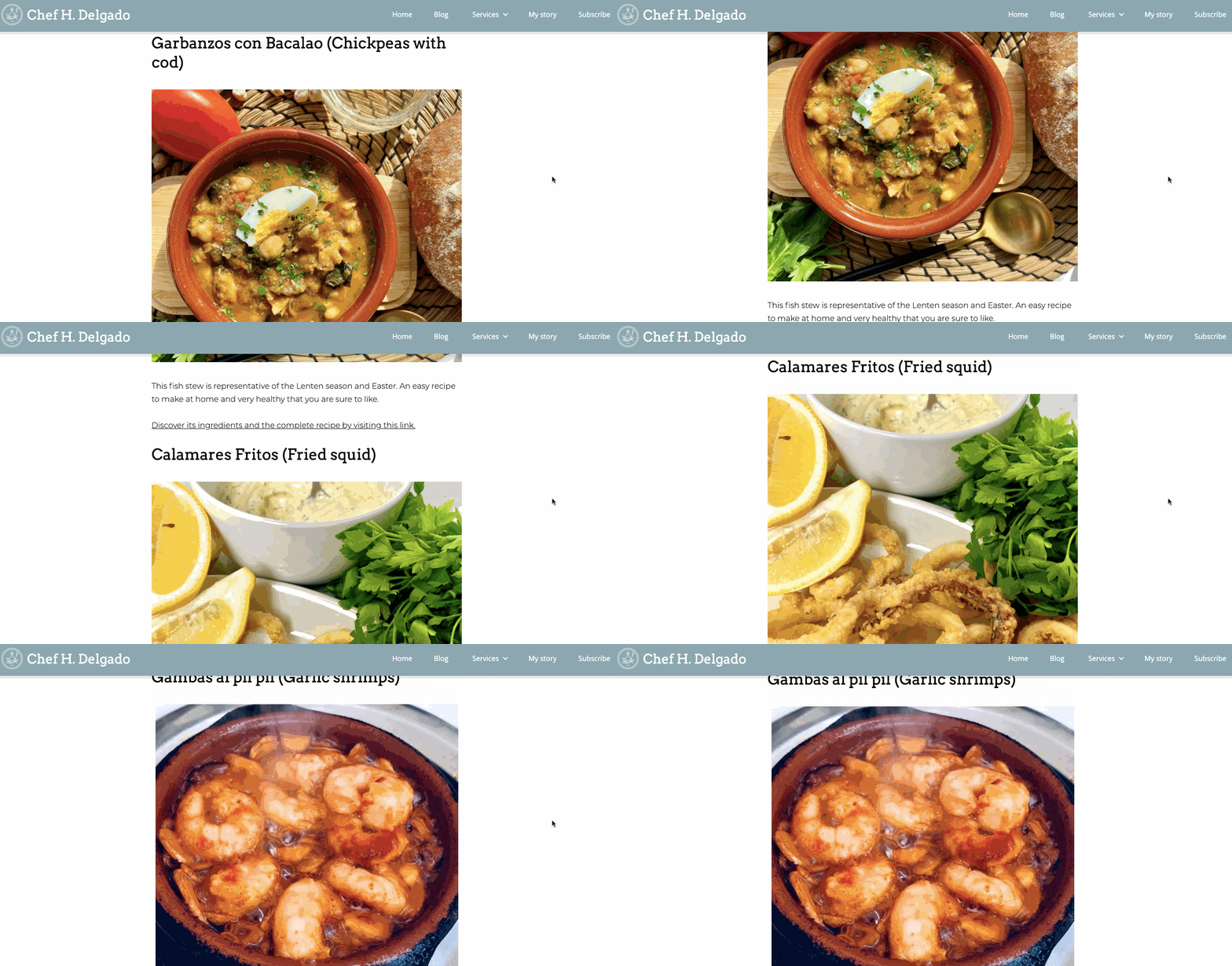
If your blog is about something that has a strong visual component like food, consider building it around high-quality photography. For those who want to start their own food blog, Chef H Delgado’s is a great example of how to use visuals to entice readers to indulge in a post and get inspired to explore their own culinary journeys.
7. Archetika
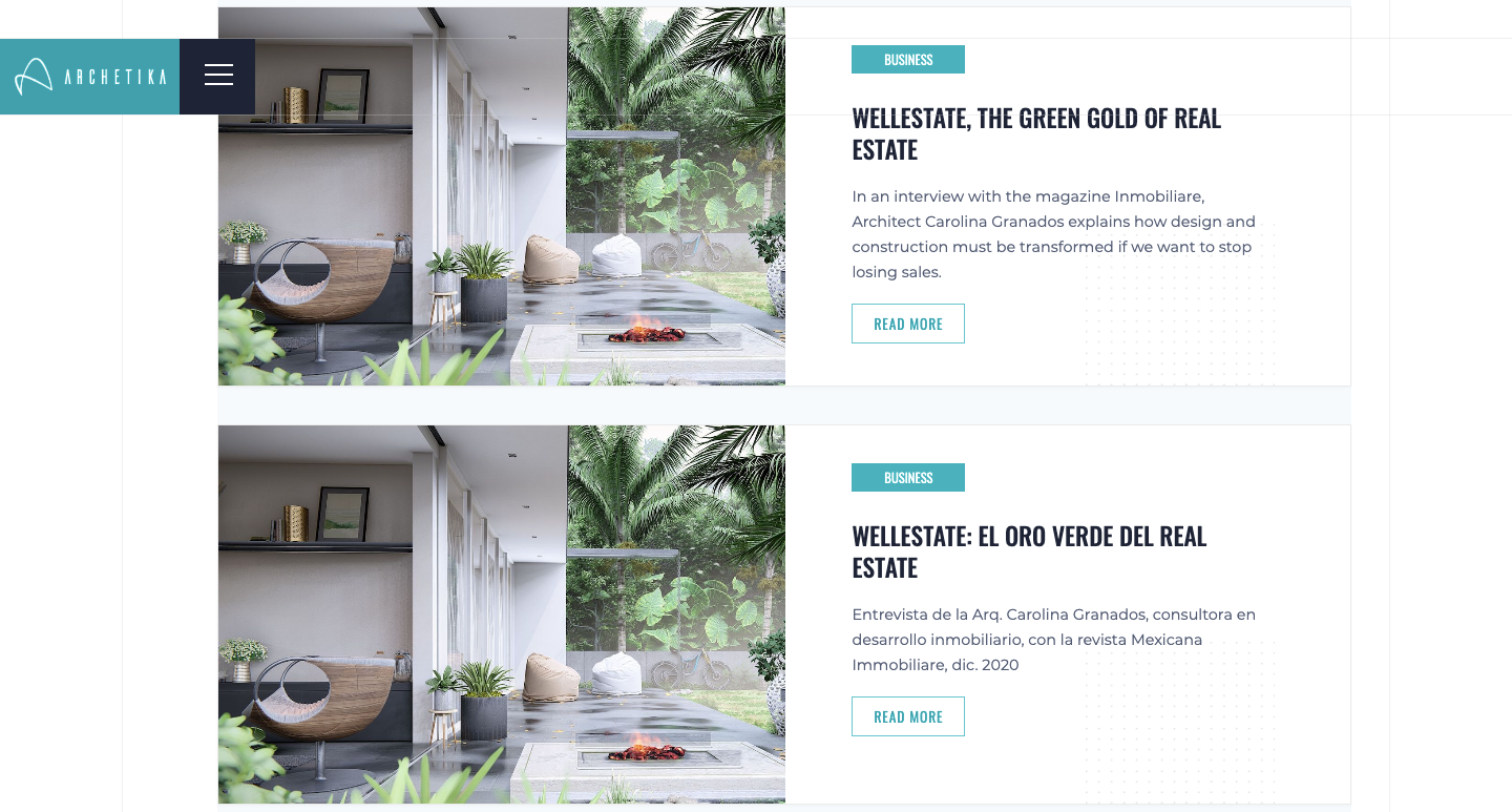
Archetika is a real estate company based in Mexico that’s dedicated to development projects that are environmentally sustainable. Their blog, which includes articles in both Spanish and English, isn’t intended for those with only a passing interest in real estate. Rather, it targets an audience of real estate professionals who are interested in sustainability.
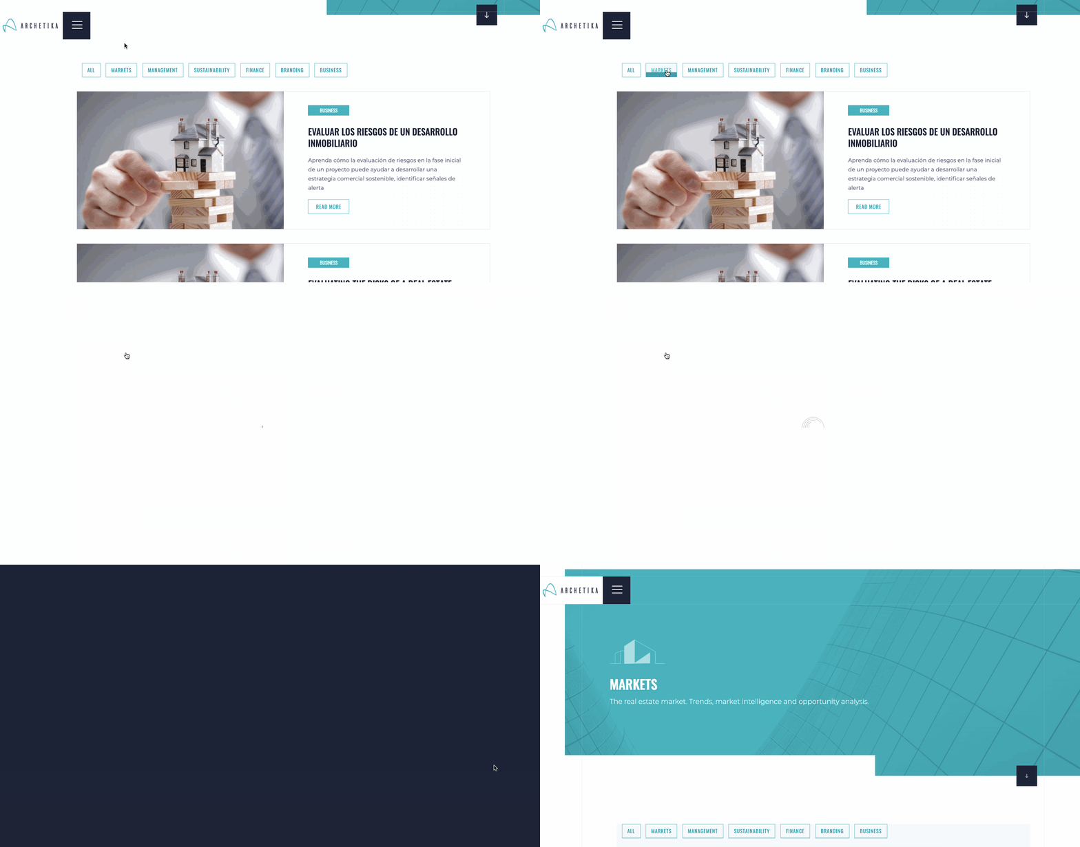
What’s special about this real estate website design is their use of effects in their top navigation of categories. When you hover over a category, a blue line animation appears. The site also utilizes animated sliding transitions for when the reader navigates to a new page. Archetika is a great example of how adding hover effects, micro-interactions, and other dynamic visuals keep blog designs interesting and audiences engaged.
For any company, especially one that occupies a specialized niche like real estate, a blog is an important extension of a brand. A blog gives your company a chance to share what you know and gain an opportunity to build trust. If you can do this with some visual flair, like Archetika, you’ll be able to set yourself apart from the competition.
A great blog can help form connections
Whether you’re a big brand in New York City or a mom in Des Moines, blogs help you reach people beyond your geographic sphere. They offer a way to get your ideas and stories heard and an opportunity to share your truths. These days, when digital technology has the potential to further isolate us, blogs are a way to form more personal connections online.
We hope you found some inspiration in these seven blog examples, and hope you can use Webflow to get your own words out into the world.


