Are you an aspiring travel writer, photographer, or foodie? Regardless of your passion, content connects you with your audience and could open doors to your next paid gig. But no matter how great your writing is, bad web design can repel site visitors. Here are 9 blogs — all designed in Webflow — that serve up great examples of good content and design.
1. Rahel and Ron Food Studio
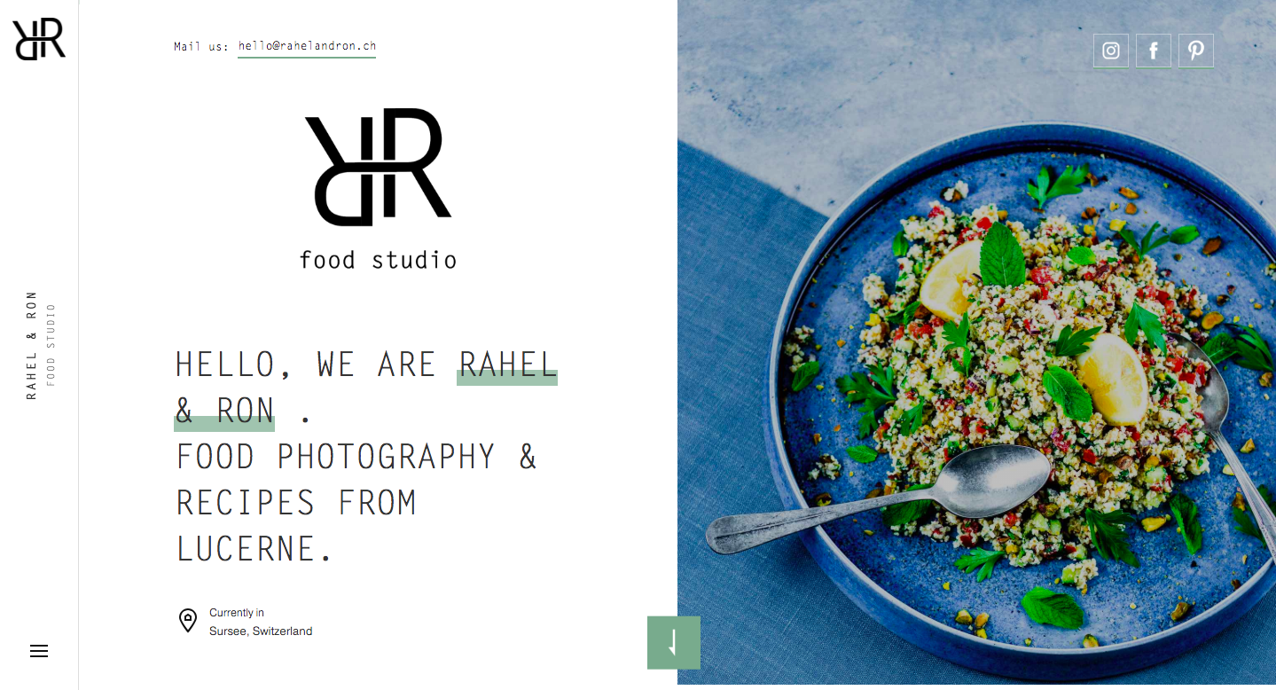
Rahel & Ron Food Studio are creators of culinary content. The recipes featured on their blog have a rustic authenticity. They don't rely on heavy photo editing or other trickery, but rather show how their dishes look in real life, highlighting their use of wholesome ingredients.
These dishes, like couscous meatballs with tzatzikitsatsiki and pickled peppers, would satisfy any foodie, but they’re also accessible enough for those who struggle to make oatmeal. There’s so much excellent content on this site and it never strays from expressing Rahel and Ron’s slow-food philosophy and the care they put into their culinary creations.
This design is built around the Persona template, with a few personalized typographic touches and layout changes. And of course they use Webflow CMS to make managing their blog posts easy.
2. Ashley Janelle

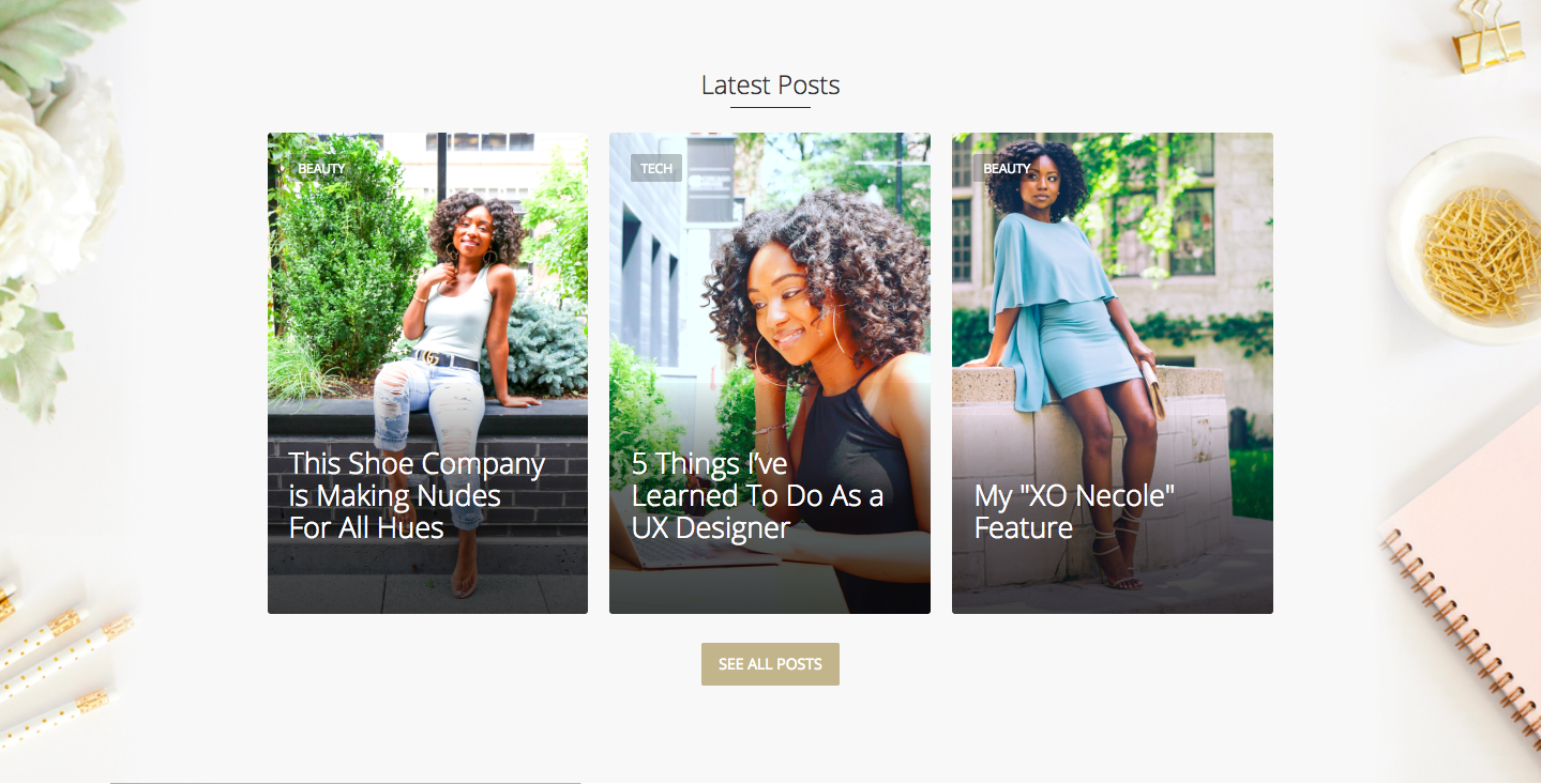
Ashley Janelle is a UI/UX designer and entrepreneur. Her blog communicates her many interests and talents, as well her insights about the creative process and what it’s like to be a designer.
The blog is a testament to her design savvy with its well-ordered, easy-to-navigate content and her writing showcases a mastery of her craft. High-quality photos capture Ashley’s vibrancy — everything working together to show us who she is as a designer and a person.
3. FASHIONLATTE blog template
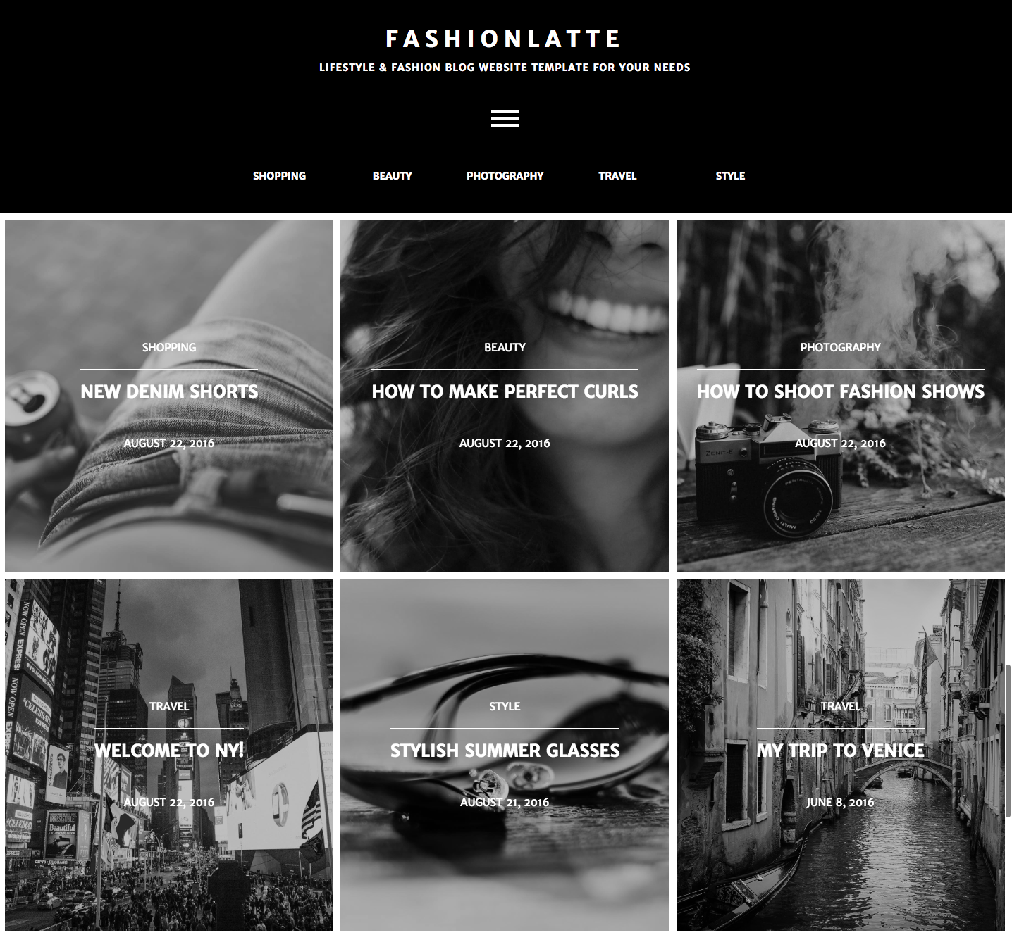
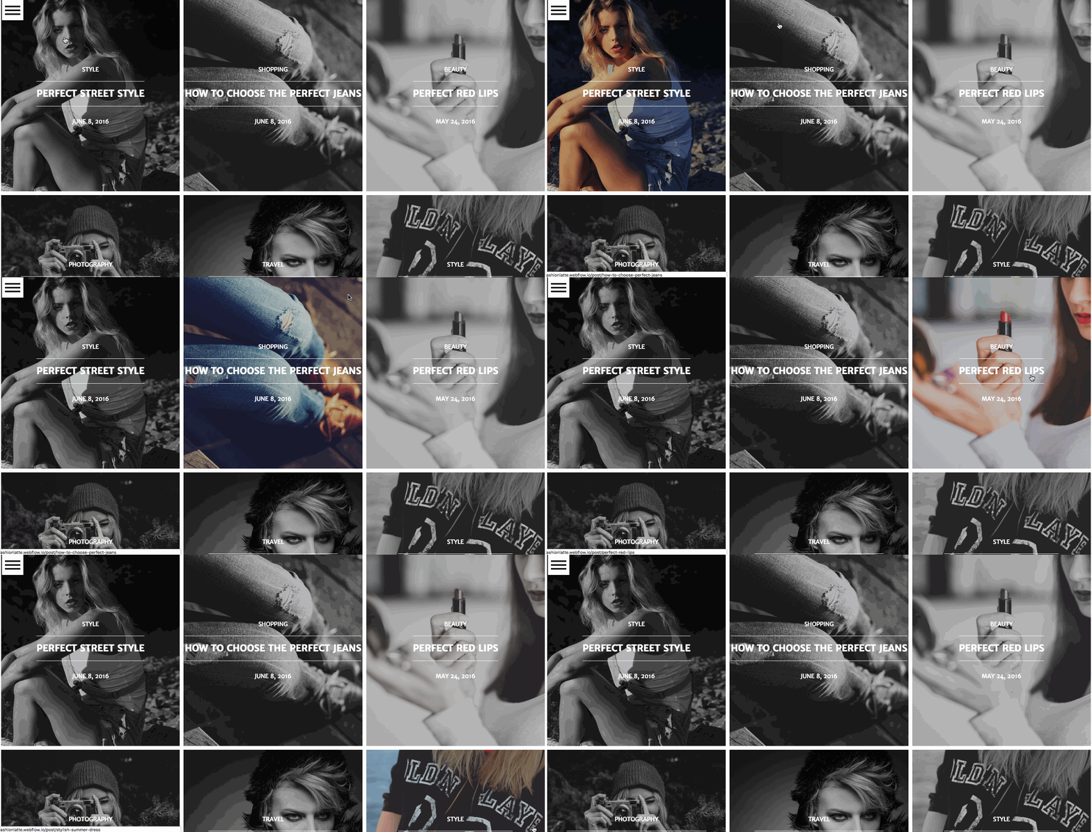
FASHIONLATTE describes itself as a “lifestyle and fashion” template. It's a simple black-and-white design with a nice hover effect that brings each block of content to life with a flash of color. For those wanting an artsy, stylized layout, this blog template would be the perfect choice.
Best of all — it’s cloneable and free!
4. I Ate Oklahoma
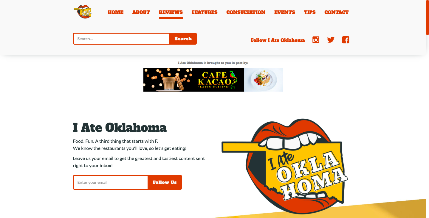
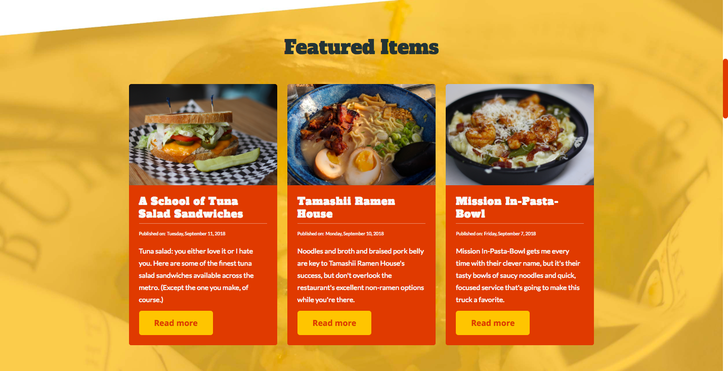
The midwest isn’t all chicken fried steak, mashed potatoes, and gravy. I Ate Oklahoma covers the great food that this midwestern state has to offer. Feature articles and positive reviews will leave you wanting to make a road trip to try their cheesesteak and ramen. Unless you live in Oklahoma — then you’re in luck!
Not only is it a well-organized design, but the writing is clever and full of mouth-watering descriptions. “Tuna salad: you either love it or I hate you.” This made me laugh, even though I strongly fall into that group of people the author would hate. Sorry, tuna salad lovers.
And like any designer who wants to simplify the process of updating a blog, they use Webflow CMS.
5. Drunk by James
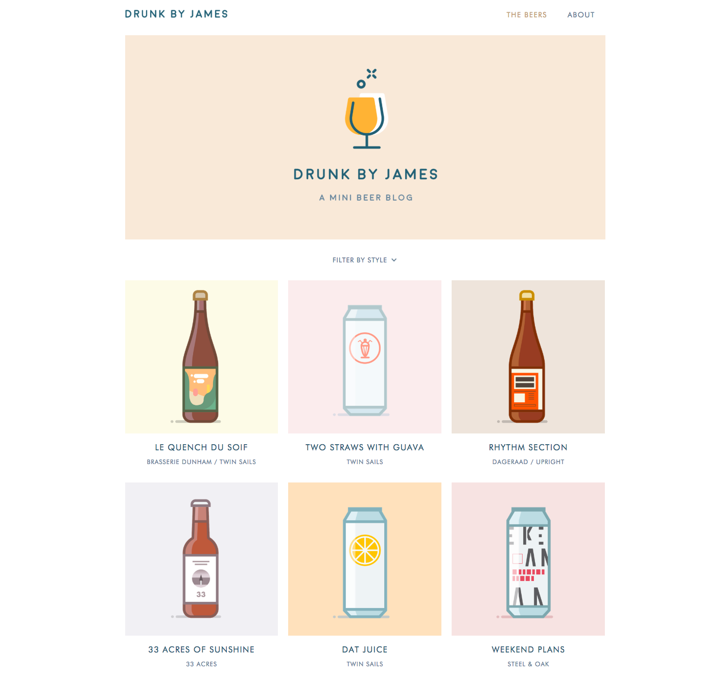
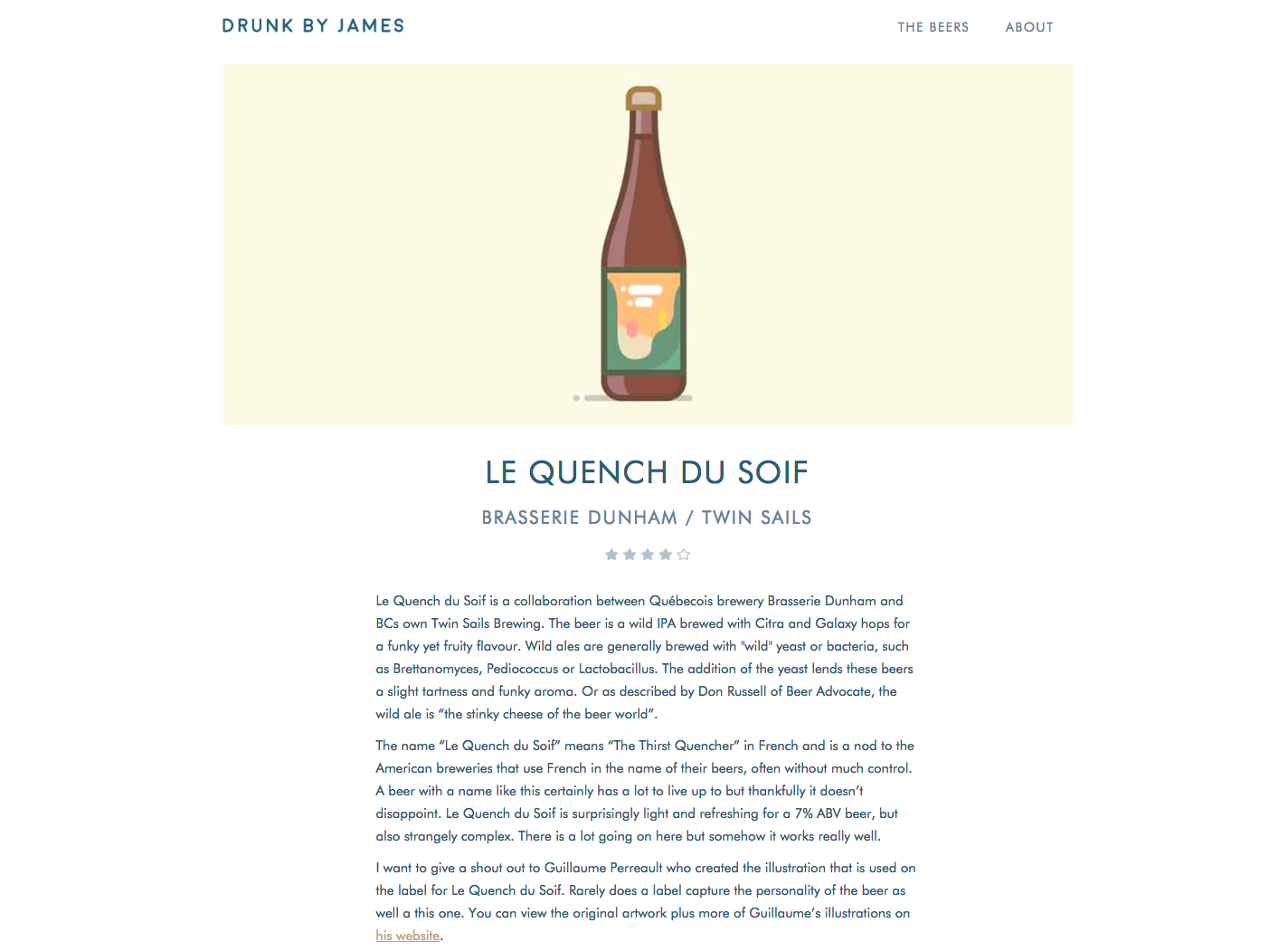
James David Thompson is a Canadian illustrator and craft beer fan. Drunk by James features beer reviews accompanied by stylized illustrations.
Not only does James put great care into the visual art of this mini blog, but there’s plenty of background information and tasting notes for each beer. It’s easy to see the love James has for both drawing and craft beer. If you’re building up your own portfolio, creating a website like this for something you’re passionate about is a great move.


The modern web design process
Discover the processes and tools behind high-performing websites in this free ebook.
6. Tea with Tami
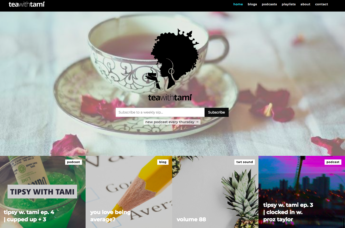
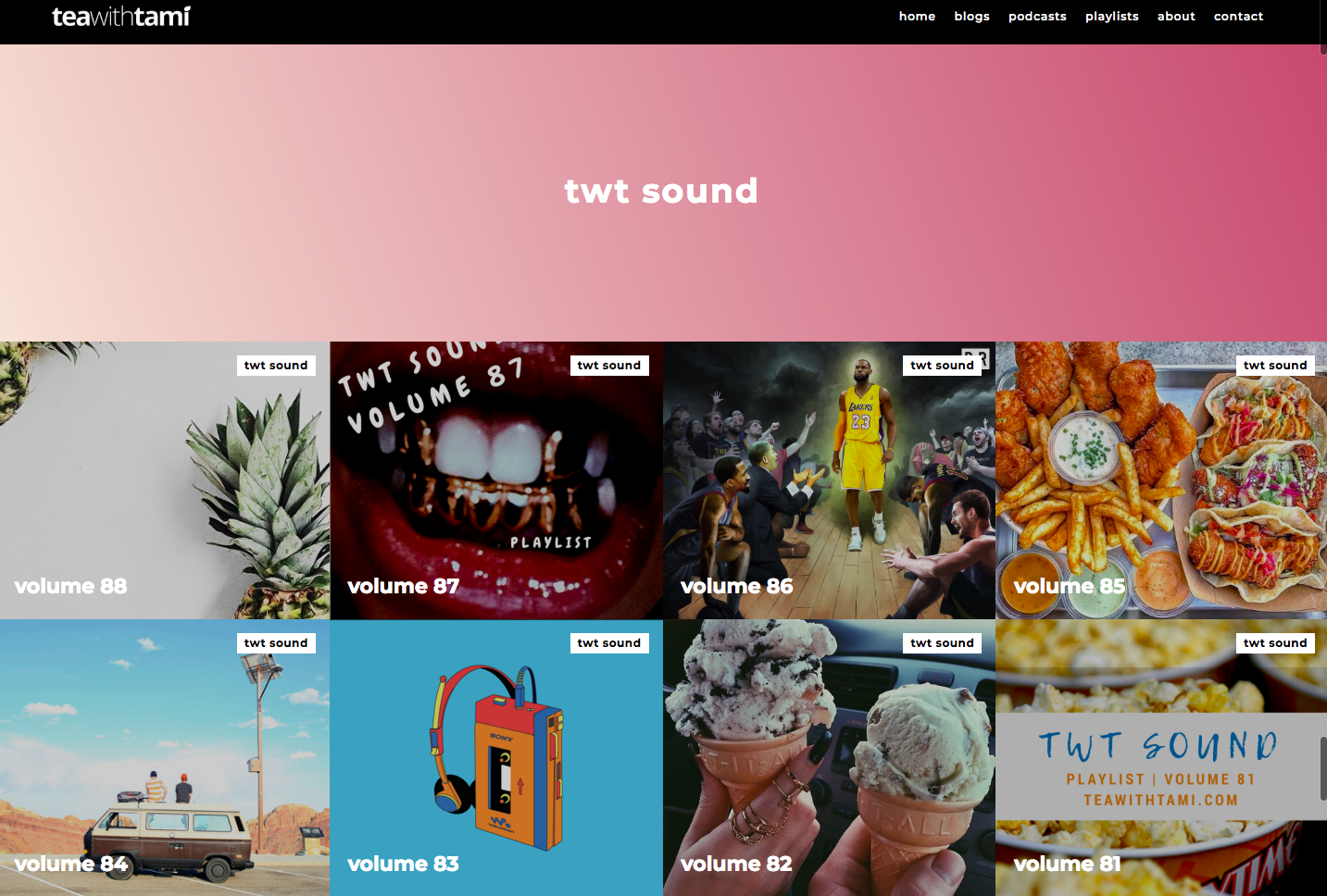
This website is for the podcast Tea with Tami. The blog features podcast episodes, writing, and music. The content speaks to Tami’s values: supporting African American culture, exploring social issues, and promoting hip hop.
With so much media and excellent content, Tea with Tami is more than just a list of podcast episodes. It’s an indie media presence for listeners to fully immerse themselves in everything Tami loves.
7. inb4
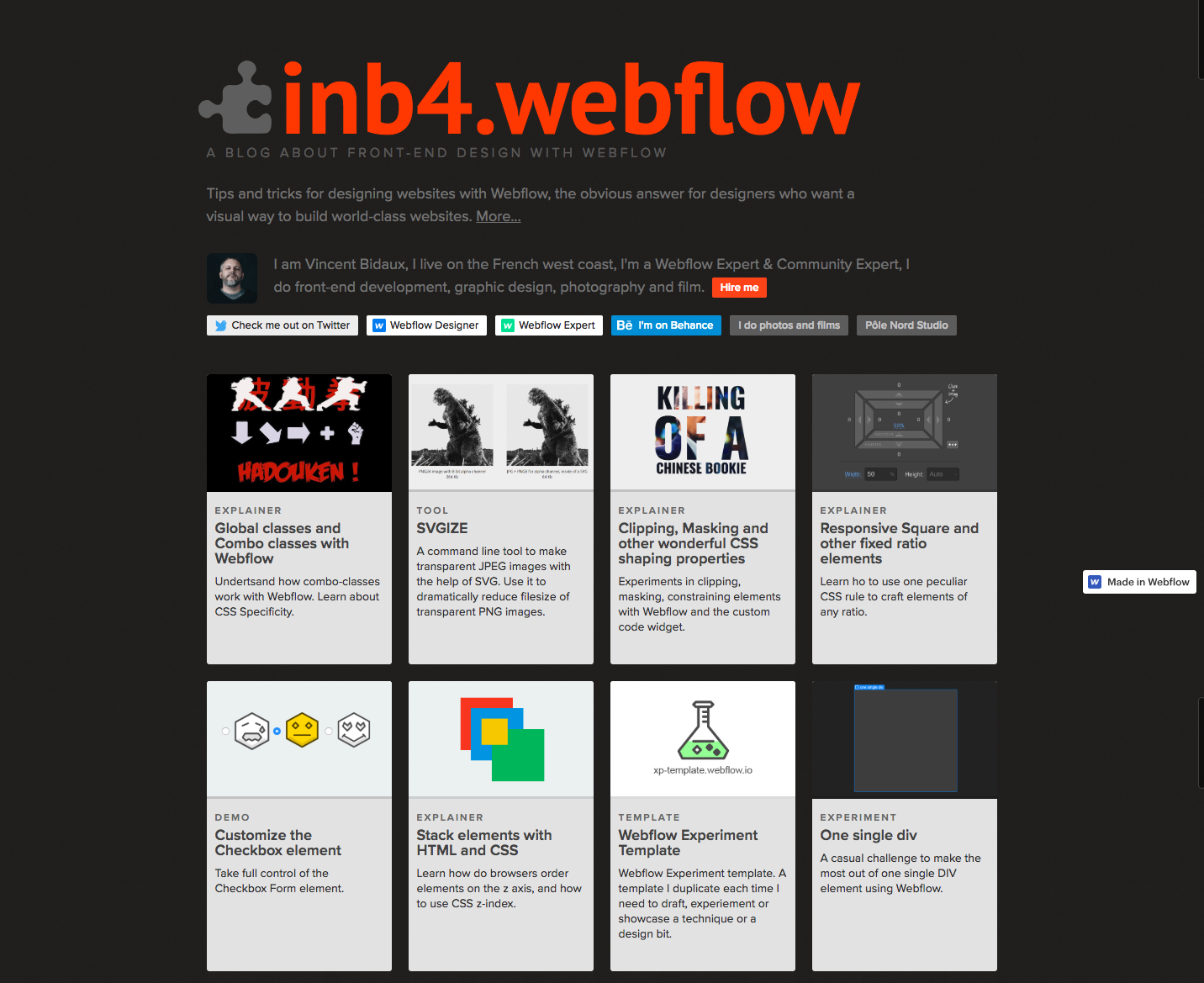
Vincent Bidaux is a French designer and Webflow expert. In his blog inb4, he shares some of the techniques he uses like CSS-only parallax, stacking elements with HTML, and infield label forms. He uses creative visuals in his explanations.
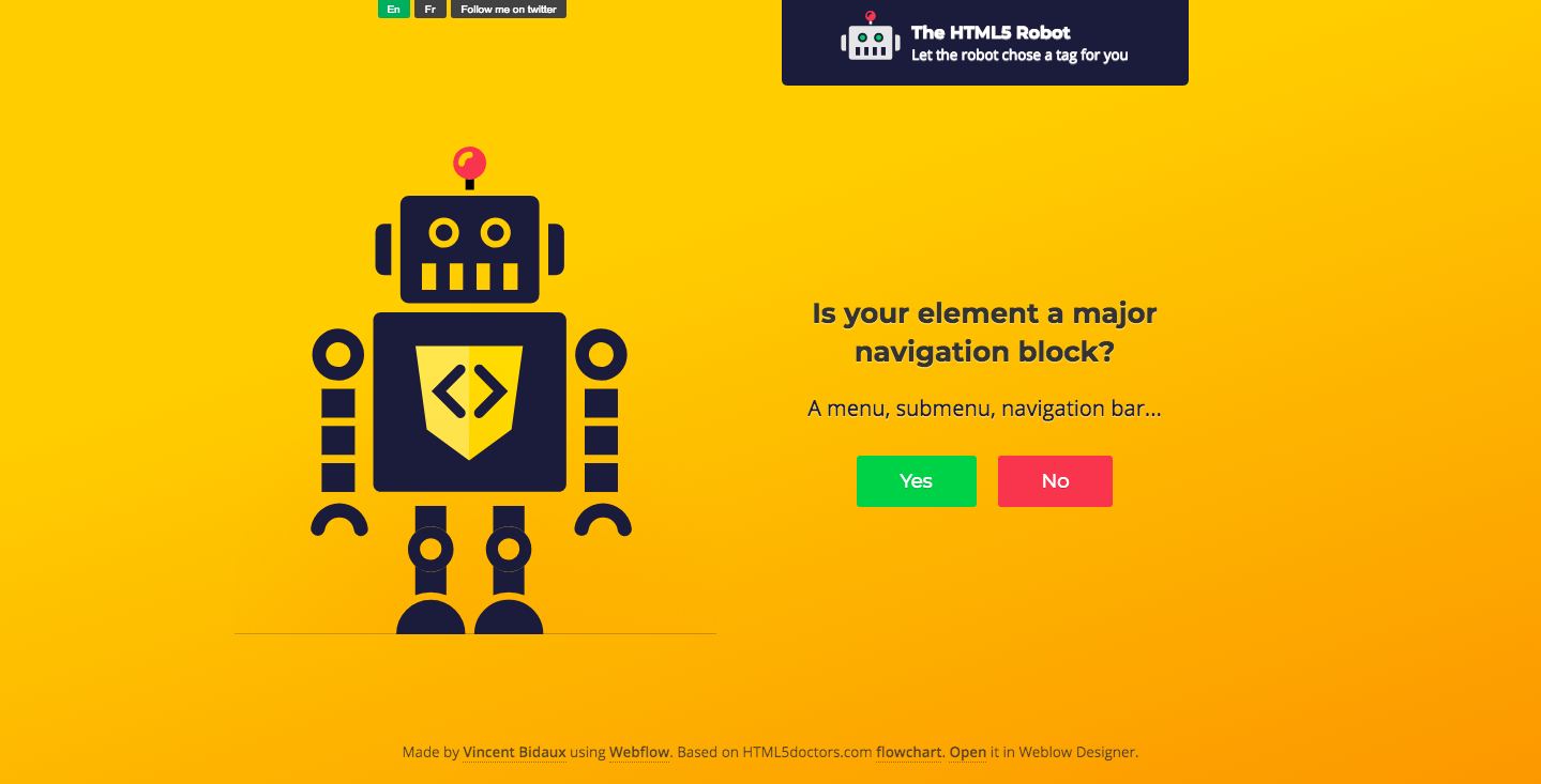
Some of his tips and tricks are interactive, like the HTML5 Robot, which helps you find the semantic tags you need. His blog is sprinkled with other creative touches, too. Like the post about cookies — it not only has a solid recipe for actual chocolate chip cookies, but also a template for the digital variety, made with jQuery.
Bidaux’s educational posts and his featured work illustrate his skills and what’s possible with Webflow.
8. Avocadoholic
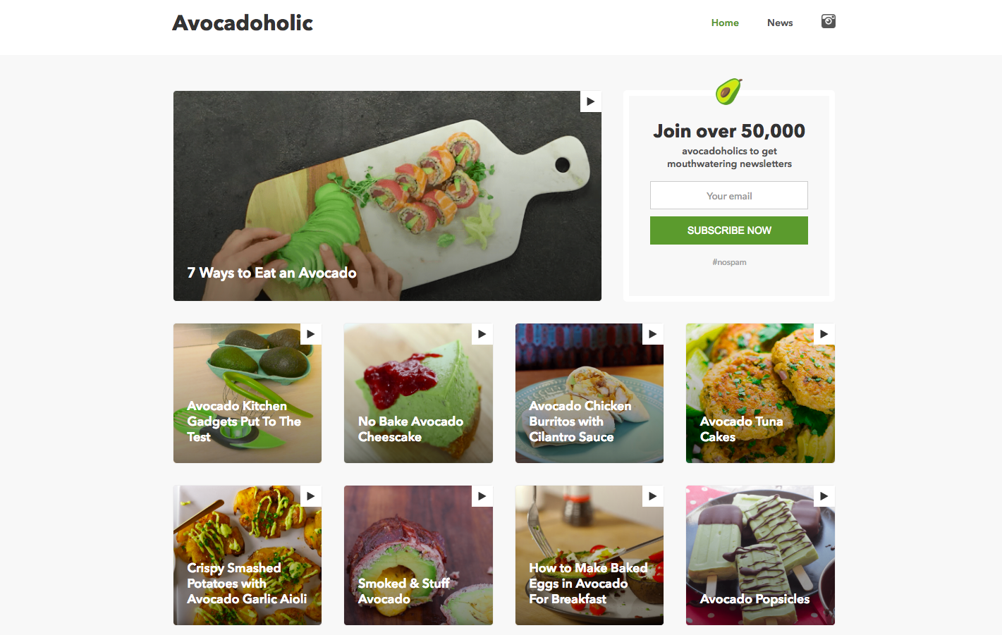
Avocadoholic serves up a curated collection of all things avocado. Each blog post features a video about this tasty, green delight. Fancy an avocado popsicle? Smoked, stuffed avocados? Avocadoholic has your back. There's enough recipes to keep even the most obsessed avoficionado busy.
One minor criticism: I know we’re all trying to find ways to make revenue, but the ad block yanked me out of my avo-induced trance. Sure, the ad was relevant to me — vintage guitar amps — but it clashed with the green, mushy goodness I’d been enjoying.
9. Travel blog prototype
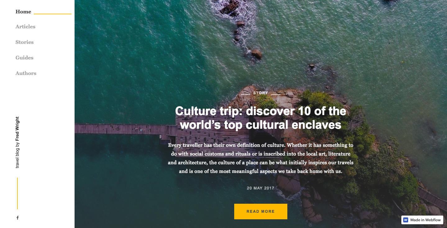
Up for a design challenge? Dima Miro created a travel blog the first time he used Webflow.
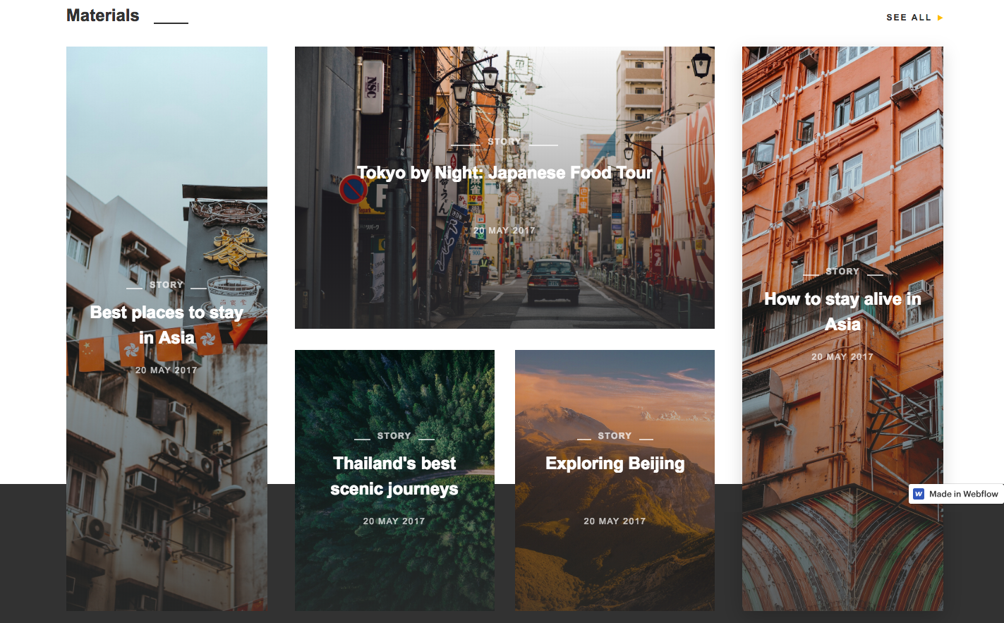
Too bad it’s not a real, live site — he did a fantastic job with the simple, one-page design. The well-organized layout highlights a featured blog post, followed by recent articles and features. Another smart design move was including author profiles. Blogs should always include information about site authors so readers who want to can dig deeper.
If you’re thinking about creating your own travel blog, this prototype is a great place to start.
Create your own blog using Webflow
No matter what you’re into, a Webflow blog is a great outlet to express your creativity — and potentially, grow your business or brand. It gives you the chance flex your muscles as a writer, photographer, and web designer. Webflow makes the design part easy and provides a powerful CMS to makes creating new posts a simple process.
Start with pulling together content that excites you. Whether it’s a personal blog or one for your business, you’ll connect with and inspire like-minded people.


