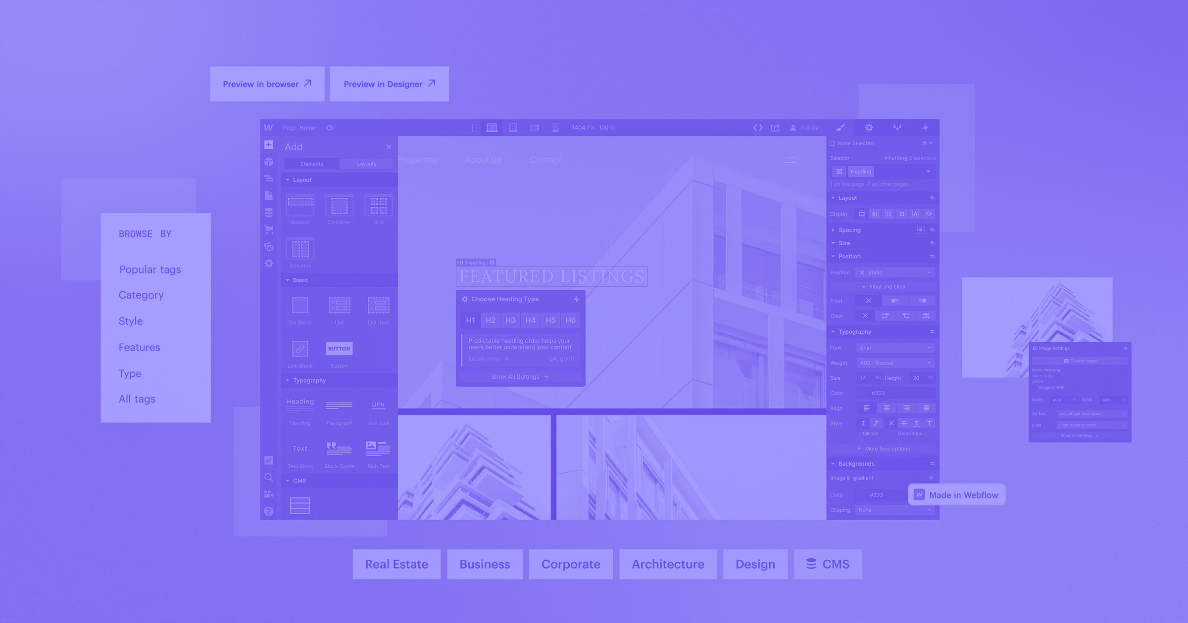
Property can be a nerve-wracking purchase, but the best real estate websites start building trust from the first click.
Real estate is a big investment, and potential buyers have equally large expectations for every step of the process. A realty website must deliver an experience that builds the agent or company’s credibility. And with so many competing sites, using SEO strategies to capture new visitors and improve their experience with AI-powered tools, like automated listings, is crucial.
Real estate site design may be the most complex client work you’ll do. This article aims to alleviate some of that complexity by providing 13 real estate website examples, along with some tips, to help you prepare.
What are some key features real estate websites should have in 2026?
The real estate market is all about staying ahead — of trends, markets, and client expectations. A real estate website is no different. The design should anticipate users’ needs with innovative choices that demonstrate the company or agent’s expertise and foresight.
Mobile-first design
In 2025, more than 62% of all web traffic came from mobile devices. A mobile-first design keeps that majority in mind by designing for mobile screens first, then adapting the experience for desktop.
Mobile-first is effective not just because mobile traffic is high (so it’s helpful to start with those users’ needs front of mind) but because constraints improve design decisions. By designing for small screens first, teams are forced to define core content, primary actions, and hierarchy upfront. Desktop then becomes an expansion of a well-defined experience, instead of mobile becoming a stripped-down version of a desktop-first design.
Detailed listings
Many website visitors will be new prospects for your client, so you won’t know their personal dealbreakers and “must-haves.” Make sure your property listings provide enough detail to address all relevant factors. Floorplans, room counts, and agent information are all essential, but consider adding more details, like how walkable the surrounding area is or when major appliances were last replaced.
Lead capture forms
You never know what the deciding items will be that push someone to reach out, so make sure the option is always nearby. Add an inviting contact form to each listing (and make sure it's available in your footer design) so the form is always on the open page.
SEO schema integration
Rich results get more clicks on search engine results pages (SERPs), so build out your page with the proper schema markup to compete with others doing the same. If you’re building in Webflow, the CMS can automatically generate schema markup for you.
AI-powered personalization
Personalizing the website experience shows visitors that you value their individual needs. AI-powered tools, like Webflow Optimize, can help you add personalization. For example, you could use geographic location and whether the visitor is new or returning to change header text, and A/B test different site design iterations to find the right way to meet each customer’s expectations.
What are the most important design practices to follow for real estate websites?
As you create realty websites for your clients, keep the following design tips in mind.
Build trust through visual storytelling
Establish credibility with your audience by inserting images, videos, and animations that tell the client’s story. A peek into the client's philosophy and history will create a more authentic experience that humanizes their brand.
Simplify navigation
It should be easy to navigate between searches, listings, and contact forms so that every experience is intuitive and frictionless. Sticky navigation menus and internal links keep navigation seamless by putting the next step in front of visitors no matter what page they’re on.
Use interactive media wisely
Some interactivity works well on these sites, such as virtual tours and filterable search results. But be mindful about where and how you’re using this technique. Perform a cognitive walkthrough after adding new features to ensure you aren’t overwhelming new visitors.
13 great real estate website examples
Here are 13 real estate website examples that use intuitive user flows, personalization, and interactivity to build trust with visitors and convert potential buyers for your clients.
1. Top Real Estate
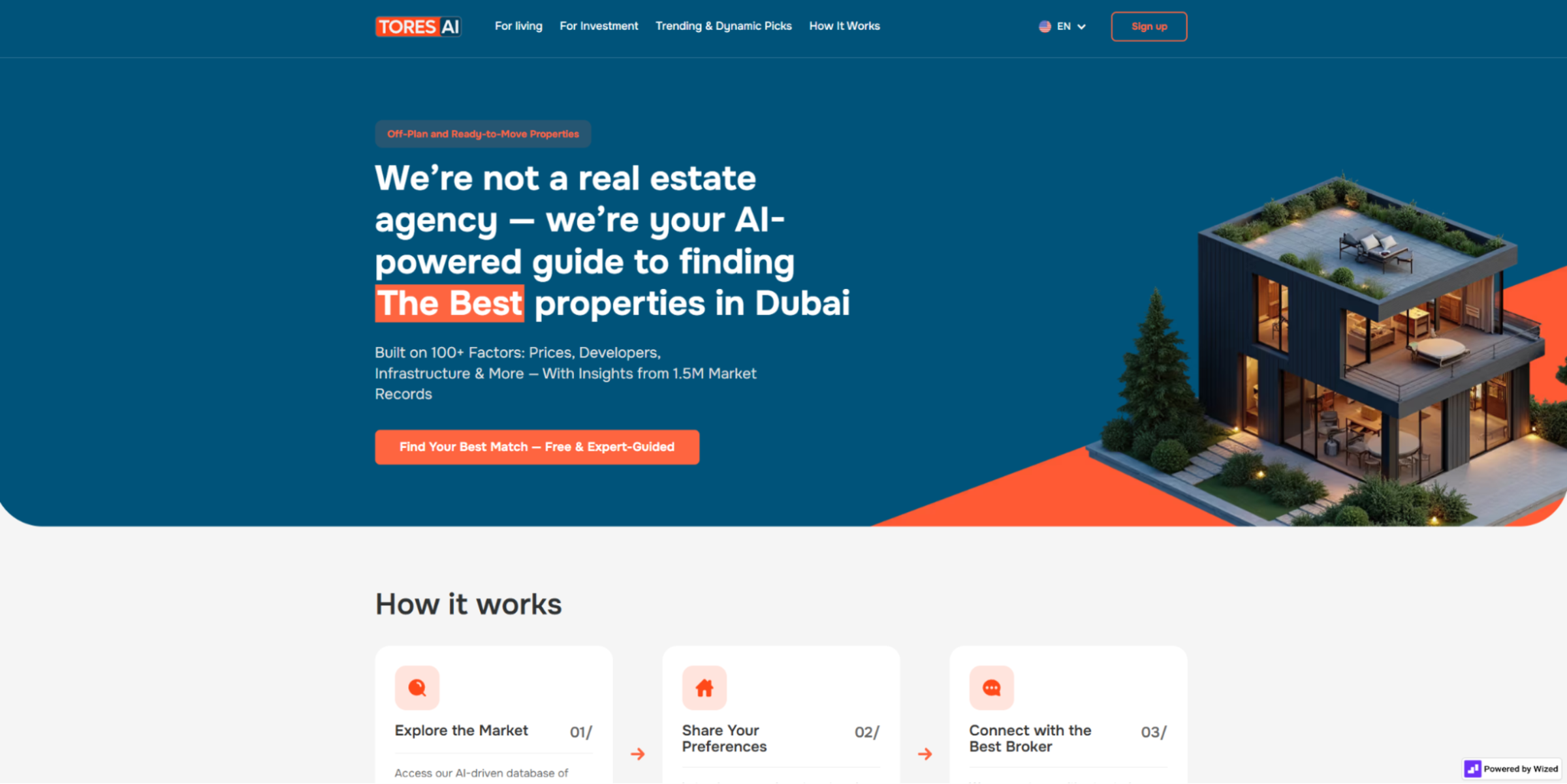
Top Real Estate is an AI-powered database of property listings in Dubai that connects investors with properties and brokerages. Their AI matchmaking differentiates them from traditional realty sites, and their website makes that fact clear in the headline and the “How it works” section that follows. Visitors must scroll through the instructions to reach the filterable property search database, so they know how to navigate the site before trying to use it.
If your client’s service is similarly unique, clarify exactly what visitors can do from the outset so everyone comes in with realistic expectations.
2. Home In Amelia Island
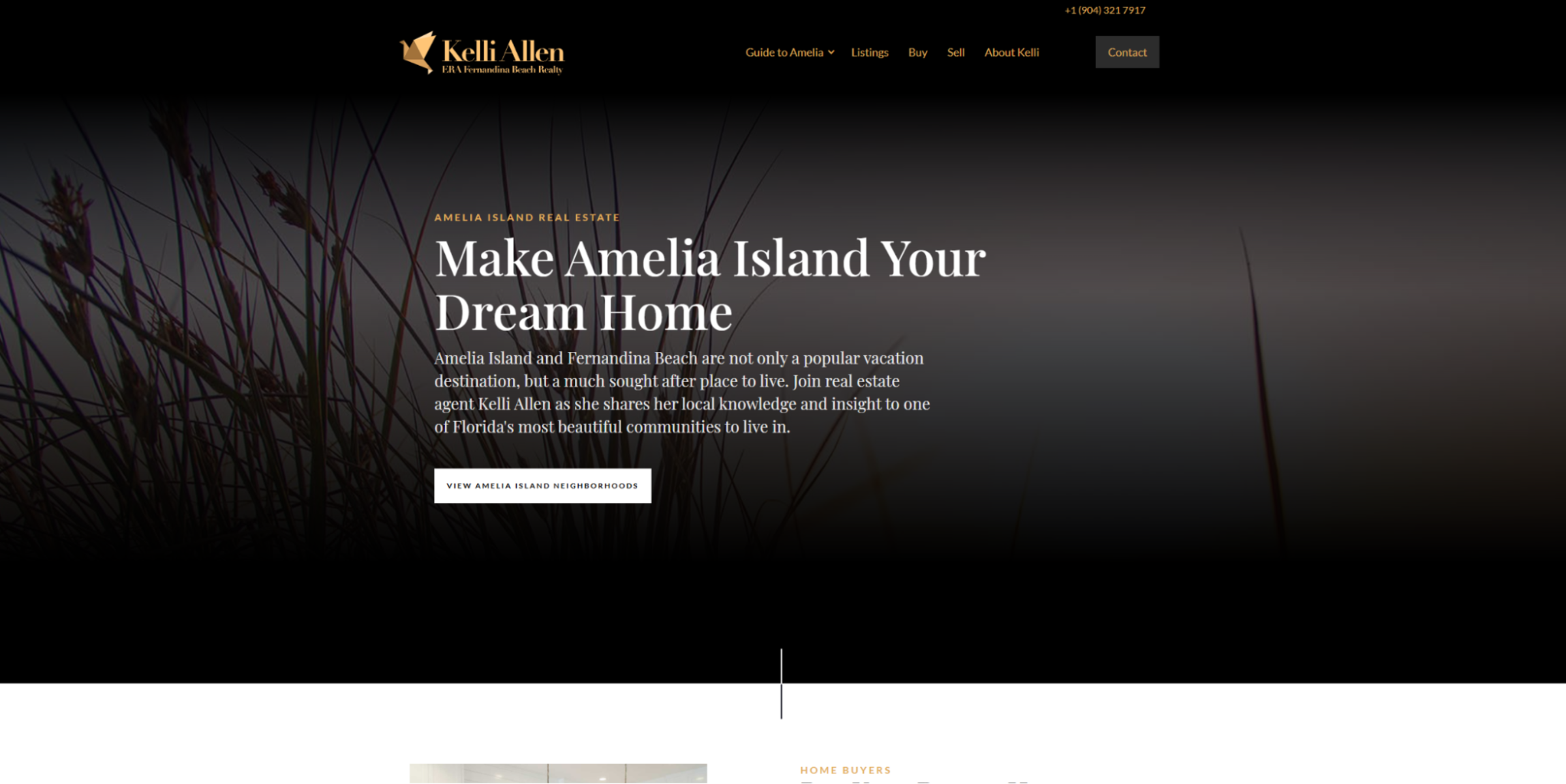
Home In Amelia Island is a real estate agency website by Onboard Creative that regularly spotlights the agent, Kelli Allen. The site includes an “About Kelli” page and images of her and her family on the homepage. Kelli serves a small part of Florida, and the person-first approach on this website mirrors the area’s small-town community focus. Since Kelli only serves Amelia Island and Fernandina Beach, specific references target local web searches for better SEO and higher-quality leads.
In your own design, consider the area your client is serving. Is it known for luxury and people who prefer white glove treatment, or is it more of a community-driven area where everyone knows the agent’s friendly face? Reflect those needs throughout the site.
3. Olympus
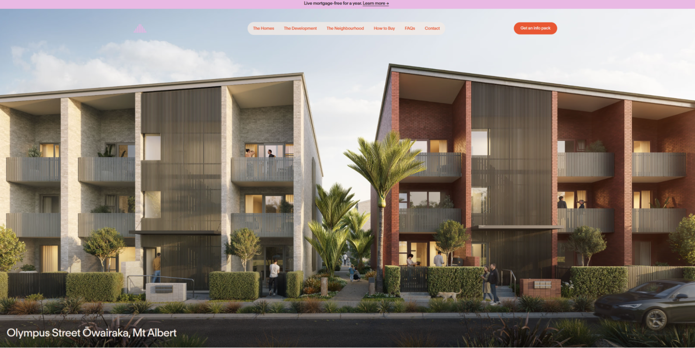
The Olympus real estate website by Daymark displays the new luxury presence revamping Ōwairaka, an established community in Auckland, New Zealand. “The Homes” tab reveals detailed floor plans that clearly distinguish the various properties they offer, while “The Development” discusses the project at large and “The Neighbourhood” talks about the perks of living in Ōwairaka.
Daymark has the advantage of centering on one distinct community. If your client is similarly focused, take some notes on how the Olympus site describes the surrounding area. It’s a great example of how informative visuals and compelling layouts can highlight nearby amenities and local culture.
4. Peritum
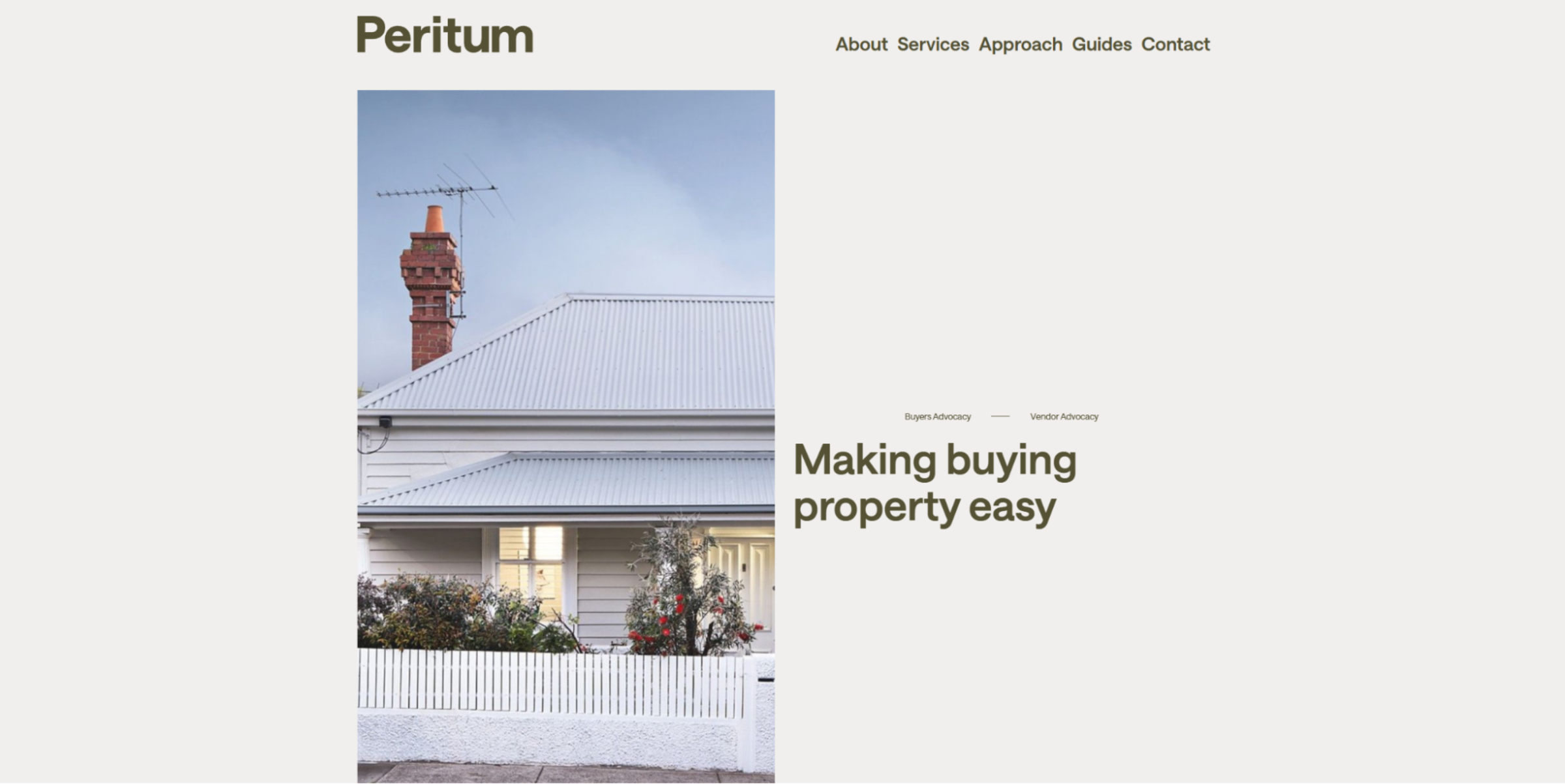
Peritum’s site by ONETOO takes a somewhat unusual approach to the real estate market. Rather than showing off a long list of properties like you might discover on Zillow, it introduces the company’s primary value proposition: vendor and buyer advocacy. Peritum acts like a project manager for property sales and purchases. Their website reflects this higher-level engagement in its SEO blog with useful guides about the Melbourne, Australia market and how Peritum operates.
If your client wants to stand out from the crowd, eschewing traditional features such as property listings is a good way to do it — but you’ll have to replace them with an equally compelling approach.


Launch with Webflow Templates
Choose from hundreds of professionally designed website templates for any industry or style. Customize visually, launch instantly — no coding required.
5. Friedheim
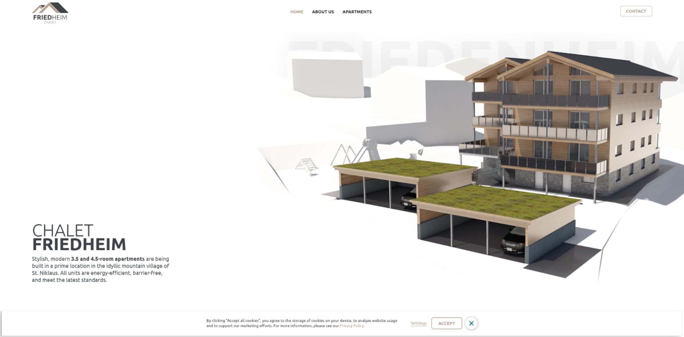
The Chalet Friedheim project is reinvigorating the traditional Swiss village of Zaniglas with new affordable housing that offers generous space and luxury amenities. The site, designed by Bravenex, spotlights all their work by immediately showcasing the building plans and amenities on the homepage. This is an especially smart strategy for a real estate company who focuses on pre-construction sales. With the right visuals and detailed descriptions, they can get buy-in from interested investors long before the project crosses the finish line.
6. Exotiq
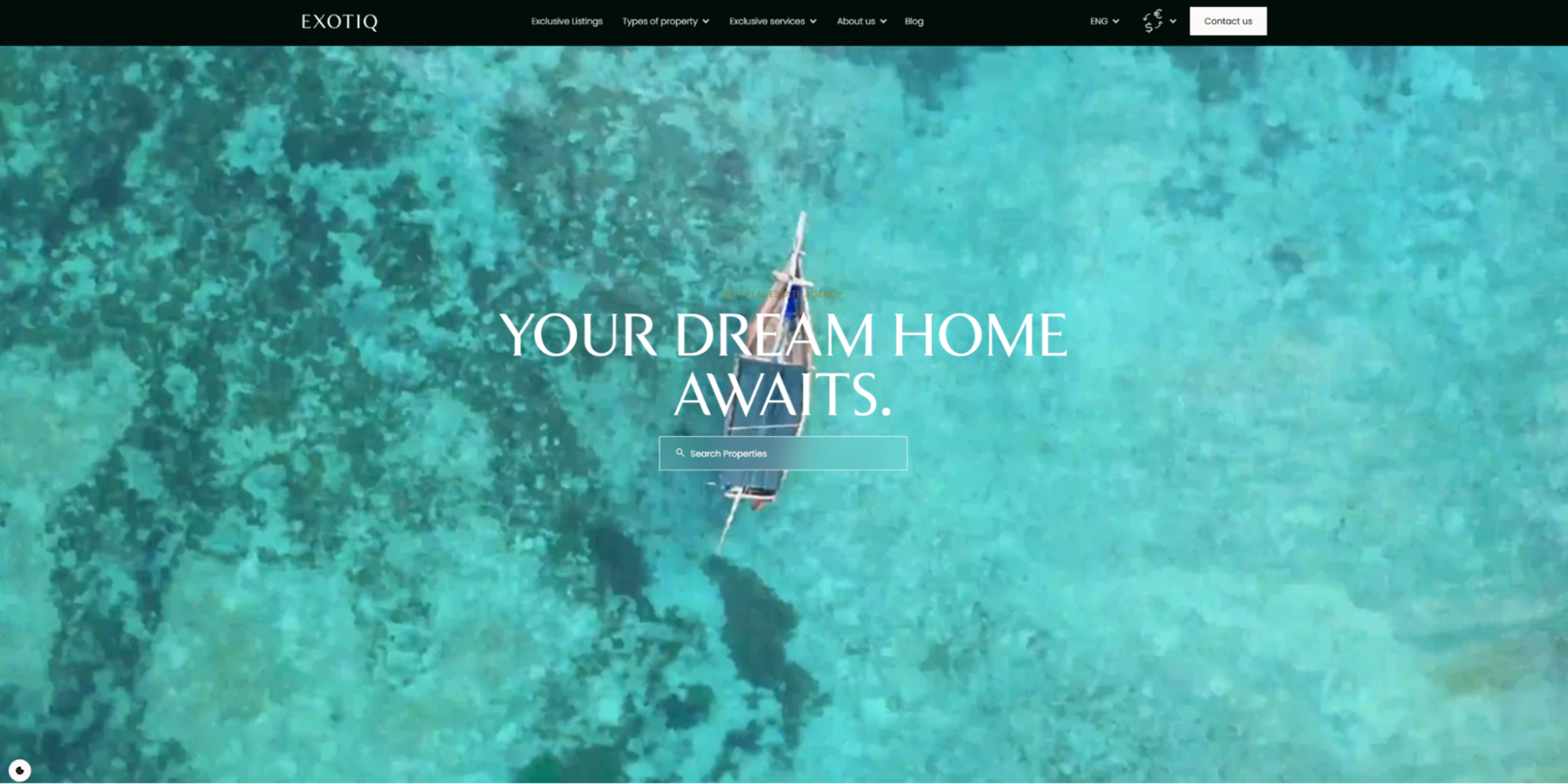
Exotiq is a luxury real estate company based in Bali that represents commercial and residential properties. The website Simon Deridder made for them follows a traditional model, with testimonials and listings sorted by property type, but it also showcases the area’s unique vistas with several high-quality visuals and evocative text. The site uses buzzwords, like “hip,” “chic,” and “unspoiled nature,” to describe Exotiq’s properties, hoping to resonate with a specific kind of buyer.
If your client is trying to bring in a new demographic, pay special attention to your descriptions and their associated visuals to squeeze personality into everything visitors encounter on the site (and boost SEO).
7. DVELE
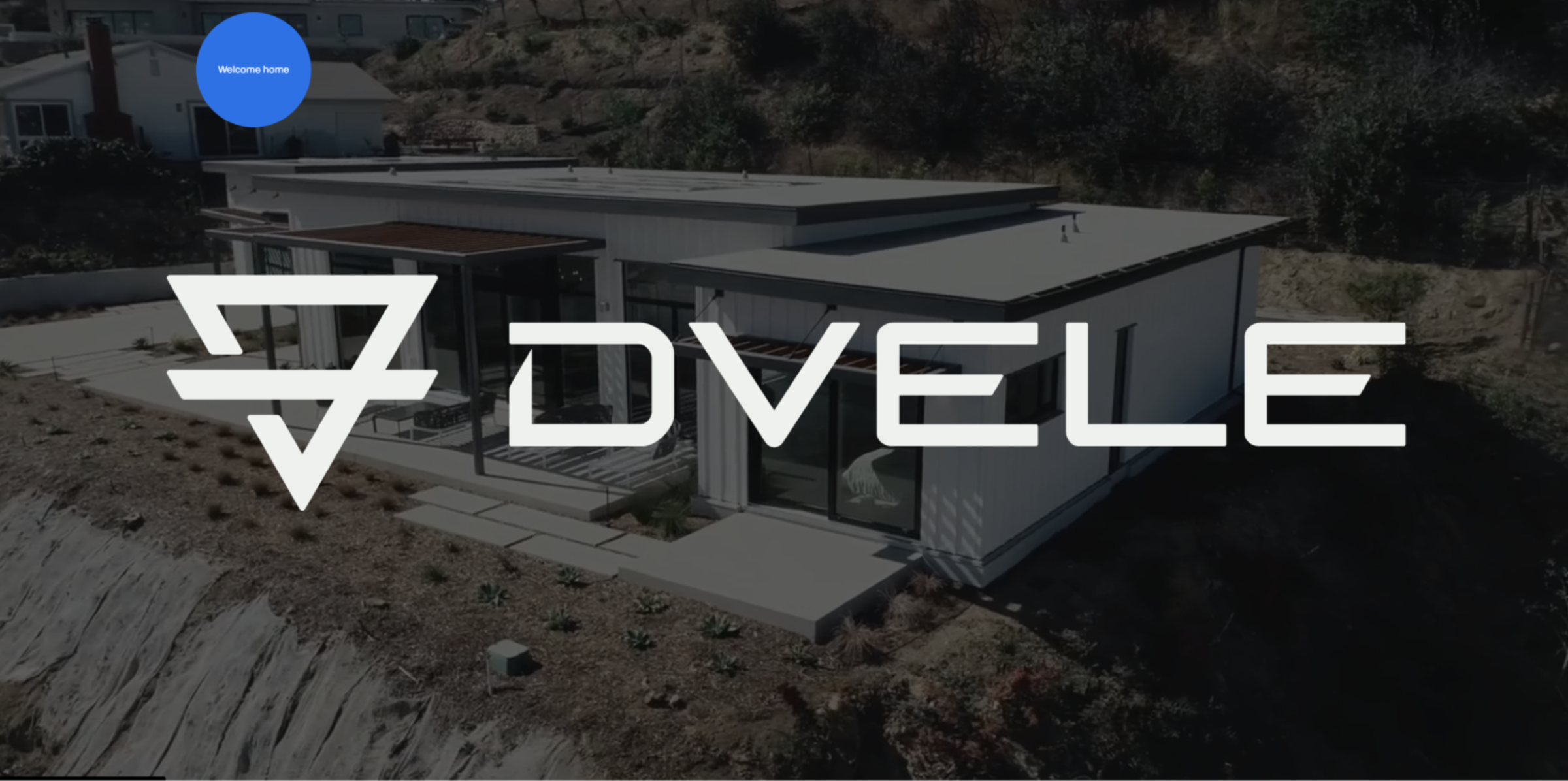
DVELE’s website features a lot of motion right away — like the video in the header’s background and a big blue circular cursor that says “Welcome home” — to engage visitors. The sticky navigation menu icon at the top means every page is only a couple of clicks away, and the “Homes” listings are filterable and dynamic. A brief loading screen slides forward to conceal each page as it loads, ensuring that the first-time user experience with each page is smooth and inviting. In your real estate website design, you could improve that experience by carefully optimizing your site to make the loading screen unnecessary.
8. A Team Real Estate
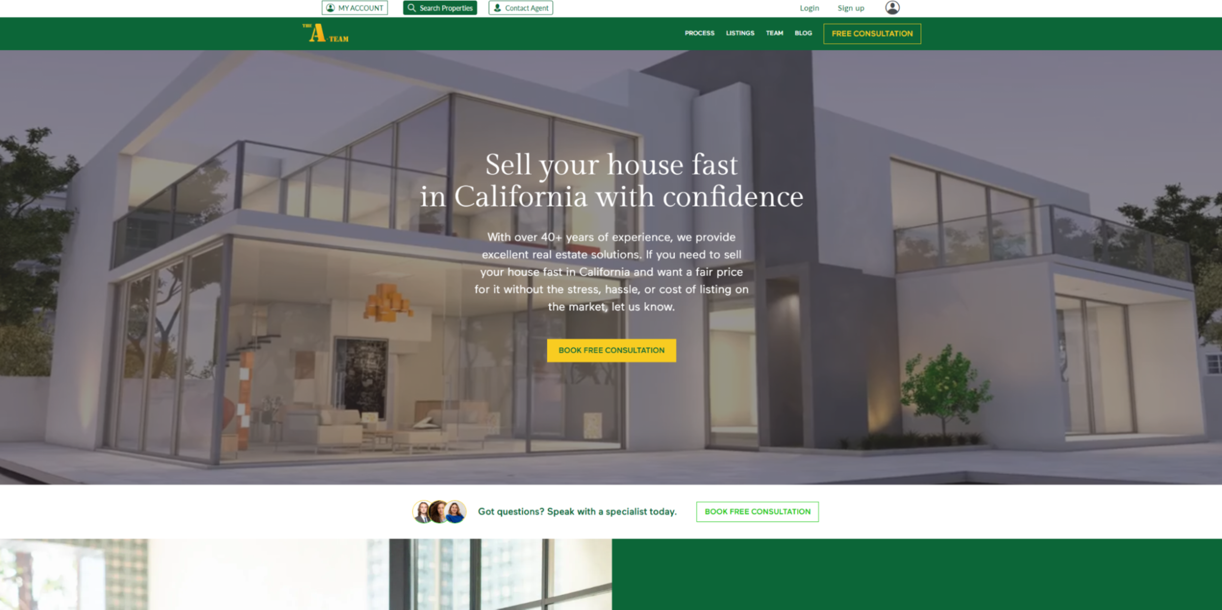
The A Team Real Estate’s website by Chintan Savaliya is an example of a traditional realty site done well. It starts with a hero image and detailed homepage that describes the realtors behind the California-based company, featuring several videos. Visitors can sign up for an account to save their favorite property listings and set their preferences. The site also features an SEO blog to drive web traffic, which The A Team can then direct to the sign-up page with call to action (CTAs). If your client wants a traditional full-service website, Chintan’s design is a great place to find inspiration.
9. NextDoor Property
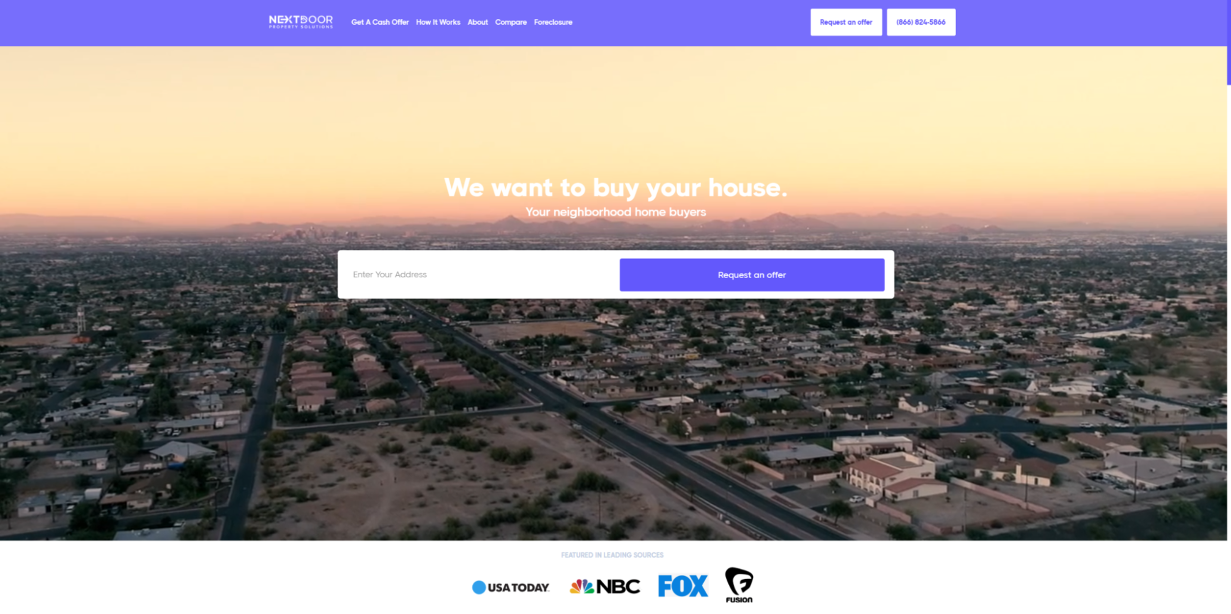
NextDoor Property is a home-buying real estate business that can provide visitors with a cash offer on their home within 24 hours. The way designer David Verduzco made this site efficiently sets a potential customer’s expectations about working with NextDoor. Just like Top Real Estate’s website, the homepage immediately describes what the service is about with a simple, direct tagline — “We want to buy your house” — so there’s no room for confusion.
This immediate clarity is crucial for clients who only work with one aspect of real estate. Site visitors don’t waste time perusing a bunch of pages before realizing this agency doesn’t offer what they need.
10. August Collections
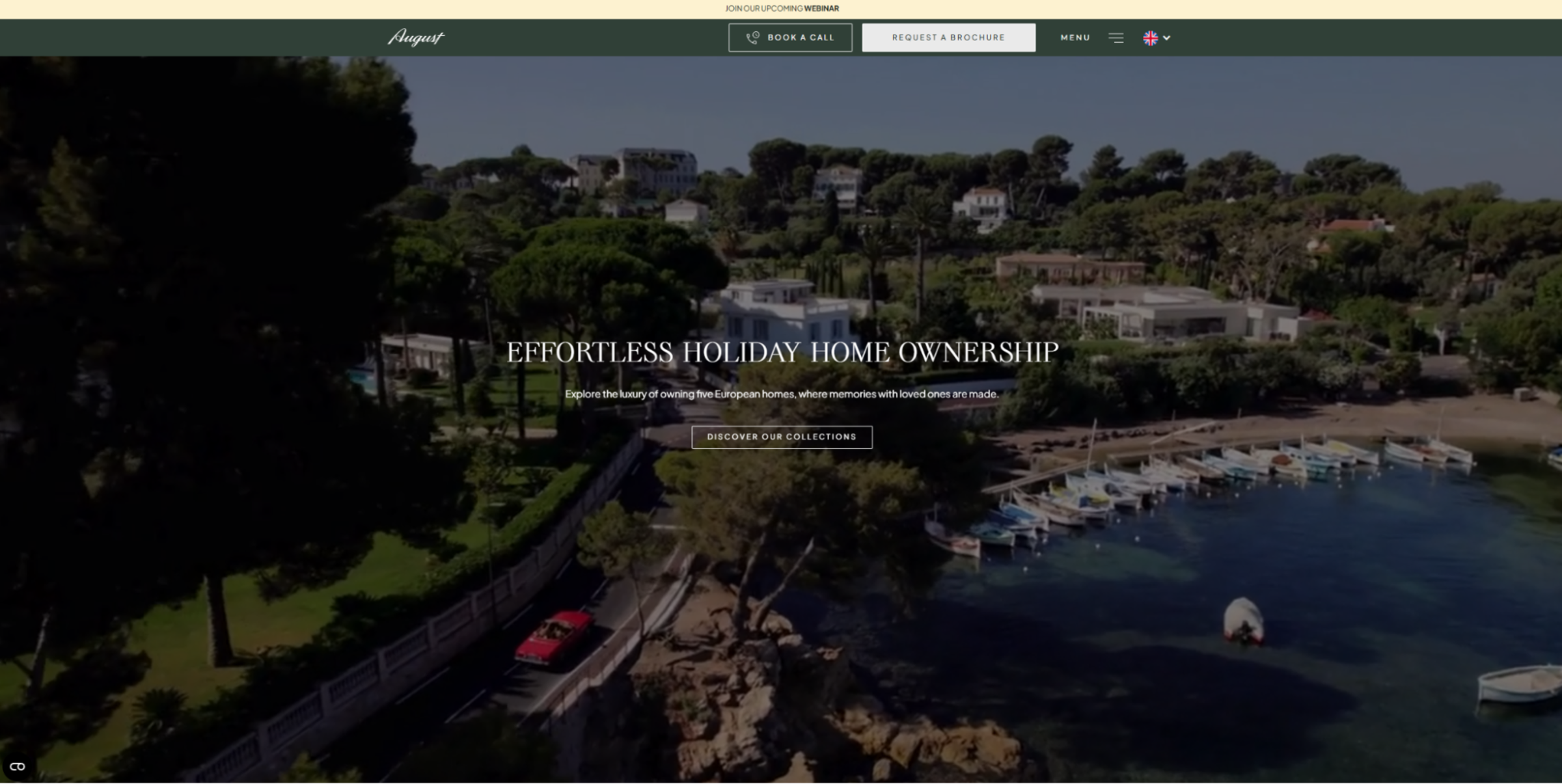
The August Collections group consists of luxury real estate professionals who focus on holiday homes and timeshares in some of Europe’s most iconic places, such as Paris, Rome, and Barcelona. In addition to their detailed property listings, their website offers several guides for popular destinations and tourist attractions nearby. This gives more context to each property for a more comprehensive experience that’ll keep repeat buyers coming back.
Since holiday homes need more upkeep and external management than a traditional home, August’s full-service approach tells potential buyers that the company will be there for them in the long run to build trust from the outset.
11. Bonus Homes
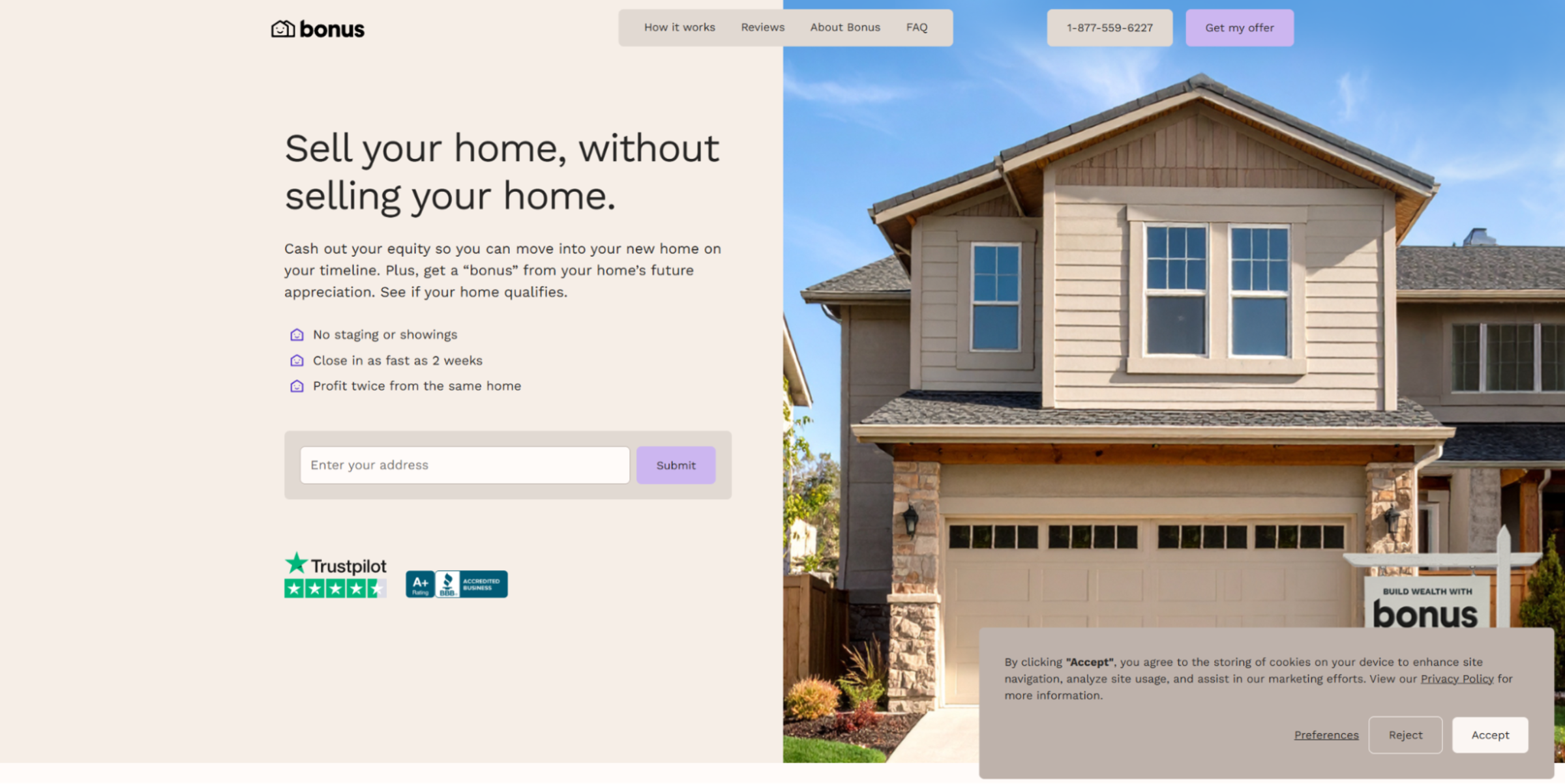
Bonus Homes allows homeowners to cash out their current equity and earn a share of their home's future value. Like other alternative real estate solutions, their website doesn’t feature property listings or spotlight real estate agents. Instead, it focuses on establishing that their unusual proposition works with reviews, certifications, and even a video from their very first customer. It serves as a great example of using social proof to build customer trust, especially for new finance-focused real estate companies.
12. Pilot Properties
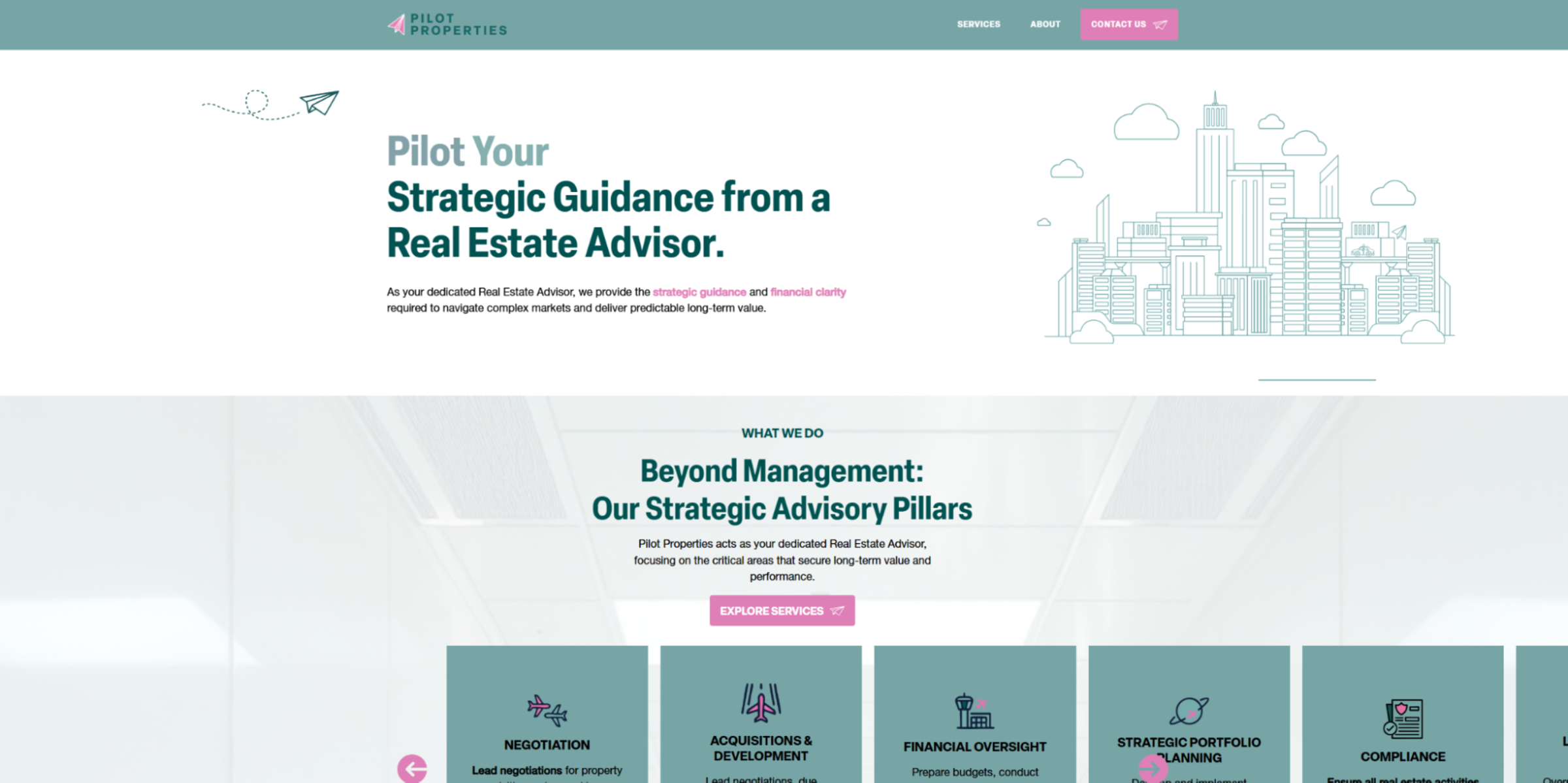
Pilot Properties is a team of real estate professionals who advise corporations and other large-scale property owners. Tanya Sillitti created a site for Pilot that uses a consistent visual hierarchy to explain the details of their service as described by the founder. This real estate website works like a template for organizing information in a user-friendly, inviting way. As you explore it, you'll notice how the elegant color palette, modern fonts, and logical layouts all establish a clear visual hierarchy that keeps each page orderly and readable.
13. WTG Property

The WTG Property website by Mustard Pte Ltd combines many of the strengths of the other examples on this list. There’s a filterable property listings database, in-depth guides for new and returning customers, and high-resolution graphics (such as comparison charts and testimonials) to simplify information and engage visitors. Every page loads quickly — without a loading screen — thanks to a streamlined design. It showcases the speed and reliability you can expect from a comprehensive real estate website builder like Webflow.
How is AI shaping real estate web design?
When creating a real estate website for a client, AI tools make the hand-off easier with “set it and forget it” functionalities.
Here are a few tools that are enhanced by AI for real estate websites:
- AI chatbots, like LiveChat, can facilitate buyer inquiries and capture leads.
- Predictive recommendations from AI tools, such as Smootify, help visitors find their dream home faster.
- Data orchestration tools, like AirOps, can pull property data from multiple sources, generate standardized property details, and publish them directly to the Webflow CMS.
As AI technologies are always changing, stay on the lookout for any new AI-powered tools that simplify steps in website maintenance or lead capturing. To future-proof your site for these applications, use a website builder like Webflow that offers AI-enhanced solutions natively and supports integrations with other AI-powered tools.
Inspired? Start your design in Webflow
Buying real estate is often a major life decision, and trust plays a critical role in moving forward. A client’s website must clearly communicate their expertise while keeping buyers and sellers front and center. When you tailor these sites to the right audience, you’ll attract more qualified leads and help visitors quickly understand whether the service is right for them.
To get a headstart on your real estate website projects, check out our list of professional real estate website templates that you can build off of immediately in Webflow. Choose from hundreds of examples and filter by style and type to find one that’s right for your client. Then, you can customize it to fit your client’s style and add things, such as SEO metadata and CTAs, on every page to capture more leads.

Build websites that get results.
Build visually, publish instantly, and scale safely and quickly — without writing a line of code. All with Webflow's website experience platform.


