The web is often the first place we go when we’re looking for a new place to eat. Making a good first impression with a well-designed website is a great way to get people through your door.
It's no secret that many people order food online these days. This makes it especially important for restaurant businesses to establish an online presence and explore ways to market online. With so many ordering services thriving in 2025, having a clear online presence gives restaurants a competitive edge.
The best restaurant websites have great web designs and know how to make potential customers easily find what they're looking for. In this post, we'll go over a few websites doing it right.
Key elements of a restaurant website in 2025
When planning your restaurant website, focus on easy menu access, online ordering or reservations, and a clear call-to-action. High-quality images and welcoming copy help visitors imagine dining with you.
Ensuring your site features user-friendly online ordering or a reservation system can mean the difference between a new customer and a missed opportunity.
19 best restaurant website examples
Check out these 19 restaurants, all designed with Webflow, to help inspire your own restaurant website design.
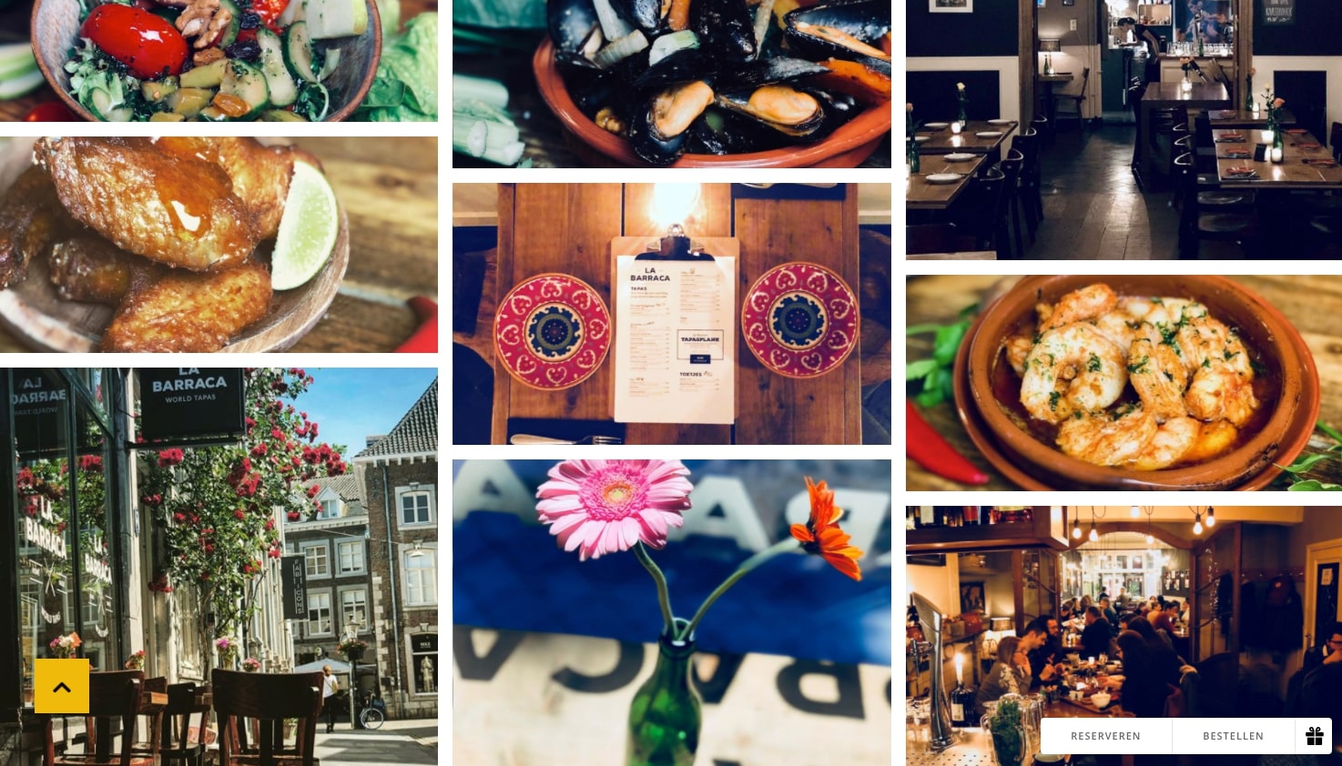
1. La Barraca
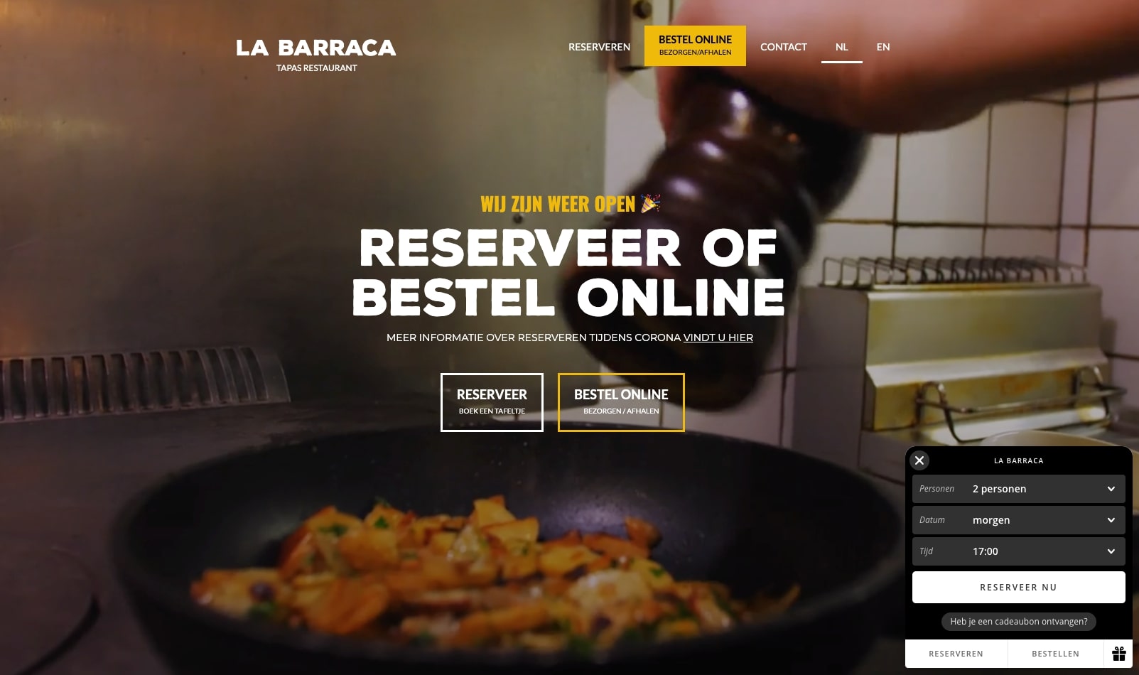
La Barraca, a Netherlands tapas restaurant, uses spectacular visuals on their website — you can almost hear the low chatter of friends visiting, the clinking of full wine glasses, and smell the delightful ocean saltiness wafting from seafood dishes.
Great photographs are crucial for making visitors crave your menu. La Barraca uses images to show us their sociable atmosphere and their mouth-watering tapas. These beautiful photos give us a good idea of what we'd experience if we decide to visit.
2. Bevri
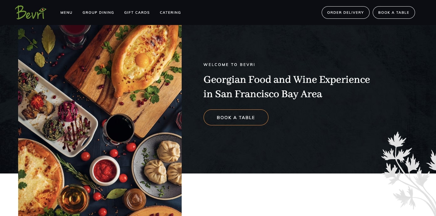
San Francisco has so much good food, but Bevri touts itself as the only restaurant in the area serving Georgian food.
The design features a call-to-action button that beckons us to book a table — a good idea for any restaurant site. This same button is used throughout the site for other calls to action like ordering online or buying a gift card. Consistency makes it easier for site visitors to know what to do and take action.
Scroll-triggered animations float text into place and layer elements. The menus, split into lunch and dinner, are clear and easy to navigate. A separate wine and drinks menu keeps the other menus from being overwhelming and busy.
For those not acquainted with Georgian food and wine, this website is a great introduction and invitation to indulge.
3. Karmel Czekolada
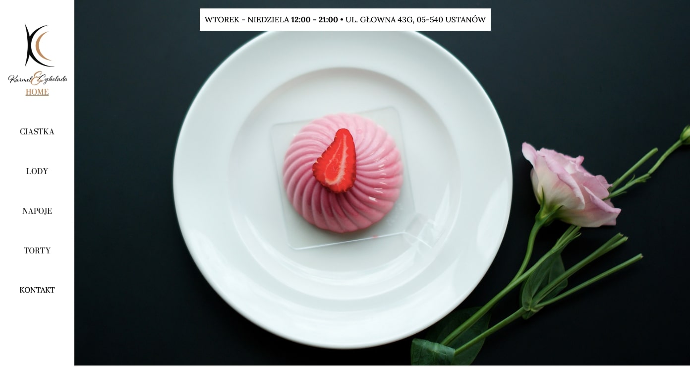
Cakes, cookies, and ice cream are just some of Karmel Czekolada's sweet treats. Good restaurant copy will tell us about their specialties and guiding principles behind the cuisine. Karmel Czekolada’s copy beautifully describes the love that goes into their creations. In just a short scroll down from the pink confection that is their hero image, they detail their focus on petit gateau cookies, which they describe as an enticing combination of chocolate and fruit.
This one-page design makes it easy to take in their delightful desserts with one simple scroll.
4. Da Francesco
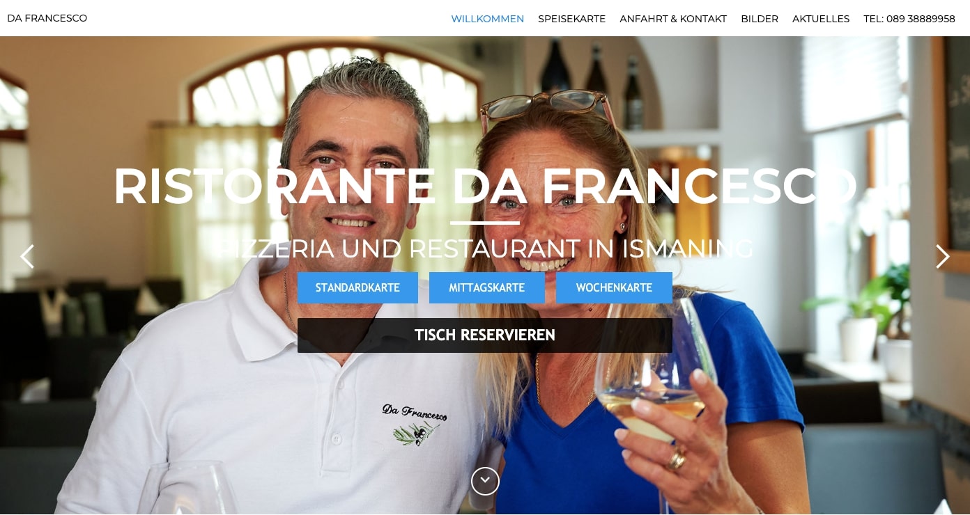
Da Francesco’s homepage greets us with a revolving carousel of photos of food and friendly faces. This personal connection with people instills confidence in a good customer experience.
Key information — the menu, location, phone number, and how to make a reservation — is featured in a neat row of grey buttons, making it easy for us to find what we’re looking for.
5. Dédé licieux
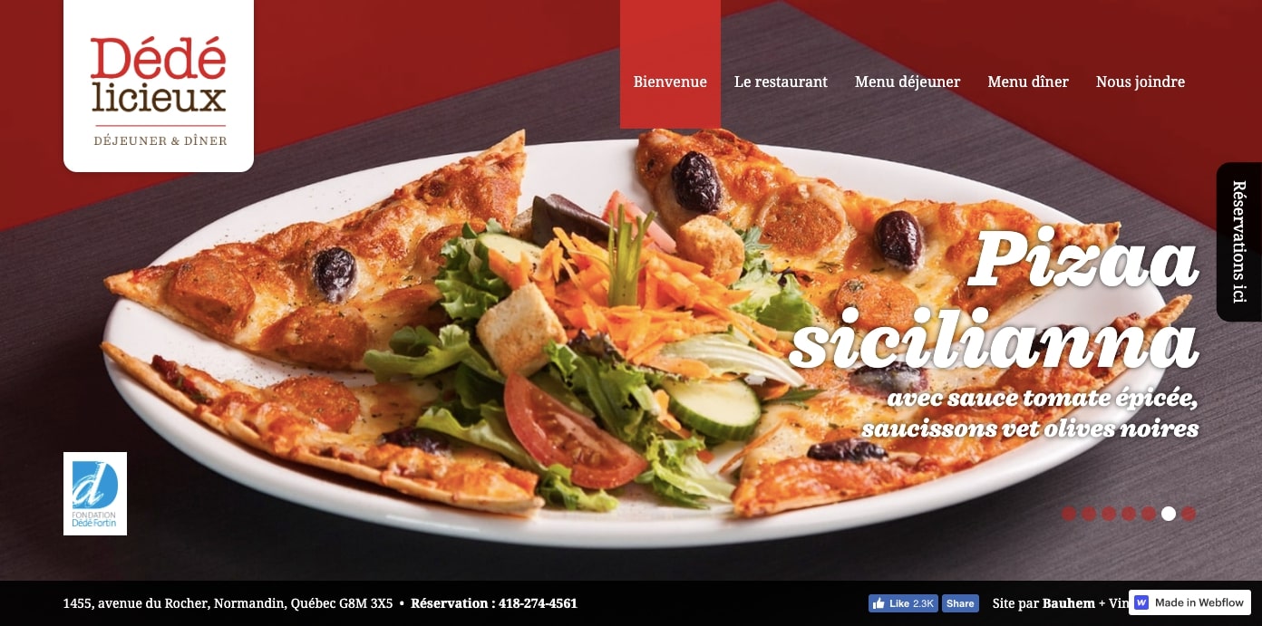
If you’re not from Quebec, you’ve probably never heard of Dédé Fortin, the charismatic frontman of the 90s band Les Colocs. Dédé licieux is a restaurant dedicated to his memory. As Google translates the site’s French to English: “Like Dédé Fortin, our lunches and dinners are animated by a contagious frenzy!” I don’t know the quality of this translation, but a “contagious frenzy” sounds pretty fun to me.
Not many restaurants are dedicated to musicians. Dédé licieux pulls off this theme without letting it dominate every design choice.
6. Tencere midye
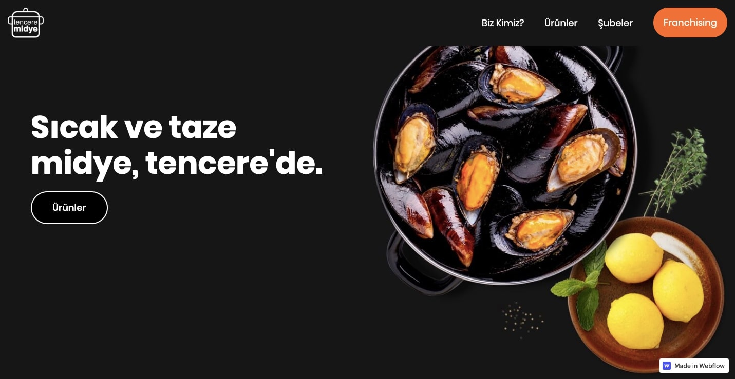
Tencere midye is a Turkish restaurant that specializes in mussels. Their copywriter may be a bit biased against bivalves, but even I’ll admit the photos on their homepage make mussels look delicious. Lemons are featured alongside most of the dishes and make an appearance throughout the site. Images of mussels and citrus conjure a freshness and quality of ingredients in Tencermidye’s culinary offerings.
7. Hasia
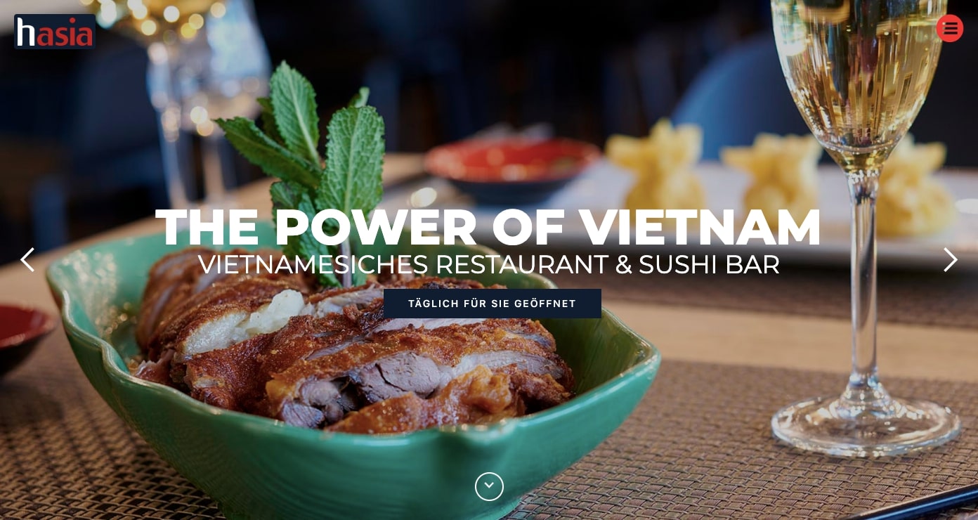
Sparkling wine glasses inhabit almost every photo for Hasia, a Vietnamese restaurant and sushi bar in Denmark. They definitely want you to enjoy a nice glass of wine while you eat. High-quality photos showcase their food and the restaurant’s fancy interior. It’s definitely a location to keep in mind if you’re looking to impress someone.
The content is well organized and easy to follow — centered blocks break up the layout and create a nice flow.
8. Harry’s on the Esplanade
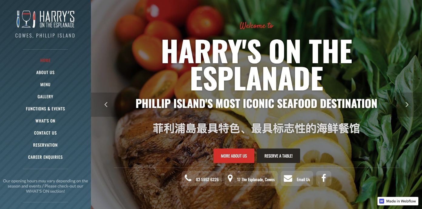
Webflow templates are such a useful tool. The homepage for Harry’s on the Esplanade was built using the Easy Times template. By changing up the images, colors, and other visual branding elements, no one would ever guess this wasn’t a custom creation.
The homepage includes a gallery that features delicious food shots and also has key information — the menu, location, phone number, and how to make a reservation. This layout, full of different sized blocks, is arranged in a grid that’s easy to pull off with CSS grid in Webflow.
9. Restaurant Bonaparte

Clicking READ MORE on the hero image brings up a full description of the historic Restaurant Bonaparte that slides horizontally into place. It’s a simple action that reveals more text with a big block of red shifting from right to left. An image of a fish with red meat and a sprig of herbs shoot into place on the left. This both grabs our attention and economizes screen space. It's one of a few interactions sprinkled throughout that brings movement to the page.
There’s so much that works well visually in this layout, and it’s complemented by great writing. There’s an entire section dedicated to the restaurant's story and an insightful profile of the head chef. There’s no doubt that when you dine at Restaurant Bonaparte, you’re in store for authentic French cuisine.

10. Herr Nilsson
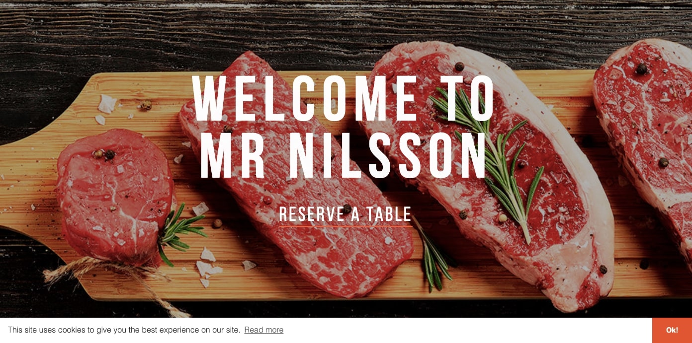
Herr Nillsson, a Norwegian restaurant with a monocled, top-hat-wearing monkey for a mascot, sets themselves apart with plenty of vegetarian options alongside their meat-based dishes. Much like any restaurant attempting to appeal to foodie types, they use photos to showcase their fresh ingredients and featured dishes.
Their one-page restaurant site design has just the right amount of detail. They include background information about their chefs and give us a glimpse into the people behind their culinary masterpieces.


Get started for free
Create custom, scalable websites — without writing code. Start building in Webflow.
11. Osteria 60
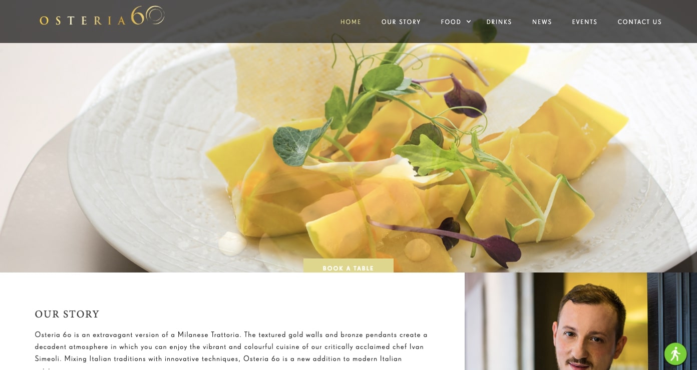
A huge part of designing a restaurant website is attracting the right clientele. With greys and touches of gold throughout, Osteria 60 clearly offers a fine-dining experience — save your shorts and flip flops for another day.
We see their high-class sophistication in the plating of their gourmet dishes and the precise placement of the layout’s visual elements. Not a single ingredient is slopped across a dish, nor is any space in this design occupied by unappetizing visuals.
It’s a design so rich and luxurious that one almost feels gauche navigating it wearing jeans and a hoodie.
12. Geoli
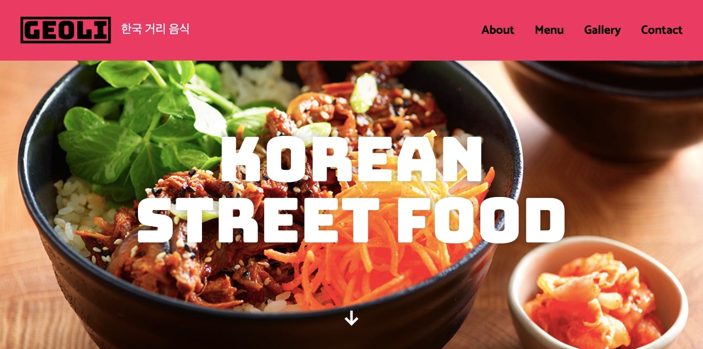
An appetizing bowl of teriyako chicken donburi greets us on the homepage of the Geoli restaurant website. An arrow invites us to explore their menu of Korean street food.
This restaurant website design doesn’t hold back with big, bright, bold color and text. Plenty of negative space keeps the layout from becoming too cramped and gives the bold text room to grab our attention.
This design is about consistency. From the photo’s lighting and colors to the typography used in the headers and body, everything works together to deliver a smooth user experience.
13. Isses
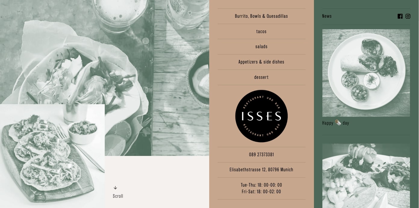
Isses is an authentic Mexican restaurant in Munich, Germany. This design has a very European feel, free from the southwestern visuals that occupy many American Mexican-styled restaurants. With muted greens and subdued pinks, this website is a change from the typical loud reds and yellows.
The navigation also has a fresh take. A center band lists the navigation menu, with related content sliding up the left side of the screen.
Isses is a good example of design that breaks free from cliches to deliver something unexpected in the best way.
14. Cafe Rosa
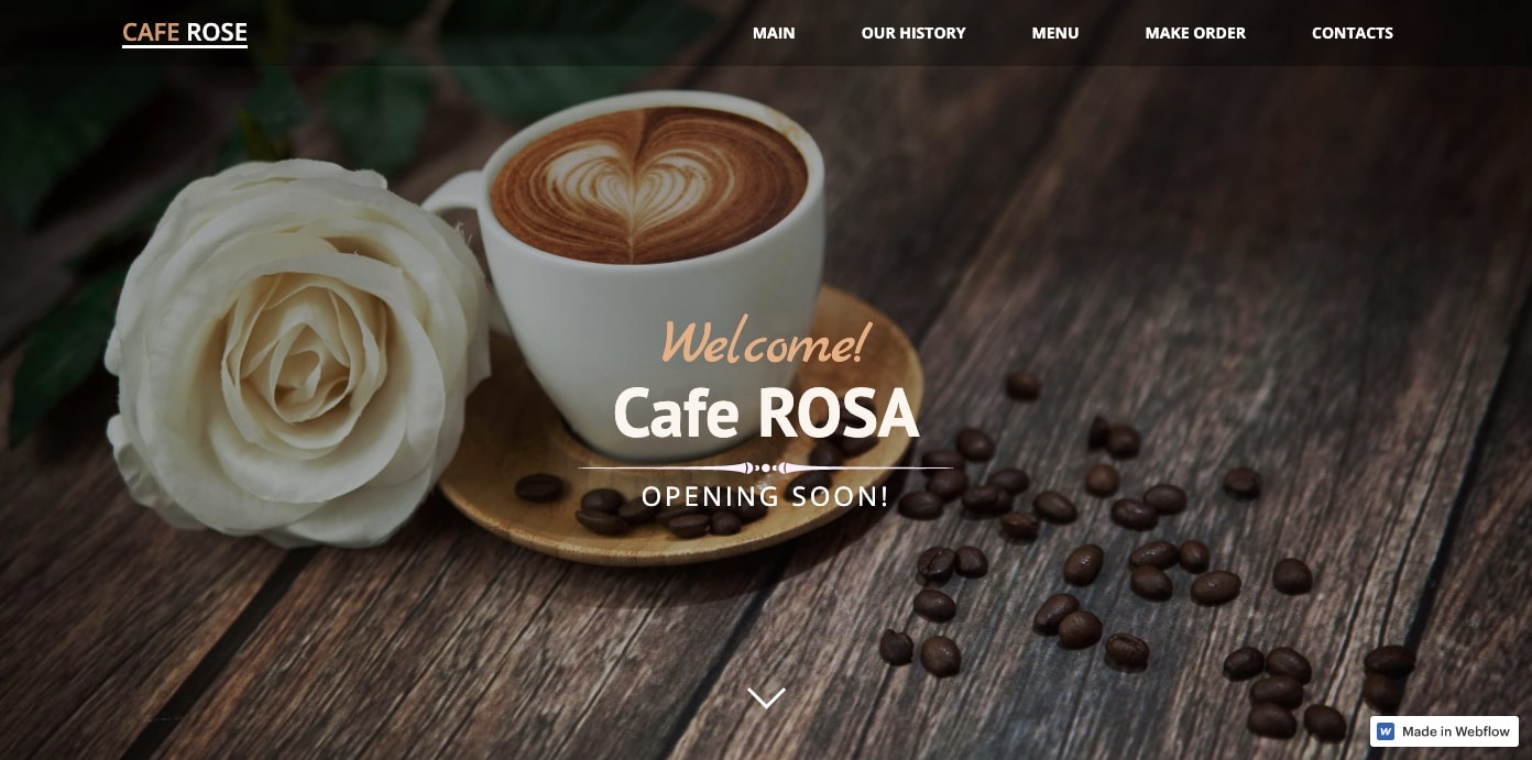
From the foam-topped espresso drinks to the fresh-baked bread, every element of Cafe Rosa's site is inviting. Projecting this sense of hominess and warmth makes for a solid business strategy in Moscow — a city known for its chilly winters.
This one-page design packs plenty of motion with animated transitions that break up each section. Photos of rustic food paired with writing that tempts our taste buds strike a nice balance.
15. El Pez
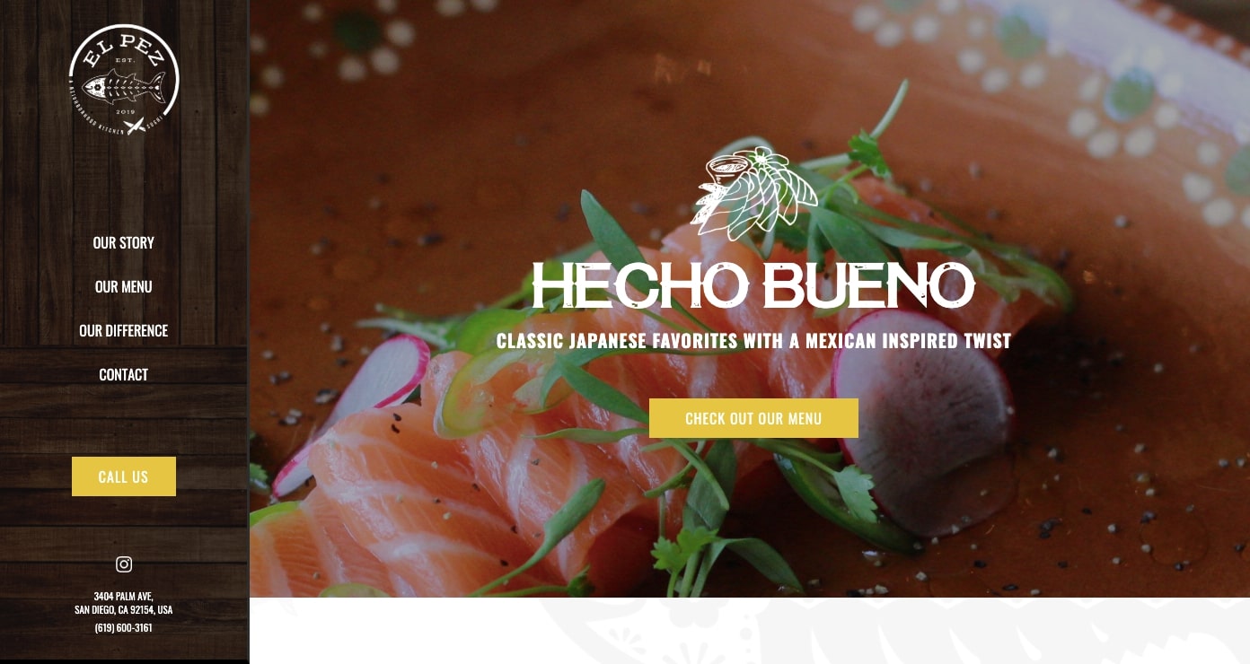
El Pez offers a fusion of Japanese and Mexican food. With speciality dishes like Carnitas Udon, we get a sense of their creativity.
Their cuisine harmonizes two cultures and their design reflects that same sense of unity. This site design is a mashup that makes perfect visual sense.
16. Leda

The Turkish-based business Leda Ice Cream has been around for over 30 years, but their site design feels modern. Light blues, pinks, and subtle browns all invoke the ice cream flavors they offer. A variety of photos feature mostly children enjoying their ice cream treats, inviting us to indulge our inner child.
17. Peony Lounge

Peony Lounge serves both Thai and Vietnamese food in a modern-looking space. The restaurant is named after the peony flower, a Japanese symbol associated with feminine beauty, prosperity, and longevity. The peony makes for a pretty background image and showcases the restaurant’s celebration of Asian cultures.
18. 211 cafe
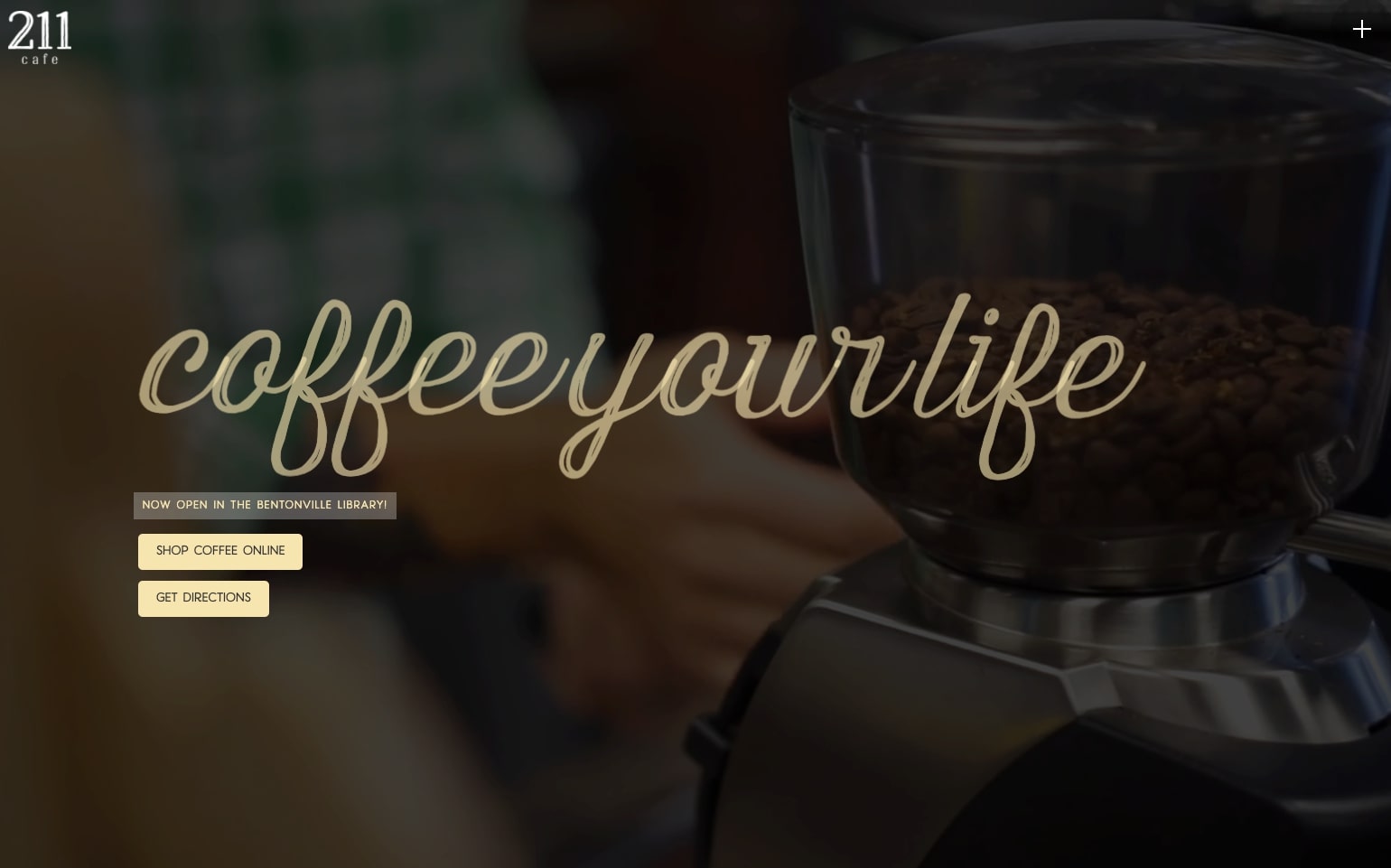
211 cafe is located in Bentonville, Arkansas. Each section of this design captures their true love for what they do. Scrolling down the homepage we learn about the founder, Mauricio, his dedication to Guatemalan coffee, and the cafe’s methods for brewing the perfect cup. The site tells us the story of a coffee shop with a mission to bring their community together.
19. Gooz Catering
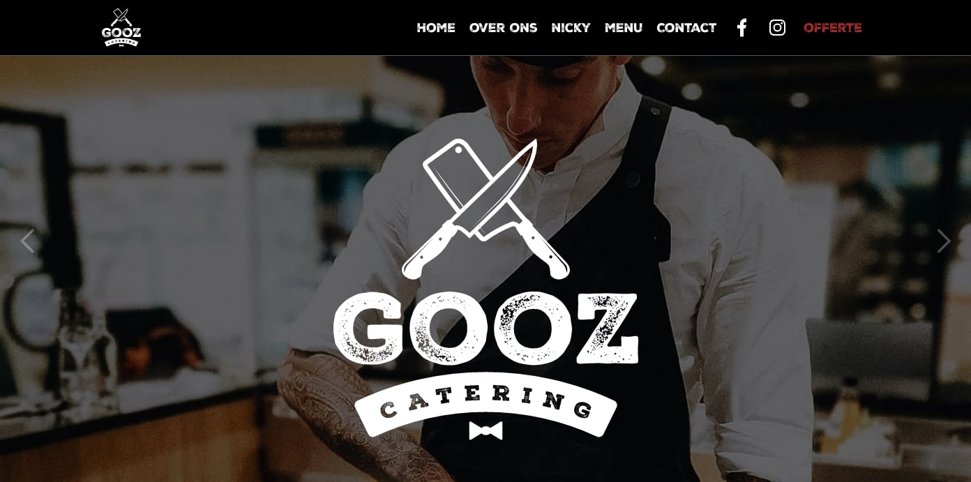
Gooz Catering offers “restaurant-worthy catering for individuals and companies.” This is communicated throughout their site — their chefs, the food, and the company’s interior all show a high level of professionalism. Their nav bar also gives visitors easy access to things like their menu, contact info, and social media accounts. This website design makes the decision to hire them a no-brainer.
Get started on your own restaurant website
Ready to build a standout restaurant website? Explore our restaurant templates and helpful resources to set your online presence apart.
Launch with Webflow Templates
Choose from hundreds of professionally designed website templates for any industry or style. Customize visually, launch instantly — no coding required.