Everybody scrolls — we know that now. But a site design can lead visitors to believe they’ve reached the end of a page, creating what's known as "the illusion of completeness." In this article, we explore best practices to guide visitors through your site and avoid the illusion of completeness.
We’re still scrolling
There was a time when designers obsessed about keeping things "above the fold." But scrolling has become so intuitive that it's a design practice that's no longer necessary.
An April 2018 report from the Nielsen Norman Group supports the claim that we do scroll, but not very far, depending on interest levels. Their data showed that “users spent about 57% of their page-viewing time above the fold. 74% of the viewing time was spent in the first two screenfuls.”
We’re cool with scrolling, but sometimes we need a little guidance.
Lead visitors through a design
Minimalism relies on negative space, but too much of a blank expanse can create a false bottom where it looks like there’s nothing more on the page. People may bounce before they realize there's more content. Though minimalism provides a distraction-free space to highlight content, visitors need cues that there’s content below the fold.
One way to do this is by showing partial slices of what’s to come. Teasing portions of text or images will encourage scrolling.
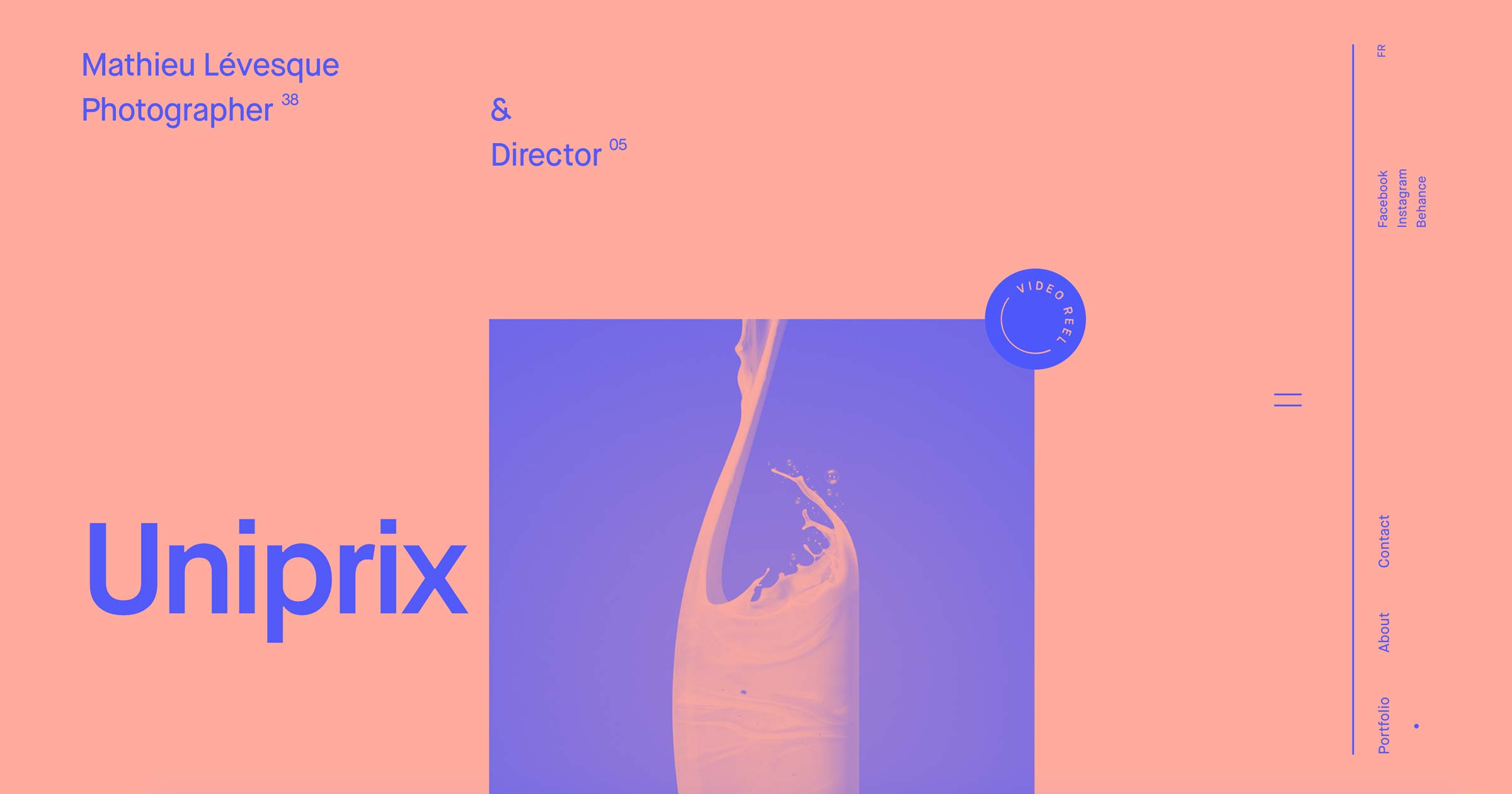
Mathieu Levesque uses this approach on his photography portfolio site. The desktop view on his landing page shows a cutoff image of a glass of swirling milk. We instinctively know there’s more to see, encouraging us to scroll. There’s also animated transitions with the heading sliding into place, signalling the transitions from one block of content to the next.

Cutting off content also works in non-minimal designs. In this layout for the skateboard magazine Thrasher, content is slightly pushed down the page and interrupted by the fold, clearly signalling there’s more to see.

Use graphics and text to provide direction
Sure, an arrow can lead the way, but not all cues need to be so blunt. Something as subtle as a single line can send people in the right direction.
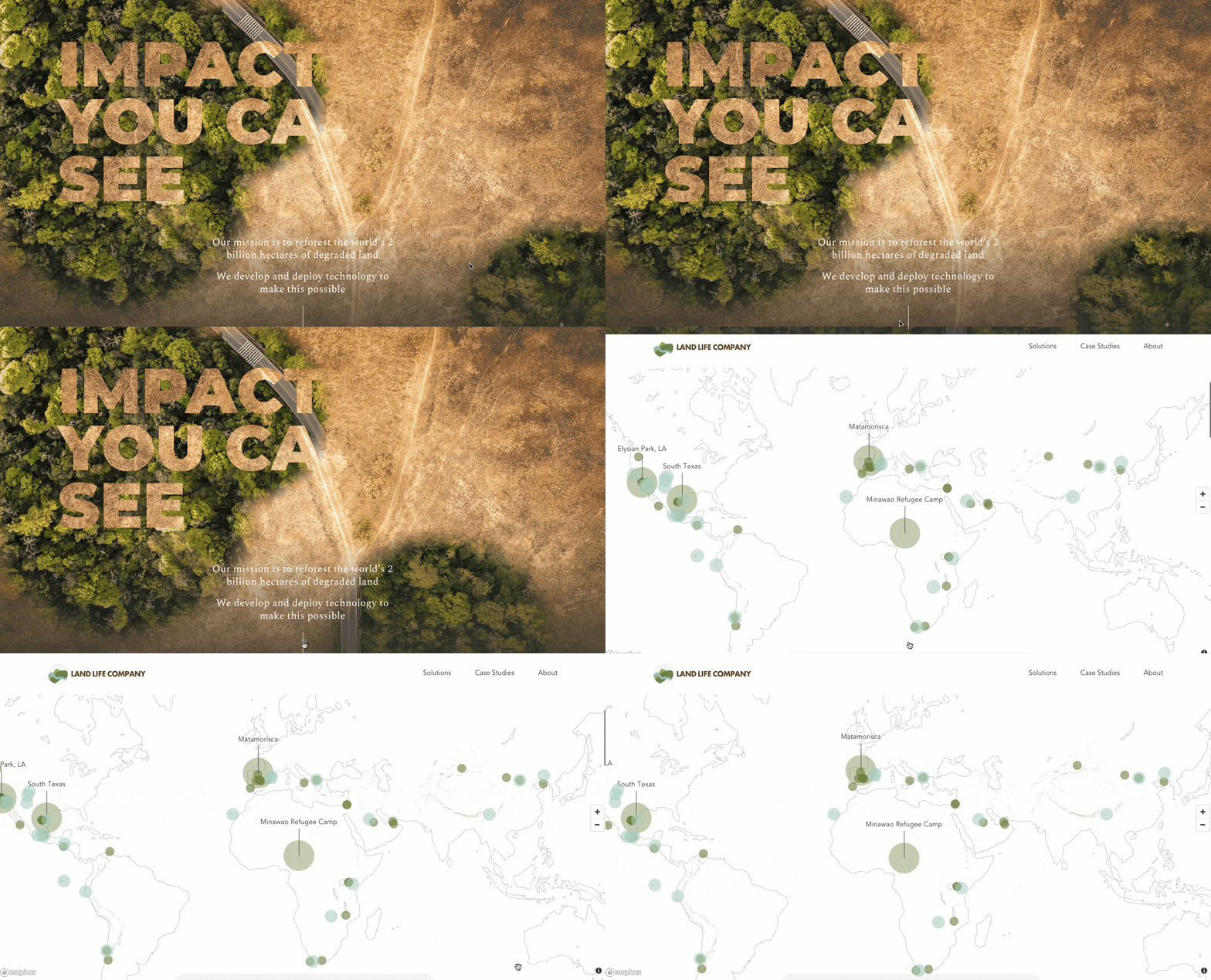
This design for the Land Life Company shows how cues can integrate with the design and still serve their navigational purpose. A single line in the bottom center of the screen signals us to scroll.
Designer André Givenchy uses a small animated icon on his portfolio site to encourage scrolling. This is another example of a graphic cue that’s subtle and effective.

Text suggestions and calls to action can also lead further into a site. The creative agency NOHAU uses the phrase, “See what we can do for you” as an invitation to keep scrolling.


Design interactions and animations without code
Build complex interactions and animations without even looking at code.
Encourage scrolling through animated transitions
Animated transitions add interest, break up the monotony of a page, and give a sense of energy. They also promote scrolling by hitting that reward center of our brains. Animated transitions distinguish one block of content from the next, pushing us to move forward in a design.
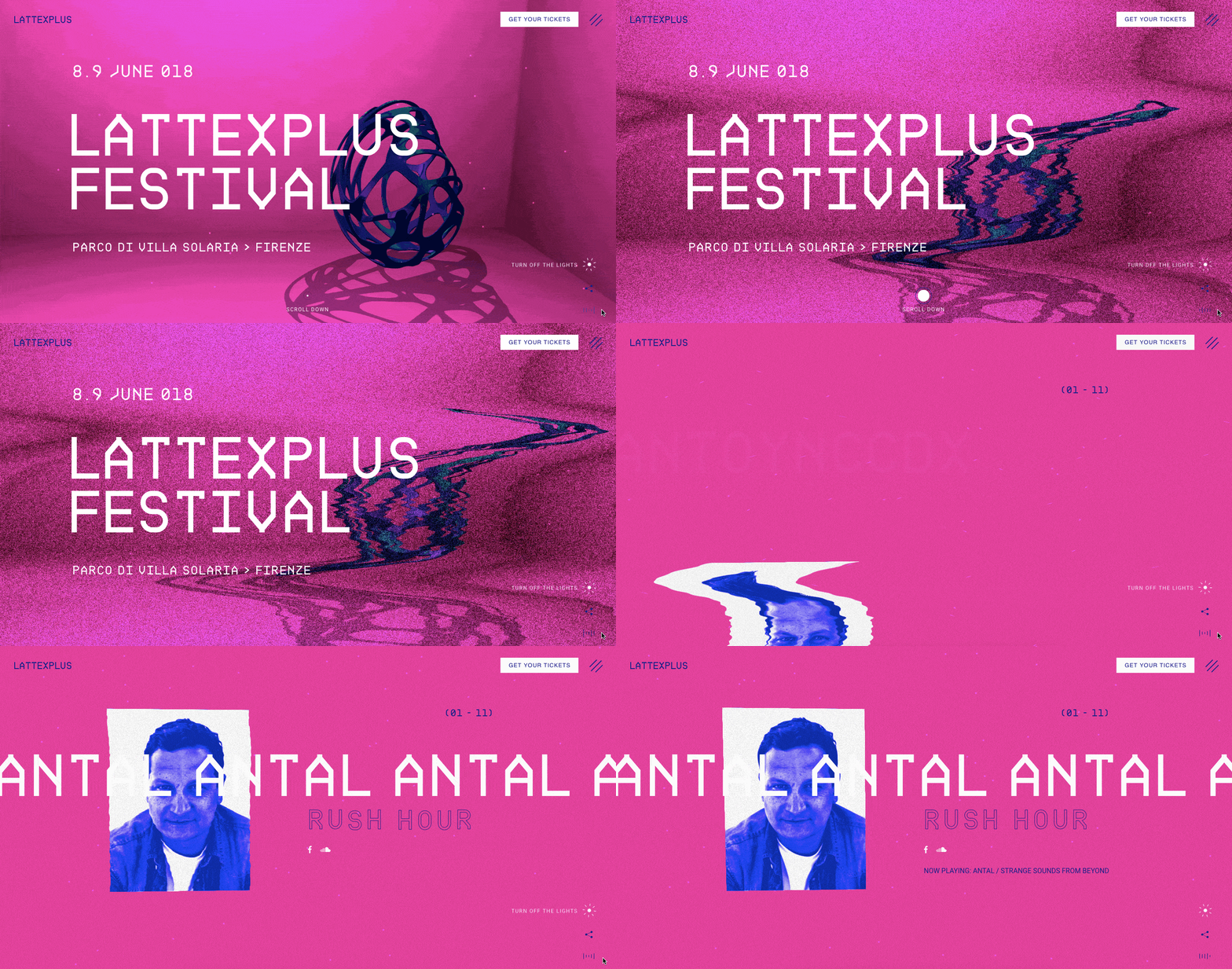
This website for the French electronic music festival Lattexplus uses guiding text to entice scrolling, but it's the animated transitions that really lead us down the page. Each scroll-triggered transition brings up a glitched-out photo of a musical act performing at the festival.
The image shifts and wobbles into position before coming into focus. With the sound turned on, EDM pulses in the background. Transitions from one artist to the next mimic the building anticipation of a DJ’s set.
And while we’re talking about scroll-triggered animations busting through the illusion of completeness, we can’t forget parallax. Parallax gives an artificial sense of depth to otherwise flat designs.
By designing the foreground to move faster than the background, we get a sense of space. And the movement in the layered graphics, images, and text prompts visitors to scroll, revealing more as elements slide into place.
ESPN uses an arrow to persuade scrolling through the subsections of athletes in their best signature moves in NBA history. Scrolling triggers a parallax effect, shifting from one professional basketball player to the next and the decade they’re known for. We get the message that we’re at the end when the word FINALE shows up on the last screen, and downward scrolling gives us nowhere else to go.

Be careful with horizontal layouts
Horizontal scrolling is popping up more and more, but because it breaks free from standard navigation, it can be less intuitive. As with standard vertical designs, animated transitions, graphic cues, and cutoff content are all indicators to get people scrolling laterally.
This design for Proud and Torn, where the focus is on Hungarian history, uses a couple different techniques to encourage scrolling. Cutoff images and a rare horizontal parallax hint that scrolling will reveal more content. There’s also a friendly prompt to, “Scroll normally as we continue horizontally.”
It pays to remember that, no matter how obvious an interaction may seem to us designers, it won’t necessarily be obvious to our audience. A little extra guidance won’t ruin the experience for those who “get it,” but can be tremendously helpful to those who don’t.

People navigating the web are used to horizontal dead ends, with things like carousels signalling a hard stop. Proud and Torn takes us through an unconventional layout that makes it immediately apparent that there’s more content to see.
Beware of using solid, horizontal lines — we’re trained to treat them as the end. A signal to stop.
Let them know there’s a bigger picture
The illusion of completeness gives you the false sense that there’s nothing left to see. It’s like going to the Grand Canyon, walking fifty feet from the edge and thinking, ”Wow! Look at those pretty rocks.” And then returning to your car.
Your design needs guideposts to lead people through the beautiful expanse that is your creativity.


