

Before CSS and JavaScript came together, web design was a bit lifeless, with graphics and content anchored to stationary designs. Interactions 2.0 shook things up even more with a new, wholly visual way to build interactions and animations. Here are 11 examples of IX 2.0 in action that may inspire your own dynamic designs.
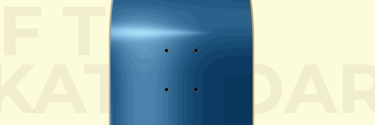
1. Anatomy of a skateboard

We've all heard how important it is for a writer to "show, don't tell." But this same concept also works with web content.
Instead of explaining how a skateboard is put together, a scroll-based animation slides the trucks, wheels and nuts into place, giving us a visual of how it’s done. The animation is smooth and the rendering of the skateboard and its parts captures all the important details. Anyone could put a skateboard together after watching it.
Interactions 2.0 makes constructing these multi-step animations easier. Designers can take a cue and apply these types of animations when assembly is needed. Imagine if IKEA provided animations like this?
It might be a designer's nightmare at that scale. But imagine a world with less profanity, fewer calls to customer service, and happier couples free from the strain of assembling inexpensive, stylish IKEA furniture.
2. Night mode

How many of us are guilty of cruising through the web when we should should be asleep? Our insomnia is fueled by the flickering of screens. Just … one ... more … cat video. Then we’ll sleep.
And it's nice when interfaces accommodate our nocturnal web habits. The navigation on Night Mode has a toggle on the top right that switches the site to ... you guessed it ... night mode. This interaction was created by Webflow's very own Customer Success Team Lead, Waldo Broodryk. It's a thoughtful design touch that helps ease eye strain and make navigation less headache-inducing no matter what time it is.
Another nice touch is the tiny, thoughtful detail of the scroll-triggered zoom that brings focus to the photo. It’s a simple, effective way to keep us engaged, instead of letting us float off to something more interesting.
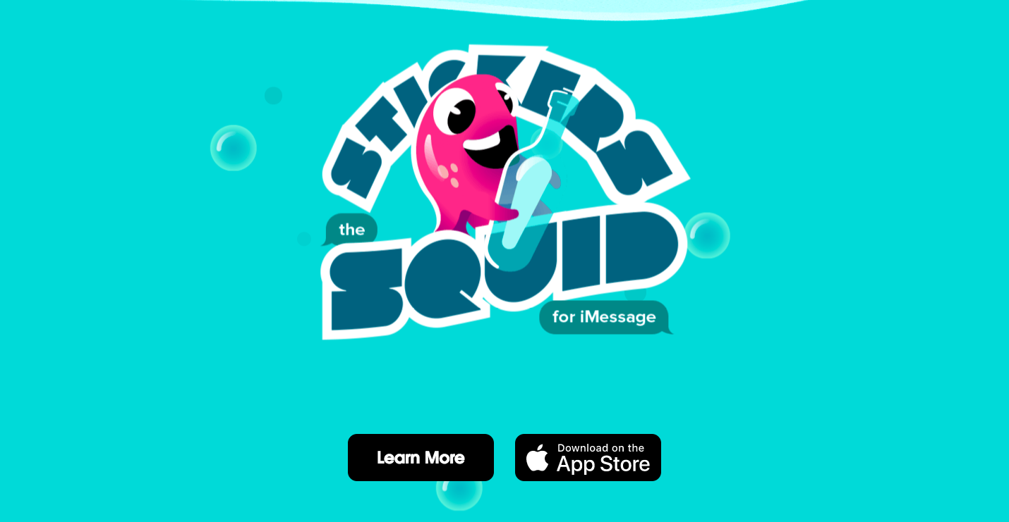
3. Stickers the animated squid
Being well over the age of 30, I'm probably not in the demographic who gets excited about iMessage sticker packs. And that’s okay. I mean, I'm so far behind knowing what's cool anyway — I only recently learned to use emoticons. ;)
But the way to even the most cynical of hearts is through good design. Not only are the illustrations for this sticker set cute and joyfully illustrated, but the site design is also fun to scroll through. There’s a smattering of undulating animations, lending to the aquatic theme. The funny back-and-forth simulated text message exchange is a nice detail. It made me realize what I’d been missing out on by not using emoticons. :(
Forget an octopus garden — I want to be under the sea with Stickers the squid.

4. Ilnur Kalimullin
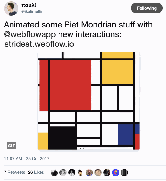
Some artists work in oil, others in pencil. Ilnur Kalimullin works in moving pixels.
This featured animation of a Piet Mondrian piece is especially gorgeous. You may be trying to figure out how he made it. Or, maybe you’re wondering — what's the point? Reader, why do you have to overthink everything? Just be in the moment. Sheesh.
Sit back and enjoy the soothing blocks of color merging into place. I know I am.
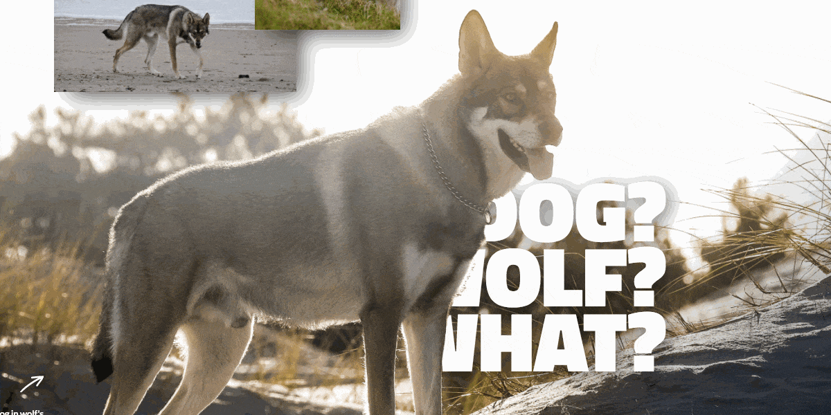
5. Raven Saarloos Wolf Dog

You have a website for your dog, you say? Cute — I’ll be sure to check it out sometime.
Yeah … right.
Wait — your furry friend is named Raven Saarloos Wolf Dog? Well. Now you’ve got my attention.
Raven Saarloos Wolf Dog sounds like something out of a fantasy novel. A dog with name like that must be the leader of an army of anthropomorphic canines bent on the destruction of orc armies and overthrowing the cocker spaniel kingdom. HBO, if you’re reading: I have a show idea.
It turns out that Raven Saarloos Wolf Dog, despite its intimidating name and wild look is actually a pretty chill dog that doesn’t have plans to feast on your bone marrow. He’ll settle for belly rubs and park frolics.
But this cool dog is deserving of an equally cool website.There’s plenty of fantastic photos, bold typography, and parallax motion to bring this long scroll to life.
Now who’s a good boy?


Design interactions and animations without code
Build complex interactions and animations without even looking at code.
6. Aaron Rudyk’s Portfolio

Your design portfolio needs to showcase spectacular work, but the website itself needs to be a demonstration of your design powers. Aaron Rudyk manages both with his online portfolio.
What’s especially cool is the mouseover effect that brings movement to each featured project. Mousing over each project warps the background image. And moving over each angled project straightens it out and pushes it forward. It’s a great engagement feature that highlights Aaron’s work.

7. Cloud 9 Observatory

Kai Jolly hits one out of the solar system with this design that gives a nod to NASA’s Visions of the Future poster series. But unlike the NASA posters, which exist on the motionless medium that is paper, Interactions 2.0 puts this design in an orbit of delightful movement.
The main image is a pyramid on an island floating in space. A mouseover causes it to wobble on its axis, and clicking enlarges it. It’s a smooth action that’s well designed and executed.
Space may be the final frontier, but there are also galaxies of web animations and interactions yet to be discovered by you, brave astronaut of design.

8. Anderson Paak site rebuild

This fan rebuild of Anderson Paak's website would be compelling to look at even if the main image was just a single piece. The organic textures and collage of sun, waves, and graphics look like they were torn from the pages of a vintage magazine and show a dash of eccentricity without going too far. Interactions 2.0 pushes this design forward.
Animating different layers that react to the cursor stirs the graphics, creating tiny swells of movement that keep Anderson Paak floating above it all behind his piano. This is the type of interaction that requires thought and planning, but the payoff is big in pulling off a creative user experience.
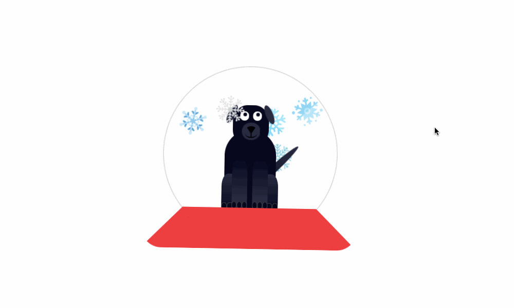
9. Snow Doggo
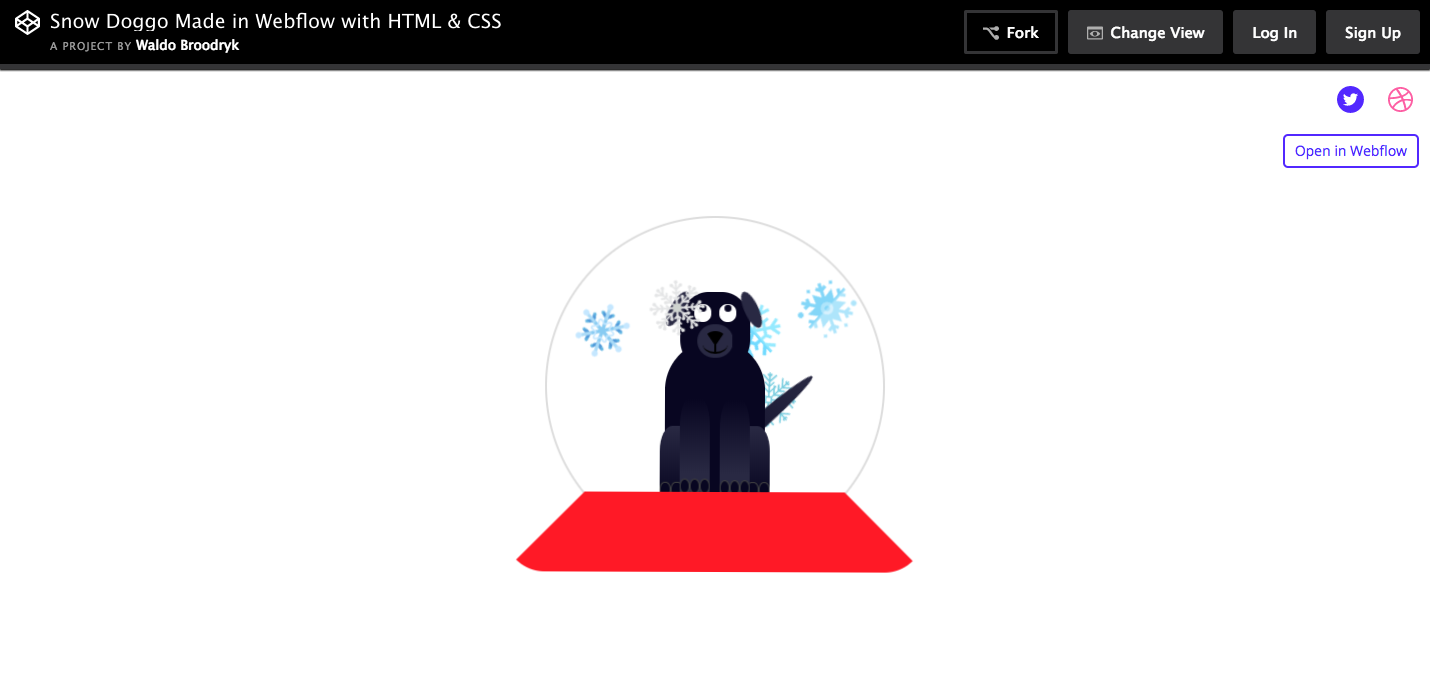
This is the type of animation I’m sure Waldo Broodryk had fun creating. Snow Doggo is an original take on a snow globe, placing a dog in the center of the wintery action.
What's neat is the cursor-tied movement of the animation. Moving it around shakes the globe, and the dog's eyes follow the cursor. This makes for an amusing and inventive interaction.
10. Mr. X Energy Recovery Drink

For those that shred the gnar and get rad on a regular basis, Mr. X has a drink to help you recover. Mr. X knows their demographic, and the designer proves they’re no poser by pulling off a clean layout of red, white, and black. It pops harder than a kickflip on a skateboard.
There’s so much that’s cool about this design. First, there’s the background video, where black and white footage of skateboarders, snowboarders, and others are doing their thing. It’s well shot with exciting footage capturing the spirit of freedom in these action sports. This combined with some cool parallax movement and tasteful microinteractions makes for a fantastic design.

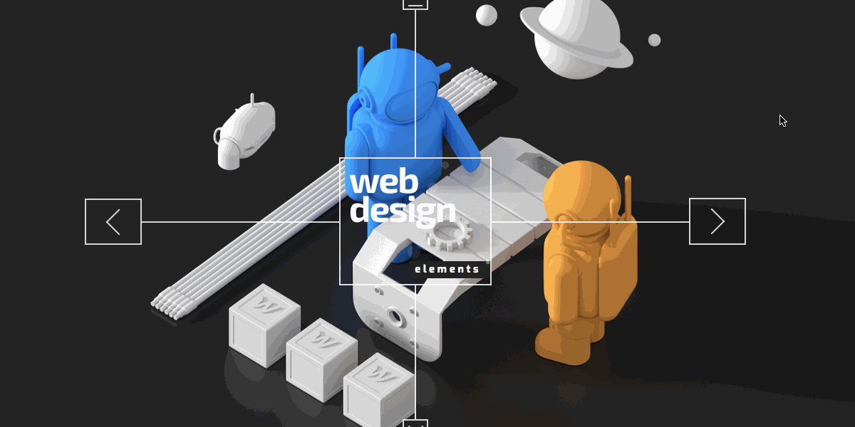
11. Kai Jolly Web 3D

Another superb design from Kai Jolly!
How many of us have taken the long scroll through web design concepts in our journey to learn more? So many concepts. So many blocks of content. But what if there was a better, more engaging way to present them?
Kai Jolly does just that on Web 3D with his interactive menu of web concepts to choose from. With beautifully rendered 3D graphics combined with dynamic elements like hidden panels and astronauts whose colors shift with the movement of the mouse, this is a super fun and educational project. Interactions 2.0 are so effective in turning material that might otherwise be dry and boring into something unique and entertaining.
Let interactions 2.0 help you create new web experiences
Design is always evolving and Interactions 2.0 is here to push it forward further. But like any design trend, it’s important to use them thoughtfully, with purpose. It's nice to have a new, shiny tool in our toolbox, but let’s not lose focus of usability. (A moment of silence for our dearly departed friend Flash. May you rest in peace.)
Let Interactions 2.0 inspire and engage, elevating your content from a static canvas to something alive and dynamic.
If you’ve come across some inspiring examples of Interactions 2.0 in the wild, we’d love to hear in the comments below.