A website is not a static brochure. It offers all kinds of opportunities for animation and interactivity. But just because you can animate everything, doesn't mean you should.
The internet constitutes a completely different form of media, the fastest-evolving form we’ve ever built. Just load up a 90s-era website like Space Jam, and compare it to the site you’re on right now.
Big difference, right?
You’ll probably notice that the use of white space, typography, color, and imagery has drastically improved over time. Thankfully.
What you might not notice at first glance is the addition of motion. Page elements animate into place. Links change colors. And buttons grow, glow, and move to-and-fro as you hover over them.
The power of dynamism
Unlike graphic designers' work, your designs aren’t static — they’re dynamic, shaped by how people use interact with them. That’s what sets web design apart.
So now that we have this dynamic power, should we start making everything spin, twirl, bounce, and change color? Absolutely not. That’s like adding a new sound and transition effect to each slide and bullet point in Powerpoint. Nobody likes that guy.
The real question is: how can we effectively add animations and interactions to our designs? Let's find out.
Effective website animations and interactions possess 5 qualities. They’re:
- Subtle – Animations should enhance, not dominate. Visitors should barely even realize they’re happening.
- Natural – Animations should look and feel natural, not robotic and jarring.
- Informative – Although you should always strive to make your designs self-evident, when you’re trying something new, animations can provide subtle cues to provide context.
- Rare – If everything’s moving around and demanding attention, nothing will get it.
- Fast – Slow animations can make people think a site’s broken or non-responsive, leading them to bounce.
Let’s explore each of these points in more detail so you can make the most of your animations and interactions.
Animate subtly
Good design is obvious. Great design is transparent. – Joe Sparano
It always astonishes me that something that takes countless hours of tweaking to get just right can be digested in seconds.
“This is great. When can we launch?”
They just glanced at it, and they liked it. It didn’t require thought.
But that’s the ideal end result with design. A fantastic design is subtle. People shouldn’t even notice your animations consciously.
So why add animations if people aren’t even supposed to notice them? The key word is consciously. Because your visitors' subconscious minds definitely notice animations. Effective, subtle animations make your site feel better and more sensible. Animations should enhance the interaction without overpowering the content.

The best designs get out of the way and let people do what they need to do as easily as possible.
Interactions should match the tone of the site
Your animations should always match the aesthetic and tone of the site you’re building. If you’re building a site for kids, you can be more showy and bouncy. If it's for a luxury watch brand, be subtle and elegant.

Animations should be au natural
Animations should never be linear. Linear animations are jerky and awkward. They remind people of robots and machines, and are anything but natural. They’re actually a bit uncomfortable to watch.
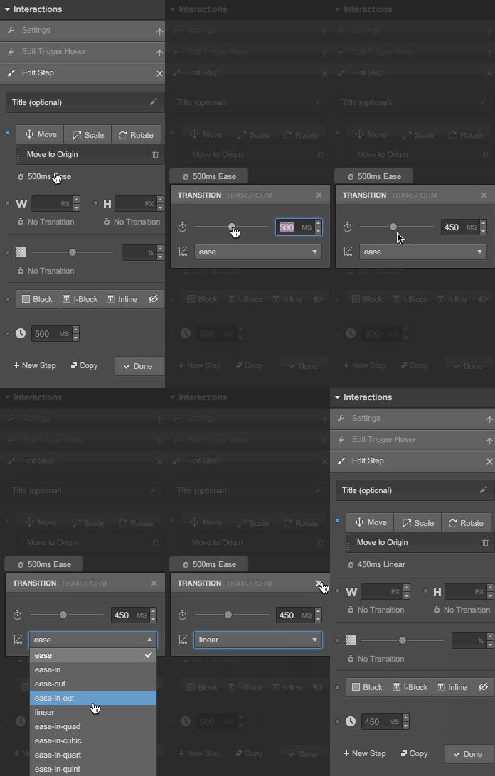
Instead, make your animations and interactions smooth, and their easing (their speed over time) natural. For example, an easing of “ease-in” starts slowly, and accelerates until its end. An easing of “ease-out” starts abruptly, but slows down near the end. Linear easings have a uniformly increasing speed throughout the animation.
Keep it natural by using more natural easings like “ease,” “ease-in-out,” and more complicated ones like “ease-in-sine.”

Interactions and animations should be informative — not just special effects
Your site isn’t a Transformers movie where explosions, giant robots, and Megan Fox cover up a simplistic, rehashed plotline.
Your sites serve a purpose: either to convey information or enable a transaction. So your animations should help your visitors’ with these tasks, and not just be overt flourishes designed to wow them.
Sites full of whiz-bang animations exist, and they can be really cool, but clients rarely pay for them. Instead, they’re built by designers and developers playing around on a Tuesday night. If the site's for a client, stick to informative animations.
But what’s an informative interaction? An informative animation enhances the user experience (UX). For example, buttons and links should should let people know they’re clickable. It helps remove the guesswork.
Motion draws the eye. That means animations can also be used to guide visitors to the next step or inform them of something potentially tricky.
In a perfect world, your sites will be clear as day on every page. But if you’re doing something a little different, like a full-height hero section, then some sort of visual cue—like a subtle arrow bouncing on the bottom of the page—can be extremely helpful.

Animate sparingly
You can’t be subtle or informative if everything has some sort of animation. This is especially true if you make each animation unique.
For example, if you animate page elements into place as you scroll down a page, then don’t make the first one fade, the second slide, the third one spin, the fourth one checkerboard.
Just make them all the same. If you must add variety, have page elements on the left of the page slide in from the left, and those on the right slide in from the right. Animate similar elements in a similar fashion.
And only add a hover interaction on an element when people can actually do something with that element. On-hover animations are just confusing if you can't actually click, drag, or do anything with that element.
In other words, only add an animation when it actually helps your visitors.
Don’t keep people waiting
People have no patience on the internet. Every second of delay on page load decreases customer satisfaction by 16% and reduces sales by 7%. Making people wait can wreak havoc on a site’s profitability.
And people don’t get any more patient after the site’s loaded.
Note: Want to keep visitors on your site? Learn how to boost your site’s performance.
What does this mean for your animations and interactions? They should be fast.
After all, no one’s going to hover over a button for 2 seconds, no matter how dramatic your rollover effect looks.

Okay, maybe some will—the first time. But what about the third time? Or the twentieth? Think they’ll still have the appreciation and patience for a slow animation then?
Same goes for the complex, multi-stage loading animations and introductions we used to build in the days of Flash. Nobody wants to sit through those. People use the web to find the information they need, or the product they want, and then move on with their lives.
TL;DR: Keep your animations below 500ms in duration to keep them snappy.
Now go forth and animate!
Open up one of your current projects and start using these tips to improve your animations and interactions. It’ll make a difference.
Interactions done right truly take a site from good to great. They take advantage of the unique power that websites have over print media by making it more real and engaging. And clients and visitors alike really love them.
Note: To learn more about adding animations to your page using Webflow's visual web design tool, check out our course on Webflow interactions.
Have some great examples of animations and interactions done right? Tweet 'em at us!


Design interactions and animations without code
Build complex interactions and animations without even looking at code.


