Scrollytelling transforms a longform story into an interactive experience. Audio and visual content adds a deeper layer of meaning, communicating what can’t be captured with words alone. Scrollytelling rolls out the details of a story in an engaging way to keep people reading. It uses what's great about the web to tell compelling stories.
Scrollytelling: when you want to tell a story rich in details
Scrollytelling is especially well-suited for a story with a distinct chronology. As events unfold, you can use the design to make the who and what come alive. Scrollytelling can be thought of as visual storytelling that heightens a story and hooks you into its narrative. Borrowing from one-page and landing-page layouts makes the details dance and prompts you to scroll further.
We’ve gathered some of the best examples of scrollytelling and resources to help you create your own.
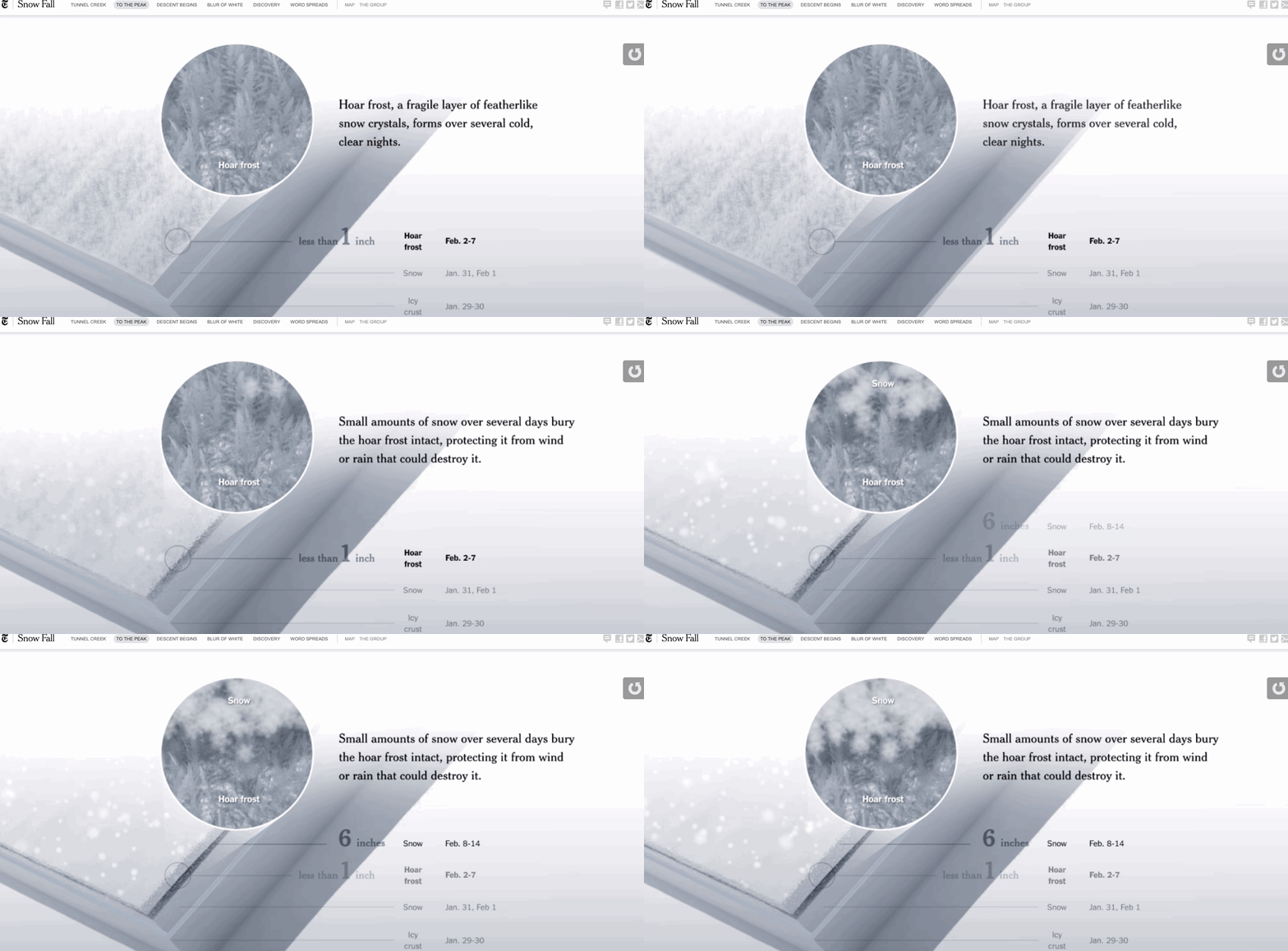
Snow Fall: The Avalanche at Tunnel Creek

Snow Fall: The Avalanche at Tunnel Creek is a scrollytelling masterpiece. It’s the harrowing tale of a Washington avalanche in 2012. Each part of this story has its own individual page, broken into manageable blocks.
It’s a compelling read with accompanying audio and visual media to offer a much bigger picture of what happened on that tragic day. Not only do we get to read the stories of those involved, we also get to learn about the terrain and weather conditions that led to this avalanche.
It’s a multimedia approach to storytelling that unpacks what went wrong and what pushes thrill seekers to careen through untouched powder, despite its dangers.
Millennials are screwed

Okay, Gen Xers. I know we've all made jokes about millennials — avocado toast, Coachella, and the word "literally" all make for easy fodder. But this generation actually does face some heavy challenges. Millennials are screwed shows us the world through the eyes of this younger demographic to get a clear picture of what they’re up against.
Told by a millennial himself, the story combines humor with concrete information about the financial struggles they face. There’s plenty of humor combined with the sobering realities of this generation.
The story is told with the help of nostalgic video-game animations, pixelated graphics, and other wacky visuals. It captures the quirky sensibilities of millennials while remaining accessible to those bewildered by SpongeBob SquarePants memes.
One can’t help but have more compassion for millennials after reading this essay. It’s a good example of using smart, interesting web design to connect with a larger audience.

UTC is enough for everyone... right?

For most of us, the subject of universal time codes (UTC) isn’t a particularly compelling topic. But Zach Holman created a website explaining how they work and the complexities of programming with them. His site includes plenty of wit and the occasional, creative use of profanity.
There are pleasing shifts in color and monochromatic background videos that break up the content. It's offbeat, but not off-putting. The mesmerizing clash of colors grabs your attention and keeps you wondering what dazzling visuals will come next.
Anyone who’s read any sort of technical programming piece has probably been lulled to sleep. This essay proves that creativity and great storytelling can bring even the driest of topics to life. For those not interested in programming, the information on time is a fascinating read.


Why your design team should use Webflow
Discover how design teams are streamlining their workflows — and building better experiences — with Webflow.
Web design and art history
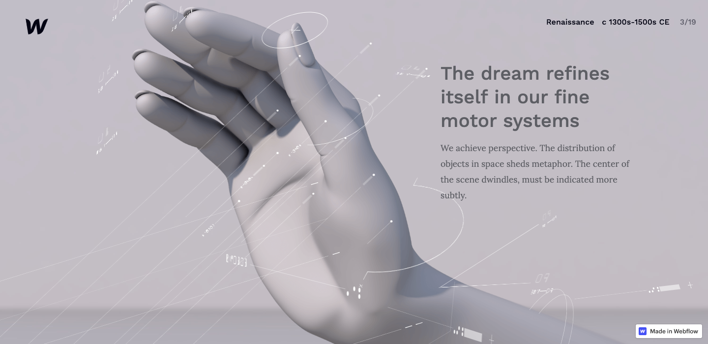
Scrolling through our very own Web design and art history piece is like spending time at a museum. Each section is like a gallery branch, curated works showcasing the breadth of a given art movement. Here, the evolution of art is explained.
Since web design and the visual arts share a common language, a familiarity of art history can inspire and inform your own work. We went all out writing informative content and including beautiful visuals and animations. If you’re interested in art and design, this essay is a fantastic primer.
The History of the Web: Interactions 2.0
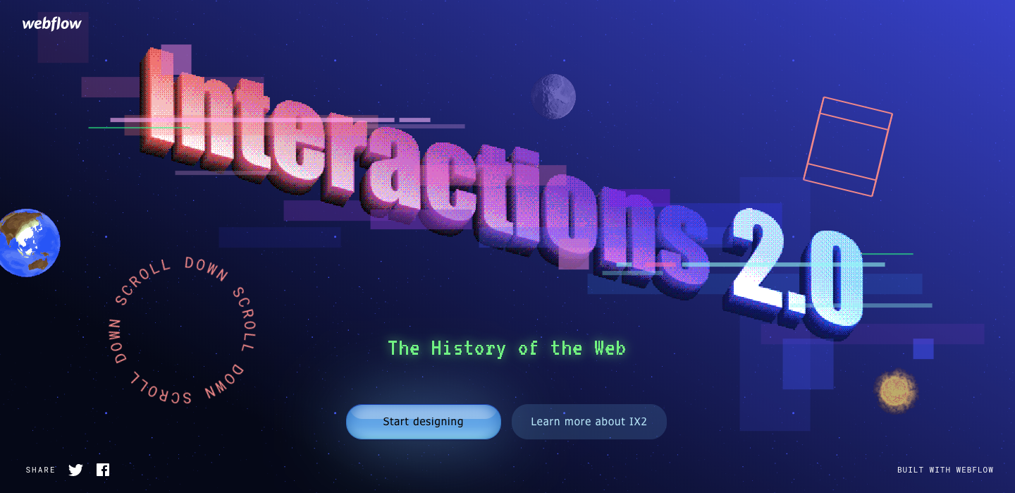
Scrollytelling breaks away from the confines of traditional storytelling and uses good web design to get creative.
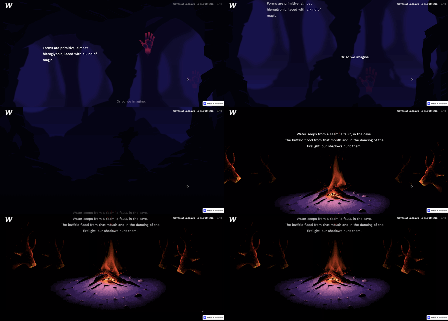
Our Introduction to Interactions 2.0 takes you from the beginnings of the web to “a 100% visual way to build animations and interactions for the web, pushing the limits of what can be built without code.” The site includes so many delightful, cheeky references to Geocities. Oh, how far we’ve come!

Time in Perspective
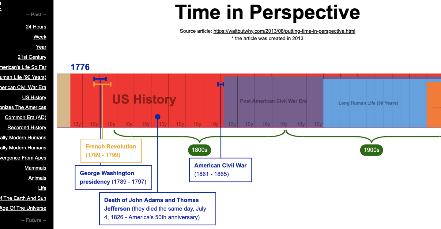
Scrollytelling is the perfect medium to tell a linear story — and what’s more linear than the march of time? From 24 hours to the end of the universe, the scroll triggered animations in Time in Perspective stretches the timeline, reveals milestones, and shows how each era fits into history. This is a great example of using web design for more than just marketing. Design is a powerful tool to educate in innovative ways.

If the Moon Were Only 1 Pixel

If the Moon were only 1 pixel is a horizontal scroll that rockets you through the vastness of the universe. Josh Worth made the site after struggling to explain to his daughter how long it would take to get to Mars, wondering if he could use a computer screen to map out space. The site does a beautiful job of focusing on the emptiness of space, helping us understand just how far-reaching our universe is. Josh used a single pixel to represent the moon and shows everything in relation to it.
This project is another brilliant example of how good design can make learning engaging.

Islamic State Tracker
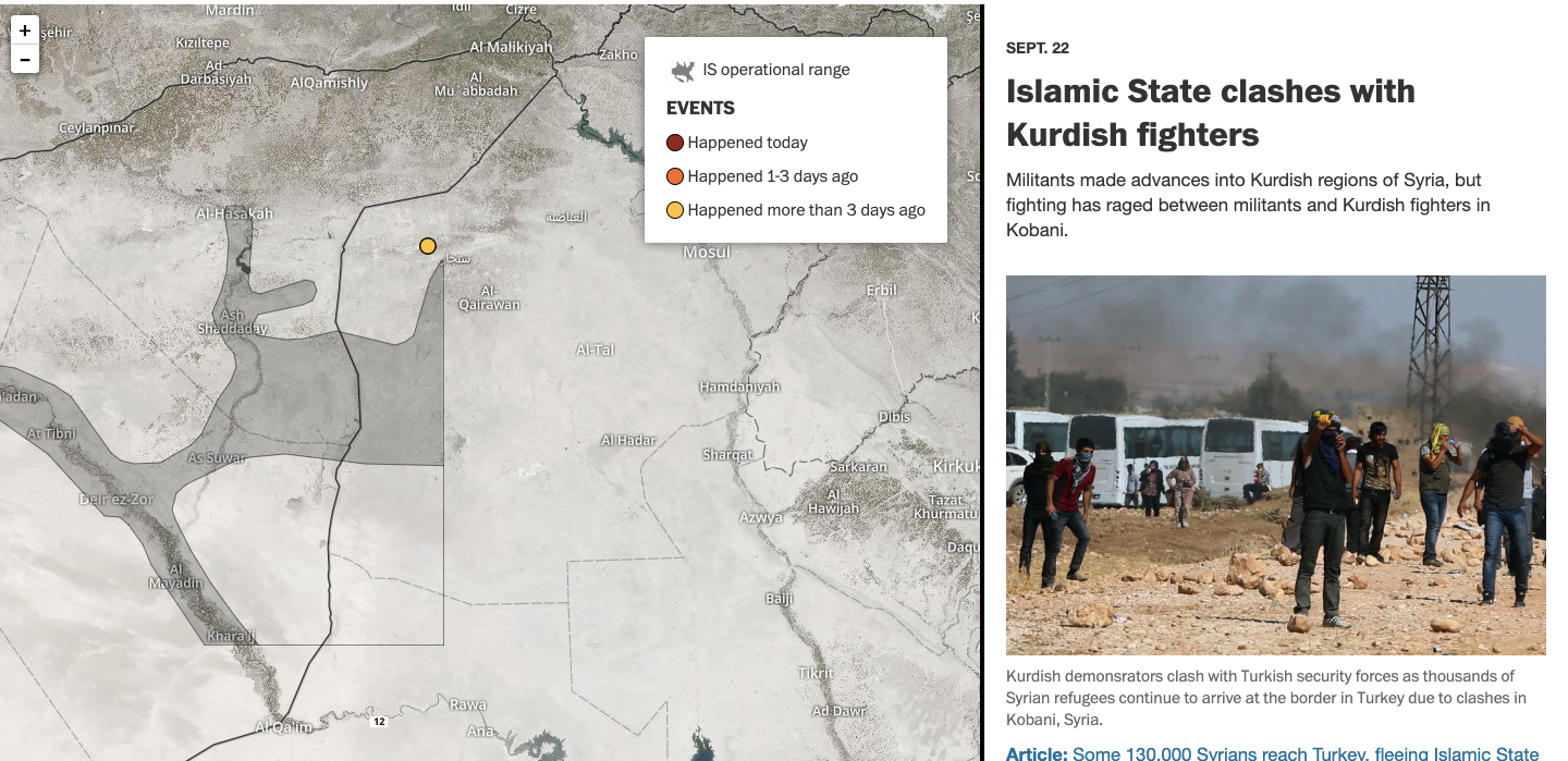
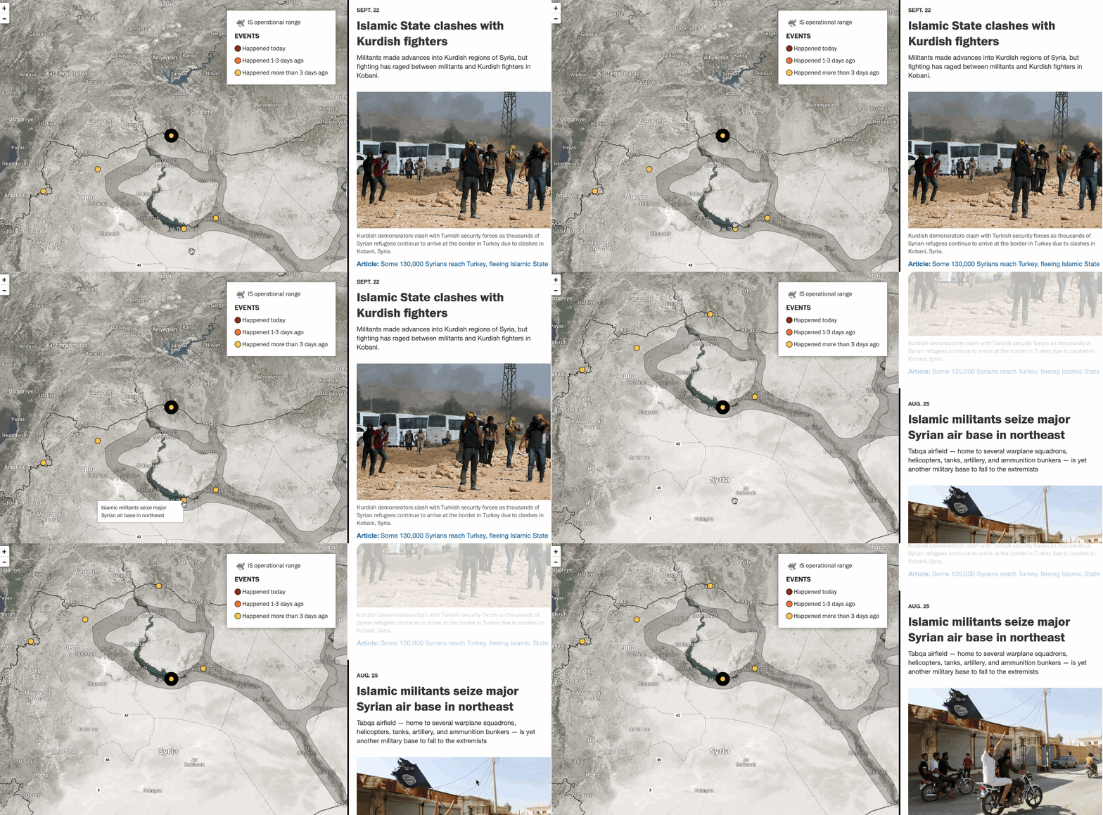
There’s so much news that comes our way. And with this mass of information, it can be hard to stay current. The Islamic State Tracker from the Washington Post shows the history and current developments of the Islamic State.
The right side of the screen scrolls through a timeline of stories while a map on the left side of the screen highlights where they happened. Clicking points on the map brings you to the specific story of that location. Mapping the location to each event gives a more in-depth picture of each region.
Ali Wong Structure of Stand-Up Comedy
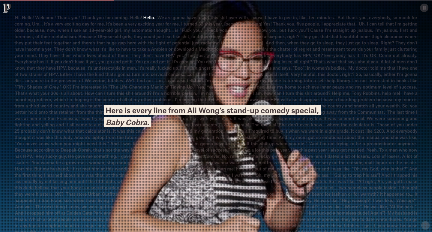
Mark Twain may have famously said, “Explaining humor is a lot like dissecting a frog, you learn a lot in the process, but in the end you kill it.” But sadly, for old Samuel Clemens, he didn’t get to see the digital age.
We talked earlier how scrollytelling can be used for stories that have a strong timeline. A comedy performance is a narrative where pacing and buildup matter as much as the actual jokes.
Ali Wong Structure of Stand-Up Comedy is an analysis of Ali Wong’s recent comedy special, Baby Cobra. It’s analyzed moment by moment, joke by joke, to show where the biggest laughs are. It’s a fascinating study in how timing and set up are key to land effective punch lines, and gives us insight into what makes Ali Wong such a brilliant writer and performer.
Scrollytelling tools
We've seen how scrollytelling can be used to tell different types of stories, and some of the design practices they incorporate. To help get you started with your own scrollytelling, we've gathered some tools to help you out. Webflow is the perfect choice for your design work if you wanted to try it out while you’re at it.
Parallax movement on scroll
Elements that move at different speeds as someone scrolls is a way to create the illusion of depth. Parallax is a simple effect to create dimensionality and movement in your story, prompting people to keep moving.
We used parallax scroll for these geometric shapes in “Web design and art history.”
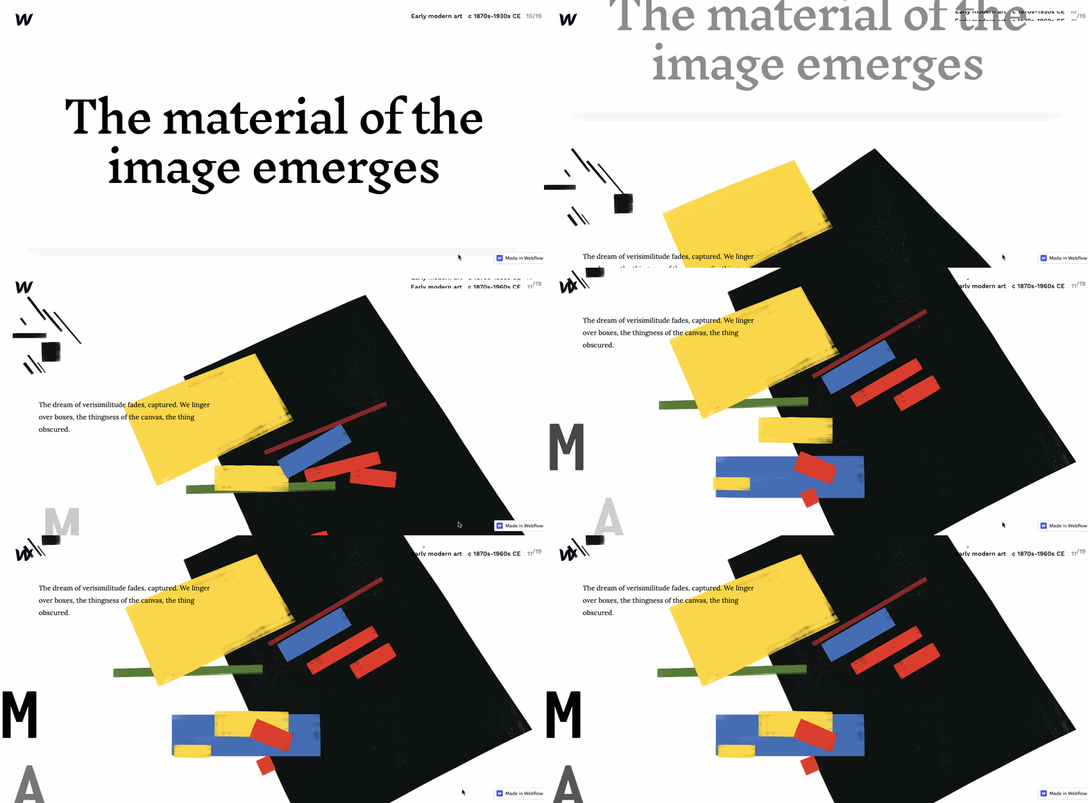
Check out this parallax tutorial to get started on your own.
Scroll progress indicator
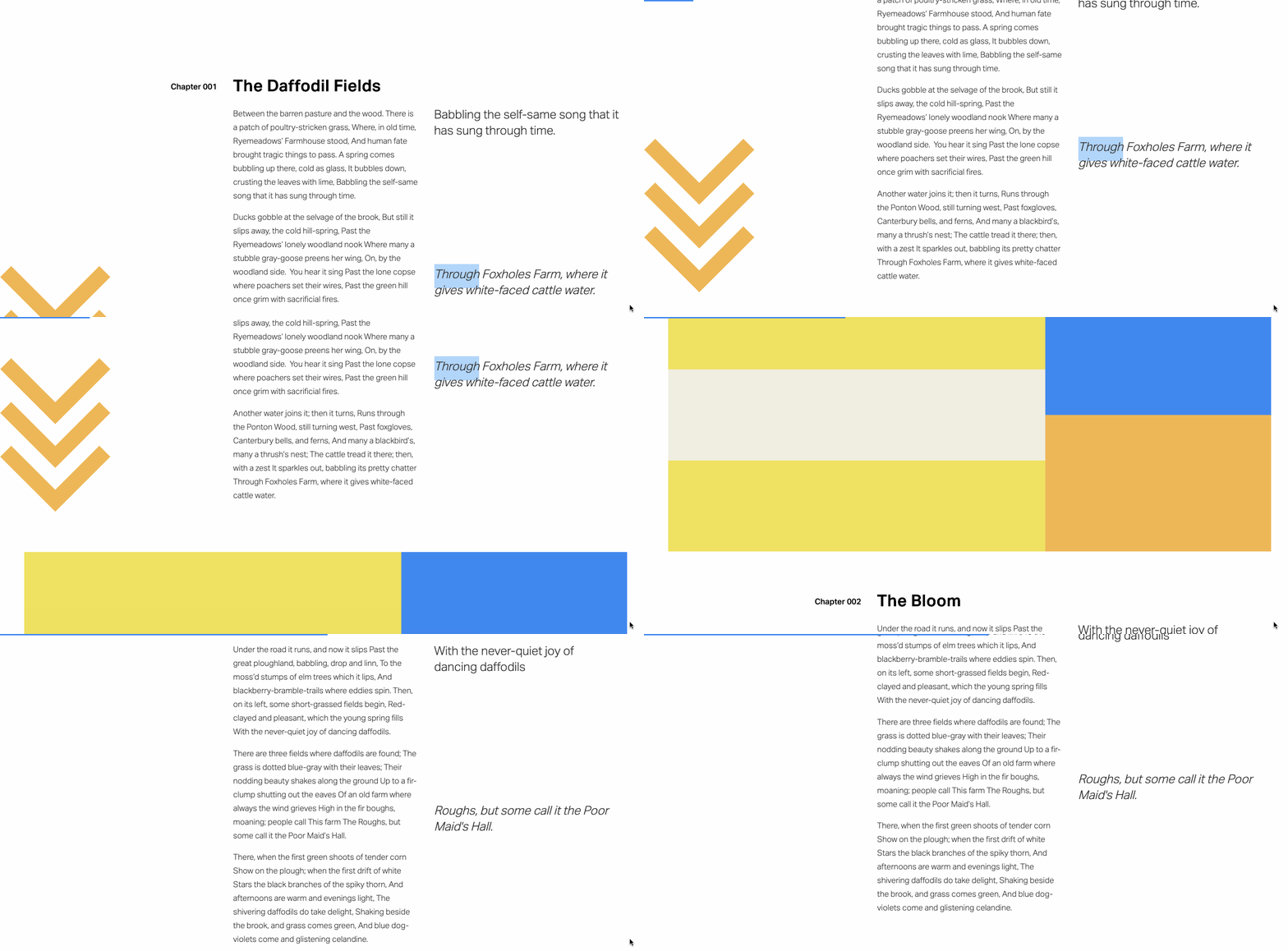
Using a scroll-triggered progress bar in your design is a way to show people where they’re at and keep moving them forward. This blue progress bar stays anchored to the top of the page with a smooth animation that stretches out from 0 to 100% of the layout. It adds motion to the design and makes for better navigation.
Check out our scroll progress tutorial to learn how to create your own in just a few steps.
Reveal elements on scroll
When a design has too much static content, it can be tiring to read. With scrollytelling, where longform stories are being told, animations offer a nice break from text and photos. The fade of visual elements adds a burst of motion.
The effect can be applied to text or visuals. We use this effect in our Graphic design archive, signaling the beginning of a new block of content.
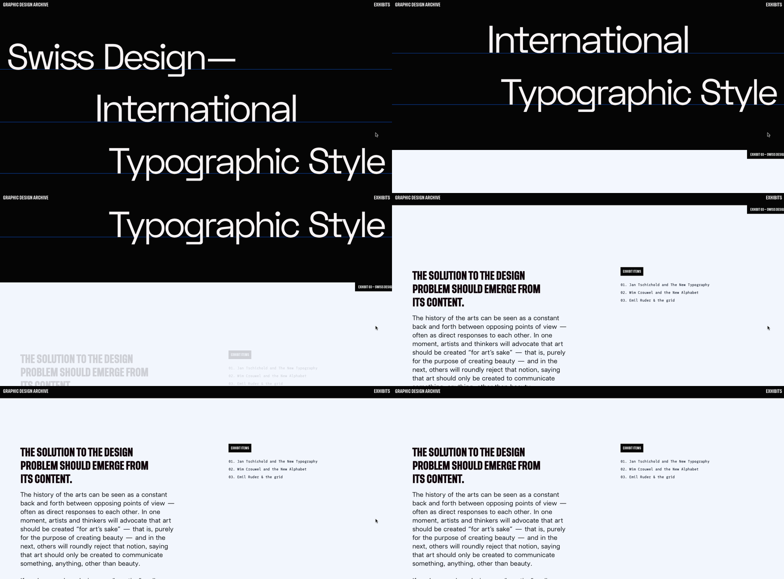
Should you reveal elements in your own design work? Definitely! Check out our tutorial to learn how.
Horizontal movement on scroll
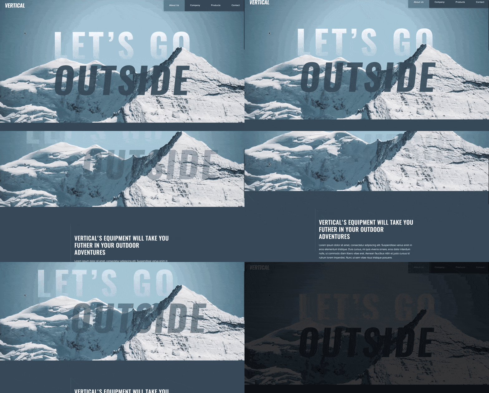
Whenever you have a design element that's sitting idle on the page, like a title, why not give it some pizazz? Horizontal movement wakes up these sleepy design elements and gives them purpose. Take the above example above from our tutorial. The horizontal movement signals the start of the story and makes “Let’s Go Outside” have more of an impact.
It’s easy to do — check out our tutorial on creating your own horizontal movement effect.
Horizontal scrolling
Horizontal scrolling can be a nice change. It brings attention to your content and breaks free from a typical vertical layout.
Proud and Torn, a website about Hungarian history uses horizontal scrolling to highlight the different eras it covers.

And to refer back to our own art Web design and art history piece discussed earlier — we use horizontal scrolling as another way to keep people active and engaged.
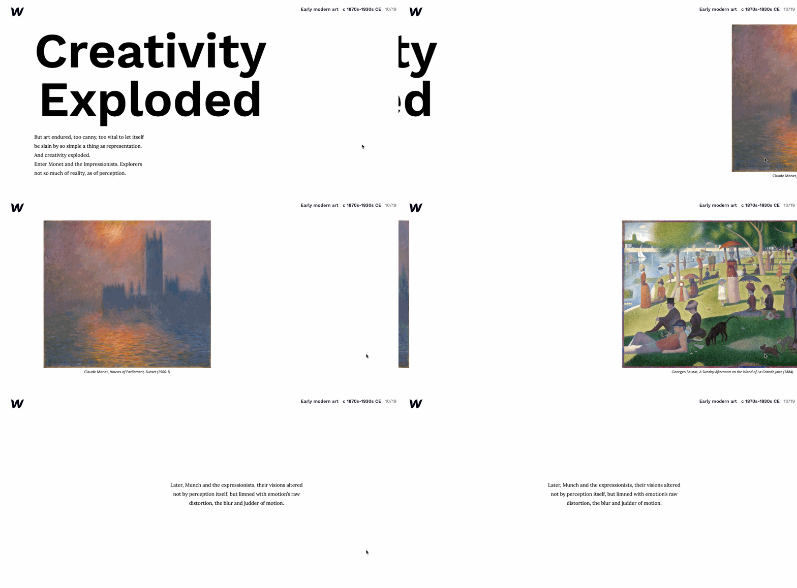
Our tutorial on horizontal scrolling will get you started on using it for your own design.
Position sticky

From the Pudding, the same website that created the Ali Wong comedy piece, comes this tutorial about creating a position sticky effect. Position sticky takes an element and stations it in a design temporarily, bringing attention to it. After a bit more scrolling, it’s then released from its position. We’re fans of tutorials that break a process down in an easy to understand way. And it’s all done through scrollytelling.
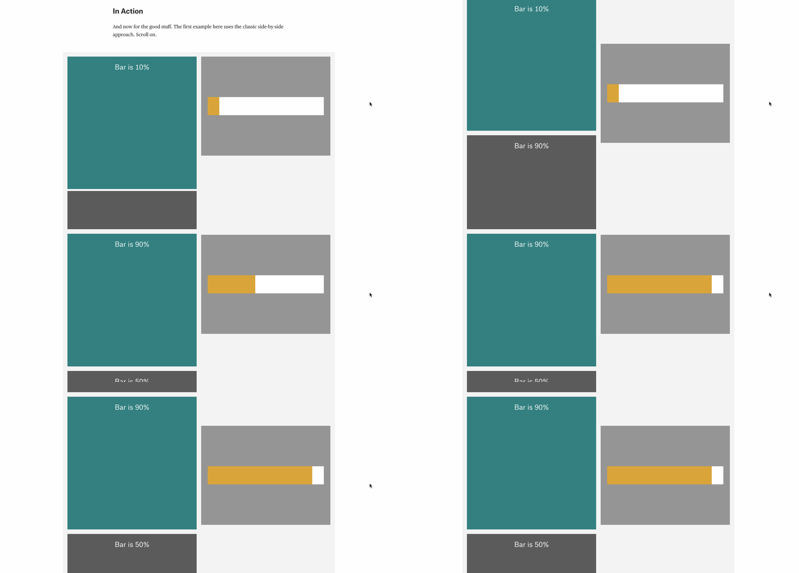
Creating a sticky sidebar
Okay, so we just talked about a position sticky. But what about making a sticky sidebar?
After a bit of a scroll, the sidebar takes a set position. You could use it to contain navigation to other parts of a story, or to different parts of the website.
Transforming a sidebar into a sticky sidebar isn't too complicated. Take a look at this quick tutorial to put the power of a sticky sidebar into your own designs.
Web design lets you tell a story in more imaginative ways
The web has transformed storytelling. With animations, visuals, and interactivity, reading a story no longer needs to be passive. Scrollytelling is a multimedia experience, provoking deeper thought and understanding. It illuminates what can't be communicated by words alone and makes the reader an active participant.
Inspired to tell a story of your own through scrollytelling? We’d love to hear about it in the comments.
