Into every designer’s life there eventually comes the request: “Could we get a carousel on our homepage?”
They may call it a carousel, slider, slideshow, or gallery. They may not even know what to call it. But whatever word comes out of their mouth, you know immediately what they mean. (And for most of this article, we’ll use carousel, just to keep things clear.)
If you’re like many designers, you give a quiet little groan. Or whatever your preferred expression of existential fear and loathing might be.
But never fear! We’ve got some tips on how to:
- Persuade your clients to forget they ever had such an idea
- Failing that, how to design a carousel that doesn’t ruin your carefully crafted UX
So let’s get going, shall we?
How to convince your clients not to use a carousel
Before we dig too deep here, please know that there’s no accounting for taste, and your client may well insist you use a carousel on their site. That’s okay. It’s their site, not yours.
But they can’t blame you for pointing out that:
- A carousel’s design and frequent movement can make people think it’s an ad, leading them to ignore it.
- Moving elements can negatively impact accessibility, especially for those with motor skill issues
- Many people can have a hard time reading all the text before a slider advances
- Since each slides’ content is only visible some of the time, content may easily be missed
And maybe most importantly: people expect control over their UIs. Taking that control away can ruin an otherwise lovely experience.
If your clients or stakeholders insist on having the carousel, you can suggest that they keep an eye on performance of this element over time. If it doesn’t get all the clicks they’re hoping for, you’ll have a strong argument for replacing it.
Now, on to some dos and don’ts if you end up having to use a carousel.
Dos and don’ts for carousels
When your client or team just won’t budge on using that carousel, it’s worth keeping a few dos and don’ts in mind, so you don’t derail your site’s overall user experience.
Let’s start with the do nots!
Don’t use a carousel...
In your homepage’s hero section
As mentioned above, a homepage carousel at the very top of your website can severely hamper a visitor’s very first experience of your site — arguably the worst time to do it. And beyond all the issues of findability and accessibility mentioned above, there’s a potentially bigger issue:
Brand confusion. As soon as a visitor hits your website, they should be able to tell what your company’s all about. Typically, that means having a single, clear message that’s easy for your target audience to understand. If you replace that single, clear message with a multiplicity of ideas, well, you’re just upping the chance people won’t understand what your company does, and worse, decrease your conversion rates.
In articles
Many clickbait-y sites use carousel-like designs to “chunk” their “articles” into bite-sized pieces you have to click through to read the entirety of.
Surely someone thought this was a very clever way of ensuring more ad views per page of their website. But like most methods of increasing ad views, this just results in a terrible, unnecessarily laborious experience for the people a content site is supposed to be serving: the readers. Plus, let’s not forget about banner blindness.
Don’t. Just. Don’t.
When it’s for the company, not the “user”
I define the goal of web and digital product design as “finding the point where user need and business need intersect.” All too often, people call for a carousel for business needs alone, not user needs.
If the person asking for a carousel can’t explain why using a carousel is good for your website visitors, it won’t be. Instead, it’s likely driven by a desire to improve some important internal metric (like ad views) rather than any interest of your users’.
Of course, we’re all trying to improve internal metrics. But it shouldn’t come at the cost of irritating people.
Let it become a dumping ground
All too often, a website’s carousel becomes the place where everything that people want on the homepage, but can’t add more permanently, goes to die.
This carousel content is rarely added with a clear intention of solving a user need, and therefore attracts few clicks from readers — and all too often, it just sticks around far longer than intended. Because, ironically, no one remembers it’s there. (I won’t name the company where I experienced this, but rest assured, I speak from experience on this point.)


UX design websites from the Webflow community
Find inspiration from the Webflow community for your UX design website.
Do use a carousel...
When there’s a precedent for a carousel
Despite all the above trash-talk about carousels, there actually are times when they’re the right choice. And one of the most prominent of these is “when people expect it.”
The history of design has included many carousel-like design patterns, including slideshows, galleries, timelines, and presentations. So if you’re displaying content that fits one of these patterns, visitors will have a good chance of immediately understanding what’s going on.
Take LinkedIn SlideShare, for example. It just makes sense that a site devoted to hosting and sharing presentations would display its content in a carousel-like UI. (Arguments that they could’ve innovated here noted and accepted.)

Another site that makes deft use of a carousel design is the (justly) popular UserOnboard. Here, the design makes perfect sense with the step-by-step process of exploring and critiquing an onboarding flow. It helps us feel like we’re walking through the flow right alongside the commentator, Samuel Hulick. Plus, it does a lot to clarify what Samuel’s talking about when.
When a carousel saves people time and clicks
Carousel designs can also actually save people some hassle when used properly. The Webflow template marketplace provides a good example of this with its template galleries:

The gallery becomes an effective design pattern here because it saves people a lot of time clicking around the demo site, and lets us highlight things you might miss with that method of exploration.
It’s also worth noting that this design works because:
- It isn’t ad-like
- It doesn’t auto-advance, so you retain control over it
When the content is visual (and simple)
Auto-advancing carousels pose problems for many readers, but if they contain visual content, there’s little need to worry. Unless, of course, your visuals contain lots of fine detail that take time to “read.”
When the carousel helps people compare things
If you're comparing several different items — say, computers, or phones — it helps to have their specs lined up side by side. And if you're comparing so many items they'd expand beyond the screen's edge, a carousel could be the perfect solution.
When it helps save a person's place

Shopping on the web remains a fraught experience for many. It's easy to be unsure what moving forward or back in a purchase flow will do — and we're also really prone to getting upsold on "related" items. In such moments, a carousel can help people browse efficiently, without clicking away from their cart.
Okay, so if your project’s proposed carousel comes in safely under the “do” heading, how do you ensure it performs effectively?
By following these best practices:
Web carousel design best practices
Okay, so you’ve determined your project passes the litmus test for carousel usability — or just lost the argument.
Here are five tips for making sure it’s not a total loss — or that your carousel is actually awesome.
1. Don’t autoplay
Many of the carousel’s biggest problems arise from the fact that they often advance automatically, without the user doing a thing. So there’s a simple fix: don’t autoplay.
How will people see the other slides, you ask? It’s simple …
2. Put people in slider control
As mentioned earlier, people have grown used to having a modicum of control over their interfaces (and yes, they are theirs, not ours). So don’t take that away from them.
Two common methods of allowing people to control the sliders they encounter have sprung up, and have become pretty familiar to most on the web. They are:
- Arrows that, on click, advance to the next slide, or move back. You can place these visually on the slides, or either above or below them. Just make sure they are placed on, and point in, the direction they move to. That is, place the advance arrow on the right, pointing to the right, and the reverse left, pointing left. (Unless your carousel moves the other direction, which might make sense for sites that use right-to-left languages like Hebrew or Arabic.)
- “Dot navigation.” These are either filled or hollow circles (often hollow by default, but filled for the “current” slide) that both indicate how many “slides” there are, and allow people to click to move to the corresponding slide.
That said, you can also combine text and images to create a navigational paradigm for your slider that doesn’t rely on the standard dots and arrows, as seen on the (old) website for the Harvard Graduate School of Design.

3. Keep text short and clear
If you are using auto-advance, for whatever sadistic reason, be sure to keep the copy short and clear. If you’re not sure your copy’s short enough, throw it into the design and see if you can read it before the slide moves on — without reading at an auctioneer’s pace.
Even better: see best practice 1, above.
4. Don’t duplicate H1 tags
If you’re using your carousel at the top of a page, chances are the various slides have headlines on them too. Possibly H1 headlines. Which is not good.
Thing is, search engines treat the H1 like a title. It defines the page’s topic, as far as Google, Bing, etc., are concerned. So having multiple H1s on a single page is like giving it five titles.
So don’t do it.
5. Make sure your carousel’s touch-friendly
There’s nothing more natural than seeing a carousel on your phone and reaching out to swipe it. And it’s far easier for visitors than trying to tap that tiny arrow. So make it easy (and natural) for your mobile-wielding visitors by enabling swipe.
Reasons your client might want a carousel
As is so often the case in web design, a client request for a carousel is a great time to ask: Why? Instead of immediately rejecting the idea, consider digging into their thinking. If you can fully understand why they’re asking for carousel functionality, you’ll be better armed to propose alternate solutions that may in fact be more appropriate.
They're not clear on their focus / message
If your client wants a carousel, there’s a good chance they don’t exactly know what the one thing they want people to know is. So work with your client to narrow in on a single message, based on your mutual understanding of the target audience, and suggest they focus on that message. Remind them that a visitor to your website should be able to immediately understand what your company does, and that a slider probably won’t help that. If there are secondary/tertiary messages they want to share, suggest that they cover these further down the homepage, rather than in a carousel. These days, people scroll.
They run an ecommerce site
Your client wants an estore, and they’ve seen plenty of stores use this method. And that’s fair — ecommerce offers probably the most compelling use of carousel functionality out there, because it supports low-friction browsing. So for your ecommerce clients, roll with it — just ensure that you abide by the best practices outlined in this article.
Popular website carousel examples
1. Custom CMS slider
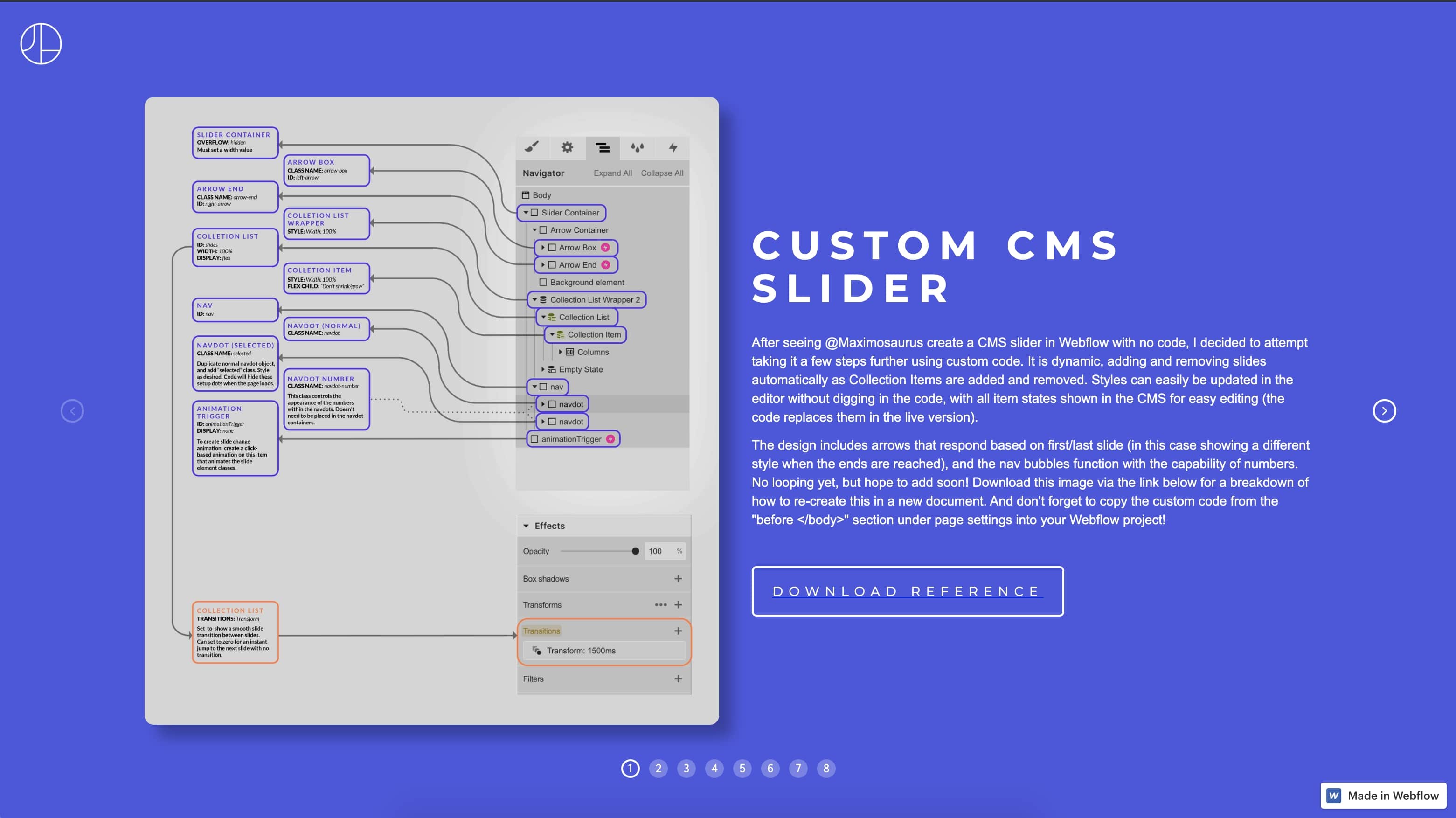
We love this slider built by Jonathan Haring, in part because of the lovely design, but more importantly, because it’s dynamically serving its images via Webflow CMS. While the CMS doesn’t natively support this yet, Sidney’s taken advantage of Webflow’s custom code capabilities to pull these images straight out of a Collection. Which makes it a pretty powerful tool for clients and marketing teams looking to manage their own slider content.
2. Card style slider
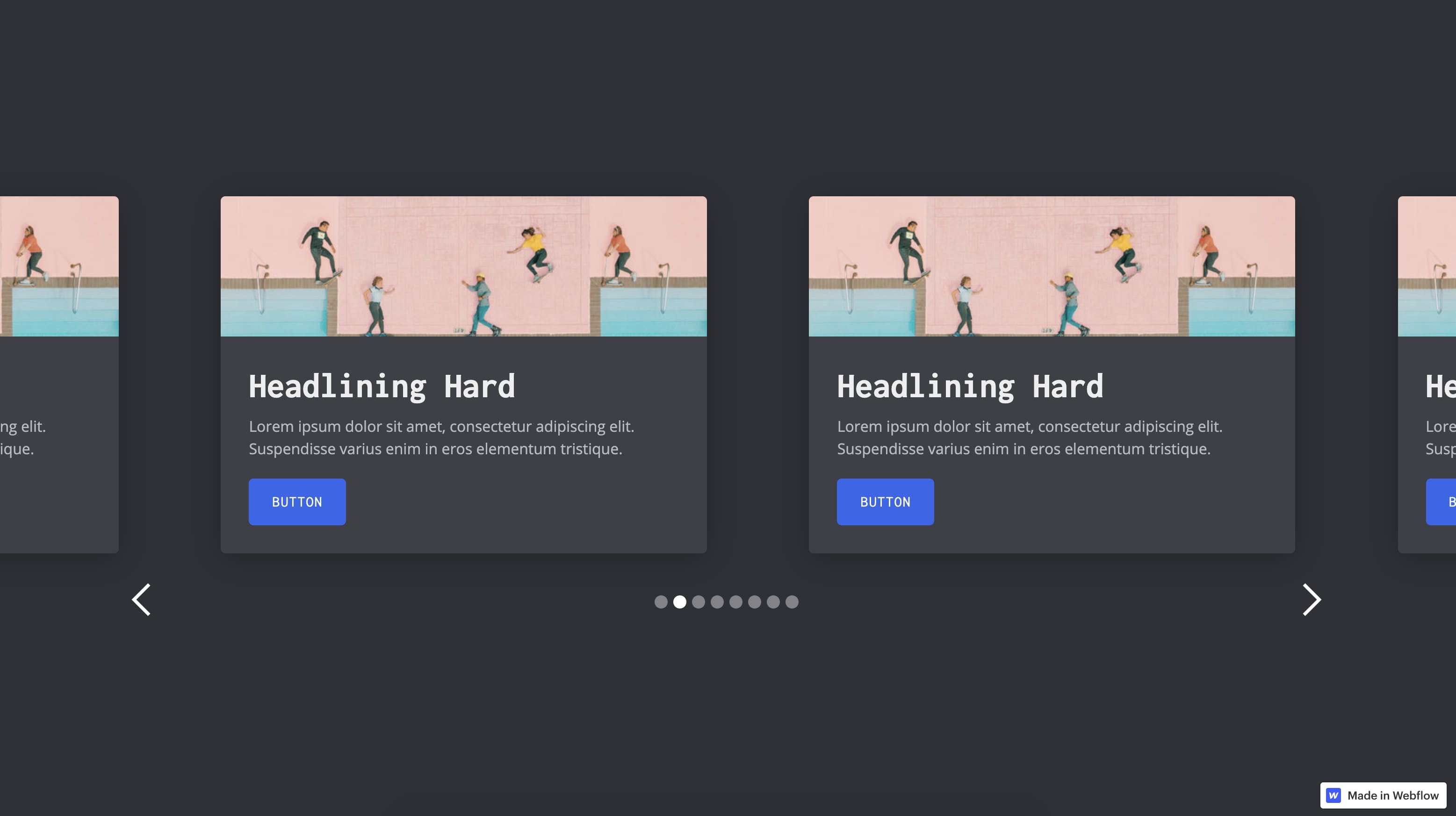
This is a great example of a fully responsive multi-column slider. Designer Corey Moen has all the components of a good card slider, as outlined in the above: dot and arrow nav, doesn’t autoplay, and the content is (largely) simple and highly visual. Bravo, Corey!
3. Ecommerce product slider
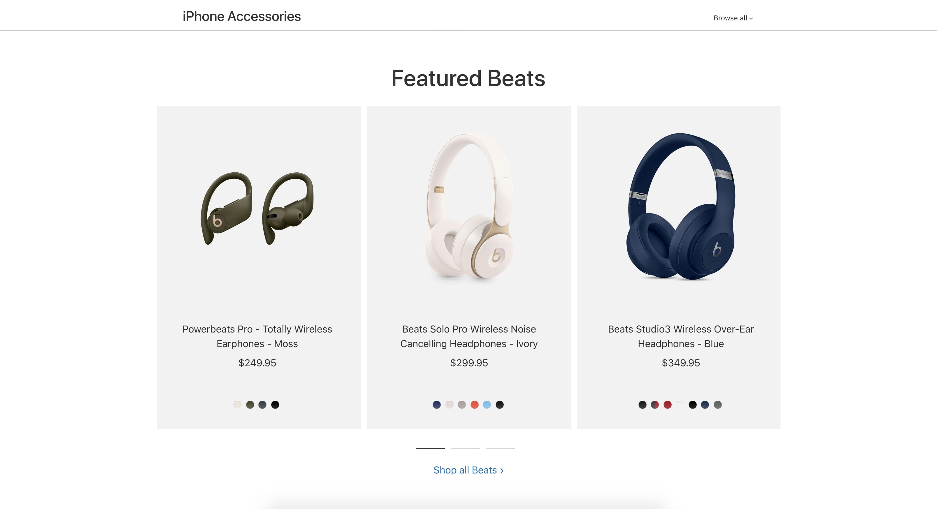
Unsurprisingly, Apple’s iPhone accessory page provides a great example of the ecommerce use-case outlined above. Its content is highly visual, supplemented by just a few concise and resonant words, ensuring the message is easy to get in mere seconds.
4. Digital commerce slider

You’ll find another one we love (maybe because we designed it) in the template detail pages on the Webflow template marketplace. Like Apple’s slider, it highlights highly visual content, features dot navigation, and it’s delightfully touch-friendly on mobile devices.
Designing carousels in Webflow
If you’re not familiar yet, you’re going to love Webflow’s built-in slider (we don't call them carousels) component — not least because it makes all these best practices super easy to follow, and actually adheres to most of them by default.
Just drag and drop the component onto the page.
You’ve got a ready-to-style slider complete with arrows, dot navigation, and autoplay disabled by default. Plus, it’s responsive and responds to swipes on touchscreens. And you’ve got a host of options to play with from there:

I won’t dig into every little detail, but the component’s settings let you control:
- How the slides animate
- Their easing method
- Touch-friendliness
- Autoplay
- Arrow display
- Dot navigation design
And, as with everything else in Webflow, you’ve got the power to customize just about every aspect of the slider’s design. Learn more about designing sliders (carousels) in Webflow University.

Get started for free
Create custom, scalable websites — without writing code. Start building in Webflow.


